Last Issues, First / Last Issues, Second Issues (that could be first issues) and so on...

Get after it, Pope.  

Grand Champion of the Kumite Brian Hibbs is going all Howard Beale above and below this post.  Go check 'em out and get smart.  Or, read me going on about comic books.  Win / win, right?

Disclaimer: This is not to say that Hibbs will follow down the awful rabbit hole Beale goes in Network.  He's just mad as hell and he's out the window telling you about it.  You're human beings, damn it!  Your lives have value!

Capsules of the last weeks after the jump!
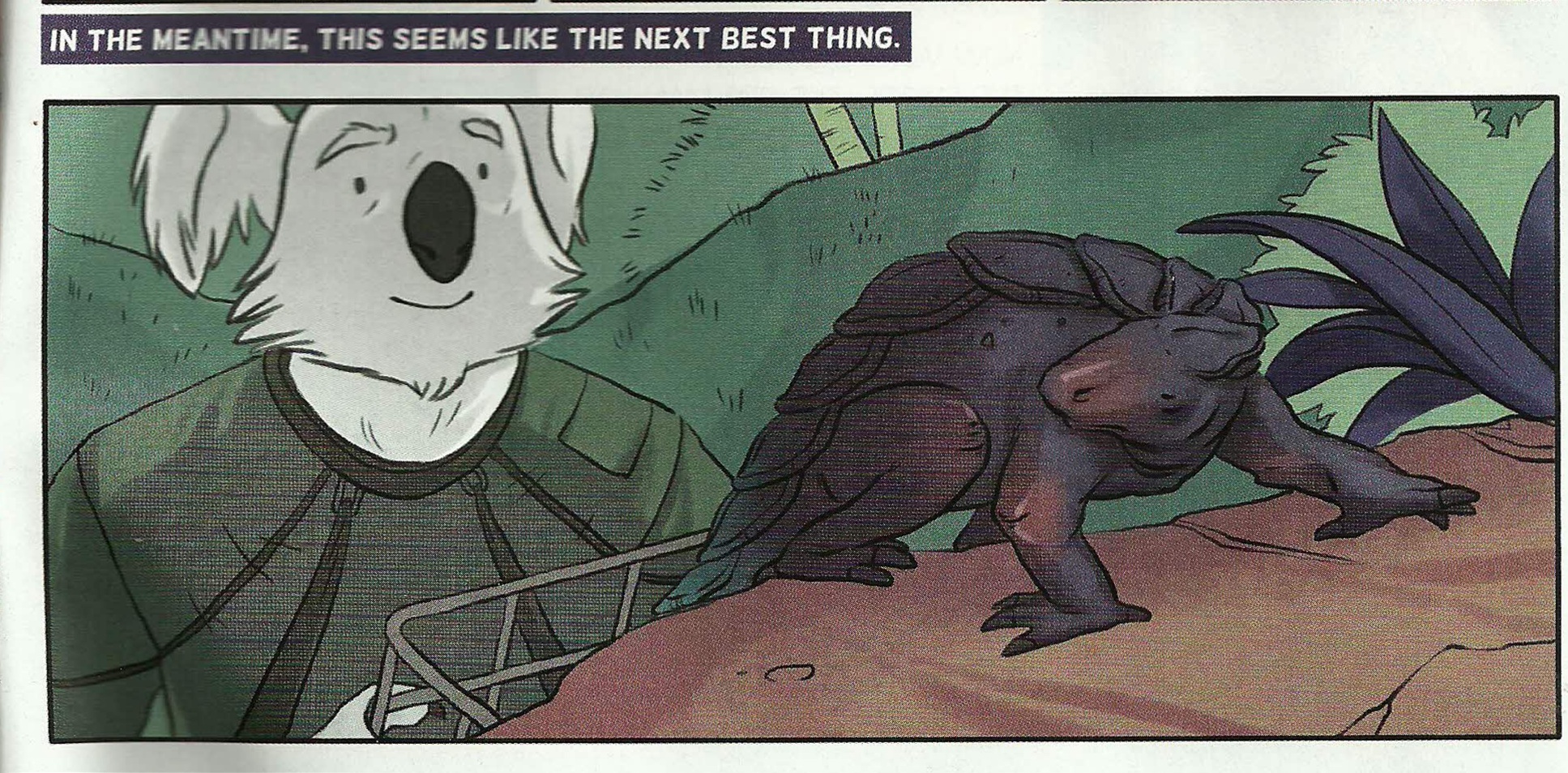
 

Dial H # 15

Mieville / Ponticelli

At $4.99 and stuffed with 38 pages of story Dial H #15 doesn’t disappoint in the “crazy be crazy” department.  My interest in the series had waned after the initial arc but I kept on with it and now at the abbreviated end I’m glad that I did.  Ponticelli’s rough madness grew on me throughout and Mieville introduced some elements I’d never thought of let alone seen in a Dial H comic.  These radical takes on existing property seem to get shorter and shorter runs at relevancy and I’m left wondering what a juggernaut like DC is doing trying to have main line (52) contributions from books like these on a sales level.  One hopes that Vertigo provides a lifeline with realistic expectations.  Oh, also, does anyone give a rip about those Channel 52 things?  Seems an indulgent house ad with no discernible value when “costs keep going up!” (by the by – 7 pages of ads in this one – mostly house and house adjacent)

Though…this is pretty funny.

Holding the line at...stupid!


Prophet #38

Graham / Milonogiannis / Roy

$3.99


First, I got the Jim Rugg cover and it’s pretty great.  I highly recommend seeking out SuperMag #1 by the man himself.  Stylistically and in all different types of delivery Rugg is really and truly a virtuoso talent.  Stunningly flexible. Check it out.  Amazing. (Additional superlatives needed)

Anywho, Prophet is lean and mean as a comic book.  The gang throws us 29 pages of story content with nary an ad.  Even the inside front and back covers are dedicated to story.  It’s a generous gesture and almost certainly costs someone money.  I can’t stress enough how immediately – by breaking the opening page monotony – Prophet slams you into the narrative.  By changing the pace you change the experience.  Not cookie cutter comics.

Also worth mentioning is the continuing and “as the wind blows” back-up selection.  This month, Kate Craig brings us a precious story about the emotional and psychological benefits of not always trying to annihilate anything that has the temerity to exist outside our immediate scope of meticulous plans and schemes.  Being decent, essentially, is its own reward.  The whole thing is enjoyably paced with a nice, emotive style.  Kate also draws amazing and weird hands / paws.  Cool.

Be Decent


Catalyst Comix #2

Casey / McDaid / Maybury / Farinas

$2.99 

Art = NICE.  Each brings an identifiable tone – sense of place – and individual style.  I gushed over each of these in my original review and talked through the motifs they’re employing but I have to say – AGAIN – that the super…SUPER…SUPER star of this thing so far is Brad Simpson.  The color palette for each of these chapters is individual – unique and simply gorgeous.  Colorists just don’t get enough love and this guy is on another level.  A true secret weapon who deserves all the credit in the world for giving this book something to simultaneously help hold it together and break it up.  Get paid, Brad Simpson.  Get paid!

On the other hand your enjoyment of the story is going to be largely dependent on how much you enjoy winking asides.  If, like myself, you generally respond with atrocious and socially unacceptable amounts of sighing and eye-rolling you may want to read this one in the isolation chamber.

At points Casey goes full frontal assault, totally aping Dr. Strangelove, using Vandelay Industries as the company responsible for rebuilding the trashed city (when everyone knows they deal exclusively in latex), and having the group therapy session centerpiece of Change Agents not only fall prey to every, single, boring satirical stereotype trope of such an encounter but also take place in the gymnasium of the Jean M Giraud Fighting Arzachs.

That is to say...it's kind of what you expect from a Joe Casey comic and that's not what I was sold as a "bold re-invention of the super-hero comic experience."

Anywho, all 3 segments here could actually be part of an extended #1 comic.  We’re re-introduced, the supporting cast fleshes out a bit, a new wrinkle is revealed.  I think it’s not a bad strategy early on to give people late to the party a bit of breathing room so, from me at least, the feel of the pace is not too bad.

Still, does this line make any f’ing sense?  I must have read this three times and I was afraid it was going to give me a Lewis Black aneurysm.  Maybe Casey is trying to say the guy talking is just coming right out of his ass with this stuff but…I kinda doubt it.

That comparison is...not apt.

Brain…hemorrhaging….

http://www.youtube.com/watch?v=sJ0s0KUUpxo

"If it weren't for my horse..."


Save me…Paul!


The Invincible Haggard West #101

Paul Pope

$2.99

32 pages – No ads

All this goes without saying and to prattle about it would really belabor the point but it’s really and truly quite striking as an artistic statement.  From the hand-drawn sound effects to the visual choices made for each character this thing is a note perfect juggernaut.

Quickly

Each sound effect is perfectly and I mean fucking perfectly suited and delivered.

Contrast a well placed “Klop, Klop, Klop” or “TCHOOF!!” with some digitally inserted garbage in Batman / Superman and that tells you there is a difference between art and product.

The design work is so elegant and beautiful it engenders hyperbole.  In action or at rest Haggard’s “flight frame” is a thing of wonder.  His guns are neon tube death machines with impossible innards.  Hell, the man himself is so pulpy when his scarf gets shot you feel him take things to the next level.  (I pulled two vertical panels out of sequence just to show you the elements)

Put it all together and VOILA!


The supporting characters are well rendered in a minimum of space.  Haggard’s daughter, Aurora, is on for all of three pages and she’s already got a backbone to envy and a multifaceted personality.

In control


This is A work and EXCELLENT.  Battling Boy can’t come soon enough.

Happy reading, everyone!

All this and Earth, too? Hibbs starts on 5/2

Everybody loves comics!

ACTION COMICS #9: This is a lot more like what I was hoping for from Grant Morrison on a regular ongoing Superman comic -- focusing on President Superman from Earth-23. last seen in FINAL CRISIS -- but I was a bit surprised to not find the "real" Superman anywhere in the story. Still, Silver Age-y without feeling dated, and lots of fun things happen. Gene Ha's art was as awesome as always. I thought this was VERY GOOD. AVENGERS VS X-MEN #3 (OF 12) AVX: Brubaker's got the writing spot this week, so maybe that's why I felt this issue had a bunch more plot? I can't even imagine how this is going to read in trade, with it's crazy tonal shifts every issue? I thought this one was strongly OK.


DIAL H #1: China Mieville's comic debut, and it's pretty decent. There are a few mechanical problems with the set up (most namely: how do you dial four digits 0n a *rotary dial* phone by accident when trying to call for help in the middle of witnessing a horrible beating?), and I have to admit that I'm not sure that I at all like the notion that the H-dial is in a static location, but putting that aside, I very much liked this issue. (On the other hand, I always liked the Robbie Reed version as well) (Sockamagee!)

I liked the schlubbiness of the protagonist, I very much liked the dialed up heroes (Captain Lachrymose needs an ongoing series, stat!), and I just liked the general weird vibe on display here -- this comic could be perfectly at home at pre-Vertigo Vertigo, and whatcha know, it's Karen Berger editing her first superhero comic in 20-something years.

The art by Mateus Santolouco sort of veers back and forth between some Ted McKeever-looking wonderfulness to "Ugh, you need more fundamentals", but it certainly works with the book just fine. Overall: VERY GOOD


EARTH 2 #1: Having read this, I really really can't even begin to understand all of the faffing about in the pre-print interviews of "well, we really can't describe this to you", because, unless there's a dramatic change from what's on display in this first issue (which would then, arguably be a not-so-good FIRST issue), this seems easy to shorthand: it's the formation of a NEW e2-based Justice Society (though maybe they'll never be called that, who knows), where the set-up is in contemporary times, rather than ww2.

I'm a pretty big ("real") JSA fan, and I didn't really like any of the new costumes we've seen so far, so I was suspicious of this at first, but yeah, I very much liked the setup and world building, and slow roll-out of characters.

James Robinson's script was solid -- I felt a real emotional tingle in that scene between Bruce & Helena -- and Nicola Scott's art is as strong as always. I don't know if I will like the new JSA, really (there's really only 7-8 pages of those characters, the rest of the oversized space is dedicated to setting up the world), but as a "Yes, I would like to see more, please" first issue, I thought this was VERY GOOD.


EPIC KILL #1:  If you want to see teenage hotties do acrobatics like River Tam in Firefly, with lots of slaughter, then this is surely the comic for you. Largely reading like a pitch for a movie, it at least has fairly pretty art by Raffaele Ienco that kind of reminds me of John Ridgeway, I think -- detailed, but with straight lines not noodly curvy ones, yet just ever so slightly stiff because of that. Anyway, since the base idea feels so "Seen that a dozen times", the joy of this kind of work is all in the *execution* of the idea, and there's just enough "hey, cool" scenes to have me say that this is GOOD.


GI COMBAT #1: Half the book is about soldiers fighting dinosaurs, so there's that, and as a plus the art is by Ariel Olivetti, and it really fits here; the other half is yet another new take on "Unknown Soldier", who is getting close to becoming DC's equivalent in the if-we-keep-relaunching-him-someone-will-like-it-eventually-right? sweepstakes to Moon Knight. I think they need to try again, as I was really entirely uninterested in this version, sorry. I think this may be a concept that just can't work in the 21st century, maybe because of the "unknown" part, and that doesn't work in our database-driven world (esp with regards to soldiers, I'd have to say). Anyway, like the first half, disliked the second, which means I can't say better then EH.


MIND THE GAP #1 :Another book that reads a little more like a pitch then a comic, but I thought this pitch was fairly terrific. The set-up is for a whodunnit kind of mystery, with the victim's spirit interacting on the, dunno, astral plane, maybe is what to call it, with what looks like a little touch of Deadman-meets-Quantum Leap, maybe?  Jim McCann's script is very strong, and the characters vivid, while the art by Rodin Esquejo and Sonia Oback is realistic, without being creepy and off-putting, like some in that style become. As a bonus, this first issue is oversized @ 48 pages, and just a mere $2.99, making it a helluva deal. No doubt this was a VERY GOOD comic!


STAR TREK ONGOING #8: Given that the premise of the first six issues of this series was adapting/converting classic Trek episodes with the movie characters, you might have missed that they followed that with a two-parter (starting in issue #7), that followed up on the film, with the Romulans and the last drop of "Red Matter" -- I know I sure did until I grabbed this issue to read, and went, "Wait... that's not TOS!" (from the "next issue" pic, it looks like they're going back to that and "The Return of the Archons"). I don't know that I exactly care about the tattooed Romulan faction, or Red Matter, but it was nice to see something wholly new set in this universe (and, in theory, "official"). I thought it was highly OK, and if you miss the TOS characters, recast or not, this was a fun little follow-up.


SUPREME #64: Wow. this should be taught as a masterclass in how to utter destroy a previous set-up in 22 pages, and replace it with the exact opposite. I really loved the clever way that Moore set up his "all versions are true" love letter to Superman, and it's own set up gave all of the ability to complete rewrite the rules as new creators came onboard, but instead Erik Larsen rips it all to shreds and chucks it out the window for the ugliest possible of all iterations of Supreme. That takes mad skills, yo. The craziest part to me is actually the letter's page to the issue (which I suspect won't be in a digital version, sorry) where Larsen defends his actions by comparing this to following Todd on Spider-Man, or whoever followed Miller & Mazuchelli after "Born Again" in Daredevil. the difference, of course, being that there's a 15-or-so year gap here between issues, and while the argument is at least understandable when related to regular ongoing production of corporately owned icons (the trains, in fact, have to keep running), it's utterly bizarre in this case, especially after they went out of their way to try and show "respect" to Alan Moore by illustrating his final "lost" script.

Obviously, the difference between, say, WATCHMEN and this situation is that the creator of the property is the owner and can do whatever they want on work-for-hire material, but there's a dissonance here that my brain is ringing from.

Erik is a talented creator, and this work has a lot of energy, but I really liked the Moore version of Supreme (and pretty much hated the grim'n'gritty take that preceded it), so I thought this comic was pretty AWFUL


WORLDS FINEST #1: I have to say that if I were DC marketing, I wouldn't have scheduled the two Earth-2 related comics in the same week, but I just sell the things, what do I know? But, I also have to say that I really really liked this one, as well. Paul Levitz turns in the first script in months that I genuinely liked from start to finish, and the twin artist (George Perez in the modern sequences, Kevin Maguire on the flashbacks) really worked much better than I thought it would. Yeah, I really thought this was strong, VERY GOOD stuff.

The one problem? That logo. Jesus, that's a horrible horrible disaster -- it looks cluttered and terrible using the "across the room" test (if you can't pick a logo/design element/whatever from across the room, it fails), and it's not at all clear what the name of the comic IS, with "Huntress" being over "World's Finest". Yow.


X-O MANOWAR (ONGOING) #1: If you read the original in the 90s, you've pretty much read this first issue, as it really alters very little of the original setup, just with a little more depth, maybe. It reads well, it's pretty enough, but I didn't feel like "OMG! I need to read the next one right now!" Maybe I'll check back in a few issues to see if they're doing new stories and not just retelling things I already know. Or, maybe I won't. OK.


Right, that's me -- what did YOU think?


-B