"I Wonder If Tom And Larry Would Be So Eager To Marry Me If My...Feet...Were...Gone!" COMICS! Sometimes They Got Moxie, You Betcha!

As an ancient ladies’ fragrance ad had it, “Men Can’t Help Acting On Impulse”; which is why we have prisons. And, slightly more pertinently, why I bought this book of ye olde newspaper continuities. Repeat offenders will recall that recently I looked at a Hermes Press collection of Frank Robbins’ Johnny Hazard newspaper strips. Hopefully such folk will fail to recall that I was somewhat out of my depth and basically just said "Frank Robbins draws real nice!" in a number of different ways without even a hint of insight. In the uncharacteristically optimistic belief that I could hardly do any worse I thought I’d look at yet more old newspaper strips. This time out they are both about and by a woman. This means there’s every chance I’ll not only fail to say anything of use but I’ll also inadvertently offend fifty percent of the world’s population. Sigh, and this is how I relax; it’s no wonder I have more hair on my toes than on my head.  photo BScredoB_zpse81f947d.jpg
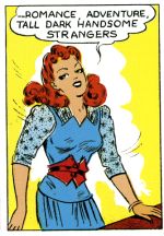
Anyway, this…

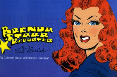
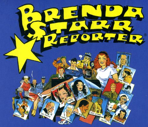
BRENDA STARR,REPORTER The Collected Dailies and Sundays: 1940-46 By Dale Messick Hermes Press, $60.00 (2012 Brenda Starr created by Dale Messick Brenda Starr and Brenda Starr, Reporter (c) Tribune Media services, Inc.

 photo BSCovB_zps93e351bc.jpg

One thing that becomes apparent very quickly when you decide to dip a toe in the newspaper continuities pool is the price of the bally things. This one goes for sixty of your Earth dollars. Now, that’s not what I paid thanks to Christmas gift vouchers and a good truffle about for a price within spitting distance of my personal definition of reasonable, but that’s still the RRP. The other thing is such books are pretty niche and people tend to buy them out of a strange kind of forensic curiosity rather than just for pure reading pleasure. What I’m getting at is it’s important to know what you are getting. I was remiss in this area with the Frank Robbins’ Johnny Hazard book which, at this late date, I will inform you contained just the strips but these were crisply reproduced. Which is fair enough; no frills but good stuff. This Brenda Starr book is a bit more of a mixed bag. So, in the interests of people who take their newspaper continuities seriously I will let you know what you are in for if you splash the cash in Brenda Starr’s direction. Some of the reproduction is a bit iffy in this volume so tread wisely.

Foreword by Starr Rohrman Introduction by Richard Pietryzk An Appreciation by Trina Robbins Chapter 1: Beginning Sunday strips from June 30, 1940 through to April 20, 1941. Presented in colour and half a strip to a page. The reproduction is excellent and the reading a pleasure. Chapter 2: The Curious Tale of Mary Elizabeth Beastly Sunday strips from September 10, 1944 through to January 14, 1945. Presented in crisp and clear B&W. With one exception these are taken directly from the original artwork. Chapter 3: The Man of Mystery Sunday and daily strips from October 22,1945 through to February 24,1946. The reproduction on the colour sundays remains good but the B&W dailies are a bit lacking. Process A brief and basic look at process but with some nice original art and colour guide stuff. Afterword by Laura Rohrman


And now I start flapping my jaw…

Dalia (“Dale”) Messick was born in South Bend, Indiana on April 11th 1906 and in 1940 she created the newspaper strip Brenda Starr for the Chicago Tribune. She created the strip under the less gender specific moniker of Dale as, back then, women weren’t taken too seriously in the comic strip biz and men’s hands had a tendency to wander. My, how things have changed, he said tonelessly. Now I’m going to make a half-hearted stab at showing a modicum of interest in the human being who made these strips. Don’t worry it’s not much; just other people’s words rewritten enough to avoid legal action (hopefully), but it’s better than nothing. Call me Icarus.

So, in between 1906 and 1940 what was Dalia Messick up to? That’s 34 years in there, that’s not chump change time-wise. Well, Dalia Messick spent the first part of her life as a child attending Hobart High School where her reported severe myopia, poor spelling and left handedness indicate those were not the happiest days of her life. Maybe, as it is for many such children, art was a refuge; maybe it wasn’t, but art was where Dalia Messick ended up and judging by how she got there it wasn’t by chance. Usually around this point I’d be obliged to point to the fact that her mother was a milliner and her father was a sign painter hence her budding artistic interest and later commercial success.

 photo BSstjohnB_zps49eef6b3.jpg

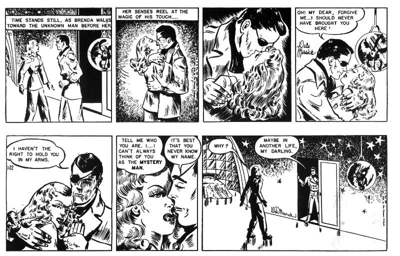
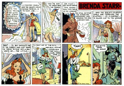
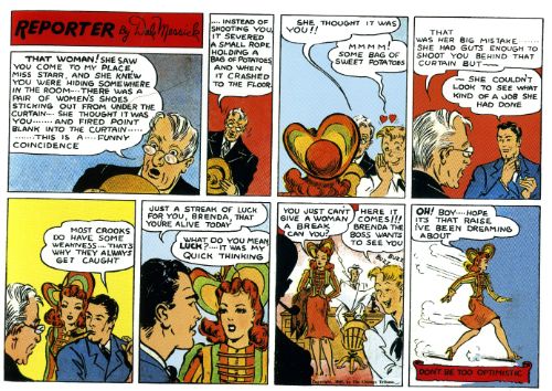
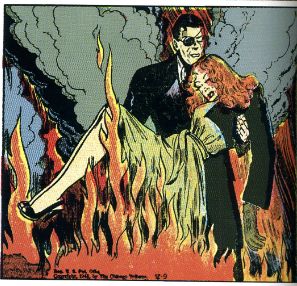
That’s a bit pat, maybe? Well, I do think the milliner thing is interesting because Messick’s art very much resembles the fashion illustrations of the time; full of sweeping lines and curves. Her strips have a marked emphasis on apparel rather than the folk sporting it. And hats; Brenda Starr is all about the hats. There’s even an innovative “soil hat” to keep the flowers adorning it fresh; it didn’t catch on. Milliners (like her Mum; keep up) design and manufacture hats, so I’m not just grabbing this stuff out of thin air. Mind you, I’m not sure about the sign painting her Dad did though. I guess it could have set in place the importance of bold visual appeal in snaring attention; something these strips also trade in. While Messick’s strips lack Milton Caniff’s (or Frank Robbin’s Caniff informed) chiaroscuro approach or Alex Raymond’s mannered elegance they do have energy. Sure, Brenda Starr is scruffy stuff in comparison to Terry and the Pirates or Flash Gordon, but what its visual raggedness lacks in precision it makes up for with impact and the eye really tears through this stuff. I’ve just exhausted all my points of ye olde newspaper strip reference, but I imagine quite a lot of the strips of the time got by on, er, enthusiasm rather than majestically realised technique. I doubt though that many strips of the time cherished fashion as much as Brenda Starr did.

 photo BSclothesB_zps668cf820.jpg

Brenda Starr is a romantic adventure strip so, sure, there are cars and building and desks and snow and rocks and all that scenery malarkey but it’s all a poor second to the fashion stuff. Yes, there’s scads of high adventure and derring-do in Brenda Starr; there are parties, mysterious millionaires, marriage proposals, young men cross dressing in sea shell brassieres, eye patched lotharios and all the enchantingly surreal stuff you’d expect from such a papery cough-syrup daydream, but there’s also a whole lot of vogueing going on. As the cupid struck men around Brenda prove it’s not unusual to fall in love with anyone, and nor is it unusual for the bulk of a Brenda Starr strip to consist entirely of Brenda flouncing around in a ridiculous concoction of feathers, fur and lace. Sometimes her kit is so flamboyantly bizarre that she resembles nothing less than a haute couture version of the Animal-Vegetable-Mineral Man. I say her outfits are ludicrous creations but I am pretty much fashion unconscious so I could be wrong there. They are certainly, um, distinctive, as they say in Paree. Yes, distinctive indeed as are each of the strips no matter the schmutter Brenda’s bedecked in. I won’t lie; these strips are kind of clumsily garish and oddly distorted and, at first, I didn’t know what to make of them. And that’s why I read up about her and did a bit of poking about at 1940s stuff. Hence the enormously speculative bit about how her Mum and dad, and their jobs, fed into her art. Even better and, better still, even less speculative is the fact that Messick worked in the greeting card industry before her strip was picked up by the Chicago Tribune. Because if there’s one thing these strips resemble it’s 1940s greeting cards pressed into service as a narrative.

 photo BSspudsB_zpsc62c9918.jpg

Reading other people’s research tells me that Messick spent the tail end of her 34 years prior to hitting the comics jackpot in the greeting card industry. She must have had a knack for it because she managed to support her family through the Great depression with such work. I guess people may not have wanted hats designing or signs painting but they still wanted to send chirpy bits of card to each other; go figure. By 1940 America had been hoisted up out of the Depression by its bootstraps via the brawny Liberalism of Roosevelt’s New Deal and, of slightly less historical import, Dale Messick’s art was forever imprinted by her past vocation. Who would have guessed a bunch of newspaper strips about a flighty but capable and independent female reporter in impractical clothing would weather the years better than Liberalism. Now, as awesome as the days when Liberals got shit done were (so awesome; so, so awesome), things weren’t all rosy back then, no, what with all that sordid kerfuffle over in Europe and all that sexism in the men everywhere. Oddly, Brenda Starr, on the admittedly incomplete evidence of these strips, largely ignores the whole unfortunate Second World War thing preferring instead to accentuate the positive and carry blithely on as though nothing is happening. Plenty of other people picked up the slack on that, but few strips would have reflected so well the growing emancipation of the women on the Home Front.

 photo BSbarB_zpsbd877c19.jpg

And Brenda Starr does it naturally without polemic or stridency simply by being a strip about a woman with moxie. Brenda may not appear terribly self-determining and there appears to be a total lack on Messick’s part to be pushing any agenda as such, but by simply being what it is it is of significance. If I, somewhat unscientifically, take some lady-centric comics I’ve been looking at lately we have Brenda’s near contemporary, and Ms Messick’s namesake, Dale Arden; there she is dressed for a bordello and endangered approximately every seventeen and a half minutes on an alien planet, and she’s mostly concerned with getting Flash Gordon to marry her. Then there’s Diana Prince: Wonder Woman from the progressive year of 1968 in which Steve Trevor picks up a strange hippy woman in a bar and Diana Prince just weeps unsettlingly fat white tears while upbraiding herself not to be so jealous. Back in this century I’ve read a couple of 2013 comics which are, you know, just the same old violent boys comics but the hero is a heroine with a name like Silky Fontaine. Which is fine if you like that; fill your boots. But I’ve met a couple of women over the last four plus decades and I can exclusively reveal to you now that some women like romance, some women have even been known to take an interest in fashion, and, it beggars belief this, they are capable human beings who get stuff done. Now, I don’t want to end up refusing to leave the house until sufficient people sign a petition saying I’m not a monster but perhaps, just perhaps, there might be a very profitable middle ground in comics between portraying women as sex toys or sad death machines.

 photo BSrescueB_zpse3950e92.jpg

Dalia Messick wrote and drew Brenda Starr from 1940 to 1980 and it continued in other hands until 2011. That’s not small potatoes there and it’s probably largely down to the fact that her audience could identify with Brenda and live vicariously through her. As gaudy as her adventures may have been Brenda was always just a woman. While there’s no end of everyman characters in comics there’s a real dearth of everywoman characters. And there is an everywoman; ask Chaka Khan. Brenda Starr might appear unfashionably feminine but she is who she is and she’s happy being like that and it holds her back not a jot. I enjoyed Brenda Starr because Brenda Starr reminded me very much of the last five minutes of INLAND EMPIRE; an eruption of women being unapologetically happy in themselves. How could that ever be less than GOOD!

 photo BScastB_zps2435d2cb.jpg

It's A Fair Cop, Guv Dept. John got any facts in the above from the wikipedia page abour Dale Messick. There are a lot more facts on there and also some useful links at the bottom of the page.

"Working Together In The Name Of The Common Good..." COMICS! Sometimes Creators Don't Get To Pick Their Fans! (Ever, Actually. Now I think About It.)

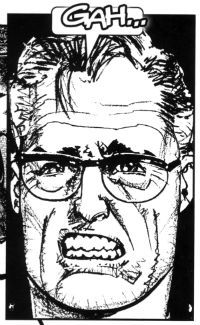
It’s a Skip Week! (Booo!) So let’s see what falls out of my head (Yay!). Checking the Savage Critic’s mail bag I see several of you may have contacted me expressing intense distress that I have yet to tell you how 2013 panned out for Howard Victor Chaykin.  It was definitely several or none. It’s so hard to remember these things. So, hedging my bets I’ll tell you anyway…  photo Gah001B_zps8964d526.jpg

 photo BuckCovB_zpsa4f9a490.jpg

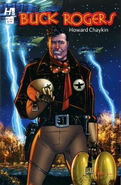
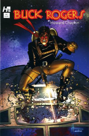
Howard Victor Chaykin ended the year of 2013 by sprawling debonairly into the first month of the new year with the final issue of Buck Rogers, which splashed down in January 2014. Judging by the sales you ‘orrible lot were blasé in the face of the charms of Howard Victor Chaykin’s Buck Rogers revival. Well, that’s your loss because I can tell you it was in fact VERY GOOD! Yes, despite the fact that a page in the final issue !OMITTED! !THE! !DIALOGUE! Howard Victor Chaykin’s Buck Rogers was the usual witty, political savvy, oddly meandering then hectically climactic appeal for everyone to stop acting like jackasses, but this time with jodhpurs and jetpacks. Kenneth Bruzenak and Jesus Arbutov all played important parts in giving the series a vibrantly pulpy sheen in keeping with the hoary yet versatile source. It was certainly very Howard Victor Chaykin and finished off what was certainly a very good year for Howard Victor Chaykin. Actually, I don’t know how Howard Victor Chaykin’s year was. It was probably a pretty decent year because throughout it he would have been Howard Victor Chaykin. Head start right there, am I right? You know I am. And what I know is it was a good year for people who enjoy Howard Victor Chaykin’s work; both of us.

 photo Cover001B_zps08054f40.jpg

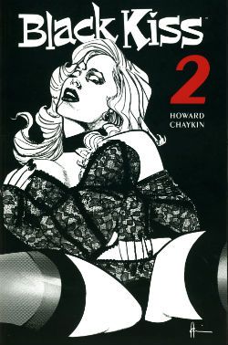
Despite being denied an overseas audience in its original periodical form (due to an aversion to spending decades in court) in 2013 Image collected and released Black Kiss 2. Which you will recall is VERY GOOD! So, it appears there are different rules for books and comics when it comes to peddling filth. And those rules are probably totally unconnected to the different amounts of money the different formats bring in. Black Kiss 2 was the one where Howard Victor Chaykin showed that even his sick smut made other people’s smart stuff look sick. Opinions were divided, with some declaring the book merely an old man whacking off in public. Such people are probably unaware just how much work goes into writing and drawing a hundred and odd pages of comics. A lot more work than whacking off, even given how much more work is involved in that the older you get. Particularly in public; you have to really plan that shit out like a caper movie unless you like having your windows broken. Or so I’ve heard. Naturally, untouched by bias as I am, in my head Black Kiss 2 was inventively vile but always engrossing and enthusiastically executed. A lot like an old man whacking off when you put it like that. It was certainly a lot less toe curling than that time Howard Victor Chaykin drew those Bendis Avengers comics. See, it’s that kind of bland doggerel kids need protecting from! Every year lowered expectations kill more people than pictures of gnawed off cocks being spat in people’s faces. Check your stats! Anyway, a mixed reaction to Black Kiss 2 like I say, but while we should always respect the opinions of others we should also remember they are worthless and only I am always right. To sum, Black Kiss 2 was probably a bit rich for most palates and we’ll move swiftly on.

 photo centurywest_zpsfc3d63e4.jpg

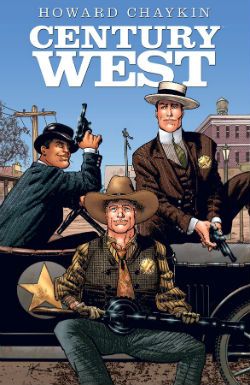
Image continued to curry my favour by finally publishing Century West; this being an OGN from about 6 years ago which originally appeared in Spanish or French or some other vulgar tongue I can’t be arsed to learn because, well, indolence is bliss. Or ignorance. Either way, I’ve got that covered! Come on now, 6 years or whatever it was; what was the hold up there? It’s not like they had to translate it or anything. I know he can be a bit excitable and his dentures might slip making his speech go all mushy but I do believe Howard Victor Chaykin usually speaks English. Anyway, like when our cat went missing that time Century West finally turned up; unlike our cat it hadn’t lost an ear and now hissed at loud noises. Despite being a bit overcrowded layoutwise and so busy with characters and events in its short span of pages it risked leaving you feeling like you’d sucked a three course meal through a straw very quickly indeed, it was VERY GOOD! It didn’t hurt that Howard Victor Chaykin’s busy script and crowded art was blessed by the titanic typography of Ken Bruzenak and Michele Madsen’s lovely colours. There was a James Garner level of cool pleasure emanating from the endeavour embodied by Howard Victor Chaykin sneaking in a sly nod to his early work decades past on the Shattuck strip. One for the keen eyed old timers there. Basically it was another fine example of Howard Victor Chaykin’s love affair with the history of America and his somewhat more ambivalent feelings about the kinematograph (it’s okay, Howard Victor Chaykin, it’ll never catch on!). It was in fact very much like Black Kiss 2 in its themes and concerns but somewhat more sunnily optimistic in its conclusions, and certainly less likely to need stashing when the Rabbi pops round to chat about donations for the next jumble sale.

 photo SATCovB_zps826dc453.jpg

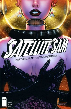
Throughout the year the odd voice was (reasonably enough) raised in opposition to the occasionally offbeat aspects of his work but it was Howard Victor Chaykin’s art that was the best reason to tolerate the tone deaf Altman impression of Matt Fraction’s Satellite Sam. Hey, another Image book. Image: we keep Howard Victor Chaykin off the streets! Despite Howard Victor Chaykin’s best efforts Fraction's incessant showboating continued to undermine the effects he was after. He's like a mirror that man,  a mirror to which access is keyed on the DNA of the entire population of the world but me; I can't see what others see in him. One day his enthusiastic mimicry might make him comics’ Michael Sheen but as the final whistle blew on 2013 he remained comics’ Mike Yarwood. And Satellite Sam remained OKAY! So, that New Year's Resolution I made to not be such a dismissive prick? Not a success. Anway, I say the art but really it was the art and the lettering which were worth showing up for. Ken Bruzenak was here again, this time busting out an innovative invisible speech approach which harked back to Alex Raymond’s Flash Gordon strip with its blunt ended bubble tails. In many ways Howard Victor Chaykin’s 2013 was also Kenneth Bruzenak’s 2013. Not only was Ken Bruzenak all over Dark Horse Presents like a beautiful rash of bruises but he was reunited with his beach dwelling pal on a seemingly permanent basis. Chaykin and The Bruise were back! Chaykin and The Bruise! Sounds like a forgotten quirky action flick from the ‘70s starring Peter Boyle and Alan Arkin or something. Maybe with a jazzily chugging score by Lalo Schifrin and a very special guest appearance by Ann Margaret. Sadly the reality is in all probability naff all like that; just a couple of salty old dudes doing the do old dudes need to do to get the dough.

 photo IM_SO_COV001_B_zps9a29b68e.jpg

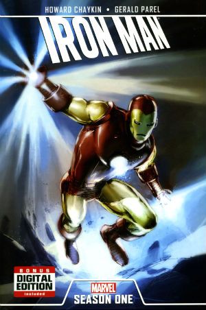
Oh, there was also Howard Victor Chaykin keeping Marvel sweet with an Iron Man OGN and that weird strip in that A+X comic (which a kind Savage Critic commenter alerted me to). This latter involved Black Widow and The White Queen flashing their breasts at a man until he puked. Because, Howard Victor Chaykin! Some even more magical pals of The Savage Critics sent me reports of Howard Victor Chaykin’s doings at conventions which were very much appreciated (SPOILER: he was a gentleman!). My thanks to all the lovely people who enable my crippling obsession! I have not named anyone because sometimes people don’t like that, but while the mental hygiene behind my thanks may be suspect those thanks are genuine. So, the year in Howard Victor Chaykin there, Actually I just blurted all this out so I probably got all the release years wrong and missed stuff and oh, dear, I have to go now. So, I might have missed something, do let me know. Oh, do!

Anyway, Howard Victor Chaykin: 2013 was another year we should have been glad he still bothered with – COMICS!!!

"DIMINISHING Your Enemy DOESN'T defeat Him." COMICS! Sometimes Ken's Hair is Brushed And Parted!

So, the nights are drawing in and we've had a full dance card over here what with begging sweets from strangers, burning effigies and firing explosives into the sky. Inbetween all that I read some comics and wrote about them. I did it as and when, so I've just put this together now from scraps and I can't even remember writing most of it. Hopefully you won't remember reading it. Anyway, this...  photo PDTownB_zpsbea8a7ce.jpg

SATELLITE SAM #4 Art by Howard Victor Chaykin Written by Matt Fraction Lettering & Logo by Ken Bruzenak Digital Production by Jed Dougherty Cover Colour by Jesus Arbutov Designed by Drew Gill Edited by Thomas K (still no relation) Satellite Sam created by Howard Victor Chaykin and Matt Fraction Image Comics, $3.50 (2013)

 photo SATCovB_zps826dc453.jpg

While on a rare physical manifestation to my LCS recently (I’ve been travelling; not for work just to throw the FBI off my trail) I asked what the response to this series was and my LCS owner said, “Weeeeeeeeell, people don’t hate this as much as his other stuff.” Hilariously, he meant Howard Victor Chaykin rather than Matt Fraction. Matt Fraction! The man who does more Tumbling than The Flying Graysons after the shots rang out! Try the veal! Apparently SATELLITE SAM is an on-going not, as I thought, a limited series; explains much this does. Mostly it explains the total lack of focus and failure of any of the narrative threads to engage my attention on anything other than a, “Oooooh, research!”, level. I guess there’s some free-form vamping jazz-scatting shabbeey-doo-waaa going on writing wise. That would explain much but it wouldn’t excuse any of it.

 photo SATtvB_zps73659af4.jpg

There’s a lot of, sigh, craft here but it’s not paying off for me. Maybe too much craft? Or maybe too much showing off. Showboating should come after you nail the basics, I’m thinking. But I’m not a writer so. Y’know…Basically Fraction’s comics remind me of a puppy that can walk on its back legs or do that creepy shake hands thing but still has a tendency to leave a surprise behind the sofa when no one’s looking. He’s a mixed bag is what I’m saying.

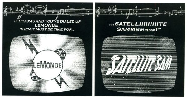
Take the gusset sequence last issue...please! That took up some major page real estate and you could almost hear his neck pop as he inclined his head (modestly, always modestly) for applause. But, c’mon, I need an Editor, stat! That sequence could have been halved (just keep the pages of the people at the table; give your readers some credit!) to double the comic effect (strictly speaking doubling zero is still zero but...). Hmmm, and yet, and yet then the world would have been denied HVC’s gusset panel. Who would deny HVC his gussets? I pity the man who gets between HVC and his gussets. I’m referring there to the last issue because I can’t remember what happened in this issue. Well, I can, but it seems like everything that happened in this issue had already happened at least once in the previous issues. Sure, sure, I hear the cries, this comic may be as exciting as watching cardboard swell in the rain but look at that craft! Craft, yeah, great. Craft’s a foundation you build on it’s not the finished product. Mind you, I’m not a writer so, y’know…Anyhow, with SATELLITE SAM Fraction attempts a faux Chaykin, which is cheeky because that’s Mrs Chaykin’s job. A bit of blue there to extend my demographic appeal. Kids like filth, right? It’s kind of a Howard Victor Chaykin comic; if Howard Victor Chaykin had never left his house. It’s not exactly riveting is what I’m saying there. Still, Fraction obviously butters Chaykin’s parsnips well because the art here is quite, quite lovely. Oh, and The Bruise is slumming it here as plain Ken Bruzenak but he’s still inventive as all get out. I really like his ‘invisible’ balloons and his subtle doubling on the loudspeaker chat from last issue. Or was it this issue? Wait, is every issue of SATELLITE SAM the same but with the pages in a different order? Yes, there’s still a tendency for HVC’s art to include character-float and counter-intuitive levels of detail in crowd scenes but he seems pretty engaged with this stuff. Far more than I am in fact; so SATELLITE SAM just gets GOOD!


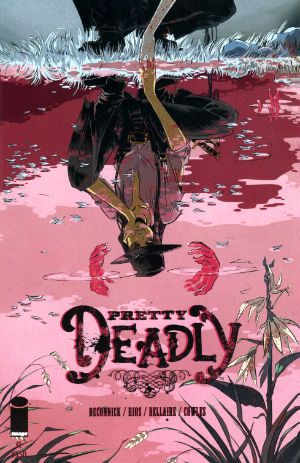
PRETTY DEADLY #1 Art & Cover by Emma Rios Script by Kelly Sue deConnick Colours by Jordie Bellaire Letters by Clayton Cowles Edits by Sigrid Ellis Image Comics, $3.50 (2013) Pretty Deadly created by Emma Rios & kelly Sue DeConnick

 photo PDCovB_zps50a7ca21.jpg

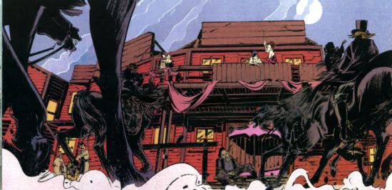
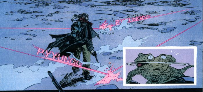
And it is. Pretty, that is. Probably not deadly though. Unless you roll it up and jam it down your throat, or maybe set fire to it and jump in a vat of gasoline, or maybe…you’d have to try hard is what I’m getting at there. I liked this and I mostly liked it for the visual aspect. Here I’m including the whole art/colours/letters synery thang, because it all worked together real sweetly. Ayup, a really quite visually impressively thing this comic was. I enjoyed many things about the visuals but the following floated to the top of my air filled head: the visual distinction with which Emma Rios defined the characters; the clear differentiation of textures, again by Rios but also Jordie Bellaire; the fact that there was not a little Colin Wilson about it all (altho’ the main debt is to that Paul Pope/Nathan Fox shabby energy thang) ; the hot pink of bullet trails in the desert dark which would be Bellaire alone; the fact that the Rios' whores looked like normal women with bodies subject to gravity; the tricksy but comprehensible page layouts, probably DeConnick and Rios; the variations within the lettering from Clayton Cowles and the attention and care with which the purposefully varied and distinct colour palettes were applied throughout by Bellaire. It was good stuff.

 photo PDShotsB_zpse2f142c4.jpg

That good in fact that I barely noticed it was called upon to illustrate what were basically standard genre scenes bolted together with the kind of mysterious supernatural vagueness that arises when you go out of your way to avoid clearly explaining anything. It’s the kind of comic which has the title character appear on the last page and I'm guessing it's also the kind that won’t actually have got around to setting the premise in place until the fifth issue. Note to comic book writers: people don’t live forever, so get a fucking move on. The writing’s not bad but it is very (very) concerned that you notice it. That whole kid at the back of the stage trying to attract its parent’s attention thing. Oh, fret not, I certainly noticed the writing but mostly because it teetered precariously on the precipice of preciousness. Luckily the fantastically evocative and atmospheric art managed to prevent the whimsy from becoming too cloying. Had I not warmed to the visuals quite so readily reading this this would have been akin to choking on Turkish Delight. At points it made Caitlin R Kiernan read like Helen Zahavi. It’s just not a style I warm to, is what I’m saying there. That doesn’t make it an invalid style or the writing itself bad in and of itself (that’s important; I should maybe mention that). There’s some back matter but since I’m not really one for all that simultaneously self-abnegating/self mythologising (you have to fail to succeed! You have to fall to fly! You have to die to live! You have to poo to eat! Marvel at the sparkle on the diamond of my life! I mean share in my enjoyment of the sparkle on the diamond of my life! Share! Well, after you’ve paid £3.99, soul sister, soul brother!!) stuff today’s comic scribes peddle we’ll move swiftly on. I give this VERY GOOD! If you get through life pretending it's a movie and you're the star you can probably go up a grade. Hey, whatever gets you through this vale of shite.

BUCK ROGERS#2 Art and Script by Howard Victor Chaykin Colours by Jesus Arbuto Lettering by Kenneth Bruzenak Pin-up (p.22) by Jed Dougherty Buck Rogers created by Philip Francis Nowlan Hermes Press, $3.99 (2013)

 photo BRCovB_zpsea67ee60.jpg

In which amends are made for the first issue omission and  Ken Bruzenak not only gets credited as letterer but is credited as Kenneth Bruzenak! Ooh-la-la! Kenneth, yet! I do so hope Kenneth lettered with his pinky stuck out and all gussied up in his tux and spats; this being a formal shindig donchew know! Kenneth’s lettering here is still bubbly and fun because no matter how shiny his shoes – he’s still The Bruise! Oh, and Jesus Arbuto steadfastly continues to colour this like he’s got peyote on a drip; which works just great in this madhouse of a future setting. You will recall that the last issue of BUCK ROGERS was pretty good but this issue is actually even better. There’s always humour in a Howard Victor Chaykin comic but he’s rarely embraced the comedic so blatantly as he does here. Successfully too I might add; I know I laughed several times. When Buck displayed his pragmatism by avoiding detection with a brutal act of unkindness I laughed like I had a flip top head.

 photo BRsfxB_zps91b76998.jpg

So there’s verbal sparring, comedic bickering, and some dark, dark laffs too as HVC confronts the racism of this world he has built, and basically tells everyone to knock that shit off. Humour not for humour’s sake but humour with a purpose. Visually it’s still Alimony Age Chaykin, so you know if you like that. And I know you don’t. Luckily I like it enough for all of us! The real standout is his breackneck don’t-sweat-the-details pacing and bracing wit. There’s even a slight “kids, today!” subtext that pays off with a man weeping to music anybody reading this would have to Google. BUCK ROGERS is funny, serious and, hey, got the sun in my eye here, cough, whisper it: moving. That’s not a bad range to cover in a book about a man in jodhpurs with a jet pack. Boy, I don’t know who this young turk Howard Victor Chaykin is but I sure like the cut of his jib! Kenneth too! Hell, Jesus is pretty good on this comic as well. There's a sentence my Sunday School teachers never thought I'd write! This issue takes BUCK ROGERS up to VERY GOOD! But you knew that because you’re already buying it, right! Whoa, that cleared the room.

And remember: we can tear each other apart but God help the fool who tears up - COMICS!!!

"Oh, Jumping Joe!" COMICS! Sometimes They Appeared Daily In Newspapers While The World Burned!

Hello again! What could be more alluring than a look at some old timey newspaper strips from the days when World War Two was still in full swing, strips by a man who has been dead since 1994! I shall capture that Youth Market, yet. Anyway, this...  photo HazrheadsB_zpsbb7b6ee6.jpg

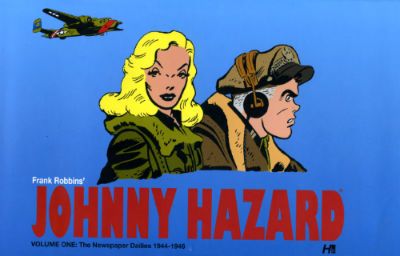
FRANK ROBBINS' JOHNNY HAZARD VOLUME ONE: The Newspaper Dailies 1944-1946 By Frank Robbins Introduction by Daniel Herman Hermes Press, $49.99 (2011) Johnny Hazard created by Frank Robbins

 photo HazCoverB_zpsc98b2ac8.jpg

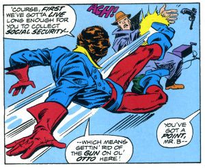
When it comes to comics posterity can be a bit of an ass. Case in point: Mr. Frank Robbins esq. (1917 – 1994). Now, Frank Robbins was an artist, sorry, an Artist. And this might be difficult to believe if you think of the things we usually think of when we think of Frank Robbins. Because what do we think about when we think about Frank Robbins? Some of us might think of his work on DC’s The Shadow or maybe the fact that he is credited as starting Batman comics on the long, dark road to gritdom, but mostly let’s face it, effendi, most of us remember him for The Invaders and stuff like this:

 photo HazinvB_zps95d39a90.jpg

Which is where I, in a younger incarnation, first saw Frank Robbins’ art and fell for it hard. No, not so much the issues where Vince Colleta’s horrific inking dehydrated Robbins’ art to the point of dusty incoherence, rather the issues where Frank Springer put the, er, spring back in Frank’s step with lovely slabs of black and a wholly sympathetic feel for the effects Frank Robbins was after. And the effect he was after was “aliveness”. Robbins’ art was primarily concerned with imbuing a sense of life within his static images. And on the pages of Johnny Hazard the reader gets to see Frank Robbins achieve this effect in every panel. Because on the pages of Johnny Hazard Frank Robbins is flying solo. Uncompromised by the penciller/inker division of The Big Two the reader is allowed to appreciate Robbins’ art fully.

The sense of life is most apparent in Robbins’ humans. Very few of his figures stand stock still as though they have a stick holding them up, instead they are usually portrayed in a way which seeks to fix their existence in that particular moment caught in his particular panel, and to further imply that before that panel and after that panel they will continue existing even if we never see them again. Arms are folded, shoulders cocked, hands gesticulate, faces crinkle and open appropriately and that’s just when they are at rest. When in motion Robbins’ figures really move. But Robbins’ genius here is in his ability to convey the sense of life via the inanimate objects. Everything from the clothes characters sport to the environment around them and the machines which seek to destroy both contain bold yet elegant cues to their texture. With a style as heavy as Frank Robbins’ style these anchors to reality enable even the most casual of readers to enjoy the content.

 photo HazactionB_zpsa2be1660.jpg

And the most casual of comics readers did enjoy Johnny Hazard. Robbins began the strip in 1944 and it folded in 1977, a hardly negligible run. The strips in this book cover 1944 – 1946 and so Johnny Hazard is firmly set in World War 2. It isn’t a war strip though, it is an action/adventure strip set in war time. Nonetheless Robbins’ does on occasion briefly acknowledge the horrors of his setting with the death of a mother, the exhaustion of the pilots and the reactions of survivors to losses incurred. Mostly though Johnny Hazard is entertainment set in war time. This may be a tough sell for some but the war was still underway for the majority of the time Robbins produced these strips and it’s not usual for the Home Front to desire a conflict’s complexities and true horrors to be presented while they are still up to their necks in it. I thought the material did a decent job of being entertaining without ever slipping into gung-ho jingoism. The war in Johnny Hazard is a hard war and while the essentially screwball nature of Johnny’s antics might distract from this it is still apparent.

 photo HazromanceB_zps5351057e.jpg

But the war was a long time ago and so were these comics and much has changed in the meantime. Consequently old comic strips have the added burden of being read by potentially revisionist eyes. Racism, we’re heading into racist territory here. Great. And I’d say Johnny Hazard comes off pretty well. Which is more than the Japanese Armed Forces does, but then, and it really is very important to note this, they were the enemy at that particular point in time. And still, and still, despite the garbled syntax, period appropriate slurs and occasional buffoonery on display Robbins’ is really just emphasising the villainous nature of Johnny’s opponents in a typically melodramatic style suited to his genre. Individuals are singled out for this treatment so as to allow the audience to boo and hiss but the wider context of the strip still conveys a sense that the Japanese are a formidable enemy. Any Chinese characters encountered are resourceful and brave indicating that it isn’t not being Caucasian that’s the problem; rather it’s being the enemy. Although the Chinese do have that silly syntax too. Mind you so do one of the Yanks and a French lady. I guess Frank Robbins hated everyone! No, I don’t know, racism? There’s a bit. You're young and strong, you'll cope.

And what of the ladies how do the ladies fare in Johnny Hazard? The ladies fare surprisingly well in Johnny Hazard. They are all capable, feisty, determined and other such characteristics which are generally positive. Woman wise here Robbins’ art seems erotically imprinted by fever dreams of Veronica Lake and is less heated and torrid than it would later become when Joan Crawford apparently became Robbins’ epitome of eroticism. Sure, there’s a woman who uses her feminine wiles but then again there’s another woman who is a hard as nails resistance fighter who could care less about romance. One stops tanks by flashing her gams while the other gets the most startling scene of violence in the book; upending a bowl of hot coals onto the head of her nemesis and just flat staring down at him as he dies screaming. Yeah I reckon Frank Robbins has plenty of range when it comes to the ladies.

 photo HazgamsB_zpsd9dcbc87.jpg

The stories are okay, too. They are though adventure serial yarns with a sense of humour some might see as verging on the cornball. One pivotal plot point revolves around someone’s name being phonetically similar to the word “marijuana”. Which is okay by me. Still, for every pilot who thinks he’s in the navy and speaks and acts accordingly to not entirely hilarious effect there’s a masterpiece of visual comic staging like this:

 photo HaztimingB_zps01426171.jpg

Which is apt because on every page of this book the visuals trump everything. The real appeal of this book is the art by Frank Robbins. All else is just a vehicle for the delivery of Robbins’ art. Which is appropriate because Frank Robbins was an artist. Sorry, an Artist. This is made clear in the sparse but dense blurb adorning the book about the man himself. This tells us that amongst other achievements at the age of nine Frank Robbins was awarded a scholarship to the Boston Museum of Fine Arts, he later illustrated for Life and The Saturday Evening Post and his paintings were exhibited at The Metropolitan Museum of Art amongst other such tony venues. So, it would be a bit of a shame if we remembered Frank Robbins primarily for this:

 photo HazinvB_zps95d39a90.jpg

Frank Robbins' Johnny Hazard Volume One: 1944 – 1946 is not only cumbersomely titled but is also pure Frank Robbins and is thus a much better way to remember him. Although I bet the ‘70s volumes when his Sweat’n’Shadows style was at its apex are well worth waiting for. And wait I shall. In the meantime Johnny Hazard, despite the meat’n’taters nature of the packaging and maybe a smidgen of racism, is VERY GOOD!

Who knew Newspapers don't just contain fish'n'chips, sometimes they contain - COMICS!!!


"...Workers Killing Each Other In The Name Of Some Plutocrat's Lies." COMICS! Sometimes They Come Back!

My Internet is back up! Got no time for smalltalk. Who knows how long this window of technical opportunity will stay open? So, hello, my name's John and I wrote too many words about two comics and I hope you have fun. A boy can hope, right? So, let the merrymaking commence! photo BuckMastersB_zps819ef194.jpg

Anyway, this...

Here are two comics predicated on the fact that in the future things will be worse. It’s a pretty reasonable assumption since in the future there will still be people. And we all know what they are like, right? Jackasses. Except for you, you dreamy fool. And except for that one person who can make a difference, obviously. Thank God up in the big blue sky for that person! Is it you? It could be you (it won’t be you)! Both of these books also concern themselves with this special person. Anyway, I though the books’ premises had enough in common and their implementation had enough differences to justify another bunch of sense repelling words from yours truly, John The Ripper. And so without any further ado let’s get our papery candidates drunk and see who boils John’s eggs properly!

 photo LazTraumaB_zpsabe43806.jpg

 photo BuckCovB_zpsa4f9a490.jpg BUCK ROGERS #1 Art and Story by Howard Victor Chaykin Colours by Jesus Arbuto Letters by (Ken Bruzenak?) $3.99, Hermes Press (2013) Buck Rogers created by Philip Francis Nowlan

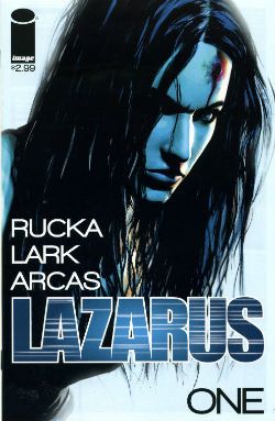
 photo LazCovB_zpsfe0cfe9b.jpg LAZARUS #1 Written by Greg Rucka Art and Letters by Michael Lark Colour by Santi Arcas Cover art and colour by Michael Lark $2.99, Image Comics (2013) Lazarus created by Greg Rucka & Michael Lark

Hell, I’m feeling saucy so let’s give this shameful shit a basic veneer of professionalism and crack out some titles:

Judging Without Reading or First Impressions and the Unreliability Thereof

 photo BuckForgotB_zpsefc29904.jpg

One of these books, LAZARUS, is a creator owned comic from a creator owned friendly publisher. The accepted wisdom would be that by rights this should be the one fizzing with invention, reckless with innovation and altogether so comicstastic that it would be the nearest you could get to a good time without emitting liquids while pulling a stupid face. The other one, BUCK ROGERS, is work for hire intended to raise the profile of a 9000 year old Intellectual Property in a clear attempt to shift some of the meat’n’taters reprints of newspaper strips (or continuities if you are a TCJ reader) the publisher is primarily noted for. Some folk get all florid faced, spittle flecked and bug eyed when an old property is dusted off because new things should be created, always! Insipidly, I reckon it depends on whether the actual comic is any good though. So here comes Buck Rogers (yet) again! But in 20 years will anyone be bringing LAZARUS back from the dead? DO YOU SEE WHAT I DID THERE! NO…DO YOU SEE WHAT THEY DID!!!

LAZARUS is new and the new is good! BUCK ROGERS is old and the old is bad!

BUCK ROGERS: 0 LAZARUS: 1

Titles Or The Naming Of The Animals (and some puerile humour)

LAZARUS is called LAZARUS which is an immediately recognisable Biblical reference to anyone brought up in the Judaeo-Christian tradition, or anyone familiar with said tradition. Or just familiar with pop culture. This is actually quite a lot of people, particularly in America which is the book’s primary marketplace. The first scene involves the heroine coming back from the dead just like…my penis on a Saturday night! Oh, okay just like…LAZARUS! Although titling the book MY PENIS ON A SATURDAY NIGHT would certainly get tongues wagging. I used to be quite good on The Bible but that was a long time ago, so other than the fact that every word on its pages is super-true I’m a bit hazy. However, I don’t think Lazarus rose from the dead and proceeded to heal the world with violence. Unlike…my penis on a Saturday night! I know, don’t milk it. Like…my penis on a Saturday night! I can do this all night, you know. Like…my penis on a Saturday night! Anyway, as titles go it is pretty bad. Pretty Television. It is dismaying in its obviousness and empty in its promises of depth. Just like…all together now!

The Hermes Press comic BUCK ROGERS is called that because it is about a man called Buck Rogers. Truth in advertising there. It is written and drawn by the divinity made flesh Howard Victor Chaykin. (Bias ahoy!) Since his last book was filthier and funnier than my penis on a Saturday night (This? This is what pride feels like.) I half expected a Flesh Gordon approach but since he hasn’t called it FUCK RODGERS it looks like he’s keeping his pants on and his hands to himself this time. I feel compelled to note the lack of …IN THE 25TH CENTURY. This means that Hermes Press aren’t wishing to trade on nostalgia for the cheerfully shit TV Series which I enjoyed when a child; the one with Gil Gerard and Twiki. Anyway, Hermes Press (or HVC) have gone back to the source for this one; buck to basics! (You liked that.)

Title wise then BUCK ROGERS wins despite the fact it is a dully literal title because it is at least honest while LAZARUS goes for a veneer of sophistication about as convincing as a politician’s choice of favourite authors.

BUCK ROGERS: 1 LAZARUS: 0

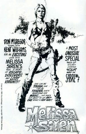
INTERVAL: It’s Ladies Night! A Brief Digression Guaranteed To Backfire Right In My Face Like Nobody’s Business, So Thank God I’m Drunk.  photo SirenB_zps324a379e.jpg Ladies! Why won’t you read comics, ladies! It’s okay, ladies! Because we here at The Comics have the answer! The answer to the question which is always phrased to imply that ladies will read comics but only if they are for ladies! Comics by Lentheric! This question about why ladies don’t read comics is Trojan horseshit. Ladies do read comics they just have better things to do than go on the Internet and get upset about Marvel or DC. That doesn’t mean ladies don’t read comics it means ladies have priorities. Anyway, so much concern about ladies and comics lately, so much, so very much. But as John Vernon said, don’t piss down my back and tell me it’s raining, Senator; all this concern about ladies and comics is really about how can they get ladies to like formularised pap and give them their money just like they did with the daft men folk? Nobody gives a shit about ladies reading comics except the people who make comics, and they don’t give a shit about ladies reading comics but they sure give a shit about those ladies’ money. Spending power as spur to equality! Well done, comics! Capitalism hasn’t been around long you’ll soon catch up! There’s clearly a popular conception that ladies will only read comics with ladies in them. But only comic book ladies who are violent because violence is strength! Also, violence means the men will read them too. And ladies, your time is nigh! Coming soon from Image is a new series about a lady spy. She’s a Spy! But she’s a Lady! She’s soft! But she’s strong! She’s…Silky! From Image! Also, a retelling of Homer’s Odyssey but in the future and…with a lady! When she went on an odyssey it was an…Ody-SHE! From Image! The home of comics for women written by men who can’t master a safety razor! I can see their logic here about ladies only reading about ladies and it is sound. Personally I only read comics about embittered old men who can only build themselves up by dragging other, better people down. And POPEYE; I like those Sagendorf Popeye comics. As boring as it is I fear that the answer to the question of Ladies and Comics is: just make good comics. Maybe ladies will read those. Maybe they already are. Lead Character or Lead(en) Character  photo BuckDeeringB_zps651d0bf1.jpg

Of course, ladies and comics? I don’t write comics (which, really, I am all eaten up inside about) and I’m not a lady (but I have brushed up against a few in crowds, purely for research) so I know bupkis. I don’t even know what bupkis is. Is it when you burp while kissing? Greg Rucka isn’t a lady but he writes comics for a living and so he knows what to do. What Greg Rucka usually does is give us a troubled woman in a sweaty vest kicking nasty men in the face in a series of mundane locations. When tasked with reimagining Steve Ditko’s ideologically charged and visually iconic character The Question Greg Rucka gave us a troubled woman in a sweaty vest kicking nasty men in a pay-n-stay car park…but wearing a hat! In a bold move Rucka here gives us a troubled woman in a sweaty vest kicking nasty men in the face in a series of mundane locations…but in the future! Form an orderly queue, ladies! She is a strong female character in the thuddingly literal sense that she is physically strong. She is also called Forever Whatsit like a bathroom suite in a catalogue. This leads to some inadvertently cringey dialogue when people say things like “We were attacked, Forever.” and “I was in the toilet, Forever.” Any such amusement occurring is probably inadvertent because humour isn’t high on the agenda for LAZARUS. Naturally Forever Amber is pretty. Despite being a killing machine she remains unmarred by scars, her nose is unbroken and her teeth unsoiled by tea or coffee stains. Although she is a killing machine she feels sad about all this killing; it is important that she feels sad about killing all these plebs because otherwise she would be a mass murdering monster with nice hair. Forever Amber is vulnerable though. Forever Amber’s vulnerability (despite her being a killing machine) is stressed by her being surrounded by people who are using her, lying to her and just downright being a bunch of two faced meanies. Forever Amber also comes across as not a little feckless and more than a bit stupid. I mean these people around her are practically twirling their moustaches and tying her to railroad tracks. She’s no Keatinge and Campbell's GLORY, is what I’m saying there. For all its surface sophistication LAZARUS is oddly unsophisticated in many very basic ways. Subtlety’s not even in this race, it’s Cliché all the way! So much so that I was hoping the ultimate signifier of Monied Evil would appear; the sweater draped over the shoulders with the sleeves fastened over the chest. Not yet but give it time, though.

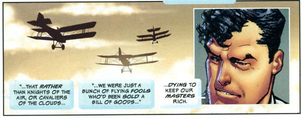
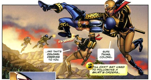
Over in Buck Rogers we find Howard Victor Chaykin’s Wilma Deering outranks Buck Rogers and is busy getting on with her job and sassing him back. Like Forever Amber Wilma kills people but everybody in BUCK ROGERS is killing people. But it's in that sort of pulpy weightless way. Okay, Colonel Deering doesn’t exactly look like a bag of spanners but other than that she’s treated as a capable individual in her own right. It’s hard to find fault in that, really. Mind you, Howard Victor Chaykin’s female characters have always skewed towards the independent, intelligent and individual. If they weren’t also so keen on lingerie more people might have noticed. It’s okay though, he’s only been doing this for forty years. The real star of BUCK ROGERS is, naturally, Buck Rogers whose voluminous and lively quiff sets my mind at rest on at least one score; in the future there will be pomade. Buck Rogers is portrayed as an adult human being who has had a number of experiences before the book opens and is written as being capable of rational thought and informed decision making. He is also purposefully written as a bit irritating. He can however quote Eugene Debs in support of his acceptance of his sexually equal future.

I have now become tired of summarising.

BUCK ROGERS: 1 LAZARUS: 0 Setting The Scene Or Budgetary Restrictions Of The Mind’s Eye  photo LazdioramaB_zps3cb7b9b4.jpg

The worlds visualised in these books are quite different. The world of LAZARUS is oddly dull. There’s a tepid quality to the storytelling by Rucka & Lark, a sense that nothing should be too exciting, too challenging. A sense of imposed limitations. I don’t know what they are and they might not even exist outside my mad head, but reading LAZARUS the storytelling felt constricted. There’s a sense that everything on these pages wouldn’t be beyond the reach of a mid-level Television budget. Coincidence, I’m sure. I don’t find Lark’s art to be exactly to my palate, he’s far too parsimonious with ink for my tastes. He can draw well though and he draws everything he’s asked and while nothing really stood out as amazing, nothing stood out as awful. A measured and professional performance from Lark, I guess.

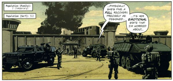
Meanwhile, Greg Rucka’s done his research and Greg Rucka lets us know he’s done his research. The tepid world of LAZARUS is based on fact, okay, it’s based on prediction based on fact. Facts like the statistics Rucka quotes to prove that the gap between the rich and the poor is growing wider despite the fact that no one believes the opposite is ever the case. Except rich people. And  in the book there is science, but the science is based on real things that might happen based on real things happening now. Or at least things Warren Ellis told him might happen when Greg Rucka e-mailed him. Apparently Warren Ellis can see the future! Can he see the future where he finished that NewUniversal series? Future cloudy, ask later! Maybe warren Ellis just has a subscription to New Scientist. There’s even some maths to prove the elite control the majority. A great deal of work has been put in to make the world of LAZARUS convincing. It’s admirable really the work Greg Rucka and Michael Lark have put in conceptually and visually delineating the world of LAZARUS. Sadly, they appear to have built a living breathing world and populated it with papier-mâché people.  When I was young and shone with fear of the world I used to build dioramas using TAMIYA kits. Mine were a bit shit but other people could work wonders making the hardware and the scenery as realistic as could be. But the figures would always be stiff and there would never be any life in their faces. That's what LAZARUS reminded me of. People in LAZARUS say things like, "She's asking questions.", "AGAIN?" and "We can't have her getting IDEAS." It's very Television dialogue. But wait, run those numbers about the Elite and the oppressed past me again. Hmmmm, I think I see a way out!

 photo LazIdeasB_zpsb4c4acae.jpg

 photo BuckInfernalB_zpsc6f93e24.jpg

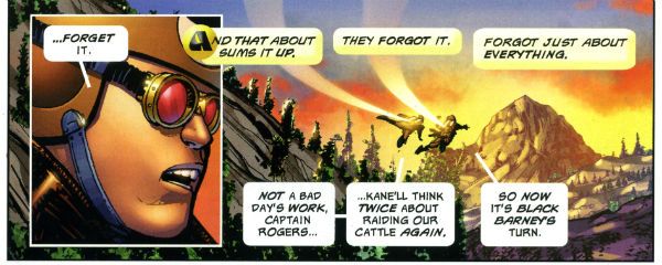
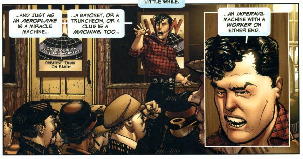
And so does Buck Rogers! And it’s the same way out because for all its differences the world of Buck Rogers has the same central problem as the world of LAZARUS: an elite few are mucking the many about. Buck Rogers has figured out that if all the oppressed band together instead of fighting amongst each other, maybe…just maybe! Oh, sorry, no, it's okay, settle down, my American friends, that’s not Socialism, it’s just common sense. Common sense which, and I’m going out on a limb here, it will take Forever Amber many issues (seasons maybe (uch!)) to reach but HVC’s not interested in the long haul (the DVD box set) so Buck’s already figured this out by the time he arrives in the 25th Century. In fact there’s a truly super page of storytelling where, reading down the page via a series of repeated set ups with different specifics to suggest the passage of time, we see Buck’s ideology evolve. Great page of comics. It is also preceded by another great page of comics where HVC’s modern technique of cut’n’paste and vivid texturing gels so well I had to genuflect and concede that when HVC’s modern approach works it really fucking works. Of course not every page works that well but they all work at least well enough for the story’s requirements. Well…okay, he does really chuff up the origin bit. I had no idea what happened there. It’s like some text or some pages were missing or something. Seriously, that whole how Buck got to the future bit was seriously muffed. Otherwise I liked the storytelling and art just fine. Even the fact that a scene seemed to take place in an apartment from BLACK KISS 2 but with different textures was okay; it just made it seem even more like a cheapy pulp serial where you’d recognise bits of scenery from other stuff. A fun side effect that.

BUCK ROGERS: 1 LAZARUS: 0

Colours or Colors(sic)

LAZARUS' world is coloured in a way that further study might prompt me to use the word subtle, but as it is I just read the thing and afterwards I thought: brown. Actually I didn’t think about the colouring much at all. That may be the point. Colouring can be purposefully unobtrusive after all. The palette did appear to be one chosen to suggest seriousness, and also to be easily replicable on a mid-level TV budget. Coincidence, I’m sure.

Jesus Arbuto vividly and vibrantly colours BUCK ROGERS’ world and over it all hang great slabs of sky in unnaturally cheerful hues. These bring to mind nothing less than the vivid and arrestingly swirling skies of Mike Hodges’ majestic Flash Gordon (1980). Here even the colourist is in on the pulp sensibility action and the colourist goes Big and Bold and it is lovely and it is apt.

BUCK ROGERS: 1 LAZARUS: 0

Lettering or The Strange Case of The Invisible Bruise  photo BuckBruiseB_zps7cdbe95d.jpg

I didn’t like the lettering in LAZARUS. The text is oddly placed in the balloons in just such a fashion that before I’d read the contents I mentally went NnnnH! Then I’d read the contents and I’d go NnnnH! verbally. Basically, the lettering seems to have been tasked with being as unobtrusive as possible. This is the default setting for genre comics and so no great demerit. But. But it does indicate a disinterest in exploiting the visual possibilities of comics as a medium. Which would make it easier for people to visualise it in another medium. A mid-level budget TV series perhaps. Just a guess.

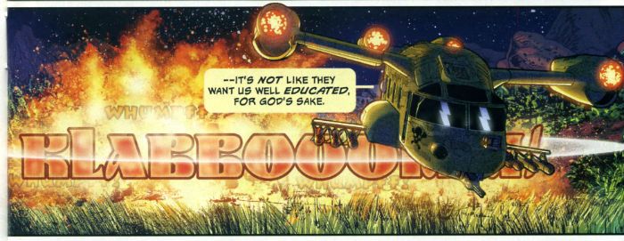
BUCK ROGERS has fun lettering bouncing about all over the shop. The ray guns make silly noises in an overwrought retro font, an explosion FX is shaped and there’s just a real sense that the letterer, like the colourist, is contributing to the whole lurid pulp aesthetic. There’s also a strong suspicion the letterer is Ken “The Bruise” Bruzenak. It’s only a suspicion as I couldn’t find any letterer credit so I don’t know. I hope that this was an oversight that will be corrected by Hermes Press in future. It’s okay bringing back old IPs but we don’t want to bring back the bad habits of not crediting creators with them.

BUCK ROGERS: 1 LAZARUS: 0

Back Matter Or Ingratiation Really Grates  photo LazEatsB_zpse6b12530.jpg

The back matter of LAZARUS is a slick mix of interesting yammering about process and clammy glad handing. Some will find this fascinating and feel privileged to receive such a peek into the world of the creators. For those people I am happy. But I am a bitter man, slow to trust and quick to flinch from unsought intimacy. Basically, I’m British. Look they’ve got a hard row to hoe here because by this point I’ve read the comic and I’m not sure I believe the unchallenging lukewarm TV friendly content of the comic is really such a passion project for the creators. That sounds shitty but it’s actually a compliment to the creators. Shitty compliments; that's me all over. As usual with creator owned comics’ back matter it’s a bit like someone hugging you while clumsily going through your pockets. The worst bit is when Greg Rucka recounts a conversation he had with a financier friend of his. The financier friend tells Greg Rucka that because he was on The Inside he can tell Greg Rucka that during the recent financial crisis we were seconds away from it All Going To Hell. Greg Rucka stresses that this person is intelligent and so implies that this fear mongering talk should be taken as a clear indication that the world of LAZARUS is just another bunch of inadequately regulated arrogant greedy c*nts away. Greg Rucka tends to forget that people talk nonsense, even intelligent people, particularly when talking to writers. Anyway, we can tell things were sixty seconds from shit city because this totally blameless financier dude was on the cusp of buying shotguns and actually stocking up on pork and beans. Christ, reduced to pork and beans! Pork and beans yet, like an animal! My heart went out to him here, it burst from my chest and travelled across the Atlantic to shatter his window whereupon he shot it with a shotgun (“for hunting purposes, Officer”) because he thought it was after his precious pork and beans. What I took away from this bit was comfort knowing that when it all goes down the financiers will be armed. Armed financiers. Great. Maybe LAZARUS would have been a better comic if Greg Rucka had talked to more of the people more directly affected by the crisis. You know, the people who would have been on the other end of his financier pal’s shotguns. He could even have bought them dinner. After all, pork and beans are cheap.

 photo LazTrustB_zpsda31fc47.jpg

Actually, most annoyingly, the backmatter in LAZARUS comes across mostly as an attempt to kneecap any criticism. Rucka pre-empts queries why he chose a lady lead with, er, because it had to be so. He shows his data to reinforce the possibility of the future he presents and provides his liberal bona fides with Occupy memories and stresses he and Lark have waited ten years to tell this story, and only this story and only in this way could it be told and...such and so forth. All this pre-emptive defensiveness does is convince me of a lack of confidence in the material. Read the comic and ignore the back matter and what do you have? A not very good comic. Factor in the back matter and only an animal wouldn't feel bad about pointing that out. The backmatter almost worked, I admit; I almost spiked this because I felt bad. And also because it is too long, the jokes are weak and posting stuff always makes my nerves sing like cats with stepped on tails. Sure, the intentions are good and the creators are talented but this comic just sits there, failing to engage. I don't like writing negative reviews. I put the humour (if humour it is) in to soften blow but maybe it just sharpens the knife, I don't know. I really don't sit here touching myself at my perceived superiority as I bring my foot down again and again on the newly hatched chick of independent creativity. But it is what it is and LAZARUS isn't very good, to my mind, and no amount of back matter can change that.

Howard Victor Chaykin requires no caveats. Howard Victor Chaykin remains brazen. His back matter blather consists of him outlining his basic approach to the series; he read some old continuities thought about it a bit and kept what worked and updated the rest. Then there’s a quick bit of comics criticism in which he maligns the reprint books advertised a page or so later but makes me hungry for some Russell Keaton Buck Rogers Sundays. Then there’s all the variant covers and a promo poster reproduced in colour and black and white which is just spoiling little old me really. Now I can scan the B&W ones in and play at being Jesus Arbuto (Arbutov? Make your mind up, son.) for a day! Basically beneath all HVC’s usual loveable grumpalumpagus schtick there’s the usual humble air of “I did what I did and I did it as best I could. I hope you like it. Now pound leather, foetus. Did I mention I live by the beach?” It’s quite short words wise and there’s a couple of typos giving it a hurried air as though HVC had somewhere else to be. Maybe he had a dinner appointment? Christ, maybe HVC stayed in and ate pork and beans that evening even though there was no State of Emergency. Pork and beans, like an animal! Or worse, a poor person! I hope he ate with his Colt Python near at hand. For as Jesus said, the poor will always be with us. And apparently they will always be after our pork and beans. Arm yourself, Jesus!
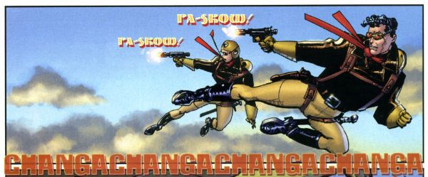
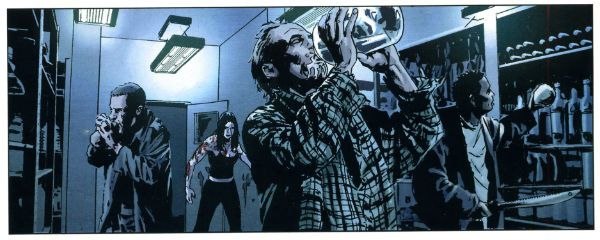
BUCK ROGERS: 1 LAZARUS: Pork and Beans!

The Verdict or Who’s Better, Who’s Better, Who’s Best?

BUCK ROGERS is messy and vivid and altogether lively. It is fast, funny intelligent and far from flawless but it has a genuine sense of pulpy fun shining out of it on every page and so it is GOOD!

LAZARUS is cold and calculating; it affects to address real human concerns but instead it's like someone returned from the dead but with something crucial missing. Something intangible, something like a soul perhaps. That's why LAZARUS is EH!

The Intellectual Properties may be old or they may be new but as long as there are good ones, in the future there will be - COMICS!!!