Abhay: Inquisition - Bitch Planet #1

This is part of a series of write-em-ups answering a series of questions about recent comics.  As an initial matter, please be advised that this will likely discuss details of the plot in the comic being discussed, and so here is a spoiler warning. Also, sponge warning: be careful of sponges that you use to wash your dishes.  According to no less scientific a news source than the Daily Mail, a "kitchen sponge is 200,000 times dirtier than a toilet seat - and could even lead to PARALYSIS."

10 Questions about BITCH PLANET #1 by Kelly Sue DeConnick, Valentine De Landro, Cris Peter, Clayton Cowles, Rian Hughes, Laurenn McCubbin, and Lauren Sankovitch.

A basic description of this comic, so that everyone's on the same page.

The first issue of a new series  about women trapped in a science-fiction prison run by an oppressive male-dominated society.

The first issue focuses on the arrival of a small group of women to a prison located on what we're told is another planet, and the immediate violence that ensues upon their arrival, some of which is caused by a bit of intrigue involving an older woman sent to this prison and her ex-husband back on Earth.

Co-author Kelly Sue DeConnick, talking to the LA Times:

"This is born of a deep and abiding love for exploitation and women in prison movies of the ’60s and ’70s.  I like this stuff so much, and it’s so terrible, it’s so deeply awful and delicious, like those candies that are bad for you. So I wanted to see if there was a way that I could play with the things about it that I love and also the things about it that make me wildly uncomfortable."

QUESTION 1.

Is this comic about anything besides its plot?

This is a first issue but the book's themes seem baked-in from the get-go. Women are put in prison for the crime of being "non-compliant" with a male society that, in brief background glimpses, we can see is fascistically obsessed with controlling women's bodies.  The prison and society are run by a violent patriarchy termed the "Council of Fathers".

This is all kind of a big, chunky metaphor that feels really ideal for a comic book: easy to grasp, angsty in a sort of adolescent way that serial comics seem to benefit by (I mean that in a complimentary way), a little goofy, lots of possible visual hooks.

But beyond establishing the premise, the first issue also works in a small plot about a husband discarding his first wife into this Prison of Misogyny because he found a "more compliant" younger woman. What makes this such an effective first issue, I think, isn't that it just presents this big chunky metaphor, but that it then immediately has a little example that fits entirely within the first issue, a little exemplar of hetero-lady anxiety / anger that's more bite-sized. It's not just relying on the big metaphor to win the day.

First issues are monsters.  So many choices to make, so many obligations to service, so many ways things can go wrong for a creative team trying to sell readers on whatever the appeal of their comic is supposed to be.  In the first issue of Bitch Planet, you can see comic authors trying to address those challenges by minimally setting up the series premise, but instead focusing moreso on providing a complete, discreet unit of thematic and emotional content for readers.

QUESTION 2.

Did the creative team make any interesting choices in the visual presentation of the story?

The way the color green is used jumps out.

The authors color-code the first issue. Red/pink is established quickly as the color of women in the early pages: the introduction to the women is bathed in pink light, the prison jumpers are red, etc. Green is the color of men: green-lit wardens, the patriarchy's representatives  back on planet Earth working in a green office, etc.

daaaaaamn

48-1230 is the combination I have on my luggage.

Once they're in prison, the women have to put on clothes in front of green stalls.  As soon as one of these women insects with the color green, however, there are disastrous consequences, and a riot ensues.
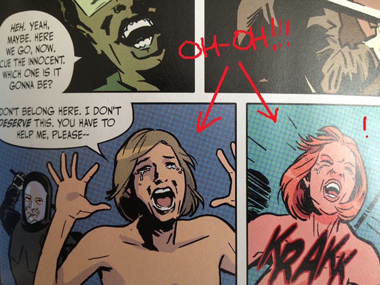
alotofcroppingwiththesephotos

Krakk is whack.

In that riot, two panels feature women being struck from behind.  In both panels where we see women being harmed, the background colors of those panels go green. Violence in this comic is depicted as the women characters being engulfed by the green color of men.

It's a small bit of narrative-through-color, but one that at least reflects a creative team engaged with the visual primacy of comics.

  • (Wild Guess Dept.: The color-coding may also be a spoiler to the mystery set-up by the cliffhanger, if you check the color-coding on the characters in play (?), but we'll see on that point in future issues).

QUESTION 3.

How is the comic structured?

A high-tempo opening page (discussed further below in detail) sets-up a dueling dialogue scene in the next two pages, where (a) information presented visually comments on dialogue taking place at a different time/location, while (b) other characters are presented simultaneously, themselves commenting upon the visual information, i.e. three layers of information are conveyed to the reader and those layers all meaningfully comment upon at least one of the other layers. (This is easier to understand when seen, than it is to describe in prose, which I again mean as a compliment).

The first issue does this a couple times-- intercutting between moments in different places (and times?), leaving it to a reader to follow color-cues and page layouts to fully process the space-time "geography" of various moments.

Anyways: first scene's about five pages, including a two-page title credit splash.

The double-page splash is a bit of a weak point here. The comic presumably takes place on another planet (?) but nothing about the planet depicted in the splash seems particularly alien (presuming the "it's all another planet" bit isn't just a fake-out).  If anything, the double-page splash seems to depict a space station in the foreground, which at least for a moment, lead me to believe the prison was on a space station. (I guess the tip-off for me should've been the comic being called Bitch PLANET but I'm not so smart sometimes...?). The creative team seemed interested in the wallop of a big double-page splash with their logo, but I don't know if that splash really carries its water narratively.

Next scene is four pages set in the prison. This is followed by two pages set back on Earth, setting up the issue's mini-story, and then again, a four page scene at the prison.

In the next two pages, the comic intercuts between the prison and Earth.  The intercutting is on almost a panel-by-panel basis for the first page, but on a more interesting "space to the left, Earth to the right" configuration on the second page which relies on color and page-geography for clarity.

There then ensues two more pages on the prison, one page wrapping up the Earth storyline, and then four pages in space-- three of which rap up the issue's mini-storyline in space, one of which is a cliffhanger page. (Thankfully, not a splash page cliffhanger! I do not dig those much at all-- way too played out, especially with first issues).

Eight scenes total: 5, 4, 2, 4, 2, 2, 1, 4.

Put another way, the comic goes Earth, Prison, Earth, prison, Earth and prison simultaneously, Prison, Earth, Prison.   If you squint at that, I think you vaguely see a symmetry to the issue.  But maybe that's just me squinting.

QUESTION 4.

Is there anything noteworthy about the cover, logo, lettering, or design?

Rian Hughes logo. He makes the letter C in the word BITCH into the planet Saturn, using a little bit of shading.  The logo looks better in the comic than on the cover-- on the cover, he uses a undefined blocky drop-shadow-y thing, like on the old X-Men logo. (I don't know what the terminology is-- I don't know logo lingo). It just looks a little more cornball on the cover.

On the cover, it seems in service of an overall aesthetic that I don't quite know that I understand.

The cover and the book itself seem intent on asserting to the reader that it's a pop culture artifact, via "this sure is a comic!"-type moves that I'm not sure I dig. Besides the blocky drop-shadow-y thing, the book's colors often have a Photoshop texture, a faux Benday-dot effect, i.e. "lots of little dots". The cover aims more for an exploitation movie poster, with exploitation-trailer style text blurbs on the cover, an insincere "Rated M Mature" logo in the corner that's almost smaller than Rian Hughes's signature.

I don't know. I think those moves are supposed to be fun, but I think there's a little insecurity to them which doesn't really make much sense to me, given the strengths of the content otherwise. It seems a little weirdly defensive, for a book that doesn't need to be defensive -- trying to preempt arguments that aren't worth entertaining to begin with (e.g., "you can't dismiss this in any way as not being a comic!  Look how much of a comic I'm being with these benday-dots"...?).

Or even setting that aside, aesthetically, it's just not very fully-formed. The faux Benday dots in particular don't really add a lot. I'm just not really into those dots, generally, so maybe that's just me. Photoshop-created dot-textures just never look right to me. (See, for comparison, Hip Hop Famly Tree pages from Ed Piskor, who actually took the time to scan in old comic pages, to a noticeably different and, I think, superior effect). I have "Annoying Music Fan Talking about Vinyl" type opinions that there's a warmth to actual old coloring and the mechanical processes and mishaps that created old coloring that you just can't recreate by slapping a computerized dot texture on top of some colors. Photoshop-dots, it just looks like a schtick to me: it's not recreating a thing, it's signifying a thing, which is just less interesting; it makes the colors intrude into the experience; for me at least, it's just too schtick-y.

Thwuuckk

I thought that word had three U's.

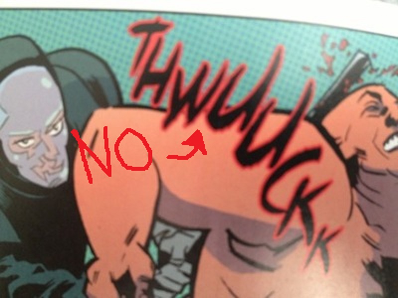
The single worst part about the comic overall is the sound-effect lettering. The THWUUCKK font should be erased from human existence. But not many people will care about that, and that's a little kink they can smooth out as the book proceeds.

QUESTION 5.

Is anything about this comic interesting politically, socially, or from some other frame of reference?

Ha-- well, this one is an easy yes.

Let's be more honest than is probably advisable, and let me cop to something I noticed about myself reading this issue:

For starters, let's establish that I'm a big old piece-of-shit guy, with a lot of dumb-ass-guy opinions.  (I think it's a little unavoidable. You know, you live in a weird crappy society, some weird crappy stuff can't help but rub off on you. The question becomes whether you admit it or or you lie and pretend like you're some special-y special exception. Me, I got nothing telling me I'm any kind of exception in life, and a whole lot going on telling me the opposite, so.)

And so... And so, the issues raised by the issue's mini-story, in particular, is really designed around pushing emotional buttons that while I imagine I might have if I were a woman, and while I can understand them intellectually (I think), I just don't have those buttons. I can appreciate on an intellectual level, at least, that the mini-story about the discarded first wife would be appealing, for example, to a woman angry about her value being defined exclusively by a short window of male sexual attention, and being discarded after that window closes.

But I'm a Shitty Guy so my immediate gut-level reaction was more, you know, "I sure wouldn't want to be trapped in a loveless (and definitely sexless) marriage, and don't blame anybody who gets out of one of those #notallmen.  P.S. some science stuff about bonobo monkeys I heard once third-hand."

Then I caught myself and realized the more Horrible and Pressing Truth:  I live in my head with the piece of crap who starts creating excuses for fictional men...! Haha, oh nooooooo.

So, I think I had an interesting experience with this issue just in that... I imagine if I was a lady, I'd have to constantly identify with male protagonists because they'd be given to me so ridiculously often.  And so it turned out to be a little bummer (though an interesting one) knowing that as a Shitty Guy, the comparative muscles for me are so atrophied from non-use.  Little bit of a bummer!

In my limited defense, they haven't assigned me a reddit account yet (they assign you a reddit account and it's just all over for you; all over).  I don't know.  In my limited defense, I can at least spot the issue with my Default Settings.  I don't know how much control we have over our Default Settings, but probably no control at all if we're not even aware of them...?

(Also: bonobo monkeys really are actually pretty interesting creatures, if you look into them!!  Blame me; don't blame the bonobos!)

Besides gender, there's also race. Race is just some tricky shit. It's more fun than not to see black female lead characters, and the book seems to promise those will be more prominent in future issues. On the other hand, the tricky bit is that those characters not all be tough fight-y fighters (which is all the first issue seems to promise), as that would kinda make them into the Other or be in a way capitalizing on cultural baggage that's uncool...? It'd make race into, like, a signifier, which is ... kinda not so great.  I've known pretty tough black ladies, sure. But I've also known black ladies who are made pretty much out of expensive cupcakes. You know?

The cast hasn't really been fleshed out yet so too early to say whether that should be a concern. Still, the first issue has black ladies beating folks up, but the characters with emotion-driven back stories, whose inner lives are of interest, those are all white-- the black characters are just engines of cool violence in issue one.

(But look, it's pretty unlikely to think that's going to be what this comic is like by the end of issue 4...? It just doesn't seem very likely that the creative team's going to have a blind spot that glaring past the jump-off.)

QUESTION 6.

Take away my first letter; take away my second letter; take away all my letters, and I would remain the same. What am I?

You're a fucking weakling.  Why don't you learn how to fight, you spineless bag of cotton candy?  A couple weeks of Krav Maga and no one's taking anything from you.  Someone takes your first letter, you just yell "Krav Maga!" at the top of your lungs and then kick them in their fun-parts as hard as you can.  Nobody's going to take a second letter after that.  Unless they have a gun.  Okay, actually, be careful, in case they have a gun. Nowadays, the way this country's going, they're probably packing some heat, the letter bandits.  Damn.  Well, I mean, if you don't need all those letters, and you're the same without them, then you should just give that shit away before some jabroni with a gun shows up and it even becomes an issue! What are you keeping the letters for anyways?  What, you want to end up on that Hoarders show?

Gun, no gun, just get your life together!

QUESTION 7.

What was the best bit of dialogue in the comic?

One of the Bitch-Planeteers (yelling): "Where'm I s'posed to put my tits?!"

The first prison fight featured in the comic is caused by men's failure to manufacture adequate bras or to appreciate the variety in the shapes of women's bodies...?  Sponge warning: it's not a very subtle comic.  Not so subtle with its themes.  No one's going to criticize the comic called BITCH PLANET for being TOO subtle, as it turns out-- surprise!

QUESTION 8.

What is the most interesting page in the comic and how does it work?

Page 1

Bitch Planet, page one.

The first page was the one that struck me as most noteworthy.

As you can see, Page one is a 12-panel grid, 4x3, with three interstitial panels cutting into the right-most two panels of each tier.

Tier 1

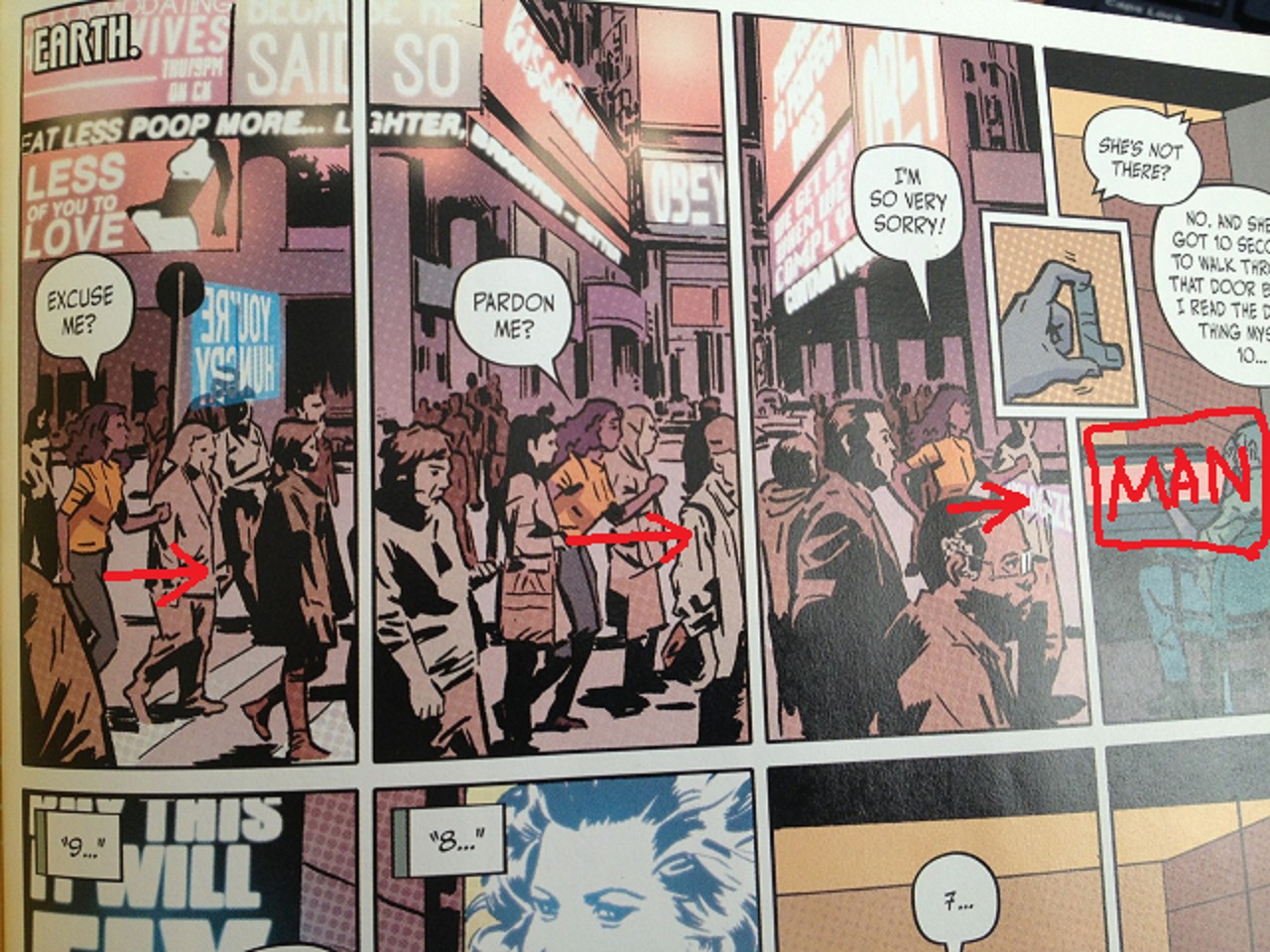
Tier 1 of Bitch Planet #1, Page 1. "Eat less poop more."

The top tier is a Woman advancing geographically across three panels. The panel borders establish an urgent staccato "musical beat" from the get-go, with the three interstitial panels acting as grace notes.

The Woman is racing towards panel 4-- a drawing of a Man sitting in a chair, complaining about her.

Tier 2

Tier 2 of Bitch Planet #1, Page 1.  Really wish that sign said "No more posers."  So that the posers would finally know how we felt about them.

Tier two, the Woman is again depicted as racing to her right, but now only in two panels. Where the Man once took up a single panel, he now takes up two panels.

While the first tier featured a generic science-fiction city-scape in the background, with John Carpenter They Live headlines like "OBEY" blaring in the distant background on various neon signs, the second tier becomes more whimsical.  The Woman has to squeeze through a crowd of three men surrounding an ape holding an "Evolve" sign.  We can see that her progression through her world is becoming more surreal and the propaganda only more oppressive, closer, unavoidable to notice.  The space she has to move in more cramped.  Meanwhile, the Man's world is expanding and stable-- he has plenty of space to work.

In his two panels, the Man begins a countdown, like the kind that would be sung out before a song starts properly.  This further adds to the high-tempo musical quality of this first page.

Tier 3

Tier 3 of Bitch Planet #1, Page 1.  Into that "Whoop!" but couldn't tell you why.  People who talk about comics being like music usually sound like self-satisfied windbags but I guess they wouldn't be wrong saying there's a musicality to this page, to that "Whoop!"

Tier three, final tier, the Woman is now stumbling to the right, with only one panel dedicated to her-- any confidence in her body language is now gone. The cityscape now seems violent and threatening, with some kind of police robots hovering above her, and her journey now pushing her past what we would presume are violent men breaking the law.

The remaining three panels are now dominated by the Man, who is prominent in the foreground while the Woman enters, small and diminished into his background.

What's interesting about this page is that as early as page 1 of issue one, there is a narrative visually presented to the reader: a competent woman has to struggle through a ever-more-hostile world, but her story, that progression?  It is increasingly diminished and subjugated to the story of a comparatively more dull male character.  It is his background, separated from him by a plane of safety glass.  And that male character is dismissive of her struggles despite having none of his own.

Page 1 - Copy

I think you're too lazy to scroll up and look at the page again.  I think that about you, and I'm not sorry.

Without resorting to dialogue, within a page, the comic is making a thematic statement, establishing everything we need to know about the world without exposition, with minimal clunkiness, and within a grid structure that immediately starts the comic at a brisk and exciting tempo.

Jeez Louse

Further bit of possible interest: in the first panel of page 2, we have a close-up of the Woman finally, as she begins her job for the Man character. The creative team presents her purely in silhouette. She had been drawn with some minimal detail before working for the Man. But now, working for the Man, her very identity has been visually obliterated.

QUESTION 9.

Did you experience any noteworthy emotion reading the comic?

I'm not a big fan of women in prison movies particularly.  As exploitation genres go, that one never really did anything for me; those movies are pretty sleazy, and not really the kinds of reprehensible gross sleaze I'm super-super-into, boner-style.  So, my reactions to the comic were more analytic than emotional or gut-level.  As mentioned above, I was just more struck by what I think I was supposed to have an emotional reaction to, but didn't. For me, that was the most noteworthy experience with the comic, beyond an appreciation of craft.

QUESTION 10.

What do we hope that younger cartoonists learn to do and not to do from this comic?

Not to do:

Maaaan, be careful of that Ben-Day schtick. Not a lot of comics I can think of where a Photoshop filter has really plus-ed a comic. It's the kind of choice that once you make, it's a tough one to back away from.

The iconography of comics is fun but may not fit every project.

To do:

Layout is storytellingColor is storytelling.  Everything within a comic's four corners can be storytelling, if you want it to be.  A comic doesn't just have to be a vehicle for telling a story.  A comic can be the manifestation of the story.

Comics.  Try to think comics.

NEXT WEEK: RUMBLE #1 from Image Comics.

Abhay: Inquisition-- The Valiant #1

For the last couple of years, I've been trying to write a certain kind of essay-- one that always kind of remained a little out of my reach but was fun to chase after. But lately, maybe for longer than I actually knew myself, it's been time to pivot, and try something a little different. I want to pivot to something a little closer to what one of the bad guys in that movie Dead Poets Society would write. Start running more of a J. Evans Pritchard fan-club.

So, this is what I'm going to be doing for a little while (at least for the next five whole weeks since I've written five of these, but I quit real easy so who knows). My apologies if it's of no interest-- hopefully, we reconnect later down the road.

In tribute to Roman god Janus

The Romans had Janus...

10 Questions about THE VALIANT #1 by Jeff Lemire, Matt Kindt, Paolo Rivera, Joe Rivera, Dave Lanphear, Kyle Andrukiewicz, and Warren Simons.

A basic description of this comic, so that everyone's on the same page.

This was heavily promoted as being a self-contained "event miniseries" by Valiant Comics (which has come back to life yet again for the umpeenth time, like the Hammer Films version of Dracula).

The series looks like it's about a bunch of heroes uniting to face down a personality-less threat. The villain is a smaller-scale version of the bad guys as from the Mass Effect video-games, if you know those, the Reapers; a recurring civilization-killer that attacks throughout time, but has no real character or points of interest beyond that barebones "it kills people" function in order to keep the viewer's attention focused exclusively on the heroic characters.

Co-author Jeff Lemire, talking to Comic Book Resources:

"The Valiant really is a story that puts a stake into the ground and really changes the flow of the Valiant Universe moving forward and really shakes up the status quo of a number of character, and sets the stage for the next couple years' worth of stories. It's something I'm really honored to be a part of, coming on fresh and working with guys like Matt who have been working in the universe for a while."

QUESTION 1.

Is this comic about anything besides its plot?

No.

QUESTION 2.

Did the creative team make any interesting choices in the visual presentation of the story?

There are two panels where Bloodshot uses his superpowers to mind-control a machine.

Do you think this is what Bloodshot sees when he masturbates? I'm going to say yes. Also, I'm going to say that he says "That's it" before he does it, out loud.

Rivera presents those by drawing the machine's console with an orange line on top of an otherwise all-black panel, detailing the console with a grid-pattern that resembles the "wireframe" effect one sees in CGI modelling. I would assume that look has science-fiction "cyber" connotations for readers, but I'm not sure why, where it originated. (From Tron? From early computer games?)

Rivera notes in the back matter that it's a similar technique to the "Radar" vision seen in his Daredevil work "but both scripts were asking for basically the same thing. Either that, or I'm a one-trick pony."  Thin color lines on top of all-black panels-- I like those; I like how they jump out, have a sort of sinister, neon-y city--at-night energy. And panels from a subjective viewpoint-- those can be pretty fun. Oh, it'd be nice to see it being put to some other use than just illustrating superpowers, constantly, but.

Nothing else really jumps out as to the presentation.

QUESTION 3.

How is the comic structured?

The comic opens with a page of widescreen panels, a camera untethered to any point of view, wandering an environment while nothing much happens. At some point in recent history, that kind of page took over as how all of these kinds of comics seem to start, the numbingly-slow crawl into a comic rather than a classic old-fashioned splash pages getting you excited about what was to come. Why? Splash pages are better.

The widescreen thankfully gets dropped for the remainder of the comic. Rivera mostly sticks to either two or three tier pages.

The comic is structured in four scenes:

1) The comic spends 9 pages setting up the Threat to the Eternal Warrior character (including a double-page splash). This first scene is repetitive-- three nearly-identical sub-scenes making the same exact narrative point, over and over. The authors couldn't find a graphic solution to convey to the readers that the Threat is as eternal as the Eternal Warrior, other than to just repeat the same exact scene three times in three different time-periods.

The problem is the authors burn nine pages of this comic in the process for repetitive scenework. And burn a lot of goodwill-- the comic builds no momentum. Reading this stretch is drudgery.

2) A three page scene follows-- thin characterization of a lady who is apparently the latest "Geomancer" on Earth. She's in conversation with the Eternal Warrior's brother Armstrong, from the Archer & Armstrong comics.

Despite them talking for three pages about what life is like as a Geomancer, the term Geomancer is never really explained to the reader.

"Listen. I couldn't keep a houseplant alive. For real. And now I'm supposed to be the guardian of the earth somehow?" Luckily, they bold-face the words houseplant and guardian-- otherwise, this might've been boring to read!

3) That's followed by six pages of Bloodshot beating up a robot in some nondescript jungle region, for some unclear reason. (Two of those pages are a double-page splash of a robot shooting at Bloodshot, with an inset panel).

4) The comic then concludes with a five-page scene that set-ups the cliffhanger: the Threat from the beginning of the comic is going to attack the Geomancer lady.

(This scene is mildly disrupted by a random one-panel conversation between Eternal Warrior and X-O Manowar -- who apparently is also in this comic, out of nowhere. The one-panel conversation features Eternal Warrior stating some information, specifically the exact same information we had already been told three times in the first scene. Holy shit! How stupid does the creative team think that people who read these comics are, that they need to be told a simple concept FOUR fucking times in one issue? X-O Manowar's response is literally "Why are you telling me this now?" So. Once again, as is true in life, as is true in love, I agree 100% with X-O Manowar.)

Four scenes total: 9-3-6-5.

None of the scenes motivate one another, particularly. The comic is mostly just stuff happening, without any compelling through-line to hold the reader's attention, more a series of events, than a story, all set-up for future issues.

Nothing presented is pleasurable in and of itself.

QUESTION 4.

Is there anything noteworthy about the cover, logo, lettering, or design?

The comic opens with an all-black inside cover, and then an all black first page with "Book One" written on it (despite there being a #1 on the cover), then another all-black page before commencing the comic on page three. The last two pages of the comics? Also, all black pages.

I didn't really understand all the black paper in this comic. Am I supposed to be impressed? "Oooooh, the paper's all black-- that's the same color as the shirts Steve Jobs used to wear. Maybe these people are visionaries, too. RIP Steve Jobs." Design seems pompous.

Rivera hand-draws the sound-effects, I think. Rivera's inconsistent with the sound effects though-- gunfire makes "Bam Bam" sound effects, but Bloodshot punching his hand through a Robot's windshield? No sound. Robots taking off into the air on rockets? No sound. What do you think about that? I let stuff like that slide, and I imagine 99% of readers do too, but is it weird we all are like ... so uncommitted to the sound effect conceit...? Maybe that's weird.

QUESTION 5.

Is anything about this comic interesting politically, socially, or from some other frame of reference?

The comic begins with a black character (an Incan) being violently murdered in order to inspire the white male protagonist.

I'd totally try to get that guy's face if it were offered to me. Just to keep the bad guy from crapping or ejaculating into my buddy's severed face. I'm a good friend that way.

So, black-rifice: check.

The next two pages feature a woman being violently murdered in order to inspire the white male protagonist.  Note that she is wearing a blouse but her breasts are hanging out of that blouse, all exposed to nature-- and yet her breasts are still hidden from the reader by a conveniently placed hand.  The bizarrely-common sexless titillation of comics-- drawings of murdered women presented as senseless sex objects, but for an audience of men disinterested in any of the actual specifics of sex.

Anita Sarkeesian did a video about how cheap imagery like this trivializes violence against women-- she calls it the Damsel in Distress trope. Leigh Alexander wrote about a variation on the topic last year, with respect to video games-- here's the key bit: "It seems that when you want to make a woman into a hero, you hurt her first. When you want to make a man into a hero, you hurt... also a woman first."

So, woman in a refrigerator: check.

The third scene features a little kid being murdered to inspire the white male protagonist. If only the little kid had been a gay character, it'd have been a kill-the-minorities-to-inspire-a-white-guy hat-trick.

The first four pages of this comic evidence a creative team oblivious to the kinds of imagery they are slopping around, and one making boring / stupid assumptions about who the audience for their work is.

Also: it's a little strange, people who will only believe in "heros" that need a bodycount to want to do the right thing. "All this bloodshed makes me want to make the world a decent place, as opposed to, you know, ethics." That's just odd.

QUESTION 6.

You are in a dark room with a candle, a wood stove and a gas lamp.  You only have one match. What do you light first?

Oh damn, I'm bad at riddles.  I would first light that ass on fire...?  Heeeey-o.

The internet says the right answer is "The match" but man-- if that's my only match, that's too valuable to light on fire, just from a supply and demand perspective. I would just leave that room-- it sounds like that room sucks; get the fuck out of colonial Williamsburg!  I'd rent a room at the Four Seasons Hotel.  The rooms at the Four Seasons come with electric lamps-- you don't need a stupid match.

Put that match on eBay-- sell it some riddle-solver-- use the eBay money to pay for the hotel room.

QUESTION 7.

What was the best bit of dialogue in the comic?

Geomancer: "Apparently, I'm the great-granddaughter of Buck McHenry."

I don't really like this line for sincere reasons. Something about it just made me giggle when I read it, just in that I don't feel like any human being has ever said that combination of words before this was typed out, and no human being ever will or would. Does that make it "good dialogue"? I don't know, but it at least makes it at least amusing the way I don't mind comics being amusing.

Anyways, that's as good as the dialogue ever got-- the rest is just lifeless.

QUESTION 8.

What is the most interesting page in the comic and how does it work?

Page 19. Bloodshot versus the robots.

Very classical eye-flow, this page.

First panel uses the outstretched arm to push the eyes to the right. Second panel pushes the eye in a sweeping move down to the console.

Drawing arrows with a mouse in MS Paint was hard.

The console uses the grid-line to redirect the reader's eyes to the climactic robot battle. And the climactic robot-battle point the way to the next page.

I don't know why Bloodshot needed "nanites" to figure out how to use a trigger-- but at that point, I didn't care.

Nothing too sophisticated but simple, classical flow.

Note also how the Bloodshot chest-tattoo shows up in the last panel as a dot. Nice touch.

QUESTION 9.

Did you experience any noteworthy emotion reading the comic?

Disdain for the bit with the topless woman.

I didn't notice the blackrifice until I was typing this out (which probably means some stuff about me, but). I didn't experience that disdain in real-time, though, so I don't know if that counts.

Besides all that, no. Absolutely nothing happens in this comic to provoke any kind of emotional or intellectual reaction. It's a completely inert product. Mentally and emotionally dead. Nothing a person could hate because it's so unmistakably a comic that will be forgotten in a week's time, if even that long. It will be like it never happened, before you even knew it. Just a comic with no point in even existing. It's just nothing.

QUESTION 10.

What do we hope that younger cartoonists learn to do and not to do from this comic?

To do:

Good artists care how a reader's eyes flow during action scenes, and I'd like to think that readers will appreciate a page with good flow even if they can't articulate that it's happening.

Not to do:

Don't repeat the same exact information three times in a span of pages that take up a significant chunk of real estate in your book. Maybe try to find a graphic solution to storytelling challenges, rather than waste pages conveying simple pulp ideas. Try anything because the beginning of a comic isn't really the ideal place to be boring and super-redundant.

Also: maybe have "write at least one line of dialogue that's interesting or lively" on a to-do list, so you remember to do that. Tie a string around your finger so you don't forget.

The essence of comics is that they are built out of images.  Images mean things.  Understand what different kinds of images mean to different kinds of people.  You would have to be pretty goddamn oblivious not to realize that comics are constantly featuring images of violence against women, in particular, and if you are a decent human being, I would imagine you would not want to add another example to that very long list without a better reason than you can see on display here.  Chances are you can make whatever point you're trying to make without adding to the world's storehouse of dumb, offensive, tiresome images. There's no rewards for being a good person, not in this world and certainly not in comics-- nobody fucking cares.  But maybe try to be one anyways just because it's the right thing to do.

NEXT WEEK: BITCH PLANET #1 from Image Comics.

"Unorthodox Practices." COMICS! Sometimes I Hope You Notice I Resisted The Temptation To Make A Terrible Play On Words Involving Her Surname!

Ted McKeever. Lydia Lunch. Fluids.  photo TGBurnB_zpsbfe04ed6.jpg Image by McKeever, Lunch & Robins

Anyway, this… TOXIC GUMBO Art by Ted McKeever Written by Lydia Lunch Lettered by Clem Robins Coloured by Ted McKeever Special thanks to Maria-Elena D'Agostino DC Comics/Vertigo, $5.95 (1998)

 photo TGCoverB_zpsa8a814c9.jpg

In 1998 DC Comics published a comic written by Lydia Lunch and illustrated by Ted McKeever. In 1998 DC Comics published a comic written by Lydia Lunch and illustrated by Ted McKeever. I repeated that because it bears repeating. It’s strange enough to think that DC Comics once had a place for an artist so atypical as McKeever, but they did. Indeed they did. In 1998 he was well within a run of work for DC which would last until the noughties were exhausted. He even had a regular gig in Doom Patrol, although it was after everyone had stopped reading. Mostly though he oozed a bunch of miniseries roiling with his idiosyncratic aesthetic and some Elseworlds with Superman, Batman and Wonder Woman shunted into a German Expressionism. We’ll get to those too, maybe. (No promises; promises are just time travelling lies). In 2014 DC Comics is a very different (trans: more banal) place so McKeever currently resides at Image, where his work provides a necessarily brusque corrective to all those underwritten begging letters to Hollywood propped up by fantastic artists. So, despite it looking odd that DC once had a place for someone who draws like everything is made of melting wax, it wasn’t really. Lydia Lunch is another matter. Admittedly, this wasn’t the first time Comics had felt the subtle touch of Lydia Lunch; in 1990 her work appeared in something called AS-FIX-E-8 and in 1992 there was Bloodsucker with Bob “Minimum Wage” Fingerman. Having seen neither I can’t comment, but it’s a safe bet they would have made Paul Levitz plotz. They were probably very Lydia Lunch what with Lydia Lunch having a quite distinctive artistic voice and all.

 photo TGSunB_zpsea8c05f6.jpg Image by McKeever, Lunch & Robins

Lydia motherflossing Lunch! I’m just going to barrel right on in with an explanatory paragraph or two about Lydia Lunch because I don’t know how many people are familiar with the lady and her work. Chances are I’m underestimating some of you; you might still be having therapy to recover from that 8 Eyed Spy gig back in ’80, or still tearfully fondle your crumbling poster for The Immaculate Consumptive inbetween school runs and on-line food shops. Mostly though it’s a sea of blank faces out there, I’m guessing. Well, a sea of two, if the hit-count’s reliable. Lydia Lunch (real name: Mind your own ****king business, sunbeam.) was a mainstay of the New York post-punk No Wave scene and has stood defiantly on the neck of the intervening decades to remain an active creative force. Lydia Lunch is many things to very few people, but back when I was still actively engaged with the world her work was mainly in the realm of auditory assault. In the music papers of the time it was commonly described as aural terrorism; a winning blend of atonal dirges and vituperative shrieking which left the listener feeling like they’d just been hurled down some stairs by a scatological force of nature in female form. It’s not for everyone, the work of Lydia Lunch, is what I’m getting at there. If pressed I’d guess her stuff has its roots in the Beat tradition, but mostly it’s about rancorous anger and provocative hostility; it would probably beat tradition into a bloody mush with a nail studded baseball bat. Think neon lipstick and rat turds. Think lo-fi ‘80s NYC grot chic. Think Driller Killer. Then think about something more pleasant. When I was a Badly Dressed Boy I liked Lydia Lunch, but part of what I liked most about her was she was several thousand miles away.

 photo TGCookB_zps33468ce6.jpg Image by McKeever, Lunch & Robins

Like many independently minded modern ladies Lydia Lunch likes to keep busy, she’s dipped a tiny toe into music, poetry, film, the spoken word and, according to the Internet, even a cook book. Apparently this has “sexy asides from the racy author” which just brings to mind an incensed Nigella with shit under her nails throwing knives at a cucumber while spitting sexual expletives. But that’s because I’m stuck in the past; I’m sure Lydia Lunch has mellowed and whips up a nice crumble these days. La Lunch’s work has always been marked by collaboration, so it’s neat she has great taste in confrères. Over the years she’s hitched her exquisitely bitter eccentricity to people like J G Thirwell, Sonic YouthThe Birthday Party, Rowland S. Howard, Die Haut and Gallon Drunk. It’s 2014 now and people don't hurl piss at Coldplay on sight so I realise some of you might actually struggle to place even the divine Birthday Party; if so then you’ve got no chance with the others. That’s okay; it’s not a contest. What I’m getting at is, in common with super heroes and wanton sack-artistes, Lydia Lunch does like a good team up. And comics is always up for a good collaboration, and Lydia Lunch and Ted McKeever is a good collaboration.

 photo TGBastB_zps8878f228.jpg Image by McKeever, Lunch & Robins

Toxic Gumbo, as the name suggests, is set in the Louisiana Bayou. Not the real one though. Visually this Louisiana Bayou belongs to Ted McKeever, because visually this Louisiana Bayou is all putrefaction and shadows, all tumble down shacks and tyre piles. This Bayou is populated by people who morph from panel to panel like they are made of warm tallow. If the real Louisiana Bayou is like the pestilential mess in this book then Heaven help the Tourist Board. In Toxic Gumbo McKeever certainly seems to be enjoying himself. Sometimes his pages are reminiscent of illustrated books with his queasy images silently swarming around a block of text, other times it’s more traditional comic pages but all with that unsettlingly feverish McKeever effect. In addition to his art there are also photos of some quite intricate dolls by D'Agostino which simply by contrasting with the drawn images punch up the unreality of everything around them. Most of the book is coloured flatly but on occasion the colours become deeper and more detailed before slipping back into a flat uniformity. It’s a nice touch. Basically, everything Ted McKeever draws looks like it’s just stepped out of Hell. Which is appropriate because Lunch’s script paints the Bayou as a Hell her heroine must navigate with only the briefest of lulls.

 photo TGTextB_zpsf9d5830a.jpg Image by McKeever, Lunch & Robins

Typically for Lydia these respites seemingly exist only so that the pain burns our heroine all the fiercer on its resumption. The heroine here is Onesia who is spat from the womb when her mother goes into toxic shock after being stung by a caterpillar. Wasting no time in indulging her abhorrence of authority Lunch has Onesia raised by nuns. One of them is nice; which is one more than you expected. Like a malefic MacGyver Onesia uses a child’s chemistry set and some putrefied vermin to develop a concoction of rot which she uses to poison her overseers. Free to wander about Onesia quickly develops an interest and aptitude for swamp magic (i.e. poisons). What follows is a perversion of the picaresque as Onesia makes her way through a world of threat and filth killing people. Okay, mostly killing men. But, you know, for reasons, so it’s okay. Unlike in most male revenge fantasy narratives nothing is solved by these murders and Onesia doesn’t feel bad about them. Oh, wait, she does feel a bit bad about the guy who melts crotch first when he tries to cheer her up with his penis. She bounces back quite quickly though - resourceful. Oh, I forgot to mention that all Onesia’s bodily fluids are toxic. (Hmmm.) Which is why she finds it hard to make friends. Well, that and her friends tend to die violently. Luckily that isn’t such a big problem as most of the folk in the book are deranged shits. Of the two exceptions one gets shotgunned in the face and the other is a kind of deranged swamp Tom Bombadil singing about Jesus. The narrative’s explicit and insistent inability to see anything in any terms other than those of  Heaven or Hell might be key. Maybe Toxic Gumbo is about how hard life can be if you insist on viewing it in extremes. I doubt it.

 photo TGThreatB_zps45d0c7ce.jpg Image by McKeever, Lunch & Robins

I’m going to stick with saying Toxic Gumbo acts as a satire of the lazy boner narrative, even though that’ll probably lead you to erroneously expect jokes and that isn’t really how satire has to work. I don’t know, Toxic Gumbo was definitely kind of darkly nuts and keen to stress that even when life is just endurance it’s still life. Which is very Lydia Lunch. Add in Ted McKeever and not only is it very Lydia Lunch it’s GOOD!

This one's for Teenage John And The - COMICS!!!

"And He Hasn't Yet Learned HOW to Lose!" COMICS! Sometimes You shouldn't Oughta Honk God Off!

Gil Kane. John Buscema. Superman. Mortality.  photo SBomAHeaderB_zps237de432.jpg

Image by Kane, Nowlan, Grant, Lopez, Giddings & Cone

Anyway, this… SUPERMAN: BLOOD OF MY ANCESTORS Pencils by Gil Kane, John Buscema Inks by Kevin Nowlan Plot by Gil Kane & Steven Grant Dialogue by Steven Grant Lettered by Ken Lopez Coloured by Noelle Giddings Separations by Sno Cone DC Comics, $6.95 (2003) Superman created by Jerry Siegel & Joe Shuster

 photo SBomACovB_zps3a72bd91.jpg

Gil Kane! John Buscema! Big John! Garrulous Gil! Together at last! On Superman! No! It isn’t as good as Gil Kane and John Buscema delineating Superman should be! Which is a shame! But then it isn’t totally terrible either! So it’s not too much of a shame! I mean, c’mon, it’s still – Kane! Buscema! Superman! If you can’t wring any pleasure out of that then I hope your high standards are a comfort to you. And while Superman: Blood of My Ancestors may not exactly have been anyone’s finest hour it was, alas, both Kane and Buscema’s final hour. Kane died on 31st January 2000 before the book was completed and Buscema finished it off before he too succumbed to the inevitable on January 10th 2002. Since they were both in their seventies when they died we’ll leave any eyewash about cursed books where it belongs – in the Middle Ages. Now I’m in my own Middle Age I’ve quite warmed to the book but when I first read it I was a demanding little shit and it just didn’t come up to scratch. Mostly that was because it doesn’t really work, but there’s still magic to be mined from it.

 photo SBomAStrengthB_zpsbd0a848f.jpg

Image by Buscema, Nowlan, Grant, Lopez, Giddings & Cone

Dollars to doughnuts the concept for this book came from the brain of Gil Kane; rejigging a Biblically evocative tale with post-apocalyptic trappings is so Gil Kane it might as well have swirl of ice creamy hair and address everyone as “M’boy!” I refer the honourable reader to such prior exercises in friable buildings and flapping loincloths as Blackmark, Talos of the Wilderness Sea and Sword of The Atom. In order to sell his concept (I groundlessly conjecture) Kane had to stick Superman in it. Regrettably this apparent sop to commercialism makes everything a little less sense-making than might be desirable.

 photo SBomABootsB_zps707058be.jpg

Image by Kane, Nowlan, Grant, Lopez, Giddings & Cone

It starts off alright with “my” Superman (everybody has their own Superman but this one is mine; how can I tell? Easy, he says, "Superman doesn’t kill." Word!) swooping in to save lives against a big eye on tentacles (very Gil Kane) which is resorbing people. It’s even quite clever that bit, because the tentacle-eye is devouring their memories and when it starts tucking into Superman it finds his racial memories stored in his DNA and…cue the main story in flashback! By all known laws of North American genre comics this flashback should involve an ancestor of Superman facing just such a beast and defeating it, thus revealing its weakness to his descendent in the present. Kane (or Grant; but I’m guessing Kane) instead sidesteps into the true reason for the book's existence – a sort-of sci-fi scuffle with the Old Testament Samson story. Which is kind of really clever because if memory (Wikipedia) serves Samson is considered by academia as a derivation of the “Sun Hero” type a la Hercules; as is Superman (whom academia is probably slower to recognise). Unfortunately all the bits required to shoehorn the story into Superman’s mythos are the bits where it fails worst. Superman has his own mythology and part of that mythology isn’t that there was kryptonite on Krypton or that Superman’s strength and heroic nature are divinely inspired by Rao and also hereditary. Everyone (he said about to tempt fate) knows Kryptonite is leftovers of Krypton and that Superman is powerful because of the sun and that he is lovely because he was brought up properly by decent elderly white Middle American child stealers.

 photo SBomABeneathB_zps062d8868.jpg

Image by Buscema, Nowlan, Grant, Lopez, Giddings & Cone

But them’s the breaks; Kane clearly just wanted to do the Space Samson stuff which fortunately is pretty sweet even though he only got to draw it for a few pages before the world was denied his presence. As exits go it might not be inspired but it’s still pretty great. In the slight space fate allotted him Kane crams in all a Gil Kane Fan’s favourites – Power Amoebas©®, Back Flip Impact©®, Angst Akimbo©®,Body Cradling©®, Floating Head of Melodrama©®, Nasal Upshot©®, Turnover Boots©®, Crumbly Buildings©® and more. All of which might as wll be ©® Gil Kane. Yes, those are all things Gil Kane does all the time, but they are also the things Gil Kane Fans turn up for because he was so darn awesome at them. They were his moves. No one ever listened to Elvis sing Moody Blue and thought, well; I have now heard that song I need not ever listen to it again. No, everyone who listens to Elvis sing Moody Blue is forever after waiting to be blessed by that aural glory again. No need for thanks; poorly thought out and decidedly jejune appreciations of comic book artists is what I do. It’s important to note that the success of the art throughout the book is indebted to the sympathetic and fluid inks of Kevin Nowlan. Not only does he professionally finish Kane’s pencils but he’s also called upon to polish Buscema up and in the process provide a discreet visual continuity between the two. Which he does, because Kevin Nowlan is awesome.

 photo SBomAHeadB_zpsc1d56696.jpg

Image by Kane, Nowlan, Grant, Lopez, Giddings & Cone Truly, it’s no mean feat Nowlan performs here either, as Buscema and Kane are hardly interchangeable. I can say that with some authority since this book shows both their essential styles side by side and even their unique interpretations of some of the same characters. Buscema’s a great fit with the book having spent a soul wilting span of years illustrating the savage shenanigans of Conan and such ill-bred sorts. Here amongst the rubble, the rabble, the swords, the sandals, the temples and the tempers Big John walks his last walk and he walks it tall. I didn’t mind the story but most of the fun was looking at Buscema and Kane’s art and then stating the obvious for you. Because looking at Superman: Blood of My Ancestors it’s clear that Kane was all fluid athleticism and Buscema was all burly sturdiness. Kane’s figures flare in their denial of gravity while Buscema’s bodies bow and bend under its burden. Weight is Buscema’s greatness while Kane’s is grace. Buscema’s work thunders with meaty drama while Kane’s shimmers with strident melodrama. Neither men are at the height of their powers here and they probably only look as good as they do because of Nowlan but, still, Christ, these guys. These goddamn guys...uh...shitshitshitdontloseitdontloseit..aw man, my mascara is running now…

 photo SBomAHominaB_zps7c5ba465.jpg

Image by Buscema, Nowlan, Grant, Lopez, Giddings & Cone

..Humph. Anyhoo, like Nowlan, Steve Grant pulls his weight and then some in a thankless role. I imagine he was called upon to ‘facilitate’ Kane’s vison hence his twin credits for script and dialogue. It’s probably due to his efforts the book reads as smoothly as it does. It’s still a bit of a bodge; the Krypton stuff never really convincingly meshes with the Earth stuff. But while he can’t quite make it work as a piece he does make enough pieces work well enough. Grant crams in plenty of characterisation too, so that while the villain, Utor(!), is still a villain he is at least a droll one and El (Samson) remains sympathetic even as his arrogance swells to God taunting proportions, but Grant’s best work is with Laras Lilit (AKA Delilah). She’s no one note femme fatale but a complicated and conflicted woman who shares in the redemption El’s ordeal offers. She even gets the best for while, in that endearingly Biblical way, El learns his lesson by dying (that’ll teach him!) she gets to live a life at peace with herself. Which is better than she gets in the original; God alone knows what happens to her in the Bible. Literally.

Superman: Blood of My Ancestors is a bit of a muddle; less satisfying as a comic than it is as a final chance to see two giants of the form in action. It isn’t a great comic but it is by some of comics’ greats so that makes it GOOD!

 photo SBomAGoB_zps9fb150ec.jpg Image by Kane, Nowlan, Grant, Lopez, Giddings & Cone

Out of the eater came something to eat. And out of the strong came forth – COMICS!!!

"He's Better Than Great, Ricky! He's SUPERMAN!" COMICS! Sometimes They Are Actually About A Man Who Is Super!

Superman. Michael T. Gilbert. Sons and Fathers.  photo MaSHeyB_zps556dbca0.jpg Image by Gilbert, Bruzenak & Jamison

Anyway, this... SUPERMAN: MANN AND SUPERMAN Art by Michael T. Gilbert Written by Michael T. Gilbert Coloured by Michel T. Gilbert Lettered by Ken Bruzenak Separations by Jamison DC Comics, $5.95 (2000) Superman created by Jerry Siegel & Joe Shuster

 photo MaSCovB_zps71d6d342.jpg

So, I was in the garage and while I didn’t find what I was after I did find a box of “prestige” format comics. This is one of them, hence it's costing $5.99 fourteen years ago. Although creeping quietly back into view the prestige format has been an increasingly rare sight for a while now so here’s a quick refresher. The prestige format, as the name might suggest, is a kind of posh comic format; it has stiff card covers, a spine, more pages than the average comic and production values somewhat above a regular issue of Unbearable X-Men. The format was popularised by the success of Frank Miller, Klaus Janson and Lynn Varley’s 1986 game changer Batman: The Dark Knight Returns. (You may have heard of it; it’s quite good.) From then on the prestige format was part and parcel of the push to pop genre comics’ zits and propel them into adulthood. For a while sincere attempts were made to get the contents to grow a bit of bumfluff on their chin as well, but no one bought those. (In 2006 the curiously well-regarded director Christopher Nolan made a movie about all this in which Michael Caine played an unsold pile of Blackhawk: Blood and Iron.) Genre comics’ natural inertia eventually prevailed and soon they were just the same comics about Batman or that guy with the magic wishing ring but, y’know, more expensive. The format’s death blow was dealt when everyone noticed Marvel had cut out the middle man and just gone and made the same old flimsy comics more expensive. Probably. But somewhere back in there some interesting books came out and, as the format was already “bookshelf ready”, they weren’t collected(?). In a futile attempt to save some of these neat treats from the disinterest of History I’m... yes, yes, basically, I’m going to continue to tell you about some old crap I found in a box because you can’t stop me. Deja vu for you!

 photo MaSTorchB_zps4adf2e6d.jpg

Image by Gilbert, Bruzenak & Jamison

You can tell this is an old comic because it’s got nuts enough to throw a George Bernard Shaw reference in with the title. Recoil or embrace such presumptuous effrontery as you will but please bear in mind it’s just a cheeky feint because this fellow, Mr. Michael T. Gilbert by name, is a bit of a scamp. What you actually find when you crack the covers is a boisterous billet doux to Superman back when he was a man. Because Superman did use to be a man and not some kind of ‘tween with a skin regime. Or, you know, whatever. LOL. The Superman era Michael T. Gilbert’s harking back to here is the one back when Superman was for kids. People can argue about what Superman “means” until the suns of Rao grow cold but I think we can all agree that back then he was a man. Yes, Mann and Superman is a throwback to the Silver Age in its nonsensical premise – Superman and a single Dad fallen on hard times swap bodies, and hard lessons about what is truly valuable in life are learned. Oh, stop rolling your eyes; it’s okay, you’ll cope because Michael T. Gilbert characteristically curdles the milk of human kindness throughout with liberal dollops of his own particular sour mash.

Mann and Superman is presented as one of those tales which considers a neglected effect of having someone like Superman around. Usually this involves a story asking why America Superman doesn't just fly into everyone else's country and make them behave or why Superman doesn't just pull people apart like crackers filled with guts. Usually these are the 'neglected' areas people like to challenge Superman fans with because, apparently, no one noticed Alan Moore covered all that decades ago in Miracleman. Rather than all that sexy stuff Michael T. Gilbert chooses to address the far more pertinent question of whether or not having someone like Superman around might not do a number on people's self confidence. What if Superman doesn't make people aspire, but rather makes them perspire and then give up? Not going nuts is a full time job even without some jackass flouncing about smiling while bullets bounce off his chest, you feel me?

 photo MaSPityB_zpsd5255663.jpg

Image by Gilbert, Bruzenak & Jamison

Gilbert's set up is fanciful fun involving a Dad having trouble coping who makes ends meet by turning to crime. His path crosses that of Clark Kent to whom he boozily rants out his woes and then later, Superman. At this latter meeting, alas, our troubled Dad is engaged in purloining an enchanted charm which, through magic, enables him to swap bodies and situations with Superman. Will Superman blame everyone but himself for his situation and fail the child who is now his? Will Mann, who is now Superman, realise that real strength comes from inside? Guess. Fair warning - if at any point you found any of that undermined the stark realism you expect from comics featuring someone who can fly and shoot heat beams from his eyes Mann and Superman might not be the book for you. It's innocent and lighthearted fun but played with a humour which kneecaps any preachiness. It's a Superman comic but it's an oddly off kilter one and the bits that are funniest are the ones where expectations are quietly undercut (Lois appears for a page to charmlessley opine about "losers"). Most of the book is basically an extended riff on that bit in Superman III where Stubbly Superman flicks peanuts covered with stranger's urine at the bar mirror and plain misbehaves all over Pamela Stephenson. Yes, here lessons are learned and smiles win the day but it's all played with a wink. Still, despite this scenario of struggling parenthood having entirely no similarity whatsoever to my perfumed and gilded existence it might ring a very real bell with some. And just knowing that everyone struggles sometimes, even in a Superman comic, might be help enough.

 photo MaSFunB_zps9982b075.jpg

Image by Gilbert, Bruzenak & Jamison

If like me you have life totally by the short hairs and need not any support nor encouragement from fictional characters the real reason to read Mann and Superman is the wonderful way it's told. While the storyline is Silver Age the storytelling’s easily more Golden Age. The artistic sturdiness of those Silver foxes Curt Swan and Murphy Anderson is seemingly absent but the vitality of Joe Shuster is here in spades. By default or by design Michael T. Gilbert here channels the Golden Age in all its hectic scrappiness. Like Shuster there’s an underlying grace anchoring the approximations atop. It's quite something seeing Superman approached from a sensibility more in tune with Tom Sutton than Curt Swan. But the vigour isn’t limited to the linework because when it comes to effects he’s like a kid in an art supply store is that Michael T. Gilbert. Laying on the Zip–a-tone with gay abandon together with outrageous colour combinations (bio-luminescent green rubbing shoulders with ardently carnal pink; hmmm) is par for the course here. There's a wonderful panel of Sad Clark Kent and it looks like it's actually been coloured with guano and rain clouds. There are wonderful panels all over this book. Subtlety isn't really at play here but the big bold, orchestral approach to almost every panel creates a comic tipsy on it's own potential, drunk on the medium itself. And then atop it all there's the design snap, onomatopoeic crackle and visual pop of Ken Bruzenak’s lettering.

 photo MaSGameb_zpsd6c0ed54.jpg

Image by Gilbert, Bruzenak & Jamison

As a story Mann and Superman is as silly, daft and unfeasible as hope itself, but then maybe that's the point. As a bunch of comic pages Mann and Superman is a hectic whirlwind of GOOD!

NEXT TIME - Ironically while writing all that I realised I was neglecting my own child, but it was okay because I did it for COMICS!!!

"All This Because of One Lousy Book!" COMICS! Sometimes I Let The Sunshine In!

Batman. Michael T. Gilbert. Stories. photo LotDKJusticeB_zpsa9660661.png Anyway, this... BATMAN: LEGENDS OF THE DARK KNIGHT #94 'Stories' Art by Michael T. Gilbert Written by Michael T. Gilbert Lettered by Willie Schubert Separations by Digital Chameleon DC Comics, $1.95 (1997) Batman created by Bill Finger & Bob Kane

 photo LotDKCoverB_zpsd3ec6448.png

I’ve liked Michael T. Gilbert’s work ever since I noticed his inks energising P. Craig Russell’s Elric for Pacific back in (Ack! The years, they fly like the leaves!) 1982(?). There his enthusiastic disorder prevented Russell’s work from resembling too strongly the statuary it can often ossify into. When Russell departed to be awesome elsewhere Michael T. Gilbert carried on the series for First! with George Freeman; together they produced line work as seemingly casual as silk in the wind but in fact each silky line was tethered securely to a stout tree of storytelling chops. No, wait - Gilbert & Freeman brought just the right balance of Order and Chaos to Elric. Good stuff; certainly good enough stuff to be slated for a series of Titan reprints starting in 2015 (Hoo-HA!). But Michael T. Gilbert made his real mark on comics with Mr. Monster, a Golden Age obscurity resurrected as a tender comedy-horror tribute to all that was trashy, camp and old. Mr. Monster recently appeared in a number of issues of Dark Horse Presents which made me glad all over. Mostly I was covered in glad because the thing I like best about Michael T. Gilbert was still there; his energy. And in the following comic his energy is in full effect. Yes, yes, basically, I’m going to tell you about some old crap I found because you can’t stop me. (Cackles maniacally.) By the time 2015 rolls ‘round you’ll all love Michael T. Gilbert as much as I do!

 photo LotDKGorillaB_zps7e355bb6.png Image by Gilbert, Schubert & Chameleon

Lovably enough "Stories" is literally a story about stories, and these stories are told by a group of people stuck in a lift on the 13th story of a building. You can see already that Michael T. Gilbert has already carried his conceit way too far for serious pipe smoking consideration, which is good as his work here eagerly spurns solemnity and dances the lambada with lunacy. The set-up is that a guy who wrote a book about some religious extremists is trapped in a lift with a few other people. They are all unawares that the impromptu stop is man-made and that the cause is on its way up the stairs to demonstrate the Love of God by machine gunning the author to death. It’s good the stalled folk don’t know that because just being stuck in a lift is enough to make the author come unstuck; everyone else trusts Batman will save them but, pointedly, the panicking author doesn’t believe in Batman. Everyone rallies round and tells him a Legend of The Dark Knight to keep his pecker up.

 photo LotDKBulbB_zps197b14ce.png Image by Gilbert, Schubert & Chameleon

All that, though, is just there to shore up Michael T. Gilbert’s manic and lopsided gallop through the history of Batman. It’s a lot of fun is what I’m getting at from hereonin. First up is an elderly dame claiming to be Julie Madison whose insane ramblings are entirely Golden Age in their overwrought and energetic appropriation of the most sensational aspects of pop culture. In the space of four pages there are werewolves and vampires and robed maniacs and gorilla wrasslin'and gorilla strangling and The Bat-Man enthusiastically shooting people in the head and all while rationality rings in, rolls over, and takes a duvet day. It’s pretty crazy stuff but I don’t think even Michael T. Gilbert’s frothing dog approach makes it much crazier than the actual Detective Comics #31 (1939). There’s just so much crazy in any Golden Age tale that any more is just a case of straitjackets to bedlam. A cop then waves things down and launches into a story ("The Bulb Boss of Gotham City!") set after Batman has dropped the definite article and teamed up with a young boy dressed like the female lead in a panto. Oh, and they are scrapping a guy with a giant light bulb on his head who nabs things like implausibly valuable tulip bulbs. This is as absurd as the Golden Age tale but in a more sedately charming way. Next up in "Age is Unhealthy to Children and Other Living Things!" some hippie with a brain fried like bacon yammers on in a Denny O’Neil & Neal Adams’ “Damn The Man!” vein and it’s another layer of humour how Good Michael T Gilbert is at evoking Neal Adams’ signature Hysterical Realism©®. This one was my personal highlight because while I laud and appreciate O’Neil & Adams’ Relevance NOW! stuff, let’s face it, it's not aged any better than the stuff where Batman dressed as a zebra and fought dinosaur clowns on the planet Cher. Throughout none of the humour is mean-spirited or patronising; Michael T. Gilbert clearly loves this stuff, but he also knows you can laugh at something and still love it. Although I think his patience is thinner with the ‘90s Exxxtreme Killer Batman as he only spends a couple of pages with that iteration as though in recognition that that stuff mocks itself just by existing.

 photo LotDKWisdomB_zpsdb724583.png Image by Gilbert, Schubert & Chameleon

While it clearly makes not a lick of sense for someone in a Batman comic not to believe in Batman it works in this Batman comic. That’s because “Stories” isn’t intending at any point to flirt with realism. “Stories” is a story about stories; a story about Batman and how he changes with the times; a story about faith and blindness; mostly though “Stories” is the type of story that if Neil Gaiman had written it, it would be anointed as post-modern, as meta-textual, any inconsistencies would be due to magical realism and everyone with a mortgage could feel a lot better about reading Batman comics. Actually, hang on, Neil Gaiman did write this, as "Whatever Happened to the Caped Crusader?" and it was a foppish porridge of constipated whimsy with perhaps the most precious ending in comics’ history. Sure, before "Stories" ends you’ll already know the exact words it is implacably intent on finishing with and while, yes, that is predictable it is also satisfying, as everything clicks into place with the final period. But any sense of neatness is illusory. "Stories" is loose and messy and ultimately refuses to be tied to a single interpretation. It may look like a crazed babble of yelping tomfoolery but, okay, it is, but under all that "Stories” is still serious and seriously GOOD!


NEXT TIME on Everybody Loves Michael T. Gilbert…Superman! (but he’s naughty, not nice!)

Soberingly, I suddenly realised that they've been around longer than any of us - COMICS!!!

“And Now For The KILL!” COMICS! Sometimes I Think You Are Going To Ignore this Particular Comic Until It Swims Up And Bites You On The Ass!

Ho-Ho-HOOK JAW! Season's Greetings from the ACTION Age of AGGRO!  photo HookTitleB_zpsbc471b9d.png

Anyway, this...

The eagle eyed amongst you will notice that, uncharacteristically, some facts crept into this one; largely in the bit about how The Man stamped on ACTION’s neck. I am indebted for these facts to the book ACTION: THE STORY OF A VIOLENT COMIC by Martin Barker (Titan, 1990). I should have read it in full but I didn’t have time; any errors are mine and any facts are from Martin Barker’s book.

HOOK JAW#1 Art by Ramon Sola Written by Ken Armstrong (and Pat Mills) Coloured by Gary Caldwell, SMOgy and Kirtsy Swan Lettered by Jim Campbell Egmont (2013) comprising 22 "pages" (6 episodes) £1.43 KINDLE Edition

 photo HookCovB_zpsdab11509.png

I once physically held a copy of the reprinted Hook Jaw in my hand and thought I’d leave it for later because, really, how much demand could there possibly be for some 1970s B&W kids comics about a shark? Now of course every time I go on-line and gaze tearfully at the prices that slim volume now fetches I am reminded that a) demand might be low for a comic but so might the print run and b) delayed gratification is not all it’s cracked up to be. However. However. Sometimes it turns out hanging on in there pays off because Hook Jaw was later gussied up for the new millennium and reprinted in STRIP magazine. I didn’t buy that mag but those strips are now available digitally in swift sharp jabs of low rent awesomeness. Well, the first shoal of those strips is out now. So, yeah, I snapped that up and now I’m a going to be yammering on about them. (SPOILER: I really liked ‘em!)

 photo Action1B_zpsbe32ecb2.jpg

Before modern readers wade in it’s probably important to stress a few things about the strips in this digital package. First, they are episodic strips not full comics. This is because Hook Jaw originally appeared in the British children’s adventure strip periodical ACTION WEEKLY. ACTION was an anthology and Hook Jaw was only one of the features within so it had a limited amount of space, around three pages, to get in and get out and leave you feeling like something had happened. Folks used to reading today’s often snail paced forays into confused tedium may need to go carefully with these strips. No one wants today’s delicate sophisticates to end up staggering about puking on their shoes like sugar rushed kids fresh from a roller coaster with a broken speedo. Hook Jaw is high impact stuff, is what I’m getting at here. AGGRO! as at least one ACTION cover spat in Britain’s face. Yes, ACTION was AGGRO! alright. These are not polite strips because ACTION wasn’t a polite comic. Hook Jaw, appropriately enough then, comes to us from a brief slice of time when comics remained a little untamed. ACTION WEEKLY was born in 1976 and died in 1977 because while the kids were up for a ruck The Man bottled it! AGGRO! Sorry, ACTION, the comic, then, was the twisted brainchild of Pat Mills who had proved his mettle with his (and John Wagner’s) successful editorial midwifing of BATTLE PICTURE WEEKLY in 1973. So successful were those efforts that in 1975 IPC told him to go away and do that again, but differently. So Pat Mills did do that; John Sanders and others edited the weekly reality of Mills’ concept. The first issue was cover dated 14 February 1976, which is appropriate because if ever there was a valentine to all the dark little hearts of the children of 1970s Britain then ACTION WEEKLY was it.

 photo MoviesB_zps9a472ff5.jpg

As the title indicates ACTION had a much broader remit than BATTLE PICTURE WEEKLY. Mills’ brief here was to be more “realistic” and “contemporary”; terms which at this far more cultured remove are best understood as “brutally violent” and “the 1970s”. Since the kids had taken to BATTLE PICTURE WEEKLY it made sense that there’d be a WW2 strip to ease the little angels in. This was Hellman of Hammer Force and it might as well have appeared in BATTLE; it eventually would due to the terrible events which were soon to befall our plucky periodical. (Bit of suspense there; you’re welcome) Hellman, then, was the first strip about a “Good German” in the sense that he was noble and conflicted, but not good in the sense that he always followed orders; those were the “Bad Germans” and Hellman spent as much time battling them as he did the Allies. His gimmick was jars of mayonnaise a big hammer. I know it sounds stupid but it worked . That’s key that, to all these ‘70s kids comics; the working bit. This one sop to the (perfectly reasonable) British inability to come to terms with WW2 aside most of the strips were cheekily direct, um, homages to all the ‘70s ultra-violent grown-up fare, rumours of which electrified playgrounds around this Sceptic Isle. ACTION took a while to settle in, so there are strips that didn’t make it but we’ll focus on the ones folks remember. I can’t cover everything but up at the top I did tell you about a book that does. Yes, I am lovely.

 photo HookCageB_zps011d1a4a.png

If you were seven years old you wouldn’t have seen Dirty Harry, but you would have heard about Dirty Harry. Even though the unreliability of the average 7 year old’s breathless recounting of Dirty Harry would make Patrick Bateman look like a reliable narrator you’d have got the gist of Dirty Harry. So when you opened up ACTION WEEKLY and read Dredger, well, let’s say you felt lucky, punk. So, yeah, since there’s no lawyers about - Dredger was Dirty Harry (1971) with a bit of espionage and class war chucked in, Death Game 1999 was Rollerball (1975) and Hook Jaw was Shampoo (1975). Oh, okay, it was Jaws (1975), obviously. (You’re no fun these days.) But it wasn’t all cinematic hand me downs. The comic also enjoyed subverting the typical Brit sport strip. I had to look these others up because, well, that glue didn’t sniff itself back then. It seems that Look Out For Lefty was a slightly harsher Roy of The Rovers (i.e. football AKA soccer) which nodded slightly more directly at reality. There was Blackjack, an apparently defiantly cheerless boxing strip which was accused of being a bit racist. Having survived the ‘70s I can’t imagine how racist something would have to have been to raise an eyebrow in the 1970s themselves. Issues of ACTION containing Blackjack must have actually been on fire with racist flames or something. Or maybe someone overreacted; that happens sometimes. And that’s what happened next. And it happened because of the hooliganism, the carnivorous shark, the violent cop, the sympathetic Jerry, the possibly racist boxing and also because of the Kids. Which is odd because the strip claimed The Kids Rule OK. Ironically of all the strips in ACTION The Kids Rule OK was the one which pointed to the future of British children’s weekly adventure strip periodicals because it was set in the future (1986! Crikey!). A future which ACTION didn’t have much of but its successor 2000AD would go on to define.

 photo aggroB_zps47576d78.jpg

ACTION didn’t have a future because in a time displaced echo of the ‘50s Wertham brouhaha which kicked the feet from under EC comics in particular, and gelded the US comics industry more generally, someone decided they knew what was best. Flashpoint occurred with Carlos Ezquerra’s now infamous AGGRO! cover coupled with, inside, a pic of a bottle being thrown into a football crowd. Innocuous enough stuff now but back then it was blood in the water and The Man sharked for the kill. The problem with the cover was the plod’s hat on the right which allowed it to be interpreted as the kid giving a copper a good chaining. Meanwhile, in the pages of Look Out For Lefty, Lefty’s girlfriend threw a bottle at some kids in a football crowd which was unfortunate as violence was staining the real-life terraces of Britain at this time. Chaining coppers and condoning hooliganism wasn’t something people were comfortable with their kids seeing. At least they weren’t when the tabloids of the time told them it wasn’t. These “news” papers had started to kick up a fuss with ACTION’s second issue and kept a completely ethical eye, I’m sure, on ACTION thereafter. Famously, The Sun ( “an ethical dunny”, said an unnamed source) dubbed ACTION “the sevenpenny nightmare” but The Sun wasn’t alone in its concerns on the behalf of the British public. Many of these bastions of journalistic integrity were the types who would later condemn Dennis Potter’s “filth” by going into great detail about said “filth”, printing pictures of said “filth” but, strangely, omitting any artistic context in which said “filth” may have been couched. Their pages were buxom with journalism concerning pressing issues of the day such as a top glamour model’s nights of passion with, say, John Inman (“I was Being Served! Five Times A Night!”) and had so much familiarity with comics they would wheel out Denis Gifford as an expert. As nice a man as Denis Gifford probably was, when it came to 1970s comics he wasn’t so much out of touch as devoid of feeling all together. Unfortunately for ACTION there had also been a rise in moral bodies wishing to protect the tiny minds of children from, well, everything. This was the time of Mary Whitehouse, organisations like DOVE and a new Puritanism which thrived on uninformed fear and which would help Margaret Thatcher inflict herself on Britain.

 photo HookWeldB_zpsd2709c6a.png

At one point John Saunders was called to defend ACTION on Television in front of Frank Bough (who would be torn into by the tabloids later in his life); Saunders gave a good account for himself despite Bough ambushing him with questions other than those agreed upon. ACTION’s profile had been raised alright but not in a good way. I can’t verify what happened next but it seems one of ACTION’s major high-street stockists may (perhaps) have intimated a possibility that it might drop not only ACTION but all other IPC publications. (I’m not saying it was W H Smiths but it doesn’t seem to have been John Menzies.) There is no documentation of this but it seems not entirely impossible. Sometimes it’s the right word in the right ear from the right mouth and there’s no proof anything ever happened, M’Lud. After all, ACTION was profitable and popular and you don’t straight up and drop that because some folk are loud about their noses being put out of joint. Or maybe you did in the 1970s, it was a simpler time in some ways at least. Manipulating outrage was certainly in its infancy whereas today O! what hay could be made! Anyway, the initiating event remains unidentified but the 23 October issue of ACTION was pulped with the title returning to shops in a much diluted form on 27 November 1976. Due to this neutering and the loss of publishing momentum ACTION limped along at far lower sales until the inevitable occurred, and it was quietly ingested by BATTLE following its 5 November 1977 issue.

 photo HookMoneyB_zpsf92bd31b.png

I know, I know, ACTION sounds like the best kids comic ever, and it was. FACT! But not for long. But while we had it? Well, Whitney, didn’t we almost have it all? Luckily nothing ever dies it just changes form. Particularly if you can make money off it. Which brings us here to 2014 and Hook Jaw #1. What was once blurrily printed on cheap paper is now digitally disinterred, disinfected and offered up for the eyes of the children of the children whose eyes originally recoiled in stunned wonder from the brute joys of Hook Jaw; the shark with a hook in its jaw. Although Ken Armstrong is credited with the writing Hook Jaw is clearly Pat Mills’ fault in essence. And it’s clear because Mills carried that essence across into the other two parts of what no one ever calls his Animal Aggro Trilogy™©. Regular readers will (as well as being wholly imaginary) recall the magic of 2000AD’s Shako! (“The only bear on the CIA death List…!”) which strip I have both reviewed and used to work out certain personal issues on this site in years past. That’s the one about the Polar bear with a bellyful of chemical warfare dispatching a bunch of foolish/hateful humans until a slightly rushed ending is forced on him by poor reader feedback. People with debatable taste may well have killed Shako! but Shako! died…WELL! Hook Jaw is very much like an early version of Shako! in that it is a rougher version of the same template. Hook Jaw, however, benefits from the shaky narrative energy of inexperience and the , quite frankly, fucking ridiculous levels of violence displayed. There’s some horrid stuff in Shako! but Hook Jaw is just taking the piss. And the bladder and the whole lower half of some poor screaming bastard. Hook Jaw doesn’t muck about; he’s in it to kill it. Mostly in this “issue” Hook Jaw is killing it around an oil rig in the Bahamas. When he’s not working on his tan anyway. This oil rig plays the same pivotal role as the Time Centre would in Mills’ et al’s Flesh in 2000AD; that is, it is the hub around which the carnage is centred and is also a capitalistic enterprise which values lucre over human life. Flesh is of course the best ever strip about Time Travellers Dressed As Cowboys Harvesting The Dinosaurs Into Extinction. Sure it’s all From Hell, Human Diastrophism, Starstruck and American Flagg! if I’m out in polite society but left to my own devices, yes, Neil and Chris, I probably would. Opt for Flesh, that is. Because the heart wants what the heart wants and the heart wants Flesh.

 photo HookSafeB_zpsba4793f9.png

As does Hook Jaw and what Hook Jaw wants Hook Jaw gets. Some people say Hook Jaw acts as a kind of moral arbiter meting out punishment only upon the guilty, but that’s just hogwash; they wish that were true. Early on in the strip there’s a boaty postman with the worst route in the world (an oil rig surrounded by sharks! Super!) who gets minced and so does his kid (we don’t actually see the kid get it; this visual omission is kindness in the world of Hook Jaw). I’ve thought about this and, other than a really severe penalty for illegally taking his kid to work, I’m at a loss as to how Hook Jaw has provided me with moral instruction there. Hook Jaw is , in fact, instructive; it introduced kids to the phenomenon of nitrogen narcosis and accompanied it with a picture of a man surfacing so fast he actually explodes in a shower of scientifically valid gore. Thanks to Ramon Sola’s artistic offences to the page Hook Jaw’s gore is pretty fruitily represented throughout. The fact that the silliness of what’s on view only hits after the involuntary retching has subsided is testament to the Spaniard’s talent for traumatising tableaux. There’s something raw about everything he draws and his pages are all about maximum impact. Every page is busy and brash but always clear because he wants you to see every screaming face and every bone protruding from every leg snapped like a breadstick. Except for the odd mis-step where a shark looks to be above the water the colouring and restoration work well; it sands down some of the roughness, sure, but to eradicate all the thrilling crudity someone else would have to redraw it from scratch. Decades later and Sola’s savagery still shines through this slick technological sheen like a shark tooth slips through wet skin. A lot of things happen to Hook Jaw in this “issue” and Hook Jaw happens to a lot of folk. To say more would spoil the fun. But remember, gentle reader, these are high impact strips. They are like someone abseiling down your cranium, smashing through your eyes, spraying your brain with tear gas, bellowing GO! GO! GO! and then….they are gone. Subtlety, nuance and sophistication are worn lightly by Hook Jaw. Look, he’s a shark not a poet. He’s Hook Jaw; the shark with a hook in his jaw. And he’s VERY GOOD!

Anyway, we delivered the – COMICS!!!!


"Anybody Who Expects GRATITUDE From A Cat Is A REAL Asshole..." COMICS! Sometimes It Might Just Be A Beautifully Illustrated Black Joke At The Expense of Catholicism!

During 1990-91 DC Comics published one of the finest comics ever created. Its sales did not set the world afire. In December 2014 you get the chance to put things right. In December 2014 DC Comics are publishing, for the first time ever, the collected TWILIGHT by Howard Victor Chaykin, José Luis García-López, Ken (Kenneth) Bruzenak, Steve Oliff and Richard Ory. I like it and I think you will too. (Now UPDATED to include quotes and acknowledgements.)  photo TWLTHateitB_zpsed68f19f.jpg From TWILIGHT by Chaykin, Garcia-Lopez, Bruzenak, Oliff & Ory

Anyway, this… Acknowledgement: The words which follow are enormously indebted to the work of Brannon Costello whose Howard Chaykin: Conversations (2011, University of Mississippi Press) remains the go-to book for HVC reference. A house without a copy is an empty house.

TWILIGHT #1 to 3 Artist - José Luis García-López Writer - Howard Victor Chaykin Colour Artist - Steve Oliff Letterer - Ken (Kenneth) Bruzenak Backgrounds - Richard Ory DC Comics, $4.95ea (1990-91) Tommy Tomorrow created by Virgil Finlay, Howard Sherman, Bernie Breslauer, George Kashdan & Jack Schiff Star Rovers created by Sid Greene & Gardner Fox Star Hawkins created by Mike Sekowsky & John Broome Space Ranger created by Bob Brown, Gardner Fox & Edmond Hamilton Manhunter 2070 created by Mike Sekowsky Space Cabbie created by Howard Sherman & Otto Binder Knights of the Galaxy created by Carmine Infantino & Robert Kanigher

 photo TWLTCov1aB_zps916da181.jpg

From TWILIGHT by Chaykin, Garcia-Lopez, Bruzenak, Oliff & Ory

"It takes all of DC's really stupid-ass science fiction characters in the '50s and '60s, except for Adam Strange, and coordinates them into a cohesive and self-supporting universe....These characters were very important to me as a kid." Howard Victor Chaykin in Amazing Heroes #132, January 1988. Taken from p.105 of Howard Chaykin: Conversations edited by Brannon Costello, 2011, University of  Mississippi.

TWILIGHT was a three issue series originally published by DC in the prestige format during 1990-91. TWILIGHT is the story of a bunch of people who all get what they want and it ends up doing none of them any favours whatsoever. The bunch of people in question are mainly rejigged DC sci-fi characters who had lain mostly fallow since the ‘50s and ‘60s. Tommy Tomorrow, Star Hawkins, Manhunter 2070, Space Cabbie, etc. Even Chaykin’s own Ironwolf appears briefly, and his ridiculous wooden space ship proves pivotal to events. (If Adam Strange seems conspicuous by his absence; Richard Bruning had first dibs there). There are plenty of new characters but the gist of the thing was that these were yesterday’s characters of tomorrow, today. Oh, you know what I mean.

 photo TWLTInnerB_zpse2ff70a2.jpg

From TWILIGHT by Chaykin, Garcia-Lopez, Bruzenak, Oliff & Ory

"Homer Glint is Ned Buntline. The tagline of the material is, "You read these stories as a boy, now you're ready for the truth!" Howard Victor Chaykin in Comics Interview, November 1989. Taken from p.143 of Howard Chaykin: Conversations edited by Brannon Costello, 2011, University of  Mississippi.

Howard Victor Chaykin’s cute conceit was that the old timeycomics were like the sci-fi version of Ned Buntline pulps; the ones which invented the sanitised Wild West we all prefer to the filthy and psychotic reality. Homer Glint narrates here as a sort of space Buntline setting the record straight in his twilight (Ho! Ho!) years. TWILIGHT, then, is what really happened as opposed to what you were told happened in fusty old code approved DC sci-fi Comics. TWILIGHT, then, is the real Wild West where Trigger bit Roy Rogers’ face off and Gabby Hayes was scalped and staked out for fire ants. But, y’know, in space. I think it would be fair to say that the audience familiar with these characters reacted badly to TWILIGHT. Which is weird, because Howard Victor Chaykin clearly loves these characters. The problem is that Howard Victor Chaykin loves these characters enough to imbue them with a lively fire more appropriate to the times he was writing in. No, that’s not the problem; the problem, and I’m just guessing here, is that comics fans think that embalming the characters they like at the point they met them is love. I sincerely hope they do not carry this attitude over to their dealings with real people. With TWILIGHT Howard Victor Chaykin sought to bring DC’s characters of the future into the present but it turned out the fans preferred them in the past. It’s a good job Howard Victor Chaykin likes irony.

 photo TWLTpigB_zps493986cd.jpg From TWILIGHT by Chaykin, Garcia-Lopez, Bruzenak, Oliff & Ory

"...it's the story of the introduction of immortality into the human eco system and how it destroys stuff." Howard Victor Chaykin in Amazing Heroes #132, January 1988. Taken from p.105 of Howard Chaykin: Conversations edited by Brannon Costello, 2011, University of  Mississippi.

Like most folk who were awake during the 20th Century Howard Victor Chaykin seems to have come to the conclusion that in the end Humanity will do the right thing, but only after it has spent an impressive amount of time trying the wrong thing out first. When the book opens humanity has been playing God for so long that it has not only turned animals into an underclass but robots as well. Even in the future we’ll need someone to shit on, even if we have to build them. The next step, naturally, is to become Gods and, via a series of repellent occurrences, Godhood is attained by two characters, while everyone else gets the leftovers in the form of Immortality. TWILIGHT doesn’t shift from the tradition of short shrift accorded Immortality by fantastic fiction. Read enough of that stuff and it’s like there’s an unconscious realisation that Humanity just isn’t built for the long haul. Immortality is the gift Humanity’s always eager to receive but probably isn’t ready for; like an 8 year old with The Terminator on his Christmas list (no chance, “Gil”). TWILIGHT has an admirably simple premise: what if Humanity got everything religion promised. What if all those poetic allusions to greater truths manifested as day to day reality? Only good things! No, not really. Because no matter the level of progress, unless basic human nature changes we’re always going to struggle with it. TWILIGHT is about that struggle because, all else aside, TWILIGHT is about people.

 photo TWLThorseB_zps1166df4f.jpg From TWILIGHT by Chaykin, Garcia-Lopez, Bruzenak, Oliff & Ory

"Tommy Tomorrow starts out as the character Peter O'Toole played in The Ruling Class and becomes The Antichrist..." Howard Victor Chaykin in Comics Interview #5, November 1989. Taken from p.143 of Howard Chaykin: Conversations edited by Brannon Costello, 2011, University of  Mississippi.

As in life, so in TWILIGHT; people are complicated. Like many a long haul comics reader I’d been brought up to understand the hero was who the book was named after so I was a bit lost on the first pass. After all, there’s no one in the book called Terry Twilight. There is someone called Tommy Tomorrow in it, but he’s just simply awful, poppets. And so is everyone else. There are degrees of awful though. There’s a difference between being awful because you’re a prudish killjoy and being awful because you are a debauched genocidal maniac. Impressively in TWILIGHT there are actually more ways of being awful than there are characters because some of these folk are just rife with foibles . And, because of the plot, these folk can live a long ass time so their kinks work on their better natures like rain on cathedrals. Take John Starker, he starts off awful because he’s so busy trying to hump automata that he neglects his duty and people die. Now that’s awful but it’s within genre comics’ flawed-but-redeemable boundaries. But in short order he’s so consumed by his unrequited passion for a Katy Perry looking clanker (before Katy Perry was a thing, even; Howard Victor Chaykin – prescience personified!) he’s just straight up shooting people against the wall of a church. I mean, they’ve asked him to (Immortality isn’t for everyone; they get wicked bored) and, sure, he can’t look while he does it, but still and all. Shooting people against the wall of a church? Not a healthy use of one’s time, I’m thinking. Oh yeah, and he’s one of The Good Guys. You want feet of clay, sophisticated characterisation and those shades of gray (all 50, ‘mIright, ladies!)? Howard Victor Chaykin was hosing the place down with all that stuff in 1990. And ,boy, did Space Cabbie fans not want that in 1990. Apparently it’s all anyone wants in 2014 so I’m expecting big things from the comic audience this time out. It's the usual bawdy and raucous writing performance from Howard Victor Chaykin and if it leans a little heavily on synchronicity, well, he's built an out in this time; because that's how the Gods work, bubeleh!

 photo TWLTprigB_zps289027ae.jpg From TWILIGHT by Chaykin, Garcia-Lopez, Bruzenak, Oliff & Ory

"The artwork is coming in like I could never have imagined; it's far and away the best thing that Garcia-Lopez has ever done. I'm flattered by the work, quite frankly." Howard Victor Chaykin in Comics Interview #75, November 1989. Taken from p.143 of Howard Chaykin: Conversations edited by Brannon Costello, 2011, University of  Mississippi.

TWILIGHT is illustrated in the main by José Luis García-López. Now, the big thing about José Luis García-López is not how many names he has but how ridiculously good he is at this comic book art lark. You know that thing you sometimes do where your eyes glaze over and you kind of stop registering the art and just take in the words? I’ve never done that with a José Luis García-López comic. Even when Elvis sang some cack handed doggerel you paid attention! Similarly, even when José Luis García-López was drawing some random issue of DC COMICS PRESENTS you were aware of a level of artistry out of all proportion to the subject matter. But he isn’t drawing DC COMICS PRESENTS here. No, José Luis García-López is drawing TWILIGHT. In TWILIGHT José Luis García-López is either working off breakdowns by Howard Victor Chaykin or is so sympatico to his taskmaster’s method that it’s as though he is channelling the Chaykin on every page. And, hoo ha, does Chaykin make José Luis García-López sing for his supper! TWILIGHT places ridiculous demands on its artist who is required to bring the same level of visual zip to a double page spread of dusty campaign insignias as he is to a double page spread of an ad-hoc satellite composed of Communistic accretions. Sing, José Luis García-López! SING! TWILIGHT takes place on a canvas as big as the universe and homes in on events as small as a cat stalking a bird. Sing José Luis García-López . SING! TWILIGHT requires José Luis García-López to trap a space armada, a rioting crowd or an explosive ascension within the same amount of space as a pipe smoking ape’s face. Sing José Luis García-López! SING! And José Luis García-López SINGS his little heart out. There’s a fucking artistic aria on every page of TWILIGHT, people. In 1990 no one bought it; no one cared! If TWILIGHT wasn’t written so damn well it’d still be worth looking at because José Luis García-López’s work is always worth looking at. I don’t want to overstate it but I feel privileged to have lived to see José Luis García-López’s art. I can’t afford those Artists Editions they do for the well-heeled comic fan but if they did an Artist’s Edition of TWILIGHT I’d find a way to afford it.

 photo TWLTScaleB_zpsf1b9eb02.jpg From TWILIGHT by Chaykin, Garcia-Lopez, Bruzenak, Oliff & Ory

But, fair’s fair, the magnificent visuals of TWILIGHT aren’t solely due to José Luis García-López. There’s Ken (Kenneth) Bruzenak whose lettering always elevates the pages it graces (and if the pages it graces are by José Luis García-López, well, homina, homina, homina!) He doesn’t get off easy either, Howard Victor Chaykin doesn’t play favourites; Ken Bruzenak has to sweat for his pennies too. One character who has experienced a form of ascension talks in a different language and The Bruise has to come up with a font which suggests this, while still being perfectly legible. (SPOILER: he succeeds). Then there are the bits where Tommy Tomorrow is so consumed by his own self-love that he starts bellowing his own name in the form of his old comic book logo, or certain words are transcribed in the form of hot pink neon lettering… and that’s just the pages I flicked past while refreshing my memory. Throughout TWILIGHT the speech bubbles flare with the emotional freight of the words they contain, SFX enhance the atmosphere or heighten the illusion of chaos without ever overloading or crowding even the smallest of spaces in which Ken Bruzenak’s artistry is confined.

 photo TWLTBabbleB_zpsf241da7e.jpg From TWILIGHT by Chaykin, Garcia-Lopez, Bruzenak, Oliff & Ory

I am hopeless on colouring but I know for a fact that Steve Oliff worked his tuchas off on TWILIGHT too. I know that because it looks to my old eyes as though he’s used his "blue-line"(?) method; the one I recall from BLACKHAWK: BLOOD AND THUNDER (Chaykin, Bruzenak, Oliff & Ory. Uncollected) and TIME2 (ditto). And if I understood it correctly that seemed like a ridiculously time and effort intensive method of funnybook colouring. You could probably do all that with computers in a twentieth of the time now, I guess. It’s kind of staggering someone would go to those Herculean lengths back in 1990. But Steve Oliff did and TWILIGHT’s certainly worthy of his efforts. Given it was 1990 it’s possible that as lovely as they are Oliff’s colours were probably short changed by the printing methods of the time. So, I have high hopes for the collection; namely that DC haven’t just got an intern to photocopy the old comics and that Oliff’s colours will benefit from advances in production and will impress anew.

 photo TWLTQuarterB_zps96ad6b59.jpg From TWILIGHT by Chaykin, Garcia-Lopez, Bruzenak, Oliff & Ory

Richard Ory’s name doesn’t appear on this comic but I understand he did the backgrounds for José Luis García-López. I got no beef with the backgrounds so high fives for Richard Ory, holding his own in such esteemed company is nothing to be sneezed at. Yeah, that’s right I even went and found out the background guy’s name; I have done my due diligence because TWILIGHT is worthy of it. Every hand involved in the pages of TWILIGHT deserves their portion of praise. For I lied earlier; it’s not an aria on every page; it’s a choir. A choir composed of Howard Victor Chaykin, José Luis García-López, Ken (Kenneth) Bruzenak and Steve Oliff.

 photo TWLTstepsB_zps595d1a0d.jpg From TWILIGHT by Chaykin, Garcia-Lopez, Bruzenak, Oliff & Ory

"I'd like to see Twilight back in print." Howard Victor Chaykin in Comic Book Artist Vol.2 #5, December 2006. Taken from p.239 of Howard Chaykin: Conversations edited by Brannon Costello, 2011, University of  Mississippi.

It’s now 2014 so all the Space Cabbie fans have probably died off and everybody else could give a rusty tin shit about Tommy Tomorrow so, hopefully, TWILIGHT’s reception will be a little warmer this time out. Twenty fours year on and I remain adamant in my belief that TWILIGHT by Howard Victor Chaykin, José Luis García-López, Ken (Kenneth) Bruzenak, Steve Oliff and Richard Ory is EXCELLENT!

Sometimes we cook 'em in the oven of our Love for twenty four years - COMICS!!!!


 photo TWLTTextB_zps28d673a9.jpg From TWILIGHT by Chaykin, Garcia-Lopez, Bruzenak, Oliff & Ory

"No WANDERING OFF." COMICS (and MOVIES)! Sometimes All Other Priorities Are Rescinded!

Hello! You can blame this one on a conversation I had at a party. I say party but at my age that's four men in a suburban living room with some nibbles and tinnies with the conversation always one slurred word away from movies. At that point it's all about ALIEN from my end of the couch. And so is this huge block of stale drivel. It's a bit wayward but if you stick with it I do mention comics eventually. Dedicated to the enduring magic of the wrestler, teacher and actor Mr. Brian Glover (1934-1997). photo PredPage1B_zps07c09ff5.png

Anyway, this... In The Interest of Clarity & Fairness John Tells You What He’s Up To This Time Out

Bodged together with duct tape as they may be my sensors indicate a sudden flurry of micro changes in air density in the Dark Horse licencing department lately. Either this is to soften the sting of Weyland-Yutani Disney-Marvel nabbing back the licence to the children’s entertainment STAR WARS or because there’s a new ALIEN videogame out. Not actually being employed by Dark Horse I don’t really know. But it turns out that there’s a fat batch of interconnected limited series capped off by a finale issue. If I’ve got it right you’ve got four issues each of PROMETHEUS: RON & NANCY, ALIENS: PORK AND BEANS, ALIENS VERSUS PREDATOR: GREEN EGGS AND HAM, PREDATOR: FLARES & BEADS (or maybe they are all subtitled FIRE AND STONE, but where’s the fun in that, eh?) To top it all off there’s some bow tying by Kelly Sue DeConnick in a finale issue. No, I don’t know who’s drawing the finale but, yes, I know who’s writing it because that’s how comics (a primarily visual medium) works these days. So, you know, it’s been a while since I tried your patience so I thought I’d do something special for you. I ran the numbers and apparently in dollars the cost of all these comics comes to, let’s see, carry the one, and…a fuck-ton of money. It’s certainly a bit rich for my palate. So I’ll tell you what: I’ll look at the first issue of each. Financially it’s still a bit racy but that’s how much I love you. Hopefully the prospect of all this will grab you a bit more pleasantly than a big hand-crab trying to face rape you. Having actually read some of my writing I can’t guarantee that though.

It All Starts Promisingly enough But Then John is Immediately Side-tracked Into Talking About Movies he Hasn’t Watched For So Long He’s Really Just Talking About Memories And We All Know How Reliable That Jackass’s Memory Is

The idea was if nothing else I’d have a good time because, well, I’m enormously selfish and also because I really like ALIEN movies. Except after a moment’s thought I realised I didn’t. You can skip to the comics if you want at this point. It’s like a Choose Your Own Adventure Review!

Do you want to listen to an old man moan about movies turn to page 2.

Turn to page 243 and hear him complain about comics.

If you roll a 6 go and spend time with someone you love.

Take A Picture To Capture That Magic Moment Where He Shows Enthusiasm Rather Than Belittling Disdain or ALIEN (1979)

 photo alienB_zpsc3a6a8b6.jpg

I do like ALIEN; ALIEN is great. No complaints on that score. ALIEN is the movie that comes for you in the night. ALIEN is one of those movies which you watch for the first time and you feel something click firmly home and you know you will be watching this movie for as long as you are watching movies. I have been watching ALIEN for about thirty years with the odd break here and there to live this life thing and I still never get bored of ALIEN. ALIEN is. ALIEN. ALIEN. ALIEN. Jeff “Altered States” Lester wrote about ALIEN here because Jeff Lester is a man of great taste. (Although in his characteristically dazzling piece he forgets that the big difference between ALIEN and STAR WARS is STAR WARS is for children.) Some of you might remember Jeff Lester and his partner in wonder Graeme McMillion$ from before. Before they set out for the new life which awaited them in the off-world colonies. I wonder how their new Patreon funded life of steak and fine wines is working out for them. Watch out for that gout, guys! Anyway, ALIEN; the pinnacle of people trapped in a hostile environment being picked off one by one movies. ALIEN; crew expendable: story of my life; story of all our lives. The massive (I’m talking creative not financial; sheesh) success of ALIEN is all very odd because ALIEN should just be a piece of enjoyably trashy genre hokum, but it is in fact far better than that. Decades after it burst into cinemas it still leaves me feeling soiled and twitchy after every viewing. And that’s hardly because I don’t know what’s coming; it’s because ALIEN has real power. ALIEN has the power of nightmares; the power of the poorly suppressed thought; the power of the suspicion that the Universe never got the memo about you actually mattering. In ALIEN as soon as they answer the distress call everything doesn’t just start going wrong, everything starts becoming wrong. I’m not even getting into all the stuff about the leathery egg sacs, organic openings and mobile, fanged phalluses (Phallusi? Phalluseseses?). ALIEN is. And it remains so to this day.

A Superficial Look At The Last James Cameron Movie He Enjoyed Ends Up With Us All In An Arcade In Cornwall or ALIENS (1986)

 photo AliensB_zps3b944961.jpg

After that it’s ALIENS which is still good stuff. It’s James Cameron and the big thing about James Cameron is that the more money and freedom he has then the less interesting he gets. Luckily, with ALIENS he’s just about at the outer limits of my interest so I still have a good time. And that’s not bad for a movie that old; it still thrills and I still jump but it doesn’t wound like its progenitor does. There’s something redundantly comforting about ALIENS’ desire to explain (there are eggs; there is a Queen; they are like insects; I have killed the magic!) ALIEN doesn’t want you to understand what’s going on; some mystery stubbornly remains because, well, that’s unsettling. ALIENS explains things too much and becomes an action movie rather than a horror movie. It’s a very good action movie but it’s only a pretty good ALIEN movie. Experience tells me things get contentious quick with ALIENS but let me be clear here: I don’t mind ALIENS. The woman whose life I soil daily with my very presence thinks it has dated horribly. I don’t know, I think ALIENS still rocks. James Horner's urgent bin lids clatterthon of a score helps more than people admit. Could do without the kid though; Isn’t she plucky, now bugger off. Mind you, whenever the family unit goes on holiday we check out the arcades and have a pop on that ALIENS arcade game; the one with the mounted guns. That game is always somewhere in every arcade. I saw a new game where you shoot animals like an American but I don’t think that’ll catch on in Cornwall. Animals, no. Xenomorphs, yes. Stands to reason. Since I am a wholly regrettable human being I can only guess that the secret of a long lasting relationship is hunting down the ALIENS arcade game and playing it together. So, yes, I don’t mind ALIENS but it isn’t ALIEN. And, yes, someone out there will prefer ALIENS to ALIEN because the world will always need people who are mistaken.

“Thus arse RHEUM-ARE CuNDRoll!” or ALIEN3 (1992)

 photo Alien3B_zps2483fe78.jpg

I’ll be uncharacteristically direct: ALIEN CUBED isn’t exactly a good movie. People let it off a lot because of its ‘troubled production’ and because David Fincher went on to do FIGHT CLUB. Me, I like it better than I probably should because it is filled with British accents. If ALIEN is HP Lovecraft’s BLUE COLLAR in space then ALIEN CUBED is HP Lovecraft’s PORRIDGE in space. It’s both comforting and amusing to think that in the far flung future no matter how far you go from Earth your lugs will still rattle to a Yorkshire bark. ALIEN CUBED is even more special to me because one of the accents is bellowed by Brian (KES) Glover, who not only looks like my Uncle Kenneth but, better yet, once pulled his car in on North Bridge to ask me and a mate directions to the digs he was due to stay in while treading the boards at the Civic Theatre. Yes, later in the ‘rub-a-dub-dub’ over some ‘laugh and titter’ we did both wish we’d told him to “stick to the road and stay off the moor”. I guess that’s not really my anecdote as such because I hung back in my usual fear of life but I nicked it anyway. Sorry, Justin. If you ever look up the unused scripts for ALIEN CUBED by William “Neuromancer” Gibson and David “PITCH BLACK” Twohy you’ll appreciate the filmed ALIEN CUBED even more as neither of the rejected scripts seem too concerned with the Alien. In fact they seem to begrudge the Alien’s contractually obliged interruptions of, respectively, the cold war analogy and the space prison hijinks which form the bulk of them. Both scripts continue the shift started by Cameron in ALIENS from movies about the Alien to movies about other things which happen to have the Alien in them. While ALIEN CUBED fails to be the former it at least struggles like a good ‘un not be the latter. Sure, like Twohy’s script, there’s a prison setting but, endearingly, Fincher & Co are clearly trying to make the Alien central again. The movie works hard not to have the Alien secondary to a larger analogy but to be integral to any analogies which might be occurring in the movie’s vicinity. I mean, it is a bit of a mess so I don’t quite know what it’s on about but I can tell it’s trying to be on about something; that always gets points in my book. I just looked and there’s a rejigged version on my Blu_Ray (I know; swanky!). It’s supposed to be well different with the Alien coming out of an ox rather than a dog and Brian Glover telling a protracted joke about remembering the Alamo (not really). I was surprised that, apparently, none of the dropped footage included Steven Berkoff as the movie largely consists of sweaty bald Englishmen shouting in thick accents so he seems an odd omission. Anyway, I should give that a decco. I’ll come back and edit this bit if I’ve had time to watch it. (I guess I didn’t get time.)

For The Entertainment of Children And The Easily Amused Faecal Matter is Referenced To Excess or ALIEN RESURRECTION (1997)

 photo alienResB_zps53328ce1.jpg

Similarly ALIEN RESURRECTION had a ‘troubled production’ but no one lets it off because it’s shit. It’s very pretty but it’s still shit. Here all ALIEN CUBED’s spirited resistance to the insistent trend of the Alien movies away from the Alien was steamrollered into the dirt. The result is a glossy action movie with a great cast (Brad Dourif!) and spectacular set design saddled with a script so shitty it smears everything about it. Worse, it might as well have had irradiated shih tzus in it as the Alien. My favourite reaction to this movie was that of the late and very great H R Giger in a documentary where, commenting on the Nu-Alien, he said something roughly on the lines of: “It was a piece of shit. Quite literally a piece of shit.” This terrible, terrible waste of everybody’s time, money and effort was written by Joss Whedon, but apparently it’s not his fault. He also did CABIN IN THE WOODS which I watched last week and that was also a piece of shit; this time because it was too busy being impressed with itself to actually be a movie. It was a lot like someone who thinks they’re above horror movies telling you about a horror movie they’d seen rather than, you know, watching an actual horror movie. It would have made a decent five minute skit, basically. Of course that’s because I’m old and certainly not because 90 odd minutes and several million dollars is a bit excessive for what is basically a smug joke about Scooby fucking Doo. Anyway, I’m sure that isn’t Joss Whedon’s fault either. So, yeah, where we? Oh, while ALIEN started it all off by beggaring expectations ALIEN RESURRECTION ends things by beggaring belief.

“I Ain’t Got Time To Bleed.” Or All The Other Stuff He’s Not Really Going To Bother Pretending He’s All That Interested In or PREDATOR/PREDATOR2/PREDATORS/ALIEN vs PREDATOR and PROMETHEUS

 photo predatorB_zpsabdfedf8.jpg

You shouldn’t really look so surprised when I tell you I really like PREDATOR, after all it is another people in a hostile environment being picked off one by one movie. It also has a script that’s as tight as a nut and just rolls like the goddamn thunder. Everything about it is great except the guy starring in it, but everything about PREDATOR is so great I can put up with him. Ugh, that guy; not even ironically, you feel me? PREDATOR 2 is okay; if it came on I wouldn’t leave the room but I wouldn’t seek it out either. People who know about science (“science-tists”) have told me that PREDATORS is a bit dodgy on the old science front. I’ll take their word for it but I thought it was a great-stupid pulp premise which, sadly, stubbornly refused to ignite the expected flares of delight in my hind brain. Maybe it’s because Adrien Brody is as convincing an action hero as Rod Hull. Also, Laurence Fishburne looked like he was in more danger from gout than predators. Maybe he was Patreon funded too. Now, you all know me and how I live in fear of being called an elitist but, holy fuck, really, I mean, those ALIEN VS PREDATOR moves sure suck. I’ll admit I’ve only seen the first one as that was enough; it was like an uncharismatic jumble of cut scenes from a video game. Perhaps the second one is the SWEET SMELL OF SUCCESS of people in a hostile environment being picked off one by one movies. After all, at our works’ Christmas do (pies in a pub; the glamour of it all!) last year a gentleman in his twenties revealed these AvP things were his favourite movies. EVER. Yes, even better than COLOR OF NIGHT. I know! Basically though it’s hard to feel I was at fault in my dislike since by this point it had not escaped my notice that the Alien franchise was reduced to the level of ABBOTT AND COSTELLO MEET FRANKENSTEIN. Oh, and I haven’t watched PROMETHEUS. Can I go out and play now?

Meanwhile Back At The Point or THE COMICS!!!!

PROMETHEUS: FIRE AND STONE #1 Art by Juan Ferrya Written by Paul Tobin Lettered by Nate Piekos of Blambot® Cover art by David Palumbo Dark Horse Comics, 22 pages, $£3.99 print/digital or $1.99 digital after a period of time (2014)

 photo PromCovB_zpsccef8a6c.png

This begins oddly with a prologue featuring a probe which is mobile enough to travel billions of miles through space and smart enough to analyse an entire environment but is neither smart nor mobile enough to avoid somebody’s foot. This foot is either a shout out to the movie (which I haven’t seen) or a secret to be revealed at its own sweet pace; it’s hard to tell because the story then jumps forward around 129 years whereupon Tobin proceeds to treat us to, well, a rerun of ALIEN basically. Sure, Juan Ferrya busts his talented nuts trying to disguise this by draping everything in the high-end hotel bathroom aesthetic of PROMETHEUS as opposed to the bedsit squalor of ALIEN, but it’s basically ALIEN all over again. That’s not a bad idea but unfortunately everything’s kind of pumped up to the extent that it starts to undermine things. There are a lot more characters here than in ALIEN but they are a lot more unlikeable and a lot more stupid, particularly as most of them are scientists and particularly as the ALIEN crew were verging on the suicidally daft in the first place. These Prometheans just sort of wander around blithe at the sight of all these “phenomena” (bit of science jargon there, cheers) which at best should necessitate a reconsideration of some of the more fundamental assumptions humanity has made about the nature of existence, and at worst strongly hint that the whole place is more dangerous than a jumper made of those bloody lethal Japanese kitchen knives.

 photo PromPageB_zpsab74c29a.png

These great minds of science find weird goop displaying the qualities of everything ever in chaotic flux and then casually slip a bit in their pocket for later; requests like “Can I take these alien ants which have displayed unprecedented ferocity back on the ship?” are met with “Oh, go on then.” These geniuses would play Twister in a room full of bear traps. The comic ends when they discover just such a room and decide to open the door without, I don’t know, “scanning” it or whatever science can do by 2219. I’m pretty sure by 2219 science will be able to tell us what’s on the other side of a door. Something to look forward to there. Anyway, some dude who is dying of an unspecified illness, maybe space-gout, is going to do something really stupid, a lot of people are going to die screaming and, er, Juan Ferrya sure draws pretty. He’s got this colouring thing going on where it looks like he’s done it all with really hard coloured pencils (yes, I know but with a computer; thanks) and I found that interesting. His attractive and sedate visuals are quite appropriate to what is basically a set up cum travelogue issue. It may have taken a whole lot of stupid to get things moving but PROMETHEUS: FIRE AND STONE is professional enough stuff: OKAY!

ALIENS: FIRE AND STONE #1 Art by Patric Reynolds Written by Chris Roberson Coloured by Dave Stewart Lettered by Nate Piekos of Blambot® Cover art by David Paulmbo Dark Horse Comics, 25 pages, $3.99 print/digital or $1.99 digital after a period of time (2014) This series takes place before the events of PROMETHEUS: FIRE AND STONE #1

 photo AliensCovB_zps4bda4c0a.png

If you’re anything like me (and for your sake I hope not) you’ll often wake up in the night wondering what happened to that bunch of colonists we didn’t see in ALIENS. Well, rest easy, pilgrims, because this comic is all about what happened to those colonists we didn’t see in ALIENS. Basically they got attacked by Aliens flew to the moon where that PROMETHEUS: FIRE AND STONE comic took place and got attacked again. If this bunch had any luck it would be shitty. This series starts off with a bang and rarely lets up; consequently it’s all largely running and screaming like a someone’s thrown a load of Aliens into a January Sale. So it’s to Chris Roberson’s credit that he still manages to introduce his cast and demonstrate the characteristics which will define them for the duration of the mini-series. However, it’s to his demerit that this is all largely just running and screaming because that relies on the art being strong enough to stop it all feeling a bit breezy; a bit lightweight. Before I get stuck in I would like to say that the artist, as with all modern artists working from other people’s scripts, has my sympathies. I imagine the script probably read a lot like this: (Obviously I have no idea what the script looked like. Maybe Chris Roberson described everything to the last detail and even provided breakdowns and sketches. I’m just assuming here which is always a really excellent idea; I’m having second thoughts about this bit now. Hope no one notices.)

ALIENS: FIRE AND STONE

PAGE 1 (3 Panels)

We are on that planet from ALIENS or something.

PANEL 1: The colonists are running and screaming.

COLONISTS: EEEEEE!

ALIENS: HISSSSSS!

PANEL 2: An Alien gets a colonist. (Have fun with it!)

COLONIST: AGHHH!

ALIEN: HISSSSSS!

PANEL 3: There are now less colonists but they are still running and screaming.

COLONISTS: EEEEEE!

ALIENS: HISSSSSS!

 photo ALiensPage2B_zpsdab5c2b6.png

That type of thing is good for an artist because they can do what they want but it’s bad because the multiplicity of options is just as likely to paralyse. It takes quite a bit of work and talent to make something like the above visually impress on the printed page. Here the art is by Patric Reynolds, the guy who did CITY OF ROSES in DARK HORSE PRESENTS. I didn’t like his art there but it works a bit better here. A bit. His line is still unsettlingly flakey suggesting everything in the world he’s depicting is inordinately friable (I’ve probably said that before; it’s still true). I don’t have some beef with the guy, he can clearly draw but he’s not really the best choice to illustrate a lot of running and screaming. Mostly because conveying motion would be handy but his panels resemble movie stills. And while everyone looks human and has a definite look it’s another case of the Amazing Photo Faced People. There’s a very real difference between someone pulling a “oh noes!” face and someone actually scared shitless; ask your dentist. He’s gamely attempted to adapt his photo referenced style to Aliens but it looks a lot like he’s got some photos of apes lunging about and scratched out an Alien shape over the top. However, since the script calls for the Aliens to be out in the open a lot Reynolds does have a tough remit. A lot of the threat, the unsettling otherness, of the Aliens just dissipates when you can see them (which is why you don’t see it properly until the end of ALIEN; basics, people!) In a further bid at appeasement I will say his space scenes are pretty nice, but they are few and far between; mostly it’s just running and screaming which he’s not really suited to. Again though, his art isn’t terrible; most of the issues I’ve sadistically outlined as problematic are ones shared by a lot of comics artist. Doesn’t mean I have to let ‘em past! As harsh as all that sounds none of the book was woeful so ALIENS: FIRE AND STONE #1 gets OKAY!

ALIEN VS PREDATOR: FIRE AND STONE #1 Art by Ariel Olivetti Written by Christopher Sebela Lettered by Nate Piekos of Blambot® Cover art by E.M Gist Dark Horse Comics, 25 pages, $3.99 print/digital or $1.99 digital after a period of time (2014) This story takes place between the events of PROMETHEUS: FIRE AND STONE #4 and PREDATOR: FIRE AND STONE #1

 photo AVPCovB_zps1fee49bc.png

This one picks up after most all the cretins in PROMETHEUS: FIRE AND STONE are dead. Most of them probably forgot to breathe, or maybe set fire to themselves because they were cold or tried to eat some live tigers. To avoid spoilers as to exactly how stupidly they died the book keep things vague, but it looks like the sickly dude did in fact do something fantastically ill-advised. Understandably then the unlikeable security guy has locked him up while they and all the other survivors fly off in the unattractively designed ship. It quickly becomes apparent that whatever the stupid thing the sickly dude did was it involved a Synthetic, Kevin Eldon. The effect on Kevin Eldon is a bit of a mixed bag; he now appears to be caked in a thick coating of icing but, balancing this, he can control it to make deadly fondant limbs. And while he’s now mentally inclined towards the more batshit end of the scale he can also control Aliens like they were hunt dogs. God giveth and God taketh away, is my take away there.

 photo AVPPageB_zps9c9d2959.png

Most of the issue is Icing Covered Kevin Eldon casually strolling through the ship while talking and setting his Aliens loose on all the survivors. As if that weren’t a big enough pile of trouble some Predators take a break from killing wildlife on a garishly hued nearby world and decide to join in. Ariel Olivetti illustrates it in his usual style; the one which lurches unpredictably from genius to godawful. Sometimes even doing so between elements within the same panel. I think I was a bit tired at this point because both the art and story seemed a bit confusing really, but I did like how they solved the problem of getting Predators into the mix; they just show up! I know that might seem a bit simplistic but I don’t know how much sophistication you should realistically expect at this point. It’s ALIEN VERSUS PREDATOR after all not ALIEN VERSUS MACBETH. (Give it time though.) OKAY!

PREDATOR: FIRE AND STONE #1 Art by Christopher Mooneyham Written by Joshua Williamson Coloured by Dan Brown Lettered by Nate Piekos of Blambot® Cover art by Lucas Graciano Dark Horse Comics, 25 pages, $3.99 print/digital or $1.99 digital after a period of time (2014) This series takes place after the events of PROMETHEUS: FIRE AND STONE #1-4 and ALIEN VS PREDATOR: FIRE AND STONE #1

 photo PredCovB_zps8b578fbc.png

This gets off to a strong start with a cover showing a Predator sneaking up on young Frank Miller who is apparently clutching what appears to be a severed Alien penis. Nothing inside lives up to that promise but I’d still argue this is the best of these comics. And I’d argue that despite the fact that this one has the slenderest wisp of a premise of any of the books I bought. Here, the unpleasant security dude has escaped from the confused mess of AVP:F&S#1 into this comic where he and his two chums are hunted by a Predator. That’s it. Three dudes on a spaceship get hunted for 25 pages. Then there’s a bit of a twist because there’s another three issues to go. As basic as the setup is (it’s Predator and people being hunted is what Predator fans pay for) I’d still argue that it’s the best comic here. And not just because I’m an argumentative **** but because it’s the best at being a comic. And I’m betting that’s all down to Christopher Mooneyham. I imagine the script he received wasn’t much in excess of:

PREDATOR: FIRE AND STONE #1

PAGE 13 (3 Panels)

We are on-board THE SPACESHIP PERSES. It’s dark because of course it is, but we can still make out space ship stuff like corridors, ladders and stuff and things. It’s dark but not that dark.

PANEL 1: Unpleasant Security Man, Cocky Cannon Fodder Boy and Bald Lee Van Cleef Walk along the corridor.

UNPLEASANT SECURITY MAN: It’s hunting us.

COCKY CANNON FODDER BOY: Dude, your Mom is hunting us. BURRRN!

PANEL 2:

Unpleasant Security Man, Cocky Cannon Fodder Boy and Bald Lee Van Cleef Walk along the corridor.

BALD LEE VAN CLEEF: How jolly.

COCKY CANNON FODDER BOY: We’re on an express elevator to Kitchenware! Going Down!

PANEL 3:

They stop walking suddenly because Cocky Cannon Fodder Boy explodes in a shower of guts. (Have fun with it!)

COCKY CANNON FODDER BOY: Ack!

BALD LEE VAN CLEEF: Tsk!

UNPLEASANT SECURITY MAN: Ooh! We’re in a tight spot now!

PREDATOR: BOO!

 photo PredPage2B_zps118c4885.png

But, unlike the unfairly maligned (by me) Patric Reynolds, Mooneyham makes every page pulse with pulp energy and an almost loutish swagger entirely appropriate to the subject at hand. Dude sure likes his Klaus Janson but there’s plenty that’s purely himself here. I enjoyed looking at Mooneyham’s Predator so much that that alone was worth the admission price. His Predator is just perfect, like a scarred spider carved from the pith of an orange. There's real impact on the page turn reveal when that dude shows up. BOO! This is genre comic book art from a time when comics didn’t bow and scrape before television. A time when comics didn’t tug their forelock in the presence of movies but instead revelled in their very nature. It’s genre comic art from a time when comics were proud to be comics. There is a feast of storytelling devices within this comic that put the polite “cinematic” devices of the rest of this bunch to shame. The comics above all largely work in long shot, medium shot and close up; they work largely in landscape panels with a daring inset to pop the monotony. And if its coincidence that all those terms are interchangeable with movie making then, well, it isn’t is it? And I get why it’s legitimate, to an extent, that the comics above treat the pages as screens (because after al I read them on a screen) I should stress that Mooneyham’s pages treated as pages worked just as well. If not better. By embracing the native skills of his medium Mooneyham provides a comic far more akin to movies than any of the placid and pretty offerings preceding it. Basically compared to any of the other Dark Horse comics above PREDATOR: FIRE AND STONE #1 is like a box of fireworks going off in your face. It is very much not that the comics above are bad as such ,and they certainly aren’t wrong with how they go about things, it’s just genre comics are such weird things now, they come from such a weird place that I am just so grateful to find a comic that’s happy being a comic. Hell, one which exults in being a comic. It’s hardly Human Diastrophism but it’s bloody well done so: GOOD!

Phew. Believe you me no one is more glad that's done than me. Cheers and all that.

You still don't understand what you're dealing with, do you? COMICS!!!!

Why I Hate The Comics Industry, Part 8756412

SENSATION COMICS #3 is a pretty great comic -- it's the kind of comic you could give to a 10 year old girl, or her 45 year old hipster mother equally.  It is kind of exactly the kind of WW comic that a whole swath of people really really want right now, because empowering but also really really cute.  I can absolutely sell this comic to a LOT of folks. Except for the barrier they put in my way.... Come under the cut and I will explain....

So the first store is totally Empowerment! with WW touring as a rock star, and dealing with piggy men (well, that part was kind of trite, actually) and raising up little girls, and it's cute and cartoony and the art by Marguerite Sauvage looks like this:

WW1

Then we get an adorable little romp co-starring Catwoman, and, again, cute and cartoony and inviting to the eye, and something that really pairs well with the previous story, and here's a very sweet page from Amy Mebberson.

WW2


Finally, the issue wraps up with the first half (boo!!!!) of Gilbert Hernandez's WW story, and it's everything you might expect, and maybe more, and clearly, these three stories have a certain cartoony aesthetic which really shines in every way you would hope that they do.  Look at Gilbert channel his love of Silver Age, with, a smart look for Wondy....

WW3

So, with all of this cartooning majesty on display, all that's left is how you package it for the mass audience, to draw in and attract the read that you want, right?

...

...right?

Well, maybe not so much, because this is the cover that DC went with:

WW4

Oh, god, really?  Instead of the intersection of cartoony and cute and empowering and sweet and appealing to women and yeah everything in that wheelhouse, someone made a decision that the best way to wrap a package like this is to show a violent cover of the too-many-lines school, where WW literally has splashes of blood all over her face.

This is the kind of cover pretty much designed to repel the people who would be interested in the insides of the comic, and the people for whom the cover is attractive would be APPALLED by the content on the inside.

This comic will get cancelled pretty soon -- which is a damn shame because this is the kind of content that today's new audience really wants -- and someone somewhere will probably point to it as an example of why sweet, cartoony, empowering material doesn't work.  But they're wrong, this is a failure of positioning and marketing.

We're going to work hard to match the people who want this comic to the comic itself, but make no mistake: it's now an uphill battle because of that cover.


-B


"The Day Terry Vanished." COMICS! Sometimes You Should Take Off And Nuke The Idea From Orbit. It's The Only Way To Be Sure!

That’s right, it has been a while! No flies on you, me old mucker. Cringing apologies duly tendered and all that. Just so you don’t think The Savage Critics don’t love you anymore here's some words about a comic.  photo DreamHeaderB_zpsd2836165.jpg

Anyway, this… DARK HORSE PRESENTS #2 Dark Horse Comics, $4.99 (2014)

 photo DHPCovB_zpsdd45db75.jpg

Resident Alien: The Sam Hain Mystery Chapter 2 Art and lettering by Steve Parkhouse Written by Peter Hogan

 photo ResAlB_zps153c5d20.jpg by Parkhouse & Hogan

This one is called Resident Alien and is about an alien who is a resident in a Small Town®©. (Small Town is ® and © The United States of America.) Sometimes there are crimes and he kind of ambles around them in DHP but actually solves the crimes in other series outside of DHP. I’m guessing he solves them because I haven’t been sufficiently moved to follow his placid antics elsewhere. Could be maybe he doesn’t solve them; maybe he just kicks back and whittles, makes a scale model of the Mary Rose in a bottle, then someone walks past at the end and mentions they caught the Canned Peaches Killer, ayup, so they did, you betcha. Like I say though, I don’t know; maybe he hunts the killer down and exacts brutal and uncompromising revenge but then feels a bit sad about it so it’s okay that he did that. There’s a lot of that crap about these days so I’m quite receptive to a series where the main action involves some nail-biting box unpacking because Res Al is moving house. (Always label your boxes and ensure you pack the kettle last, so you unpack it first; top moving tips there, no charge). Ramping the thrills right up there are also some scenes of the Feds methodically failing to pick up his trail. I guess this isn’t exactly heart stopping stuff unless having crumpets instead of toast gives you palpitations (the razor’s very edge!) It’s an inoffensive and gentle mosey around familiar tropes in a kind of early Sunday evening TV fashion. No disrespect is meant when I say I can easily imagine it being on TV in the ‘80s with an elderly Bill Bixby in a latex mask helping out the character actor residents of a Small Town®© while The Authorities (Tony Danza) unhurriedly fail to track him down. Of course on TV you wouldn’t have Steve Parkhouse’s wonderfully precise yet sketchy art. Art which is unusually attentive to everyday details to such an extent that you are struck by the odd revelation that most comics just vamp this stuff. I’m so used to seeing characters wear Clothes (Shirt, Trousers, Shoes) and live in a House on a Street that Parkhouse’s unforced work here makes the hum drum as visually interesting as any alien world. It also enables Hogan’s amiable script become a decent comic regardless of any televisual ambitions. After all, I always figured my Mum secretly hoped Bill Bixby would run off with her so I prefer comics to Television. Resident Alien is GOOD! comics.

Dream Gang Chapter 2 Story & Art by Brendan McCarthy Lettering by Nate Piekos of Blambot

 photo DreamGangB_zps135bb304.jpg by Brendan McCarthy & Nate Piekios of Blambot

This one is called Dream Gang and is about a gang of people in dreams. Or something, dreams figure in it though. I don’t think it’s about anything really, I reckon McCarthy’s just larking about which is okay by me. Because Brendan McCarthy can really draw; breaking news there. McCarthy’s lines are just brimful of confidence and so assuredly loose that his art has all the appearances of random doodles miraculously converging just shy of sense. He also knows how to colour stuff in and while I am dreadful at appreciating colours I do know the colours here are bright and inviting since the sight of them from a room length away caused my son (“Gil”) to express an interest. Maybe he can explain it all to me; maybe it is just crazy deep (man). I mean, I like it but McCarthy’s bull-headed insistence on evading clarity can get a bit wearing. It’s also kind of weird to me how Dreams are always this short hand for the imagination frolicking in delighted play and that they are just obviously Technicolor gear and fabgasmtastic but in contrast real life is all grey drabbery. In dreams I have never ridden a marsupial boat on a tangerine river under a liquorice sky. And nor in dreams have I walked with you. More often than not I wake up feeling like someone’s been at my soul with a bone saw; gone at my very essence with a craft knife or something. Not so much Yellow Submarine as Das Boot when everything creaks just before the ocean bursts in. I guess me and Brendan McCarthy will just have to beg to differ when it comes to dreams. GOOD!

Wrestling With Demons Chapter 2 Art by Andy Kuhn Written by Jimmy Palmiotti & Justin Gray Colours by John Rauch Letters by John J. Hill

 photo WrestleB_zps25b56395.jpg by Kuhn, Palmiotti, Gray, Rauch & Hill

This one is called Wrestling With Demons and is about a man who has to wrestle with demons. Literally. Not metaphorical demons like eating too much chocolate or boozing until he shits himself or a penchant for bouncing his wife’s head off the worktop. No, proper demons. Which he wrestles. Literally. I’d hesitate to suggest either Palmiotti or Grey is coasting but I will just point out that Steve Niles manages to do this kind of workmanlike sticklebricking of stale ideas all by himself. Last issue was the introductory chapter with decent dad and sassy kid bonding on a road trip before it turned into Fight Club for Demons (and Dads who want their sassy daughter back). I just made it sound really interesting didn’t I, like Joe R Lansdale or something. While Lansdale would routinely turn something this slight into a fast and nasty blur of invention and profanity here the set up just sits around going from predictable beat to predictable beat. Oh, these comic writers and their beats. You need a bit more than beats, folks. But then I remember when beats were nice boys touching each other in pretty cars in between smoking menthol cigarettes and typing be-bop prose & poems. Beats. Anyway this is astonishingly dull stuff considering I used the phrase “Fight Club for demons”. I was watching this movie Shooter the other day, because it was on while I was sitting still for a bit and after a while I was watching the background because I don’t live in America and I like to see what it’s like. Also, the movie was predictable shit so in a defensive move my brain was focusing on the setting. I think it was set in San Francisco because there was a bit where he drove down a hill really fast and the only hill anyone ever drives down really fast in movies set in America is in San Francisco. I didn’t see Brian Hibbs so maybe it wasn’t set in San Francisco; it’s not an exact science. Yeah, I know, it was probably filmed in Canada for tax reasons and they tilted the camera to make it look like Mark Wahlberg was going down a hill. Movie magic in action. Anyway, the big thing I took away from Shooter was that America isn’t really fussed about architecture is it? No, not your old stuff, you’ve got some nice old buildings; we probably built them so, y’know, you’re welcome. Mostly though you have these big things which yell “FUTURE” and then everything else is all boxes. Big boxes and little boxes, yes, but basically boxes. (And then there’s the odd nice old bit here and there like someone spread Barnsley over 3,794,100 square miles) So, boxes with a big shiny thing or two stuck in the middle, that's you that is America. Now, it’s possible, maybe, perhaps, that I could be misjudging the architecture of what is essentially 50 discrete cultures there. But then basing an impression of an entire nation’s architecture on five minutes of an unnecessary Mark Wahlberg movie will do that. My real point is that the actual movie was dross but I found something to keep my synapses firing. So, I was reading this Wrestling With demons and I tell you I appreciated Andy Kuhn’s artwork a lot because everything else was just rote time wasting. Basically compared to the writing in Wrestling with Demons, which was as tepid as an unnecessary Mark Wahlberg movie, Andy Kuhn was America. And it was still just OKAY!

Banjo Art by Declan Shalvey Story & Colours by Jordie Bellaire Lettering by Ed Brisson

 photo BanjoB_zps6a57aeaa.jpg by Shalvey, Bellaire & Brisson

Sometimes I wonder whether or not reading comics from such a young age has somewhat degraded my finer sensibilities. Never have I wondered this more than when I finished reading a prettily illustrated and lightly written short revolving around the power of music and memory, in which a young girl wishes only for her father to return from the savage bastardry that is war, and my first thought is disappointment that there wasn’t a final panel of a skull telling me that “..the only victor in the WEIRD War is DEATH! HA! HA! HA!” Sometimes, I appal even myself. GOOD!


Action Philosophers: Action Philosophy! Art & Lettering by Ryan Dunlavey Written by Fred Van Lente

 photo ActionPB_zpsf65b41b7.jpg by Dunlavey & Van Lente

My favourite Philosopher Fact is that Nietzsche claimed to have caught syphilis by sitting on a piano stool. But back to the comic and I’d have thought this was the kind of quirky attention getter that would be kicked straight to the curb as soon as the either of these classy dudes got a regular seat at The Big Table. But no, here they are soiling the joint with wit and intelligence like they actually care about this stuff. Alas, they are playing to an empty house because everyone's pissed off to watch Shooter. GOOD!


Aliens: Field Report Art and Colours by Paul Lee Written by Chris Roberson Lettering by Nate Piekos of Blambot

 photo AliensB_zps68ccb1ec.jpg by Lee, Roberson & Piekos

Here Lee and Roberson commit a few scenes from the movie Aliens straight to the comics page. Almost. It’s an attempt to graft the new Aliens series (ALIENS: TURNER & HOOCH) into the canon. You know, so that it counts. God forbid it just be good. So Hicks notices the spaceship from the new Aliens series (ALIENS: CHEESE & PICKLES) on a monitor. Limited to a single page (and it could easily have been limited to a single page) this would have been a cute little come on. Maybe with a jokey nod at those Hostess Twinkies ads. Okay, maybe not. It doesn’t matter because this is 2014 so it isn’t a page long, no, it goes on for pages more than it should and then tells you to go buy ALIENS: SONNY & CHER; wherein you won’t find anyone from Aliens (well, except the aliens obviously) but you will find the ship Hicks saw on a screen in that one panel. Lee’s art is lifeless and flat while faithful to the source but he dismays everyone when he chooses not to draw Paul Reiser and instead hides him with a shadow. While I know I’m supposed to be all out of touch and stuff even I have a sneaky suspicion that all this Alien activity is due to the release of that new Alien videogame, ALIEN:ISOLATIONISM. Apparently it’s about Alien in America during the period just before it entered WW2. What? Yes, I suppose isolationism is a misnomer for American foreign policy at that point but since the game isn’t called ALIEN: NON INTERVENTIONISM I worked with what I had. (Our Motto: there’s a reason this stuff’s free.) Back in reality, the game looks proper good and all. I’ve heard it’s hard as time served in San Quentin but well authentic. There’s even some DLC (yes, I do know what that means, cheeky.) where you can play as members of the original Nostromo crew. Who doesn’t want to play as Yaphet Kotto!? Who doesn’t want to wander about effing and jeffing about bonuses in space. If it tells me to “Find Cat” it can **** off; it’s the escape pod for me, baby! Ma Parker raised no fools. EH!


Peppered throughout this issue are various spot illustrations by Geoff Darrow: Scrumdiddilybloodyumptious and no mistake, me old plumduffs! VERY GOOD!

Right then, this issue of DHP was a bit lacking to be honest. But that’s the thing with anthologies; there’s always an element of pot luck involved. I appreciate reading a bunch of stuff I probably wouldn’t have sought out and that’s probably the true value of a book like this; reminding me how good Andy Kuhn is or that some comic writers still think about the world. The big mistake in this latest iteration of Dark Horse Presents is the lack, two issues in, of any Howard Victor Chaykin. I don’t want to influence anyone or anything but DHP would be a little bit richer in content if it had more stuff like that one where General George Armstrong Custer survives Little Big Horn, becomes President and invades Canada. All in about 8 pages too. Just saying. In conclusion, I had a decent enough time so I’ll go with OKAY!

Hope that'll do ya, because you know what don't read themselves - COMICS!!!

“F*** it. I’ll Do It Meself.” MOVIES! Sometimes No Matter How Warm The Fire Is You Shouldn’t Sit With Your Back To The World!

In which an old man suckers you in by talking about a movie you might have seen recently and then bores your balls bald by chuntering on about a triple bill of flamboyantly and unrepentantly 1970s Vincent Price horror movies. Cardomon - it's the spice of life! No, wait, it's variety!  photo headerb_zps27dcb93c.jpg

Anyway, this…

THE GREY (Universal, 2011) Starring: Liam Neeson (Ottway) Frank Grillo (Diaz) Dermot Mulroney (Talget) Dallas Roberts (Henrick) Joe Anderson (Flannery) Nonso Anozie (Burke) James Badge Dale (Lewenden) Ben Bray (Hernandez) Anne Openshaw (Ottway’s Wife) Directed by Joe Carnahan Written by Joe Carnahan & Ian Mackenzie Jeffers Based on the short story Ghost Walker by Ian Mackenzie Jeffers Music by Marc Streitenfeld

 photo Greyb_zps0fe9917c.jpg

"Who do you love? Let them take you."

I wasn’t going to watch this one; I figured it was going to be some kind of dumb but entertaining Liam Neeson versus wolves thing (“I will find you and I will skin you.”) but my Lady of Infinite Patience assured me it was better than that. Turns out it’s one of those movies about a small group in a hostile environment being picked off one by one. Personally I’m all about that elegant narrative concoction so she was bang on. She was also right in that the film should have started when the cast of salty roughnecks boarded their ill-fated plane. If you hang on in through the overly explicatory first ten minutes then you’ll be rewarded with a really good time watching other people having a really bad time. There are some great jolts (the snow that suddenly isn’t there; the quiet pan revealing the silent feral shape), plenty of emotional punches to the solar plexus (“You’re dying.”; the wallet growing increasingly obese with the family snaps of the deceased); good performances (everyone; no exceptions), tight scripting (the sparse words worked like sled dogs); sound direction (good at action; good at inaction) and I swear there’s even a faint keening of Meaning. Sure, there are a couple of bum notes (Ottway is fucken terrible at his job) but it’s certainly far more thoughtful and successful a movie than I’d expect from something where a character jury rigs some brass knuckles by taping broken miniatures to his fists. GOOD!

THE ABOMINABLE DOCTOR PHIBES (AIP, 1971) Starring: Vincent Price (Dr. Anton Phibes) Joseph Cotton (Dr. Vesalius) Peter Jeffrey (Inspector Harry Trout) Virginia North (Vulnavia) Terry-Thomas (Dr Longstreet) Aubrey Woods (Goldsmith) Caroline Munro (Victoria Regina Phibes) Directed by Robert Fuest Written by James Whiton, William Goldstein & Robert Fuest Music by Basil Kirchin

 photo PhibesB_zpsbe65ffc9.jpg

Doctors are dying and someone must be called to account. Inspector Harry Trout is on the case and soon finds not only that the murders homage the Plagues of Egypt but also that the finger of suspicion points to one Anton Phibes. Yes, Doctor Anton Phibes, the noted surgeon and accomplished organist whose wife died while under the ministrations of a rapidly attenuating list of physicians. Unfortunately Anton Phibes is himself deceased, having died in a car accident. What manner of deviltry is afoot and can the forces of law and order prevail before this diabolical masterplan reaches fruition?!

Nine killed her; nine shall die! Eight have died, soon to be nine! Nine eternities in doom! The organ plays till midnight!

This is one of those movies where some nutjob with a grudge picks off a bunch of character actors in a series of ridiculously convoluted but thematically linked scenarios of slaughter. There are two things this movie is immediately reminiscent of: an episode of The Avengers and a comic book. Obviously there I’m talking about John Steed Avengers (the best Avengers of all) on which Feust worked (1961,1968-9) just prior to this movie. No surprise then that this delightfully offbeat thing seems to take place in its own pocket universe and chooses to ramp up the artificiality of everything. It’s set in the 1920s Art Deco period but it’s Art Deco through a very ‘70s filter. The Abominable Dr Phibes isn’t really bothered about historical veracity (it’s set in 1925 and features a song written in 1943) but then it doesn’t actually take place in the real world (the song is played by a band of Frank Sidebottom looking automata; Dr Phibes is a surgeon and a world class organist; the whole film is basically to realism what salt is to slugs).Very much like The Avengers The Abominable Dr Phibes is utterly charming nonsense delivered with a strangely tongue-in-cheek solemnity; an approach quite often found in comics. It also uses a couple of narrative tricks (notably scene transitions bridged by a single line of dialogue pertinent to both) comics have nicked. That latter one’s a very 1980s Alan Moore move and with its disfigured nutter of a protagonist, his memorabilia laden lair and his elaborate murders there is lot of Doctor Phibes in V For Vendetta. (There’s also quite a lot in V For Vendetta which has nothing to do with Dr Phibes). The Abominable Doctor Phibes is a very comic book movie despite having nothing to do with comic books. That just struck me really strongly this time around.

All of which probably managed to eradicate any of the sense of vitality and joy which informs this odd duck of a movie. It’s a stylised gem of a thing filled with dark whimsy. A bizarre mix of visual delights and cheeky wit. It's a movie where the villain not only puts his face on like Mr Potatohead but amonst the face bits on his tray slumber a pair of sideburns. Who is in the details? The Devil himself! It was also nice to be reminded that just like many a 1970s teenage boy Dr. Phibes spends an unhealthy amount of time looking at pictures of Caroline Munro while playing his organ. (I forget; are we still permitted to make jokes like that?) There's a lot to love about The Abominable Doctor Phibes if you're built that way. And since I am built very much that wayThe Abominable Doctor Phibes is GOOD!

DR PHIBES RISES AGAIN (AIP,1972) Starring: Vincent Price (Dr. Anton Phibes) Robert Quarry (Darrus Biederbeck) Valli Kemp (Vulnavia) Peter Jeffrey (Inspecter Trout) Fiona Lewis (Diana Trowbridge) Hugh Griffith (Harry Ambrose) Peter Cushing (Captain) Beryl Reid (Miss Ambrose) Terry-Thomas (Lombardo) John Cater (Superintendent Waverley) Gerald Sim (Hackett) Lewis Fiander (Baker) John Thaw (Shavers) Keith Buckley (Stewart) Caroline Munro (Victoria Regina Phibes) Directed by Robert Fuest Written by Robert Fuest & Robert Blees Based upon characters created by James Whiton & William Goldstein Music by John Gale

 photo phibes2b_zpsebe6ad22.jpg

You cannot threaten the dead with death, my friend. Only with life, eternal life!

This is one of those movies where some nutjob with a grudge picks off a bunch of character actors in a series of ridiculously convoluted but thematically linked scenarios of slaughter. Again. However, it is my sad duty to report that this movie doesn’t work. Which is odd because it has everything the first movie had in Vincent Price (still Vincent Price, still can’t dance), The Frank Sidebottom Swingers and the old organ (nicely juxtaposed with an Egyptian tomb), ridiculous murders (clockwork snakes; man in bottle), witty dialogue (“Where do you think we are?”, “I don’t think! I know!”, “ I don’t think you know either.”), Terry Thomas (as a different character), brief glimpses of Caroline Munro (the one woman Kickstarter for 1970s male adolescence) and some very stylish sets. There’s even new stuff (Peter ”The Cush” Cushing (but just for a minute), Beryl Reid (the legendary), Egypt (well, some palm trees and sand). For all that though (and all that’s fun enough) there’s something missing you can’t quite put your finger on.

Whatever it is, its absence results in a disjointed mess even people inclined towards this stuff struggle with (a person not like me said it was “****ing ****”; honestly, she’s like a sailor sometimes!) I think the big thing missing is clarity. In Phibes everything was ridiculous but you knew why it was happening; it all made sense within the rules of the Phibes world. Here everything is ridiculous and you don’t know why it’s happening; it doesn’t even make sense in the Phibes’ world. It doesn’t help that there’s no one to root for. Cotton’s sympathetic doctor is replaced by Robert Quarry (as emotive as his surname) and he just seems like a big shit. So much so that you’d think they were maybe repositioning Phibes as a more sympathetic figure. Or you would if Phibes didn’t just seem to be killing people just because they’re around. For most of the movie he’s picking off an Egyptian expedition the members of whom he hasn’t even met before he gets stuck in. It’s just a shame. It isn’t a complete loss. I mean, Inspector Morse gets mauled by a hawk in a catacomb so, you know, there’s lots to enjoy. But damn if it just doesn’t work. If you loved Phibes you’ll merely like this but you’ll only merely like it because it’s EH!

THEATRE OF BLOOD (United Artists, 1973) Starring: Vincent Price (Edward Kendal Sheridan Lionheart) Diana Rigg (Edwina Lionheart) Ian Hendry (Peregrine Devlin) Milo O’Shea (Inspector Boot) Eric Sykes (Sgt Dogge) Harry Andrews (Trevor Dickman) Jack Hawkins (Solomon Psaltery) Diana Dors (Maisie Psaltery) Arthur Lowe (Horace Sprout) Michael Hordern (George William Maxwell) Robert Morley (Meredith Merridew) Dennis Price (Hector Snipe) Directed by Douglas Hickox Written by Anthony Greville-Bell from an idea by Stanley Mann & John Kohn (with contributions by a certain Mr. William Shakespeare Esq.) Music by Michael J. Lewis

 photo theatreB_zps95fcb5a2.jpg

Critics are dying and someone must be called to account! Inspector Boot is on the case and soon finds not only that the murders homage the plays of William Shakespeare but also that the finger of suspicion points to one Edward Lionheart. Yes, Edward Kendal Sheridan Lionheart, the noted thespian and accomplished ham whose career died while under the ministrations of a rapidly attenuating list of critics. Unfortunately Edward Lionheart is himself deceased, having thrown himself off a balcony in a fit of pique. What manner of deviltry is afoot and can the forces of law and order prevail before this diabolical masterplan reaches fruition?!

Only Lionheart would have the temerity to rewrite Shakespeare!

This is one of those movies where some nutjob with a grudge picks off a bunch of character actors in a series of ridiculously convoluted but thematically linked scenarios of slaughter. If that sounds like it’s basically the same as The Abominable Dr Phibes then that’s intentional on my part. Maybe it was intentional on the part of the film makers too; there’s having certain similarities and then there’s straight up taking the piss. And there’s just no way Theatre of Blood isn’t absconding with industrial quantities of urine. With its adoption of the same basic template (and star) it’s highly likely Theatre of Blood is a wilfully raucous riposte to the earlier, more genteel movie. While Phibes’ nastiness is tempered by its campily weightless tone Theatre rubs its malice in your face like riverbed mud; at one point the beloved narrator of Paddington Bear is knocked off. Oh, it’s revolting stuff but it’s still campy and very, very funny; it’s just the humour is lip smartingly brackish so it reduces the horror not a jot. If anything it makes it worse. Location shooting makes Theatre feel more alive and grounded in reality than Phibes; the squalid goings on in Theatre are going on in a very squalid and very real world. This has the added bonus of an absolute beauty of a moment; in the background of a scene outside Meredith Merridew’s house a woman pauses midst rummage in her handbag upon noticing the commotion the film crew over the road are making. Due to the nature of the role Phibes could be said to have largely wasted Price under latex and afterdubbing but Theatre gives Price his druthers and allows him to belt out The Bard as he’d never been able to before (typecasting, darling; plays merry Hell with careers). Not only that but Price is given a ridiculousness of grotesques (groovy chef; camp hairdresser being the highlights) to portray which display both his range and utter lack of conceit. Some of these and the generally grubby demeanour of the movie itself might paddle in what modern viewers may believe is a very ‘70s kind of bad taste. In the film’s (and the decade's) defence I think Theatre draws its lewd and impudent tone from farther back; as far back in fact as the revenger’s tragedies it and Phibes’ basic plot echo so strongly. I’d say it was Jacobean but you’d think I was crackers.

Other than getting you to watch this movie, I think my point was that bad taste is eternal because we all enjoy a bit of it on the sly; we always have and we always will. While the casts of the Phibes movies are all good with a few standouts the whole cast of Theatre is great; each fruity thesp clearly revelling in ensuring his/her critic is as odious or foolish as possible. In fact they might be a bit too good because by the end you’re kind of starting to see Lionheart’s point. Luckily this veritable shit of critics counts amongst their number Ian Hendry and no one presented, as we are here, with the ineluctable allure of Ian Hendry in a too tight polo neck would ever wish harm on Ian Hendry’s head. Alcohol robbed cinema when it took Ian Hendry. As good as The Abominable Doctor Phibes is (and it is GOOD!) Theatre of Blood is better; it is VERY GOOD! it is also the only movie in the history of cinema with a 'Meths Drinkers Choreographer' in the credits. Probably (I didn’t check; I'm not made of Time).

So there you go. Watch ‘em or don’t just remember to read some – COMICS!!!

“I Think Guys Don't Know These Things.” COMICS! Sometimes I May Be Slow To Praise But When I Praise It Comes Like The Rains!

Sometimes people stop me in the street and ask me to stop following them what the best monthly periodical genre comic currently on the stands is. And I tell them, all these people who I’m pretending constantly stop me in the street and ask that question, that the best monthly periodical genre comic currently on the stands is STRAY BULLETS. I haven’t said that before on here because, honestly, I didn’t think it needed saying. It seems I thought wrong. So no blame, no shame and let’s don our knuckle dusters, knuckle down and rectify this shabby state of affairs right damn now. Also, I tell you how to get CHEAP COMICS!!! Yeah, thought you’d like that.  photo SBK05Pheader_zps8a884138.jpg

Anyway, this...

 photo SB01b_zps7d85de86.jpg

What is STRAY BULLETS? I’m glad you asked. STRAY BULLETS is in all likelihood all the things you say you want in a comic and a few more things chucked in for good luck. It’s a long form story told in done-in-one chunks; the dialogue’s to die for, being smoothly natural and never, not ever, no, not once, nope, degenerating into tic driven idiocy; the pacing is aces and while it’s got sex, violence, profanity and perversion by the pound it’s also got characters, intelligence, humour and heart to spare. STRAY BULLETS might hide behind Crime but it’s neither desiccated homage nor a canter through the clichés reliant on violence for impact. Superficially STRAY BULLETS is a crime book but like all the best crime fiction it’s really all about life. I never said I was above stating the obvious. STRAY BULLETS is set in a world where everyone pretends they live in a civilised society but they are all just a moment’s inattention or single surrender to temptation away from finding out just how many teeth the world still has. Sometimes teh chracters find out they have the sharpest teeth of all. STRAY BULLETS is about many things but mostly it's about surviving. Or not surviving.

Now you may say that away from STRAY BULLETS Lapham’s a mixed bag. Me, I thought YOUNG LIARS was a modern classic, his strange take on Batman (City of Crime) was pretty frosty large plant seeds and SPARTA U.S.A. was messed up in the right way but sunk by the art (who can ever forget High Blood Pressure Colin Farrell?). There’s others but it’s variable stuff. Which is fine; which is how that stuff goes. But when Lapham’s on STRAY BULLETS he’s up there with los Bros Hernandez, with Clowes, with Speed McNeil. When David Lapham's on STRAY BULLETS he is on. Bang a gong.

 photo SB02b_zpsb87c5a2c.jpg

STRAY BULLETS is in all likelihood all the things you say you want in a comic and a few more things chucked in for good luck. But you aren’t buying it. What’s all that about?

Right, my sleeves are rolled up so let’s get stuck straight in. Firstly, roll your jellied orbs of sight over this ridiculous nonsense:

March 2014: STRAY BULLETS #41 – 8,297 March 2014: STRAY BULLETS: THE KILLERS #1 – 14,208 April 2014: STRAY BULLETS: THE KILLERS #2 – 9,147 May 2014: STRAY BULLETS: THE KILLERS #3 – 7,935 June 2014: STRAY BULLETS: THE KILLERS #4– 7,092

Those figures are taken from Chris Rice’s Indie Month-to-Month Sales June 2014 column which lurks on Heidi McDonald’s The Beat. With admirable brevity and mordant understatement Chris “Numbers Are My Wonders” Rice comments only, “Should be selling better.”

He’s not wrong.

Okay, sure, STRAY BULLETS #41 was the final issue of a storyline left dangling since the cessation in 2005 of the regular publication of STRAY BULLETS; mass turnouts weren’t ever really on the cards. Staggeringly, in 2005 the world of comics was so preposterous that David Lapham couldn’t actually afford to publish his Eisner winning (not that that matters, but still) and thoroughly EXCELLENT! comic. Beyond staggeringly this nonsensical state of affairs persisted for nine years until Image Comics rescued David Lapham’s EXCELLENT! series. An understandable state of affairs then that such a long delayed comic should shift so few ‘units’ (ack!). Turning that frown upside down though; that’s a remarkable number of units for a nine years delayed comic to move. Always a silver lining, that’s me. Anyway this is collected in STRAY BULLETS UBER ALLES EDITION which we’ll get to shortly but STRAY BULLETS: THE KILLERS is the new stuff and y'all ain't picking it up.

 photo SB03b_zps83dd8397.jpg

I like to try before I buy and purchases cost money and money is not something I am fat with, you might say. Hush, for this is a strange new world where procurement does not always require payment in full. All the sexy souls riding The Future bareback like the Pope intended can just get right on the STRAY BULLETS bandwagon right here and right now at the slightest possible cost. See, the first issue of the original 1995 series is available for just $.99 and just $1.99 for each issue thereafter at just the touching of a screen or two. Being all old and not really into the whole riding my jetpack to the mall thing I won’t risk embarrassment by going into any further detail but, yes, Digital users curious about STRAY BULLETS can have a virtual bunch of them in two shakes of a Vic20. Okay, there’s the hidden cost of actually being able to afford one of those tablets or pads or gadgets; which might explain why you haven’t any money left to purchase comics on the shinily enticing thing. But I just showed you a way round it that doesn’t involve piracy (not a fan, sorry). No worries, my pleasure. While I do want you to read STRAY BULLETS I do draw the line at discretely placing it on your devices without your consent like some shower of tax dodging rock star ****s in servitude to some dark Corporate Beast. Politeness is the first casualty of synergy it seems.

 photo SB04b_zps62741310.jpg

STRAY BULLETS UBER ALLES EDITION Written & Drawn by David Lapham El Capitan/Image Comics $59.99 STRAY BULLETS created by David Lapham

 photo SBUA01b_zpsb205ad25.jpg

If I can just prise the offended fingers of noted paper based merchant and mini brew swigger Brian “Two Shops Are Better Than One!” Hibbs from around my throat I’ll swiftly make amends by shilling the physical things. Because what of those resistant to the tug of the Future? What of those medieval souls who through habit or penury remain chained to the physical world? Oh, shred not thy garments and untear thy hair for those wayward dregs also have the ability to start at the beginning; thanks to STRAY BULLETS UBER ALLES EDITION. This is not a low cost entry point; it is in fact $59.99. But for that money you do get 41 issues of consistently EXCELLENT! comics. Yes, that is a lot of greenbacks, a lot of hours at the coal face, a lot of time staring at a screen while your arteries quietly harden, but it is worth every ass busting cent in terms of comics. Also, you’ll get STRAY BULLETS #21. You don’t know this yet but STRAY BULLETS #21 is one of the finest single issues ever made. If I was stranded on a desert island I’d die within three days of exposure. But if before that happened I was allowed to take two comics one would be OMAC #1 by Jack Kirby and the other would be STRAY BULLETS #21. That’s because they are my idea of perfect single issue genre comics and together the two of them would provide enough entertainment for the three days I had left to live.

STRAY BULLETS #21 is just great comics as Lapham smoothly fillets the heterosexual male psyche with the scalpel of satire without once faltering in his deadpan delivery. All those lazy boner scenarios which flit across the inside of the bored suburban male’s skull are drily depicted in all their banal hilarity. In the character of Benny David Lapham wrought a comic creation the equal of Jack Kirby’s OMAC. For just as OMAC was the ultimate man for the world which was coming!!! Benny is the ultimate man for the world that’s already here. (Fucking Benny. You fucking shambles, Benny.) And then there’s a whole bunch of comics around that little sweetie during the course of which David Lapham shows us many things, all of which come under the umbrella heading of Comics: How They Should Be Done. Reading STRAY BULLETS UBER ALLES EDITION it becomes apparent that it is possible to create a series with a strong sense of time and place without wallowing in received clichés; it is possible to create characters at once grotesquely monstrous but also unsettlingly human and relatable; it is possible for the ridiculous to sit beside the realistic without duelling elbows; it is possible to take for granted art displaying the influences of Mazzucchelli, Munoz and Meskin; it is possible to get things right right from the start and to keep right on getting them right. STRAY BULLETS UBER ALLES EDITION might look pricey but it’s a steal for what it is, because it is EXCELLENT! multiplied by 41!

Of course it’s cheaper just to hop on board the new series so let’s see how that’s shaping up! (SPOILER: It’s EXCELLENT! You didn’t know I could be this positive for so long did you? Ack! I think something just popped inside my head.)

STRAY BULLETS: KILLERS #1 Written & Drawn by David Lapham El Capitan/Image Comics, $3.50 (2014) STRAY BULLETS created by David Lapham

 photo SBK01Cb_zps128f1cd1.jpg

But c’mon! Where were you all with this one? STRAY BULLETS: KILLERS #1 was a real Double Deckers (“Get on board! Get on board!”) moment but it seems most of you forgot to set your alarm and missed the bus. Because, according to those figures at The Beat in June 2014 STRAY BULLETS: KILLERS was the 234th best-selling comic book to North American retailers. 234th. Two hundred and thirty fourth. True, nestled just beneath it in 235th place was Parker & Shaner’s bubbly respray of FLASH GORDON, so it’s in good company down there. But it remains a fact that STRAY BULLETS: THE KILLERS is being outsold by 233 other comics, many of which, horrifically, have Mark Millar involved. While you don’t need any prior knowledge of STRAY BULLETS if you do have prior knowledge of the series then it’s a richer experience but then that’s what knowledge does; it makes experiences richer. All you need to enjoy this comic is to read it. But to do that you have to buy it. If you do you'll find that this one’s about Dads and how men who become Dads don’t stop being men. When people say it’s a full time job being a Dad they mean it’s a full time job not backsliding into being an asshole. Thematically this issue is akin to that episode of East Bound And Down where Kenny took everyone to the water park. It’s EXCELLENT!

 photo SBK01Pb_zps8e2b7b4e.jpg

STRAY BULLETS: KILLERS #2 Written & Drawn by David Lapham El Capitan/Image Comics, $3.50 (2014) STRAY BULLETS created by David Lapham

 photo SBK02Cb_zpsd6fb9d77.jpg

Well, that was upsetting. But not in a cheap way. It's EXCELLENT!

 photo SBK02Pb_zpsee01e910.jpg

STRAY BULLETS: KILLERS #3 Written & Drawn by David Lapham El Capitan/Image Comics, $3.50 (2014) STRAY BULLETS created by David Lapham

 photo SBK03Cb_zps4dafaa6b.jpg

This one’s like David Lynch trying to do one of those John Hughes movie things people who aren't me like. One of those full of loveable scamps and risky japes. If you worked in Television and needed everything reducing to a formula you could kind of boil this one down to: Hi-jinks ensue when Laura Palmer babysits for Bobby Peru! It’s all kind of light and frothy except for all the darkness and psychological pain which keep bursting into the dollhouse setting like a mental elephant at full pelt. It’s EXCELLENT!

 photo SBK03Pb_zpsc379b2de.jpg

STRAY BULLETS: KILLERS #4 by David Lapham El Capitan/Image $3.50 (2014) STRAY BULLETS created by David Lapham

 photo SBK04Cb_zps8e518910.jpg

Wherein David Lapham focuses in on the burgeoning romance of his young leads without once making me do a bit of sick in my mouth. Maybe that’s because Lapham’s such a good storyteller that he can communicate that early adult feeling of being so trapped between the life you have, the life you want and the life everyone else wants for you that you can feel your brain physically flex. And then you go and do a load of dumb shit and get to live with it. Forever. Jellybeans for everyone! Or maybe it’s just that David Lapham knows just when to throw in a panel of monkey cuddlies dangling from a beach hut roof. Either way in this issue I watched a couple of kids behave as foolishly and as purely as any real hormonal basket cases and I liked them even more by the end. It's EXCELLENT!

 photo SBK04Pb_zps88243749.jpg

STRAY BULLETS: KILLERS #5 by David Lapham El Capitan/Image $3.50 (2014) STRAY BULLETS created by David Lapham

 photo SBK05Cb_zps51e74c0b.jpg

This is one of the regular breather issues which have peppered the series since it started. One of the ones some folk don’t cotton to overmuch. One of the issues where Lapham interrupts the regular narrative to catch up with the ridiculously violent, bombastically nonsensical and wholly imaginary adventures of Amy Racecar. It’ s possible these issues act as the very dreamlife of the series itself with all the key themes and motifs allowed to frolic across the pages without the constraints of logic the preceding issues worked within. I’m probably the wrong man to ask about that kind of stuff as I’m busy laughing my ruby red ass off at it all. Can a mass murdering and quite fetchingly befreckled fugitive from justice who has sworn off killing find love with a suicidal and blind quadruple amputee; yea, though all the guns of the world be turned against them? Buckle up and find out. Makes Oliver Stone's Natural Born Killers look like Downton Abbey, and I like Natural Born Killers. STRAY BULLETS: KILLERS #5; the louder you scream the faster it goes! It’s EXCELLENT!

 photo SBK05Pb_zps3e305e46.jpg

STRAY BULLETS: KILLERS #6 by David Lapham El Capitan/Image $3.50 (2014) STRAY BULLETS created by David Lapham

 photo SBK06Cb_zps1286dff1.jpg

It’s a bit late in the day but I should probably say that STRAY BULLETS: KILLERS is for mature readers. Sure, it’s for mature readers in the commonly accepted sense that it’s frequently rudey-roo and would make your vicar’s cheeks shine like a freshly slapped arse. However, it’s also for mature readers in that it can tease and hint at the contents of a locked room and let your mind fill in all the unspeakable details only to wrongfoot you at the end with an ending which admits that sometimes reality is horrible enough. Basically (and it’s unusual for genre comics this) STRAY BULLETS: KILLERS is for mature readers in the sense that it treats you like a fucking grown-up. It’s EXCELLENT!

 photo SBK06P_zps8965f01d.jpg

So, there you go, I’ve told you all about STRAY BULLETS (and STRAY BULLETS: KILLERS) while leaving you no wiser. Some might argue that that’s pretty thoroughly bloody useless but, what; you want me to spoil everything for you? That isn’t going to happen. All you need to take away from this is that I think STRAY BULLETS (and STRAY BULLETS: KILLERS) is EXCELLENT!

Or to put it to you a little more pithily:

David Lapham’s STRAY BULLETS is – COMICS!!!

"DO NOT Get In The Car." COMICS! Sometimes I Just Want To Hug Scotland.

Yeah, thanks Scotland. We're stronger together and all that. But no time to shilly shally lets get on with kicking the Tories out. In the meantine I read some comics and then wrote some words about them. I wouldn't grace them with the term reviews but, you know, it's content.  photo NWHeader_zpsceb13cc1.jpg NIGHTWORLD by Leandri & McGovern

Anyway, this... THE FIELD #1 Art by Simon Roy Written and Lettered by Ed Brisson Coloured by Simon Gough Image, $3.50 (2014) THE FIELD created by Simon Roy & Ed Brisson

 photo FieldCov_zpsa7007fd9.jpg

What with THE FIELD, TREES and THE WOODS it’s like orange is just so over, darlings, and vegetation is the new black. Maybe there’s something other than autumn in the air, knowing my luck it’s probably paraquat. Or is this the dawn of a new age of agri-comics embodying mankind’s unconscious mass rejection of the cities and profound yearning for a return to Mother Nature’s embrace? As this would involve no Wi-Fi and a significantly truncated lifespan probably not. More likely it’s a complete coincidence not worth the bother of mentioning; so I won’t. Simon Roy sold this book to me as surely as if he’d knocked on my door selling sponges and dish clothes (it’s shocking how little of the proceeds goes back to those people; I believe the returns can be quite bad for door to door salesmen too. BOOM! BOOM!) I’d previously encountered Simon Roy’s talents within the pages of Prophet where the strength of his style (a little grubbiness; a lot of ungainliness) stood out even amongst the insectile swarm of other talents embroiled in visualising Brandon Graham’s entertaining body-horror-meets-Roger-Dean-album-covers-space-fest. In THE FIELD Ed Brisson’s script brings Roy’s art out of the heavens and solidly down to earth. Which is what fields are largely composed of; earth. Clever word play there, cheers. As though regretting giving the comic a title so plain it verges on the unmemorable (Pop Quiz, Hotshot, is it called TREES, THE FIELD or THE WOODS?) the first issue of Roy & Brisson’s four part mini goes hell for leather to leave an impression in your mind; like a boot in freshly tilled dirt.

 photo FieldCar_zps9050f9a2.jpg THE FIELD by Roy & Brisson

Unlike most fields this one really moves, which is good because it’s also pretty slight, I guess, in that it’s all set up, momentum and promises. But then that’s what comics like this are all about; comics where amnesiac men wake up in fields and are suddenly swamped by threats and enigmas such as a phone which TXTs warnings, an unhappy biker gang, flashbacks to science, and a bible salesman whose decorum desert him utterly in a diner. I liked the weird dynamic to the scenes in the car which suggested familiarity with long road trips in the company of an angry parent, and the fact that there’s a Christian guy whose Christian name is Christian. Hopefully other cast members will be similarly named; Muslim O’Rourke, Seventh-day Adventist Jones, Scientologist Gaiman etc etc. Mostly though I enjoyed the energy of it and the fun of the thing was augmented by the residual pleasure of rolling the ideas and potential developments around like some kind of boiled sweets of the mind. If it’s a pitch for a movie it’s a good one, because it’s a good comic first. I could see this being one of those calling card movies new directors make where energy and invention rooted by a flamboyant central performance distract from budgetary restraints. You know, Fall Time and Mickey Rourke, like that. And like that THE FIELD is GOOD!


SOUTHERN BASTARDS #3 Art & Colour by Jason Latour Written by Jason Aaron Lettered by Jared K. Fletcher Image Comics, $3.50 (2014) SOUTHERN BASTARDS created by Jason Aaron & Jason Latour

 photo SBCoverB_zpsf3b10496.jpg

Jason Latour deserves better than this. It's EH!


NIGHTWORLD #1 Art by Paolo Leandri Written by Adam McGovern Coloured by Dominic Regan Lettered by Paolo Leandri Image Comics, $3.50 (2014) NIGHTWORLD created by Paolo Leandri

 photo NWCover_zps19761c20.jpg

Boy, these guys really dig Steve Ditko, am I right? That isn't funny but if it was it would be because this book is an unapologetic homage to the work of Jack "King" Kirby. It's not much more than that, mind, but maybe that's enough anyway. Leandri's got the page layouts down pat but his line lacks the chunk of prime-time King Kirby. He's plumped for a Dithering D Bruce Berry line rather than a Mighty Mike Royer line. This leaches some of the impact off but there's still power enough on every page to sense the pleasure of the phantom presence of The King. It's still good stuff; if he'd chosen Colletta we wouldn't even be having this conversation. Leandri respects his source enough to add some of himself to the mix. There's a lovely four panel zoom in on our hero sipping a cup of tea all unaware as demonic dangers mass progressively behind him. Leandri's ladies are more svelte than Kirby's solid sirens and their faces are far more his than the King's. Unfortunately these faces tend towards looking like plastic surgery disasters at worst and Phoebe from Friends at best.

 photo NWFace_zps5044fa60.png NIGHTWORLD by Leandri & McGovern

Adam McGovern does a nice job of writing a comic that reads like people think Jack Kirby comics read rather than the way Jack Kirby comics actually read. He's got the "out there" ideas, the comical explanations which serve only to confuse, the intrusion of a slightly dated view of modernity (cable reception? "Bwoy"?) in the form of the villain and a, cough, unique approach to language. But there's a fundamental loss of energy which can't but occur when someone is doing an impression of someone being excited rather than actually being excited. NIGHTWORLD is all very nice and all very KOIBY! and I hope the creators had a lot of fun making it, but homage only gets you GOOD!

THE MULTIVERSITY #1 Pencilled by Ivan Reis Inked by Joe Prado Written by Grant Morrison Coloured by Nei Ruffino Lettered by Todd Klein Superman created by Jerry Siegel & Joe Shuster DC Comics, $4.99 (2014)

 photo MultCovB_zps43ad4c7e.jpg

Slip on your Fiction Knickers once more as the Shaman of Solipsistic Sorcery conjures up (yet) another post meta scrying into the nature of the folk who are super with this, the first issue of the series no one is calling LIVER TITS YUM. It works okay too and that’s not be sneezed at but, honestly, it was all a bit frictionless and underwhelming. I preferred the hot mess of the very similar Final Crisis (to which VIRILE SMUTTY is a sort of sequel) because, I guess, failure is more interesting (except mine; although I never fail so that’s purely theoretical, obviously). Weirdly it’s to LIME IVY STRUT’s detriment that it works so well because I’m free to consider the end result and I remain convinced that LEVITY TRUISM is (like much of the output of the sigil slinging Scotsman since Zenith) basically the end of The Kree-Skrull War with some modernism slapped on top. Only an assassin of fun would not find Precocious 6th Former Roy Thomas a pretty entertaining approach for a cape comic but I fear I still never mistook RIVET MUSTILY for having my mind turned inside out.

 photo MultComicB_zps9dd46381.jpg

THE MULTIVERSITY by Reis, Prado & Morrison

Most of the enjoyment inhibiting came via the teeth on tin foil effect of all that shaky shit throughout TRITELY VIM US about how the Real Enemies of Cape Comics are Bad Readers and Critics. (But only when Critics are pointing out the shaky shit; when they are mindlessly cheerleading they’re also part of The Elect, I guess.) Clearly, I’m biased but I have a slight suspicion that in reality the Real Enemies of Cape Comics are Bad Writers. When that bleating quieted VEIL ITS MY RUT was pretty good; being as entertaining, fast paced and inventive as a good cape comic should be. There were still weird dead areas though. On Earth-Marbles Locum Loom has plenty of time to shellac Rood Ripples because all the other heroes are stood a hundred yards away arguing with the new arrivals instead of helping; there are panels where people say stuff about how bad it’s all getting and we just have to take their word for it (luckily, we do because, comics) and there's the almost ultrasonic whining I mentioned earlier. But we can see these are part and parcel of Morrison’s work now since they never bloody go away. So none of the failings can really, as is frequently the case, be laid at the foot of the artist (this being one Ivan Reis whose tendency towards visual literalism grounds everything nicely. Hopefully he’s aware that since VILE MIST YURT is a Grant Morrison comic (and he isn’t Frank Quitely) his contribution will only ever be considered parenthetically). VERILY IT MUST works well enough and cleverly enough but it doesn’t work well enough or cleverly enough to be better than GOOD! (There’s nothing wrong with GOOD!)

And now a change to our regular programming as I realise Christmas is coming and things are a bit tight (we had to let the nanny go;only four holidays this year) and decide to use this place to try and drum up some funds:

Dear Image


Alright, Image Comics, yeah? Good day, good day, my rosy red arse. I’m a busy man and I’m sure we’ve both got places to be, so let’s pretend all that how y’all doing soft soap shit is up here at the top, okay. We both like comics but we both like money too, so let’s make some comics and some money together. Yeah, it’s your lucky day ‘cos I’m thinking of doing a comic. Fingers on buzzers and knees up Mother Brown!

I’ll be calling it COCKNEY WANKERS. That’s not negotiable. It’ll be about some geezer called Terry Chiswick coming back to Cheapside after forty years or so Oop The Soft North. Old fella but fit like a butcher’s dog. He’ll have come back to clear out his dead Dad’s digs. His dead Dad’ll have been a bent copper, a local legend; a bit quick with his fists and slow to hug his son. Dickhead of Dock Green, you feeling me. His signature move will have been smacking folk about with some pool balls in a sock. Yeah, a la “The Daddy” Ray Winstone. If we go TV (which has only just occurred to me, honest guv) Winnie might be well up for, you know, essaying, Tel’s Dad and that. And Tel’s Dad’ll have had a nickname like C***y Chiswick , or Chiswick The C***, or maybe, if we go blunt, just The C***. Don’t worry about the swears we’ll rip off the asterisks in print, it’ll give us playground cachet, you know look all grown up and that. Oh, got a blinder on the slow burn, see, Tel’s Dad’ll have had problems with Terry being all (redacted) like, but we’ll hold that back a bit to surprise the punters. In flagrant contravention of Health & Safety as it may be, not to mention common fucking sense, The C***’ll have been buried in his old house’s garden. See, then we can have Tel blubbing his guts up on dear old Dad’s grave. Oh, don’t worry I’ve been watching them out there and they do so love that Daddy didn’t love me stuff. Every Dad’s a Bad Dad, yeah, no worries, whatever. Look out, almost got some personal responsibility on you! Calm down, winding you up, son. Smile, you won’t break anything.

 photo CockBorisB_zps90ef9779.jpg A Cockney with a Wanker

This next bit is just blinding because, see, Tel’s old Dad’s old pool cue’ll be stuck in Tel’s old Dad’s old grave and one day, while old Tel’s knelt there with the old waterworks on, we’ll have the wind pick up a bit, startle a cat, knock some bins over and, bish bosh, the pool cue takes a tumble too. This’ll bounce off Tel’s noggin. Tel’s going to be a bit thick so the daft sod’ll see this as a sign and set out to clean his Dad’s old manor up. He’ll do this mostly by hitting people with the very same stick. Cards on the table, I can’t see this doing much to solve any of his problems but we need some violence or they get bored out there. Yeah, you know it, and so I’m lining up some good kickings in a KFC. I’m thinking we can spin this as a statement about violence. Stop ‘em dwelling on how thick you’d have to be to think you can eliminate organised crime by hitting each individual member of it with a stick.

 photo PearlyFancyB_zps28bc2fd6.jpg

Tell you straight, folk over here are crackers about the football so we’ll tap into that too, see Terry will have been a dab hand at the football when he was a nipper but not no more he won’t be. Strikes me now we might have to call it the soccer, you know, for you yanks. Bless ‘em, innit. But, still on the football, right, we stick that in with the crime and it’s twofer time. I’m not wrong. Yeah, Tel’ll return to his roots and find the local crime boss is also the P.E. Teacher at the local school, All Saints Primary & Infants (Ofsted Rating 4 (inadequate)). He’ll be Barry Bass by birth, but, I know, nickname, right? Simpatico, son. We are totes simpatico, see. Same page and everything. So, nickname it is and it’s Bad Baz, I’m thinking. Or, better, The Bitter. Yeah, you’ve got it. Like the beer, the ale, like we have in this neck of the woods. Yeah, yeah, we drink it warm. This country’s fucking cold enough, pal. When The Bitter’s not doing Parents’ Evenings, marking homework, filling in a shit-ton of paperwork, having his tea or making the team run laps before Eastenders then he’ll be up to all kinds of shady shit and maybe a robbery, yeah, probably a robbery. So, yeah, Tel and The Bitter it is; the immoveable object and the unstoppable force; a berk with a stick and a sports teacher with too much time on his hands; legends come out of less. When they met it was murder, Lionel Stander in the house there and all that malarkey. So yeah, anyway it kicks off. Right fucking palaver. Proper chimps tea party all round. We’ll round it out with recipes (eels and mash, pie and mash, gin and mash; the pukka stuff) have football chants, readers’ fantasies about the Queen, rose tinted horse and trap about The Sarf (how the Krays were okay because they loved their Mum; at least you knew where you were in them days; you could leave your back door open; dream on, eh), maybe get a quote from that tirelessly entertaining buffoon Morrissey; he don’t ‘alf love The Sarf he don’t. Yeah, COCKNEY WANKERS will be the full English all right.

 photo MorrisseyBondB_zpsc49b678c.jpg “No one’s keener/Than a Window cleaner…!”

COCKNEY WANKERS will be all about its setting and the people in it, a real place filled with real people; a raw and real portrait of a truly unique place and state of mind. The very last thing COCKNEY WANKERS will be is generic. And that’s what they call a punchline.

Get back to me sharpish, alright or I’m going to Avatar with it.

Don’t be a stranger now!

John K(UK)

Yeah, I know. Don't give up the day job, John. Stick to just reading – COMICS!!!!

"Don't Make A Noise Or I'll Send The Devil A Henchman." COMICS! Sometimes My Eyes Get A Rough Ride!

Content, he said tersely, and spun upon his heel to leave.What? Conan. It’s Conan. It’s always been Conan. So cleave the break asunder and have at it with much vigour.

 photo ConanKlonk_zpsfe61f611.jpg

Anyway, this… CONAN AND THE PEOPLE OF THE BLACK CIRCLE #1 - 4 Art by Ariel Olivetti Written by Fred Van Lente Coloured by Ariel Olivetti Lettered by Richard Starkings & Comicraft Dark Horse, $3.99 each (2013/4) Adapts Robert E Howard’s The People of the Black Circle Conan created by Robert E Howard

 photo ConanCov_zps3dcfa70a.jpg

In which I decide to purchase one of Dark Horse’s apparently endless stream of Conan series. Because they are apparently endless aren’t they? But only apparently because everything ends (even Friends, thank Crom). Since his arrival in the Dark Horse stable (ho ho ho) Conan’s been busy; he’s been busy being a Barbarian, a Cimmerian, a King, he’s even done a Bob Hope/Bing Crosby movie (Road of Kings) and now he’s an Avenger (in the general sense rather than the specific sense of Steed and Mrs Peel or those Marvel children’s entertainment movies). This series, Conan and the People of the Black Circle was of fixed length so, yeah, new readers sharpen your axes here. I jumped on board, as they say on the trolleys (Ding! Ding!). And why not, I have no beef with Conan; fact is I like the fact that there are always Conan comics going on somewhere, it gives life a sense of stability. When you get to my age that’s important. Hey, maybe Conan can fill that gap when Star Wars goes Marvel. Can the audience for the children’s entertainment Star Wars be replaced by that for the geriatric pulp sniffer’s entertainment Conan? Doubtful isn’t it? But that’s Dark Horse’s concern, mine is whether these comics were any good.

 photo ConanHorn_zps81ddc274.jpg

And the comics comprising Conan and the People of The Black Circle were pretty good because for starters the job Fred Van Lente does is a good one. Here he adapts a Robert E Howard short which means, as it is from the source of all things Cimmerian, it’s all as Conan-y as any Conan fan could want. Yeah, Van Lente does a good job though I did get a bit lost at times with all the to-ing and fro-ing and odd names but that’s not really on Van Lente; it’s more on Olivetti’s tendency towards visual uniformity and basically, let’s be fair, my personal inability to focus properly on narratives concerning people and places called things like Pizzazz the wizard and the city of Chuffbundle. I’m not joking either (about my failings; of course I’m joking about the names; get real, hot pants) those made up names just slip right off my brain and since those names come with the territory (the territory of Slickpiddle) it’s hardly the fault of the comic, Van Lente or Robert E Howard. Since someone who shys away from reading books with maps in the front enjoyed Conan and the People of The Black Circle I’d wager a cheeky smile at least that for a fan of this stuff this is good stuff indeed. There’s certainly plenty going on, there’s no little intrigue, some surprising developments and a both a wider scope and a greater level of characterisation than I, at least, have come to expect from Conan comics. The wizards aren’t just bad men clad in black potato sacks pointing gnarled fingers and hissing, they have a plan, and one of them even has the hots for a lass in harem pants. And as for the lasses, well, yes, the ladies have some agency; one of them is a bad lass and the other’s a princess but even the regal Rita (not her real name) holds her own (as well as Conan’s; calm down, it’s consensual). And Conan? Well, Conan’s Conan but maybe there’s a little more going on under that sofa arm of a brow than usual, but then Conan’s never been quite as thick as he was in that original flick. Nice one, Fred Van Lente! But then there’s Ariel Olivetti. Yes, there certainly is Ariel Olivetti.

 photo ConanHorse_zpsede688bf.jpg

Now, I know you don’t think so but I almost do myself a mischief sometimes looking for reasons to like things. I know you think otherwise but that’s because, and we’ve all noticed this, you’re really quite negative and you project that onto me. So while it would be easy for me to spit like a wet cat about the art of Ariel Olivetti I’m going to first say that he gives good Conan. Ariel Olivetti’s Conan is certainly a sight worth seeing; you certainly know he’s about when he’s thugging up the page. Here Conan is all pink tautness, oily sheen, vein bulge and black bangs; like a man shaped pork banger topped with a lady’s wig. There’s a hint of Big John Buscema’s broken nosed Conan about the face (and who broke Conan’s nose? John Severin. Fact.) but Olivetti’s Conan would wear Barry Windsor Smith’s sinewy Conan like a feather boa. He’s good, Olivetti’s Conan, I liked him; looking good out there, Conan. In fact all of Olivetti’s figures are good, really good; there’s a definite sense of density and conviction in the details which really sells them. And if there’s a tendency towards sameness (and there is; I mentioned it early, keep up) only intensive effort could avoid this when costumes and face foliage are, as the material dictates, so interchangeable. And, really, why expend that effort when ninety nine per cent of the people in the panels will shortly be dead. Because after all this is a Conan story and if you looked down on Conan with God’s eye then you’d see him as the point of an arrow of corpses stretching round the globe to a small village in Cimmeria. Yes, Olivetti’s people are quite, quite convincing even though the hats they wear look liked iced gems. Especially so, even. Unfortunately (and it’s the bane of my life too, so I sympathise) people have to exist in a world and the world Olivetti gives us here is somewhat less than convincing.

 photo ConanTower_zpsd88438cf.jpg

Which is weird because a lot of the time it consists of photographs or computer modelled scenery far more realistic than his convincing but clearly fantastical figure work. And so Olivetti’s excellent figures occupy a world seemingly wrought from combining snaps taken on the Olivetti family Tuscan holiday (circa 1987; caravans airbrushed out) and bits of children’s plastic castles. Being as kind as can be at its best this approach creates a wonderful sense of Harryhausen-ness with the discreteness of the elements (and the clear artificiality of one set) forcing your mind to just go with it; to just deal with it. Unfortunately a lot of the success of that approach in movies rests on the presence of motion for your imagination to be swept along by. Alas, motion is something comics are not known for possessing being as they are largely static in nature. Mostly then Olivetti’s approach flops flat on its face as firmly as a Gwangi with lassoed legs. Being slightly more realistic with the praise then, it’s a lot like that collage stuff Richard Corben did in the 1970s but I didn’t like that much either, and I like Richard Corben’s work significantly more than I do the work of Ariel Olivetti. Also, it’s 2014 and I’m not sure it’s a good use of more technology than got us to the moon to replicate mistakes made in comics four decades ago. For Corben those effects were a step on the road to a better artistic place but for Olivetti they threaten to become an artistic pothole he’s decided to curl up and kip in for the duration. And finally, to be most unkind; at its worst it’s a goddam eyesore. Bit of a mixed bag visually then. Sometimes Olivetti’s approach hits the cinefantastique jackpot and raises Van Lente’s solid efforts but mostly it doesn’t and so Conan and the People of The Black Circle can't quite get higher than OKAY!

And having no further concern, he and his companions sought adventure in the…COMICS!!!

“They're As Big As The Sky...” COMICS! Sometimes The Eyes Have It!

O, America! There you go again sneaking another holiday in! Did it involve turkeys? You and your turkeys, America! Well, there’s no holiday from me going on about something I read. Much as both of us might wish otherwise. Was it a turkey though? Eh? Eh? Some clever word play there. Force your own face under the break to find out!  photo EXWantB_zps58889462.jpg

Anyway, this… EARTH X Story, character designs, epilogue & covers by Alex Ross Pencils by John Paul Leon Inks by Bill Rheinhold Story & Script by Jim Kreuger Coloured by Matt Hollingsworth, Melissa Edwards & James Sinclair Lettered by Todd Klein Marvel, $29.99 (2010) Collects Earth X issues 0, 1-12 & X

Featuring characters created by a veritable multitude of minds in tandem with a host of hands the naming of all of whom it shames me to say I am not up to. However, the bulk of the stuff herein must surely have come from some of these: Jack Kirby, Steve Ditko, Gil Kane, Carl Burgos, Don Heck, Gene Colan, Joe Simon, Neal Adams, Dave Cockrum, Herb Trimpe, Bill Everett, Wallace Wood, Dick Ayers, Marie Severin, John Romita Snr, John Romita Jnr, Jim Starlin, Stan Lee, Roy Thomas, Len Wein, Chris Claremont, Gerry Conway, Arnold Drake, Steve Gerber and one more time…Jack Kirby

 photo EXCovB_zpsaed8d9e6.jpg

I picked this up from the remaindered book store despite it looking like someone had beaten four generations of spiders to death with it. It was a bit shop worn is what I’m getting at there. (1) I’d not read Earth X before this and I didn’t really know anything about it. From the Alex Ross covers I’d lumped it in with Marvels and Kingdom Come; books that hit readers younger than me harder than they hit me. Because to be honest both those admittedly well-crafted series just sort of glanced off my burly shanks; that’s nice, I thought and thought no further. But at £8.99 I was willing to have a pop at this unknown quantity. My pecuniary impetuosity was spurred mostly because of the presence of John Paul Leon’s art because, c’mon, John Paul Leon is a pretty great comic book artist. (2) The words and such in Earth X are by Jim Kreuger and his name didn’t tempt me much. (3) So when I opened the book I thought I’d just end up flipping through it and making cheeky monkey faces at Leon’s sweet art (4) but when I shut the book I had actually read it all and had a surprisingly good time.

 photo EXWhyB_zpsbba979c5.jpg

I know! Considering the whole thing is mired in Marvel continuity up to its nuts and has its origin in some sketches (artistic not comedic) Alex Ross came up with for Wizard or something Earth X turned out to be a decent enough read indeed. Basically then Earth X seems to be set on an Earth (Earth X, I guess?) where all the Marvel characters exist but in the time since their inception they have aged and things have happened to them that have actually not been undone five minutes later. (5) This means a lot of characters are dead when the book opens and a lot of characters aren’t who their name would lead you to believe. (6) This is fun stuff and arrests the attention early on but the real advantage of the set-up is that this is a story where there are actual consequences. If there’s a threat of such magnitude that the world might end then, in this book at least, there is actually a possibility that the worst might happen. (7) The book also attempts to tie all of Marvel’s continuity up in a neat bow (8) and it does a credible job too. Of course I’m not all that invested in the minutiae of the Marvel Universe so it’s possible some of the fudging and bodging necessary to make the book work might curl some readers’ hair. Those readers are duly warned although let’s be honest I probably lost those particular readers at the first footnote where I gently intimated Marvel’s treatment of Jack Kirby’s legacy was somewhat less than ideal. I’ll find the strength to soldier on though.

 photo EXForB_zpsd3b071d5.jpg

Given the scope (wide) and the scale (big) of the story it would be quite understandable if characterisation received short shrift, particularly as two of the major story strands initially seem to revolve around how You Can’t Trust The Smart Folk and how Captain America Can’t Make The Hard Decisions. (9) However, Kreuger & Co. slowly layer their portrayals and while not everyone (there’s a lot of them so fair enough) is nuanced those who are nuanced are revealed as being surprisingly so. By the close of play things have become quite emotional indeed.(10) The writing and the art play the whole thing on the dour side but, crucially, Earth X is never as dour as I feared and it is always more entertaining than I hoped. This is largely because the creative team remember that you can have the biggest stakes in the world but it matters not one jot unless the reader cares. (11) They also remember that there is always humour in life even when things are looking pretty grim (especially then? Yes, especially then) so there is also some humour; I liked the Vision joke and that whole domesticated Ben Grimm dressing like an elderly Jack Kirby shtick but there’s a sparse smattering of other comedic offerings; offerings which seem to rise naturally out of the situations presented and temper the dourness somewhat.

 photo EXBenB_zps6fe2a6ee.jpg

Be in no doubt though that given the reverential treatment of all things Marvel for some folk Earth X will be the interminable continuity wank I feared. Luckily for all our souls John Paul Leon’s presence swung it for me. Assisted here by Bill Rheinhold's sturdy inks he’s got this high contrast thing going on. A lot of detail is bleached out but all the detail you need is there. This approach is super rough on the colourists but Hollingsworth, Sinclair & Edwards do a mighty fine job. John Paul Leon’s got the magic happening in pretty much every aspect of his art on the pages of Earth X. His staging’s great and a lot of the impact comes from this and his thin vertical panels which suddenly burst on a page turn into double spread splendour. Because be in no doubt that there are images in here that need to have some impact; if some of this stuff doesn’t work the book won’t work and I think John Paul Leon makes it work. But he also makes the small stuff sing. This is a book which starts with a man in a room and ends with another man in another room but in-between there are swarms of humanity and creatures so gargantuan humanity is less than a swarm and John Paul Leon sells all that tricky shit like Ricky Roma on a roll. Only a truly talented artist could make comics with so many vertical panels work so well, and only a few of that select bunch could successfully lend humanity to a robot exoskeleton. John Paul Leon’s chunky lines and slabs of black give everything the necessary gravitas but he builds in sufficient space for the crucial emotions to sit. (12)

While John Paul Leon’s mostly to blame for my enjoyment of this book there’s no way everyone else’s contributions can be discounted. I wasn’t expecting much when I cracked the covers so maybe that made me value what I found all the more. But I was surprised by how much I enjoyed it. Almost as surprised at how influential Earth X has proven to be. (13) I can’t deny Earth X was VERY GOOD! What a revoltin’ development!

 photo EXMarvB_zps71f59022.jpg

(1) Initially I was going to pick up a Rick Remender X-Force book and make a joke about Rick Remaindered but I think he’s suffered enough recently, so I’m glad I didn’t make that joke. There was also a whole bunch of Brian Bendis books but, I’m sorry, even at remaindered prices…not with your money even. Truthfully I was tempted by his tiny wee digest Oral History of the Avengers but I read a bit and I don’t know what happened but when I came to I was crying in a library surrounded by burning televisions. Yes, the selection of trade paperbacks on offer was just Marvel books by the way. Which is probably due to some distribution deals or other rather than any intrinsic lack within Marvel’s trade program per se. Heaven forefend anyone should think I’m being petty just because Marvel refuse to acknowledge the contribution of Jack Kirby to their multi-billion dollar revenue streams. I don’t need a reason to be petty.

(2) John Paul Leon’s work on Winter Men is pretty much reason enough for someone to put that beauty back into print (and Brett Lewis’ writing on it is none too shabby neither).

(3) The only place I recall his name from is his and Alex Ross & Doug Braithwaite’s Justice (DC Comics, 2005-2007) and if I can tell you one thing about that comic seven years on then I’d be guessing. The JLA all turned into robot toys or something? I should dig that out for a re-read. Right after I sort my life out.

(4) Ook! Ook!

(5) The quicker studies will have gathered I’m not one for recounting plots; I’d rather let you know if I liked something and why that was or wasn’t. I will also throw in some heroically terrible jokes and probably lose my mind for several sentences over something or other like a goddamn crazy man. That’s why this shit’s free.

(6) Thankfully they even keep the High Evolutionary and the fact that he created an exact duplicate of earth, but without bologna or something. Every time that High Evolutionary guy shows up I want to know where he got his funding. He must pitch like nobody’s business.

(7) This is slightly undermined by the fact that I now know that Earth X was followed up by Universe X (2000 - 2001) and Paradise X (2002 – 2003). N.B. There is no truth to the rumour of plans to pave over Paradise X and call it Parking Lot X. A little early Christmas present for Brian Hibbs there; more of a Joni Mitchell man than a Cher man, I’m guessing.

(8) People are always pulling this “Everything’s Connected!” shtick and it always irritates me how we are supposed to be impressed. Of course everything’s connected if you write something where everything’s connected. Nuh!

(9) It is possible these were still original approaches back then but after a decade of writers continually going at them like a dog with a bag of chips it’s hard to tell. I think Jonathan Hickman is the one currently sucking the marrow out of these conceptual bones but we won’t know for another fifty years when he finally finishes his story.

(10) Although since I am the kind of man who blubs at the “That’s no salesman…that’s your Daddy!” scene in Armageddon YMMV. (Yes, Michael Bay’s made some shit but it is in the nature of shit that sometimes it sticks).

 photo EXFaceC_zpsfb6a393f.jpg

(11) Or if “caring” is a bit Dad then feel free to use “gives a shit”.

(12) Or: I like John Paul Leon’s work and I think the book succeeds as well as it does largely because of him. Why can’t I just say that? Write about the art, my arse. Do I come out there and tell you how to read? Well, do I?

(13) Truly, it’s like everybody at one of these Marvel Writer’s Retreats (Let’s whiteboard this one! We’re ordering burgers IN, how valued thou art! I’ve arrived, I’m a cog!) has a post-it note studded copy of Earth-X under the table or something. To say Earth-X has been influential is to put it mildly. Anyway, here are all the similarities I could remember. There may be more!

ITEM! Uatu the Watcher is blind. In 2014 he would lose his eyes and be killed which is about as blind as blind can be. In Earth-X he’s still alive mind, just blind. In both Earth X and the normal Marvel U something a bit more unpleasant than Pink Eye happens to his eyes anyway.

ITEM! The Terrigen Mists are changing everybody into special magic people. This is basically the same as that Inhuman series no one cares about. Even Matt Fraction, a man who cares so hard about everything veins pop out of his head like pulsing blue worms, doesn’t care about this series. If he cared he wouldn’t have left! Like my Dad! (N.B. this is a joke, my Dad didn’t go anywhere.)

ITEM! Black Panther has made Storm the queen of Wakanda. I think this happened a couple of years back. I’m not sure, I was busy and couldn’t make it but I sent a telegram and told them to let me know Wakanda present they’d like but they never got back to me. Brian Azzarello gets paid for puns like that and people still take him seriously.

ITEM! Johnny Storm is dead. I know he came back but he was dead for a bit back there in the Marvel U, or maybe he wasn’t; I haven’t read Fantastic Four since Wieringo & Waid’s (Very Good!) run, looking at the FF sales figures I’m not the only one.

ITEM! Norman Osborne has a position of political influence. In Earth X he’s President and in those post Secret Invasive comics he was whatever he was (Secretary of the Tommy Lee Jones Fan Club). I don’t really know about Sensual Invadement because there is actually a level of drivel I won’t sink below; yes, I’m as surprised as you are. In Earth X it’s believable that he’d be President because no one actually cares about being President on Earth X, they are all busy with their new powers and stuff. In the normal Marvel U it is not believable in the slightest but, hey, whatever, as The Kids are wont to emote.

ITEM! Beast’s appearance has changed. But then when has Beast’s appearance not changed. There are even comics where Beast’s appearance changes from panel to panel. But those comics are drawn by Greg Land, so there you go.

ITEM! Cyclops’ dad is alive. He’s that space guy who dresses like a pirate who is very comfortable in his sexuality, right? Nice sash, buddy! I’m sure he was dead in normal continuity but now he’s alive in some X-Men comics? I expect the explanation given for this sudden turn of events will be profoundly satisfactory.

ITEM! Professor X is dead. He died during Avengers vs. X-Men when things got out of hand at a rest stop in Phoenix. I don’t know; I have neither the money nor the patience for such Events. That’s what Wikipedia’s for. Do I look like Wikipedia? No, sir or madam, I do not.

ITEM! Thor is a lady. In the current comics this is shortly to occur due to the natural progression of a story Jason Aaron was compelled to write with a forcefulness non writers will never know, and they will always secretly hate themselves for the not knowing. Really. Ah-huh. In Earth X this is the result of Loki tricking Thor which is quite funny. Unfortunately in Earth X Lady Thor has a costume with these raised studs running down each side of the torso giving her the appearance of having being bestowed with many brass teats with which she can suckle her strange barnyard animal kids or something. It’s not a good look, honey.

ITEM! Cyclops leads a team of X-Men on Earth X. I understand that he now does this in normal continuity while also pursuing Revolution as effectively as anyone can while being written by someone who thinks it is a ride at Alton towers.

ITEM! In Earth X Captain America isn’t black but he is bald which is different but they do both begin with “b”. There’s a lot of prejudice against the bald even today. In many ways the bald are the invisible victims of our culture. Which is heart-breaking but they’ll just have to wait until we cut all that hateful racist, sexist, homophobic shit out first. (I see you, Internet. I see you!) Anyway, they should make Wyatt Wingfoot Captain America. Yeah, that’s right. Don’t you walk away from me, America. You heard; Wyatt Wingfoot. There’s nothing wrong with your ears, America!

Oh, I'm just mucking you about but I'm deadly serious about my love of - COMICS!!!

Farewell, sweet prince: Hibbs on 8/27

Back again!  Under the Jump! Go!

ALL-NEW X-MEN #31:  "Joe Quesada was asked if the Ultimate Universe and the Main Marvel Universe would ever cross over and he replied no. Quesada said he'd rather close down one universe than have them cross over because it meant they were officially out of ideas." And ANX started off so strong, too.  Now? I don't even know what's going on with it or if there's any point to anything that's happening at all in the X books.  EH for me.

BATMAN ETERNAL #21: The weird thing with this series is the constant changes in artist, and, worse, artistic style from issue to issue.  It makes it hard to "keep the comic in my head" if you know what I mean? One issue will be all artistic, the next will be very DC house-style -- it is jarring, week-by-week, and I think it's going to make a pretty messy TP.  Also, the first TP is solicited as #1-20, and, frankly, I think this issue is the culmination of the Act, not the previous issue. This one was fairly GOOD.

BODIES #2: The first issue was barely comprehensible, and nothing is improved here in #2.  The high concept (A body is found in four different time periods -- and it is the SAME body) doesn't come across at all in the comic, and while there is some lovely drawing on display here (I especially like Tula Lotay's section), Si Spencer's story just doesn't gel together. Overall pretty EH.

OUTCAST #3: It is attractive, it is well-written, and yet here we are more than 80 pages in, and I still don't really have any real interest in the protagonist, or anyone orbiting around him. OK.

POP #1: Interesting first issue here -- the premise is what if Pop Idols were literally manufactured, like from cloning vats; and then one escapes prematurely. Yeah, that's a high concept, alright.  I'll be super-curious if they can sustain this over the course of four issues, but the first one was a fun and buzzy (yet nicely dense) little read.  VERY GOOD.

SAGA #22: This is still the best comic on the stands every month, but damn if the current conflict between Alana and Marko doesn't feel a bit forced to me. VERY GOOD.

SILVER SURFER #5: How refreshing to read a cosmic level book where the problem is resolved by cleverness and peace, and not explosions. You also got to love a semi-Defenders issue that's not actually the team getting together. I thought this was the strongest issue yet of what's been a fun series.  EXCELLENT.

SUPERMAN #34: I can't say that I'm caring too much for this storyline because the last thing Superman needs is Yet Another Doppleganger, but I really do enjoy just how genuinely good of a person that Johns' Superman is. For someone known to pile on the gore and cynicism, he really does write sweet and charming so very well. And for that this earns a low GOOD.

WAYWARD #1: Now, that's some fine and pretty art from Steve Cummings, but, oy, I thought the story was pretty hackneyed and pretty been-there, done-that. OK, but only for the art.

WOLVERINE #12: I've only been really giving this book half an eye (I didn't especially like the first six issues of the previous arc), but I thought I should check back in with this before the "death" of Wolverine (No, not that one!), but, ugh, bleach in my eyes!  That was really AWFUL, and makes me understand why we've only been selling single digits of this book.  Man, and $5.99, too, what a rip off.


That's about all I have for comics this week, but I didn't want another week to go by without expressing my sadness at the death of Robin Williams.  I was eleven years old when "Mork & Mindy" debuted on TV, which was pretty much the perfect age to love Mork -- and I had a pair of rainbow suspenders that I wore down to shreds. So it really made me happy when, in my later years, Robin ended up being a pretty regular customer of the store for a number of years (I haven't seen him in five year or so[?], as he moved out of San Francisco).  He had a really good and diverse taste in comics, and I can't think of a single time that he came in that anyone approached or bothered him while he was shopping.  Once I made some silly comment as I was checking him out about something, and I actually got a laugh out of him, and his eyes crinkled up, and he switched on his riff machine for 30 seconds or so,  that was pretty insanely awesome. I'm very sad that he chose to end his life, because he brought a lot of laughter to a lot of people.  If you are depressed, or suicidal, I urge you to seek help.

Peace.


-B

"They've Set Fire To The Universe!! Look Out! LOOK OUT!" COMICS! Sometimes We Celebrate The Arrival On Earth of Jack Kirby!!

Yes, it's that time of the year again! The time of the year when we celebrate the eternal magic of the man born on this day in 1917 as Jacob Kurtzberg; a man more commonly known to all as Jack Kirby. I'll shut my fat yapper now because this is his day and so without any further ado here are a selection of "cosmic"!!! images that just boggle my mind every time I see 'em. Many happy returns then to the man whose physical form has gone but whose genius transcends mortality. KIRBY!!!  photo Kirby05C_zpsfff296b0.jpg

Anyway, this...  photo Kirby09B_zps150f77f0.jpg

 photo Kirby07B_zpsf67db62e.jpg

 photo Kirby08B_zps98dc2f53.jpg

 photo Kirby11B_zps35b65302.jpg

 photo Kirby17B_zpsadcc40d1.jpg

 photo Kirby19B_zpsd91d75cc.jpg

 photo Kirby16B_zpsb4fce4b4.jpg

 photo Kirby18B_zps535b5e65.jpg

 photo Kirby14B_zpsd2a8ddac.jpg

 photo Kirby15B_zps5df5efd0.jpg

 photo Kirby12B_zpsfb6f761b.jpg

 photo Kirby10B_zps1108833c.jpg

 photo Kirby13B_zps8aad4cc2.jpg

 photo Kirby04B_zps14613a00.jpg

 photo Kirby03B_zps7ea243b5.jpg

 photo Kirby06B_zpsb17719aa.jpg

 photo Kirby01B_zps91663037.jpg

 photo Kirby05B_zps04f0ccda.jpg

He was born on 28th August 1917.

He was Jacob Kurtzberg.

He was Jack Kirby.

He was EXCELLENT!

He was the King of - COMICS!!!


All images taken from issues of the 1976-7 comic book series 2001:A Space Odyssey(*) published by Marvel Comics. All pencils by Jack Kirby with letters and inks by "Mighty" Mike Royer.

(*) Based on concepts of the MGM movie by Stanley Kubrick and Arthur C. Clarke.


“They're Rewriting History. But They Forgot About Me.” VIDEO GAMES! Sometimes I Think After Manic Miner It Was All Downhill.

Geeze Louise, it's a regular content tailback you can see from space we got going on here. Below this is Brian "Two Shops" Hibbs' Shipping List and under that is Abhay Khosla's typically effervescent take on the TV pitch comic Fatale. Me, I let the side down and do a good impression of a middle aged man who doesn't understand what he is looking at or why it is doing those things. Yes! I played a video game and I didn't have to go to an Arcade to do it. It was in my own home. Food in pill form next. I'm tellin' ya! IT'S PEOPLE! photo WolfNOTitleB_zps57242c0f.jpg Oh, be warned; I have no idea how to get pictures off my XBox 360 so I just scanned in some images. What do you want, jam on it? Anyway, this... As age sets in I think it helps keep you fresh to find new things to fail at, so here’s my latest attempt to avoid staleness setting in. (Too late, John!) This one’s about a video game. Now, I am horrifically old (face wrinkled  like a bat’s anus; side parted nasal hair) so some of the terms I’ll use might be a bit out of date (modem; joystick; decency; socialism) but hopefully I’ll make myself understood plainly enough. Hey now, hey now, now, put down your Rubik’s Cubes and let’s slap that cassette into the tape player, adjust the volume infinitesimally and bask in a high pitched shrieking (not unlike I imagine a mass slaughter of ghosts might sound) because this thing is LOADING….LOADING….shit…let’s try that again…LOADING….LOADING….hang on…LOADING…LOADING…LOADING…

WOLFENSTEIN: THE NEW ORDER Bethesda/Id/Machine Games (2014) XBox 360 £25.99 and up (shop around - it's what Capitalism wants!)

 photo WolfNOCovB_zps6d573d43.jpg

Right, video games then; not got a lot of time for them these days, I fear. I do still get to go on them though but thanks to the child, “Gil”, I’m mostly limited to those (entertaining) LEGO©® games but sometimes, maybe once a year, I sneak a Bad Dad one in. This year I have chosen to indulge myself with WOLFENSTEIN: THE NEW ORDER. Tediously, I do remember the original WOLFENSTEIN 3-D (1992) maze and Shoot ‘em In The Face game because in my first Real Job someone had installed it on the network. Being only human  I’d go in early and play it every week day before clocking on, except  Friday when I’d also finish early and stay and play it (while perhaps not being entirely rigorous about the whole clocking on and  off thing. That place is gone now so I doubt they care at this late date.)  I was never a big fan of work but I liked WOLFENSTEIN 3-D; I liked it a lot and I think that’s when I first got the taste for Shoot ‘Em In The Face games. QUAKE (1996) was a big moment for me (Shoot ‘Em In The Face AND Nine Inch Nails!) but QUAKE II (1997) was pretty much my Breakfast Club, my Back To The Future, my Weekend At Bernie’s, My Color of Night; it was a big deal for me that game. I think QUAKE III: ARENA went on-line multi-play which I didn’t follow it into because I have, quite rightly, always loathed human contact. I still don’t do the whole on line thing because human contact? Nope, still not a fan. I like you though; you have pretty teeth. I’m all about the single player campaign and so is WOLFENSTEIN: THE NEW ORDER. It's a single player game and that's probably the end of any useful information in this tripe.

 photo KnifeStalkB_zps79b2de41.jpg

It’s a Shoot ‘Em In The Face game and we all know how that works right? Everything’s experienced from your character’s viewpoint and they run about acquiring a ridiculously powerful array of armaments. Armaments which can turn people into blood fondue and bring down robots the size of Canary Wharf but still can’t open doors or break windows. There are usually some banal objectives (doors; levers; codes; Universal Health Care) but mostly it is tacitly understood that your main objective is to kill the enemy in such a way that your tinkler feels a bit sparkly and you giggle like a creepy freak. It’s basically murder as play, and there’s an interesting conversation to be had about whether that’s helpful or harmful. We won’t be having that conversation here, but I will say that I’ve played a lot of these games and I haven’t murdered anyone in real life. Anecdotal perhaps but it’s still true. All Shoot ‘Em In The Face games are basically this: playing at murder. Only two things set them apart from each other: some technological leap in graphics/gameplay or the setting. While WOLFENSTEIN: THE NEW ORDER was a step up to me with its leaning around corners and neat graphics (last Bad Dad Game was Doom III BIG FRIENDLY GIANT EDITION (2012); fun but graphically dated at a rate of knots) For the hardened gamer it’s all probably all par for the course and I think the main selling point will be the setting. Because the setting lets you kill Nazis.

 photo BangLongB_zps90d6ff52.jpg

According to the blurb it is 1960 and the Nazis have won World War II which, with the best will in the world, is just factually incorrect. What kind of schooling do kids get these days? It’s all very well and good being smart at programming or becoming a multi-millionaire before your testes descend but where is your basic grasp of history, pal. Oh wait; it’s an alternate timeline where the Nazis won. I take it all back. And it’s a nicely realised one at that. You don’t see all of the world but you see some of it. You do get around a bit and there’s a marked emphasis on concrete, grandeur of scale and durability; as one would imagine there might be in everything from the buildings to the cars had the Nazis won. Although to be fair I can’t think about what would have happened had the Nazis won for any length of time without falling into a proper slough of despond. I’m sorry, I just have these issues with Nazis; I’m sure it won’t take over the latter half of this piece to the extent that I look like a rubber room candidate. There are documents scattered throughout which you can read to find out all the history you missed (America? Folded like a jumper after a nuke) and there was a booklet with stuff in. One of the things in it was a map of the UK showing mainland Britain as "safe" but areas of resistance in Ireland and Scotland. Which I think is just blatant pandering to our Celtic cousins. Everyone plays at having roots in Oirland or Scootland but no one ever wants to be English, do they? Um, they've done a good job on the world-building front is what I'm getting at. But, yeah, having a coffee maker that looks like it could take RPG fire  seems quite Nazi and their loveable way with  rocket science would probably have sent them where you end up briefly (no spoilers). I think the designers do a good job on the Nazi-ness of it all, so good in fact that they even acknowledge the nastiness of it all. And this is what threw me; WOLFENSTEIN: THE NEW ORDER is really nasty and not just for Nazis.

 photo InhumanB_zpsb0e15e09.jpg

We'll get to that but first, is it any cop gameplay wise? Well, bags don't come much more mixed than this, I think. There are some absolute crackers of levels; the absolute best of which can be completed either by stealth and shivving or via brutish full automatic fire-ageddon. Your choice; which is nice. Visually there's quite a bit of variation and there's logic in the way your environments are limited. Unfortunately there are a couple of levels which are real momentum killers. There's one in the sewers where I swear nothing happened at all that I noticed , but the absolute worst offenders are the couple of occasions where you have to search for items in the Resistance HQ. It seems like a complete waste of all this technology and programming brain power to put it to use in flawlessly recreating the experience of '90s me in my shared student house hunting fruitlessly and increasingly sweatily for an unsmoked fag. The rule of thumb, I guess, is that if shooting is involved then the levels are pretty good, and most of the time shooting's on the cards so mostly it's a fun time. The AI ain't too shabby neither, but it's hardly likely to be turning on humanity and turning us into batteries while we sleep. The Nazis duck, seek cover, roll and even lunge from side to side. This was all quite marvellous to me and I had a few cool fire fights complete with concrete decaying in front of my face as I leaned out and popped back in trying to take some luckless bastard's head off. Good times. But then I am a bit shit at games so you may be a little less impressed. People like to know about the range of weapons don't they? There's a spread, but not a wild one. Knives are good muck and lead to some repellent takedowns which are even more gooshy if you double wield the knives. Because, yes, double wielding is a thing here. It's a bit Liberace for realistic warfare but still fun. Succumbing to the temptation to double-wield means you will, however, go through ammo like piss through a horse's urethra. Most weapons have a dual mode as well; your SMG can fire rockets, your pistol has a silencer and your knife can slice cheese if you stumble into a soiree etc.. The big thing weapons wise, I guess, is the laser cutter which gains mods as you go along but it can only be used on certain things, which, honestly, I don't think is how a laser cutter with mods would work. The anti-gravity-throw-stuff-back-in-their-face thing in DOOM BFG was more entertaining, to be honest.

 photo BaloomB_zps5b06b016.jpg

There were a goodly amount but not an amazing amount of levels. When you open the case there are four disks and your malignant little heart skips a beat at the hours of fun ahead. Turns out one disc is an installation disk and the rest are mostly occupied by cut scenes. (Are they still called "cut scenes"? Eye Captchas?) These are kind of weird. It took a while to sink in because I was skipping them (because my playing time was limited) but after a bit I realised something; I realised the game was supposed to be serious. Now, early on you see some awful stuff but I thought this was just outrage bait or something. Nope. Now, I don’t know why you play video games (I’m not entirely sure I know why I do) but I’m fairly sure that feeling as cheerful as if you’d just woken up to find you’d strangled your cat is probably pretty low on the list. Early on there are ashes, an emaciated corpse, mental patients being permanently discharged via pillow and pistol, and (a real crowd pleaser this) you have to make a kind of Sophie’s Choice. And all that’s just horrific hor d’oeuvres for what's to come. By the end of the game when the screen finally goes black you’ll wish you’d had the foresight to ask someone to stand by to rub balloons in your face and sing show tunes. It's a game about killing people but it's like they don't want you to enjoy it or something. It's like they don’t want you to have your cake and eat it but rather; you can have your cake but only if you remember that we all die alone. Fun.

 photo WindowB_zps4c822cc7.jpg

I can see their point though. I mean, now I can. Initially I was just bummed out and wished I'd gone for one of those drive'n'rape games; something a bit more upbeat. But looking at this thing while I was playing it over again (it has replay value; that's what people like to hear, right? That and, you'll find someone someday), I can see now that maybe these games have got to the point where they are a little too realistic for comfort. It's not just a case of blowing away a bunch of pixels you're humouring in its belief that it resembles a real person; now it looks quite a lot like you just stabbed some guy through both ears with your adroitly wielded daggers. As a form of compensation or pleasure penance then everything's really downbeat in presentation; people sacrifice themselves but they do it like they are adjusting their tie; the people you kill have conversations about their kids interrupted by you lasering their arms off; no one's happy; the people in charge are all mad as a bag of cats; Britt Eckland has let herself go and everything's turning to shit and that's the good news; the only rays of sunshine are the hilariously ill-judged sex scenes (think Team America) and the fact that the Scots dude has to have subtitles throughout. There are Nazis in this game who don't get subtitles but the Scots dude always does. And quite right too; you have no idea how much technical jiggery pokery Jeff Lester has to submit Graeme McMillan's voice to every week before anyone can understand it. Lesser men than Jeff would weep.

 photo ThatManB_zps3ce8bf7a.jpg

Or maybe, maybe, this snatching of laughter away from the recreational charnel pit has another purpose. Because I know you're out there thinking, "Christ, John, again with the Nazis. It was a long time ago, man. Let it go. It's all over.  Enjoy the smile of your child." And I know this also: you are wrong. Now hear my song:

"...in the Baltic states, where SS veterans are hailed as "freedom fighters" against the Russians and are allowed to parade unhindered through the streets of Tallinn. In this view, the war fought by the western allies against Nazi Germany was a gigantic mistake; all it achieved was the enslavement of eastern Europe under the Soviet yoke." (Richard J Evans, The Guardian, 6 August 2014)

 photo KaBrooomB_zpsbbfbdaae.jpg

We were fighting the wrong enemy! Who had that ticket in the raffle? How many of you would ever have thought there could ever have been any doubt that the Nazis were the bad guys? Humanity is many things but it is always full of surprises! Look, no one (i.e. I'm not) is suggesting for one second that Stalin was not a monster whose actions shame history but I think we can all agree (Nazis excluded, natch)  that this is taking The Enemy of My Enemy Is My Friend a bit far. If the Enemy of your Enemy Is a Nazi I'd suggest you get used to your own company. WOLFENSTEIN: THE NEW ORDER does a few things wrong, or just plain weirdly, but the thing it never stops doing is reminding you that there's just no excuse for Nazism; no excuse at all. Sure, it may be confused and straining under the weight of its inherent contradictions but I enjoyed it and I couldn't work out why until I finally nailed what WOLFENSTEIN: THE NEW ORDER resembled more than anything else. As ever a whole load of time, money and effort has been spent trying to capture that feeling of being in an interactive movie but really what WOLFENSTEIN: THE NEW ORDER reminded me of with its odd blend of adventure and dour solemnity was a bunch of old comics. The old comics specifically brought to mind being the magnificent  Gerry Talaoc & David Michelinie 1970s issues of STAR SPANGLED WAR STORIES Featuring THE UNKNOWN SOLDIER. So, yeah, I don't know what a young whippersnapper would make of this game but this elderly gent thought it was VERY GOOD! Just a word of advice though; next time if seriousness is on the agenda it might be an idea not to have a main character called B. J. Blazkowicz.

 photo ThatsWarB_zpsb24cd705.jpg

So in the end we learned nothing except I like video games, but not as much as I like - COMICS!!!

All comic panels taken from various battered copies of STAR SPANGLED WAR STORIES FEATURING THE UNKNOWN SOLDIER (DC Comics, 1970s). All art by Gerry Talaoc All words by David Michelinie

Abhay: The Finale of FATALE

FATALE, a comic series by Ed Brubaker, Sean Phillips, and Elizabeth Breitweiser (published by Image Comics), wrapped up the other day. I'd enjoyed the first five issues well enough; then gotten busy at life during the next 5 and fell off; ended up catching up in trades before the last issue came out. Thought it'd be fun to chat about how it all wrapped up. Spoiler Warning, but chitter-chatter under the jump.

fatale_021_cvr

Numbers-1

So I just wanted to chat about it, now that it's wrapped up. Just chat it up. When a well-regarded long-running series wraps up, there's never as much "what did we all read and what did it all mean?" talk as I'd expect. Fans seem to prefer just to be in this mode of "Aaaah I appreciate this exists what next???" rather than to reflect on what the Whole of it amounted to for them.

Then, the next series comes out and it's like, "By the comic book legends that made FATALE." Or whatever. And I find it a little odd, that presumption of greatness when it's a comic I haven't seen people really engage with...? At least not the way comics used to be argued over when I was a kid, where it was normal to hear people with Boring Ass Opinions spout off about the end of WATCHMEN. "The end of Watchmen this, the end of Watchmen that. I am the most boring human being alive!  GRRRRAAAWR."  Why isn't anyone like that with FATALE? FATALE had octopus monsters, too! We're all still boring people! What happened? Why did that go away?

Numbers-2

So, right: the end of FATALE. Was everything "explained"? There's always that nagging feeling with a mystery-driven series, that some key thing didn't get explained. This manifested itself most famously after the finale of LOST-- there was a video of "Unanswered Questions" that went around, highlighting for many people how little had been resolved (though I remember feeling that the video was often nit-picking things an attentive viewer could answer perfectly well for themselves).

I'm just not sure I'm really the best audience for mystery-driven series.  I keep diving into them, mindlessly, but I just know with television shows, especially, shows where the action is driven by "watch this episode to find out what all the other episodes you've watched meant"... That model hasn't worked out for me as a viewer so far. Not as much as shows driven by a more classical "this is a show about a character who is driven by urges x, y and z-- watch his behavior when put under stresses a, b, and c" format.

If anything, I felt like a lot of time in FATALE was spent answering questions I didn't really have. The book spent time near the end establishing that so-and-so was the son of a Native American shaman who we saw in issue such-and-such, in order to explain why Fatale Girl had male henchmen who weren't beholden to her. This was very ornate, and just felt sort of unnecessary when earlier issues showed her with an old lady henchmen and it worked just fine, without undue explanation where that old lady had come from (at least that I remember).  Plus: I just always get a little nervous around magical minority characters...

A lot of time got spent with the FATALE characters chasing around a mysterious book. But once we find out the significance of the mysterious book, well... It doesn't make that story feel richer retroactively.

It's the old problem: the answers can never be as satisfying as the mysteries. It's a storytelling model that just has a certain amount of "oh okay, ho-hum" built into it.

Numbers-3

So, plotwise, did you like it?  Did you think it had a cool plot?

I think I was on board for the first 10 issues-- I think the highpoint was definitely that Los Angeles arc. The cult, the actor addicted to heroin, Fatale Girl on her own hidden out in some mansion like a forgotten celebrity, the drug-abusing movie producer-- there was a real liveliness and detail to that arc that I don't think the book ever quite matched.

But after that arc, for me, the book started spinning its wheels a little, some of the air got out of that balloon.

Some of single issue stories in particular just didn't feel very urgent. A story about a creepy guy having a ghost mom, or the Old West cowboy issue-- some of those issues just felt like they had no point other than to make the scope of the book bigger...?  Which isn't nothing, but the Mystery of the book just didn't feel interesting enough to justify it. "Here's a lady controlling men in the Old West. Here's a lady controlling men in medieval times. Here's a lady controlling men at a K-Mart sale on toasters. Here's a lady controlling men at a nose-picking competition."

Her powers were creepy enough for 10 issues, but 20 issues? I'm not 100% sure. I think a repetition set in. The book could only present her powers as creepy and strange for so long-- at a certain point, it became a little "This again?"

Plus: in a world where PREACHER already got made, maybe there was only so much juice with me to Involuntary Lady Preacher to begin with... I don't know anyone would ever put "Patience with Comic Books" high on my list of virtues, even under the best of circumstances, though.  I don't think I can fool myself that I'm anyone's Ideal Target Reader, at this point...

But this sounds too negative and I did quite enjoy that LA Arc-- I was never bored by the rest.  It was more a question of momentum, where I felt like when the last arc started, it became noticeable that it had regained a momentum that had gone missing.

Numbers-4

Things reached a low point for me with the Seattle arc. The San Fran detective arc and the LA Hollywood Cult Crime arc both felt like worlds where Brubaker-Phillips were powered by a certain lust for the aesthetics. Those felt like worlds they really wanted to bring to life as creators. Whereas post-grunge era Seattle-- it didn't feel like they had the same romance for that time, not the same way.

Ed Brubaker's mentioned in interviews having been there during that time, described that arc as a "bit like going home" and I think maybe that created a very different dynamic-- a different feeling to things underneath the surface action...?  It just didn't feel like there was an equivalent playfulness as what was present for the LA arc-- and it's weird because that Seattle arc, the "woman who ruins a band" manifestation of the femme fatale, should have really worked well, maybe better than the rest of it. On paper, that's really great stuff to play with thematically.

I don't know; I just didn't love the Seattle stretch. One of my favorite movies is a documentary called HYPE! which is about what the mainstream media's "discovery" of grunge, and how that ruined the Seattle music scene. And it's got, you know, the Fastbacks and Tad and all these bands talking about how everything changed once the money became an issue, once people started thinking about money. It's a movie I've thought about a lot since, just watching what's happened in comics in the last 10 years. And so that may just be that I have a very, very particular set of interests about that particular era (as an outsider, as someone who didn't live in Seattle) that fucked up my ability to appreciate what they were aiming for. Or that might be the arc where Brubaker's interests in the time period just most sharply diverged from my own....?

(Plus: the grunge section of Peter Bagge's HATE, where it's about managing the rock band-- that's tough competition for me. That's my favorite part of Peter Bagge's HATE, the first part I think about whenever that book comes up... Well, the second part-- the first part is when Buddy has sex with the girl in the hospital bed, for some goddamn reason... But that's a strong second place...)

Numbers-5

Thematically, I'd say the book's ... interesting, with some caveats...?

Uhm, it's about different kinds of dysfunctional artists-- writers, filmmakers, musicians-- and how these femme fatales emerge at their darkest moments-- how that archetype is all about the self-destructive lives of men getting projected onto women, how women get wrongly blamed for the dysfunctions of these broken, shitty men (regardless of the women's actual inner lives).

This thematic exploration culminates in kind of an interesting way, too, which is that the true origin of Fatale Girl (if you look past the contortions of the plot, the cult sacrifice nonsense) is a boy's shame at his own incestuous feelings towards his mother...? I found it interesting, the book embracing that kind of imagery.

I enjoyed what it had to say about the femme fatale.  I just had a harder time, though, with how it presented the femme fatale idea, to begin with.

For example, I think that's where the Seattle music arc should've worked better for me because "some woman broke up the band" is such a classic and obviously sexist story.  People blamed Yoko Ono for a LOT of shit that wasn't her fault, which was just silly-- the Beatles split up because of the Beatles. John Lennon beat women-- people just don't like to talk about that. And people still tell those kinds of "Temptress" stories-- you know, if you remember how people used to talk about Jennifer Aniston, Brad Pitt, and Angelina Jolie, back when all that happened. People blame women for things that men decided to do, all the time.

Did Fatale interrogate any of that in a meaty way? The actual "here is the horrible shit that people actually do" of it all...?  Well. I'm not sure...

Yes, it's saying "stories about femme fatales are a way of men blaming women for the bad things in them, their own anxieties about lacking any control over their sexual desires, etc." All of which I think is an interesting topic to discuss.  But because the stories were wrapped in these supernatural genre adventures, I don't know that the specific examples we saw in the book are as interesting as the specific examples we could talk about just from the life happening around us...? Because it's a crime-horror hybrid, it made FATALE feel more like a comic discussing genre tropes (especially with its recurring focus on the femme fatale myth slamming into frustrated artists), more engaged in a sort of literary criticism, than talking about how men & women tell stories about each other in, like, society...? I felt encouraged to think more about the Wild West than, you know, life...

(Here, again, the value of single-issue stories was a little confusing.  On a purely genre level, I'm not sure how prevalent the femme fatale character has been outside the crime genre. I associate that character with old crime movies-- but cowboy movies? Medieval fairy tales?  Haunted house stories?  I'm not an expert on any of those things, not by any means, but all of them seemed like strange areas to explore the femme fatale character in.  I'm not a huge cowboy movie fan, and the ones I do like... It's hard to remember that character having been an especially prominent part of them.  (Am I forgetting a good one?).  The issue that flirts with Anthony Perkins PSYCHO is the most successful, having at its core another weird boy-mom relationship, but that resolved itself to be a haunted house story and I just don't associate femme fatales with haunted house stories.  So I'm not sure I ever felt like I understood that choice completely...)

Plus, even though I liked the LA arc, I was kind of mystified how the femme fatale idea tied in to the Manson murders or that post-hippie cult-anxiety era of LA crime. Yeah, there were all those women in the Manson Family, but... do people think of them as "femme fatales"?  The word I've always heard associated with the Manson Family is "svengali" which is sort of a different thing (and I think referenced to some degree in the LA arc itself with how the occult asshole is presented).  I think that stretch worked in a fun way as a cult-horror / cult-crime crossover, but thematically, I found that confusing about it...

But: an interesting thing to think about, that sort of recurring Evil Sex Woman character in tabloid history.  I suppose FATALE at least brought up an interesting topic... And there is something to be said for talking about the sort of real life anxieties I'm referencing through a fantasy lens, I suppose.  Maybe for many readers, that distance between subject matter and their area of interest probably wouldn't pose much of a problem...

Numbers-6

What made everything a bit weird with FATALE is that usually the femme fatale is an interesting character.  Actresses got to play something besides Supportive Girlfriend! But here,  Fatale Girl character never really, for me, became very interesting because she's always kept at arm's length.  We usually see her from the point-of-view of the different male narrators, which limits finding much about her very interesting separate from the plot mechanics of the moment, separate from the bigger Mystery Story going on.

This culminated in the thing I felt the most confusion about which is the series' ending.

The ending is that Fatale Girl engineers her escape. But her escape is that instead of manipulating men to their doom for the benefit of Evil Patriarchal Demon People, she engineers men to their doom on her own behalf.

But because the story's being presented through the POV of various male characters... how much agency can we say that Fatale Girl is given at the end?

Yes, she's arguably gained "control" over her sexuality, however temporarily. But if it's still bad men doing things to worse men, the same story we've seen play out about 5 or 50 times by that point in the book, how much of an improvement is the Win Scenario to what we've seen before?

Isn't it at some level being communicated that Men are the true actors in various scenarios, that true results are yielded by Men?

Why does the happy ending still involve men doing all the saving?  Is it enough for you that men are doing all the saving but there's a caption box next to the Man-Saving saying "it was her idea"...?

Plus: Fatale Girl learns how to save the day not on her own accord or through her own ingenuity, but through her friend and psuedo-butler, some Old White Guy.  Some Old White Guy has the ability to read mystic books, i.e. Fatale Girl wins the day thanks to ancient wisdoms that are shown as being the sole and exclusive possession of and apparently residing in, uh, old white guys (???)(is it better if the old white guy is the descendant of magical minorities?  Uh, not for me).

Why didn't Fatale Girl discover how to save herself?  Why did Fatale Girl need an Old White Guy, if the book is about Fatale Girl attaining a sexual autonomy from Old White Guys?  Doesn't that suggest that sexual autonomy is theirs to give and not hers to claim?  Or am I just overstating the role of the friendly Old White Guy at the end?

EDITED TO ADD: There's the super-obvious reading I should mention-- that it's about a woman being a character in the stories these men author for themselves, and at the end it's about her wresting authorship away from them-- she "steals their book", tells her own story finally to the writer, and in becoming an author herself is able to feed her would-be other authors to the hungry evil audience instead of her.  And the book ends with her 'freed of male narratives.'  That's the most obvious reading, of what goes on, I suppose, but also just seems... I don't think it really resolves what makes that ending so odd for me at least because it glosses over the "She learns to be an author thanks to a helpful male librarian" part or the "But she writes a story about having men save her" part that makes things just... just a little more weird, I think.  Maybe for other readers, that just wasn't a big deal though.

Numbers-7

The finale is preceded by a stretch where we're told that the Fatale Girl character has revealed her weaknesses to Boring Doomed Man and thus become a "real person" to the Boring Doomed Man.

This happens while Fatale Girl and Boring Doomed Man are fucking.

After that, Fatale Girl wins and saves the day, and finally has attained a victory.  After which, she's transformed into a withered crone and the reader is explicitly shown that men no longer sexually desire her.  In other words, FATALE posits victory for Fatale Girl not as a permanent sexual autonomy but as an utter loss of sexual appeal...?  Huh?

-- It felt weird that the book doesn't end with Fatale Girl still in control over her sexuality, after having fought to attain that control.

--  It felt weird that the book's happy ending was her becoming safe only once she lost her sexual appeal altogether.

-- It felt weird that Fatale Girl only could gain control over her sexuality by taking off her clothes and giving her vagina over to the boring-ass boring, super-boring white male main character.

I just found the end of FATALE fucking confusing thematically, confusing as to how I should receive any of this. Or at least... I just thought FATALE ended much darker than I expected.  Because the idea of "loss of sexual appeal as the only possible victory" struck me as very cynical.  That loss of appeal is preceded by an elaborate fairy tale sequence in which fairy tale creatures discuss how evil (the evil of the patriarchy) can't ever be truly defeated.  Which... wait, what??

One of the last comics I talked about, Beautiful Darkness, and talked about glowingly was itself an exceedingly cynical book where it came to human nature. And so maybe I'm being hypocritical.  But Beautiful Darkness was cynical about features of human nature that feel timeless-- our greed, our cruelty, our capacity to pick on outsiders, our capacity for violence.

Whereas FATALE feels cynical about stuff that ... I want to believe (maybe naively!) isn't quite so set in stone. The book sort of just throws its hands in the air and goes "Welp, that's just how it is"-- but about men terrorizing women. Which... is an area of humanity where you can see some amount of progress or at least changes in attitude over time-- not as much as we would like certainly, but some.

(Sure, things may not have improved *throughout the world*, some parts of the planet are still quite backwards.  And look, all human progress is tenuous-- the economy goes one way, human health goes another and fuck it, anything goes, right?  But FATALE feels cynical even within those parameters).

By equating patriarchal violence towards women as an unkillable monster outside of space and time, how much does that obviate our responsibility to actually, uh, think about it or you know, ask that people not be so shitty about things?

Granted, it's a horror comic so the ending maybe is appropriate to the genre. I don't think a happy ending would've worked for FATALE, of course.  But when I ask myself whether women being horribly mistreated is some unfixable thing... I don't know, man. That just seems kind of fucking extreme.

This sort of cynicism feels very par for the course for comics.  It's an industry that just threw its hands up for years and said "Well, women just don't want to read comics." We all used to hear that all the fucking time! All the time! Do you even think about how much we used to hear that?  It was CRAZY!  And even now, it's an industry that throws its hands up in the air and says "well, we'd love to hire more women but there aren't enough that are ready for the Big Leagues. Ooooooh, the BIG LEAGUES."

And not just where it comes to minorities-- I feel like a lot of comics operate in this mode of "Well, this is how it is, and there's no changing it", on a host of topics.

It's all sort of a fucking bummer, man.

But maybe that's a lot to lay on FATALE's doorstep. Like I mentioned above, you know, it's a horror comic.  I just don't know. I just thought that ending was super fucking weird. What'd you make of it? I couldn't fucking get my head around it.

Numbers-8

I don't really have a lot in my tank to say about the art...? They try things that I don't feel like I've seen them do-- most notably a PROMETHEA-ish stretch near the end.  But... I can't say I was hugely impressed with results in that stretch-- their version of PROMETHEA is just drawing naked bodies on top of Hubble photos or some shit...?  Uhhhhh.  But they at least try things I haven't seen from them.

Uhm, I think the colors were more fun than in earlier projects, a little more adventurous there-- Elizabeth Breitweiser's colors are usually just an A+ for me.  But I don't think I really have the words to articulate what she's doing that makes it so much better-- I don't know how to talk color temperatures or whatever.  It's more just a gut thing...

I think the interesting thing for me about FATALE from an art perspective, more than anything, is how they made no effort to present Fatale Girl as anything all that special. She just looked like some regular ol' Sean-Phillips-drawn girl. She was drawn a little more attractive than the other ladies in the book perhaps-- but certainly not considerably more attractive. Not "throw away your life" attractive. There was no color cues or anything else marking her as otherworldly.

But I can't imagine any way of presenting that which wouldn't have been cheese-ball or inconsistent with the visual universes they tend to create. Plus, I also don't know that it's something the book suffered from, necessarily, not finding some way to distinguish her. It's hard to imagine a solution that wouldn't have just been ... just cheesy. Or that wouldn't have undercut their efforts to give that character an inner life.  Or that wouldn't have had some unintended meaning at a certain point-- you probably can't put a glowing-ass white lady in a comic and not have it get fucking weird after a while...

So, I don't know...

Was there any part that really struck you, in how they approached things visually?  Or where you thought they broke from how they usually approach things especially successfully?

Numbers-9

Let's wrap this up with a big picture question: If FATALE is some kind of big deal-- and I think there's a certain segment of comics that wants to believe that's true or have pretended that's true-- what are some things we hope other cartoonist and comic creators learn from it?  What are the big take-aways for the Young People?

I think a big one for me is how having a comic set in a specific time and specific place adds something. Even if I had a contentious relationship with the book's presentation of 90's Seattle, I got a big enough charge out of the arc set in 70's LA that I think in the final calculation, it's worth advocating for.  If I remember FATALE two years from now, within two years, what I'm going to remember about that comic is the stretch in 70's LA.  That's going to be that book for me.

The book was never super-specific with its references-- it never felt like it was flinging information from Google at the reader about 70's Los Angeles. But I think just letting the reader fill in the gutters of the pages with what they themselves know about that time and place was a smart move, added something to the experience.

So I think there's a teachable lesson there.

From a negative perspective, I think younger creators could learn from FATALE how ... FATALE's an interesting case of more issues not necessarily adding up to a better book.

It's hard to say exactly how or what they should've cut but ... But I think it's a possibly educational book to look at if you want to think about the cost-benefit between fleshing out minor details and preserving momentum. I get the sense from glancing at FATALE fan-talk online that more hard-core fans were really into finding out how the Native American guy was kissing cousins with so-and-so's accountants, and the lineage of all the horses, and whatever else. But me, I think I'd have dug that book more had it gotten to the finale quicker...

That may not line up with the economics, though.  The economics may be that with a series received as well as FATALE and as enthusiastically as FATALE was, it may have been better for them that they have those extra trades out there for sale.

But from a momentum perspective, I think there was a cost that younger creators would want to consider and judge for themselves.

Numbers-10

Overall impressions?

Sometimes interesting comic, sometimes dull; not a comic experience I regret by any means, but not one I thought was perfect by any means.

An ending I definitely feel very confused about, but at least not for plot reasons I don't think (though I don't really know why the grunge guy was there at the end-- no idea what he added) but confused more because... because the book was attempting to discuss themes of a certain... of a loaded nature-- these aren't easy themes to discuss, and so, you know, I don't feel any great upset at the points I'm confused by (and feel like it's probably pretty open to other, more amicable readings-- or perhaps answers to my question would be resolved by appreciating some details I failed to consider).  At least a comic with something of some interest on its mind as it turns out, but maybe felt a little muddled in its presentation.

Another book that presents a sort of visual universe that ... You know, right this second, I just listened to that Rob Liefeld Inkstuds interview podcast this weekend so I feel myself really wanting to look at loud, crazy action comics.  But if you prefer to look at comics as a delivery system for visual aesthetics (as opposed to purely narrative experiences), it's another Brubaker-Phillips work that presents a visual universe that ... I think I find pretty appealing and respectable and coherent, even if occasionally or at the moment, I find myself longing for a certain comics vulgarity that would not work in their aesthetic universe.  More successful visually as a crime comic than a horror comic, but...

Yeah, I don't know.  Positive feelings, mixed feelings, I'm all over the map with it, I guess.  But a series people spent years working on and crafting, so... you know, worth at least a moment to think about.