Why I Hate The Comics Industry, Part 8756412
/SENSATION COMICS #3 is a pretty great comic -- it's the kind of comic you could give to a 10 year old girl, or her 45 year old hipster mother equally. It is kind of exactly the kind of WW comic that a whole swath of people really really want right now, because empowering but also really really cute. I can absolutely sell this comic to a LOT of folks. Except for the barrier they put in my way.... Come under the cut and I will explain....
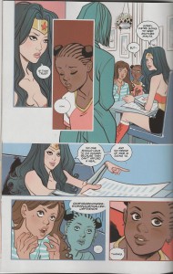
So the first store is totally Empowerment! with WW touring as a rock star, and dealing with piggy men (well, that part was kind of trite, actually) and raising up little girls, and it's cute and cartoony and the art by Marguerite Sauvage looks like this:
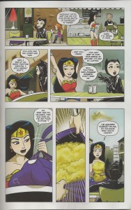
Then we get an adorable little romp co-starring Catwoman, and, again, cute and cartoony and inviting to the eye, and something that really pairs well with the previous story, and here's a very sweet page from Amy Mebberson.
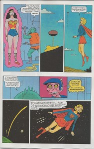
Finally, the issue wraps up with the first half (boo!!!!) of Gilbert Hernandez's WW story, and it's everything you might expect, and maybe more, and clearly, these three stories have a certain cartoony aesthetic which really shines in every way you would hope that they do. Look at Gilbert channel his love of Silver Age, with, a smart look for Wondy....
So, with all of this cartooning majesty on display, all that's left is how you package it for the mass audience, to draw in and attract the read that you want, right?
...
...right?
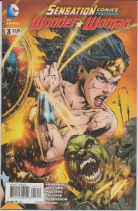
Well, maybe not so much, because this is the cover that DC went with:
Oh, god, really? Instead of the intersection of cartoony and cute and empowering and sweet and appealing to women and yeah everything in that wheelhouse, someone made a decision that the best way to wrap a package like this is to show a violent cover of the too-many-lines school, where WW literally has splashes of blood all over her face.
This is the kind of cover pretty much designed to repel the people who would be interested in the insides of the comic, and the people for whom the cover is attractive would be APPALLED by the content on the inside.
This comic will get cancelled pretty soon -- which is a damn shame because this is the kind of content that today's new audience really wants -- and someone somewhere will probably point to it as an example of why sweet, cartoony, empowering material doesn't work. But they're wrong, this is a failure of positioning and marketing.
We're going to work hard to match the people who want this comic to the comic itself, but make no mistake: it's now an uphill battle because of that cover.
-B


