Abhay: Inquisition-- The Valiant #1
/For the last couple of years, I've been trying to write a certain kind of essay-- one that always kind of remained a little out of my reach but was fun to chase after. But lately, maybe for longer than I actually knew myself, it's been time to pivot, and try something a little different. I want to pivot to something a little closer to what one of the bad guys in that movie Dead Poets Society would write. Start running more of a J. Evans Pritchard fan-club.
So, this is what I'm going to be doing for a little while (at least for the next five whole weeks since I've written five of these, but I quit real easy so who knows). My apologies if it's of no interest-- hopefully, we reconnect later down the road.
The Romans had Janus...
10 Questions about THE VALIANT #1 by Jeff Lemire, Matt Kindt, Paolo Rivera, Joe Rivera, Dave Lanphear, Kyle Andrukiewicz, and Warren Simons.
A basic description of this comic, so that everyone's on the same page.
This was heavily promoted as being a self-contained "event miniseries" by Valiant Comics (which has come back to life yet again for the umpeenth time, like the Hammer Films version of Dracula).
The series looks like it's about a bunch of heroes uniting to face down a personality-less threat. The villain is a smaller-scale version of the bad guys as from the Mass Effect video-games, if you know those, the Reapers; a recurring civilization-killer that attacks throughout time, but has no real character or points of interest beyond that barebones "it kills people" function in order to keep the viewer's attention focused exclusively on the heroic characters.
Co-author Jeff Lemire, talking to Comic Book Resources:
"The Valiant really is a story that puts a stake into the ground and really changes the flow of the Valiant Universe moving forward and really shakes up the status quo of a number of character, and sets the stage for the next couple years' worth of stories. It's something I'm really honored to be a part of, coming on fresh and working with guys like Matt who have been working in the universe for a while."
QUESTION 1.
Is this comic about anything besides its plot?
No.
QUESTION 2.
Did the creative team make any interesting choices in the visual presentation of the story?
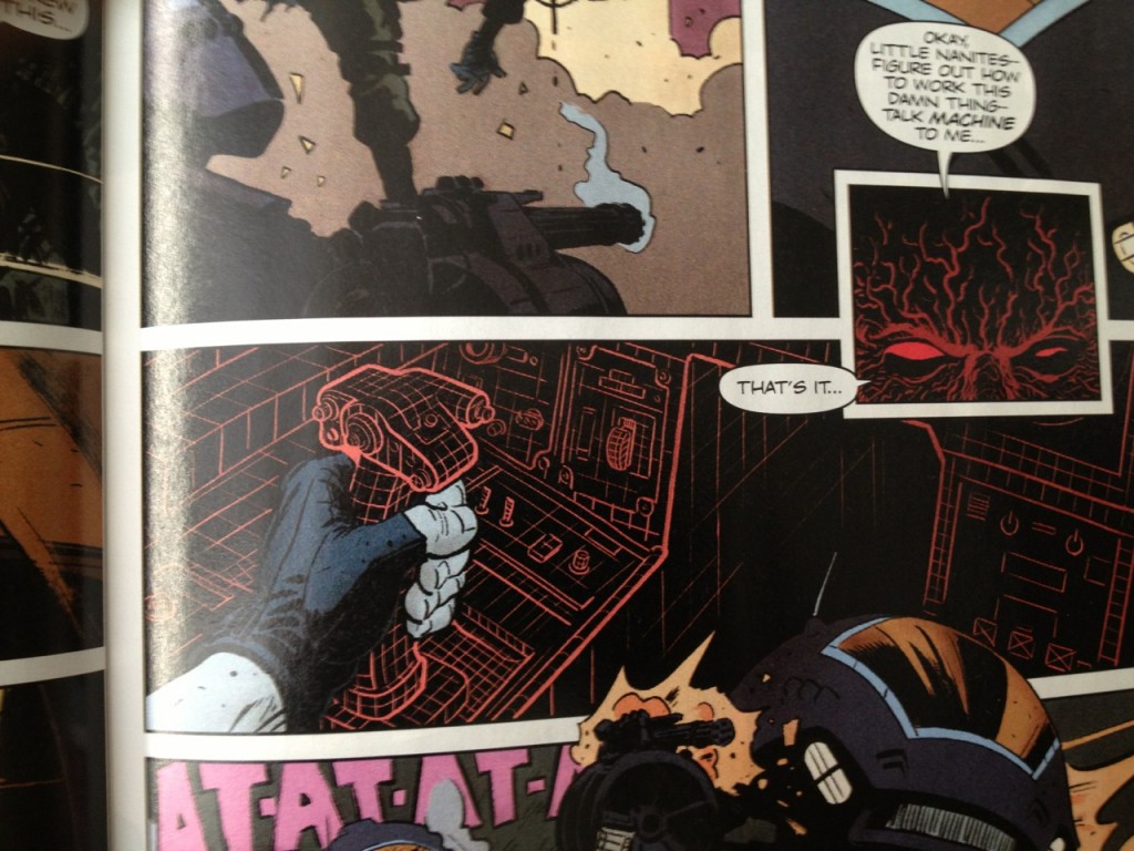
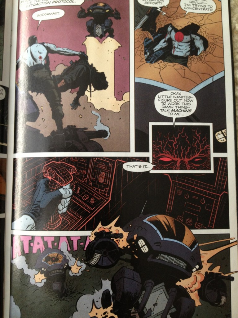
There are two panels where Bloodshot uses his superpowers to mind-control a machine.
Do you think this is what Bloodshot sees when he masturbates? I'm going to say yes. Also, I'm going to say that he says "That's it" before he does it, out loud.
Rivera presents those by drawing the machine's console with an orange line on top of an otherwise all-black panel, detailing the console with a grid-pattern that resembles the "wireframe" effect one sees in CGI modelling. I would assume that look has science-fiction "cyber" connotations for readers, but I'm not sure why, where it originated. (From Tron? From early computer games?)
Rivera notes in the back matter that it's a similar technique to the "Radar" vision seen in his Daredevil work "but both scripts were asking for basically the same thing. Either that, or I'm a one-trick pony." Thin color lines on top of all-black panels-- I like those; I like how they jump out, have a sort of sinister, neon-y city--at-night energy. And panels from a subjective viewpoint-- those can be pretty fun. Oh, it'd be nice to see it being put to some other use than just illustrating superpowers, constantly, but.
Nothing else really jumps out as to the presentation.
QUESTION 3.
How is the comic structured?
The comic opens with a page of widescreen panels, a camera untethered to any point of view, wandering an environment while nothing much happens. At some point in recent history, that kind of page took over as how all of these kinds of comics seem to start, the numbingly-slow crawl into a comic rather than a classic old-fashioned splash pages getting you excited about what was to come. Why? Splash pages are better.
The widescreen thankfully gets dropped for the remainder of the comic. Rivera mostly sticks to either two or three tier pages.
The comic is structured in four scenes:
1) The comic spends 9 pages setting up the Threat to the Eternal Warrior character (including a double-page splash). This first scene is repetitive-- three nearly-identical sub-scenes making the same exact narrative point, over and over. The authors couldn't find a graphic solution to convey to the readers that the Threat is as eternal as the Eternal Warrior, other than to just repeat the same exact scene three times in three different time-periods.
The problem is the authors burn nine pages of this comic in the process for repetitive scenework. And burn a lot of goodwill-- the comic builds no momentum. Reading this stretch is drudgery.
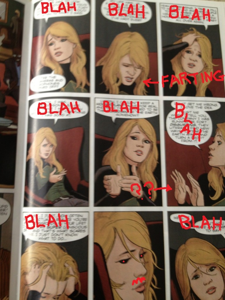
2) A three page scene follows-- thin characterization of a lady who is apparently the latest "Geomancer" on Earth. She's in conversation with the Eternal Warrior's brother Armstrong, from the Archer & Armstrong comics.
Despite them talking for three pages about what life is like as a Geomancer, the term Geomancer is never really explained to the reader.
"Listen. I couldn't keep a houseplant alive. For real. And now I'm supposed to be the guardian of the earth somehow?" Luckily, they bold-face the words houseplant and guardian-- otherwise, this might've been boring to read!
3) That's followed by six pages of Bloodshot beating up a robot in some nondescript jungle region, for some unclear reason. (Two of those pages are a double-page splash of a robot shooting at Bloodshot, with an inset panel).
4) The comic then concludes with a five-page scene that set-ups the cliffhanger: the Threat from the beginning of the comic is going to attack the Geomancer lady.
(This scene is mildly disrupted by a random one-panel conversation between Eternal Warrior and X-O Manowar -- who apparently is also in this comic, out of nowhere. The one-panel conversation features Eternal Warrior stating some information, specifically the exact same information we had already been told three times in the first scene. Holy shit! How stupid does the creative team think that people who read these comics are, that they need to be told a simple concept FOUR fucking times in one issue? X-O Manowar's response is literally "Why are you telling me this now?" So. Once again, as is true in life, as is true in love, I agree 100% with X-O Manowar.)
Four scenes total: 9-3-6-5.
None of the scenes motivate one another, particularly. The comic is mostly just stuff happening, without any compelling through-line to hold the reader's attention, more a series of events, than a story, all set-up for future issues.
Nothing presented is pleasurable in and of itself.
QUESTION 4.
Is there anything noteworthy about the cover, logo, lettering, or design?
The comic opens with an all-black inside cover, and then an all black first page with "Book One" written on it (despite there being a #1 on the cover), then another all-black page before commencing the comic on page three. The last two pages of the comics? Also, all black pages.
I didn't really understand all the black paper in this comic. Am I supposed to be impressed? "Oooooh, the paper's all black-- that's the same color as the shirts Steve Jobs used to wear. Maybe these people are visionaries, too. RIP Steve Jobs." Design seems pompous.
Rivera hand-draws the sound-effects, I think. Rivera's inconsistent with the sound effects though-- gunfire makes "Bam Bam" sound effects, but Bloodshot punching his hand through a Robot's windshield? No sound. Robots taking off into the air on rockets? No sound. What do you think about that? I let stuff like that slide, and I imagine 99% of readers do too, but is it weird we all are like ... so uncommitted to the sound effect conceit...? Maybe that's weird.
QUESTION 5.
Is anything about this comic interesting politically, socially, or from some other frame of reference?
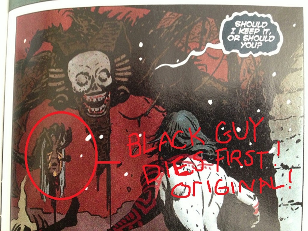
The comic begins with a black character (an Incan) being violently murdered in order to inspire the white male protagonist.
I'd totally try to get that guy's face if it were offered to me. Just to keep the bad guy from crapping or ejaculating into my buddy's severed face. I'm a good friend that way.
So, black-rifice: check.
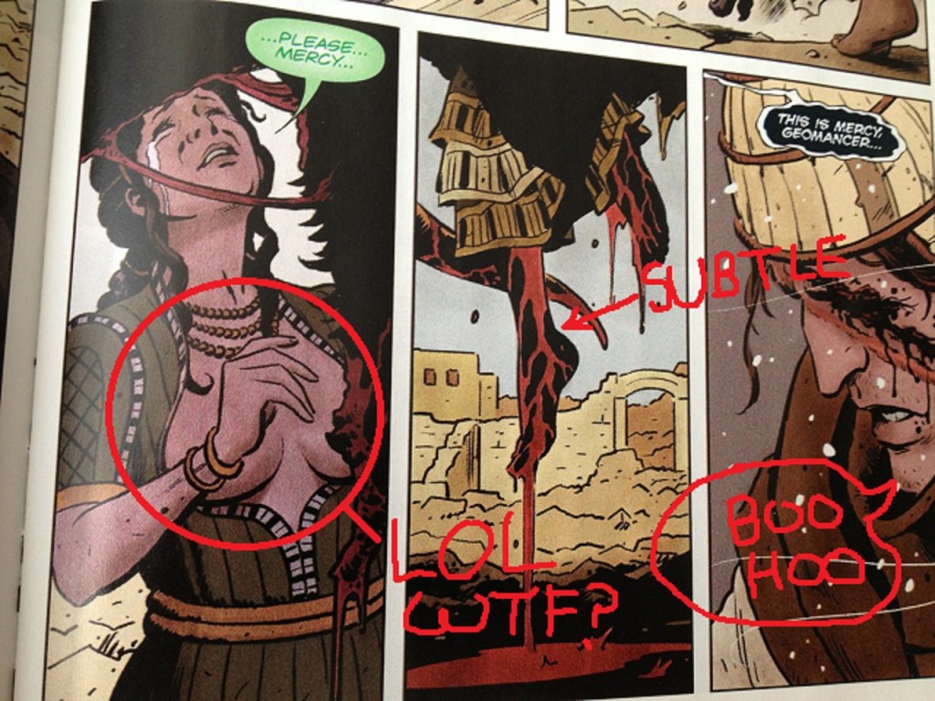
The next two pages feature a woman being violently murdered in order to inspire the white male protagonist. Note that she is wearing a blouse but her breasts are hanging out of that blouse, all exposed to nature-- and yet her breasts are still hidden from the reader by a conveniently placed hand. The bizarrely-common sexless titillation of comics-- drawings of murdered women presented as senseless sex objects, but for an audience of men disinterested in any of the actual specifics of sex.
Anita Sarkeesian did a video about how cheap imagery like this trivializes violence against women-- she calls it the Damsel in Distress trope. Leigh Alexander wrote about a variation on the topic last year, with respect to video games-- here's the key bit: "It seems that when you want to make a woman into a hero, you hurt her first. When you want to make a man into a hero, you hurt... also a woman first."
So, woman in a refrigerator: check.
The third scene features a little kid being murdered to inspire the white male protagonist. If only the little kid had been a gay character, it'd have been a kill-the-minorities-to-inspire-a-white-guy hat-trick.
The first four pages of this comic evidence a creative team oblivious to the kinds of imagery they are slopping around, and one making boring / stupid assumptions about who the audience for their work is.
Also: it's a little strange, people who will only believe in "heros" that need a bodycount to want to do the right thing. "All this bloodshed makes me want to make the world a decent place, as opposed to, you know, ethics." That's just odd.
QUESTION 6.
You are in a dark room with a candle, a wood stove and a gas lamp. You only have one match. What do you light first?
Oh damn, I'm bad at riddles. I would first light that ass on fire...? Heeeey-o.
The internet says the right answer is "The match" but man-- if that's my only match, that's too valuable to light on fire, just from a supply and demand perspective. I would just leave that room-- it sounds like that room sucks; get the fuck out of colonial Williamsburg! I'd rent a room at the Four Seasons Hotel. The rooms at the Four Seasons come with electric lamps-- you don't need a stupid match.
Put that match on eBay-- sell it some riddle-solver-- use the eBay money to pay for the hotel room.
QUESTION 7.
What was the best bit of dialogue in the comic?
Geomancer: "Apparently, I'm the great-granddaughter of Buck McHenry."
I don't really like this line for sincere reasons. Something about it just made me giggle when I read it, just in that I don't feel like any human being has ever said that combination of words before this was typed out, and no human being ever will or would. Does that make it "good dialogue"? I don't know, but it at least makes it at least amusing the way I don't mind comics being amusing.
Anyways, that's as good as the dialogue ever got-- the rest is just lifeless.
QUESTION 8.
What is the most interesting page in the comic and how does it work?
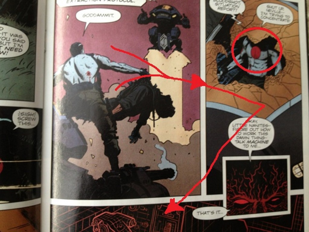
Page 19. Bloodshot versus the robots.
Very classical eye-flow, this page.
First panel uses the outstretched arm to push the eyes to the right. Second panel pushes the eye in a sweeping move down to the console.
Drawing arrows with a mouse in MS Paint was hard.
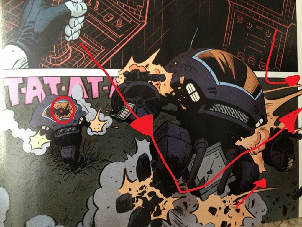
The console uses the grid-line to redirect the reader's eyes to the climactic robot battle. And the climactic robot-battle point the way to the next page.
I don't know why Bloodshot needed "nanites" to figure out how to use a trigger-- but at that point, I didn't care.
Nothing too sophisticated but simple, classical flow.
Note also how the Bloodshot chest-tattoo shows up in the last panel as a dot. Nice touch.
QUESTION 9.
Did you experience any noteworthy emotion reading the comic?
Disdain for the bit with the topless woman.
I didn't notice the blackrifice until I was typing this out (which probably means some stuff about me, but). I didn't experience that disdain in real-time, though, so I don't know if that counts.
Besides all that, no. Absolutely nothing happens in this comic to provoke any kind of emotional or intellectual reaction. It's a completely inert product. Mentally and emotionally dead. Nothing a person could hate because it's so unmistakably a comic that will be forgotten in a week's time, if even that long. It will be like it never happened, before you even knew it. Just a comic with no point in even existing. It's just nothing.
QUESTION 10.
What do we hope that younger cartoonists learn to do and not to do from this comic?
To do:
Good artists care how a reader's eyes flow during action scenes, and I'd like to think that readers will appreciate a page with good flow even if they can't articulate that it's happening.
Not to do:
Don't repeat the same exact information three times in a span of pages that take up a significant chunk of real estate in your book. Maybe try to find a graphic solution to storytelling challenges, rather than waste pages conveying simple pulp ideas. Try anything because the beginning of a comic isn't really the ideal place to be boring and super-redundant.
Also: maybe have "write at least one line of dialogue that's interesting or lively" on a to-do list, so you remember to do that. Tie a string around your finger so you don't forget.
The essence of comics is that they are built out of images. Images mean things. Understand what different kinds of images mean to different kinds of people. You would have to be pretty goddamn oblivious not to realize that comics are constantly featuring images of violence against women, in particular, and if you are a decent human being, I would imagine you would not want to add another example to that very long list without a better reason than you can see on display here. Chances are you can make whatever point you're trying to make without adding to the world's storehouse of dumb, offensive, tiresome images. There's no rewards for being a good person, not in this world and certainly not in comics-- nobody fucking cares. But maybe try to be one anyways just because it's the right thing to do.
NEXT WEEK: BITCH PLANET #1 from Image Comics.
