"Don't Make A Noise Or I'll Send The Devil A Henchman." COMICS! Sometimes My Eyes Get A Rough Ride!

Content, he said tersely, and spun upon his heel to leave.What? Conan. It’s Conan. It’s always been Conan. So cleave the break asunder and have at it with much vigour.

 photo ConanKlonk_zpsfe61f611.jpg

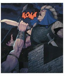
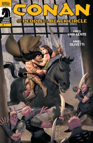
Anyway, this… CONAN AND THE PEOPLE OF THE BLACK CIRCLE #1 - 4 Art by Ariel Olivetti Written by Fred Van Lente Coloured by Ariel Olivetti Lettered by Richard Starkings & Comicraft Dark Horse, $3.99 each (2013/4) Adapts Robert E Howard’s The People of the Black Circle Conan created by Robert E Howard

 photo ConanCov_zps3dcfa70a.jpg

In which I decide to purchase one of Dark Horse’s apparently endless stream of Conan series. Because they are apparently endless aren’t they? But only apparently because everything ends (even Friends, thank Crom). Since his arrival in the Dark Horse stable (ho ho ho) Conan’s been busy; he’s been busy being a Barbarian, a Cimmerian, a King, he’s even done a Bob Hope/Bing Crosby movie (Road of Kings) and now he’s an Avenger (in the general sense rather than the specific sense of Steed and Mrs Peel or those Marvel children’s entertainment movies). This series, Conan and the People of the Black Circle was of fixed length so, yeah, new readers sharpen your axes here. I jumped on board, as they say on the trolleys (Ding! Ding!). And why not, I have no beef with Conan; fact is I like the fact that there are always Conan comics going on somewhere, it gives life a sense of stability. When you get to my age that’s important. Hey, maybe Conan can fill that gap when Star Wars goes Marvel. Can the audience for the children’s entertainment Star Wars be replaced by that for the geriatric pulp sniffer’s entertainment Conan? Doubtful isn’t it? But that’s Dark Horse’s concern, mine is whether these comics were any good.

 photo ConanHorn_zps81ddc274.jpg

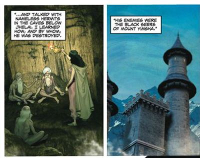
And the comics comprising Conan and the People of The Black Circle were pretty good because for starters the job Fred Van Lente does is a good one. Here he adapts a Robert E Howard short which means, as it is from the source of all things Cimmerian, it’s all as Conan-y as any Conan fan could want. Yeah, Van Lente does a good job though I did get a bit lost at times with all the to-ing and fro-ing and odd names but that’s not really on Van Lente; it’s more on Olivetti’s tendency towards visual uniformity and basically, let’s be fair, my personal inability to focus properly on narratives concerning people and places called things like Pizzazz the wizard and the city of Chuffbundle. I’m not joking either (about my failings; of course I’m joking about the names; get real, hot pants) those made up names just slip right off my brain and since those names come with the territory (the territory of Slickpiddle) it’s hardly the fault of the comic, Van Lente or Robert E Howard. Since someone who shys away from reading books with maps in the front enjoyed Conan and the People of The Black Circle I’d wager a cheeky smile at least that for a fan of this stuff this is good stuff indeed. There’s certainly plenty going on, there’s no little intrigue, some surprising developments and a both a wider scope and a greater level of characterisation than I, at least, have come to expect from Conan comics. The wizards aren’t just bad men clad in black potato sacks pointing gnarled fingers and hissing, they have a plan, and one of them even has the hots for a lass in harem pants. And as for the lasses, well, yes, the ladies have some agency; one of them is a bad lass and the other’s a princess but even the regal Rita (not her real name) holds her own (as well as Conan’s; calm down, it’s consensual). And Conan? Well, Conan’s Conan but maybe there’s a little more going on under that sofa arm of a brow than usual, but then Conan’s never been quite as thick as he was in that original flick. Nice one, Fred Van Lente! But then there’s Ariel Olivetti. Yes, there certainly is Ariel Olivetti.

 photo ConanHorse_zpsede688bf.jpg

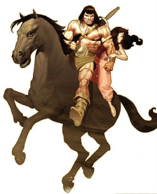
Now, I know you don’t think so but I almost do myself a mischief sometimes looking for reasons to like things. I know you think otherwise but that’s because, and we’ve all noticed this, you’re really quite negative and you project that onto me. So while it would be easy for me to spit like a wet cat about the art of Ariel Olivetti I’m going to first say that he gives good Conan. Ariel Olivetti’s Conan is certainly a sight worth seeing; you certainly know he’s about when he’s thugging up the page. Here Conan is all pink tautness, oily sheen, vein bulge and black bangs; like a man shaped pork banger topped with a lady’s wig. There’s a hint of Big John Buscema’s broken nosed Conan about the face (and who broke Conan’s nose? John Severin. Fact.) but Olivetti’s Conan would wear Barry Windsor Smith’s sinewy Conan like a feather boa. He’s good, Olivetti’s Conan, I liked him; looking good out there, Conan. In fact all of Olivetti’s figures are good, really good; there’s a definite sense of density and conviction in the details which really sells them. And if there’s a tendency towards sameness (and there is; I mentioned it early, keep up) only intensive effort could avoid this when costumes and face foliage are, as the material dictates, so interchangeable. And, really, why expend that effort when ninety nine per cent of the people in the panels will shortly be dead. Because after all this is a Conan story and if you looked down on Conan with God’s eye then you’d see him as the point of an arrow of corpses stretching round the globe to a small village in Cimmeria. Yes, Olivetti’s people are quite, quite convincing even though the hats they wear look liked iced gems. Especially so, even. Unfortunately (and it’s the bane of my life too, so I sympathise) people have to exist in a world and the world Olivetti gives us here is somewhat less than convincing.

 photo ConanTower_zpsd88438cf.jpg

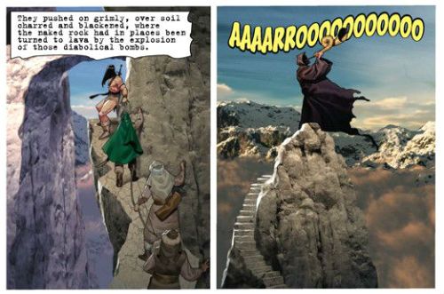
Which is weird because a lot of the time it consists of photographs or computer modelled scenery far more realistic than his convincing but clearly fantastical figure work. And so Olivetti’s excellent figures occupy a world seemingly wrought from combining snaps taken on the Olivetti family Tuscan holiday (circa 1987; caravans airbrushed out) and bits of children’s plastic castles. Being as kind as can be at its best this approach creates a wonderful sense of Harryhausen-ness with the discreteness of the elements (and the clear artificiality of one set) forcing your mind to just go with it; to just deal with it. Unfortunately a lot of the success of that approach in movies rests on the presence of motion for your imagination to be swept along by. Alas, motion is something comics are not known for possessing being as they are largely static in nature. Mostly then Olivetti’s approach flops flat on its face as firmly as a Gwangi with lassoed legs. Being slightly more realistic with the praise then, it’s a lot like that collage stuff Richard Corben did in the 1970s but I didn’t like that much either, and I like Richard Corben’s work significantly more than I do the work of Ariel Olivetti. Also, it’s 2014 and I’m not sure it’s a good use of more technology than got us to the moon to replicate mistakes made in comics four decades ago. For Corben those effects were a step on the road to a better artistic place but for Olivetti they threaten to become an artistic pothole he’s decided to curl up and kip in for the duration. And finally, to be most unkind; at its worst it’s a goddam eyesore. Bit of a mixed bag visually then. Sometimes Olivetti’s approach hits the cinefantastique jackpot and raises Van Lente’s solid efforts but mostly it doesn’t and so Conan and the People of The Black Circle can't quite get higher than OKAY!

And having no further concern, he and his companions sought adventure in the…COMICS!!!

“The Weaving of Ornate Tapestries Glorifying Our Ancestors and Their Bygone Way of Life." COMICS! Sometimes I Treat You Like My Local Library And Continue To Patronise You!

This week I visited my library and took out and read a recent-ish TPB of some quite old Conan comics, 1982 or thereabouts. Then I tried to put my thoughts about ‘em into what them there clever folks call words. I think it worked out about as well as that usually does for me. Probably a lot less well for you. One thing I did discover was that the Hyborian equivalent of Occam’s Razor was Conan’s Rock:  photo ConanRockB_zps7e2816b4.jpg

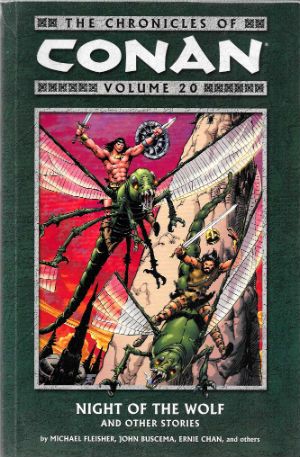
Anyway, this… THE CHRONICLES OF CONAN VOLUME 20: NIGHT OF THE WOLF AND OTHER STORIES Art by John Buscema, Gary Kwapisz, Ernie Chan, Steve Leialoha, Bob Camp & Rudy Nebres Written by Michael Fleisher Lettered by Janice Chiang Coloured by Peter Dawes, Wil Glass and Donovan Yaciuk Conan created by Robert E Howard Dark Horse Comics, $18.99 (2010) This volume collects Conan the Barbarian issues #151- #159 (originally published by Marvel Comics), newly coloured, with all of the original series covers, a foreword comprising the first short part of an interview with Ernie Chan, and with a brand new pinup by Ernie Chan.

 photo ConanCoverB_zps18ef2f24.jpg

My first thought on seeing this book was to wonder who in the name of Belit’s water wings needed twenty Dark Horse volumes of reprinted Marvel Conan comics. My second thought, and one which ran so hard on the heels of the first it risked tripping it up, was how could I get every single one of all those twenty Dark Horse volumes of reprinted Marvel Conan comics. Seeing Conan comics on the shelves of my local library had transported me (sigh; yes, that’s right, figuratively not literally) back to the days when those Marvel comics were actually coming out and also back to the days when my reading erred towards quantity rather than quality. This is a point often overlooked when it comes to kids and reading; it doesn’t really matter how good the reading matter is, it only matters that there’s lots of it. Basically, the kids that do read, well, they really read. They really go for it reading wise, those kids that read, and quality doesn’t really come into it. They don’t even particularly have to be interested in what they are reading, they just have to not be disinterested in it. Which is why I find it baffling that Comics Companies act like the kids demographic is beneath them. First, nothing is beneath Comics Companies (nothing, I say!) and second, Kids would eat that violent crap they poop out up with a spoon. Or if you’re uncomfortable with the unfortunate and unintended mixing of kids and scat back there let’s say they’d read it with their eyes. After all, the young me read every Robert E Howard (REH) etc Conan book in the library but I didn’t actually care for them all that much. I didn’t dislike them or anything. I only really remember that the covers were the most exciting bits, they were published by Sphere (I don’t know why I remember that; I was boring even then?) and I enjoyed the Conan comics way more. Years after it came out I remember getting that Conan Treasury Edition (#4) from a market stall on a day trip to Blackpool; at the stately age of ten Barry Windsor Smith and Roy Thomas’ adaptation of REH’s Red Nails seemed like the most grown up thing in the world. Except for my Dad, anyway. Of course the twin hidden tragedies of this opening, digressive and purely warm up paragraph are that I no longer have that Conan Treasury edition and the young me is dead now. So, let’s see what the old me, in his bitterly truculent way made of some old Marvel Conan comics reprinted between two covers by Dark Horse.

 photo ConanSteveB_zps64ef650b.jpg By Buscema, Leialoha, Fleisher et al

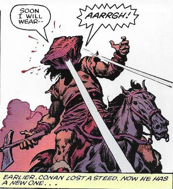
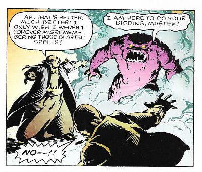
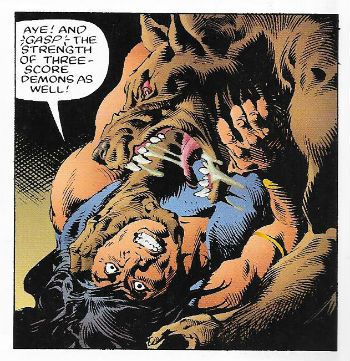
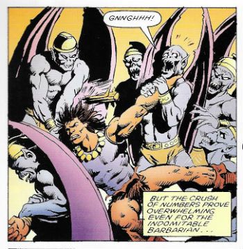
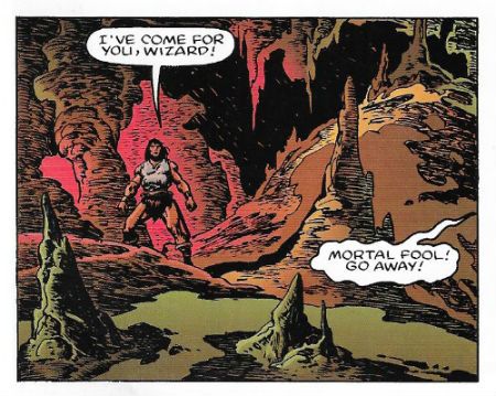
It takes Michael Fleisher a couple of issues to get over his impulse to regularly update us on the state of Conan’s thews (e.g. in #159 they are “bronzed”), and this initially distracted me from noticing that the stories in here are pretty basic on the Conan Scale. Which is okay because, and I make no apologies for this, I don’t mind my Conan being basic. Your basic Conan story should involve a woman, a wizard, a monster and a horse. Conan should ride off on one of those carrying another after having have killed all the rest. Usually he’d ride off on the horse with the woman but we’re all more open minded these days so more permissive permutations may be indulged in the safety of your own skull. Michael Fleisher (with an assist from Buscema, see later) recognises that there’s still plenty of room to manoeuvre even within that format and gives us werewolves, demons in metal dungarees, flying people, Hyborian Age rohypnol and other things I’ve forgotten. To be honest Conan stories have a hard time holding my attention, mostly because of the made up names which just fail to gain traction in my head. Except when there is a wholly unintended comical effect. Such as when Michael Fleisher names his winged lady character Alhambra. Now, he may be doing so purely for the evocative sound of the name; he may even have in mind the famous Spanish stronghold built circa the 9th Century which remains a notable tourist attraction still worthy of the Moorish poets’ description of it as “a pearl set in emeralds” (citation needed); however, and alas, Alhambra also has a namesake in Bradford, West Yorkshire, which is a theatre built in 1913 which remains a notable attraction during the Christmas season for anyone wishing to subject their children to the sight of Christopher Biggins dressed as a woman and talking about the size of his pumpkins. Additionally and endearingly a lot of these stories contain a panel which seems to be an overly literal visual representation of a colourful but slightly unsuccessful imaginary sexual euphemism; see Conan strangle an eagle!; see Conan stab the Demon’s heart!; see Conan sup from the lady’s cup!

 photo ConanRudyB_zpseb4996b9.jpg By Buscema, Nebres, Fleisher et al

Of particular interest in this volume is the fact that John Buscema is allowed a few extra links in his artistic chains so he can stumble out of his inky illustrator’s cave and trespass for a few steps on the sun warmed ground usually earmarked for those weavers of dreams, the writers. What I’m saying is he gets to chuck some ideas and plots at Fleisher for a quick polish and a very nice how do you do to boot. Pleasingly the quality of the stories takes a swift upswing with Buscema trying to open things out of the established formula a bit with a lighter tone and a particular eagerness to get some expanded characterisation going in the vicinity of Conan himself. At times the barbaric One appears downright avuncular. This is dangerous ground Buscema is treading, however, as I personally believe that the occasions when Conan experiences emotions should be kept to a minimum; when he does feel something more than hunger, anger, lust or disgust at men who perfume themselves and live by words rather than actions (PAH!) he should always have a sort of slightly surprised air like a lion seeing a hot dog stand for the first time. But that’s just me, basically John Buscema does okay with the pen as well as the brush. Who knew?

 photo ConanGaryB_zps3535486a.jpg By Kwapisz, Fleisher et al

Gary Kwapisz provides the art for an issue and also a couple of covers, all of which are nicely done with promise aplenty; but I won’t lie I don’t really know who he is. I was just going to make a crack about how his name sounds like he probably left comics and went off to play chess in a tin foil hat but I realised that would be rude and dismissive which isn’t like me at all(!), so I Googled him instead and found out that he’s still active in comics; he recently illustrated a Chuck Dixon series about the American Civil War (as opposed to the English Civil War which I imagine Chuck Dixon finds somewhat less interesting). So, yeah, Kwapisz’s stuff here is nice, being sinewy as opposed to Buscema’s brawn. But this is Conan and so art wise this is John Buscema’s show. Or, more correctly Ernie (Chua) Chan’s show. For even a great noble beast of an artistic Shire horse like John Buscema must have been tiring by this stage and Chan’s inking works hardest of all the inkers present to bolster Buscema . Certainly as we join John Buscema here, several years into bearing most of the weight of both the colour Conan and the B&W Savage Sword of… magazine, his art is typified by body language, staging and character design worn into familiar patterns by the repetition inherent in his colossal workload and the insanity inviting narrowness of the subject matter. Were the “he” in question not John Buscema this would likely be a critical hit, but as it is even the most cursory of his pages retains a well-honed gift for flow and all the essential cues other hands would require to beef it up to presentation standard. Basically, on these pages John Buscema’s art is saved from the gauzy weightlessness of a harem dancer’s veil by the efforts of both the inking (mostly by Chan (Chan’s the man!) but also Leialoha, Camp and Nebres) and, surprisingly, the colouring by various hands. Now (spoiler!) I’m not usually a fan of modern comic colouring technology applied to old timey comics but here I reckon it works. Earlier Dark Horse Conan volumes disastrously swamped Barry Windsor Smith’s delicately evolving lines under all the technological bells and whistles available; a no doubt well-intentioned but ultimately ill-judged attempt at updating the art which ended up resembling only aesthetic philistinism (he said sputtering wildly). Here, however, the colours lend vigour and spark to art which, unlike Windsor-Smith’s, is open enough to accommodate all the technology Dark Horse can chuck at it.

 photo ConanColoursB_zps276cb788.jpg By Buscema, Chan, Fleisher et al

It can’t come as much of a surprise given its title that THE CHRONICLES OF CONAN VOLUME 20 showcases a series past its prime. But nobody herein disgraces themselves and every story between its covers is entertaining if not entirely sensible. It’s pulp fluff that was meant to entertain for the moment never giving a fig for posterity yet here it is in 2014 and I had a good time so I say THE CHRONICLES OF CONAN VOLUME 20 is OKAY!

And remember, what is best in life? COMICS!!!!