"Always Prepared. Always Ready." BOOKS! Sometimes You Get What You're Given And Just Make Do

Okay, let's stop pointing fingers, dry our eyes and just accept it’s a BONUS SKIP WEEK! (Bonus Booo!). Caught me on the hop a bit, I’ll admit. Unfortunately I haven’t anything in my head about comics but there are a couple of books I’ve been thinking about. Why not, eh? You never know your luck in a raffle. So, it’ll be a bit rough and ready this time out (yeah; no change there then) but I’ll probably find my flow after a couple of dozen words. Anyway, this…  photo SkySleepRedB_zpse518c49a.jpg

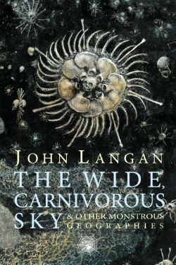
THE WIDE, CARNIVOROUS SKY AND OTHER MONSTROUS GEOGRAPHIES By John Langan Hippocampus Press, 2013 £15.00 (Kindle: £4.02)

 photo skyB_zps68c3ea0b.jpg

It’s refreshing to find an author who not only knows the difference between Sabretooth and Wolverine but also mentions John Byrne’s Alpha Flight. He mentions the latter in the back matter which he provides for each story. And I know you comics lot like your back matter. It’s in the back matter that he chattily unpacks each of the short stories herein so that you know exactly what he was up to. Turns out what he’s up to is reinvigorating all the old horror tropes; the ones as familiar as that dream where someone makes you eat your own face. Yes, my little chubby cheeked chums, all the old favourites are exhumed once more; zombies, vampires, ghouls, werewolves, Lovecraft, Poe and so on and so forth, yea until the stars come right again and the Old Ones rise.

Which would be worthy of little remark were it not for the stylistic panache with which Langan executes each of his macabre modernisations. You know, speaking plainly, this was by the far the best book of (modern; no one beats Aickman) horror stories I read this year. And I read a lot of short horror stories; you didn’t know that did you? Mysterious creature that I am. Anyway, it was the best book of horror stories I read because John Langan writes like a real son of a lady and no mistake. He’s a bit of a stylist is John Langan; a bit of a shit hot stylist as it turns out. He’ll keep you on your toes and wide awake with his magnificent ability to inventively riff on concepts which looked dead only seconds before. Langan playfully pressgangs Thonrton Wilder’s Our Town into imbuing the listless zombie trope with a real sense of horror again. He beautifully uses the backdrop of a Cthullu scoured Earth to play out an emotionally flensing one hander concerning how it feels when your child moves on and away. There’s even a post-mod lyric to lycanthropy that loses none of its savagery amongst the stylistic trickery. Somewhere in there he also throws in the weight of autobiography, although probably not in the one about the Iraq War vets up against a very different vampire indeed. It’s a clever book, it’s a moving book, it’s an entertaining book which, all in all, I guess, makes it a VERY GOOD! book.

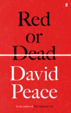
RED OR DEAD By David Peace Faber & Faber, 2013 £20.00 (Kindle: £7.79)

 photo RedB_zps81be45d7.jpg

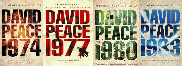
Repetition. Repetition. Repetition.” Those are the first three words of David Peace’s new book and they are both a statement of intent and a warning. Those three words are the book. The entirety of the book is encapsulated in those three words; no, that one word. Repetition. (Repetition. Repetition.) Because Red or Dead is a book about Bill Shankly and how Bill Shankly took Liverpool Football Club to success. Peace takes the brave and unfashionable tack of shunning mythologising and renders down the story of Bill Shankly’s success to its essence. To its basics. This is the portrait of a man. Bill Shankly had insight and Bill Shankly had talent but mostly Bill Shankly had the guts for the long haul. Tedium and slog. Slog and tedium. These are the things that got Bill Shankly results. That got Bill Shankly’s team the results. The results for their supporters. Results for the people of Liverpool. For the people. Always, always for the people. Working for the greater good. Toiling for the larger whole. And as the pages pass, as the years die Peace’s subtle subtext shimmies into view. For as the pages pass, as the years die Bill Shankly’s world slips into the past. The England of people like Bill Shankly. And a new England is born. An England not about the people but about the person. An England not about society but about the self. An England in which people begin to ask what have I got and why have they got more than me? An England in which people end by asking what have I got and why have they got anything? England: before the match, after the match. England: before The Thatcher, after The Thatcher. This book is work. This book is hard work. No, no, no. This isn’t working. This isn’t working at all. Half time whistle. Oranges and a re-think…

…Okay. Look, that’s all very well and good, all that up there; it’s nice I get to pretend to write all proper like in my little half-arsed way, but I’ve read the reviews. A lot of people seem unhappy about this book. So let me speak plainly for a change; this book is a fucker. It could not give less of a shit what you want from it. Huge swathes of it are repeated. (Repeated. Repeated.) It will bore you. You will be bored. To get through this thing boredom is something to be mastered. Or befriended at least. This is not a mistake. It is not an accident. David Peace is not a numbskull. It is a device. A literary device. To understand Bill Shankly, to understand Bill Shankly’s achievements, Peace puts you in the same position as Bill Shankly. Tedium and slog. Slog and tedium. These are the things that will get you results. And at first the results are small (the simple switch from players’ surnames to forenames is weighted with emotional import). Then after the slog, after the tedium come the real results. The last third of the book portrays Shankly after success, after retirement. The last third of the book is where your heart gets a work out. The last third of the book is where the results come in. The last third of the book is the pay off. But to get to the pay off, to get to the result you have to put the hours in. You have to put your back into it. You have to work for it. Look, I’m not fussed in the slightest about football and I was a near blank about Bill Shankly but it still paid off. Red or Dead is not for everyone. But if it’s for you it’s VERY GOOD!

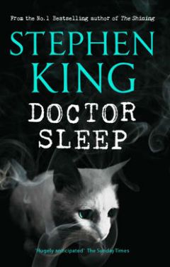
DOCTOR SLEEP By Stephen King Hodder & Stoughton, 2013 £19.99 (Kindle: £5.70)

 photo SleepB_zps9d406f7b.jpg I like the total uselessness of the quote on the front of the book: "Hugely anticipated”. Yeah, and…? My dinner is hugely anticipated; getting in out of the rain is hugely anticipated; the next episode of The Spoils Of Babylon is...the gist you are getting, yes? I’d have thought Stephen King writing a sequel to The Shining would merit a bit more, I dunno, oomph in the blurb department. Maybe they didn’t want to get anyone’s hopes up too high. Because this is no way the equal of The Shining. Now, I’ve not looked so I don’t know what the consensus is on this one is but I’d guess it’s mixed? Doctor Sleep’s got a strong start and a solid finish but the bit in-between lacks conviction, and there’s a lot of in-between here. The Danny Torrance bits which start, finish and weave through the book are great (and we’ll swing back round to that later), but they’re sandwiched around an idea more suited to a short story than the length of this brick. I mean, having old people in RVs being evil kid killers and eating schadenfreude is a droll and smart way of talking about the sick way we (“we” as a society; not me and you, we’re awesome. It’s everyone else; It’s always everyone else.) process tragedies these days together with the dangers of assumptions. But it isn’t smart enough or droll enough to carry something this hefty.

Unfortunately because the bulk of the book is less than gripping King’s late period tics stick out quite a bit. There’s the momentum sapping return to an earlier already documented event but in even more deadening detail (as though excessive attention to tedious minutiae as will effectively balance the fact we’re talking about psychic vampire eldsters); the failure to invest the mundane with menace (“She had a top hat which sounds stupid but really it was proper spooky, honest.”); the kind of attempt at a quick descriptive pop that misfires into flatness (“She had a single yellow tooth like a tusk” Annnnnd?); the interminably dull reporting of a character’s internal decision not to say something (“Chad decided not to tell Betty-May about how the world had cooled and fish had left the seas to become people and how those people had built cities and societies, and how all those cities and societies fell but history and humanity never stopped moving until here they were, today, next to the roto-rooter section in Target.”) And just like all the stuff in brackets prevented that sentence from flowing smoothly through your mind all those aspects constantly scupper King’s momentum.

But Doctor Sleep is still worth reading; it’s still worth your time, and that’s mostly because of how well King deals with addiction. There’s no horseshit here about dancing through the fire and being a better man for it; King knows that if you’re an addict you’re never through the fire and you don’t dance through it you trudge; King knows that most of the time the only reward for not drinking is that you didn’t have a drink. And eventually you don’t want to drink anymore because eventually you’re dead. You know, there’s probably a reason people talk about recovering addicts but no one ever talks about recovered addicts. The fact that a man who has been there and bought the t-shirt but is now a multi-millionaire and who lives behind a wall can still understand all this so well and, better, can communicate it so directly and sympathetically is an impressive feat of empathetic writing. Due to his mind beggaring popularity King is often given short shrift as a writer, which is a tad unfair. Because somewhere along the way Stephen King became a writer good enough to handle the horrors of reality head-on without the ghoulish gee-gaws of plastic fangs and rubber bats and it’s when he trusts himself to do so that Doctor Sleep is at its best. It is then that Doctor Sleep is better than GOOD!

Next time on Words From My Head: COMICS!!!

"Working Together In The Name Of The Common Good..." COMICS! Sometimes Creators Don't Get To Pick Their Fans! (Ever, Actually. Now I think About It.)

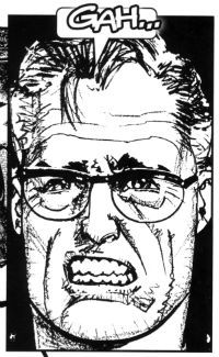
It’s a Skip Week! (Booo!) So let’s see what falls out of my head (Yay!). Checking the Savage Critic’s mail bag I see several of you may have contacted me expressing intense distress that I have yet to tell you how 2013 panned out for Howard Victor Chaykin.  It was definitely several or none. It’s so hard to remember these things. So, hedging my bets I’ll tell you anyway…  photo Gah001B_zps8964d526.jpg

 photo BuckCovB_zpsa4f9a490.jpg

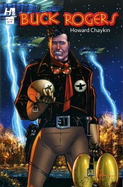
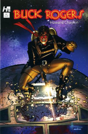
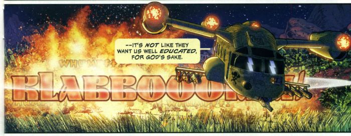
Howard Victor Chaykin ended the year of 2013 by sprawling debonairly into the first month of the new year with the final issue of Buck Rogers, which splashed down in January 2014. Judging by the sales you ‘orrible lot were blasé in the face of the charms of Howard Victor Chaykin’s Buck Rogers revival. Well, that’s your loss because I can tell you it was in fact VERY GOOD! Yes, despite the fact that a page in the final issue !OMITTED! !THE! !DIALOGUE! Howard Victor Chaykin’s Buck Rogers was the usual witty, political savvy, oddly meandering then hectically climactic appeal for everyone to stop acting like jackasses, but this time with jodhpurs and jetpacks. Kenneth Bruzenak and Jesus Arbutov all played important parts in giving the series a vibrantly pulpy sheen in keeping with the hoary yet versatile source. It was certainly very Howard Victor Chaykin and finished off what was certainly a very good year for Howard Victor Chaykin. Actually, I don’t know how Howard Victor Chaykin’s year was. It was probably a pretty decent year because throughout it he would have been Howard Victor Chaykin. Head start right there, am I right? You know I am. And what I know is it was a good year for people who enjoy Howard Victor Chaykin’s work; both of us.

 photo Cover001B_zps08054f40.jpg

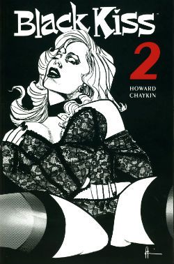
Despite being denied an overseas audience in its original periodical form (due to an aversion to spending decades in court) in 2013 Image collected and released Black Kiss 2. Which you will recall is VERY GOOD! So, it appears there are different rules for books and comics when it comes to peddling filth. And those rules are probably totally unconnected to the different amounts of money the different formats bring in. Black Kiss 2 was the one where Howard Victor Chaykin showed that even his sick smut made other people’s smart stuff look sick. Opinions were divided, with some declaring the book merely an old man whacking off in public. Such people are probably unaware just how much work goes into writing and drawing a hundred and odd pages of comics. A lot more work than whacking off, even given how much more work is involved in that the older you get. Particularly in public; you have to really plan that shit out like a caper movie unless you like having your windows broken. Or so I’ve heard. Naturally, untouched by bias as I am, in my head Black Kiss 2 was inventively vile but always engrossing and enthusiastically executed. A lot like an old man whacking off when you put it like that. It was certainly a lot less toe curling than that time Howard Victor Chaykin drew those Bendis Avengers comics. See, it’s that kind of bland doggerel kids need protecting from! Every year lowered expectations kill more people than pictures of gnawed off cocks being spat in people’s faces. Check your stats! Anyway, a mixed reaction to Black Kiss 2 like I say, but while we should always respect the opinions of others we should also remember they are worthless and only I am always right. To sum, Black Kiss 2 was probably a bit rich for most palates and we’ll move swiftly on.

 photo centurywest_zpsfc3d63e4.jpg

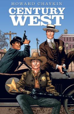
Image continued to curry my favour by finally publishing Century West; this being an OGN from about 6 years ago which originally appeared in Spanish or French or some other vulgar tongue I can’t be arsed to learn because, well, indolence is bliss. Or ignorance. Either way, I’ve got that covered! Come on now, 6 years or whatever it was; what was the hold up there? It’s not like they had to translate it or anything. I know he can be a bit excitable and his dentures might slip making his speech go all mushy but I do believe Howard Victor Chaykin usually speaks English. Anyway, like when our cat went missing that time Century West finally turned up; unlike our cat it hadn’t lost an ear and now hissed at loud noises. Despite being a bit overcrowded layoutwise and so busy with characters and events in its short span of pages it risked leaving you feeling like you’d sucked a three course meal through a straw very quickly indeed, it was VERY GOOD! It didn’t hurt that Howard Victor Chaykin’s busy script and crowded art was blessed by the titanic typography of Ken Bruzenak and Michele Madsen’s lovely colours. There was a James Garner level of cool pleasure emanating from the endeavour embodied by Howard Victor Chaykin sneaking in a sly nod to his early work decades past on the Shattuck strip. One for the keen eyed old timers there. Basically it was another fine example of Howard Victor Chaykin’s love affair with the history of America and his somewhat more ambivalent feelings about the kinematograph (it’s okay, Howard Victor Chaykin, it’ll never catch on!). It was in fact very much like Black Kiss 2 in its themes and concerns but somewhat more sunnily optimistic in its conclusions, and certainly less likely to need stashing when the Rabbi pops round to chat about donations for the next jumble sale.

 photo SATCovB_zps826dc453.jpg

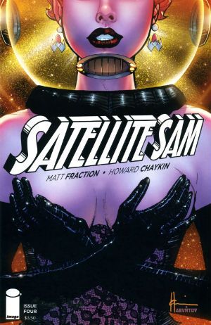
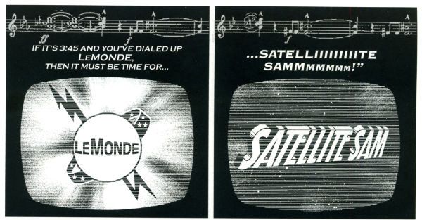
Throughout the year the odd voice was (reasonably enough) raised in opposition to the occasionally offbeat aspects of his work but it was Howard Victor Chaykin’s art that was the best reason to tolerate the tone deaf Altman impression of Matt Fraction’s Satellite Sam. Hey, another Image book. Image: we keep Howard Victor Chaykin off the streets! Despite Howard Victor Chaykin’s best efforts Fraction's incessant showboating continued to undermine the effects he was after. He's like a mirror that man,  a mirror to which access is keyed on the DNA of the entire population of the world but me; I can't see what others see in him. One day his enthusiastic mimicry might make him comics’ Michael Sheen but as the final whistle blew on 2013 he remained comics’ Mike Yarwood. And Satellite Sam remained OKAY! So, that New Year's Resolution I made to not be such a dismissive prick? Not a success. Anway, I say the art but really it was the art and the lettering which were worth showing up for. Ken Bruzenak was here again, this time busting out an innovative invisible speech approach which harked back to Alex Raymond’s Flash Gordon strip with its blunt ended bubble tails. In many ways Howard Victor Chaykin’s 2013 was also Kenneth Bruzenak’s 2013. Not only was Ken Bruzenak all over Dark Horse Presents like a beautiful rash of bruises but he was reunited with his beach dwelling pal on a seemingly permanent basis. Chaykin and The Bruise were back! Chaykin and The Bruise! Sounds like a forgotten quirky action flick from the ‘70s starring Peter Boyle and Alan Arkin or something. Maybe with a jazzily chugging score by Lalo Schifrin and a very special guest appearance by Ann Margaret. Sadly the reality is in all probability naff all like that; just a couple of salty old dudes doing the do old dudes need to do to get the dough.

 photo IM_SO_COV001_B_zps9a29b68e.jpg

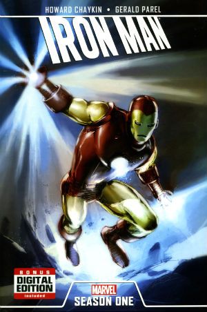
Oh, there was also Howard Victor Chaykin keeping Marvel sweet with an Iron Man OGN and that weird strip in that A+X comic (which a kind Savage Critic commenter alerted me to). This latter involved Black Widow and The White Queen flashing their breasts at a man until he puked. Because, Howard Victor Chaykin! Some even more magical pals of The Savage Critics sent me reports of Howard Victor Chaykin’s doings at conventions which were very much appreciated (SPOILER: he was a gentleman!). My thanks to all the lovely people who enable my crippling obsession! I have not named anyone because sometimes people don’t like that, but while the mental hygiene behind my thanks may be suspect those thanks are genuine. So, the year in Howard Victor Chaykin there, Actually I just blurted all this out so I probably got all the release years wrong and missed stuff and oh, dear, I have to go now. So, I might have missed something, do let me know. Oh, do!

Anyway, Howard Victor Chaykin: 2013 was another year we should have been glad he still bothered with – COMICS!!!

"At Least A Soldier's Enemies Are FLESH & BLOOD!"COMICS! Sometimes War Is Even Worse Than Hell!

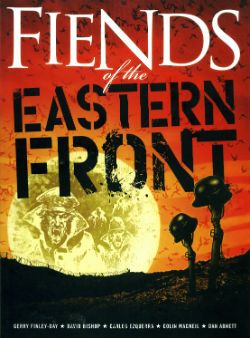
This time out it's a tale of Vampires in World War Two. COMICS! The gift that never stops giving!  photo FotEFWireB_zps038c4031.jpg Anyway, this... FIENDS OF THE EASTERN FRONT Art by Carlos Ezquerra, Colin Macneil Written by Gerry Finley-Day, David Bishop, Dan Abnett Rebellion, £9.99 (2010) Fiends of The Eastern Front created by Carlos Ezquerra and Gerry Finley-Day Originally serialised in 2000AD Progs 152-161,The Judge Dredd Megazine 4.17 & The Judge Dredd Megazine 245-252

 photo FotEFCovB_zps9db88648.jpg

At the stately age of 10 there were few pleasures which could compare with the arrival of a new Prog of 2000AD weekly, and only one which could exceed them; the end of a storyline. With the end of a storyline I would be free to pull all the relevant Progs out, crack open the biscuits and weak orange drink and get stuck in. Naturally, every week I would have read each episode of any given series but once complete a full re-read would be on the cards, and intermittently thereafter and for a far greater portion of my life than might strictly be deemed healthy. I got my money’s worth is what I’m saying there. This irregular revision of the strips of 2000AD probably accounts for the fact that when I saw a collection of Fiends of The Eastern Front listed I could maybe have sketched out several of the pages from memory and most definitely outlined the plot with a truly spooky degree of accuracy. Since I am no longer 10 this would have been the behaviour of a madman so I settled for ordering it.

 photo FotEFWhoB_zps2645abc0.jpg

In 1980 when this strip first appeared the three greatest works of Art I had been exposed to were Flesh, Shako and Fiends of The Eastern Front. How foolish and how very like a child this seems in retrospect. Now 30 years and change later I have experienced the movies of David Lynch, stood toe to toe with Rothko’s work in the Tate Modern, read Shakespeare and seen Batman Live. Consequently the three greatest works of Art I have now been exposed to are Flesh, Shako and American Flagg! Why then the loss of Fiends of The Eastern Front from the Kane canon?

The simple answer for those of you with a bus to catch is that it just isn’t up to snuff like that other stuff. But it’s still a far cry from awful. It had, after all, remained entrenched in my memory for several decades which is no mean feat for a strip which ran for a meagre 10 weeks and in toto comprises 44 pages. But what pages they are. Oh, what a nightmarish war. Oh, what pages Ezquerra and Finley-Day have gifted posterity. If posterity loosened its knickers a bit and appreciated them anyway.

 photo FotEFBloodB_zps5271b567.jpg

Gerry Finley-Day may be a name more unfamiliar to most than Carlos Ezquerra but he has his place in Brit Comics History; and it is hardly a negligible one. Like many of the men who would go on to change the face of British boys comics Finley-Day started being of historical interest in the ‘70s with his work on IPC’s girl’s comics. Here he and Pat Mills etc honed their skills writing as though they wished to seriously emotionally disturb their audience. They would carry this approach across to the boy’s weeklies Action, Battle and, of course, 2000AD. Although there are exceptions (Harry Twenty On The High Rock, Ant Wars) Finley-Day’s boy’s comic work was largely war orientated. On Battle and Action he appears to have had a particular penchant for The Good German (Panzer G-Man, Hellman of Hammer Force etc.) And if these did not influence a tiny Garth Ennis then I’m French. 2000AD had a ready made place for Finley-Day in its regular Future-War slot which he dutifully filled with enduringly popular series such as The V.C.s and, most notably, Rogue Trooper.

 photo FotEFDankeB_zpse402a696.jpg

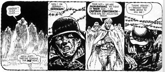
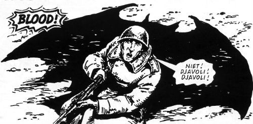
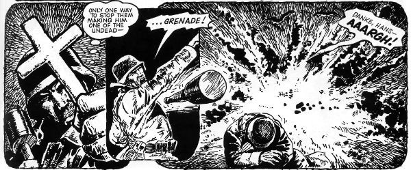
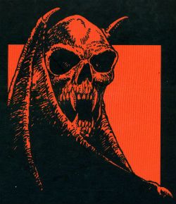
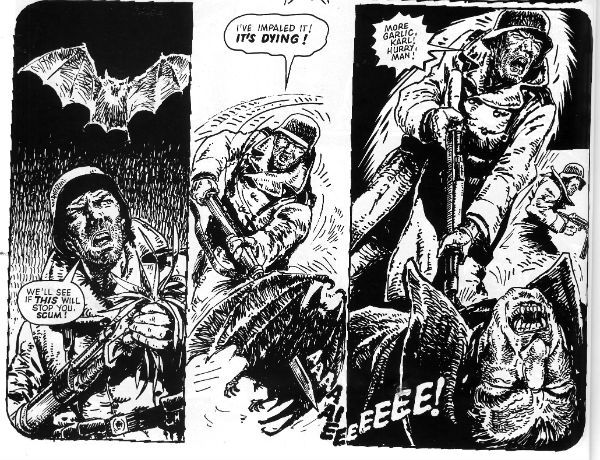
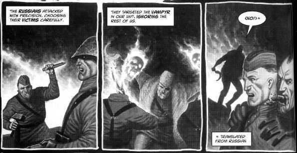
Fiends of The Eastern Front is a throwback to Finley-Day’s WW2 strips set as it is on the Eastern Front. Like his straighter stuff the main character is a Good German and like Rat Pack in Battle he is paired up with Carlos Ezquerra on art. Unlike any previous strip the pair had inflicted on the febrile male minds composing their audience here they doubled down on the horrors of this war with the addition of Rumanian vampires into the unholy vortex of the Russian Front. The first few episodes embrace formula with the Germans being attacked weekly by a new iteration of the Russian Army (tanks, Cossacks, paratroops, ski-troopers) which the Rumanian vampires best and leaving Hans Schmitt somewhat conflicted and questioning in the final panel. With the fith episode things turn around rather sharply for Schmitt and he and the entire German army are on the back foot of a sudden. Because it turns out that Rumania didn’t stay on the German side for the duration. And it’s at this mid-point the strip abandons any pretence of everyday logic and embraces the nonsensical non logic of nightmare. And becomes all the better for it. It becomes as outlandish as a fever dream and it succeeds as such because of Carlos Ezquerra.

 photo FotEFBackB_zps2767224a.jpg

In all fairness Fiends of The Eastern Front is not a fit testament to the scripting skills of Finley-Day. It is rushed, haphazardly plotted and clumsily contrived. It has the feel of a fill-in; something pulled out of a hat at the last minute to fill ten week’s worth of pages. Finley-Day rises to that (assumed on my part) challenge as best he can but the success of Fiends of The Eastern Front, the reason why it causes unease in me thirty four years later is due to two things: the suicidal pacing and Carlos Ezquerra’s dark, dark art. Pacing wise Fiends of The Eastern Front doesn’t just move it hurtles along like a sprinter with his hair on fire. The speed of Finley-Day’s script seeks to pull you through the pages at such a pace that you don’t have time to notice all the deficiencies. Because they are deficiencies, but they also don’t really matter. The pleasures of Fiends of The Eastern Front are more sensual than cerebral. And this works because Fiends of The Eastern Front is a nightmare and nightmares aren’t about thinking they are about feeling; they are about feeling fear. And if you want fear on the page you’re on to a winner with Carlos Ezquerra.

 photo FotEFStabB_zps31b5274c.jpg

Carlos Ezquerra may be one of the best horror artists in the business despite his forays into fear being far fewer than his war and S-F strips. He is, after all best known as the co-creator of Judge Dredd and Strontium Dog and, to more recent readers, his name will be hard not to associate with Garth Ennis’ war comics. As adaptable as his art is to many genres it always has the same base elements; grubby tickling and flat blacks, blunt faces and scrappy holding lines. He only has to punch these up a little and his tattily tactile and grottily grubby art seems Hellishly apt to the horrors on these pages. The misshapen and unclean aspects of Ezquerra’s art totally convince in their depictions of things that could never be, things that should never be.

 photo FotEFColourB_zps01b61aa1.jpg

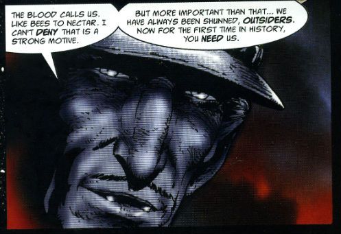
The book ends with a Dan Abnett 2006 reimagining of the strip with the addition of Ezquerra’s Strontium Dog character Durham Red. Most notably this reveals Ezquerra’s art has become more disciplined and focused without losing one jot of the essentially Ezquerra-esque qualities present in the 1980 strip. Additionally laid over the art is some lovely colour work in which browns and greys are played off against beautifully lurid purples and reds to queasy effect. Sandwiched between the two Ezquerra strips is a Dave Bishop and Colin MccNeil resurrection of the concept which appeared in The Judge Dredd Megazine.

 photo FotEFMacNeilB_zpsc6e4883d.jpg

Bishop’s Stalingrad set script is as (intentionally?) daft as Finley-Day’s original but MacNeil is less successful in diverting attention from this. Don’t get me wrong, MacNeil is a talented artist (with particularly great work showcased in Judge Dredd: America) but here his art is a little too stiff and defined in comparison to Ezquerra’s to survive unscathed. And also I wasn’t 10 when I read it although that’s neither Bishop nor MacNeil’s fault. In the end it’s mostly Carlos Ezquerra’s fault that Fiends of The Eastern Front is GOOD!

"Thor Has His Doubts About This One.." COMICS! Sometimes It's Gruff In The Age of Mjolinir!

Here's some words about a comic with Thor in. Do with them what thou wilt.  photo TVikWhatB_zps0c53cbd6.jpg

Anyway, this... THOR: VIKINGS #1 - 4 Art by Glen Fabry Written by Garth Ennis Coloured by Paul Mounts Lettered by Dave Sharpe MARVEL, $3.50ea (2003) Thor created by Jack Kirby, Larry Lieber,  Stan Lee and the people of Norway Dr. Strange created by Steve Ditko and Stan Lee

 photo TVikcoversB_zps7e8433ed.jpg

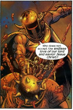
This 2003 limited series features the popular and girlishly tonsured hero Thor versus zombie Vikings. It is set in the Marvel MAX universe and is written by Comics’ toughest shave, Mr. Garth Ennis. Surprisingly Garth Ennis isn’t the star here and nor is Thor; the real star of this series is the genially grotesque art of Glenn Fabry. For a MAX series about Thor versus zombie Vikings in New York City the whole affair is relatively restrained. Particularly on the part of Garth Ennis. Quite possibly in deference to the real-life events of 11th September 2001; an event towards which eyes are obliquely lowered towards at a couple of points on these pages. While there’s some playful undercutting of the usual conventions of super hero comics (The Avengers get a royal battering; Thor is swiftly shunted to the sidelines) Ennis never really lays into the superhero concept as is his wont. He certainly doesn’t do that bullying overkill thing where it becomes less like reading a comic and more like watching a drunk squaddie man-dance on a student’s neck in a pub car park come closing time. The reason, I think, being Ennis just isn’t that interested in Thor;Thor's not worth it. To the extent that it doesn’t really read like a Garth Ennis Thor story at all. It reads like a Garth Ennis story that happens to have Thor in it.

 photo TVikyukB_zpsb808c8d9.jpg

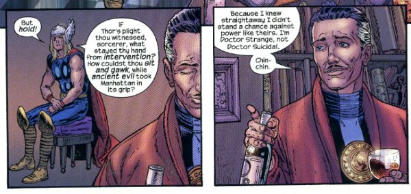
The generic set up’s the give-away; all that’s required is a titular hero you can blindside the reader by immediately side-lining, a chippy wizard who does all the work and a city of Enormous Symbolic Importance. So here we have Thor, Dr. Strange and New York City but it would have worked as well with Judge Dredd, Devlin Waugh and Mega City One or Superman, John Constantine and Metropolis. Sure, you’d need to shorten the hem and let out the waist a bit in each case but the set up would basically be a snug fit. Because this is a Thor comic here we have Thor and (seriously) Ennis isn’t really interested in Thor so Goldilocks gets a good hiding in short order from the zombie Vikings. Dr Strange (who Ennis isn’t interested in either even though he gets all the best lines) kisses the be-banged one’s boo boos better and gets the plot moving and hustles us into the bit Ennis is interested in. See, to battle the zombie Vikings (a very English sounding) Dr. Strange plucks three people from the time stream (amusingly visualised as a stream of Time) and it’s these which allow Ennis to play with his favourite toys. Selected for the First Team are a lady Viking (woman are as good as men at the worst men can do. Violence, I’m talking about violence there); a Python-esquely single minded Crusader (Religion; not the top of Garth’s Pops so rumour has it) and a Good German (if Garth Ennis has a dog I bet it’s called "Erwin").

 photo TVikStrangeB_zpsb51e4bb4.jpg

This bunch fight the Vikings while Ennis backs Thor into a ridiculously confined corner and then just shrugs and, metaphorically, has Thor turn round and open the door which was behind him all the time. It isn’t exactly tightly plotted is what I’m getting at there. It is, however, fast-paced, absurd and wryly inventive in its scenes of horror and violence; but best of all it is gifted with an artist who can do Ennis’ ridiculous flights of fancy justice;Glen Fabry.

 photo TVikChristB_zps726aee0b.jpg

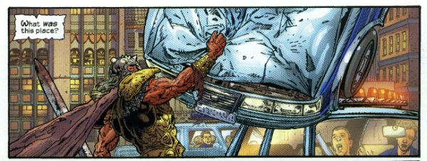
Of course Fabry and Ennis have previous form; Fabry provided painted covers to Ennis and Steve Dillon’s popular series about the undeclared homosexual love between a vampire and a virile idiot. Preacher, I’m talking about Preacher there. They’ve worked together since then (e.g. The Authority: Kev); enough so to suggest that Ennis has geared this script to the tastes of his artist. Glen Fabry’s wonderful art first lunged off the page at me in 1985 when he started illuminating Pat Mills’ Slaine series in 2000AD. Unlike his Preacher covers his art there was B&W linework and the subject matter of Celtic barbarians soon made him a dab hand at drawing the underdressed enthusiastically hacking away at each other. This comes in very handy here as his zombie Vikings have a physical solidity and air of authenticity which make the ridiculous concept peculiarly plausible. The early scenes where the Vikings are behaving badly in their own time are highly convincing but it’s when the magically animated anachronistic dead start acting up in NYC that the art becomes most captivating, and the appeal of Fabry’s skills become most apparent.

 photo TVikCarB_zps7329c247.jpg

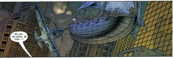
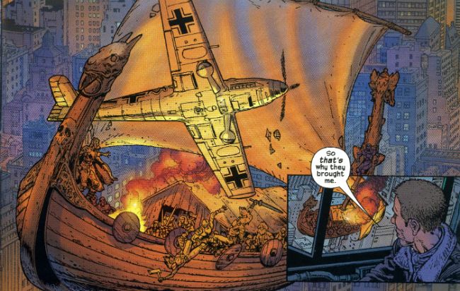
The credibility Fabry’s detailed art has given the time shifted terrors in the earlier pages is carried straight-facedly into the more modern milieu in which they massacre like massacre’s are going out of fashion. The hard won visual integrity of these impossible figures allows Fabry to pull off the frankly preposterous demands of Ennis’ imaginative, but cursorily plotted, script. Severed heads piled so high they block a street; Fabry’s the man with his rubbery mugs which flinch just short of caricature. A dogfight between a levitating longboat and the last of the Luftwaffe in the sky alleys of the Big Apple; Fabry’s the fella with his melding of research and chutzpah.

 photo TVikBroughtB_zps84e2cde8.jpg

While Fabry’s art is grounded in realism there’s an amiability about it which lends it a degree of flexibility. It’s more cordial than the chill of po-faced photorealism and this openness allows his art to embrace unreality just enough to make the impossible, well, probable at least. In its attention to detail Fabry’s art is very similar to the art of another talented 2000AD alumnus, Chris Weston. If Weston’s clench jawed and detail dense art were on muscle relaxants. Of the Old School Fabry’s art harks back to Hogarth (Burne not William; the 1700s is a bit too Old School, cheeky) both of them sharing a preoccupation with anatomy but Fabry’s figures are more placidly posed than Hogarth’s often frenetic excess in this area. It is of course excessive indeed to place skills of Fabry’s calibre in the service of, um, Thor versus zombie Vikings in the MAX universe. But then there’s little point to Thor versus zombie Vikings in the MAX universe other than the excess, which I guess is why Fabry’s art elevates a sloppy but fun wisp of a thing to GOOD!

Thor versus zombie vikings in modern day New York is very much - COMICS!!!

Two-Sentence(-ish) Reviews by Abhay (Who has That Cold That's Going Around)

VELVET #2. I thought the first issue was incredibly generic, but I was a minority opinion enough there that I tried the second and third issues anyways. Boy, sometimes I am incredibly NOT wrong!  

VELVET #3. Still, it's a spy comic, so it's in my wheelhouse-- I could see myself inertia-getting more of these, even if it's not very interesting or entertaining yet, just boy-howdy generic. While I'm not sold at all on Steve Epting (I'm not really into the whole Alex Raymond school of comics), Elizabeth Bretweiser always makes whoever she's working with look good, better than they are-- she's been critical on any comic I've ever seen her on, at least.

SEX CRIMINALS #4. They ran out of things that are funny about sex, I guess, because now the main character is using her Sex Superpowers to avenge date rape...? The comic works in getting you to care about this relationship between the lady and the creepy guy (he's a creep, right? we're all on the same page there?), so it works as a story, if not the whole jokes/laughing/mirth thing that I usually look for in a comedy (p.s. ...comedy...?).

ASTRO CITY #7. I like the move on this one, a character whose powers come from public support having to deal with a public relations crisis...? Kind-of emphasizes what makes the book work: more than one story with that premise would be insufferable, but seeing one story with that premise sounds like a decent time.

ASTRO CITY #8. Less into this one: I'm sure there are readers who want to see Samaritan fight the Confessor, or Astro City's version of SHIELD in action, so this one's for them, I guess. Felt like a stepping-stone issue: more of a middle-of-the-road superhero comic, but necessary to lay out the stakes of the public relations crisis in the background, I suppose.

FIVE GHOSTS #7. Never read one of these-- impulse buy; some guy who's friends with ghosts has to go on a pirate adventure involving magic stones or saving a lady or something. I thought it was interesting how much the art seems influenced by Erik Larsen; I like Larsen, but... it just seems like an odd choice, considering all the choices a young fella has in that regard anymore.

PROPHET #42. Another Die Hard comic-- not as epic as that last one, just a story about Die Hard having an adventure (one I'm not entirely sure I understood-- at least the "Vision" part of it). Ron Wimberly's pages are fun to look at-- I especially liked the weaponized sound effects.

SAGA #17.  Even though I can see how Vaughan's built himself get out of jail free cards into the story (which I figure he'll use for at least one of the book's three big moments), I found this issue pretty involving. I can see how Saga's schticky-dialogue and overall preciousness can be turn-offs, but occasionally, it's a mean little book-- those are the bits I'm reading for, at least.

X-MEN #16. I tune in once in a blue moon into Bendis working these X-books since he seems to have taken to them, but the last impulse buy I had in this direction was this horrifying thing involving Bendis's idea of what a "girl's night out" is like (i.e. ladies going shopping)(p.s. the shopping got interrupted by crossover hooey)(p.p.s. because of course it did). This issue's a fun one again though, or at least, seems to me something about Bendis and Bachalo doing Magneto comics gets those guys right into the zone or at least me in a more appreciative headspace than I am with shopping-comics (except Bachalo colors himself, and he's copy-pasting cloud photos into his own comics, which I truly wish I didn't know was  happening).

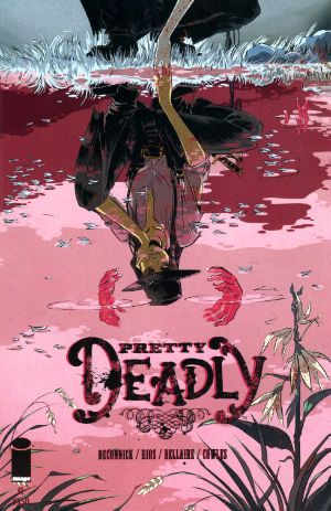
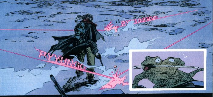
PRETTY DEADLY #3. I don't know if finding out what's at stake is something I'd ordinarily recommend you should want to save for a third issue-- that second one was rough going for me at least, but now that some stakes are laid out (good stakes, I think-- emotional stakes), I finally get to be interested to see what happens next for a story reason instead of just "wanting to see the creative team do them some weird shit," which is what fueled me before, exclusive-like. Plus, I understood this issue the first time I read it, so I felt pretty happy of myself.

ZERO #4. I liked the bit where the cars went into the tunnel-- if I've seen that before, I can't remember where (or it's somewhere class, like Akira or Golgo 13). I wasn't hot for #3-- the whole kickstarter for terrorism bit, the bit where a terrorist doesn't like that kids die from terrorism (?), the teleportation bit, too many busy bits, too many distractions (even if Velvet could use some of that energy)-- so I preferred this one's "talking then killing" structure, that this one just kept it simple and did the thing.

"G'wan And STARE At Me. I KNOW I'm Not Pretty!" COMICS! Sometimes They're So Fine They Blow My Mind! (Hey, Mickey!)

In which I carved out a bit of free time at the weekend and chose to spend it with you worshipping at the altar of Mike McMahon. Just like any sane person would.  photo LoDHimB_zpsbf146653.jpg

Anyway, this...

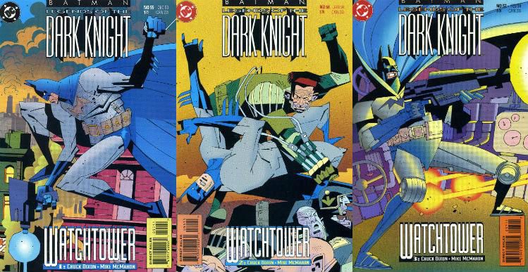
BATMAN: LEGENDS OF THE DARK KNIGHT #55-57 Artist: Mike McMahon Writer: Chuck Dixon Letterer: Willie Schubert Colourist: Digital Chameleon DC Comics, $1.75 each (1993) Batman created by Bob Kane

 photo LoDCovers_zps07c1206d.jpg

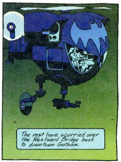
These three issues comprise the self contained and out of continuity Batman tale Watchtower. The comic itself, Batman: Legends of the Dark Knight, specialised in such tales. This title delivered a surprising number of accomplished tales from a talented and varied array of creative minds and hands; certainly at least for as long as Archie Goodwin was at the editorial helm. The attraction in this arc for me was very much the magic of Mike McMahon. Now, Chuck Dixon does a fine job, don’t get me wrong. Like a TV version of Miller’s Dark Knight Returns Dixon’s story is of a near future Bruce Wayne pining for the colourful criminals of the past. Here though none of the colourful loons conveniently return and so Batman must confront the banal but no less evil prospect of Privatisation (and its co-joined twin Corruption). Craft wise it’s spot on; Dixon hits all the beats. You know, those beats the comic book writers are always going on about. He doesn’t use narrative text either; just dialogue. I know! It turns out you can write a well paced entertaining story which makes sense by combining just dialogue and art. (Actually it turns out people have been doing it for decades, but shhhh!) Yes, Chuck Dixon provides a strong script; one so strong I suspect it would have succeeded in entertaining the reader had most anyone drawn it. That’s not faint praise but that’s all he gets because most anyone didn’t draw it; Mike McMahon did.

 photo LoDHatchB_zps866e9578.jpg

Before I demonstrate my love for McMahon’s work on these pages (work he has dismissed as awful) in the usual storm of horseshit hoping to pass for art appreciation let’s talk about Mike when he was but a tyke. The first time ever I saw Mike McMahon’s art was on Judge Dredd in the weekly British comic 2000AD in 1977 AD. Turned out that was his debut. McMahon, the scent of Chelsea Art College still lingering in his puppyish nostrils, was called in to pinch hit due to editorial shenanigans centering around Carlos Ezquerra. That’s why his early stuff looks like Ezquerra – that’s what he was told to do. And, bless his gifted mitts he did it. But, leisurely, he stopped doing it.

 photo LoDCopterB_zps2bc5d8ad.jpg

As the years passed it was clear McMahon was developing his own style under cover of The Carlos. Initially grubby and giving the impression of portraying a world made of compacted scabs there was soon a sense of flakiness to McMahon’s art, as though a slow act of shedding was underway. In strips like Ro-Busters and A.B.C. Warriors there is a definite impression of McMahon’s Ezquerra-isms swelling as though from internal pressure. It’s true, I tell ya; his figures become bloated and even have strange flecks drifting off them. And then his art, primarily on Dredd in this period, seems thereafter to suddenly retract, fitting itself tautly around a new wholly McMahon framework of geometric precision. But it didn’t stop there; McMahon’s art kept going (and it is still going), kept fresh with refinements both calculated and accidental. (How his outstandingly appropriate woodcut style on Slaine was the unexpected result of a new method involving Bristol board, markers and tracing paper has now passed into Legend.) Then he got ill. A couple of years passed and he came back strong with The Last American for Goodwin’s EPIC imprint. McMahon, being notoriously self critical as he is, was unimpressed by his work there but Goodwin knew the real stuff when he saw it and so (I assume) threw McMahon this assignment. But like San Francisco’s favourite cop you don’t assign McMahon you just turn him loose.

 photo LoDLayersB_zps4afa3782.jpg

Loose being the last word you’d apply to McMahon’s work here. Meticulously constructed from the most basic level as it is to reflect the comprehensive vision of Mike McMahon. A vision which embraces the two dimensional nature of comic art like no other. Looking at Mike McMahon’s art is like looking at the world through the eyes of an alien creature. You can tell what everything is but everything is off.  Yet in relation to each other every element is clearly related to the same perceptual set. It’s the flatness that gets me. Usually that would be a pejorative term obsessed as comic book art can tend to be with verisimilitude Here though realism is out of the window. Indeed, McMahon’s art seems to imply that if you want realism then look out the window because right here, pal o’ mine, is something better than reality. Something other. Something no one else could produce. Something that you won’t get anywhere else. I could have just said it was unique but I have a reputation for going on a bit to maintain. Standards and all that.

 photo LoDWhudB_zps1db7eecd.jpg

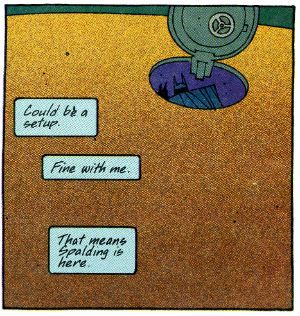
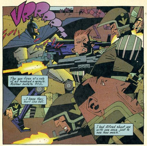
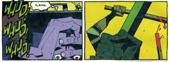
Surprisingly given its unique nature McMahon’s art isn’t hampered by the involvement of other hands. I have no idea whatsoever if there was any level of communication between the various parties but if there wasn’t then what we have here is the happiest of artistic accidents. Willie Schubert’s font in the speech bubbles and the Sound FX, with their slanted angles and hand crafted air have a very McMahon feel to them. They seem a part of the art. There’s a killer sequence where a hood is beaten by security specialists and the SFX appear in the panel showing a witness quailing in fear, but they are then absent from the next panel which shows the risen clubs. I described that quite tediously but the actual success of the effect is indisputable. You’ll notice there is only the slightest indication of motion in the image of the clubs (the blood on te rearmost club). McMahon eschews motion lines throughout. Usually he’s designed the image in a panel to lead the eye in such a way that the implicit motion is conveyed. Sometimes though ,as in a panel where a club strikes a head, the only clue to motion is the presence of a SFX (“WOK!”).

 photo LoDSkylineB_zps1006d617.jpg

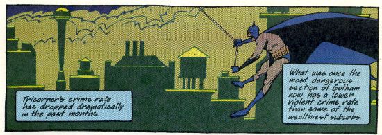
Digital Chameleon’s colours are noticeable even to me and I am notoriously inert in my appreciation of comic colouring. However, they don’t stand out because they jar or if they jar they are meant to. The palette of lime greens, midnight blues, soiled yellows and popping reds all provide another level of visual interest at the very least. And at their very best they collaborate with McMahon’s images in achieving the effects he’s reaching for. Particularly when it comes to the layering of the image. McMahon’s very keen on layering the elements in his panels. His panels can be many layers deep but each layer is distinct and the illusion of depth is the result of their distance being adequately conveyed. It's akin to those fuzzy felt pictures you used to do as a kid; if you are super-old like me. Anyway, there are panels where the colouring quite blatantly enhances this effect. In these issues i was pleasantly surprised to find that McMahon’s work adapted well to the many hands make light work ethos of North American genre comics; something everyone involved gets a high five for.

So, yeah, Mike McMahon did a Batman comic back in the day. Mike McMahon probably doesn’t like it and I can’t conceive what fandom of the day made of it, but I thought it was VERY GOOD!

But then again Mike McMahon is – COMICS!

“As You Love Me.” COMICS! Sometimes It's London Calling!

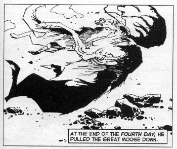
Let’s start off 2014 with a panel that fair throbs with magnificence:  photo CoWMooseB_zps386c8a5d.jpg

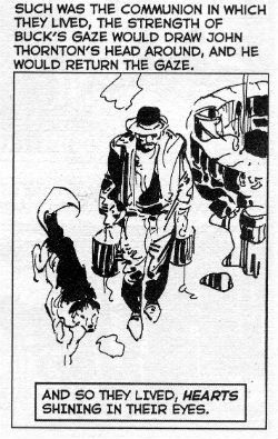
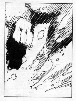
That there being Dog vs. Moose by Alex Nino from Alex Nino & Neil Kleid’s adaptation of Jack London’s The Call of The Wild. Kids, use your nascent psychic powers to guess what I’m on about this time!

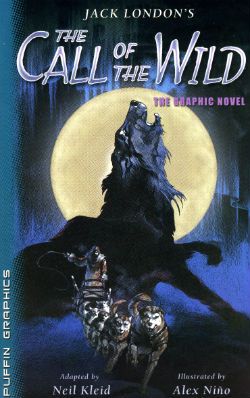
Anyway, this…  photo CoWCovB_zpsef9116ce.jpg

Jack London's THE CALL OF THE WILD Illustrated by Alex Nino Adapted by Neil Kleid Puffin Books, $10.99 (2006) Based on the original novel by Jack London

Those not hammered to the brink of psychosis via Holiday overindulgence will have already deduced that what we have here is a paperback adaptation of Jack London’s "immortal classic" The Call of The Wild. Despite London’s book having been around since 1903 I’d never actually read it. It was one of those books that when a child one’s parents would heavily suggest one read and was thus one of those books one strenuously avoided. And as is so often the case it turns out I’d been robbing myself. Turns out Jack London’s The Call of The Wild is a pretty damn good book, combining as it does two perennial childhood favourites; snow and cruelty to animals. Technically, I guess, I still haven’t read it but I have read a graphic novel adaptation by Alex Nino and Neil Kleid which was good enough to suggest I should have maybe gone to London sooner.

So, for all the other insolent children of the world: The Call of The Wild is the tale of a dog called Buck who is torn from his pampered life of domesticated bliss and thrust into a harsh world of servitude in the Klondike Gold Rush. As civilisation is quickly shredded by the brutality of the wild Buck finds nature has equipped him better than any human for survival. The unsentimental conclusions London reaches about nature vs nuture are tempered by the mutual respect and admiration that grows between Buck and The Man, Thornton. I would have used the word love there but this late in the world’s day that would only be incitement to snickering. They really hit it off is what I’m saying there. And then, ah, and then

 photo CoWHappyB_zpsc722877a.jpg

Upsettingly it transpires that Jack London died at the youthful age of 40. On the plus side, for us anyway, he did so after writing his way out of poverty via a series of extraordinarily popular novels (and more importantly - good novels), these being based on a couple of periods of hard scrabble living he endured along the way. Obviously you don’t have to be savaged by wolves to write about being savaged by wolves; that’s what imagination’s for. But if you have been and they leave you enough fingers to set it down in words it’s probable that authenticity will give your work a little extra kick. Of course, you do still have to be able to write. Being savaged by wolves isn’t going to make up for any lack in that department. (But it’s worth a try, Dan Brown!) What I’m getting at is; Jack London wrote from experience and he wrote well. Sure, in the book at hand I’m experiencing his words at a certain remove but they are still his words. For the most part Neil Kleid’s smart enough to step out of the way and let London’s language determine the course for the most part. While largely blunt and simple, as befits his subject, London’s words via Kleid glare with brilliance in brief and arresting bursts. Now, “..his anger swelled like a kidnapped king.” are not, I believe, London's words precisley but they lose none of the magic for having been adapted.

 photo CoWSpeedB_zpsf865117a.jpg

Here Kleid arranges London’s words to sit atop Alex Nino’s striking images. Alex Nino (b. 1940) is a Filipino artist whose work I first recall seeing in ‘70s DC Mystery comics (House of Mystery, House of Secrets, House of Secret Mysteries, Secretive Mysterious House, etc). His art was striking at the time and it is striking still. Not literally, no, but close; I do feel like I’ve been slapped whenever I look at his pages. In a good way; suddenly refreshed and attentive. He’s kept on going and kept up the same high standard all the way. The last time I saw his work was in the Image Comics series Dead Ahead which was about zombies on a boat and was visually insane. Seriously, I’ll have to dig that out; it’s nuts. The big thing about Nino’s art for me is how it teases incomprehensibility without ever actually falling into it, or if it does you don’t mind. Well, that’s when Nino has his druthers anyway, which he hasn’t here so it’s a far more sedate and populist performance on these pages. It’s still Alex Nino so it is still pretty spicy stuff.

 photo CoWSadB_zps3faecb81.jpg

Like Joe Kubert, Nino knows the best way to draw snow is not to draw snow; so most of these snow set pages consist of whiteness. There’s no short-changing though; Nino makes what ink there is work like a harried sled dog. His figures, flora and fauna are reduced to, mostly, rough assemblages of lines; the close proximity of one to another is the only clue that they delineate the same shape. At times Nino seems to be testing how dispersed he can make his lines and still ensure the reader’s eye can herd them back together as a dog; a bush; a party of three with a heavily laden sled disappearing under fracturing ice. Maybe he’s having a bit of fun with the fact that the conditions he’s drawing are so elemental and thus reducing his work to its elements. Probably not.

 photo CoWNinoB_zpse2935ef8.jpg

In keeping with London’s unimpressed view of humanity under duress Nino’s lumpen tuberous fizzogs give everyone the look of grumpy goblins. Everyone, that is, except The Man, Thornton, who is drawn in the classical hero mould and so stands out visually from his fellow humans as much as London’s text would wish him to. Throughout Nino’s art is smart and sophisticated but he’s smart and sophisticated enough to know simplicity works too; the eye is always drawn to Buck as Buck is given heavy black markings which make him immediately stand out in any given panel, largely white as they are. Fans of Nino will be pleased to note several panels of Pure Nino (a group of dogs that resemble crystal automata; a primordial vision via Nino’s signature fantasmagoria). He’s one talented son of a lady. The book closes out with a nice chunk of backmatter with script pages, sketches and preliminary layouts. From this it appears Kleid specified the page layouts for Nino. They aren’t high art but they don't have to be they just have to work, and they work well in that they carry the reader through the pages unobtrusively. Ideally, I think, at some point the reader should forget they are reading and just be reading; the simple layouts achieve this. Additionally, their basic nature provide a necessary buffer, an essential corral, for the signature manic intensity of Nino’s art.

So, yeah, dogs, violence, emotions, great art by Alex Nino, a thankless task well executed by Kleid (good use of black panels, sir), great source material; The Call of The Wild is VERY GOOD!

"If This Was Dinner...I Can't Wait For The Cabaret!" MOVIES! Sometimes...The Year Must Die!

So, I didn't get near any comics this Holiday but I am always writing nevertheless. In my head mostly. So, although I haven't got anything about comics I have got a head full of dumb words about some Peter Cushing films I watched this year. Usually I just dump this head written stuff into the ether but I felt like posting something and this was all I had. So I dumped it on you. Attractive, non? Anway; an old man, some old movies and a spatter of tired old jokes. What better way to see the New Year in. Have a drink, it'll read better that way. Everything's better when you're insensate with drink. That's what it's for. Oh yeah, Happy New Year everybody!

Oh yeah, none of these are Oscar(C) winners in waiting but they are all fun so they are all GOOD!

All images taken from Wikipedia.

TWINS OF EVIL Directed by John Hough Screenplay by Tudor Gates (Based on characters created by Sheridan Le Fanu(?!?)) Music by Harry Robertson (Hammer, 1971)

 photo TwinsB_zpsf27a2317.jpg

Yes, there is a joke there isn’t there? One about breasts; but I won’t be making it. Knock yourselves out though by all means. Then try and look your mother in the eyes, pal. In this movie, the quality of which is indicated early by the choice of Hot Electric Pink for the titles, Peter Cushing plays Gustav Veil whose surname is not only an anagram of “evil” but is pronounced “vile” and that’s about as restrained as this one gets. Seriously, there’s a bit where a lady is enjoying the physical attentions of a gentleman and the camera zooms in to show her hand lightly gliding up and down the shaft of a candle. Y’know, like a penis. Keep up. Anyway, Peter Cushing, equipped with a buckled hat, blithely classes this silly exercise up in his role as a Puritan who roams about at night with his Puritan pals burning single young women as witches. Cush & Co. average one a night which suggests that there is a preternaturally large population of single young women in and around his village or someone is bussing them in so Cush’n’chums can have their fiery fun. It’s testament to Cushing’s performance that when someone says Vile “means well” despite there being nothing in the script which indicates he is anything other than a murderous misogynist you do actually think, oh, maybe he’s just a tad, a smidgen perhaps, overzealous. So anyway, his twin nieces, or what have you, come to stay and one’s a bit of a scamp and is lured into depravity by the sleazy Lord of the manor who has been en-vamped. Unfortunately he’s played in a way that’s about as threatening as a doily. After a few creepy scenes of young women leading old men on (“What would your Uncle say?” Urrrggghhhh. No thanks, 1970s.) and flashes of flesh it’s all boiled down to The Cush vs the fanged doily man for the souls of his flock! There’s some mileage in that; the bloke who was seeing Evil everywhere where there was none now has to deal with real Evil right in his own home. But, basically, this movie prefers to find excuses to chuck some knockers up on the screen.

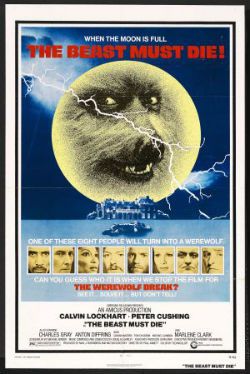
THE BEAST MUST DIE Directed by Paul Annett Screenplay by Michael Winder (From the short story by James Blish) Music by Douglas Gamley (Amicus,1974)

 photo BeastB_zps71ece143.jpg

This mangy but loveable cur of a movie has a spectacularly inappropriate theme tune. Oh, It’s really good, don’t get me wrong but it’s the kind of swinging up-tempo floor shaker more suited to a title sequence in which Oliver Reed checks out ‘birds’ from his Union Jack mini as he tootles down Carnaby Street. Here it sits oddly atop a movie about a bunch of weird people lured to an island retreat by a big game hunter who believes one of them to be a werewolf. The most dangerous game of all just got dangerouserererer! I can’t lie; it’s a bit dull beyond the campiness but it does perk up whenever Peter Cushing uses his fantastic accent, someone dies or when everyone has to fondle a silver bullet in a game of Pass The Death Sentence. Oh, and there’s an exciting bit where our superfly hero hounds the werewolf in his helicopter and tries to machine gun it. Mind you, that last bit now looks like nothing more than a man shooting at a very large German Shepherd and inadvertently ruining someone’s potting shed in the process; I can assure you that was very thrilling when you were 10. But then so is hopscotch. Near the end a ticking clock fills the screen and you have to guess who the werewolf is. I don’t know how the movie knows what you’ve guessed but every time I watch it it’s (SPOILER!). I’m not saying the movie struggles to fill its screen time but it will find a favourable reaction amongst people fond of watching Michael Gambon driving about in a jeep.

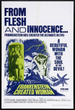
AND FRANKENSTEIN CREATED WOMAN Directed by Terence Fisher Screenplay by John Elder (Anthony Hinds) Music by James Bernard (Hammer, 1967)

 photo WomanB_zps9412fc36.jpg

In which Frankenstein doesn’t but what he does do is trap the soul of a wrongly executed man in the body of the guy’s disfigured girlfriend; she having drowned herself on seeing his execution. Together with Thorley Walters (played by Eddie Izzard) Peter “The Cush” Cushing as Baron Frankenstein fixes her face (and her hair; Blonde Contretemps by Boots) and everything turns out just dandy, thanks. No, no it doesn’t, you fool! See, the soul of her boyfriend makes her hunt down the three fops who not only teased her about her face but , worse even, murdered her father and left her beau to take the rap. Some people probably say that the scenes where a man in a woman’s body seduces then murders his/her victims are ripe with trans gender subtext. Well, they might if they weren’t distracted by the fact that the victims are all dressed like Willly fucking Wonka. Anyway, if The Baron had fixed her face in the first place all that unpleasantness could have been avoided. So, basically, it’s a movie about getting your priorities right.

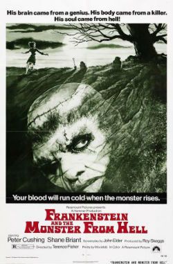
FRANKENSTEIN AND THE MONSTER FROM HELL Directed by Terence Fisher Screenplay by John Elder Music by James Bernard (Hammer, 1974)

 photo HellB_zps0eb5a0b0.jpg

This is the one in which Peter Cushing plays Baron Frankenstein one final time. It isn’t the best send-off but Peter Cushing doesn’t flag and nor does he falter. So, The Baron is now covertly running an asylum he’s supposed to be banged up in because he’s got the goods on the pervy dude in charge. He’s landed on his feet but his hands are giving him grief. His burned mitts are hampering his quest to stitch together the mentally unhygienic into a perfect man. Good thing then that Shane Briant (played by Twiggy) gets locked up in his gaff. And it is lucky because not only is Shane a surgeon in training he is also The Baron’s biggest fan. What are the odds? They are good, my friend. Anyway these two knock up a makeshift man who looks like a shaved ape and has a penchant for sticking broken glass in people’s faces. Shane Briant is also feeling moral pangs about The Baron passive aggressively badgering the inmates into committing suicide so he can play pick’n’mix with their parts. Oh, Madeline Smith wafts about the place as well giving the place a woman’s touch and some pathos; a bit anyway. Anyway, everything goes tits up pretty quickly. It’s possible to read the film as an indictment of the parlous state of the care of the vulnerable and how, without regulation, the gaolers become worse than the gaoled; but, basically, it’s a movie about how if you’ve got Peter Cushing in a top hat you’re sorted for 80 minutes and change. Cush Fact: the feathery wig sported by the great man himself is the exact same toupee which adorned his magnificent bonce in And Now The Screaming Starts… which, ah, here it is now…

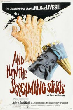
AND NOW THE SCREAMING STARTS..! Directed by Roy Ward Baker Screenplay by Roger Marshall (David Case) Music by Douglas Gamley (Amicus,1973)

 photo ScreamB_zpsa015bead.jpg

For about 40 minutes this enjoyable but not exactly good period set horror film consists of scenes of Ian "The Saint" Ogilvy and Stephanie “Powders” Beacham reacting badly to odd events in a stately home. A severed hand, a slashed portrait, something going bump in Stephanie Beacham’s night, a Richard Harris impersonator and hushed references to something terrible bad in the past combined to leave me clawing for clarity and wondering if I was suffering another dry drunk or what. Thankfully at that point Peter Cushing sauntered into the movie and delivered a performance which managed to make the whole thing watchable at least, and this is despite his sporting the aforementioned alarmingly feathery wig. Actually I spent a lot of time looking at this unsettling hairpiece so I could have missed some nuance or subtlety in what followed. It’s doubtful though as what followed not only had Patrick Magee pretending to be strangled by an invisible severed hand but also featured Herbert Lom as a not entirely convincing example of the landed English gentry who lets things get out of hand; sparking all the unpleasantness off with a poorly considered decision to reinstall the droit de seigneur tradition. From then on Cushing attempts to combat superstition and supernatural vengeance with the new-fangled Science Of The Mind! It ends badly for everyone involved. Where is your science now, Peter Cushing!?!

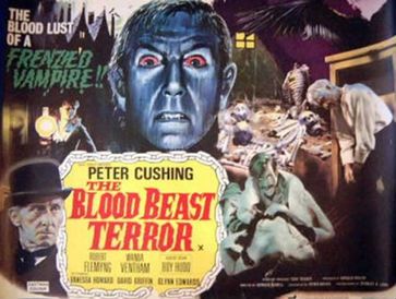
THE BLOOD BEAST TERROR Directed by Vernon Sewell Screenplay by Peter Bryan (Trigon, 1968)

 photo BloodBeastB_zps4e8f1566.jpg

This is the one with the lady who seduces men, turns into a big moth and kills ‘em. I see no subtext. Probably because there isn’t one; the script has it all on trying to make sense. Which it doesn’t but when did that ever matter; just entertain me, you mad fools! Peter Cushing is on record as claiming this is the worst film he ever made. Steady on, old boy; that’s a bit harsh. I mean even I haven’t seen every film Peter Cushing ever made but I think maybe the proximity of filming to his wife’s death coloured his judgement. Don’t get me wrong it’s quite, quite terrible but it is not without its charms. There’s Roy Hudd popping up to give the 1970s version of an amusing cameo(i.e. it isn’t; amusing that is); Cushing’s fellow plod is played by Dave the barman from Minder; some good performances convincingly delivered in spite of everything; an electrifyingly perfunctory climax in which Peter Cushing and Dave from Minder set fire to some piled up leaves, which the moth cannot resist and so meets its fiery end. And then the credits whizz up the screen. One of the things I never noticed about these movies until this re-watch is how tight they all are with film. No sooner has the final line slipped into silence than BANG! THE END! CREDITS ROLL! They might as well have someone shout "That’s yer lot! Ain’t ya got homes to go to! Fawk off home! G’wan! Whaddya want, Jam on it? Home! Now! Go!"

Speaking of which…THE END.

Happy New Year!

Abhay: 2013-- Another Year that I Mindlessly Consumed Entertainment

Here are some Year-end Best-Of Lists-- no one else was writing those, so I thought I would be the only person to do that.

BEST TELEVISION

I didn't watch anything on HBO or Showtime this year, and I didn't feel like I missed anything. I didn't see the Game of Thrones hoo-boy episode or the Homeland this-or-that. There's too much. There's too much. Here's what I saw instead:

10. Black Mirror - "White Bear"

9. Luther -- Season 3, Episode 4 -- Series Finale

Hannibal and Les Revenants (The Returned) were fun pulp shows, but for total satisfaction, nothing came close to the finale of Luther. I don't involuntarily cheer TV shows too often; this episode, I cheered twice. An ending I hope they leave alone.

8. The New Girl -- "Virgins"

7. Arrested Development -- "Señoritis" (The Maeby episode)

I hated how this season got received, in that ... After years of hype, Netflix dumped fifteen long episodes all at once, and within about 2 hours, the same websites responsible for that hype, there were negative reviews, noise about "disappointment", insta-reaction backlash. First! Congratulations on being first with your fucking opinions, you glorified comment sections. And then in a month, it was like this show never happened.

I'm not saying you can't have a thoughtful negative reaction to that 4th season-- what an imperfect season! But to see a work with so many interesting angles to it get boiled down and wasted on just being more fuel for their dumbfuck tweet noise machine ... What a bummer. Is that what art's going to be like now? Fuuuuck.

Anyways, the Maeby episode, I just thought was the best, in that... Everything that made that season interesting to me-- seeing that family fall apart without one another, seeing their mistakes snowball over longer spans of time, their scheming coming across differently once the characters became lonelier and lonelier-- all of that hit more and hit hardest in the Maeby episode. It seemed like the show at its darkest and fucking meanest, even though I thought it was still a pretty funny episode.

I've never seen a sitcom where you get to watch the child actor get screwed up over however many episodes by their dysfunctional family and then actually become a screwed up adult, as a result of that bad parenting on display in the funny sitcom episodes, while staying funny, staying a consistent comedic character the entire time. That felt new, and worth celebrating.

6. The Chris Gethard Show - "The Villain's Journey" 5. 30 Rock -- "A Goon's Deed in a Weary World"

4. Person of Interest-- "Relevance"

One of my favorite things about the show is even three years into the show, people are screaming, "Look out! It's... it's.. It's the MAN IN THE SUIT." Because they never gave Jim Caveziel's character a name like Batman or anything, so everyone just yells "Man in the suit!" Man in the suit! But the thing that makes this episode is great is the focal character is someone else for a change, a new character, such that when Jim Caveziel finally does show up in the background, lurking and all intimidating... You do have to kinda admit, if you saw him on the street and had to describe him, you'd probably say, "holy shit, this man in a suit showed up."

Sometimes I like this show so much that I think about reading Batman comics when it's not on because maybe the people writing those are taking notes, but then my head clears up...

I imagine this episode would make a nice double-feature with that Joe Carnahan episode of The Blacklist. (But the second episode of Carnahan's two-parter, the part he had nothing to do with, kinda bit-- that show's still figuring things out).

3. Mad Men -- "In Care Of"

I know a lot of people who don't care for this show. And that's fine: I just don't know that you can appreciate what this show has accomplished watching any one episode, at this point. Season after season has meditated on how much people can change, with last season culminating in this lush, sinister exclamation that they they can't, that people are trapped in their cycles because of the poison of the world they're stuck in. This season, a season of misery, ends with this beautiful, spare scene that finally allows for the possibility that they can, as painful as that might be. And so I don't know what to say to someone who doesn't like this show -- "Just watch 5 years of it because oh my god, moving!" The show doesn't work as a soap opera (as much as fans made a bizarre spectacle of themselves trying to make it one this year) or as "entertainment"-- but I find it a great pleasure just to watch a show that really contemplates how slowly things happen in people's lives and the time it takes for things to finally come to a head for them...

2. Parts Unknown - "Tokyo"

Parts Unknown has had amazing hour after amazing hour after amazing hour. Anthony Bourdain has exploded what a cooking show can be and uses it now as a launchpad to talk about anything, everything (also: to insult Creed and Nickelback a lot). Everybody eats-- it seems like a simple idea, but as Bourdain tours all the world's darkest corners, that idea begins to seem more and more profound. I could put any episode here-- the Copenhagen one! DETROIT! But this one, so dark and strange, sex-soaked, hentai-soaked, alien, pulsing. I just think the fucking world of this show.

1. Breaking Bad -- "Ozymandias"

WORST TELEVISION

On the one hand, I didn't see Sex Box, the British reality show about people who have sex in a box. So I don't know for sure how bad that got. But on the other hand, I did see more than one episode of Agents of SHIELD. ... I have to go with my gut and my gut says that Sex Box probably had more surprising plots and more interesting characters than Agents of SHIELD.  It just stands to reason...

BEST COMICS

I missed some major books this year, as usual. I'm still way behind on the Hernandez Bros. in particular; I'm waiting on my copy of that Blutch book So Long, Silver Screen and Frank Santoro's Pompeii.  I wasn't a very adventurous reader this year for the most part, so with those caveats,

10. "The Long Journey" by Boulet

9. "Hawaii 1997" by Sam Alden

8. Hellboy in Hell, by Mike Mignola

7. "Mars to Stay" by Brett Lewis and Cliff Chiang, from the DC-Vertigo Witching Hour one-shot

8 pages aren't a whole lot, but this comic managed to sell a plot about space exploration, reality shows, sex, horror, capitalism, desparation, and survival into 8, without it ever feeling cramped. Brett Lewis wrote the Wintermen, and this shares what impressed most about that comic, how every page felt like it conveyed so much information, story, character, whatever without ever losing sight of being a comic page. Cliff Chiang limits his palette to reds and greys-- it all looks like class. If you're working on ultra-short comics, I'd suggest giving this one a look.

6. Bandette, by Paul Tobin and Colleen Coover 5. FURY: My War Gone By, by Garth Ennis and Goran Parlov

4. In the Kitchen with Alain Passard, by Christophe Blain

This comic was my favorite comic this year for most of the year, more in how it slotted into my obsessions than for its actual content. You know, it's a completely great, globally famous cartoonist doing a talking head comic. Talking head comics are kind of a thing for me, so seeing Blain work in that territory was of particular interest. Plus, like every other obsessive, I've always wondered why there wasn't more cooking in comics, besides that one recipe in Scott Pilgrim-- so to not only see one done but with a renowned chef, drawn by the guy who did Gus & His Gang... Jesus! And I guess it speaks to where my mentality was most of this year, that I found it so pleasant, in the midst of reading all these dreary Image comics, to read a light non-fiction piece of reporting about the actual world, a comic aware that interesting people lives in that world, that the world can make for good comics.

All that having been said, it's not the most pulse-raising comic-- it's basically 100+ pages of a French guy "oohing and aahing" while eating, like, a turnip. Not for everybody.  Not for turnips.

This comic pairs well with the lush Copenhagen episode of Parts Unknown.

3. Incidents in the Night by David B., translated by Brian and Sarah Evenson

Though this is one of my favorite comics of the year, it's difficult to recommend. It's an unfinished comic, and it's remained unfinished for, what, 10 years now...? But oh goddamn, this thing-- I don't know what it is about it, exactly. This was just the only comic where I wanted to run and start making something after I got done reading it.

It's a comic about a David B. analogue character becoming embroiled in a sinister war between a near-immortal author of a mysterious publication and the Angel of Death. Comic book pleasures galore: an impossible panel of David B.'s face with an aerial view of a city in the background; David B.'s character able to change shape and assume different forms at whim, including a "shadow form" and a "skeleton form"; bookstores that resemble a Carl Barks moneybin. After a year struggling to connect with most comics, it felt like a curative to read a comic so intoxicated with the form.

(Black Paths was o-kay, too, but I think Incidents was much better.  Black Paths is a little more complete though, plus the full color work, so for recommendation purposes, maybe the safer bet...).

2. Copra, by Michel Fiffe 1. Sunny, by Taiyo Matsumoto

WORST COMICS

The Disappointments

These comics weren't bad. I could even half-recommend them for some of the merit they did feature. But I'd list them as disappointments:

6. Satellite Sam, by Matt Fraction and Howard Chaykin.

My favorite character is the guy with the moustache.

I'm mostly confused why I don't know what's at stake. What's at stake in this comic? Mad Men uses advertising as a metaphor for the lies that these characters in the show tell themselves, the lies that people want to hear, people's self-inflicted confusion as to the surface of an image and what lies beneath.  Here, what's at stake in the early days of television?   After 4 or 5 issues now, I'm still not sure. Someone's dad got laid a lot-- why should I care? The social mores of this entirely unpleasant, charmless cast feels unmoored to anything connecting them to us, rendering the whole experience weightless.

Comics with unclear stakes-- if you stray from mainstream comics, you get a shit-ton of that heaped on you.  That Amazing Killjoys thingy-- can't even pick on that, it'd be like picking on a three-legged blind dog. That comic Nowhere Men from late last year. Federal Bureau of Physics-- a damn swell-looking comic, entertaining at times, but if I can read more than one issue of your comic and not care if every character gets a bullet in the head....

5. Supermag by Jim Rugg

I was hoping that this would be more like a magazine, and that he would embrace the format. Instead, it was just a collection of odds and ends, placed into a magazine-shaped container. People received that magazine-shape of the container in a pretty rapturous fashion, but comics have been sold in magazine-shaped containers before-- that's how they sold Tank Girl.

The variety of comics on display was interesting, but I think kept it from being any kind of statement (other than a statement re: variety or some dull postmodern sentiment)-- there's no feeling like it's more than the sum of its parts. Some of the odds and ends are goddamn great-- Jim Rugg draws like a motherfucker. But some are just an entire page dedicated to Vanilla Ice...? A blaxploitation pin-up drawn in a 1990's X-comic vernacular has little going for it other than the joke of its existence. I mean, Rugg's Art Thibert impression is swell, but a boring drawing is still a boring drawing.

4. Hair Shirts by Pat McEown

The two graphic novels that bookended the year for me were Hair Shirts and Charles Forsman's The End of the Fucking World.  With both, I had the same reaction, of (a) the book being really interesting to look at and (b) oh, how much happier would I have been if I had a way to consume the visual aspects of both without having to read them!

TEOTFW had pretty interesting storytelling, a very readable comic ; it just lost me super-super-hard once the reveal of the "bad guys" happens.  Considering the acclaim it received on its release, that might just be a failure in my own generosity as a reader. But I just... it's in a genre that I'm very tired by and I don't know that it brought much to that genre. I was very interested in TEOTFW as comics-- just not as a story (so I don't know that I'd call it bad or a disappointment or whatever; it's not on my list; I'd just put it as promising work and keep my fingers crossed that Forsman improves on that end).

But with Hair Shirts, my reaction was that multipled by a thousand. I just went in with a higher opinion of Pat McEown, and Hair Shirts ... Hair Shirts is just so fucking pretty-- it's such a fun comic to look at that I really wanted it to be better than it turned out being.

I just don't think .... I just don't think I'm the audience for a comic about the sexual dysfunctions of young people. I'm not sure how much I cared about that when I actually was a young person, even.  I just found the story too generic, and its attempts to be specific to be too unconvincing.  Once again, it was never persuasive that anything meaningful was at stake.

The Hates

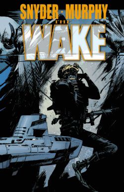
3. The Wake by Scott Snyder and Sean Murphy 2. Lazarus by Greg Rucka and Michael Lark

1. Zen Pencils by that Zen Pencils Asshole

The worst thing to happen in comics and in many ways, the worst thing to happen in all of our lives this year were the fucking Zen Pencils comics. This is that asshole who takes other people's thoughts and creative work, who takes the words that have come out of other people's mouths, and sets them without permission to the most goddamn generic comic stories possible told with the most generic storytelling possible, all of which (regardless of how the original speaker might have felt about the world, or their own attempts to convey subtlety in their work) consistently emphasize Zen Pencil's own one-dimensional, shallow, poorly-communicated thematic obsessions, e.g. lame nerds quitting their white-collar jobs in order to "pursue their stupid dreams" and angrily attacking their former bosses for having dared to stand between nerds and their dreams. At least if you're lucky, and some quote from Pico Iyer hasn't been overlaid on top of a fucking Game of Thrones fan-comic...

Rather than think great things, or create great stories, Zen Pencils settles for stealing and coasting off other people's celebrity. This is just dimestore internet plagarism, fed by a social media system that mistakes reblogging political sentiments for political activism, mistakes flooding each other with incessant numbing streams of copyright infringing no-credit images for curation, mistakes badly drawn rip-offs of Bill Watterson with real cartooning. It transforms the hard-won wisdom of our best comedians, thinkers, and writers into commodities. Have you managed to say something great, after a lifetime struggling with the language and your own internal limitations in order to express something uniquely your own? Well, here comes Zen Pencil to turn it into a source of ad revenue, maybe a fucking print he can sell. Wee! Zen Pencils trots out "liberation from day jobs" fantasies and paeans to childhood dreams in order to sell more bullshit to squares that they don't need, and thus offers only another manifestation of a comics culture constantly unable to see other people as anything besides more chattel to be exploited.  While other young cartoonists are busting their ass trying to discover who they are and what they can bring into the world, this jack-off repackages shit people already like, in the crassest way possible, never pausing to wonder whether the people he quoted wanted to be drafted into his misbegotten enterprise (even when those people include Bill Watterson, a cartoonist more than equipped to convey his thoughts to his audience without this fucking guy's "help").

Zen Pencils is representative of both comics and the internet at its very, very worst-- it's leading the charge towards a world of diminished expectations.  Congratulations, mediocrity.

In conclusion and summation, fuck him, fuck his comics, and fuck your stupid "Quit your dayjob" fantasies. Get back to work! We're a species that depends on each other working hard for each other and sacrificing for one another, if we all want to live in a functioning civilization. Your outlaw fantasies where you get to coast off everyone else's sacrifices are childish shit and you should fucking know better. You're a grown-ass adult.

BEST MOVIES

I "missed" (sometimes on purpose, sometimes not) a lot of this year's serious movies, I guess: Captain Phillips, Dallas Buyers Club, Rush, Her, Short Term 12, All is Lost, Drug War, Enough Said, Fruitvale Station, Blue Jasmine, Nebraska, Place Beyond the Pines, The Spectacular Now, Before Midnight, Computer Chess, the Bling Ring, and The Counselor. 2013 doesn't end without getting to see the Wolf of Wall Street, though; my hopes there are very, very high.

Setting all of those (!) aside...

10. The World's End

9. Pain and Gain

All of those Transformers movies were made so that Michael Bay could earn the freedom to make a movie about steroid addled maniacs torturing and murdering people in order to achieve a cocaine-tinged version of the American Dream. It's called "dreaming big."

8. The Great Beauty 7. Cheap Thrills 6. Upstream Color 5. Inside Lewelyn Davis

4. In a World...

Lake Bell making a movie about sexism in the movie trailer voiceover business...? On paper, that sounds like an oddity or a vanity project, but I thought the comedy that resulted, while maybe a little uneven in places... I don't know, sometimes when you're watching a movie, do you ever start rooting for the movie? I felt that with this one.

3. Side Effects

2. Furious Six

Maybe not a "Great movie" but by far, the most memorable theater experience of the year. People yelling things at screen; people cheering in the right places; I remember at one point one of the guys I saw this with trying to argue with the screen-- he is in his 30's. People losing their minds; people caring too much what happened to a Korean guy named Han Seoul-Oh; people going home and watching Fast & Furious 3: Tokyo Drift because that's a sequel to this movie? I was all of those "people", this year; it was great. I don't know what the best movie of the year was but this was the best time.

1. Kings of Summer

My favorite kinds of movies are comedies, and I just thought this movie was fucking hilarious. I've only seen it the once and I've heard mixed things from people who've seen it since. But me? I laughed my fucking ass off at this. Apparently it's not for everyone, but the jokes plus I just really connected to a couple things in this movie that... This was the movie I walked away from the most worked up this year.

WORST MOVIE

Star Trek Into Darkness:  This is a really boring choice, but man, this movie really was a piece of shit. It's such a boring choice-- is anyone even arguing this is a good movie anymore? But even in the same year that Matt Damon played a Mexican, this was the worst movie. Even the same year people pretended that an endlessly tedious Iron Man movie was a "real Shane Black movie" just because it was set at Christmas, this was the worst movie. This was just tip-to-toe pretty thoroughly numbskulled and unentertaining. It'll probably make for a good Redletter Media Mr. Plinkett review someday, but even giving it points for that, what was as bad as this movie?

I don't have any great hate for JJ Abrams, both before or after this-- if I don't think much of him as a "filmmaker," I still think he's actually an interesting guy, from, like, a business model perspective. He was a good guest on Jeff Garlin's podcast. He's helped made television I've enjoyed. But what had as much contempt for its audience, the rules of logic, or cinema itself? Nothing comes to mind.

HONORARY MENTION 

Pacific Rim Fans on the Internet aka the John Carter Memorial Award:  Quit telling people that boring, stupid special effects movies without any characters in them need to be "supported"! Those movies have already been supported with eight-figure ad campaigns. There was nothing wrong with those campaigns-- those campaigns accurately conveyed to general audiences that Hollywood spent a lot of money on computer graphics for 11-year-old boy wankery. Every summer there are small, deserving independent movies that actually need support while all that goes on-- Kings of Summer didn't have a 8-figure ad campaign; In a World... had to rely on word of mouth, for a movie that no one probably got paid much on to begin with. It's grotesque.

"Movie ticket purchasing is your way to vote for originality, the blistering originality that is this guy semi-incomprehensibly ripping off anime for 2 hours. It's this generation's Star Wars!" Ugh, go fuck yourself with a Gundam figurine. Why is that happening every year? Is this going to be every year now? After the next one of these special effects movies bombs, can Chris Hardwick have a post-movie-bombs show where he talks to that guy who writes about movies in all-caps, that Dragon-Con child-molester guy, and Jimmy Kimmel? Thanks.

 Podcasts

5. Jeff Garlin -- "Will Ferrell" 4. Slumber Party -- "Flash Flood of Sadness"

3. Harmontown -- ?

I've seen some amazing things thanks to Harmontown:  Robin Williams talking about Brandon Graham comics, Eric Idle singing, Jeff Davis revealing he has magical psychic powers that could've fucking prevented 9-11 or something, etc.  Amazing things I felt privileged to see.

But my favorite moment this year was during a D&D game -- Erin McGathy grabbing some goblin, looking deep into its eyes and saying "You are me" (or something like that).

I don't remember the exact words; I just remember that was probably the fucking hardest I laughed all year. McGathy killed my shit.

2. The Best Show on WFMU -- the final episode

I'm not a super-fan like a lot of people on the internet so a lot of stuff went over my head. It wasn't my first time at the rodeo either-- I'd just dipped in and out over the years; I was never consistent with it. But boy, this was still some listen.

(I also liked the one where Tom was writing the Entourage movie all night, though I don't know it was best-of-the-year material.  But I enjoyed that one a bunch).

1. Welcome to Night Vale-- The Sandstorm, Parts 1 and 2

Warning: you can't start listening with the Sandstorm episodes.

Least favorite: I tried to get into the Thrilling Adventure Hour-- it didn't go well. We didn't agree with each other.

BOOKS

Best: Crab Monsters, Teenage Cavemen & Candy Stripe Nurses by Chris Nashawaty

I haven't read all of it yet-- been sipping on it, but here's an excerpt that meant a lot to me, spiritually:

"Jim Wynorski [talking about Dinosaur Island]: We made the film in ten days. I thought it came out pretty well. The funniest thing is I was at a party and Joe Pesci-- who I didn't think even knew my name-- came over and said, 'Hey, Jim Wynorski.' And I said, 'Hi, Joe Pesci, right?' He said, 'Yes. I've got to tell you, I love Dinosaur Island! Every time I watch it, I feel like I want to go there.' He was with Barry Levinson. And they kept asking me about Dinosaur Island. Bizarre."

Worst: Back to Blood by Tom Wolfe

I'd read some old non-fiction pieces Wolfe had written back in the day and put me in the mood for one of his novels, my memory for what one of those are like failing me. It wouldn't be so bad that this novel is super-racist if it at least worked as a novel. But man, the story goes nowhere. The characters aren't believable. And the prose ain't shit.  Also, p.s., hoo-boy, it is super-racist.

COMPUTER GAMES

BEST:  Tomb Raider

I wouldn't have guessed I'd be the audience for this game, but Conan O'Brien playing this on his show sold me on giving it a shot.  I was pretty surprised how effective this was, especially in the first hour or so, in conveying a character in a desperate situation and how much that kept me invested for the rest of the (admittedly too long) game.

Worst:  Gone Home.

I really hated this.  I don't know if you remember, but when webcomics first became a thing, there was a wildly overpraised webcomic about what it was like to be a boring, boring LGBT person.  Wildly overpraised, now equally forgotten because it skipped the part where a comic has an interesting story, fun characters, etc.  Here, I felt like reaction to this game was driven by the politics, the fact that it was a "Discover your sister is a lesbian" simulator, especially right now when I know the image I have in my head of a stereotypical "gamer" is someone leaving women death threats while wearing a Penny Arcade shirt celebrating rape.  Gamers just seem like pretty much the worst, even as games become more widespread, more ubiquitous.

But this game was terrible, and as a piece of fiction, there just wasn't anything interesting about it that I could figure, other than the (okay, pretty great) soundtrack.  The sister's story is just dull, dull, dull-- nothing interesting happens in that relationship, other than the fact that it's a gay relationship.  The dark, stormy night and creepy house the story is plopped in just make the whole thing seem extra-silly-- why is your character wandering through a creepy house for no reason?  Why doesn't she order a pizza and watch TV?  Delaying the delivery of this tedious story so that the player has to solve lame puzzles-- I just felt like that mechanic paled in comparison to any number of more interesting indie games out there this year (I liked Kentucky Route Zero much more, though that's incomplete at the moment).  The side stories (including the dad-uncle relationship) don't improve any of this noticeably.

I couldn't guess at what people saw in this.

WEBVIDEOS

5. Take a Knee

4. Actress -- Episode 8

It's the last episode, so you should watch the rest first if you haven't seen it.

3. Biting Elbows -- Bad Motherfucker 2. Cop Show Drug Test 1. Car Jumper-- Episode 7

Honorable Mention:  Addy, on CNN.
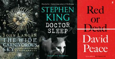
"Why Did You Turn Us From Pets Into Slaves?" COMICS! Sometimes It Is Christmas On The Planet of The Apes (Part 4)

Believe you me when I say I share your relief as we thunder into the fourth and final part of what people as far away as the chair next to me are calling a Planet of The Apes Weekly gallery! Merry Christmas! Ho ho ho! photo ENDB_zps7b672cf9.jpg

Anyway, this...

 photo 097PoTAB_zps7a2a66fb.jpg

 photo 098PoTAWB_zpse96836e1.jpg

 photo 099PoTAWB_zps8110da4b.jpg

 photo 100PoTAWB_zps65ea8238.jpg

 photo 101PoTAWB_zps0b267997.jpg

 photo 102PoTAWB_zpsbeb3cb57.jpg

 photo 103PoTAWB_zpsd3bc04e8.jpg

 photo 104PoTAWB_zpsab2de56b.jpg

 photo 105PoTAWB_zpsb91e66fe.jpg

 photo 106PoTAWB_zpsfac88de8.jpg

 photo 107PoTAWB_zps65c053b2.jpg

 photo 108PoTAWB_zpsd2891f54.jpg

 photo 109PoTAWB_zps2081d9fd.jpg

 photo 110PoTAWB_zps442a3505.jpg

 photo 111PoTAWB_zps96a69b12.jpg

 photo 112PoTAWB_zpsc5e67691.jpg

 photo 113PoTAWB_zps9133577d.jpg

 photo 114PoTAWB_zps379c5a58.jpg

 photo 115PoTAWB_zps88a1a83a.jpg

 photo 116PoTAWB_zpsc553e313.jpg

 photo 117PoTAWB_zps60154b9f.jpg

 photo 118PoTAWB_zps8ce09984.jpg

 photo 118PoTAWpuB_zps573509ee.jpg

 photo 119PoTAWB_zps4d5f7a9e.jpg

 photo 120PoTAWB_zps8b5d51ad.jpg

 photo 121PoTAWB_zpscac3408d.jpg

 photo 122PoTAWB_zps82cf1483.jpg

 photo 123PoTAWB_zpsdbcc7601.jpg

After all that it turns out the guy I borrowed these off was just shy of the complete run. Sigh.

So 'almost' only counts in horseshoes, hand grenades and - COMICS!!!

My name's John Kane and I wish you all, every man Jack of you, a very Merry Christmas!

"Because I Loathe Bananas!" COMICS! Sometimes It Is Christmas On The Planet of The Apes (Part 3)

"Beware the beast Man, for he is the Content's pawn. Alone among God's primates, he scans for the attention of strangers during Internet lulls. Yea, he will politely ask his work-mate to borrow his work-mate's Planet of The Apes Weekly collection. Let him not breed in great numbers, for he will spend most of his time washing, cleaning and generally running about to little result before finally sitting and staring dully into the far distance. Shun him; drive him back into his new-build lair, for he is the harbinger of death." Thus spaketh The Lawgiver. And so Part Three of the Planet of The Apes Weekly cover gallery begins:  photo PART2B_zps2c2498fd.jpg Anyway, this...

 photo 065PoTAWB_zps10532b3b.jpg

 photo 066PoTAWB_zpsce385e44.jpg

 photo 067PoTAWB_zpsb5c2d924.jpg

 photo 068PoTAWB_zps41cc0819.jpg

 photo 069PoTAWB_zpsefda6a07.jpg

 photo 070PoTAWB_zpscf1afaa7.jpg

 photo 071PoTAWB_zpsce566873.jpg

 photo 072PoTAWB_zpsff87164d.jpg

 photo 072PoTAWpuB_zpsd68a25ff.jpg

 photo 073PoTAWB_zps344f0ff2.jpg

 photo 074PoTAWB_zps6743fcb0.jpg

 photo 074PoTAWpuB_zpsda493282.jpg

 photo 075PoTAWB_zpsfd474065.jpg

 photo 076PoTAWB_zps3f89bead.jpg

 photo 077PoTAWB_zpsee57cabf.jpg

 photo 078PoTAWB_zps2f74644d.jpg

 photo 079PoTAWB_zps1a6920ad.jpg

 photo 080PoTAWB_zpsdf425c46.jpg

 photo 081PoTAWB_zps950d25fa.jpg

 photo 082PoTAWB_zpsf78d94e2.jpg

 photo 083PoTAWB_zps8cc71435.jpg

 photo 084PoTAWB_zpse1b038e9.jpg

 photo 085PoTAWB_zps0aef20e2.jpg

 photo 086PoTAWB_zps27b66f3a.jpg

 photo 087PoTAWB_zpsca89a2da.jpg

 photo 088PoTAWB_zpsabe466b0.jpg

 photo 089PoTAWB_zps8b934556.jpg

 photo 090PoTAWB_zpsdd59570b.jpg

 photo 091PoTAWB_zps9b0825bb.jpg

 photo 092PoTAWB_zps8b326fbc.jpg

 photo 093PoTAWB_zps2f698f6b.jpg

 photo 094PoTAWB_zps2caa302b.jpg

 photo 095PoTAWB_zpsbd876930.jpg

 photo 096PoTAWB_zpsa16d4b1f.jpg

Ape Shall not borrow and then forget to return ape's - COMICS!!!

"What The Hell Would I Have To Say To A Gorilla?!?" COMICS! Sometimes It Is Christmas On The Planet of The Apes (Part 2)

Well, Christmas The Holidays are almost upon us! Now, if you do knock back the old grape juice plus please refrain from driving. This isn't the Nineteen Seventies, you know! Although you could be forgiven for thinking otherwise as we plummet into the second part of our gallery of Planet of The Apes Weekly (very old but VERY GOOD!) covers. It ain't Nostalgia, it's History. (Okay, it's nostalgia).  photo bombB_zps4ea6ac7c.jpg

BONUS**BONUS***: Fool your friends! Baffle your enemies! Be hunted by the Government and shot in a ship yard with our Amazing Like-Life Ape Mask! (Never use scissors unless supervised by an adult.)

Anyway, this...

 photo 032PoTAWB_zpsb11bac15.jpg

 photo 032PoTAWpuB_zpsa449c371.jpg

 photo 033PoTAWB_zps745983c3.jpg

 photo 033PoTAWpuB_zps036d9213.jpg

 photo 034PoTAWB_zpse314393e.jpg

 photo 035PoTAWB_zpsc27e11e1.jpg

 photo 035PoTAWpuB_zpsb7564e40.jpg

 photo 036PoTAWB_zpsbba9287a.jpg

 photo 037PoTAWB_zps8c0a94e4.jpg

 photo 038PoTAWB_zps046811c5.jpg

 photo 039PoTAWB_zpsd05c55b7.jpg

 photo 040PoTAWB_zpsed28d181.jpg

 photo 041PoTAWB_zps3b200302.jpg

 photo 042PoTAWB_zps9c260324.jpg

 photo 043PoTAWB_zps4b0eeb24.jpg

 photo 044PoTAWB_zps44df60c4.jpg

 photo 045PoTAWB_zpsfb993b8f.jpg

 photo 045PoTAWpuB_zpsed4836aa.jpg

 photo 046PoTAWB_zpsa3c97a0e.jpg

 photo 047PoTAWB_zps78b943fe.jpg

 photo 048PoTAWB_zps84b21e13.jpg

 photo 048PoTAWpuB_zps539ee59e.jpg

 photo 049PoTAWB_zps80a3be1d.jpg

 photo 050PoTAWB_zpsb95fe246.jpg

 photo 051PoTAWB_zps2f579c8a.jpg

 photo 052PoTAWB_zpsf30ae4cb.jpg

 photo 053PoTAWB_zps9f397cbc.jpg

 photo 054PoTAWB_zpsfc376dcd.jpg

 photo 055PoTAWB_zps94b0ce0f.jpg

 photo 056PoTAWB_zpsd55544e5.jpg

 photo 057PoTAWB_zps8a74f7d6.jpg

 photo 058PoTAWB_zpsf93eca3c.jpg

 photo 059PoTAWB_zpsba006373.jpg

 photo 060PoTAWB_zps544982c7.jpg

 photo 060PoTAWpuB_zpscca1f0d2.jpg

 photo 061PoTAWB_zps33abf5c9.jpg

 photo 062PoTAWB_zpsa3589bc7.jpg

 photo 063PoTAWB_zpsf57269ef.jpg

 photo 064PoTAWB_zps661150d9.jpg

Oh, apes might talk but they don't make - COMICS!!!

“…There Must be A Creature Superior To Man.” (Slight Reprise) COMICS! Sometimes It Is Christmas On The Planet of The Apes!

It is with no small amount of shame that I note it has been over a year(!) since I promised to take a look at Planet of The Apes Weekly. Um. Prizes for the best excuses! Er, I mean reasons. Look, we're all adults so let's all just put it behind us and move on. As a special Christmas Treat, and as a small act of atonement, please find the covers to the first 31 issues of Planet of The Apes Weekly. If you like 'em I'll do some more. And, okay, we'll see what we can do about, y'know, going on about the contents in word form. No promises, mind. Special BONUS: from hereonin I (mostly) shut my mad yapper and let the pictures speak. Merry Christmas!  photo Heck01B_zps7e3b137e.jpg

Anyway, this...

Oh, context: Planet Of The Apes Weekly was a repackaging of Marvel's PoTA material for the British market. It was spurred by the enormous popularity of the PoTA TV show. The PotA strips were hacked into episodes of about six pages and backed up by whatever mad sci-fi based stuff Marvel had to hand. Turned out Marvel had plenty. The weekly schedule really burned through the scant PoTA material and filling each issue must have been quite an adventure. The movie adaptations constantly rotated in and out and the Killraven strip was rejigged from a disco themed continuation of H.G. Wells' War of The Worlds into a disco themed continuation of PoTA via the genius of the addition of badly drawn ape heads on anything that wasn't moving. PoTA began in 1974 and ran under its own title for 139 issues before being subsumed into other Marvel reprint titles and finally expiring in 1977. Which is when the children's entertainment Star Wars hit...Anyway, we'll get into all that later. Maybe. For now, the singular visual magic that was 1970s Marvel reprint comics covers:
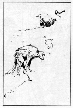
 photo 001PoTAWB_zps7189b829.jpg

 photo 002PoTAWB_zpsff2ce023.jpg

 photo 003PoTAWB_zps540a3986.jpg

 photo 003PoTAWpuB_zps3d4f5a64.jpg

 photo 004PoTAWB_zps617ea87d.jpg

 photo 005PoTAWB_zps334d09cd.jpg

 photo 005PoTAWpuB_zpsa66a870e.jpg

 photo 006PoTAWB_zps72cba669.jpg

 photo 007PoTAWB_zps99929b33.jpg

 photo 008PoTAWB_zps03794684.jpg

 photo 009PoTAWB_zpsdfbf3106.jpg

 photo 009PoTAWpuB_zpse790a631.jpg

 photo 010PoTAWB_zps7b7332e0.jpg

 photo 010PoTAWpuB_zpsfc6ab720.jpg

 photo 011PoTAWB_zpsecddcc38.jpg

 photo 011PoTAWpuB_zpsc8ce184a.jpg

 photo 012PoTAWB_zps03aae12c.jpg

 photo 013PoTAWB_zpsdc114946.jpg

 photo 014PoTAWB_zps34b49bf9.jpg

 photo 014PoTAWpuB_zpsc020e866.jpg

 photo 015PoTAWB_zps32372843.jpg

 photo 016PoTAWB_zps1b7f8b4a.jpg

 photo 017PoTAWB_zps35bec6df.jpg

 photo 018PoTAWB_zpsebf302e3.jpg

 photo 019PoTAWB_zpse1d6a03a.jpg

 photo 019PoTAWpuB_zps62d97804.jpg

 photo 020PoTAWB_zps73b054ae.jpg

 photo 021PoTAWB_zps89ae5708.jpg

 photo 022PoTAWB_zpsa1442d1a.jpg

 photo 023PoTAWB_zps42bde807.jpg

 photo 024PoTAWB_zps17667418.jpg

 photo 025PoTAWB_zps55839abb.jpg

 photo 026PoTAWB_zps857a1a2e.jpg

 photo 027PoTAWB_zps40d33006.jpg

 photo 028PoTAWB_zps9a4c3948.jpg

 photo 029PoTAWB_zps91ab679e.jpg

 photo 030PoTAWB_zps888b6885.jpg

 photo 031PoTAWB_zpsb0475c28.jpg

And a fond farewell for now from The Planet of The COMICS!!!

"Dig It, Fangs--" COMICS! Sometimes It's The Unsteady Dead!

It's a Skip Week! Oh, oh, the horror! So let's take your mind off it and hurriedly look at some comics which originally appeared some forty one years back. Way back, back when a lady entering a pub unaccompanied would be burned as a witch. And rightly so! Look, it was either this or I did a Best Comics of 2013 like everyone and their mother, but you know what The Best Comics of 2013 are? Whatever you think they are! Merry Christmas! Don’t worry, I try and get serious later. That’s usually quite funny isn't it; like a chimp baking or something? So, Tomb of Dracula!  photo ToDwordsB_zps757a4689.jpg

Anyway, this...

THE TOMB OF DRACULA Vol. 1 Penciler: Gene Colan Inkers: Gene Colan, Tom Palmer, Vince Colletta, Ernie Chan & Jack Abel Writers: Marv Wolfman, Gerry Conway, Archie Goodwin & Gardner Fox Colourists: Tom Palmer, Glynis Wein & Petra Goldberg Letterers: John Constanza, Artie Simek, Charlotte Jetter & Tom Orzechowski Front Cover: Neal Adams Contains material originally published in magazine form as Tomb of Dracula #1-12 (1972-3) Blade created by Gene Colan & Marv Wolfman Marvel, $24.99 (2010)

 photo ToDCoverB_zpsd9a029e5.jpg

The biggest surprise on reading this book was how long it takes for Marv Wolfman to show up (issue 7, p.137 ff). I’d got it into my head he and Gene Colan were there from the off but apparently not. Gene Colan’s here from the start but for most of this book he’s bolstering up a bugger's muddle of writers; each stopping only to catch their breath before being yanked out and replaced by the next passing writer. Stability only really even starts to settle in when Marv Wolfman starts bringing his own mug in, symbolically speaking. He's the one who, mostly in later volumes than this, defines the cast and events which would cause Tomb of Dracula to be so fondly remembered all these years later. Because it is a lot of years since these appeared. 1972! Or Nineteen Seventy Two as David Peace would have it.

 photo ToDEeeeB_zps723594c4.jpg

Tomb of Dracula is a bit of a bumpy ride writing wise; it’s a bit cacophonic in terms of authorial voices but that does mean it's never predictible. Gerry Conway starts us off and I have to say, credit where credit’s due and all that, I do have to say Gerry Conway starts proceedings off with a surprisingly strong first chapter. There’s a very adult air about the whole thing driven as it is by debts, resentful friendships and sour love. Really quite enjoyable and effective at hooking the reader in. Sadly his next chapter is pretty bad, largely being a rehash of the first issue and featuring some big bald dude who seems significant but is never seen again. Come issue 3 and Archie Goodwin tries to reign it all in to some shape, succumbing to his omnipresent Editor Within to explain continuity glitches away and home in on a coherent  narrative direction. This direction being, as it was throughout the series, finding a way to repurpose the Gothic trappings of Dracula within the heady, crazy days of the fast changing fondue-tastic, tie-dyed seventies. The book takes a while to settle into this and there are moments of inadvertent humour as Dracula is nearly bested by the use of car headlights, enlists children as feral weapons, encounters a projecter that can make an army of vampires (Don't ask. Really.), goes on a cruise, mixes it up with biker gangs and voodoo and dispenses advice to a couple of troubled teens hemmed in by small town life.  It's all very silly but quite charming.

 photo ToDSceneryB_zpsd9bb1dda.jpg

You can particularly feel Marv Wolfman settling in and becoming more comfortable and far more effective as the pages pass. And as the pages pass Wolfman's cast amasses. Largely a drab bunch to begin with things liven up with the arrival of Blade, the blaxploitation inspired vampire hunter who would go on to earn Marvel millions in other media. (Oh don’t worry, I’m not going to go into it. I mean, Christ forbid someone should express any concern for another human being. Particularly one they've never met. How absurd! I will say, to no one's surprise, I do think Marv Wolfman was badly treated in this instance.) Which is lucky because besides Harker with his seemingly magical wheelchair (which can access any location unaided no matter how remote) and his array of endearingly rubbish gadgets ("I call it...a net!")Dracula is the only real personality on show.

 photo ToDNetB_zps86cbd1c8.jpg

Good job it's his book. And it is his book. Despite being portrayed as a slap-happy chap who never changes his clothes and monologues like monologuing is in danger of going out of fashion Dracula really comes, er, alive by the end of the book. He's no frilly cuffed fop puling and whining like Andrew Bennet in I...Vampire. No, this dude is a proacative predator with schemes galore up his grave dirt soaked sleeves. Also, don't fuck with him because this Drac fucks back.  As our outclassed band of hunters discover to their chagrin in issue 12. In fact by that moment in the final issue reprinted here everything is meshing so smoothly that the art, writing, colouring all combine into this magnificent sequence atypical of '70s corporate comics in its artistic innovation and emotional impact:

 photo ToDgreatB_zps7ad4517b.jpg

Now fair warning; these comics are from an earlier day, a day in which comic book dialogue was distinct from dialogue in other media. Here people spout great gouts of unexpectedly near lyrical verbiage within a single panel portraying as swift an action as, say, Dracula slapping someone to the floor. (He does that a lot.)But then no one literally took the words being spoken to actually be occurring within the time frame of the action being portrayed. We were children, yes, but we weren’t idiots. Because back then comics were comics and cheerfully so. And one of the conventions of comics back then was that the dialogue would, yes, be the words spoken but these would be presented in a manner in which such words were supplemented by information informing the emotional affect, the emotional stakes of the scene and the emotional states of the players in question. Either via narrative text boxes or within the dialogue itself. Hence the overstuffed armchair of exposition effect modern readers often balk at. Inelegant as it may have been at its best the result was a very comics specific variation of, I guess, prosody.
 photo ToDProsodyB_zps870ae7ae.jpg

There’s an assumption that this method was unsophisticated; in fact it was very sophisticated. However, it was implicit, instinctive and had evolved naturally along with the comics form. It wasn’t pretty but it was one of the unique beauties of the comic form. It is of course dead now. And it died because it was very hard to reduce to a simple formula, thus it was hard to replicate and, not insignificantly, requires not a little knowledge and love of the English language. For a reader the dissimilarity between the old school and the new school is, I think, the difference between passively watching a story unfold and actively inhabiting a story as it develops. Both are valid, but I have always liked to live within my comics as I read them. It’s more difficult to do that now. But time passes, trends change and the moving finger writes; and having writ moves on…to television (it hopes). Of course the ascendant trend is borne not of artistic need but of expediency, the very expediency Gene Colan turned to his very great advantage.
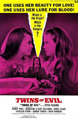
 photo ToDFoolB_zps3d168259.jpg

Because if there’s one reason I bought this then that reason is Gene “The Dean” Colan. This time out the big thing I noticed about Gene Colan’s art (the inkers here varying from Palmer's sympathetic magic  to Colletta's reliably shitty hackwork) is how his signature style is shaped by the demands of his job. Every page and every panel on these pages is an illustration not only of whatever the script calls for but also of the requisite rapidity a Bronze Age comics warrior's position entailed. Gene Colan’s work here is a series of exercises in expediency. The genius is that he manages to turn this from a stylistic restraint into an instrument of stylistic release. Using shadows, bizarre POVs and about three battered postcards of London Gene Colan provides an England that never was, but an England absolutely fitting to the pulpy melodrama at play. And he populates this eerie environment with figures whose startlingly realistic faces contrast starkly with the impossibility of their bodies; these bodies apparently composed of clothes filled with living winds in fluctuating states of agitation. As a result Colan’s pictures are pickled in atmosphere and thrumming with potential threat. So, when the kick off comes (and come it always does) Colan’s flailing and comprehensively wind whipped figures whirl around a world filled with fearful shadows. More than anyone else involved Gene Colan makes Tomb of Dracula the success it is. When I was young I thought Gene Colan’s art was awesome simply because it looked awesome now I am less young I think Gene Colan’s art is more awesome still because I now have the merest inkling of the skill involved. That’s why Gene’s The Bursar! I mean, that’s why Gene’s The Dean! And ultimatley that's why Tomb of Dracula Vol. 1 is VERY GOOD!

It's also, it almost goes without saying, COMICS!!!

"You Dropped The Coffee, Stephanie." COMICS! Sometimes They Shaped Us In A Million Invisible Ways!

I was a bit rushed this week so I thought I'd save some time by doing a gallery instead of a bunch of words arranged in upsetting orders. Hilariously, I saved no time whatsoever but I can now present to you a cover gallery of all the issues of WARRIOR Magazine I own (i.e. no issue 1). They are old, stained, dog-eared and read to within an inch of their lives but they still look nice and give a savoury taste of the groundbreaking early '80s anthology that thrilled me from the age of twelve and up, up and away. Anyhoo, have a look if you want. (Also: How To Make a Zirk! Really!)  photo IntroB_zpse02fb8fe.jpg Alan Moore and Alan Davis correctly predict the reaction of the Internet to those Miracleman reprints coming in January 2014. Who sez he ain't magic!?!

Anyway, this...

Oh, WARRIOR was VERY GOOD! there, now I can categorise it as a review. Tricks of the trade, my loves. Tricks of the trade.

 photo Warrior02B_zpsf0dcc82a.jpg

WARRIOR ISSUE 2 COVER ART by Garry Leach

 photo Warrior03B_zps5d034ab7.jpg

WARRIOR ISSUE 3 COVER ART by Paul Neary

 photo Warrior04B_zps64332e03.jpg

WARRIOR ISSUE 4 COVER ART by Steve Dillon

 photo Warrior05B_zps10f3176d.jpg

WARRIOR ISSUE 5 COVER ART by Dez Skinn

 photo Warrior06B_zps723094ce.jpg

WARRIOR ISSUE 6 COVER ART by Steve Parkhouse

 photo Warrior07B_zps8990bfc2.jpg

WARRIOR ISSUE 7 COVER ART by Mick Austin

 photo Warrior07bB_zps29da3f31.jpg

Mick Austin's cover unadorned except by age and stains.

 photo Warrior08B_zpse6358dbf.jpg

WARRIOR ISSUE 8 COVER ART by David Jackson

 photo Warrior09B_zps2563fc45.jpg

WARRIOR ISSUE 9 COVER ART by Mick Austin

 photo Warrior09bB_zpsaec03555.jpg

Mick Austin's cover unadorned except by age and stains.

 photo Warrior10B_zpsbefc5426.jpg

WARRIOR ISSUE 10 COVER ART by Garry Leach

 photo Warrior10bB_zpsde876a4e.jpg

Garry Leach's cover unadorned except by age and stains.

 photo Warrior11B_zpsbf309a50.jpg

WARRIOR ISSUE 11 COVER ART by David Lloyd

 photo Warrior12B_zps76183303.jpg

WARRIOR ISSUE 12 COVER ART by Steve Parkhouse

 photo Warrior13bB_zps9204a412.jpg

WARRIOR ISSUE 13 COVER ART by Garry Leach

 photo Warrior13B_zps3d16a63c.jpg

 photo Warrior14B_zpsd0ac56f1.jpg

WARRIOR ISSUE 14 COVER ART by Jim Baikie

 photo Warrior15B_zps913a00af.jpg

WARRIOR ISSUE 15 COVER ART by Mick Austin

 photo Warrior15bB_zpscef0bbbb.jpg

 photo Warrior16B_zpse55e2952.jpg

WARRIOR ISSUE 16 COVER ART by Steve Parkhouse

 photo Warrior16bB_zps34c7d61e.jpg

 photo Warrior17B_zps47329e7b.jpg

WARRIOR ISSUE 17 COVER ART by David Jackson

 photo Warrior18B_zpsccb7bbe4.jpg

WARRIOR ISSUE 18 COVER ART by Steve Parkhouse

 photo Warrior18BB_zps2663513f.jpg

 photo Warrior19B_zpsf52be5f0.jpg

WARRIOR ISSUE 19 COVER ART by Dez Skinn?Garry Leach?David Lloyd? I know not.

 photo Warrior20B_zps9a6a3189.jpg

WARRIOR ISSUE 20 COVER ART by Garry Leach

 photo Warrior20bB_zps8bb74e63.jpg

 photo Warrior21B_zps9b85fdd9.jpg

WARRIOR ISSUE 21 COVER ART by Mick Austin

 photo Warrior22B_zps249d36c1.jpg

WARRIOR ISSUE 22 COVER ART by Geoff Senior

 photo Warrior23B_zps3ec71d17.jpg

WARRIOR ISSUE 23 COVER ART by Jim Baikie & Garry Leach

 photo Warrior24B_zps750d6b70.jpg

WARRIOR ISSUE 24 COVER ART by John "Joz" Bolton

 photo Warrior25B_zps24dd2f22.jpg

WARRIOR ISSUE 25 COVER ART by Garry Leach

 photo Warrior26B_zps33736a6a.jpg

WARRIOR ISSUE 26 COVER ART by Garry Leach

 photo MManSpec01B_zps5af23b23.jpg

MARVELMAN SPECIAL #1 COVER ART by Mick Austin

BONUS****BONUS****BONUS****BONUS***

How to Make a Zirk Art by Garry Leach!!!

 photo ZIRKB_zps43994b1d.jpg

As you've probably gathered by now, those were - COMICS!!!

"NNGGGGAAAANNGAAAABBUUUBBBUUUZZZZZZZ..." COMICS! Sometimes They Are Good, Sometimes Not So Much!

I hope all our American friends had a smashing Thanksgiving! Managed to sneak another holiday in there before Christmas again, I see. Couldn't wait a few weeks for some Turkey. America, we are going to have to work on your delayed gratification! Maybe in the New Year, eh? Along with that membership to the gym. No, I have no idea what I'm on about.  Here are some words about comics I managed to dash off before being swallowed by the pre-Christmas maelstrom. Sorry about the lack of images but, y'know, time and all that hot jazz. Anyway, this...

All Star Western #25 Artist Moritat Writers Jimmy Palmiotti & Justin Gray Colour Mike Atiyeh Letters Rob Leigh Cover by Howard Porter Jonah Hex created by Tony DeZuniga and John Albano DC Comic, $3.99 (2013)

 photo ASWCovB_zpsf3838270.jpg

I’m not saying the driving conceit of this series is low hanging fruit but its rind is a gnat’s fart from brushing the tips of the grass. It’s Jonah Hex in the DC Now! While it was a fair joke to have Jonah show up and be more inclusive of difference than the modern populace stewing around him it wasn’t a joke that had much legs. A better joke would have been having Jonah show up and be distastefully offensive to everyone. (But that would require having some nuts left in your sack). Every month Jonah could have wandered around displaying levels of racism, homophobia and misogyny toxic to normal people. Hell, he could even have worked in comics. (Oh, too soon?) Anyway, now it’s just Jonah mamboing about and bumping into DC Universe characters. Like a Bob Haney comic but with none of the energy, inventiveness or flair. So, not much like a Bob Haney comic then. More of a Gerry Conway comic. It isn’t well written; something happens; something else happens; then it ends. Despite the fact Jonah is in the 21st Century, meets John Constantine, fights (well that’s gilding the lily, they move about a bit in an aggressive fashion) a demon and then Swamp Thing shows up it is all curiously unengaging. If it were any more pedestrianly written it would come with a free pair of shoes. Which means, as is more often than commonly acknowledged, the art has to carry most of the load. Luckily, Moritat has many strengths, mostly in figure work, architecture, faces and textures. Not so much panel to panel flow or action. There was a bit an issue or two ago where some guy in a car looked to be spoiling a fun run but in fact he was killing people by the shed load.  The impact was somewhat diluted. And the same is true here with Moritat tasked with a battle in the desert which, well, he muffs. Even so Moritat just about carries this comic, but it isn’t really a Jonah Hex comic anymore than Hex was a Jonah Hex comic. All Star Western is EH!

THE WAKE #5 (of 10) Artist Sean Murphy Writer Scott Snyder Colour Matt Hollingsworth Letters Jared K. Fletcher The Wake created by Scott Snyder & Sean Murphy DC Comics, $3.99 (2013)

 photo WakeCovB_zps41562b66.jpg

Fair warning: turn away now because I don't think this comic is very good. The urgency of any notionally exciting action is continually being spuffed away by the creaky and derivative narrative joltingly halting while someone delivers a big old furball of exposition. Said text dump consisting of a lightly tweaked wikipedia entry in a laughably unconvincing attempt to lend the ridiculous events occurring some kind of gravitas. In old legends floods are mentioned sometimes so, uh, yeah. And the people hawking this stuff up are just, well, it’s a good job they are all so memorably portrayed by Sean Murphy because otherwise they might as well just have stickers on their heads (Spunky Lady, Sciency Man, Troubled Mom). Murphy gives them all engaging visual presences (it doesn’t hurt that one of them looks like Harlan Ellison and another Ditko and Lee’s elderly Vulture). In fact it’s wholly to Sean Murphy’s credit that I’ve stuck this badly written dross out thus far. With his incredible ability to convey mind swamping discrepancies of scale; to lend the quieter moments as much weight as the flashier bits together with his endearing tendency to draw people with beards as though their face is a mass of scar tissue, Sean Murphy is the only real reason to turn up.

Anyway, at this point the series takes a break and I’ll not be rejoining it. Apparently when it resumes all the good stuff starts. Which seems a bit late really. Since the good stuff seems to consist of the umptyumpteenth iteration of a Drowned! World!, and one where there’s enough technological infrastructure to produce cutting edge swimwear at that, I think I’ll be popping off, thanks. Oh, and let there be no doubt all the failures here are the writer’s (“Oh we’re all doomed! Luckily I have a secret submarine armed with ridiculous weapons I failed to mention before.” Oh, do fuck off. Do! ) This is exemplified by a piss poor text piece at the back which is so repetitive and badly written it’s just depressing. So, I’ll see you on something else Sean Murphy. As for Scott Snyder, well, everyone meet the new Steve Niles, same as the old Steve Niles. The Wake is EH!

Batman ’66 #5 Art by Ruben Procopio, Colleen Coover Written by Jeff Parker Colours by Matthew Wilson, Colleen Coover Lettered by Wes Abbott Cover by Michael & Laura Allred Batman created by Bob Kane DC Comics, $3.99 (2013)

 photo batman66B_zps511681b0.jpg

While DC’s bold new creative direction of frantic barrel scraping is largely of little interest to me…everyone has a chink in their armour and my chink is shaped like the ‘60s Batman TV series. Personally, I believe the only reason God has still not scoured his finest creation of the plague of humanity is His/Her/It’s remembrance that the ‘60s Batman TV show existed. I like it is what I’m saying there. And I have always liked it. Even during those tedious decades when acknowledgement of the frivolous magic that was the ‘60s Batman TV Show provoked spittle flecked aneurysms in fandom. Finally I have been vindicated by DC’s creative bankruptcy! Batman is Bat-back! It’s like that time your family realised Uncle Larry was a lot wealthier than everyone thought and suddenly became oh-so-accepting of the fact he was a man who preferred the company of men and started inviting him to Thanksgiving again. While the art on every story here is wonderful and captures the ungainly physicality of the cast in action beautifully what most impressed was the writing. Writing wise it’s all about catching the voices; the lovely honey roasted burnish of those hammy, oh so hammy, voices. Although mine ears may be festooned with the hairs of age it sounds to me, well, it sounds to me like Jeff Parker couldn’t have done a better job if the voices were running around in straightjackets and he was armed with a butterfly net. Jeff Parker’s come along way from selling chickens by the roadside. Good on you, Jeff Parker. But this is a joint success with every hand working towards the creation of ridiculous, hilarious, entertaining and wonderful comics. Batman ’66 is VERY GOOD! Sure now and so it is, Boy Wonder!

Zero #3 Illustrated by Matteus Santolouco Written by Ales Kot Coloured by Jordi Bellaire lettered by Clayton Cowles Designed by Tom Muller Zero created by Ales Kot Image Comics, $2.99 (2013)

 photo ZEROCovB_zpsefbca0a6.jpg

It didn’t look good. The comic starts off with that terrible style of dialogue that seeks to be arch, smart, worldy and profane but just comes off like how kids think grown-ups might talk if grown-ups were, like, not totes super-lame all the time but, you know, somehow got it together sometimes to be all, whoa, cool and shit, maybe, uh, nice tats, my man, ha, no, your mom, ha ha ha ha, no, really, your mom. As a reluctant eldster I can assure you that never, not once, on the very many occasions on which it has occurred have I failed to punch someone who greeted me with “Hey, cock-stippler, see ya still got a face like a racist’s taint!”, or, you know, whatever. I mean. It’s not really conducive to productive communication, is what I’m saying there. So, the dialogue here’s great if you like that Ellis-y “I know you are, but what am I?” playground mode of chat. Hell, don’t get me wrong, it’s still okay even if you don’t. After all, this is comics where a guy (not this guy, another guy) whose dialogue is nothing more than the literary equivalent of water-injected meat can be compared to a Pulitzer winning playwright. No, my point is it set my teeth on edge and the likelihood of enjoying the following comic was low.

And yet enjoy it I did. And very much so.

(Which is supposed to indicate how good the comic was, how it won me over after my knee-jerk initial negative reaction. A reaction which was wholly on me and not on anyone involved on the comic. Just making that clear.)

Because after the writer has had his c-word and eaten it the dialogue calms down. Then we’re off to the races as the creative team throw a fizzy confection of ideas and helter skelter paced events into your face like, er, a glass of innovation laced with a soupcon of emotional impact. Or birds, a handful of garish birds singing a swetly sad song thrown in your face. Or something else, pick something. Everybody on these pages pulls their weight and the success of the resultant package is a group success. A success resting on Bellaire’s palette shifts from warm party colours which threaten to push into the red spectrum of violence to the icy blues which foreshadow the chill of the denouement; Santolouco’s clarity of staging, elegance of scene setting and crisply sudden violence; even Cowle’s letters which get to hold centre stage unadorned for a whole page and leave the reader feeling not in the slightest shortchanged. All these are brought together to serve the writer’s fun, fast and slightly experimental ideas. I stress this; Zero is not one of those Shit’n’Glitter comics that seek to distract you with pointlessly ostentatious storytelling devices from the hollowness within them. No, Zero is a collaborative success. Zero is good comics. Zero is VERY GOOD!

Shaolin Cowboy #2 Story and Art Geoff Darrow Colours Dave Stewart Letters, back cover, design Pete Doherty Shaolin Cowboy created by Geoff Darrow Dark Horse Comics, $3.99 (2013)

 photo ShaolinCovB_zps1ce09658.jpg

COMICS!!!! And unrepentantly so. EXCELLENT!


"Gara Gara!" COMICS! Sometimes They Are MANGA!

Konichiwa! What follows is almost Zen like in the purity of its pointlessness. Unless…unless you are one of the three living people who have not already read these old manga comics. Comics which are now available again in a new series of petite omnibooks. So someone must not have read them, right? C’mon, throw me a rope here!  photo LWCwaveB_zps1eb44615.jpg

Anyway, this…

If you have never read any of the manga comics and are a bit trembly about starting then this one’s for you! Because cards on the table; fox in the henhouse; monkey in the nunnery; I know sweet FA about the manga comics. When it comes to the manga comics I’m not your man. Gah! So, given my impressive indolence when it comes to the appreciation of other cultures I just read these as comics. Just opened ‘em up and read ‘em. Treated ‘em like comics, see. Crazy.

LONE WOLF AND CUB OMNIBUS VOLUME 1 Art by Goseki Kojima Written by Kazu Koike Translation by Dana Lewis Lettering by Digital Chameleon Lone Wolf and Cub created by Goseki Kojima & Kazu Koike Dark Horse comics, $19.99 (2013)

 photo LWCcovB_zps8fe5a2c3.jpg

Hey, as far as I can tell (and I may tell a lie, inadvertently) these comics originally appeared in 1970, as indeed did I. Bouncing Buddhas, these comics are as old as I am! Luckily they seem to have aged somewhat more gracefully. Unlike Lone Wolf & Cub I was not originally created by Goseki Kojima & Kazuo Koike and serialised in Weekly Manga Action Magazine, nor did I form the basis of a television series and a string of successful films before being reprinted in English by FIRST! comics in 1990 and, following FIRST’s demise (but no demise in the thirst for these comics) thereafter by Dark Horse Comics. This is Dark Horse’s second third (thanks, Ben Lipman!) go round at the material. This iteration is digest sized but impressively girthed. It’s a thick little brick of a book is what it is. This edition of Omnibus Vol.1 ends with Half Mat, One Mat, a Fistful of Rice in case anyone with an incomplete collection of the previous volumes wanted to know when to hop on board.

At the back of the book there are some author bios from which I cravenly cribbed the previous factual bits and a glossary of terms pertinent to the Edo period Japanese setting. Initially you’ll be flicking to this glossary every time you meet an unfamiliar word but you’ll soon get caught up in the flow of the narrative stream and your insecurity will erode to nothing as you use context to impose meaning; much as you do with your native language. English, I ‘m talking about English there, in the case of our American friends. Look, I don’t want the elbow patches and chalk dust connotations of a glossary to put anyone off; it’s useful and a nice touch but you’ll be too busy reading some 700 pages of great comics to bother with it, or as the experts would have it: 700 pages of great manga.

 photo LWCdadB_zps44187c34.jpg

Don’t worry about the words and the possibility of babel-jabber. In fact the translation by Dana Lewis reads smoother than a lot of English speaking comics writers’ work. Since the top names in US comics write like they learned English via correspondence course (and a lot of the lessons went missing in the post) I’m not sure who this reflects best on. The only jarring note is struck when sometimes the speech of the peasantry mimics that familiar from Westerns; this may sit oddly atop the images of Edo period Japan (“Consarn that dangdurned Emperor!”) but the genres have enough surface similarities to make this decision explicable. And it does create a clear divide between the scrofulous ones and their betters (who aren’t; they never are). On reflection this contrast between the earthier utterances of the proles and the formal rigidity of their masters nicely reinforces the divides. It’s such a good translation that it enables the quiet genius of the original writing to shine. Lone Wolf & Cub does many things but one of the things it does best is present a portrait of a repressive society and all the unhealthy sexuality and violence roiling beneath the social constrictions. The storytelling is remarkably convincing in its period detail although, full disclosure, I am neither Japanese nor a historian; so the fact that there aren’t any car chases and no one checks their wristwatch is the only level of historical accuracy I can vouch for.

I hear that all reviews must now contain some words about the art. So, yeah, let’s do that. Sadly I have sod all reference for Japanese art except for that Great Wave by Hokusai I had on a calendar once and a picture of a lady with a squid I saw in The Guardian the other week; one that was altogether too rude by half. Luckily for all of us inadequately prepared reviewers Lone Wolf and Cub has a built in entry point for palettes moulded by the North American comics tradition. The sentient reader will note that the cover to this first volume is by Frank Miller and Lynn Varley. This dynamic duo provided the initial run of covers for the FIRST reprints (followed by Bill Sienkiewicz and then, I believe, Matt Wagner. Pedigree stuff there, kids). The art of Miller and Varley’s Ronin (DC Comics, 1984) had been cheerfully blatant about showcasing its debt to the work of Goseki Kojima and Miller had vocally championed Lone Wolf and Cub in interviews at the time. Miller’s stylistic lifts are revealed to even my uninformed eye at certain points in this volume (the straw of hats, motion lines forming figures, etc and etc) and nowhere are these lifts more apparent than in the graveyard scene which closes out this book. That’s how good Goseki Kojima is here; Frank Miller took a leg up from him to reach his pinnacle.

 photo LWCstoneB_zps15e5abd6.jpg

And make no mistake Goseki Kojima is damned good here. The world the series inhabits is concretely defined with clear demarcations between the austere human constructs and the lush natural sweep of the land itself; the similar socio-economic demarcations between the folk populating the book are also succinctly sketched. So much so that one who knows less than zero about Edo period Japan grasps instantly and easily a wealth of information about what was seconds ago unknown and alien. And then there’s the action. The savagery of which, with its barrage of brutality and people coming apart like mud in heavy rain, is never in doubt. The violence in Lone Wolf and Cub is awful in exactly the right way.

 photo LWCviolB_zps53aff7fe.jpg

Lone Wolf & Cub is, I guess, primarily about Fathers and Sons. It can’t help but be about Fathers and Sons because when you are an itinerant assassin for hire saddled with a son, every day is Bring Your Child To Work Day. Usually comics about Fathers and Sons continue the bad rap Dads have. This very comic might be about how bad this dad is too, it’s hard to tell; it’s open to interpretation. He clearly loves his son and this love is reciprocated. Lone Wolf so loves his cub in fact that he is taking him to Hell with him. Sometimes you can love too much. Obviously Social Services might have something to say about having the kid feign drowning to lure an enemy into an unarmed swim or riding his dad’s back in a swordfight with a mirror strapped to his head in order to provide a surprise advantage.

 photo LWCpolB_zps41056c90.jpg

But there aren’t any Social Services, or indeed any form of supportive infrastructure for those less fortunate. Which is odd because everybody here is paying taxes, some people are paying so much tax it is killing them. And you pick this up as you go along; Lone Wolf and Cub is really quite political. But it is so in a very gentle way. The squalor of the peasantry, the machinations of their betters (who aren't; they never are. It bears repeating) and the way a whole Society can be its own worst enemy are powerfully but subtly conveyed by every page. But never, ever, in a dull, dry or dreary way. All that smart stuff is smuggled in under cover of a series of chapters that hop from genre to genre with no sign of sweat or effort. There's a chapter with the grubby brio of High Plains Drifter but set in a spa town; an episode recalling nothing less than Inspector Morse; an excursion into religious symbolism; a prison break revenge saga cum murder mystery; never a dull moment is what, I'm saying.

 photo LWCkidB_zps1ed8dc05.jpg

Lone Wolf & Cub is truly humbling in its mastery of comics and the heights of entertainment it reaches. It's from the past and another country and they really do things differently there. For the duration of Lone Wolf and Cub it’s hard not to think that they do things better.

Sometimes Lone Wolf & Cub is still as a pond; sometimes Lone Wolf & Club dances like the fire. But Lone Wolf & Cub is always EXCELLENT! Because Lone Wolf And Cub is always – COMICS!!! (or MANGA!!!)

(I’m worried about the kid though.)

"Choke!", "Gasp!" Not A Podcast! BOOKS! Like Television But In Your Head!

I hear tell Gentle Jeff’s taken his hard drive into the bath again or something. Sigh, that boy! For once I’ve got something to plug that Skip Week Gap. As ever on these occasions I write about whatever I want knowing you won’t mind because you are all so lovely! And you are aren’t you? Weesss ooo arrrr! This time out I write about a British author who is in no danger of being called “Chuckles” anytime soon. One David Peace whose new novel, Red or Dead (VERY GOOD!) came out recently so I didn’t actually read anything else until it was done. It took some reading as well. He’s not the easiest read in the library, this David Peace guy. I was going to go on about that new one but I’m still cogitating. In the meantime let’s take Kylie’s tiny hand and step back in time to the books that made his name. Or not. Free Will, right? Anyway, this... photo NAME_zps1c01f891.jpg

 photo COVERSB_zps1a89c733.jpg

I say, did I ever tell you that David Peace once had the pleasure of meeting me. Oh wait, that’s later. For now let’s begin at the beginning. Traditional and shit, innit.

In the year of Our Lord 1967 a child was born of human love. This child, this future author, this David Peace, grew up in Ossett which is in West Yorkshire, Great Britain. Until 1974 West Yorkshire traded under the name of The West Riding of Yorkshire. Don’t worry about why; I just looked it up and unless you’re having trouble sleeping I wouldn’t stress over shifts in regional demarcation or naming. No, the important things to take away this far in are ‘1974’ and ‘West Riding’. Now, for our International viewers tuning in let me just explain that while Great Britain may well be smaller than the great state of Texas it is rich in regional divisions and distinctions. And, Boy Howdy, are folk proud of those. Particularly Yorkshire people, or ‘puddings’ as they prefer to be known. Yorkshire folk have a weird kind of self-deprecating arrogance; we’re better than everyone else but that’s no great shakes because everyone else is a bit shit to start off with. A bit like that. Now, I can’t prove it but I understand Keith Waterhouse (1929 – 1999; wrote Billy Liar etc.) used to tell a joke about a Yorkshireman who died and upon approaching The Pearly Gates was greeted by St Peter with the words; “Welcome to Heaven. You won’t like it.” That’s Yorkshire folk right there. And it might explain why David Peace’s books are so driven to refute the stance of noted philosopher Belinda Carlisle and posit that, rather than Heaven, it is in fact Hell which is a place on earth. And David Peace’s Hell is a Hell built by men. (And Margaret Thatcher.)

Peace got right on men’s case with his debut novel Nineteen Seventy Four (1999). Nineteen Seventy Four (as well as being painful to type out) is set in 2036 A.D. on the planet Bagwash. No, Nineteen Seventy Four is set in 1974 A.D. and is set mostly in The West Riding of Yorkshire and is all about the Evil that men do. Nineteen Seventy Four would prove to be the first in a four book cycle later termed The Red Riding Quartet, in much the same way as James Ellroy’s Black Dahlia (1987; VERY GOOD!) would mark the start of the L.A. Quartet. And, yes, of course The Demon Dog is here snuffling at our collective crotches already because Nineteen Seventy Four is pretty much the work of Yorkshire’s James Ellroy. Of course James Ellroy had already been happening for some years so Peace gets to cut the shit and his style starts at White Jazz (1992; EXCELLENT!). Nineteen Seventy Four is a pitch perfect balancing act of genre thrills and literary skills. That’s proper reviewing shit that last sentence is.

Nineteen Seventy Seven (2000) seems like a bit of a step backwards. This is where, I think, David Peace decided he aspired to be more than Yorkshire’s James Ellroy. Unfortunately he seems to have decided this after writing Nineteen Seventy Seven which reads like the work of someone stepping fully into the shadow of James Ellroy. Everything after Nineteen Seventy Seven reads like someone trying to shake off James Ellroy’s shadow. While Nineteen Seventy Seven is essential to the Quartet in that it continues and develops the themes and introduces a couple of characters of pivotal importance, it’s a bit trad, Dad. There’s a reason the 2009 TV adaptation of The Red Riding Quartet skipped Nineteen Seventy Seven is what I’m saying. However, if there’s a reason that same adaptation has an egregiously uplifting ending I am not party to it. In its defence it does have Sean Bean clad in a nasty sweater shouting about shopping centres so it’s not all bad. With Nineteen Seventy Seven it looked like David Peace had struck lucky with Nineteen Seventy Four and was just(!) going to be a pretty good genre author.

With the twin triumphs of Nineteen Eighty (2001) and Nineteen Eighty Three (2002) David Peace dragged this assumption into an abandoned lock up garage and danced on its head until his boots looked covered in jam. With Nineteen Eighty and Nineteen Eighty Three David Peace swiftly sidled into Serious Fiction and there he sullenly squats still. Because with Nineteen Eighty and Nineteen Eighty Three it became apparent that Peace was lifting the carpet of British History, clawing past the soiled and stained underlay, rooting down through the foundations and finally shattering the sewer pipe that ran beneath everything all along. This is England, says The Red Riding Quartet and this, this is how England fell. When misogyny, racism and homophobia are institutionalised, when misogyny, racism and homophobia are unquestioned, when misogyny, racism and homophobia are acceptable what, then, is unacceptable? And at the end of all this, at the end of four tubby books touted as serial killer thrillers, as police procedurals, as crime fiction the answer comes back. At the end of four fat bricks of almost unremitting foulness conveyed in repetitious and emaciated prose pressed into literary frameworks of increasing subtlety and complexity the answer comes back. And the answer is, nothing. Nothing is unacceptable. As long as there’s money in it for someone.

Fair warning for sweet souls; these are hard books to read. No, they are not easy books to read. From their unforgiving (relentless in its repetition) prose style to the draining focus on the sordid (relentless in its denial of light), no, these are not easy books to read. But they are worth reading. They are worth the effort. They will, I think, reward you if you make it out the other end. Start at the beginning. Start at Nineteen Seventy Four and see how it goes. The Red Riding Quartet is not easy because it is a portrait of a land insane. My land. And here my land is like an ulcerous cur tearing out its own stomach to bite the pain away. All of which flowery guff is just to say David Peace is EXCELLENT!

Welcome to David Peace. Welcome to Hell. You’ll like it.

BONUS: When David Met James!

Postscript: In Which I Light Up David Peace’s Life

It would have been 2007, I guess, as Tokyo Year Zero was the book David Peace was promoting at the time. I read in The Guardian (it has a good book section on Saturdays) that his promotional duties were to bring him to Sheffield. Having just relocated Sheffield was now practically on my doorstep. So it would have been rude not to go. As it turned out it was rude to go, but still. Perhaps our lives had merely been prelude as fickle Fate moved us both , the talented and modest writer and also David Peace, towards this ultimate showdown, this fateful face-off, conducted near the “New This Week” shelf in Waterstones, Sheffield. It was towards the end of dinner time creeping into the afternoon, I remember that. So I barged into the Sheffield branch of Waterstones my mind aflame with excitement at the prospect of exchanging words with a man whose words I had spent so much money on. Perhaps I would lean in just a little bit too closely and gather his scent in my nostrils to savour later at my leisure. I was expecting crowds; I was expecting bedlam; I was expecting droves; I was not expecting the shop to be practically empty. Wrong-footed and discombobulated I cast my gaze around the place; all the people I could see were a smartly dressed lady stood by a man sat at a table. So, I asked the lady if she knew where David Peace was and the lady inclined her hand to indicate the man at her side. I had not recognised him because he was wearing glasses and all I had to go on was a close cropped author photo that made him look like something off the cover of GQ.
 photo FACESB_zps7095f133.jpg

So, now I’m flummoxed by the lack of crowds and, on top of that, I’ve just failed to recognise the very man I came to meet. Also, I was expecting some time to get my head in order, compose my silly self, practice my lines and all that. But, no, it’s clear that any second now David Peace (DAVID PEACE!) is going to politely raise himself up from his chair and extend his hand and I’ll have to say something and ohgodineedtimetoprepareitsalltoosuddentootoosuddennnurrrhhhh

“Hi!”, said David Peace, politely raising himself up from his chair and extending his hand. Was it the very hand that had written all those words, all those words I had read, those very words I had come to thank him for? Perhaps it was that hand. That very hand indeed.

“O!”, I said.

“O! I thought there’d be LOADS of people!”, I said.

And we all stood there.

In the silence.

The silence of loads of people not being there.

The silence suddenly as loud as thunder.

And we all stood there.

In the silence.

The silence of loads of people still not being there.

The silence that ended only when, with a face as red as a freshly smacked arse, I passed him my book. I muttered a quick thanks for all the books and for signing that book right there and fled. Out. Out into the street. Out onto the street where I leaned against a supporting pillar and swore like a sailor under my breath. And scant seconds later I saw David Peace emerge with his shoulder bag swinging and literary minder in tow. And that was the last time I ever did see David Peace. Scampering towards Sheffield city centre, receding into the distance and approaching the future in which he would write Occupied City (2009) and Red or Dead (2013) and I would go on to write a load of old crap; sometimes about whatever caught my fancy but mostly about - COMICS!!!!

David Peace – A Bibliography

Nineteen Seventy-Four (1999) VERY GOOD!

Nineteen Seventy-Seven (2000) GOOD!

Nineteen Eighty (2001) EXCELLENT!

Nineteen Eighty-Three (2002) EXCELLENT!

GB84 (2004) EXCELLENT!

The Damned Utd (2006) VERY GOOD!

Tokyo Year Zero (2007) VERY GOOD!

Occupied City (2009) GOOD!

Red or Dead (2013) VERY GOOD!


"DIMINISHING Your Enemy DOESN'T defeat Him." COMICS! Sometimes Ken's Hair is Brushed And Parted!

So, the nights are drawing in and we've had a full dance card over here what with begging sweets from strangers, burning effigies and firing explosives into the sky. Inbetween all that I read some comics and wrote about them. I did it as and when, so I've just put this together now from scraps and I can't even remember writing most of it. Hopefully you won't remember reading it. Anyway, this...  photo PDTownB_zpsbea8a7ce.jpg
SATELLITE SAM #4 Art by Howard Victor Chaykin Written by Matt Fraction Lettering & Logo by Ken Bruzenak Digital Production by Jed Dougherty Cover Colour by Jesus Arbutov Designed by Drew Gill Edited by Thomas K (still no relation) Satellite Sam created by Howard Victor Chaykin and Matt Fraction Image Comics, $3.50 (2013)

 photo SATCovB_zps826dc453.jpg

While on a rare physical manifestation to my LCS recently (I’ve been travelling; not for work just to throw the FBI off my trail) I asked what the response to this series was and my LCS owner said, “Weeeeeeeeell, people don’t hate this as much as his other stuff.” Hilariously, he meant Howard Victor Chaykin rather than Matt Fraction. Matt Fraction! The man who does more Tumbling than The Flying Graysons after the shots rang out! Try the veal! Apparently SATELLITE SAM is an on-going not, as I thought, a limited series; explains much this does. Mostly it explains the total lack of focus and failure of any of the narrative threads to engage my attention on anything other than a, “Oooooh, research!”, level. I guess there’s some free-form vamping jazz-scatting shabbeey-doo-waaa going on writing wise. That would explain much but it wouldn’t excuse any of it.

 photo SATtvB_zps73659af4.jpg

There’s a lot of, sigh, craft here but it’s not paying off for me. Maybe too much craft? Or maybe too much showing off. Showboating should come after you nail the basics, I’m thinking. But I’m not a writer so. Y’know…Basically Fraction’s comics remind me of a puppy that can walk on its back legs or do that creepy shake hands thing but still has a tendency to leave a surprise behind the sofa when no one’s looking. He’s a mixed bag is what I’m saying.

Take the gusset sequence last issue...please! That took up some major page real estate and you could almost hear his neck pop as he inclined his head (modestly, always modestly) for applause. But, c’mon, I need an Editor, stat! That sequence could have been halved (just keep the pages of the people at the table; give your readers some credit!) to double the comic effect (strictly speaking doubling zero is still zero but...). Hmmm, and yet, and yet then the world would have been denied HVC’s gusset panel. Who would deny HVC his gussets? I pity the man who gets between HVC and his gussets. I’m referring there to the last issue because I can’t remember what happened in this issue. Well, I can, but it seems like everything that happened in this issue had already happened at least once in the previous issues. Sure, sure, I hear the cries, this comic may be as exciting as watching cardboard swell in the rain but look at that craft! Craft, yeah, great. Craft’s a foundation you build on it’s not the finished product. Mind you, I’m not a writer so, y’know…Anyhow, with SATELLITE SAM Fraction attempts a faux Chaykin, which is cheeky because that’s Mrs Chaykin’s job. A bit of blue there to extend my demographic appeal. Kids like filth, right? It’s kind of a Howard Victor Chaykin comic; if Howard Victor Chaykin had never left his house. It’s not exactly riveting is what I’m saying there. Still, Fraction obviously butters Chaykin’s parsnips well because the art here is quite, quite lovely. Oh, and The Bruise is slumming it here as plain Ken Bruzenak but he’s still inventive as all get out. I really like his ‘invisible’ balloons and his subtle doubling on the loudspeaker chat from last issue. Or was it this issue? Wait, is every issue of SATELLITE SAM the same but with the pages in a different order? Yes, there’s still a tendency for HVC’s art to include character-float and counter-intuitive levels of detail in crowd scenes but he seems pretty engaged with this stuff. Far more than I am in fact; so SATELLITE SAM just gets GOOD!


PRETTY DEADLY #1 Art & Cover by Emma Rios Script by Kelly Sue deConnick Colours by Jordie Bellaire Letters by Clayton Cowles Edits by Sigrid Ellis Image Comics, $3.50 (2013) Pretty Deadly created by Emma Rios & kelly Sue DeConnick

 photo PDCovB_zps50a7ca21.jpg

And it is. Pretty, that is. Probably not deadly though. Unless you roll it up and jam it down your throat, or maybe set fire to it and jump in a vat of gasoline, or maybe…you’d have to try hard is what I’m getting at there. I liked this and I mostly liked it for the visual aspect. Here I’m including the whole art/colours/letters synery thang, because it all worked together real sweetly. Ayup, a really quite visually impressively thing this comic was. I enjoyed many things about the visuals but the following floated to the top of my air filled head: the visual distinction with which Emma Rios defined the characters; the clear differentiation of textures, again by Rios but also Jordie Bellaire; the fact that there was not a little Colin Wilson about it all (altho’ the main debt is to that Paul Pope/Nathan Fox shabby energy thang) ; the hot pink of bullet trails in the desert dark which would be Bellaire alone; the fact that the Rios' whores looked like normal women with bodies subject to gravity; the tricksy but comprehensible page layouts, probably DeConnick and Rios; the variations within the lettering from Clayton Cowles and the attention and care with which the purposefully varied and distinct colour palettes were applied throughout by Bellaire. It was good stuff.

 photo PDShotsB_zpse2f142c4.jpg

That good in fact that I barely noticed it was called upon to illustrate what were basically standard genre scenes bolted together with the kind of mysterious supernatural vagueness that arises when you go out of your way to avoid clearly explaining anything. It’s the kind of comic which has the title character appear on the last page and I'm guessing it's also the kind that won’t actually have got around to setting the premise in place until the fifth issue. Note to comic book writers: people don’t live forever, so get a fucking move on. The writing’s not bad but it is very (very) concerned that you notice it. That whole kid at the back of the stage trying to attract its parent’s attention thing. Oh, fret not, I certainly noticed the writing but mostly because it teetered precariously on the precipice of preciousness. Luckily the fantastically evocative and atmospheric art managed to prevent the whimsy from becoming too cloying. Had I not warmed to the visuals quite so readily reading this this would have been akin to choking on Turkish Delight. At points it made Caitlin R Kiernan read like Helen Zahavi. It’s just not a style I warm to, is what I’m saying there. That doesn’t make it an invalid style or the writing itself bad in and of itself (that’s important; I should maybe mention that). There’s some back matter but since I’m not really one for all that simultaneously self-abnegating/self mythologising (you have to fail to succeed! You have to fall to fly! You have to die to live! You have to poo to eat! Marvel at the sparkle on the diamond of my life! I mean share in my enjoyment of the sparkle on the diamond of my life! Share! Well, after you’ve paid £3.99, soul sister, soul brother!!) stuff today’s comic scribes peddle we’ll move swiftly on. I give this VERY GOOD! If you get through life pretending it's a movie and you're the star you can probably go up a grade. Hey, whatever gets you through this vale of shite.

BUCK ROGERS#2 Art and Script by Howard Victor Chaykin Colours by Jesus Arbuto Lettering by Kenneth Bruzenak Pin-up (p.22) by Jed Dougherty Buck Rogers created by Philip Francis Nowlan Hermes Press, $3.99 (2013)

 photo BRCovB_zpsea67ee60.jpg

In which amends are made for the first issue omission and  Ken Bruzenak not only gets credited as letterer but is credited as Kenneth Bruzenak! Ooh-la-la! Kenneth, yet! I do so hope Kenneth lettered with his pinky stuck out and all gussied up in his tux and spats; this being a formal shindig donchew know! Kenneth’s lettering here is still bubbly and fun because no matter how shiny his shoes – he’s still The Bruise! Oh, and Jesus Arbuto steadfastly continues to colour this like he’s got peyote on a drip; which works just great in this madhouse of a future setting. You will recall that the last issue of BUCK ROGERS was pretty good but this issue is actually even better. There’s always humour in a Howard Victor Chaykin comic but he’s rarely embraced the comedic so blatantly as he does here. Successfully too I might add; I know I laughed several times. When Buck displayed his pragmatism by avoiding detection with a brutal act of unkindness I laughed like I had a flip top head.

 photo BRsfxB_zps91b76998.jpg

So there’s verbal sparring, comedic bickering, and some dark, dark laffs too as HVC confronts the racism of this world he has built, and basically tells everyone to knock that shit off. Humour not for humour’s sake but humour with a purpose. Visually it’s still Alimony Age Chaykin, so you know if you like that. And I know you don’t. Luckily I like it enough for all of us! The real standout is his breackneck don’t-sweat-the-details pacing and bracing wit. There’s even a slight “kids, today!” subtext that pays off with a man weeping to music anybody reading this would have to Google. BUCK ROGERS is funny, serious and, hey, got the sun in my eye here, cough, whisper it: moving. That’s not a bad range to cover in a book about a man in jodhpurs with a jet pack. Boy, I don’t know who this young turk Howard Victor Chaykin is but I sure like the cut of his jib! Kenneth too! Hell, Jesus is pretty good on this comic as well. There's a sentence my Sunday School teachers never thought I'd write! This issue takes BUCK ROGERS up to VERY GOOD! But you knew that because you’re already buying it, right! Whoa, that cleared the room.

And remember: we can tear each other apart but God help the fool who tears up - COMICS!!!

Going Home Again

So... Sandman: Overture?

I was pretty excited when I heard that Neil Gaiman would be returning to Sandman -- Comix Experience has a history with the book, after all -- but I'm also not at all afraid to say I was a smidge nervous.  The last few comics Neil has written have been.... well, they were certainly technically fine (he's a pretty good writer, after all), but they also felt a bit bloodless, and appeared like they had more originated from someone asking Neil to write something than a story that Neil had passionately originated from his own mind and heart.

(There's nothing wrong with that -- that's how most comics are created; but seldom, I think, is that how the best comics are created)

Then there's also the whole "aging act" thing -- you know, how you just love a band or a story or a character or some other thing, but how going back to it isn't nearly as good as you remembered that band was (or, even worse, sometimes, that it is really terrific, but it is just different enough that the mainstream pretty much ignores it.  For example, I really liked Rush's last two albums, but I don't think that any of the "classic rock" stations in the Bay Area really ever played a single track from them, despite playing "Tom Sawyer" 6 times a day.... or Jeff Beck's last record, or... well, you get the point, I guess), and then you start to wonder how much you liked the original in the first place? (you fickle fickle fan)

So, I'm pretty happy to say that I thought Neil's return to Sandman with "Sandman: Overture" was simply terrific -- it had just enough classic strains of what we liked about it before, melded with a writer pretty much at his peak, and with what appears to be a pretty intriguing new twist to go with it.

Yes, there are bits that are going to seem very familiar: "There is a book. A book filled with everything that has every happened, everything that ever will happen. It is heavy, and leather, and chained to his wrist." and so on. You can't stray so far from what worked, after all, and the characters are who they are -- and because this is a prequel you at least think you know where all of the pieces have to come out. But Sandman has always been about stories, and I'd argue that seldom were there a lot of surprises once things were set in place in Sandman because stories have rules -- could "the Kindly Ones" have really gone any other way, from a plot perspective?

But that's from us who loved this with a spoon 25 years (!!) ago -- I think if this is your first time reading this world and these characters, I think you're really going to see why we fell in love all the way back then, because there is an incredible cosmology being formed here (And, actually, "Overture" might solve the problem I always had with starting new readers at v1 -- I always thought "A Doll's House" was the much much better entry point, because there weren't any more bits about how much the Martian Manhunter loved Oreos or whatever, that so dates the first story arc)

But, yeah, for those of us who already were fans, if you're a lapsed comics reader, I entirely think it is worth your while to come back to Sandman -- especially as a periodical reading experience.

In fact, there's a specific physical thing that happens here in the serialized comic book (I've been led to believe that the reason it wasn't described in the solicitations was that Neil wanted it to be a surprise for the reader, so I won't say more than that -- because it was a lovely surprise!) that I strongly believe will be mediocre at best in a collected edition -- and downright dire in a digital version. This first issue at least is very much meant to be a comic book, if you ask me.

If you are a lapsed reader somehow reading this review, I'd like to urge you to try and start up a conversation with the person behind the counter of your local comics store, and ask them about what is happening in comics right now that that's on the same level as Sandman.  Because there really is a lot of wonderful contemporary comics out there that you will delight to discover -- the first one I'll give you for free is "Saga" by Brian K. Vaughan and Fiona Staples -- my deepest hope would be this brings back many readers from "back in the day" and reintroduces you to the general resplendent wonder that is comic books.

I didn't say anything yet about the art, and that there is because I really don't have the words.  This is the work of J.H. Williams III's career -- and given all of the awesome astonishing comics he has drawn before, that's saying a lot. Stunningly, epically beautiful where the page is at least as important as the panel. Brother can draw.

There are a few weaknesses, sure -- the house ads are a bit jarring when they come; and if you didn't like Sandman back then (and there were many people who didn't), this probably won't change your mind -- about half the issue had a certain level of "read this before" to it (though the verses change), but all of that was extremely minor to me. I thought this was truly EXCELLENT work, and I'm kind of proud to have it on my shelf.

What did you think?


-B