"G'wan And STARE At Me. I KNOW I'm Not Pretty!" COMICS! Sometimes They're So Fine They Blow My Mind! (Hey, Mickey!)
/In which I carved out a bit of free time at the weekend and chose to spend it with you worshipping at the altar of Mike McMahon. Just like any sane person would.
Anyway, this...
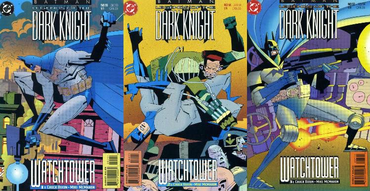
BATMAN: LEGENDS OF THE DARK KNIGHT #55-57 Artist: Mike McMahon Writer: Chuck Dixon Letterer: Willie Schubert Colourist: Digital Chameleon DC Comics, $1.75 each (1993) Batman created by Bob Kane
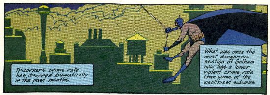
These three issues comprise the self contained and out of continuity Batman tale Watchtower. The comic itself, Batman: Legends of the Dark Knight, specialised in such tales. This title delivered a surprising number of accomplished tales from a talented and varied array of creative minds and hands; certainly at least for as long as Archie Goodwin was at the editorial helm. The attraction in this arc for me was very much the magic of Mike McMahon. Now, Chuck Dixon does a fine job, don’t get me wrong. Like a TV version of Miller’s Dark Knight Returns Dixon’s story is of a near future Bruce Wayne pining for the colourful criminals of the past. Here though none of the colourful loons conveniently return and so Batman must confront the banal but no less evil prospect of Privatisation (and its co-joined twin Corruption). Craft wise it’s spot on; Dixon hits all the beats. You know, those beats the comic book writers are always going on about. He doesn’t use narrative text either; just dialogue. I know! It turns out you can write a well paced entertaining story which makes sense by combining just dialogue and art. (Actually it turns out people have been doing it for decades, but shhhh!) Yes, Chuck Dixon provides a strong script; one so strong I suspect it would have succeeded in entertaining the reader had most anyone drawn it. That’s not faint praise but that’s all he gets because most anyone didn’t draw it; Mike McMahon did.
Before I demonstrate my love for McMahon’s work on these pages (work he has dismissed as awful) in the usual storm of horseshit hoping to pass for art appreciation let’s talk about Mike when he was but a tyke. The first time ever I saw Mike McMahon’s art was on Judge Dredd in the weekly British comic 2000AD in 1977 AD. Turned out that was his debut. McMahon, the scent of Chelsea Art College still lingering in his puppyish nostrils, was called in to pinch hit due to editorial shenanigans centering around Carlos Ezquerra. That’s why his early stuff looks like Ezquerra – that’s what he was told to do. And, bless his gifted mitts he did it. But, leisurely, he stopped doing it.
As the years passed it was clear McMahon was developing his own style under cover of The Carlos. Initially grubby and giving the impression of portraying a world made of compacted scabs there was soon a sense of flakiness to McMahon’s art, as though a slow act of shedding was underway. In strips like Ro-Busters and A.B.C. Warriors there is a definite impression of McMahon’s Ezquerra-isms swelling as though from internal pressure. It’s true, I tell ya; his figures become bloated and even have strange flecks drifting off them. And then his art, primarily on Dredd in this period, seems thereafter to suddenly retract, fitting itself tautly around a new wholly McMahon framework of geometric precision. But it didn’t stop there; McMahon’s art kept going (and it is still going), kept fresh with refinements both calculated and accidental. (How his outstandingly appropriate woodcut style on Slaine was the unexpected result of a new method involving Bristol board, markers and tracing paper has now passed into Legend.) Then he got ill. A couple of years passed and he came back strong with The Last American for Goodwin’s EPIC imprint. McMahon, being notoriously self critical as he is, was unimpressed by his work there but Goodwin knew the real stuff when he saw it and so (I assume) threw McMahon this assignment. But like San Francisco’s favourite cop you don’t assign McMahon you just turn him loose.
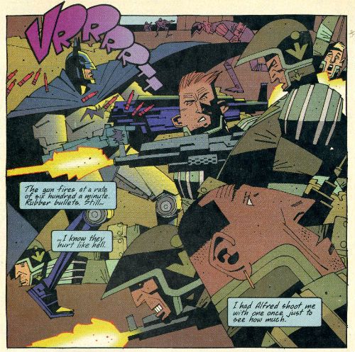
Loose being the last word you’d apply to McMahon’s work here. Meticulously constructed from the most basic level as it is to reflect the comprehensive vision of Mike McMahon. A vision which embraces the two dimensional nature of comic art like no other. Looking at Mike McMahon’s art is like looking at the world through the eyes of an alien creature. You can tell what everything is but everything is off. Yet in relation to each other every element is clearly related to the same perceptual set. It’s the flatness that gets me. Usually that would be a pejorative term obsessed as comic book art can tend to be with verisimilitude Here though realism is out of the window. Indeed, McMahon’s art seems to imply that if you want realism then look out the window because right here, pal o’ mine, is something better than reality. Something other. Something no one else could produce. Something that you won’t get anywhere else. I could have just said it was unique but I have a reputation for going on a bit to maintain. Standards and all that.
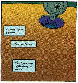
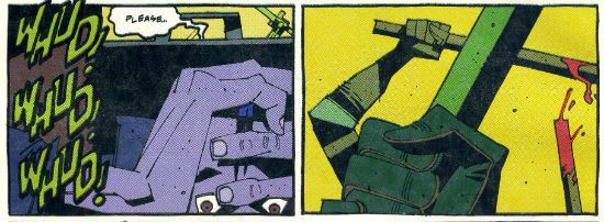
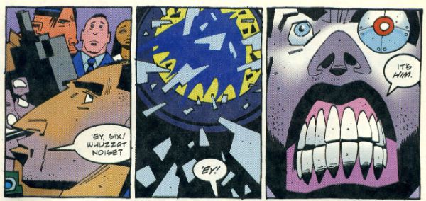
Surprisingly given its unique nature McMahon’s art isn’t hampered by the involvement of other hands. I have no idea whatsoever if there was any level of communication between the various parties but if there wasn’t then what we have here is the happiest of artistic accidents. Willie Schubert’s font in the speech bubbles and the Sound FX, with their slanted angles and hand crafted air have a very McMahon feel to them. They seem a part of the art. There’s a killer sequence where a hood is beaten by security specialists and the SFX appear in the panel showing a witness quailing in fear, but they are then absent from the next panel which shows the risen clubs. I described that quite tediously but the actual success of the effect is indisputable. You’ll notice there is only the slightest indication of motion in the image of the clubs (the blood on te rearmost club). McMahon eschews motion lines throughout. Usually he’s designed the image in a panel to lead the eye in such a way that the implicit motion is conveyed. Sometimes though ,as in a panel where a club strikes a head, the only clue to motion is the presence of a SFX (“WOK!”).
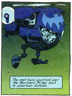
Digital Chameleon’s colours are noticeable even to me and I am notoriously inert in my appreciation of comic colouring. However, they don’t stand out because they jar or if they jar they are meant to. The palette of lime greens, midnight blues, soiled yellows and popping reds all provide another level of visual interest at the very least. And at their very best they collaborate with McMahon’s images in achieving the effects he’s reaching for. Particularly when it comes to the layering of the image. McMahon’s very keen on layering the elements in his panels. His panels can be many layers deep but each layer is distinct and the illusion of depth is the result of their distance being adequately conveyed. It's akin to those fuzzy felt pictures you used to do as a kid; if you are super-old like me. Anyway, there are panels where the colouring quite blatantly enhances this effect. In these issues i was pleasantly surprised to find that McMahon’s work adapted well to the many hands make light work ethos of North American genre comics; something everyone involved gets a high five for.
So, yeah, Mike McMahon did a Batman comic back in the day. Mike McMahon probably doesn’t like it and I can’t conceive what fandom of the day made of it, but I thought it was VERY GOOD!
But then again Mike McMahon is – COMICS!
