Savage Symposium: FEAR ITSELF & FLASHPOINT (Part 3 of 3)

The fiery climax of our roundtable Q&A, in which questions about FLASHPOINT #2 are FINALLY ANSWERED, preconceptions are EXPLODED, homes are INVADED, true love is TESTED, and the hope of ALL will fall into the hands of ONE-- and in a stunning twist ending, it turns out we were all in monogamous relationships with prostitutes this ENTIRE time.  Who saw that coming?  Well, in my case, everybody.  Everybody saw it coming.  Awwwww.

* * *

QUESTION #5-

ASKED ON JUNE 5, 2011

UPON THE RELEASE OF FLASHPOINT ISSUE #2

* * *

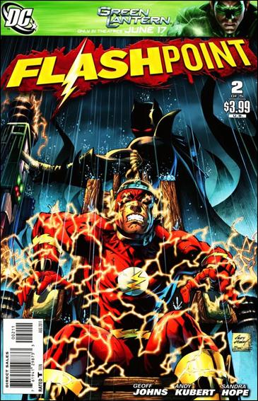
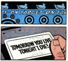
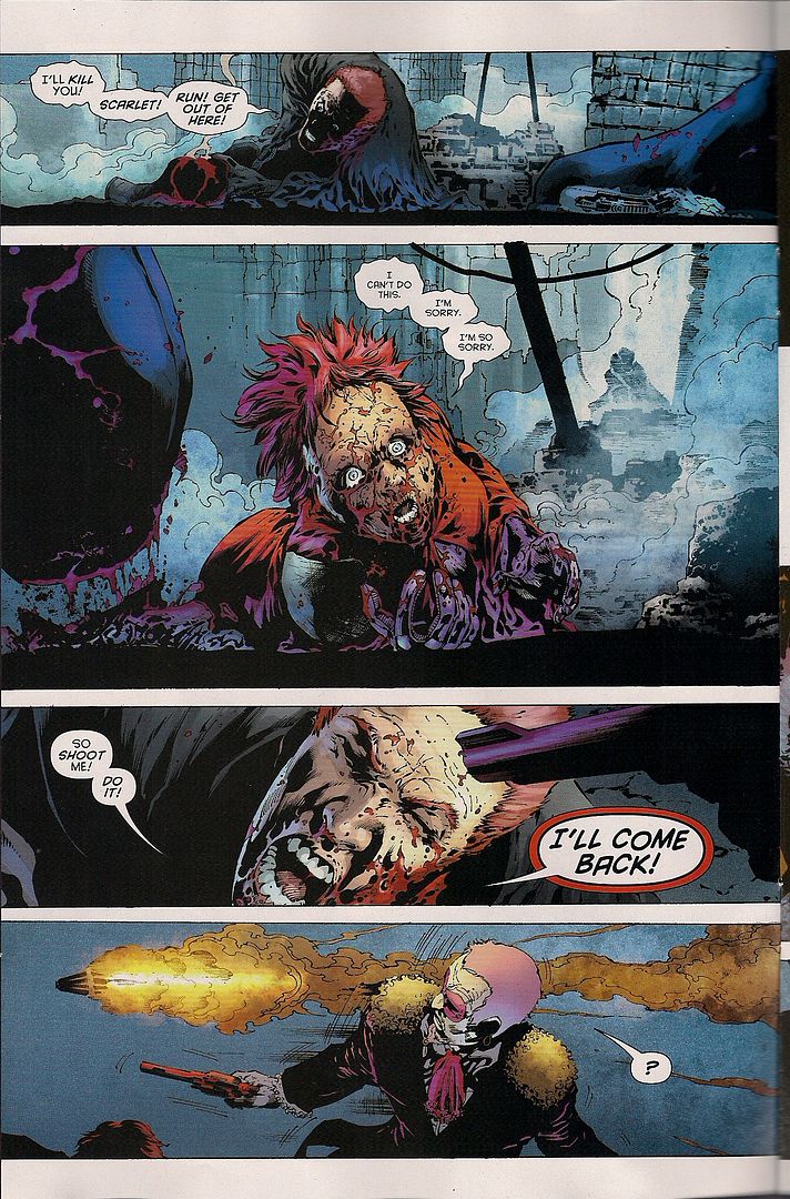
ABHAY:  So, I enjoyed FLASHPOINT #2.  At least, I thought the final sequence of FLASHPOINT #2 was funny-- Barry Allen electrocuting himself and severely burning himself?  It reminds me of playing with my He-Man toys as a kid, how their lives met a grisly and ignoble end thanks to a free canister of Nikelodeon slime JC Penny gave-away at Halloween-time.  Thinking about Geoff Johns as being like the Sid character from the TOY STORY films-- that seems to work for me.  Anyways, I liked the issue; it seems that other people didn't-- it's gotten some negative reviews from our mutual pal, the internet. To the extent it matters.  It's a DC crossover, so the actual content of those tend to be pretty irrelevant: at some point, all of the late-era DC crossovers became about the DC Universe's relationship with itself.

Given the recent news of an upcoming psuedo-reboot-something-whatever, that certainly seems to be the case with FLASHPOINT.  DC is constantly trying to "fix" its universe, but... Well:  does anyone remember why they're constantly trying to fix their universe anymore?  Can anyone tell me what's broken about it that needs constant fixing?  Does anyone still care about seeing that universe get fixed?  I feel very alienated from DC crossovers because I don't care at all, even a little, about the container that holds the DC characters, certainly not as much as DC expects that I do.

With FLASHPOINT, I think the speculation that Graeme had on one of Jeff & Graeme's GUH WHY? podcasts-- which I, of course, take as gospel-- is FLASHPOINT will end with Barry Allen mis-remembering the DC universe, with his mis-rememberings forming the new continuity.  If I remember correctly, I think that was Graeme's guess.  Which... Is that what they're going to do?  I don't know, but it sounds equally plausible with any other fucking thing we can think of, doesn't it?  "FLASHPOINT will end when fart-leprauchans rebuild the DC Universe from soiled panties found in a Japanese vending machine."  That would mean about as much to me as anything else, at this point.

I mean, I can't say I don't understand the impulse.  I guess I probably have my pet belief of how-I'd-run-DC, in a way that I absolutely do not have with Marvel, in the slightest. I think DC has always seemed so chaotic and pieced together, that it ends up inviting its readers to play Railroad Tycoon: Comics Edition with the company, in a way that maybe Marvel doesn't.  So I can see how it'd be tempting to get your fingerprints on everything if you're running the show. But... I think it's a case of people misjudging their greatest strength: because of the fact that DC is a more chaotic and pieced-together universe than the Marvel universe, almost every single great superhero novel has been done for DC.  After so many years, Marvel has, what, SQUADRON SUPREME and MARVELS.  That’s about all I can think of.  Whereas DC, you have the major Alan Moore superhero comics, all the best Grant Morrison comics from ANIMAL MAN on, ENIGMA, NEW FRONTIER, THE GOLDEN AGE, RONIN, Goodwin-Simonson MANHUNTER, DARK KNIGHT RETURNS, BATMAN YEAR ONE, SANDMAN, SANDMAN MYSTERY THEATRE, BLACK ORCHID, ALL STAR SUPERMAN, the good bits of STARMAN or v4 LSH, and so on.  DC may have cancelled CHASE and MOSAIC, but Marvel never published either, you know?  I would have to attribute some of that difference in the numbers to DC being a far more patchwork universe, that the patchwork quality lead to it being a place that could contain wildly disparate takes, strange voices, rogue editors, whatever, in a way that Marvel has never been able to match, to the present day.  The whole urge to force the DC Universe to “make sense” ... I don't think I can reconcile it with how I'd evaluate DC's strengths...

So:  Is the organizational structure of the DC universe a conceit you still have any interest in?  If this is something that's completely apart from your set of interest, if you're more of a manga/art-comic reader, how do you regard this discussion?  Is it wholly weird & alien to you or is it consistent with what you'd expect mainstream comics to be like?  Also:  what's wrong with DC's characters that I'm missing?  Have you been angry for the last 30 years that Hawkman doesn't "make sense" or something?  Or what do you want to see fixed in this next reboot?  Is there some particular change to the DC universe you've got your fingers crossed and are hoping to see?  One of my all-time favorite Batman comics is an Evan Dorkin one-panel comic from the inside front cover of an old issue of DORK, where the one-panel shows Two-Face flipping a coin and saying to himself something like "Tails!  That decides it-- tonight, Harvey Dent fucks men."  I would like for that comic to be in continuity after the reboot in September.  Can we start a petition?  (Also: I think Lex Luthor should be the world's scariest criminal again, instead of a rogue CEO lame 1980's bullshit character. Also: they should do an Absolute edition of "Luthor Fights for Good" from ACTION COMICS.  Also: in the rebooted DC universe, girls should like me. Awwwww).

BRIAN: I think that the instinct that things must “make sense” is more that they don’t contradict themselves. Clearly, if you invest so much of your time/self in following a fictional universe, you want the various pieces to “add up”

I think some people might have some particular want list of changes -- “Man, I wish Babs Gordon was still Batgirl” or whatever -- but I really do think that most people are just looking for the consistency that “the sun does, in fact, rise in the east”.

The problem with a shared universe is that the what is “east” in one strand of it might be “north east” in another. In a for example, post-Crisis, Wonder Woman wasn’t actually a founding member of the JLA -- she didn’t come to “Man’s World” until several years after the JLA was formed, for whatever reason. But we have the comics where she was there fighting Starro the conqueror or getting turned into a tree, or whatever else alongside J’onn. How do you “fix” that?

Someone (Waid, I think?) thought, “Well we can just replace Diana with Dinah (the Black Canary), and it will all be close enough” - and for most things, it probably is. But Black Canary is actually the daughter of the 1940s BC, and if that’s still true, then what happened to the story where they crossed from Earth-1 to Earth-2, because if that didn’t happen, then....

And so on and so forth -- the “continuity implants” end up having a domino impact on dozens of OTHER characters and events.

The problem with a character like, say, Hawkman, is that it is really hard to reconcile the Reincarnated Egyptian Prince version with the Space Cop From Thanagar version -- mostly because Thanagar has, y’know, invaded earth in INVASION or whatever. Dominoes, tink tink tink thud.

Do those things ACTUALLY matter when you’re talking about a shirtless guy who flies through the air to beat the shit out of people with medieval weaponry? Well, no, probably not, but there’s a jarring discordance that hums in the background and makes it hard to have that all important willing suspension of disbelief.

It’s like.... hm, it’s like have you ever had a dream and you’re totally following along, then something happens in the dream that makes you say “Wait, that fire hydrant is green!” then you know it is a dream, and the whole thing unravels in your mind, and you wake up suddenly feeling just a little askew? Balancing continuity across scores of characters and scores of books and scores of years is just like that. We’re “willing to accept” that, say, Dick Grayson has only aged 12-15 years in the last 75, but that Bruce has only aged maybe 7 or 8, because that’s the kind of cognitive dissonance that doesn’t jar us out of the dream. But Hawkman? “It’s a floor wax AND a dessert topping” is just one step too much.

This is what gets me about the assurances that “It isn’t a reboot! It’s a relaunch!” for NuDC -- if it isn’t a reboot, AND if they’re changing some/many/all details about some/many/all characters, then you’re starting from a cognitively dissonance-filled place. It is almost certain that we’ll have to look at SOME of the bits as “pre- and post-Flashpoint” which means that you’ll have to explain Flashpoint to explain the character, which then means you’ll also have to explain COIE, and how this is the fourth try at having Hawkman “make sense”. If you’re NOT doing a “hard reboot”, then a certain amount of your forward momentum will have to be spent on explaining where you do or do not know the previous versions.  There’s a tiny handful of creators who can thread that needle adequately, but I can not see how on earth this could work across a line of 52 comics.

JEFF: As somebody who used to be really into continuity and no-prizes and what have you, I can safely say I now give less than two shits about that kind of thing, except where the always-difficult-to-gauge “so-and-so is/isn’t acting in character” (also known as the infamous “the real Batman wouldn’t do that” argument my wife finds so hilarious) comes in.

In fact, I think it’s pretty apparent that a consistent comic book universe can only go so far -- thirty years, maybe, at the most? -- before it collapses in on itself due to contradictions and paradoxes.  I’m now more enthralled by the way in which both the Marvel and DC universes have conceptually become analogous to post-first world countries, structures that have to cannibalize past resources in order to continue to function, areas where new buildings are built on top of the old.  Cultural palimpsests.  Have you ever played World of Goo, and had to pull critters out of your tower of critters in order to get it to the right height and had the whole thing collapse?  These days, the two universes remind me of that.

ABHAY: My whole life is a World of Goo.

JEFF: So I really don’t have much interest in the organizational structure of the DCU except in an insider baseball kind of way.  And in that way, as long as it doesn’t destroy the direct market, I find this potential restructuring kind of interesting:  I feel like someone sat down and seriously tried to figure out why people are watching movies and playing videogames featuring these characters but not reading the comics.

Maybe that someone was wondering what moved the needle so visibly and obviously when the trailer for Watchmen came out and suddenly you hundreds of thousands of copies being sold, but you’re lucky to get even a portion of that action after The Dark Knight, a much larger movie?  Of course, we know it has everything to do with Watchmen’s quality and the fact that the trailer called the book “the greatest graphic novel of all time” but maybe someone somewhere actually had to explain to some higher-ups why a negligible success can sell tens of thousands of graphic novels and one of the biggest movies of all time can barely sell any.

In a way, I like the idea of DC sitting down and trying to remove the obstacles keeping a fan of the movies and games from picking up a comic book.  I think they’re making a ton of mistakes, of course -- misunderstanding the role of quality, overestimating the need for synergy, ignoring the deeply entrenched disfunction in their editorial offices -- but I appreciate they’re actually thinking about what to do.  As long as they haven’t decided one of the obstacles to getting new people into comic books are the comic shops, I don’t really care too much what they do or un-do or re-do to make it work. I’ve lived through worse things happening to comic characters I like than what they’re promising now.

ABHAY: It’s kind of fun that DC’s version of the Age of Apocalypse is making way for a new DC headed by Bob Harras where star comic creators like Dan Jurgens, Scott Lobdell, Rob Liefeld, Fabian Nicieza and Ron Marz can work on characters like Voodoo, the stripper-hero from WILDC.A.T.S. (Covert Action Teams).  I don’t want to read any of their comics-- but I do want to watch THE EXPENDABLES with them, so you know-- bittersweet, pretty bittersweet.  I guess people who miss the 90’s are happy-- if MC Hammer or Gerardo read DC comics, they’re both probably thrilled; if I’m Scott Lobdell, I’m waking up every morning praying that Gerardo isn’t dead-- that’s all I know.

JOG: Woah, whoa - OMEGA THE UNKNOWN, the Jonathan Lethem one!  I’d put that up there with the big “superhero novels,” definitely.  Maybe it needs more time to steep?  I got irrationally agitated at the bookstore today flipping through the paperback edition of CHRONIC CITY and noticing that it wasn’t listed among Lethem’s works in the obligatory By the Same Author bit up front.  It couldn’t be that he used a co-writer on the script - KAFKA AMERICANA is noted, in collaboration with Carter Scholz (whom we all know best, of course, as one of the premiere early writers for THE COMICS JOURNAL), so maybe it’s a publishing thing?

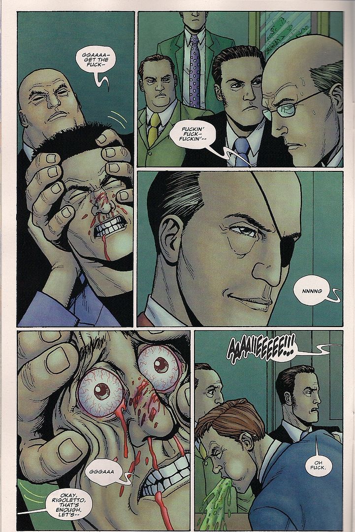
But anyway, here’s something I’ve been chewing over - I’m not generally interested in the organizational structure of the DCU, but I actually am in this instance, because I think it syncs well with what I’ve picked up as Johns’ continuing themes as a writer.  I was discussing this with Sean Witzke on Twitter the other day - the final page of FLASHPOINT #2 is like something straight out of RUINS, Warren Ellis’ ultra-sardonic 1995 ‘response’ to MARVELS, positing a realer-real world superhero continuity where radiation gives people cancer instead of superpowers.  And while it functions as mostly a dark joke, there’s something really serious about it too, because it’s not just a ‘ha ha superheroes are so dumb’ kind of thing - it’s a lament, a hyperbolic cautionary tale about adding too much focused ‘realism’ to superhero concepts, because the more you do that the more evident it becomes that actually living among superheroes would completely terrifying and awful.  And I think about this whenever I’m reading superhero comics like FEAR ITSELF, with its global calamities and assaults on population centers, only the latest of so many - I’d fucking riot too!

That effect, I think, is what concerns Johns as a very devoted superhero writer.  Because really, to say all of the ‘big’ recent DC crossovers are concerned with superhero mechanics -- and I’d agree with that -- is to say that Geoff Johns and Grant Morrison are, because they’re the headlining writers.  You don’t get a lot of talk about Morrison as supplicant to the state of the DCU, however, because his invocation of such is hardwired into the broader evolutionary theme that marks so much of his work across media and genre.  Johns is more of a strict company man, and a much more literal writer than Morrison -- was it our David Uzumeri that coined the term “Johnsian Literalism”? -- so it’s perhaps easier to process his own themes as merely the Hand of the Market at work, but think about it: of his big crossovers, INFINITE CRISIS and BLACKEST NIGHT, the threats as I understand them (having only read ‘of’ INFINITE CRISIS via essays and the like, I’m warning you all now) are corporeal avatars for problems facing superhero comics, respectively the desire to return the superhero world by force to a presumed ‘better’ state, and the return of dead characters as atrocious mockeries (an idea not so far away from some of the stuff Garth Ennis got into with THE BOYS).

Given this, with FLASHPOINT #2, I wonder if Johns’ plan is to pit superheroes against the world itself, a shitty state of being where Batman is crazy-violent-in-a-bad-way and ‘royalty’ characters mostly desire blood-soaked conquest and where getting doused in chemicals from an electric blast wins you third-degree burns from head to toe.  The villain of FLASHPOINT -- and hey, I’m speculating!! -- might well be Reality as a potentially wicked factor, and thrashing Reality would be a suitably Geoff!Johns! way of resetting the universal status quo.

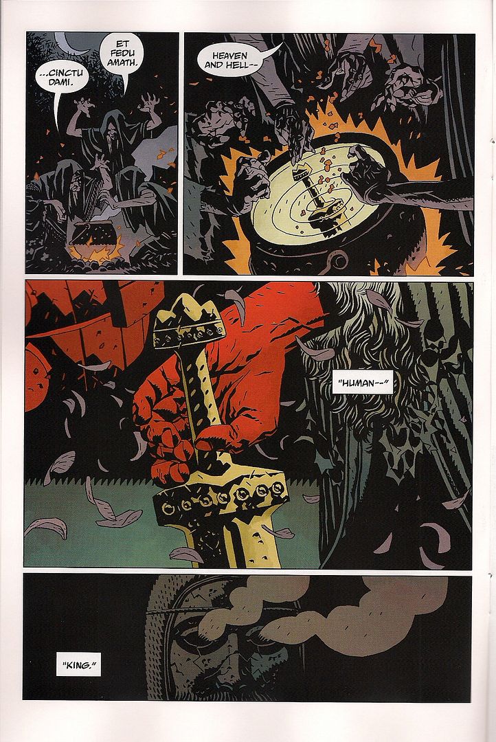
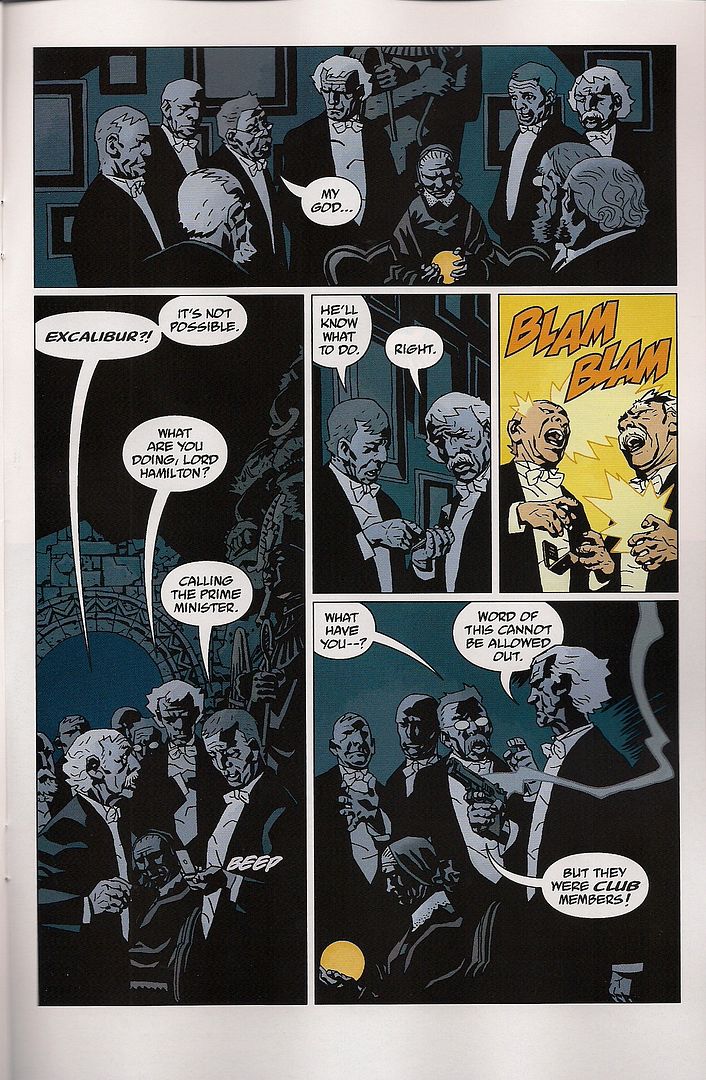
I could be entirely wrong, obviously, but that’s the way the DCU fits into my reading of FLASHPOINT, to answer your question - as complimentary to the ongoing themes I’ve sensed as an admittedly none-too-thorough Geoff Johns reader.  I still think the little detours to Wonder Woman and Aquaman in issue #2 are more of a distraction than anything -- particularly in that Johns is going all DEATHMATE with the action, where characters long ago established as awesome fighters are checking out like punks left and right because it’s an alt universe -- and that’s about half the comic right there, so I can’t say it’s fantastically compelling on the whole, but I’m getting a bit more out of it than I’d expected.  Shame it came out on the same day as HELLBOY: THE FURY #1, though, ‘cause that’s how I like my End of Days superheroes to roll.

JEFF: I think that’s a really lovely analysis, Jog, and I’m inclined to agree.  My only problem is that Johns has repeatedly shown himself able to talk the meta-talk but very unwilling to walk his meta-walk:  Johns followed up that commentary in BLACKEST NIGHT with the endless “hey-who-else-can-we-bring-back-from-the-dead?” adventures in BRIGHTEST DAY.  And what looks more like the “return” of DC’s heroes to a better state by force than those 52 new titles awaiting us at the end of FLASHPOINT? I think it makes a lot of sense that Barry Allen will end up ushering a new “age of wonder” at this event’s end, mirroring the way his helped usher in the start of DC’s (and comics’) Silver Age, but I can’t help but suspect what we will see in that new age of wonder will be exactly the same as what we’re seeing now.  Johns may have the capacity to talk about things being different, but he either lacks the commitment or the imagination to actually make it so.  While that probably positions him as the living embodiment of DC in the direct marketplace, it’s still (a) a god-damned shame, and (b) renders FLASHPOINT’s subtext just as meaningless as its text.  It’s just another thing to keep you amused while you’re reading it.

JOG: Ah, but of course!  The heroes zapped away the embodiment of ‘doing it wrong,’ so now revivals can be demonstrably ‘done right!’  In the end it serves the status quo as implicitly correct, although I maintain there’s a special juice to FLASHPOINT in that the extent of what the reboot is even glancing at -- ineffective as it might well prove to be -- gives Johns’ crossover thematics a little extra punch from facilitating something bigger than Johns himself and more superficially drastic than prodding the timeline ahead for a year.

ABHAY: I think what I like so much about your reading is how much I'm inherently rooting for the grim-gritty terminus-of-our sins reality to in fact prevail over boring-ass Barry Allen.   I'm rooting for more shocks, more blood, more gore, more viscera, more splatter-horror.  I want to see Barry Allen get mutilated repeatedly like Kenny from South Park-- because I'm old and bored and it'd be funny to me.  Which I suspect is how a not insubstantial amount of the fanbase actually is receiving these comics, at least if the internet reactions I've seen to Aquaman getting his hand ripped off or whatever, if those things form an accurate sample.  The idea that the audience can be walked through this gauntlet of bloodshed and gore in order to come out the other end in a "better state"-- like all of DC’s recently announced plans, I just think that sounds very, very optimistic.  But only because it’s a mystery to me why FLASHPOINT would possibly serve to lessen or correct the audience's blood-lust rather than to merely temporarily sate it.  A mystery that I hope Grouchy-Batman solves by throwing Barry Allen off that one ledge, or by flying Wonder Woman’s invisible jet all up into his ass or something.

I forgot about OMEGA THE UNKNOWN.  And ELEKTRA: ASSASSIN, which isn’t really my book but should probably be on my list.  ELEKTRA LIVES AGAIN isn’t going on the list, though!  Exercise of arbitrary power!

JEFF: Considering ELEKTRA: ASSASSIN isn’t in print as of this writing, I don’t think you have to worry about forgetting about it, Abhay.  I mean, since Marvel’s forgotten about it, why shouldn’t you?

For that reason, I’m reluctant to get into the DC and Marvel canon comparison, though, because DC’s continued commitment to (a) their backlist; and (b) a line of creator owned/participation comics has given them a tremendous leg-up to crazy crackhead Marvel in this debate.  Marvel really did a lot of great idiosyncratic stuff in the ‘70s (such as Gerber and Skrenes’ OMEGA THE UNKNOWN, without which there’d be no Lethem book) and even after Shooter came in and cleaned house, you’ve got weird stuff on the fringes like STRIKEFORCE MORITURI  by Peter B. Gillis, or titles from EPIC like MOONSHADOW, MARSHAL LAW, THE ONE by Rick Veitch, two SAM & MAX books, STARSTRUCK, STRAY TOASTERS, etc., etc.  But you wouldn’t know it from talking to the crazy crackhead because they’re too busy trying to sell you this amazing lamp they found on someone’s lawn so they can get their fix.

TUCKER: I sort of dug on the way Thomas Wayne, upon hearing that his son was alive in another version of reality, immediately throws in with this crewcut dickhead whose fingers he just broke. There’s something positively Batmanian about a guy who says “yeah, so how do I annihilate my entire existence, universe, everything et. all so that my son can live to become a psychotically driven vigilante”, especially when the first part of the answer to his question is “make a homemade electric chair and fry Barry Allen like he’s an Alabama fat boy.” Maybe it’s because I grew up reading DC, maybe it’s because the main thing I’ve learned from the last five years of comics is that I fucking loath Barry Allen, maybe it’s because Tim O’Neil is absolutely right, and Death Row Records means more to me than my father’s intermittent affection, but Issue Two of this Comic Book Series was more interesting than Issue One.

CHRIS: I have far too dim a view of Geoff Johns’s abilities of writing and self-reflection to believe that there’s anything deep and meta in FLASHPOINT, so I’ll sidestep that issue. I think the reason fans have such an impulse to Fantasy Edit the DC Universe rather than the Marvel Universe is because DC’s done it so much themselves. I started reading comics around the time of the first Crisis, so my entire reading life has seen DC pull out repeated attempts to edit and retcon their universe into a new shape. In comparison, Marvel’s been pretty steady with having One Universe, occasional One More Days aside. It’s all Fantasy Editing, but making huge reboots/retcons to the DC Universe at least seems like something within the realm of possibility.

I do think you’re shortchanging Marvel in terms of having Great Superhero Stories. The vast majority of the examples for DC fall into the category of them having employed Neil Gaiman, Frank Miller and Alan Moore at the Right Time. And if you expand the definition out to longer runs (like you did mentioning Starman and the mythological pixie of Good Legion of Super Heroes stories) then Marvel has Simonson’s Thor, Milligan and Allred’s X-Statix, Miller’s Daredevil, BORN AGAIN, Morrison’s New X-Men, the aforementioned OMEGA THE UNKNOWN, Bendis and Maleev’s Daredevil, Simonson’s Fantastic Four, Waid and Weiringo’s Fantastic Four, UNSTABLE MOLECULES, DAMAGE CONTROL, Priest’s Black Panther, Fraction/Brubaker’s IRON FIST, Ennis’s Punisher MAX... I am probably being a fanboy here, but I think Hickman’s FF, and Brubaker’s Captain America will end up on this list too. I realize that few if any of these can stand up to comparisons to the monolithic import of WATCHMEN!!! or SANDMAN!!! and you could throw out [insert big DC run here] to counter half of these examples, and you’d be right to say that the vast majority of my examples come from the last decade or so, meaning Marvel Failed from 1961-2001 to achieve these sort of books, and that they’re all too new to really call Great, and whatever. But come on, Black Orchid? Starman, which I adored at the time but is a sprawling 90+ issue mess that crosses over with fucking UNDERWORLD UNLEASHED and GENESIS? If we’re letting Phil Rizzuto into the Hall of Fame, we might as well throw in Ron Santo and Steve Garvey too.

* * *

QUESTION #6-

FINAL QUESTION.

PENCILS DOWN.

* * *

ABHAY: There's a saying that flits through the ether every so often-- Mark Waid circulated it recently, but other people have said it and I don't think it's an uncommon expression:  "The audience doesn’t know what it wants. If it knew what it wanted, it wouldn’t be an audience."

Sometimes I see mainstream fans, in comment sections and such, they say things like "I don't want to read crossovers anymore-- I just want to read good stories about the characters I like."  And when I see that kind of talk, I just wonder... do people really still think things can be any other way? I'm a 'sky is falling' type person so I think the ship has sailed.  How do you turn back once you've gotten into this incessant cycle of diminishing-returns crossovers?  Oh, things broke down for a brief moment when Marvel hit the skids, and they had to bring Quesada & Co. on.  For a couple years.  But as soon as they saw a hint of daylight, whippity-woo and yee-hah and damn the consequences-- we were right back in it.  Now, DC is trying to built this fresh start, but how much do sales have to go down on those 52 new titles before someone with an itchy trigger finger puts out that next Crisis?  How can any Crisis be final once you've trained your audience to be on the look-out for the next crisis to upend everything?  SIEGE issue #4 was released in May 2010.  FEAR ITSELF was announced in December 2010-- they waited seven months.  During which time, Marvel released the Shadowland, World War Hulks, Chaos War, and X-Men: Second Coming "mini-crossovers" while their bigger books I think may have been busy teasing the NEXT crossover (they kept teasing some Martian shit...?).  If people don't want to be reading crossovers, then based on all of that, is it safe to say they probably shouldn't be reading mainstream comics?

I see people scoff -- scoff!-- that fans only want to read comics that "matter."  Of course they do-- that's what they've been taught. What do people think that crossovers wouldn't teach fans lessons in how to best spend their money?  The comic audience has been well-trained by comic creators and comic publishers, and yet I feel like the fans are the ones who get blamed when their actions merely reflect that training. "Oh, those horrible old fans who hate change and how they hold us back from creating new things."  How did those fans end up that way? Who chased away everyone else? They just point to the fact that no one bought critically-acclaimed book X or no one bought internet-favorite Y, as if the audience had unlimited funds.  They keep saying fans vote with their dollars, but ignore that the election’s been rigged.

My favorite thing recently: did anybody notice interviews in the promotional campaign for FEAR ITSELF involved Marvel repeatedly telling its fans that there was no such thing as crossover fatigue?!  I feel like every interview that I saw, someone would be sure to say at some point that the only crossovers that people are tired of are The Bad Ones.  Which-- what's that old expression-- who are you going to believe, me or your lying eyes?

So. Final questions.  Are you happy with the current status quo in mainstream comics? Do you think this is all perfectly normal and natural given a more competitive media landscape (i.e. hyping up certain books is simply what is needed to be done given the amount of things competing for readers' attention)? Or are you unhappy but either (a) don't care anymore or (b) never cared really to begin with?  If neither (a) nor (b)-- do you think things can actually be any other way, anymore? Do you think things can reverse course somehow and fix themselves, with the current people in charge?  Or if there have to be crossovers, if there simply must, is there something you'd like to see them do differently with them than what we've seen so far?  Or is Mark Waid right, and you don't even know what you want, and you're waiting for Mark Waid to whisper what you actually want into your ear, late at night, when you were just about to fall asleep?  Wait-- how did Mark Waid get into your house?  Does he have a key to your house?  If he (a) doesn't have a key and (b) the door was locked, did Mark Waid come in through a window?  If (a) he is in your bedroom and (b) he has his shirt off, is Mark Waid going through your drawers?  Why is he breathing like that?  Is he getting ready for a bullfight?  If you think Mark Waid is getting ready for a bullfight, is he playing the part of (a) the matador or (b) the bull?  On a scale of 1 to 10, how many times will Mark Waid “gore” you?  Discuss.

BRIAN: For me, only, I think what the audience “wants” is what we used to have in (say) the 70s or 80s -- smaller lines of books, where “everything counts”, “nothing contradicts other books”, where is issue is (generally) self-contained, giving you at least the feeling of a complete story, but ALSO adds up to “something more” when you read bits of it together, comics that are dense, but not ponderous, and publishing regimes that don’t seem dedicated to thinking “oh, you like that? Well therefore you’ll like three times that THREE TIMES MORE!” Plus, the audience wants to be thrilled and surprised, but not taken drastically out of its comfort zone.

On paper this is very very simple.

I am very much convinced that if the big two superhero universes published roughly half or less of what they do today everything would be much healthier and more focused, and that everything devolves from the insane overproduction we’ve had for many many years now.

I don’t think that the current stewards of the two companies are actually capable of “fixing” things, because I think they’re too beholden to the system that they themselves have created. (dur)

JEFF: “Do people really still think things can be any other way?”

I think the answer is more than likely “no,” of course.  Linewide events are these tumors that keep springing up no matter how much everyone talks about cutting them off. They seem like an inevitable consequence of having a shared universe, in a way.  Take a shared universe, irradiate it with sustained exposure to editorial mandates and intense bursts of profit  and...is it any surprise the fuckers just grow out of control and threaten to take over the entire system?  I don’t know what my metaphor for chemo in this case would be, but....no.  There will be no ridding ourselves of them.

As for the thing about audiences, you know what it makes me think of?  Nirvana.  I don’t really know where to go with the song lyrics, but, many years later, the titles stick with me.  You know, “Radio Friendly Unit Shifter,” and like that -- I love how Cobain took a bit of shitty radio marketer speak and isolated it.  It’s more than just a meta-joke to me, it’s a phrase put in a new and strange light, a military term, like something you’d read in a Burroughs book.

The last few weeks or so, I keep coming back to another song title, though -- ”Pay To Play” -- another term from the music biz (if I’m remembering correctly) for clubs and other venues that make the bands pay an upfront fee to play that venue. I’m not crazy about the song (or “Radio Friendly Unit Shifter,” actually) but I still appreciate how resonant it is.  Sometimes, it seems like so much of our culture can be reduced down to that three-word phrase.

The other day, I was talking at the shop with Brian about how typical or atypical a comic book reader I am, and I was of the position that I’m pretty atypical -- I have a strong bond for the characters but don’t care so much for what’s going on with them these days, and I don’t spend a lot of money on them.  But Brian insisted I am in fact a pretty typical reader for the industry these days -- a guy who’s almost entirely lapsed as a mainstream comic reader but someone who still pays attention to what’s going on and is either looking for a new way back in to the industry, or a final way out.  So it’ll be interesting to see how much of what I write now will resonate with other people reading this.

With mainstream comics these days, I feel more and more like I pay to play.  If I want to be able to talk about what others are talking about, I have to read the damn books.  And instead of just torrenting them off the net, I either (a) pay to read ‘em; or (b) read ‘em off the shelf at the store and make it a point to buy something else.  One of the obvious appeals of a linewide event is the feeling that everything is happening in the same universe, but maybe one of the less obvious appeals is the idea that everyone following different titles in the same universe finally have a common ground.  You know, one dude reads Thor, another reads Cap, but theoretically they can both talk about FEAR ITSELF because the same events are unfolding in the shared universe.

It’s the superhero comic equivalent of talking about the weather, I guess.  In fact, that’s exactly how the “red skies” worked in CRISIS ON INFINITE EARTHS—it could be a very minor tie-in (“Hey, look at the sky!”) or it could be something more major—but the idea of giving the fans something to talk about, to “get excited about” was obviously a big deal behind these types of things.

More than anything else, I feel like the pink healthy tissue linewide events metastasize from aren’t the big superhero universes, it’s the desire to talk.  You know, “this is the issue that everyone will be talking about!” “This is the event fans will be discussing for decades!” are used for a reason.  It’s specifically stated there’s a conversation going on about these books and by purchasing them, it’s implied we have a right to engage in that conversation.

Lemme take this a step further -- we talk about the language of comics or comics as a language, but what if superhero comics are a kind of language?  Not like math or something, but...you know how any sufficiently advanced field of knowledge becomes so dense with jargon and specific terminology?  What if superhero comics are now not unlike that?  We have people who are fluent in the language of superheroes -- not the meta-language of superheroes and not the language used to craft comics, but the actual superhero themselves.  By reading superhero comics for a certain period of time, you can become fluent in this language, and then, by reading the characters, you are engaging in a dialogue of sorts with -- I’m not quite sure how to put this, in part because I’m not entirely sure I know what I’m saying -- the superheroes?  The universes?

Sure, it sounds crazy but I think this idea of participants in a dialogue has more relevance to serial entertainment than the concept of “the audience” as mentioned by Waid in that interview.  (And if I was being a smarty-pants, I would point out that the term “audience” derives from words for “hearing and listening,” specifically, but never mind that.)  An audience for a play or an art piece or a book is very different from the audience for a TV show or a comic book because at some point the art piece or the play ends.  A TV show or a comic book continues until not enough people are watching anymore -- otherwise, it runs forever. So it makes sense the longer these things run, the more the audience is trained by them, right?  I mean, that’s just simple -- if not evolution, than at least education, right?  It’s exactly as you say, Abhay:  “That’s what they’ve been taught.”

And I think this is a huge fucking problem facing mainstream comics today -- we’ve whittled down our audience to the point where only a (comparatively) small number of people are having that conversation with superhero comics, but they’ve been having that conversation for a very long time.  For people like me, it’s been a forty year long dialogue (I’m rounding up a little).  There’s an investment in continuing that conversation on the part of the long-time purchaser.

I’m actually okay with that conversation starting over or, you know, having DC or Marvel start another conversation with a new group of people while we continue to have ours over there. But it’s never going to happen that way, is it?  There’s not enough money for the companies or for the retailers to stock those books long enough for them to build up a new audience. And the existing group of purchasers will either have no interest in talking to that new line of books (it would be like talking to children, wouldn’t it?  There might be a certain charm in the way things are perceived or misunderstood but it seems almost impossible that they could tell you anything you didn’t know.) or they want to talk to it at their own level of complexity (“is there a Barbara Gordon?  Is she Batgirl?”).  In a very short order, it becomes Ultimate Universe syndrome all over again -- Dazzler is disco, but Ultimate Dazzler is punk! Ultimate Colossus is gay! Is Ultimate Daredevil really blind?

Even if the mainstream comics companies try to start a sustained conversation with a new audience, our audience tends to barge in and dominate the conversation because our audience is *starved* for conversation.  It wants to listen to what the companies have to say, and then it wants to say what it thinks about what that company just said.

And, really, the companies are a million times more comfortable talking to our audience because the companies can talk superhero comics at our level.  Even if they’re bored by that conversation by now -- really, the only side of our conversation they still care about is the things we tell them with little green slips of paper with dead presidents on them -- it’s easier than teaching the language to a new audience and having to put up with pretty simplistic conversations.  People are willing to teach that conversation to, say, a movie audience because there are hundreds of millions of dollars to gain if you succeed and hundreds of millions of dollars to lose if you fail.  That conversation gets mapped out a little more carefully, to be sure.

So, yeah.  I wasn’t going to buy these comic books but then because I wanted to participate in this conversation, I signed up to talk about them and -- in that weird way I’m doing a terrible job of writing about -- to them?  I thought in doing so, I was being motivated by very different reasons than the majority of the audience but now I’m not so sure.

TUCKER: I generally agree with Waid about business-y type stuff, but this is one where I have to part company: super-hero comics don’t have any comparison, because other forms of this kind of entertainment don’t attempt to keep the same audience in the room for this long a period of time. Television shows get cancelled, new things sprout up, the general appeal of certain genres and styles changes generationally--it’s only super-hero comics that posit “keep ‘em in the room, cradle to grave”, and they’ve only been doing that for a few decades now. I don’t disagree that Marvel is telling people they aren’t sick of cross-overs in the hope that those who are sick of them will be further separated from the pack of people who aren’t, that’s a smart (and wholly cynical, also short-sighted) business method that pops up everytime there’s an election, survey, or new product to sell. It’s how independent cartoonists and independent publishers and independent musicians and anything else gets a certain percentage of their support, by strengthening the boundaries between the audience, because audiences like to feel like they’re special and part of groups, especially when dealing with art, where aesthetic decisions have to be made so constantly that the potentiality for feeling stupid and being wrong is at a fevered pitch, even more so when feelings of persecution and shame are tied into the exchange, which of course, they always will be when you’re dealing with something that appeals to infinitesimal audience numbers, no matter how hard people adopt the character traits of Warren Ellis and present them as their own personalities.

That doesn’t really answer Abhay’s question, but generally speaking, I don’t know that Abhay’s question is something I can answer, because I believer there’s a fundamental implication to the question that I don’t agree with, which is that there’s-someone-at-the-helm-making-a-choice, and I don’t think that’s the case. Super-hero comic companies and creators are RE-active forces, they’re not PRO-active. They don’t come up with ideas a year out, or two, and anyone who says different has been proven over and over again to be lying. They flood the market with shitty tie-ins because the week before they didn’t flood it with shitty tie-ins and the numbers went down, so maybe this will make the numbers go up. They kill the Human Torch and see a spike in their quarterly financials, so the decision gets made that they’ll kill characters before each quarterly financial. I can’t use my third grade understanding of economics and supply and demand and business on companies that change their mind every two weeks, and doing so would drive me up the wall and make me even crankier than I already am.

CHRIS: I lived through the period where Bob Harras was the Editor in Chief of a company putting out almost uniformly bad comics once. I will live through that period again. I still like superheroes, and superhero universes, and have come to accept that they’re going to give characters I’m fond of to creators I can’t stand, have Grant Morrison scripts drawn by lousy artists, have Keith Giffen and Marcos Martin draw lousy scripts, see promising books driven into the ground by crossovers and event blitzes, hear the lamentations of their women, etc. I’m also used to television shows I love being cancelled, bands I love die in obscurity. What I Want -- and I like to think I know What I Want -- just isn’t what the publishers Think I Want, and it’s often not what all of the other fans Think They Want, or even what the other fans Actually Want.

On a day-to-day, grousing with friends about the latest press release level, I think about this, and it annoys me. But I can compartmentalize all that shit long enough to enjoy the superhero comics from the Big Two I enjoy. I don’t really know what else to say, I don’t work in any aspect of the publishing or retail side of Comics so I don’t have a horse in the race like lots of other pundits do.

JOG: It’s funny you should phrase the question like this, in such inevitable terms, although, y’know - you’re probably right. And yet, I think right now we’re on the brink of one of those few points where serious change is a real possibility for one of the prominent superhero publishers.  Like, I don’t think there’s any greater symbolism out there in the genre right now than the cover artwork of all these DC comics getting obscured by a big GREEN LANTERN banner ad and their innards being disrupted by a promotional comic for SUPER 8.  And, you know, not that I’m complaining about Tommy Lee Edwards popping up out of nowhere, but - well...

I saw SUPER 8 this weekend.  At risk of sounding precious, it was an efficient, irregularly effective piece of crowd-pleasing craftsmanship that left me feeling as if Joel Courtney and Elle Fanning were walking me through the subconscious ruins of culture like the angels at the end of BERLIN ALEXANDERPLATZ and nothing good would ever happen again. Because this is J.J. Abrams’ third film as a director, and his first ‘original’ creation in the director’s seat, filling up what’s looking more and more like the obligatory seasonal solo spot for a non-franchise concept in big budget popular genre film-making, and - it actually is essentially a franchise piece.  First there was a MISSION: IMPOSSIBLE movie, then a STAR TREK movie, and now a STEVEN SPIELBERG movie, taking the very notion of paying homage to an influential predecessor and executing it in much the same manner as ‘rebooting’ a past-effective bit of property, specifically the ‘70s/early ‘80s Spielberg through roughly THE GOONIES (which he produced), plus some giant monster suspense mechanics derived from JURASSIC PARK, because who can ignore that, right?

What’s interesting, and I think depressing, is that Abrams’ approach -- abetted by Spielberg himself as producer, mind you -- assiduously avoids any of the especially rough patches of Spielberg-the-brand, knowing instead when to swap in some complimentary Michael Bay-isms with that absurd exploding train and its seventeen consecutive volleys of whooshing debris and erupting fireballs that each and every member of the young cast manages to dodge in nimble order.  Spielberg-as-director-at-the-time had his action, yes, but just the other day my younger brother was telling me about seeing E.T. THE EXTRA-TERRESTRIAL for the first time in a long while and being kind of startled by that weird, aggressive, scary-funny scene where the government people are charging into the house in contamination outfits and covering everything in white - this really vivid, kind of satiric ‘70s-bred don’t-trust-the-government stuff that Spielberg, a father of the summer blockbuster but autodidactic in that way, would typically drop in, and still does - I mean, I do think I recall the guy quoting IRREVERSIBLE(!!) in the early panicked car ride in WAR OF THE WORLDS, and while everyone on the internet seems to hate the invincible fridge in INDIANA JONES AND THE KINGDOM OF THE CRYSTAL SKULL, it’s still surrounded by this pretty funny and striking sequence with the facade ‘50s town sitting uselessly and melting down under nuclear force.

AH, but wait, wait - RAIDERS OF THE LOST ARK was a crucial predecessor of this geeky patchwork cinema style, right?  Totally right, but the subtext of RAIDERS was always that Indy was in command of the subtleties of the items he pursues, the dusty matinee serial discoveries that are the basis of his being - that’s how the villains always die in that franchise, they kill themselves fucking around with the magic doodad because they’re not understanding, and Indy is.  This, arguably, is a consistent theme in the Spielberg movies Abrams is invoking: understanding something greater than yourself, be it through physical contact with the aliens in CLOSE ENCOUNTERS OF THE THIRD KIND or the relationship between the boy and the creature in E.T.

(Uh, SPOILERS for the next paragraph!)

In SUPER 8, there’s none of that.  Quite the opposite!  It’s established that the alien is trapped on Earth from the machinations of the (of course!) sinister and rather under-characterized government goons -- politically unspecified to function most efficiently as blunt trope -- but it’s made equally ‘clear’ (if only through the screenplay’s fuzziness on the point) that the alien’s psychic connection with various humans is tenuous and futile.  Fuck getting to know people - the alien has no qualms against eating random citizens despite its notional mental connection with them as thinking, living beings, much as the movie, in macro, has no qualms about killing assorted standby characters to make the creature seem just a bit more deadly.  It’s a very intentional disconnect - the most emotion Abrams can muster in this area is when the boy speaks to the alien underground, and even there it’s left ambiguous whether the alien even understood his words become a plot point literally clatters to life off-screen.  And in the end the creature just takes off, taking Joel Courtney’s attachment to his dead parent with him, and leaving everybody to their own devices.  There’s no cosmic understanding, no great revelation, no touching of the fingers a la Michelangelo - it’s just a lot of dazed staring at a lens flare receding endlessly to the heavens without you or your memory.

The implications are clear to me - there is no use in understanding what’s greater than you, just navigating in its shadow. You can only ever react to what’s bound to happen. Maybe a pretty girl will hold your hand in the end. Is J.J. Abrams the boy?  Is Stephen Spielberg the alien?  Can I be the girl?  Is Mark Waid the bull, or can he only ever be a matador, dodging out the way of expectations?

And, you know - maybe superhero comics are already like that.  There’s evidence!  Revisiting old concepts, quoting old stories, spinning it all around and around; if we’re bled ‘till we’re dry by movies, we can’t very well fucking say we didn’t invite it, eh?  But GREEN LANTERN - that’s some toxic fucking buzz, man.  I think this might be the designated hate object of the season, it looks weird enough -- like an unholy $300 million variant on Guillermo del Toro’s HELLBOY movies -- and it’s usually the odd-looking ones that get smacked around; the genre-as-movies is maybe too formulaic now for semi-odd-ish stuff not to stick out as undesirable while still being close enough to the mold to attract all the seething resentment superhero movies are building, because I think by and large they’re a pretty conservative thing.

I mean, I’m not saying the DC reboot is necessarily going to turn the place into a license farm for multimedia exploitation, even more so than it already is, to the point where stories are poised mainly to reassemble past elements in as schematic a narrative manner as possible (er, more so than it already does) - speaking pragmatically, I’m not sure how they could foolproof that down through the editorial structure.

BUT - I do think the notion of simplifying the superhero genre in a flattened shared-universe space carries with it as much risk for dulling as it does for innovation.  For example: how many creator-owned series are going to exist in the new DC?  That’s been a quiet area of the conversation; I guess the bigger sellers will continue, but it really does look like that anything that can’t efficiently be pounded into the “superhero” brand is no longer even as ‘welcome’ as it might have arguably been before.  I hope I’m misinformed!

Even speaking of the particulars of the superhero genre, the odd stuff, the sometimes-appealing content that crops up, almost on its own volition - the stuff some of us seem to enjoy about FLASHPOINT: that’s not what the movie on the banner obscuring the art is all about.  What superheroes do for movies is provide a ready-made means of applying recognizable and/or ready-to-franchise content applicable to established action movie formulae, basically.  A little more comedy can seep in, a little more romance, but that’s true for most ‘summer’ action pictures.  This isn’t what makes superhero comics interesting to me, albeit to the small extent I still read them.  Maybe I’m guilty of valuing the stuff of specialization - more people are going to see a movie right?  Yet that’s the hazard, because when someone decides that nobody likes superheroes anymore, it’s gonna hurt in the publishing arm, and hurt there is gonna flow into comic book stores, which is still a terrific thing, a great potential for harnessing the breadth of a wonderful art.

Of course, the revolutionaries in the crowd will say that’s the moment of real change, the only one superheroes can even hypothetically provoke anymore.

So, uh...

To answer your question, Abhay - I don’t think things will have to be quite the way they are in the near-future.  And I hope we don’t come to wish they still were.

 

Savage Symposium: FEAR ITSELF & FLASHPOINT (Part 2 of 3)

Part 2, in which Questions are asked about FLASHPOINT #1 & FEAR ITSELF #3, lessons are learned, truths are revealed, a bloody revenge is discharged and a bloody discharge has its revenge.

* * *

QUESTION #3-

ASKED ON MAY 15, 2011

UPON THE RELEASE OF FLASHPOINT ISSUE #1

* * *

ABHAY: After two issues of FEAR ITSELF, I think I enjoyed  FLASHPOINT #1 more than I would have otherwise.  Here's my guess why:  it had recognizable protagonists.  Who is the protagonist for FEAR ITSELF?  Does anyone have any guesses? Thor and Captain America are in it but I don’t really know what they want and haven’t seen them do much of anything yet based on what they want-- they’ve been purely reactive. For me, like SECRET INVASION, like SIEGE, I don't know that FEAR ITSELF has a protagonist that I can identify.  And so to some extent, I don't know if I would even call it a "story”--  my extremely elementary understanding of story is that stories have protagonists, i.e. characters who WANT things and who do things because of the things that they want.  What do any of the heroic characters in FEAR ITSELF want?  To defeat the recession...?  FEAR ITSELF feels, for me, more like a Powerpoint presentation so far than a "story."  Slide 1-- there are hammers falling to the Earth.  Slide 2-- here are the toyetic new versions of such-and-such characters.

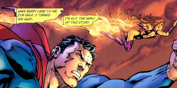
FLASHPOINT, I can tell you who the protagonists are.  It's the Flash-- who wants to restore reality back to "normal", with Batman being set up as either a villain of the piece, as an anti-hero or as a tragic hero in the "I'm not the hero of this story" line.  Heck, there's even a brief scene setting up Cyborg as a secondary protagonist-- we know what he wants, as well.  I not only know what they want, but we’ve seen them take actions based on what they want.

"I'm not the hero of this story" is a very DC line.  I always find it completely bizarre, DC's ongoing conversation with itself in its books.  But by the 4th page of the comic, the comic is engaging the reader in a discussion of its own contents-- the FLASHPOINT authors are underlining who the hero of the piece is, as soon as possible.  Yes, the premise of FLASHPOINT is one that we've seen many, many, many, many, many, many, many, many, many, many, many, many, many, many times before.  But it was at least something I could recognize as being a story, and that I understood as being something I could invest in as such.

Were you able to read FLASHPOINT, without being impacted by your reading FEAR ITSELF, or was a compare-contrast unavoidable for you?  Do you see these things as a “competition” or do you take everything on its own terms?  Do you think about "story structure" or whatever when you read crossovers?  Is my rudimentary, caveman definition of story-- "things happening to a protagonist we care about, who is a person that wants something and does things for that reason"-- is that overly narrow for you?  Would you argue that the Marvel crossovers have had their villains as the protagonists-- Green Goblin in SIEGE, say, or the Skrull Queen in SECRET INVASION, maybe Sin for FEAR ITSELF-- and that they are recognizable as stories to you for that reason, one story after another about failed attempts to conquer the Earth?  Am I misapplying the word "protagonist" by limiting it to heroic characters?  Do you think my argument is flawed because it might apply to crossovers which you did like, e.g. INVASION (where I remember being extremely invested in the Snapper Carr character, who kind of went nowhere, nowhere being a Peter David comic named BLASTERS)?  And do you think fans even care if they're reading a story?  For crossovers, is fan investment in the "DC Universe" and "Marvel Universe" as entities enough where it's wildly irrelevant whether these crossovers function according to, you know, the rules according to Aristotle's Poetics, or whatever?  Or do you look at crossovers the same way you look at, like-- like an Altman movie?  If so, which Altman movie, and when do you expect to see Julianne Moore's cooter in FEAR ITSELF?  Can we start a pool? Also: what happened at the end of DR. T AND THE WOMEN?  What was that all about?


JEFF:  You know, Altman is a pretty good filmmaker to invoke here because later-period Altman is a lot like big comics events:  rather than a sense of a story being told, there’s a lot of big recognizable names being paraded before your eyes and a shitload of apologizing going on by defenders for what is some relatively decent atmosphere, a few nice acting turns, and a fucking shambles of a story.  I’ve had my heart broken in movie theaters before--hell, lots of times--but I the especially awful hurting in my heart caused by SHORT CUTS stands out to me.

SHORT CUTS so fucking fundamentally misunderstood Raymond Carver--didn’t understand the importance of the Northern Californian setting, didn’t understand the importance of his characters’ place in the bottom part of the class structure, didn’t understand why the fuck you can’t have every fucking actor just jangle out any fucking thing that comes to mind because Carver’s characters are so very nearly beaten and exhausted and cautious they can barely talk--that I can’t move beyond my frustration and disgust to convey how badly the movie dulled and blunted any of Carver’s story hooks.

You’re not going to mistake Carver for Stan Lee any time soon, but taking the waitress whose husband overhears two guys saying disparaging things about her ass and begins compulsively pressuring her to lose weight, and then making that waitress be the person driving the car that hits the kid whose parents are being bullied by the guy who needs them to pick up the kid’s birthday cake?  By taking those individual story moments, each kind of painful and human and understandable, and chewing them up into a beige flavorless paste?  (After Gordon Lish put in so much hard work on them, ha-ha?)  SHORT CUTS is such a wretched literary adaptation of a work it makes LAWNMOWER MAN look like GONE WITH THE WIND.

All of which is to say--hooray for competence!  There are times when its charms can trump those of genius, and FLASHPOINT #1 is certainly one of those times.  Interestingly, while I don’t think Johns necessarily makes clear all the connections yet--we assume by the end of the issue we know who’s narrating the story but it could be a fake-out, we only see the villain for a panel, if that--there is such a clear sense of where the story is going, what the hook is, that I’m not pissy about having to infer those connections.

In fact, it feels like Johns is having me make those inferences so he can then fuck with them later....which, I guess, is the difference between what is commonly understood as the difference between a story and a good story:  our expectations are set up, then toyed with, then turned upside down, and then are fulfilled in ways beyond our expectation.  [Man, I hate how Robert McKeeified and Syd Fieldish our understandings of stories have become, but they also work when it’s time to lay down some fast, quick generalizations about what things work and why.]

In short, Johns seems to have some chops for this sort of thing in a way Fraction which doesn’t.  And that  isn’t entirely surprising--the guy has written several of DC’s big crossover events and he also wrote and co-wrote a huge number of issues of JSA.  He’s comfortable writing books with lots of characters such that everyone in the rooftop gathering of heroes gets a chance to say a line or two and define who they are and what their conflict is with someone else. Sure, it’s a big ol’ exposition dump and it’s done in that very comic booky way of having Character A reprimand Character B by reminding Character B of a conflict neither of them would have forgotten or bothered to mention in real life...but in doing so, Johns also gets to slip in bits of information about the larger situation they’re in, the nature of their world that’s gone wrong.

Seeing as superhero comics are predicated on the idea of selling you the next issue (or, if you’ve switched to trades, getting you to read the next chapter), I guess the very basic test of this type of story at this stage is, “Sure, I’d like to read more about that.” And there were multiple times during FLASHPOINT #1 where I found myself saying exactly that.  You know, that one panel where the Outsider is talking about hunting a kid whose energy “could keep my homeland lit for years” or making Captain Marvel into a kind of Forever People equivalent using real kids instead of New Gods. And, I should point out, I did kinda like Barry’s plight and his very immediate reaction to it, even though I give less than two shits about alternate world time stories, generally, and stories about Wonder Woman and Aquaman tearing apart the world with their coming fight, even less so.  [I kinda wish Alan Moore’s TWILIGHT pitch had never been written, in a way: it’s like this weird barrel of toxic waste buried under the comic landscape that polluted it ever since. I feel like I see its influence all over the place, but never more than in big DC crossover events like this and ARMAGEDDON 2001.]

Having hit my “sure, I’d like to read more about that” funny bone gives FLASHPOINT a huge edge over FEAR ITSELF where the ideas seem kinda paltry and/or ill-defined, clumsily tied together, and poorly paced. The fanboy part of me wants to infer larger, more inflammatory statements from that--Competence trumps genius! Craft trounces innovation! Alternate realities edge out ambiguous analogues! Johns is better than Fraction!--but the part that’s been around the block a few times more remembers that, again, Johns did a ton of team books and has done a lot more of these things: I haven’t re-read it recently nor will I probably ever bother, but INFINITE CRISIS was a big ol’ sludgy mess that Johns wasn’t able to make work, either.  I kinda think if Fraction really wants to do this kind of thing, he’ll figure out a way to make it work.  (And you know, he might be able to pull it out in the next couple of issues, though I really doubt it.)

Which I guess more or less gives you the answer to the question about whether I read one event and compared it to the other:  I should confess that I’ve only read both events so as to participate in this symposium and therefore I think it would be utterly disingenuous of me to pretend I wasn’t comparing one book to another.  But putting that aside, isn’t that the way we read comic books?  For those of us who still buy the single issues, isn’t there a reason why we so rarely walk out of the store with just one?  Sitting down with a big stack of comic books is something I still do as an adult, and even though I tell myself there are grown-up reasons to do that--it seems more efficient to read a bunch of books in one 45 minute go, than to read each of them in five to ten minutes bites spread thoughout the day--I think we overlook the hidden value in the act.

Italo Calvino once wrote an essay about the hypothetical bookshelf, in which the placement of disparate books side by side create their own improbable connections, “produce electrical shocks, short circuits.” To a much narrower extent, this same frisson is something we are looking for when we sit down with a stack of comics--they battle it out for which one is the best, and we often pre-sort the pile as to whether we’re going to read our likely favorites first or last or spread out among the others we’re undecided about or buy for our weird political inclinations  (favorite character, or title we have always bought, or artist/writer we always support even when we’re not really interested in what they’ve done over the last one-to-twenty years)--and not only can we not help but subconsciously compare and/or merge the books we’re reading all at once, it may be a very important component as to why we read them at all.

The excitement of the stack explains a couple of things about modern comic readers--why we as fans complain about how expensive comic books are (because we don’t buy and read just one, and the people who talk about how few titles they do buy always say so with a very palpable sense of regret), and how we cannot help but ask some endlessly internecine questions:  Who’s stronger, Hulk or Thor? Marvel or DC?  Johns or Fraction?  FLASHPOINT or FEAR ITSELF?

I think we can’t help but compare these things to each other all the time.  The Stack demands it of us, and it is something to which we very happily submit.  The way in which the event-wide crossover both mirrors (who will be stronger, Hulk with a hammer, or Thor with a hammer?) and alleviates (I can’t afford to buy Cap and Iron Man and Spidey and Hulk, but if I buy INFINITY GAUNTLET, I get one book with all of them!) the (Infinite) Crisis of the (Finite) Stack is one I could go on about for a while, but obviously I’ve written more than enough, here.
JOG: Huh, I dunno Abhay, FEAR ITSELF so far seems like the makings of a traditional enough three-act structure to me.  The protagonist would be Captain America, who verbalizes the story’s conflict (as introduced by the opening riot) while up on the roof of Avengers Tower: “It was chaos. People just screaming-- at each other’s throats-- and I couldn’t stop it.”  As a result, Iron Man pitches his ‘rebuild Asgard’ initiative, which frays the relationship of Odin and Thor, the latter of whom is likely the secondary protagonist (naturally Cap ‘n Thor are the two characters who happen to have movies coming out while the series runs, although maybe this presumption of synergy is coloring my reading).  All the stuff going with the various antagonists prompts an already-pissed Odin to withdraw the Gods from humankind -- establishing Thor’s related personal conflict as a desire to aid the humans, thus thematically conjoining him to Cap -- while the big (potential!) end-of-Act I stinger sees everything going REALLY crazy for Earth: nations mobilizing; blood supplies souring - all the news crawl stuff, which aggravates Cap’s initial stated conflict, i.e. preventing everything out on the street from going straight to fucking hell.  Indeed, he’s literally seated in the middle of the chaos, in that the news crawl that covers the end of the chapter diegetically originates from inside Cap’s command center.

Again, I really want to emphasize that this is only a possibility, because I’m writing these things after reading each individual issue, and I don’t really expect to understand everything happening in the broader plot as of issue #2 of 7, but that’s how the it looks to be operating for me.  Whether it’s a successful operation is something else - in addition to Jeff’s criticisms above in particular, I think the series might be laboring a bit under genre expectations, which is to say: of course a ton of villains attacking the world will give rise to international conflict, that’s not unique enough in this story to register all that much as a unique or compelling conflict for Captain America, especially when the supporting political content in issue #1 isn’t all that strong and the various character cutaways in issue #2 don’t have a ton of impact. Because of that, it seems like parts are ‘missing’ from the story, or Cap is difficult to even identify as a substantive protagonist, let alone care for - I personally didn’t have any trouble discerning the story elements, but I can’t say I’ve found the story itself to be compelling.

Now FLASHPOINT - well, to quote Thierry Groensteen, this here’s a damn superhero-y superhero comic. I was pretty taken with Nina Stone’s reaction, where she expresses this utter bafflement at what’s going on, starting with the somewhat ALL STAR SUPERMAN-styled condensed origin opening page, which doesn’t reward the same confidence of brevity, in that the Flash is lacking the necessary cultural cachet.  Although - you wouldn’t know it from paying a lot of attention to superhero comics.  That’s it, right?  Like, there’s an argument to be made that it’s maybe little more than critical shadowboxing to presume that a down-to-the-bone piece of genre mechanics like a superhero event crossover even should try to appeal to anybody outside of the devout.  Or, to (sort of) answer Abhay’s question (for starters), I do think that really intent superhero universe followers care if a traditionally composed “story” is present, definitely -- right now I’m flashing back to the WORLD WAR III mini-event in 52, which I don’t recall anyone liking very much despite being diabolically intent on resolving potential shared universe inconsistencies -- but I think what’s also important is emphasizing the unique qualities of the genre as incarnated via comic books: the ‘window’ factor, the momentary glimpses into a fictional world that’s bigger and older than you, with none of the heavy-distancing artifice of aging actors or discernible mortality.  I think the appeal of that quality can substitute for elegantly primped narrative composition.

The thing is, FLASHPOINT hits a lot harder on this than FEAR ITSELF, to the point where I’m forced in writing about the thing to face down these questions of my engagement with genre particulars, because I think the makeup of the comic forces it.  I did like parts of it - Johns has a knack for leaping deep into this visceral appeal of a big superhero universe, so that the opening origin/motivation page immediately gives way to this big heroic costumed image, and then the next page goes fuck that - ALL THE SPEEDSTERS, and then it expands AGAIN to a double page splash of SOOOO MANY SUPERHEROES, all while this insistent narration chokingly builds up the inspirational quality of just what you’re looking at, soul-searing virtue in effect, AND THEN - BOOM, right to a banal police station with men in shirts and ties discussing Miss Alchemy and the Pied Piper and murder and shootings, this self-evidently absurd smashing of semi-realism and superhero fantasy, proudly so, embracing the nonsense of it.

Yet this unabashed affection also extends well past the point where the enthusiasm is transferable to relative outsider me.  I’m gonna be blunt now - I’m at an absolute loss as to how anyone could find anything -- ANYTHING -- in FEAR ITSELF to be more rhythmically clumsy, narratively illogical, or otherwise dubious-on-a-craft-level than that ridiculous eight-page rooftop sequence where one-third of the fucking alternate DCU allusively discusses their interrelationships **among themselves** like some horrible Earth-2 Jim Shooter deal where the purpose of everyone pausing for introductions is not to clarify anything.  All because Cyborg, plot-wise, has apparently begun his globally critical cross examination of Thomas Wayne without knowing the answers to his questions, thereby prompting a scene-ending ‘lol no’ and Our Hero bowing his head with his fists clenched in the steaming debris of approximately one quarter of an issue at his feet.  And, you know, maybe it’s a lack of imagination on my part for failing to engage in speculation over the potentials of the modified universal scenario, but in terms of on-page execution I’m firmly with Amy Poodle in that the dialogue reads as less credible articulation than script directions indicating how the dialogue should go.  Or, y’know, notes from on high re: how the periphery books could operate.

And still!  That’s a superhero thing!  Totally!  I invoked Jim Shooter, because ostensibly story-stalling periphery character background dumps have enough of a tradition of usage in superhero comics that it can register as “comic booky,” to quote Jeff, rather than uniquely troublesome.  But to me, this inadvertent-or-otherwise traditionalism comes off as both boring and self-defeating; if this is superhero comics qua superhero comics, it primarily reminds me of how distanced I feel from the genre in terms of engagement, if this much of an introductory showpiece is going to leave me conscious to my own breathing while it presupposes my interest in the delineation of variations to the mega-continuity and how maybe -- possibly -- characters might deal with each other in some other purchasable forum.  Some of them by potentially superior creative teams, yes, but that’s frankly not part of the presumption - that I’ll just care, right there, as part of the crossover event experience, the very reading of a very superhero thing.

So, I guess to (further!) answer your question(s): no, I couldn’t not compare the two series, because I felt they embodied different aspects of contemporary superhero concepts, FEAR ITSELF touched by multimedia possibilities and ominous, ‘big,’ ‘00s-born tone, while FLASHPOINT is superheroes-as-superheroes, “a riot of colourful nothing forever, then Armageddon,” to quote the Poodle.  Which might suggest something about why Marvel series of this sort nominally concern themselves with Real Issues while DC events are essentially about, again, Superheroes Themselves.  Or, to tie it in with my FEAR ITSELF comments, the highs for me were a little higher with FLASHPOINT, due to Johns’ immersion in superhero stuff, but the lows didn’t just raise concerns of whether the story isn’t laboring under genre expectations, as they did with Fraction - I really questioned, fundamentally, my interest in what’s going on with comics like this.

I don’t think this needs to be a dichotomy, by the way, in case I’m sounding nihilistic!

BRIAN: I’ll tell you why I think people are seeming to like Flashpoint #1 better than Fear Itself #1, and I think that it is as simple as Geoff Johns not having to do the heavy lifting in selling it to you.

There were two things I admired about Flashpoint #1. The first was that it was a Geoff Johns event comic, but that it didn’t have any gore. The closest I can find is that flashback panel showing the Amazon’s subjugating the UK, where the sword in the foreground has some blood on it -- but there’s no decapitations or limbs getting hacked off or anything. Oh, sure, it will probably change before issue #5, but for now, it was nearly violence free, and I was surprised by that, and enjoyed it.
But the other thing was maybe the most important one -- I felt like I was reading a Grant Morrison comic, with rapid ideas being thrown out just for texture. Like Jeff, I had at least one “Hm, I probably wouldn’t mind reading more about that” moment (S.H.A.Z.A.M. for me, too!) -- but I don’t actually WANT to read just any comic on the subject... it would have to be a handpicked one, y’know?
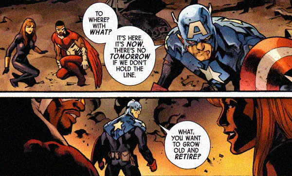
I thought most of the Alts on display felt fairly fleshed out, and I thought that was a pretty neat trick summarizing a bunch of characters down into a single word balloon, in most cases. But that’s the cool part of it: the ideas are cooler because they’re single snapshots, and don’t have to have an entire comic book written about them.  It’s like... mm, how about that issue of Animal Man where all of the forgotten and never-were superheros came into Buddy’s existence -- one of them never-were’s was a 1960’s counter-cultural Justice League (The “Love Syndicate of America”) with “Magic Lantern” and “Speed Freak” and “Sunshine Superman”. Funny, great idea -- but I don’t actually want to see more than that.

So, Johns gets to just have all of the good lines, without having to show you all of the backstory that gets you there, or to tell a compelling story with those characters on their own. That’s for other creative teams to do.  Meanwhile, Fraction is the one selling the the spine of story on the Marvel side. Fear Itself’s crossovers appear to be magnifying incident, so it lives and dies on Fraction’s ability to sell the story.

To answer Abhay’s question... yeah, I’m pretty weird as a reader, I think. I’m good at compartmentalizing when I’m in the process of reading the actual story, but I’m otherwise incessantly contrasting and comparing things most normal fans probably aren’t considering, like marketing plans and number of tie ins and so far.

(I only ordered one of the 16 Flashpoint spin-offs in a number high enough to qualify for the pins, and decided not to involve myself in this marketing exercise. Logo pins for alternative reality mini-series is not the same as a rainbow of power rings tying into regular monthly concepts)

My absolute guess is that Fear Itself will sell more tie-ins because of the cover branding and the expansion of incident nature of their crossovers, while Flashpoint is going to be very narrow focused -- the only one of the spin-offs I actually see selling is the Batman one, now more than ever, but I see very few readers buying into most of the rest because one presumes that what they’re expanding will be the backstory, not the main story. That is to say, it’s hard to envision a way to split off sixteen threads for the sixteen three-issue mini-series from Flashpoint #2, that won’t have any meaningful weight to them to dovetail back just before the story conclusion in Flashpoint #5 without them being dealt with in #3 & 4. More likely they are to use scenes in #2-4 to either dole out the backstory, or to tell non-Flashpoint related concurrent stories -- not the magnifying-the-incident nature of a Fear Itself tie in.

Oh, there, that’s it -- Fear Itself is likely to have tie-ins, while Flashpoint will have spin-offs. Those are different things, and they change the nature of the main story by their very existence. Johns is able to do something reasonably breezy, while Fraction necessitates something more dense.

TUCKER: I’m kind of taken with reading everybody else on this subject, so I’ll try to respond to the key points, or what I perceive them to be. I also preferred Flashpoint to Fear Itself, in opposition with my wife, which would have caused any number of problems on the homefront if she wasn’t blessed with the ability to absolutely forget every comic book she disliked almost immediately after disliking them. I still didn’t really like Flashpoint--it’s an info dump comic that seems to propose a fantasy world where very little is different, except for a couple of broad “millions are dead” strokes regarding boring ass Aquaman and even more boring ass Wonder Woman, and for the record, let me make it clear that you’re dealing with a Batman > all other DC characters kind of Comics Critic here, and I have no problem sending a telegram that says “WONDER WOMAN IS BORING FULL STOP”, and in no case is that more true than here, a comic where she actually murders a decent percentage of the world and yet still manages to find the most boring looking helmet in the cabinet of the world’s most famous options for helmets, and that’s worth some kind of prize, even if it’s just me nodding at her and saying “You win again, you boring clown”. Thankfully, this comic features a Batman more driven than my Batman, because my Batman settles for just beating up and incarcerating criminals, whereas FlashpointBatman has worked himself into such a lather that he actually herds them like cattle to a specific location for the “beats them up” part, whereas regular Batman just fights wherevs, which is a lot easier to do. I don’t even understand how FlashBats pulls that off. Like--why do the pursesnatchers and spree-rapers that populate DC Comics end up on the roof so often? How does that factor in to the equation? Or is this like that Nighthawk guy in Supreme Power who only attacked white criminals, and Flashbats only goes after people who can go off the roof near Crime Alley?

Regarding whether or not reading Fear Itself impacted me--I don’t know that it did. I don’t really think they have enough in common for me to compare them while reading them, you know? I could probably extrapolate something--obviously, you cats did--but in the heat of the moment, one’s a fantasy type of Elseworlds thing where Deathstroke is a pirate, and one’s a shitty Thor comic with a Captain America villain. I remember thinking that Flashpoint seemed like something more super-hero fans would like than Fear Itself, but isn’t pretty much true all the time when you’re doing a Fraction/Johns comparison? I know guys like Graeme and Jeff think that Iron Man isn’t a piece of shit, but they’ll come around eventually, to it being a total piece of shit.

Remember that music video from Pret-a-Porter? “Here comes the hotstepper”? I’d argue that video has more in common with super-hero comics than Altman movies.

CHRIS: It looks like I am in the minority of enjoying Fear Itself more than Flashpoint, though that's damning Fear Itself with faint praise. While Abhay's right about Flashpoint having more clearly defined protagonists, I don't think it's that hard to see the Avengers Holy Trinity of White Guys as the primary protagonists of Fear Itself either.

The thing that made me recoil from Flashpoint is that's it's basically a Kitchen Sink Elseworlds. There's nothing wrong with Elseworlds -- there have been some enjoyable ones, even if I'm blanking on them right this second -- but the best ones drill down to a handful of characters and explore them in a different light. Doing a story where Barry Allen never got powers and how that affects The Flash and Central City or Keystone City or whatever is a fine idea for a story. Exploring how different Gotham City would look if you had Thomas Wayne as the Punisher instead of Bruce as Batman is a fine idea for a story too. And both of these stories are pretty simple to explain as a writer and grasp as a reader. But the Butterfly Effect of Zoom's Million Little Retcons leads me as a reader to pick everything apart. It's simple enough to look at the Planetary-style interference that affects many of the characters -- a few bullets shifted in Crime Alley, Hal Jordan never gets a ring, the Kents never find a baby in a rocket ship -- but what subtle changes to Wonder Woman and Aquaman's youth turns them into genocidal monsters? Is Wonder Woman forever *this close* to just slaughtering millions of dudes, if she doesn't have the Right Friends keeping an eye on her in the Justice League? Why is Captain Marvel turned into Captain Planet, and why is this a dark turn? And why is Cyborg such a Big Player in the dystopia? Is he being held down by a glass ceiling in the "real" DCU, where he's a meaningless afterthought? And why is America, home of most of the DC heroes, pretty much the same place in Flashpoint, while Europe, Africa and South America are completely decimated by Amazons, Nazis and Gorillas without the proper influence of Barry Allen and friends? Oh, and Alaska has been taken over by zombies if you look at that map they've distributed. That's a shitload of World Building for what's theoretically a five issue series, and assuming Johns is going to touch on one-tenth of this over the course of five issues, it makes me wonder how much time is going to be wasted on explaining "cool Elseworlds ideas" in place of doing anything with his lead characters, like Zoom, the villain of the piece who doesn't actually appear in this first issue.

And I know that moaning about "character development" and "goofy World Building" in a big dumb superhero crossover is overanalysis. I know that I should be able to sit back and just appreciate the idea of Shade the Changing Man running a superhero team, Nazis running a continent, Alaska being overrun with zombies, etc. and not spend time worrying about DC's publishing strategy and blah blah blah blah. I'm probably being some sort of continuity-obsessed partisan fanboy saying "it's okay when Morrison does this in an event, because he's seeding the DC Universe with cool ideas, not just putzing around with ideas that at best will be explored in a three issue series written by a former Assistant Editor and purchased solely by that kid I saw on the bus last week with all of the Flashpoint incentive badges and Blackest Night rings attached to his backpack". But I couldn't disengage with any of that to appreciate the pure joy of people looking ruff and tuff and awesome in an Andy Kubert spread.

* * *

QUESTION #4-

ASKED ON JUNE 5, 2011

UPON THE RELEASE OF FEAR ITSELF ISSUE #3

* * *
ABHAY:  And so now the part where someone dies because... because someone dies in crossovers.  That's what happens-- that's what everyone knows fans want to see from these, to justify the money they've spent on crossovers, to justify them as being important. After all, who could forget when the Will Payton STARMAN died in ECLIPSO: THE DARKNESS UNLEASHED, or when the Wasp died in SECRET INVASION, or when Black Goliath died in CIVIL WAR?  Who could forget where they were, what the air tasted like, what the price of gas was when Black Goliath was no longer a part of our lives?

One of the things I like to do when reading crossovers is to read the simultaneous publicity that goes on.  Because the creators always seem to be reading just completely different comics than I am.  And hey, to some extent that fact is understandable because ... things that look very simple and obvious, I suppose it sometimes takes a considerable amount of thought and labor to make things seem "simple."  It's all quite understandable.

So, I read the Newsarama FACING FEAR ITSELF group interview, and I really enjoyed that everyone involved seems convinced that they surprised the readers by killing Bucky.  And... I was curious about that because I had taken it as a given:  FEAR ITSELF, issue #3? Oh, sure sure-- that's the one where Bucky dies. I had thought that was the conventional "wisdom," in fact.  I mean, with OSBORN over, I don't really read any Marvel comics-- I'll pick up a Bendis thing occasionally just to check what he's up to, but that's it.  I don't think I'm too plugged in, though I do listen to Jeff & Graeme's WAIT STOP podcast.  And I'd be surprised-- no, deeply shocked-- if Graeme didn't call this a long, long time ago.  But, I mean-- is it a hard call?  There's a Captain America movie coming out.  They're not going to have two Captain Americas when the movie comes out, so they're going to kill Bucky.  The end. I don't think it took a lot of detective work from the fans.

So:  did anyone not know ahead of time that Bucky was going to die?  Was it a surprise for anyone?  Does anyone care that character is dead?  My favorite thing when a superhero dies used to be that in the letter pages afterwards, someone would always invariably send in a poem, which they'd run, memorializing the dead superhero. I always thought that was ... is it funny or sad or both or neither or...?  In fact, to help spur things along, here's my poem for Bucky-- feel free to contribute your own:

Ode to Dead Bucky: A Poem

Oh, Bucky, with your metal arm, How sad it is you bought the farm. Even though you carried that sweet glock, You met your end in this boring schlock. Remember Rodney Dangerfield reciting "Rage Rage Against the Dying of the Light?" Like you now, that was out of sight. How do you like your blue-eyed boy Mister Death.

JOG: I didn’t know Bucky was going to die because I don’t read his comic and his first spoken lines of the FEAR ITSELF miniseries were in this issue.  As a result I wasn’t surprised either, but I’ll just chalk that up to something that’s meant to register in different ways to readers with different levels of engagement; to me, it’s just something I’d expect to happen in a big battle - and it did!  What’s worrying, however, is that I don’t think the stakes are all that well established in any of the ongoing fight scenarios beyond the broadest “world going crazy” contours, so everything kind of landed with the same weight, no matter what happened, anywhere.  The Choose Your Own Adventure advertising denouement directing you to appropriate tie-ins for the rest of such-and-such a plotline didn’t inspire a lot of confidence on that front either.

ABHAY: Maybe it speaks to how oblivious I am, but I didn’t notice until I read CBR’s review of the issue that they’d spent two pages in issue #2 setting up the “Absorbing Man needs to get his hammer” story that was resolved in one panel of issue #3 that shows the Absorbing Man with a hammer which he got in some spin-off.  Which is also fun because #2 set up that he had to go from South Africa to Dubai, which from what I can tell is about 4,000 miles away-- Dubai to Johannesburg is about an 8 hour flight according to my internet.  I don't know if either of those characters can fly using superpowers, though (do the hammers let these characters fly like Thor? I don’t think they do, right?)(Wait, wait-- why don’t the hammers let those characters fly like Thor?? Wouldn’t that have been cooler?). But-- it sort of plays into Jeff’s theory that these characters were really very, very badly stuck in traffic, if it took Bucky 8 hours to respond to Washington DC being blown up by Nazi robots. So yeah-- spin-offs.   Then again, I thought the end of Final Crisis was impenetrable having not read the spin-offs there either, and that didn’t seem to stop people from loving that.  So, I don’t know.

JOG: I laughed at the part in FLASHPOINT #1 where Barry Allen was stuck in traffic.  Also, I think this fits nicely into Brian’s point above - how FLASHPOINT is differently conceived so that its “spin-offs” needn’t hew to any particular span of time, a la the “tie-ins” of FEAR ITSELF.  And, granted, a resourceful enough writer could probably carve out some space to play with in FEAR ITSELF without the tie-in feeling like a total protrusion from the main plot.  I’m sure some of the books actually will behave like that, although I haven’t seen any that really caught my eye - although query whether the FLASHPOINT spin-offs don’t have an easier time of catching eyes since you can pretty much glance at, say, DEATHSTROKE AND THE CURSE OF THE RAVAGER and think “oh, Jimmy Palmiotti’s writing a pirate comic,” while the FEAR ITSELF tie-ins don’t really have that luxury of detachment (nor, of course, does every FLASHPOINT tie-in, but I’m talking potentials).  I bought the Azzarello/Risso BATMAN - KNIGHT OF VENGEANCE too, and it’s the same thing - a basically straightforward crime comic, by crime comics people, albeit sprinkled with arch-capitalist ultra-aggression pertinent to the Batman concept.

This is the irony of FLASHPOINT - it’s off-puttingly reliant on a reader’s compulsion to fill in the gaps, but the gaps are so big it allows secondary creative teams more leeway to play to their individual strengths.  Personally, I’d rather not have to bounce over so many on the main highway -- unless Jason Todd’s planning to replace my hubcaps gratis -- since I think you can preserve the magnitude of spin-off space without making as big an issue of it in the main series as Johns does.  But I’ll take what I can get with the comic I’ve got in a situation like this.

BRIAN: Oh, was Bucky meant to be dead?  Huh. Yeah, I guess I see that now.

Shame, though -- he’s a generally more interesting character than dull ‘ol Steve Rogers.

If comics like this were honest, Bucky would just be the first of many many dead heroes in a battle against “gods” -- at least he has a supposedly unbreakable shield. What good would Falcon do against the Red Skull’s god-avatar? He can’t do anything other than talk to birds (or is it just the one specific bird? Now there’s a power!)

My favorite part, I think, of that sequence is that Bucky yells “Avengers Assemble!” and charges in, and Falcon and Widow are shown running behind him, then, all of a sudden, they disappear for the next few pages. It’s like: “Yeah, go Bucky, go! We’ll.... uh... we’ll wait back over here”

(My second favorite part is how Valkyrie shows up out of the blue in the last few panels [Seriously, she’s not in the rest of the issue!]... but not to escort ol’ Buck to Valhalla or something, but to put her hand to her face and seem shocked. Um, you’re a VALKYRIE, this should be old hat to you, sister!)

JEFF:  Not only did I not know Bucky was going to die before reading FEAR ITSELF #3, I didn’t know after reading it, either. I think it was only after reading your question, Abhay, that I looked at it again and went, “Ohhhhhh!  Oh, okay.”  I mean, there’s a certain sense of mayyyybe he might be dying? I guess?  But the idea that I just watched him punch his ticket?  I didn’t get that because I was too busy trying to figure out why he was saying a bunch of shit about “the serpent” and how the hell he picked that up by getting punched through the chest.

Remember the days when a comic would have a full page of somebody screaming and there’d be this, like, dramatic montage of the visions appearing in their head?  And usually the writer would throw in a bunch of overwritten captions telling you what the fuck was going on?  FEAR ITSELF #3 really made me miss hackneyed old storytelling tricks like that. People seem very fond of the new fresh storytelling tricks available to us (giving interviews on Newsarama seems to be a big one!) but I dunno...call me a traditionalist.

Anyway, maybe as a result I’m still disinclined to believe he’s either dead now or will still be dead by, I dunno, the end of the event?  I quite like Bucky -- which is this amazing accomplishment considering how old school I was in my pre-Brubaker belief he should stay dead -- and would like him to hang around. At the very least, I would like him to get a death scene deserving of him.

Clear Storytelling

So much depends upon

clear story- telling

glazed with captions

instead of damn tie-ins.

JOG: Huh?  C’mon guys, this is a proper cinematographic action comic of 2011.  We can tell “he’s supposed to be dead now” because the last page is an overhead shot slowly pulling back toward the heavens, accompanied by a fade to white.  I mean, they didn’t throw in anybody falling to their knees and shouting NOOOOOOOO -- a subtler dying-character-reaches-up-toward-the-camera-waving-his-arm-as-his-soul’s-POV-retreats-only-for-the-arm-to-dramatically-fall-upon-the-moment-of-death maneuver is duly substituted -- but this is about as basic a mortality shot as it gets.  Maybe so much that nobody uses it anymore... I attribute any confusion to the lack of a death blip at the end of “gotta save” in panel #3.  Like, the little blip sign that concludes a dying character’s final statement?  Could have helped.  (I’m also partial to the Stan Sakai skull balloon, but that might require an alternate universe to facilitate.)

JEFF:  I can’t even begin to tell you how down I would’ve been with a Stan Sakai skull balloon for that last panel (and if it had turned red as it dissipated, so much the better)?  But although I understand the technique, I just figured it wasn’t being used correctly.  Issue #2 also ended with a pull back shot toward the heavens, remember?  And it wasn’t like anyone was dying there--instead the emphasis was supposed to be (I guess) on the serpentine wave wrapping around the planet Earth.

So second issue in a row with a pull back shot and a wave of variable color, but they mean utterly different things and the first one was vague enough that I just wasn’t able to “go” where the storytellers wanted me to go the second time around. Also, the death just felt cheap, as these things go.  Not “Private Mellish gets shanked while Cpl. Upham weeps on the stairs and there’s nothing heroic there” cheap, but “that made no fucking sense at all” cheap. What exactly are Sin’s powers, other than whatever Fraction needs them to be?  Why does Bucky say, “There’s no tomorrow if we don’t hold the line,” other than that’s what needs to be said to have the fight happen?  If I’m trying to answer certain questions like “who the fuck is getting knocked through the air by the robot arm, because it makes no sense if it’s Bucky?” I think the suspension of disbelief breaks down at the most fundamental level and you get those “wait, is he dead?” moments.

Sorry, man.  I’m not going to take the fall for this one.  I’m certainly not altogether innocent, I’m sure, but an accumulation of unearned and unexplained moments led up to it.

JOG: Oh, I don’t disagree with any of this - it’s what I’m getting at in the very wide umbrella term of “stakes” that haven’t been established.  Or even in the final page’s pullback itself -- weirdly, now that you’ve brought it up, I notice that every issue attempts to begin and end with some type of continuous movement, back, up, down, something, except for the end of issue #1, which is really odd; the end of issue #2 seems to reverse and bookend the start of issue #1, and I think that maybe subconsciously(!) touched my thinking on issue #2 bringing a distinct end to an Act I  -- there’s some confusion in that from the cinema techniques chafing against the comics attributes.  Like, in panel #3, Bucky’s arm drops, which should be commemorating the mighty moment of finality, since that’s where his arm is ‘leading’ in panels #1 and #2, except a comic panel (obviously) can’t depict continuous movement, it’s a frozen image, so you go from panel #2 to panel #3 ‘filling’ the falling arm movement. Except, there’s also dialogue in panel #3 to additionally mark the moment of death, and the two aspects of the page don’t sync correctly because you’re inevitably reading the words in panel #3 as if Bucky is still moving, even though the drawing in the panel depicts his arm as already fallen (if, admittedly, at enough of a distance it’s possible to maybe not even notice the movement).

Add to that the unfortunate choice to have the final word balloon’s lettering ‘fade to white’ by leaving a bunch of blank space, directly below a balloon where there’s plenty of white space left already to indicate weakened speech -- there maybe should have been some dissolving effect on the bottoms of those last words, although that admittedly might jar with the blank balloon space motif established elsewhere in the comic, even if its not too much of a pain in the ass to implement, digitally -- and yeah, even reading the last page for its intended purpose can cross some wires.  I just thought the broad contours of the technique were so blatant it tipped me off anyway.

Seriously though, someone ought to bust out a skull balloon.  Like Jae Lee.

ABHAY:  Someone bust out Jae Lee.  I haven’t seen his comics in forever.  But yeah:  color me surprised by these answers-- I thought people might not have known ahead of time, but not after the fact.  I saw people in the comment section for Graeme’s FEAR ITSELF review also express confusion, too, though. But... Stuart Immonen draws Bucky with a hole in his chest.  Most people don’t survive that...? Well: maybe Super-Dave.

(I went so long without knowing Super-Dave was Albert Brooks’s brother-- imagine my surprise... never put that together until recently...).

JEFF:  Well, yeah but...people also don’t get huge holes punched in their chest and then keep talking either, right?  I mean, my knowledge of what people  do with large holes in their chests is based entirely on pop culture and there’s a wide range of possible responses, I guess but...

As much as I think the art in Fear Itself is mighty pretty, there are a few points in this issue where I think Immonen’s choices might’ve muddied the waters.  Like the scene on page four where Sin suddenly surprises Bucky from behind (I think?), or how Falcon and Black Widow rush alongside Bucky on the Avengers Assemble scene and suddenly they’re...nowhere?  It certainly confused me as to the Serpent stuff you pointed out -- I mean, Black Widow and Falcon are right there when Sin talks about being an avatar of the Serpent, right?  Doesn’t Sin say, “The Serpent is coming. Tell them.  Tell them all.  It won’t help.” to...Black Widow and Falcon?  Or was that scene supposed to be just between Sin & Bucky and Immonen borked it?  I guess the scene plays differently if it’s supposed to be Bucky straining with his last breath to tell Natasha and Sam something they already know, but all I got from it was: (a) Bucky is hurt really bad; and (b) Immonen doesn’t know who else is in the Secret Avengers apart from Valkyrie and Shang-Chi.

Another fun fact about Albert Brooks and Super-Dave?  Their last name is Einstein.  I can see why Albert changed his name, but if Bob had performed as Super-Dave Einstein? I would’ve liked that routine a lot more, I think.

TUCKER: The art on this is crazy fucking weird--look for the Shang-Chi panels, tell me what the hell he’s doing? He’s jump-kicking-what? Each issue has had something like that, and while I don’t think you can put it all on Immonen, I think you have to put some, you know? The guy stares at these pages longer than anybody else does, so he has to know that there’s zero dramatic oomph on that first two-page splash where Steve Rogers is going “whoa” to absolutely no one in the first issue while a bunch of cops stand around, and while I get that Fear Itself is ultimately a Matt Fraction comic, Immonen knows this shit too.

Nobody was surprised Bucky died. I think people might have been surprised that the Marvel creators were on twitter and shit talking like this was a big shocker, but other than that....give me a fucking break. The whole “editorial summit” method of comics, where Bendis and Fraction tweet back and forth to one another while sitting in the same room where they’re having Five Guys burgers and talking about there favorite place to buy black t-shirts will forever exist in my mind as the sideways version of a role playing game and not the Aaron Sorkin toungekisses David Mamet writing room that it gets advertised as, but that doesn’t mean I don’t think it has some potential for working, theoretically. Right now it just seems to be way more interesting at its initial inception, imagining what sort of argument Brubaker might have made to save Bucky’s life, and what sort of response Bendis might have had, and whether or not Fraction is one of those guys who only talks at the very end, in short, quiet sentences that knocks everyone back for a minute into a period of quiet reflection and rumination that only concludes when Axel Alonso says “gentleman, I think we have some shitty event tie-ins to dole out to whatever wanna-bes are currently sitting in those metal folding chairs outside of the Meat Wheelbarrow’s cheese cavern. Get to it.”

CHRIS: I assumed Bucky was going to die during Fear Itself, though I think it’s more of a Steve Rogers/Bruce Wayne/Guy Whose Return Plan is Established Before He Dies death than a Bill Foster We’re Just Going to Kill This Guy for a Story. I know there’s a movie and everything, and it’s easy to just envision every decision made by comic execs as Dumb and So Goddamned Regressive, but Brubaker appears to still have a big Captain America story he wants to tell, and Marvel seems receptive to letting him tell that story, and even on a mercenary level it seems silly to kill off Bucky again after being so successful at making people accept him as a someone who Came Back from the Dead. But what do I know?

I do think Bucky’s line about “who wants to grow old and retire?” line was a bit of a dick move on his part, since he and Black Widow are super-steroided World War II vets that have lived unnaturally long healthy lives, whereas Falcon is just a dude in his early 30s.

E

End of Part Two; Part Three concludes on Friday.

Savage Symposium: FEAR ITSELF & FLASHPOINT (Part 1 of 3)

As part of the 10th anniversary of The Savage Critics on the internet, and in conjunction with the 4-part discussion of Chester Brown's PAYING FOR IT, a more mainstream-oriented "round-table" discussion of Marvel Comics's multi-title crossover headline series FEAR ITSELF and DC Comics's multi-title crossover headline series FLASHPOINT was conducted between April 11, 2011 and June 19, 2011, covering slightly less than the first halves of both series. As each issue of FEAR ITSELF #'s 1-3 & FLASHPOINT #'s 1-2 was released, a single question was posed.

Both FEAR ITSELF and FLASHPOINT represent the major status quo defining series for their respective companies in 2011.  FEAR ITSELF was created by Marvel "Architect" Matt Fraction and artist Stuart Immonen, FLASHPOINT by DC's Chief Creative Officer Geoff Johns and artist Andy Kubert.  Questions were written by Abhay, who has insisted that he be hereafter referred to as "King Shit of Fuck Mountain."

This first part of the round-table covers the questions asked after the release of FEAR ITSELF issues #1 and 2.  The second part on Wednesday will cover FLASHPOINT #1 and FEAR ITSELF #3, while the final part on Friday will conclude with FLASHPOINT #2 and a "Big Picture" question.  And of course, both crossovers were discussed elsewhere on the site in reviews contributed by Graeme McMillan, as well as in recent installments of the probably-award-winning OH, BEHAVE! podcast from Graeme & Jeff Lester.


* * *

QUESTION #1-

ASKED ON APRIL 11, 2011

UPON THE RELEASE OF FEAR ITSELF ISSUE #1

* * *

ABHAY:  The promotional materials for Marvel crossovers tend to highlight their "relevance"-- at least, that's certainly been the case with FEAR ITSELF. Here are excerpts from CBR's announcement of the comic:

Quesada acknowledged that the state of the economy was rough, and that a number of television pundits “are telling you what to be afraid of.  … It's a great time to be fearful.  The world has gotten smaller, and fear, above all else, seems to be a great motivator. There are no shortage of frauds, charlatans, and despots looking to fan the fire. ... It's undeniable that there's a certain... something in the air.”

So: how do you feel about the politics of FEAR ITSELF?  Or these crossovers generally?  I feel like they start out well-meaning, but that the "political messages" tend to become completely fucking nuts as these things go along.

Consider the last "trilogy" of crossovers-- the “Bush Trilogy.”  In Episode 1, CIVIL WAR, right-wing heroes use the fear of terrorist acts to squelch civil liberties, but... those opposing that squelching ultimately quit fighting once they realize that the American people hate their civil liberties and prefer security over freedom.  In Episode 2, SECRET INVASION, it turns out that we aren’t any more safe because our society was already infiltrated by foreign religious fanatics.  The Marvel heroes then begin the eradication of the foreigners, but in the process of that heroic genocide, an even more extreme right-wing despot (also a religious fundamentalist) becomes a hero to the media, and thus assumes control of the Marvel universe.  So, finally, in Episode 3, THE SIEGE, the Marvel heroes defeat this right-wing media despot (literally, by turning him off using a remote control)... but then realize that it's not enough to merely defeat the religious right’s figurehead.  The Marvel heroes can only create a Heroic Age by murdering the Old Testament God, suggesting to the audience that the only way that a meaningful peace can ever be achieved is the destruction of all religious belief of any kind...?

So, then we arrive on FEAR ITSELF #1, which I thought was just going to be a retread of Jon Stewart’s dopey rally.  But instead, Obama Iron Man’s trying to launch a job program and fix the economy, but is being derailed by violent protests over the Marvel universe version of the Ground Zero mosque.  Which-- it's a crossover where a jobs program is at stake?  I'm really worried that in issue two, the taxation of trade routes will cause the Trade Federation to create a blockade around the planet Naboo, you guys.  But then ... But then as the comic proceeds-- the comic ends with the Gods leaving the United States and then an image of Congress on fire, which-- for me, at least, calls to mind Pat Robertson, Jerry Falwell, Fred Phelps, one of those fucking guys who claim that their God has removed its "protection” of the United States in response to our sins...?

On the one hand, the audience is encouraged to think about these comics through a political lens, but on the other hand... am I the only one who gets made to feel like a crazy person when he does?  None of what I just wrote sounded sane!  Is this the kind of stuff you folks think about?  Is this something that gives you any pause?  Or are you just able to enjoy watching Odin yell at the Watcher, and avoid shoving your head up into your own rectum?

JOG: Well first off, let me just say I was more than able to enjoy the stylin’ Marvel Architects photo spread at the issue #1 center.  Like, where they’re all dressed in black and posing in front of a goofy blueprint pattern?

I think it’s got real potential to be a superhero equivalent of the immortal Lit Comics Bad Boys Rooftop Luncheon 2004 shot from days of legend.  In fact, I’m half-convinced Brubaker is actually trying to ‘do’ Chester Brown’s pose, although I guess Marvel wouldn’t allow Fraction a cigarette to complete the mirror effect.

But anyway, it’s interesting that you emphasize the departure of Gods from humankind; to me, issue #1 only showed disparity between the superpowered or superhuman-affiliated characters and the rabble of humanity, i.e. those balding local pride types prone to stargazing with adorable moppets that use Ds instead of THs -- prudently, Fraction declines to double down with the hazardous R-to-W maneuver, which has never worked for anyone besides Osamu Tezuka, and only then with the psychological distance afforded by translation -- or, y’know, participating in riots.  What I found revealing was Cap’s little comments during the latter, insisting that Democracy is in full effect and declining to adopt any specific political position, even though the action makes it very clear that it’s his job (and that of superheroes in general) to take charge in terms of keeping the peace.
In this way, it seems the superhero characters are metaphorically standing in for police officers or the military or something -- in a profoundly idealized state, mind you -- yet their positioning in the story is above humankind.  You need only go a few more pages for tacit confirmation, as we find Cap brooding at the front of this big wide heroic introductory panel, with everyone on top of Avengers Tower, literally looming over the concerns of the common folk. And while further on there’s an attempt made to level the field visually by having both the superheroes and assorted undistinguished non-superpowered onlookers beheld and verily spat upon by Odin before his Fuck Thou exchange with the Watcher, that only follows another wide heroic panel depicting Marvel’s finest assembled at a press conference, tense and sweatless, addressing the nation before a baker’s dozen of mics.

They’re elites, albeit not portrayed through any discernible political/cultural point of view; it seems like this mass characterization was only a result of the genre being the genre, and certain characters pinging off one another to best facilitate logical genre expectations. Like, yeah - it’s totally in character for Cap to get frowny over the state of America, and Iron Man would indeed have the in-story resources to launch a jobs program, but all the superheroes here are ultimately presented fundamentally apart from the shared ‘fear’ of humankind, and, at least in terms of allegory, I think that’s what marks the politics here as sort of decorative. Ultimately, it’s superheroes doing superhero things.  In contrast, you take something like CIVIL WAR, the central issue there -- political divisions in the U.S. post-9/11 ripping the country apart -- was big and broad enough to subsume the superhero characters into the mass of humanity, so that Cap and Iron Man could double for, say, folks in your office going a little more to the left and right, pulling a little harder.  And I think it’s telling that CIVIL WAR was the only one of these things fronted by Mark Millar, who, for whatever his faults, has a real gift for cooking up these pliable concepts.

And that’s a virtue for a tentpole crossover event to have, because they’re the most mechanical fucking things in the genre, they need to accommodate X number of supplements of varying plot importance, they need to officiate the direction of X number of superhero brands for however long a period, they have to feel big and crucial and extinction-level in a manner ideally broader than any of the provincial plot movements building up to them (most of which will have been headed by entirely different writers, or even editors) - it’s really tough.  So when I look at FEAR ITSELF #1, I mostly see superheroes in charge, paternalistically tackling (or, this being a contemporary superhero comic, considering the imminent tackling of) some world-killing threat that just doesn’t sync well with the kitchen table worries of Main Street America, as I think they still say, because the mechanics of superhero crossovers aren’t particularly conductive to much else without some real inspiration firing itself off.

Which isn’t to say I don’t recognize details in the allegory; I’d differ a little from you in that I see the story’s Gods as less religious forces than a separate elite from the superheroes, the inward-looking movers & shakers and ultra-rich of the world vs. the civic-minded leaders and philanthropic entrepreneurs of the spandex set that are gonna get sick with the word’s Fear - but, y’know, the latter are gonna get sick for our good.  This is a Great Men story, and it sure looks like it’s gonna be the “greatest” getting things done less as avatars for our potential as humans and citizens but on our behalf, because we humans can’t do it. Which admittedly is a potential appeal of the superhero concept, but the feint of FEAR ITSELF points us toward a more humanistic objective, even as the structural necessities of the crossover book set superheroes apart from Us, and Our problems.

Because of this, the on-page political stuff seems like a sop to sophistication, or a backdrop, or even just a more roundabout means of squeezing our sympathies for great heroes that suffer so much, which makes them awesome and mythic and cool, and I don’t see that as too many dozens of feet away from narrative captions and/or expository chatter directly alerting us to the soul-searing virtue of Hal Jordan or Barry Allen or whomever is most in the foreground.

JEFF:  I think Jog’s got a really good take on this so I guess all I can really do is come clean: I ignored the politics of CIVIL WAR, then ignored all of Marvel’s big events after I bailed on that mini.  (I’m not sure it’s done me any harm, although my understanding is I missed out on some neat-o stuff in WORLD WAR HULK.)

So, reading the first issue of FEAR ITSELF--the first big event I’ve bothered with in something like five years--my reaction to the political stuff was largely one of bewilderment: like, how closely are we supposed to map these things?  Like that opening scene with people rioting seemed as close to contextless as could be imagined, so how do I interpret it? Are those people freaking out because the God of Fear is manipulating them even though he doesn’t get freed until later on (provided the sickly dude freed by Sin is indeed the God of Fear)?  Or are they just freaking out for the same reason people in our America were, because mainstream news outlets were whipping them into a frenzy?  Then we’re told that they’re freaking out over jobs?  So...why isn’t the riot taking place in front of an unemployment office, or a Wal-Mart?

Are the Asgardians shown abandoning us supposed to represent the Republican Party turning their backs on any kind of deal with the Democrats? Are they supposed to represent the Tea Party, a generation of entitled Baby Boomers who after wrecking their own fucking magical city with a host of bad decisions, refuse to play nice with the rest of us? Or do they represent me, who at this point regards both Democrats and Republicans as two sides of one ugly, rigged piece of political theater that is either robbing us of our rights very slowly or terrifyingly quickly?  Because if you wanted to make a case that I’m a scared and pissed-off Asgardian god with regards to our political situation now, someone who just wants to cut out for a chilly Norwegian clime with good national healthcare and decent housing, rather than hang around to see the whole stupid fucking thing fall apart?  You probably could.

I dunno.  Maybe issue #2 will make the whole situation more clear, but I say: who cares?  Maybe Marvel lost the right to be the political chronicler of our times when it apologized to The Tea Party for offending it?

I mean, sadly, the cleanest way the whole situation maps for me is that Marvel Comics, like a lot of mainstream news organizations, is in the fear-mongering business, and for the same reasons: it’s a reliable way to make a buck. Just as a supposedly moderate organization like CNN makes all kinds of crazy cash by focusing on disaster, Marvel holds its own status quo hostage and floods the comics press with announcements about the coming deaths of its own heroes. Maybe the Asgardians are supposed to represent comics readers, walking away from comics’ biggest titles in droves of one to three percent per month?

Ultimately, I don’t know what to tell you (other than I am clearly turning into a hideous mutant hybrid of Noam Chomsky and Abe Simpson as I age). It seemed kinda dull, FEAR ITSELF #1--lovely art by Stuart Immonen, Wade von Grawbadger, and Laura Martin, to be sure, but kind of a snoozer. Ultimately, the politics were just frosting--hideous, hideous frosting--on a big ol’ heap of snoozy dullcake. I just hope issue #2 has more punching.

BRIAN: I’ve never been a fan of trying to put modern political analogy into superhero comics. If it comes out unintentionally, from the views of the authors, that’s a different thing, but consciously putting it in tends to be fairly embarrassing for all concerned -- everywhere from “you work for the blue skins, but what about the black skins”, to the Englehart era Captain America (I think Jeff and Graeme will hang me for that one), where a decade later it’s all so clunky and self-absorbed reading.

Millar would be, I think, the only one who actually made it work in a crossover, and that’s probably because he isn’t an American.

JEFF: You’re saying Millar made modern political analogies work in superhero comics but Steve Englehart didn’t? Oh, Hibbs...

CHRIS: I agree with everyone that direct political mappings are a fool's errand, both on the part of the creators and the readers. A lot of it stems from taking that whole "realistic Marvel heroes" thing too far: it's great that Hank Pym has an inferiority complex and Spider-Man has girl trouble, but classic Marvel never extended that to have Reed and Sue fighting about Goldwater's campaign platform and Daredevil tussle with tort reform.

Inasmuch as "people worry about their futures" informs Fear Itself, I didn't mind that serving as background flavor. It's understandable that Common Folk would look at the troubles of the Avengers and Asgardians as trifling distractions as best and abuse of power at worst, the same way they might the NFL Lockout or Goldman Sachs bonuses. But that should only be thematic resonance: when the books drill it down to involve the "Ground Zero Mosque" or something equally Ripped from the Headlines it forces readers, consciously or otherwise, to consider Super Heroes in the Real World, which given the relatively ground "world outside your door" status quo both Marvel and DC aspire to, becomes ridiculous. I do think the second issue did a decent job of backing off on that, for what it's worth.

DAVID: Abhay, I was with you on your Bush Trilogy until you got to the Old Testament God, at which point you made my brain explode with frustration. Long story short, I think equating the Sentry with Old Testament angry God outside of anything other than “they were both judgmental dicks” is barking up the wrong World Tree - I doubt that Bendis, the son of a Rabbi, was trying to make any kind of religious statement about the ascension of mankind against false gods who were basically the dude who iced Sodom and Gomorrah. I can’t really think of a way to put this other than that I think it’s so cynical and wrongheaded it makes me cry. I recognize the comparison Bendis makes Dark Avengers #13 regarding Siege and the Plagues of Egypt, but not only was it like two pages long, it’s never been mentioned again.

I don’t think the political relevance scenes in this issue work at all, largely because I think sticking political relevancy into this story was a gigantic mistake. There’s a time that had to come where a Marvel comic had to rely on more than just thinly-veiled metaphors for what’s on CNN, and that was now, and Fear Itself can’t decide whether it’s the future or the past.

It feels like Final Crisis had a really awkward college one-night stand with Civil War and this was the result. There’s an interesting comic about the dissolution of American optimism in here, and there’s also a totally separate, interesting comic about a dark secret at the root of the Asgardian pantheon that threatens to use humans against them. But it’s hard to think of the Asgardian Gods as Gods when they don’t have any worshippers, and it’s hard to equate their presence with any kind of actual religion.

ABHAY: I think you might be giving more weight to intent and the biography of the authors than I do-- though in this case, maybe that’s my fault; maybe that’s something I invited because I was unclear on what I was saying. Namely: by having political themes in the backgrounds of these stories, in a glib way, so that crossovers can be marketed as being “important for our times,” that what tends to result is that those themes tend to not be serviced with the same level of care as the Violent Men with Hammers in the foreground. And as a result, the stories inadvertently tend to seem unintentionally crazy when read in a way that ISN’T the enormously dull, surface-level way they were “intended” to have been read-- but which readings have nevertheless been invited by the marketing (of which, the authors are participants and complicit). Anyways, sometimes, even well-crafted stories have unintended meanings-- I don't put any weight on authorial intent, in general.

Setting aside intent: The Sentry was depicted as being responsible for the Biblical plagues at about the same exact time SIEGE came out, no? One of the two pages you reference from DARK AVENGERS issue #13, you can still find online-- the only words on the page are “there is only one true God” on it, with the art depicting the Sentry/Void about to open a can of Bible-story on some primitive peoples. That scene mirrors the finale of SIEGE-- Sentry/Void laying waste to another city. I don’t know why that scene’s place in continuity-- i.e. that it merely wasn’t mentioned again-- should trump its place in the publication history. I mean, I understand you don’t read that sequence the way I do, but... then how do read it? For me: I liked SIEGE more once I noticed it having that theme to it. Then, at least there was something to it. Otherwise, it was just a series of haphazard, random events. With that theme, it’s at least kind of neat in a weird kind of way. (Well, I still don’t get what was going on with Loki’s character but … Apparently, that’s a thing they’re answering now in Kieron Gillen’s THOR book, which … is helpful... I hope Gillen explains whatever winds up being nonsensical with FEAR ITSELF a year from now, too.)

DAVID: Actually, I’m pretty much with you with regards to Siege having a thematic void at its center (pun intended). It’s just hard for me to attach much actual weight to that original Sentry sequence in Dark Avengers, at least within Siege’s thematic framework, largely because it came off to me less as anything theological and more as Bendis just trying to make something that would look badass. Which was a lot of my problem with Siege, when it was all done - it was almost less a story and more a cathartic process for Marvel readers.

TUCKER: I have to skip to one part of Abhay’s original question here, that being the “kind of stuff you think about” part, to which I say: no, not really. I think it’s interesting in a conversational/bloggy interchange to discuss the broader strokes of what Marvel has tried to do with their event comics (or Fraction’s Israel stuff in Uncanny X-Men, or Millar’s proto-fascism in the Ultimates), but generally speaking, I don’t think about this stuff when I’m reading these because I don’t ever find that sort of thinking to be layered in that well. Like--great art notwithstanding, how horribly put together is that pre-riot scene? Steve and Sharon aren’t anywhere near the two sides of people who will soon be battling back and forth, and half the riot cops are standing around jawing away like it’s a regular day. It’s a crap layout, and while it has some real world relevance in a really earnest n’ dumb high school presentation on legalizing weed kind of way, all I can think about is how silly it is for a super-hero to be in that situation in the first place. Did Steve drive up, walk into the middle of that gigantic construction site, tell Sharon to turn around, and then proceed to speak in a normal tone of voice to a bunch of people on the other side of a barricade that’s far away from him? That’s what I’m thinking about. Why that happened. How that happened. I can’t even start caring when I’ve already been shown the door.

That being said, I get that the politics of these things are what matters to a certain kind of reader, but I feel like that’s a post-Millar type of thing, because Civil War had stuff that was cool to look at in terms of super-hero type of cool, like Captain America fighting a plane and Punisher shooting people in their pumpkin face. Then they went all the way into action and violence with World War Hulk, only to pull back to meandering “politics” and character-killing in Secret Invasion and Siege, because Bendis doesn’t like action comics. Now that it’s Fraction--I don’t know what his shtick is on these things, and that “not knowing” makes Fear Itself compelling in the same way it would be if Brubaker or Aaron wrote one of these things (as opposed to Bendis or Johns or Millar, where you already have an idea of what you’re going to get), although I don’t think Brubaker & Aaron in the same “time to prove it, can’t write Thor guy” as Fraction is. This is it for him, you know? He’s got that architect cred going, he still interviews better than the rest of Marvel, Casanova is good again, but he can’t seem to pull off super-hero comics the way the rest of the crew can. And based off of this issue, which seems to spend a massive amount of time building a concept (the “go make some jobs” idea) only to undercut that and dump it completely as an idea before the issue is over, I’m not sure what to think. Why couldn’t this issue’s content have been handled in the prequel comic? That Watcher confrontation is classic build-up-to-something stuff, and wouldn’t it have been more engaging for an event comic to begin with the bad guy characters IN action instead of being named? Its a truism dating back to elementary school that desperation makes the ugly even uglier, and I sort of wonder if that isn’t the case here, if I’m not looking at a comic that’s trying way too hard to deliver something that the key players involved (both Immonen and Fraction) just don’t have that much interest in, because their current status demands that they do so from time to time.

* * *

QUESTION #2-

ASKED ON MAY 6, 2011

UPON THE RELEASE OF FEAR ITSELF ISSUE #2

* * *

ABHAY: With FEAR ITSELF #2, what I guess I found myself thinking about is how the big crossovers have so rarely had great villains. CRISIS OF INFINITE EARTHS had the Anti-Monitor-- I don't really remember him much but I guess he was o-kay-ish. CIVIL WAR had Iron Man-- I thought that was pretty neat. Past those two, though...? ZERO HOUR (Extant), SECRET INVASION (the Skrull Queen), SIEGE (The Green Goblin), INVASION (aliens), ARMAGGEDON 2001 (Monarch), INFINITE CRISIS (Superboy)... for me, for my money, that is a lame bunch, right there. Not impressive. (We may have to agree to disagree which bucket you'd put FINAL CRISIS (Darkseid) in...)

So then: are you into the villains in FEAR ITSELF, two issues in? They seemed to be the focus of the second issue: (1) Odin tells us that they're scary, using all of his words; (2) familiar faces are transformed into a villain team called The Worthy; (3) Evil Fear God Guy rants and raves, and uses the word "vermin", and (4) villains blow some monuments up. Oh, also, (5) some weird thing about autism rates rising (?)...

Personally, I don't really understand what's cool about The Worthy. I guess the big news from issue #2 is that Juggernaut and the Hulk are now going to take a break from rampaging through the Marvel Universe to... rampage through the Marvel universe in a brand new set of clothes...? Hulk has Tron-dreadlocks now-- be afraid. "Hulk goes on a rampage" has been the premise of every Hulk comic ever, except for, like, three Peter David issues in the mid-1990's where Gray Hulk was a fluffer on the Bangbus. Why is it special for people now just because he has Tron-dreadlocks? And then at the end of the issue, after this incredibly long and drawn-out introduction of the Worthy, the entire issue ends with "Oh, by the way, Nazis totally have robot-suits now. Fuck you, America!" Where did that come from??  What happened to the guys with hammers?

So, what, all in all, the premise of FEAR ITSELF, if I understand it correctly, is the Marvel Universe takes on some God dude, super-strong villains wearing exciting new fashionz, Nazi mechs, FOX News, autism rates, the Tea Party, the economy, unicorns with herpes, naked old men in gym locker rooms, rich kids from the summer camp across the lake, Andy Dick on PCP, a guy on cocaine who wants to talk about The Who for a couple hours, whoever killed Biggie and Tupac, and Omarosa from the first season of The Apprentice.

Of course, that might be what we should expect, for crossovers to be weak on villains. Assembling all those superheros together-- how hard must it be to think of a threat that Wolverine or Superman can't solve in 5 minutes, let alone one that would take EVERY SINGLE hero assembled to defeat. That must be extremely difficult. Do you care? When it comes to mainstream superhero comics-- would you describe yourself as a sympathetic member of the audience or an unsympathetic member of the audience? What do you make of the villains?


JOG: As a matter of fact, the Bangbus was the villain of FIRE FROM HEAVEN. Alan Moore called it something else, obviously, but all the Wildstorm kids knew what was really cruising through Ideaspace in ‘96, or so I’ve read in my studies of library microfiche. I think Deathblow shot its tires out?

But anyway, now that we’re two issues in, I’m personally thinking less of CRISIS ON INFINITE EARTHS and more of its slightly older Marvel counterpart, MARVEL SUPER HEROES SECRET WARS, which was so ahead of the crossover curve it needed to assess you as to the presence of Marvel Super Heroes as a collective unit in the very title. Especially if you were just popping in from the toy store, since the whole thing was predicated on the development of a line of action figures, and, fittingly, the Beyonder functioned mostly as a means to the end of banging toys together, i.e. getting a whole lot of superheroes to fight a whole lot of villains, with some cool complications continuing into a few ongoing series. It contrasts quite a bit with the fallout from CRISIS -- the ‘model,’ more or less, for huge-ass crossovers to follow -- which had a vast threat that affected the whole of the DC universe, and thus every DC reader, which I think encourages a bit more fixation as to the particulars of the villain/threat, even if not a lot is actually on the page. In contrast, I suspect in the end the personality of the Beyonder wasn’t so much a necessity as the fact that tons of characters were coming together. Novelty!

I get the feeling that’s what FEAR ITSELF might be going for: a more nebulous threat hovering over a lot of character-on-character battles. Granted, I only have a feeling, since this is, again, a contemporary superhero production and I’m not reading any tie-ins, and it’s looking like we’ll be drawing perilously close to the main series’ halfway point before any big fights start up. Issue #2 is mostly about raising the stakes, and I liked parts of it - especially the Bryan Talbot/Chaykinesque news blips that intermittently assess us as to global calamities, or how the similar-looking location titles and introductory labels to the Hammered characters culminate in the BLITZKRIEG U.S.A.: designation for the double-page spread, which could either formally identify the Nazi mech squad or just give a special ‘oh shit’ ID for the image. Or both. That’s pretty cool. I’m a sympathetic reader to stuff like that, less so the specific implications of SKIRN BREAKER OF MEN, since I don’t read a lot of superhero comics, and I suspect I’m meant to fill in some of the space here with my preexisting attitudes toward these characters.

As a result the whole gathering process left the issue feeling both narratively dense and very content-light for me; mostly I wondered if Fraction is planning a long riff on Geoff Johns under the guise of tying elements of the project into a certain motion picture in theaters now, which is totally the toy line of today. I haven’t read a whole lot of GREEN LANTERN, so I might wind up out at sea with that, but it might still be more fruitful subtext than pursuing the political stuff from issue #1, which might be congealing already into a miscellaneous OH FUCK SHIT SHIT SUPERHEROES SAVE US!! Those thankless peons.

Brian: More broadly, I’d say the best antagonist-in-a-crossover would probably be Thanos in INFINITY GAUNTLET. I understood what Thanos wanted, and how he would logically achieve his goal, and that gave the story much greater weight to me than created-for-the-series antagonists like the Anti-Monitor.

To a large extent, I’d say that these kinds of big stories CAN’T work unless the players “have skin in the game”. Oh, sure you can do “well it doesn’t matter, because the entire POINT is to smash the action figures together” kind of stories like MARVEL SUPERHEROES SECRET WARS or, even more prototypically, CONTEST OF CHAMPIONS where the specific antagonist is rather beside the point. On the DC side, INVASION would fall into that bucket, probably, or the not-a-crossover of SUPERMAN VERSUS MUHAMMED ALI (Seriously, can anyone remember anything about the alien race of the McGuffins, except maybe Hunya?) – but I tend to think that the crossovers that really “work” (INFINTY GAUNTLET, CIVIL WAR on the Marvel side; possibly FINAL CRISIS and BLACKEST NIGHT on the DC side) stem from long-standing character’s long standing motivation.

The PROBLEM with doing that, however, is that crossovers tend to remove the antagonist from the Board for a long period of time – sometimes from “after you’ve killed half the universe you can’t rob banks” or just from sheer overexposure (who wants to ever see the Beyonder again, and that was 30 something years ago!). It isn’t entirely impossible to reverse that – Fraction destroyed and rebuilt Tony Stark’s mind in order to make him reasonably palatable again – but Thanos had to “go away” for nigh on 20 years because by the end of the THIRD “Infinity” crossover-thingy, who wanted to see HIM again for awhile?

FEAR ITSELF seems to be trying to walk a thin line here, with making… well do we call her The Red Skull now, or just Sin? godpowered. Presumably, they can un-God her at the end, and still have a viable antagonist (though, dunno, Nazism is pretty played out these days, ain’t it?), but my problem here is more that it took a continuity implant to get her godpowered in the first place.

With regards to The Worthy themselves, there’s something about them that rub me the wrong way. Part of it is the somewhat illogical notion of these magic hammers that need a specific and exact character to wield them (Absorbing Man can’t touch the hammer, but Titania can?), which seems slightly off for a species of gods tens of thousands of years old, and there’s also some weird duplication there. I kind of get “breaker of earth” and “breaker of oceans”, but doesn’t “breaker of worlds” INCLUDE “earth” and “oceans”. We’ll see how the crossovers themselves shake out, but it almost feels like lazy do-what-thou-wilt storytelling, and it wouldn’t shock me if we eventually get a “breaker of [something for plot convenience]” in some book at some point.

I may be wrong, but I think I think that the best crossover stories are ones that have very very specific Big Beats, and every crossover is in specific relationship to those beats – the more specific instances there are, the more the crossover issues themselves can drift into other directions, the less successful the event, as a whole, becomes.

Again, like INFINITY GAUNTLET, maybe – there’s like only one tiny bit of it that takes place “on earth”, and the rest is off and cosmic and not able to be derailed/diluted by other stories.

Take the crossover issue FEAR ITSELF: YOUTH IN REVOLT #1, where, if I read it correctly Steve Rogers finds a leader for, and has him recruit a super team made up of characters from ALL FIFTY of the “state-based initiative” teams from the last cycle of crossovers. They appear to accomplish this between the first hammer’s landing, and the attack on DC, which appears to be, dunno, an hour or so max? This weakens the main story, in my mind.

Also: we never ever ever EVER need to see Washington DC being attacked in another comic ever again. Especially in the DC and Marvel universes where you HAVE to assume they have access to KirbyTech or better. The US government can build a helicarrier for Shield, and Life Model Decoys, and they can’t protect the Washington mall from nazi robot rockets? Really?

Anyway, “The Worthy” seem to me less examples of strong antagonists as an attempt to get a few more action figures released somewhere.

TUCKER: Aw shit, I gotta be that guy on this one? I think I gotta be that guy.

Invasion was the way to do it right, no shit. I can tell this is a Marvel room here, so why not become a sympathetic audience member and let me play this out right now: the thing that makes the bad guys in Invasion work is that they’re all a part of one really sudsy melodrama, and that melodrama is put together in a way that’s engaging even if you separate it from the super-hero stuff that surrounds it, which is something I don’t think that a lot of these comics we’re talking about can claim as well. The creative excitement I find in most of these comics isn’t usually tied into what the villains do, it’s in how the super-heroes react to those villains, and in Invasion, that’s all reversed. All the alien species are teamed up in the face of the common enemy, and they’re wiling to ignore some longstanding grudges with one another because they just hate the hell out of Earth, and wish to see it brought low.

There’s a decent bit of palace intrigue, none of which ever gets as boring or convoluted as that sort of thing usually gets, and it ends up dovetailing right into the conclusion of the series, when the agreements fall apart and people start switching sides. Since we’re dealing with a strength-in-numbers type of bad guy, there’s no reason why they can’t show up again and again, although I’m not sure how often they do outside of REBELS or Lobo comics. Dominators and Khunds can still be baddies in one-shots, they can still randomly team up, and while I hope it never happens, they could still conceivably unite and form a world-threat all over again if they wanted to.

CHRIS: At least the Nazis in Fear Itself mostly spent the past seven decades on ice -- I prefer Unfrozen Nazi Menace to People Who Would've Grown Up Watching The Cosby Show and Are Now Nazi Stormtroopers you often get.

Sometimes just having a Dangerous Force is enough. Secret Wars was a perfectly nice Everybody Fights Everybody event where the Beyonder was a disembodied voice commanding everyone to fight. When it came time to flesh his character out, you got Secret Wars II, where God gave himself parachute pants and a Jheri Curl and Spider-Man had to teach him how to poop.

The important thing for Big Crossover Villain is to establish their goals. The Serpent presumably wants to Wreck Shit and Enslave or Exterminate Humanity, which is something he has in common with Darkseid, the Skrulls, the Alien Alliance in Invasion, the demons in Inferno, etc. I'll also accept the motive of Kill Everything Ever, a la Thanos or Nekron in Blackest Night. Where the Big Crossover Villain often fails is when you really don't know what their endgame is. Can anyone explain what Sinestro and his posse was going for in Sinestro Corps War? Was there a scenario where Superboy Prime would just tire himself out killing nobodies and take a nap? What did Norman Osborn think was going to happen after he goes crazy and commits treason and kills a bunch of people on global television?

And two issues in, I'm still not really sure what The Serpent's plan is, beyond Do Bad Things. It's *probably* to take over the world, but why does he need a crew of seven Hammer Guys to do that? Why is he enlisting Nazi Robots, if he's as fantastically powered as he seems to be? Couldn't he just make more hammers? Is he mind-controlling the non-Hammered villains who are shown tearing up cities? It'd be great, even if it was Geoff Johns style Arbitrary Fart Machine Rules, to know what the Big Crossover Villain is working with.

DAVID: I thought this issue was kind of a mess. There just wasn’t any real gravitas to the Worthy - they had some cool designs, sure, but none of them were particularly surprising and the main plot didn’t really move itself in any meaningful way past what we already saw in the teasers at the end of last issue. We knew Thor would get locked up, the Worthy would get their hammers and Washington, D.C. would be attacked; this isn’t even a matter of reading solicitations, this was all shown in the teaser that ended #1. I was expecting the issue to go past those points and give us something more; something to make the Serpent a remotely compelling villain. But so far, not only is he not walking the walk, he barely talks the talk. Fraction seems like he’s going for one of those grand poetic Shakespearean avatars of evil, the Darkseid take, but the Serpent’s threats seem really hollow. Make them fear us, make them pay, bla, bla, bla. He’s got zero charisma, and his design is just an old suit with a fur cape and a cane. He looks like a lost fucking hobo-pimp, not the God of Evil.

I get that he wants to usurp Odin and take his place as the Allfather again (how the fuck does that work, anyway?) but I can’t really care about whether he succeeds or not. There’s nothing really personal here, except against Odin, who’s acting like a gigantic fucking douchebag anyway. And as for Sin, she’s barely gotten any lines in the book so far, and seems considerably less bloodthirsty and well-defined than she was (even though I hated her character) when she was the jailbait half of Nazi Bonnie and Clyde with Crossbones in Brubaker’s Captain America. I realize this is supposed to feel like a huge threat from the pasts of both Cap and Thor, but so far neither major antagonist has really interested me at all. A Loki/Johann Schmidt Red Skull team-up would be even more boring, so kudos to Fraction to trying to create some new characters and add to the mythology, but so far he’s been spending too much time on montages of dudes picking up hammers and taking up mystifying names (is Absorbing Man going to be “Breaker of Women” with a Kirby-circuit dick like Titania’s fallopian tube pattern?). Stop pulling back from the exposition and make me give a shit.

JEFF: I’m gonna punt on this one, in part because I spent wayyyyy too many words on the next question, and also because I think FEAR ITSELF #2 was too crappy for me to want to think about it very much. On the final page when some transmission is caterwauling “Where are the super heroes? Who’s coming to save us--?” and you realize that the super heroes haven’t gone anywhere, they’re just...in transit or something? That’s when you realize how badly shit has been bungled. I mean, really, the only “heroes” whose absences are accounted for in the issue itself are Hulk and Thor (and Red She-Hulk, whatever they’re calling her); I could almost see if all of The Worthy had been heroes whose compulsion to grab those hammers came at crucial moments of the heroes’ response to mecha-Nazis, but....nah, apparently not.

The villains are flat, the heroes have very little to say, the story beats are repetitive and without impact. It’s bad in a very different way from, I dunno, ZERO HOUR (where all the superheroes talk only to introduce one another, and the crisis only appears to be endangering a status quo, and the reader’s hand is held from one boring event to the next) but it’s equally bad, if not worse. FEAR ITSELF #2 seems to me to be such a profound failure of craft, it’s almost impossible to use it to analyze anything other than the importance of not putting a two page ad for Thor Slurpees immediately after the climax of a five page sequence about Thor and the Asgardians. Even Miller and Mazzuchelli’s BATMAN: YEAR ONE wouldn’t have survived that.

End of Part OnePart Two resumes on Wednesday.

And now, a short review.

The Bulletproof Coffin #1 (of 6): This is, on one level, a comic about comics. As our own Abhay Khosla recently said: "I don’t know– do you think that’s interesting, comics about comics? Me, not so often." But me? A little more so.

What sets The Bulletproof Coffin apart from the rest of the pop comics-on-pop comics pack is that it positions itself as genuinely radical in embracing some rather vintage, potentially anathematic ideas about self-expression, and thereby carries the potential to upset. It doesn't particularly play fair either, nor does it seem to even want to - there's a lip-smacking, facetious undercurrent to much of the commentary in this first issue, nonetheless presented with such eccentricity it registers instantly as forthright. And this tone is so odd and delicate its potential shortcomings act as their own thrill for this introductory chapter, juicing up an old fashioned funnybook critique so that it somehow feels like it can go anywhere.

The plot is very simple. Steve Newman is a voids contractor and avid collector of pop culture ephemera: he hauls garbage out of the homes of the recently-deceased, but keeps the good garbage for himself, provided there is no verifiable auction value. No speculator our Steve - he's in it for the love, or even the life, posing heroically in his colorful work jumpsuit ("G-Men" brand prominent) before exploring a clip art-perfect spooky old house, only to return home to a listless, vacuuming wife, fast food ketchup-stained twin boys and a family dog with spiky red hair and no genitals. Temporary solace comes in issue #198 of "The Avenging Eye," a vintage Golden Nugget horror comic the price guide insists ended with issue #127. The mystery deepens when a coin-operated television broadcast maybe reveals the murder of the comic's prior owner, an old man with a Golden Nugget superhero's costume stashed under the floorboards. Can these weird events have something to do with the publisher's legendary 1950s/60s writer-artist team, Shaky Kane & David Hine?!

Of course, Kane & Hine are the British creators of The Bulletproof Coffin itself -- Kane handling the art, Hine writing the script, but both credited with "story" -- neither of them quite old enough to recall the salad days of American Code-era chillers, nor even from the correct country. The start of it, then -- the first layer of commentary -- is that distinctly American strands of comics have been imbued with a near-mystical, life-changing force, propagating a complete alternate reality for the devout - it's like alien technology, and Kane & Hine imagine themselves as cosmic commanders, masters of the universe.

That alone isn't so unique, but the creators complicate matters by also acknowledging their own real-life works and personae: Kane the elusive, art-focused contributor to Escape, Deadline & Revolver (with later, intermittent forays into 2000 AD), and Hine, writer and/or artist of assorted fantastical British works and author of the expansive horror comic Strange Embrace turned script man for various front-of-Previews superhero franchises. As hero Steve enters the spooky house, rooms are lined with items from prior Kane or Hine projects, like totems warding off danger.

This quality is made explicit in the 'historical' essay in the back of the book, even as the creators' histories erupt into burlesque. As eager Hine arrives at Kane's door in 1956 full of ideas, the already-veteran artist growls that comics are bought for pictures, not what's in the word balloons. Nothing in particular happens to rebut that idea, even when the malevolent Big 2 Publishing buys out Golden Nugget's line to gut the place of Kane/Hine's vibrant horror, fantasy and bugfuck costumed hero work: Kane becomes a legendary comics mega-recluse combining Steve Ditko and Jack T. Chick elements with Russian porno produced under the name "Destroyovski," while Hine produces Big 2 superhero scripts for the "Z-Men" (setting up an amusing alphabetical continuum of quality with the G-Men farther up and Kane's own A-Men up front), including a desperately mediocre event crossover titled (oh dear) "Final Meltdown."

Eventually, the pair (allegedly) reunite as old men and (allegedly) set about reviving all their old properties in defiance of Big 2 copyrights. Indeed, eight pages of The Bulletproof Coffin #1 are devoted to one of these new stories, a perfectly blunt horror short about the dead exacting revenge on a weak man who murdered them in stealth, keenly blending Kane's real-life early 21st century horror endeavors from Black Star Fiction Library with in-story Hine's bottomless shame over having surrendered his principles to crank out superhero scripts, actually scripted by the man who wrote last week's Detective Comics.

It's perfectly bananas, delivering strident satirical messages -- snorting at the very idea of interesting or personal or relevant work even conceivably existing at Marvel or DC and then doubling down to lampoon the very idea of comic book writers -- in a style rife with insane self-deprecation or aggrandizement (Kane is at one point compared to Michelangelo) and industry criticisms that appear self-evidently contrived to fix wild old superhero and horror comics as the true state of vibrant comic art, vs. those multimedia-scrubbed corporate bozos who apparently haven't accrued a clattering enough mechanism of generic expectations to produce Justice League: The Rise of Arsenal.

Yet there is a richness to this seemingly on-the-nose-if-maybe-sarcastically-so lampoon, tucked away in Shaky Kane's art. More so than anyone working in Deadline, Kane was concerned with graphical qualities, and visual tropes as personal symbolism; look at his A-Men from that magazine, and you'll see a properly (John) Wagnerian costumed ass-kicker as faux-heroic icon of oppressive law transform rapidly into series of cutting, personal images, mixing comic book signals and Kirby gestures into readable mystery collage. It's precisely the opposite of Big 2's Z-Men, presumably writer-run, editor-managed and continuity-bound, enough so that in-story Kane's hyperbolic distaste for writers makes sense; what worked in A-Men, it's very center of being, was something writing couldn't dictate. There a revealing bit of Frank Santoro's Shaky Kane cover feature in Comics Comics #4, where Kane mentions that outside scripts would ask him for Kirby tribute-style art, and "it fell to pieces" almost all the time - he wasn't trying to become the King on a moment-to-moment level, but absorbing and reflecting the stuff that resonated, personally.

Kane's art is more direct in The Bulletproof Coffin -- as it was in Black Star eight years ago -- full of bright popping colors and clean panel arrangements, but still possessing a lumpy, rather boldly posed character to the figure work (a few pieces even seem to be cut 'n pasted from panel to panel) that gently reinforce their status as graphic elements in tilted perspectives and too-close zooms. It really is a whole world of artifice here, but meaningfully and mysteriously so, because odd foreign comics can be meaningful and mysterious for impressionable minds. Can't you see it in manga? Here we see it in the Silver Age, shone back at us.
All of this is naturally only a reaction to issue #1 - things can change quickly, especially as far as satire goes, especially with one this mannered and conflicted. Certainly the suggestion is made that artist Kane isn't much the same without writer Hine -- hint #1 is in the credits box -- and interviews suggest the series' looming threat isn't nearly as simple as a hard-scrubbing corporate superhero monstrosity wiping out The Best Comics Ever, Which Are the Genre Comics We Loved From Back Then. As I said up top, this is delicate work, almost private, enough so that it could be a total banal disaster or something inscrutable, or just wonderfully unexpected. I have no idea where this superhero-tinged commentary comic is headed, and damn it all I value that.

SAVAGE SYMPOSIUM: WILSON by DAN CLOWES

Dan Clowes is the cartoonist and author of a considerable number of the most celebrated comics of the past 20 years, including GHOST WORLD, DAVID BORING, ICE HAVEN and THE DEATH RAY, all of which originated in his EIGHTBALL anthology series.  His most recent publication is WILSON, his first original graphic novel published by DRAWN & QUARTERLY and released on April 28, 2010.

WILSON prompted the following Savage Critic round-table discussion, which took place via the internet between May 2 and May 9, 2010.

ABHAY:  Let's start with the premise.  WILSON is a series of one-page comics (mostly, gag comics) documenting the life of an abrasive Clowes-character, between late-middle-age and old age. Wilson is a hyper-critical blowhard with a persistent need to expound at length upon his opinions to total strangers, whose relentless judgments on everything around him-- none really earned by a life of any notable accomplishment-- leaves him increasingly isolated and pathetic.  So, question #1: Is Dan Clowes making fun of me?  What did I ever do to Dan Clowes??  We all fall under the category of "internet loudmouths", as far as St. Peter is concerned, so: did you relate to the Wilson character?  I'm curious to know how much your sympathy for the main character, and/or recognition of yourself in the main character, impacted your enjoyment of the book. That seemed to be the thesis of Mr. Glen Weldon's WILSON review for NPR.  Weldon's review suggested the pleasure of WILSON was recognizing the worst parts of yourself in the main character.  And I think I had the opposite experience, where-- I read it on a night where I was having a little struggle with the ol' self-esteem, and WILSON provided the precise opposite of relief.  I had a "Why did I just do THAT to myself" reaction to it, a wrong-night-to-read-Clowes reaction, on a pure human level, separate and apart from any admiration of craft or what have you.  How did it find you?
JOG: Speaking from my personal experience, Wilson is a nearly-to-a-T reminder of one of my uncles, since passed; we weren't super-close, but I liked him a good deal, we got along well, I think.  He carried himself in much the same way, albeit without Wilson's incessant, possibly fake nostalgia for a time when people really connected to others.  Or his prolonged unemployment, or his failed marriage; like, this guy I knew was a consistent worker, very pragmatic, who essentially understood the disconnects between people - then again, maybe Wilson himself is like that, just not on the page?  In that his sputtering seems characterized as only half self-aware?  I'm thinking of the various bits where Clowes has Wilson going off and yammering toward the end of a page, while his unwitting target just sits there resigned to their fate - it got so that sometimes I wondered if Wilson was even actually talking or if several of his rants are simply occurring in his imagination.  I don't know if that's correct as in-story happenings -- a bunch of the time people WILL react to Wilson, so that would render the technique odd and irregular, not that Clowes might not be interested in that anyway -- but it does isolate Wilson as a real oddball purely by his impolitic nature, rather than for his yearning for a more pressed-flesh kinda existence.  Obviously one of the big running gags is that Wilson is a "people person" who completely fucking hates people, because they don't meet his standard of how people should interact, which naturally implies (to me) that Wilson doesn't understand his own outlook all that well.

As for the effect it had on my reading, I'd say I found it more difficult to process the book as 'pure' humor, which I know is how some people took it, in that it struck me as more of a painful, seriocomic character study.  And it's not just personal recognition feeding into that -- most of the comedy-of-awkwardness Clowes is dishing out is very similar to the humor in Chris Ware's work, where I think it comes off better (just done better, better timed, written; funnier), and anyway some of the page ending 'gags' are straightforward, pretty cheesy dramatic beats (I'm thinking of the part where he asks his dad on the phone if he's been to see the doctor, that'd be the earliest manifestation of that) -- but I do wonder if the farcical aspect of the character would be clearer to someone who might interpret it all as some distillation of the worst part of themselves, rather than a fairly recognizable personality type?  I mean, I agree that parts of Wilson's struggle are supposed to be taken as a variation on universal human longing, judging from his cliché attempts to divine meaning from water and weather patterns, which are acknowledged by the character as being a silly banality, but of course Wilson is a silly character, so in the end it's raindrops beating rhapsodically on the windowpane that leaves him touching something he believes to be divine, so it's more of a look-how-true-and-lovely-these-well-worn-poetic-devices-really-are.  This is immediately preceded by a defiant howl of existence against the uncaring universe, again ironically positioned because it's really an empty cafe, ha ha, not the universe (and the one other guy in there would probably like to leave since Wilson is really annoying), but - it's a lot like a genre comic acknowledging an overused trope before using it.  That doesn't make the writing deeper, it just indicates the writer knows better and did it anyway.

Er, to sum up, it strikes me as a fairly natural impulse on a reader's part to want to identify with a nasty character by recognizing said nasty parts in their own personality, but I don't think that's entirely the point here; I saw Wilson as a pretty specific, wholly-formed character in his own right.  Moreover, my idea of the book's visual concept is that Wilson is a singular character -- "100% Wilsonesque" as the back cover puts it -- that perseveres within and according to himself, while the reader's observational position is aggravated by ever-changing visual styles that I think inevitably color our reading of the action.

TUCKER: Near the end, Wilson refers to Thomas The Tank Engine as Thomas the Train Engine, and I did that once too.

SEAN: I don't think I recognized myself in Wilson any more or less than I recognize myself in any character I read about. You can't help but pivot off of shared experience, and so to the extent that I've ever thought "Jesus Christ what a miserable fucking shithole this world is" then yes, Wilson and I have that in common. But at the same time I can't imagine being abusively rude to total strangers I met on the street or in a cab or coffee house or whatever. (The Internet, on the other hand? Game on, assholes!)

DOUGLAS: Wilson came off as a blowhard and a dick every step of the way to me--an absolute jerk who likes to pretend he wants to connect with other people but can't begin to manage it. He's always a caricature, and I never really believed in him because of it (I can't imagine, for instance, why Pippi got married to him in the first place). The routine of his trying to find meaning in nature had its moments, though--I like pg. 58, "Icicle," although it reminded me a little of Jaime Hernandez's story in Kramers Ergot 7 ("I still don't see it").

SEAN: Douglas--well, Pippi was clearly a mess herself, right? Compared to a situation where getting a tattoo that reads "PROPERTY OF SIR D.A.D.D.Y. BIG-DICK" is the right choice, marrying Wilson doesn't seem so bad. Of course, if you don't buy Wilson, you might not buy Pippi either.

BRIAN: There wasn't anything in Wilson himself that I saw or didn't see in myself, I wouldn't say -- but that's generally true for Clowes' characters for me. I tend to think that Clowes most vivid characters, in general, are obsessed with being right, even when they're clearly wrong. Hm, actually, on reflection, that does sound a bit like me after all...

DAVID: I really didn't feel any degree of association with Wilson - as Douglas said, he's a dick through and through, and basically every incident of showing concern still comes from a deep well of selfishness. He doesn't mourn his dad's death because he's sad he's gone, he mourns it because it's the proper thing to do. I think everyone's known someone KIND OF like Wilson, someone totally involved in other people's behavior, and intensely critical of it, while being a gigantic douche himself. So no, certainly none of myself in Wilson.

DOUGLAS: Note the Washington City Paper interview with Clowes: "Likable characters are for weak-minded narcissists. I much prefer the Rupert Pupkins and Larry Davids and Scotty Fergusons as my leading men." Fair enough; but if you've got a totally abrasive deadbeat as your lead, it's hard to justify claiming that he can function in society without showing us how.

CHRIS: Wilson definitely fit the Larry David archetype for me: a protagonist in a story in which you more readily identify with his many victims. Still, like with most unlikable characters in fiction, I found myself cringing with brief flashes of identification. Then again, I'm the type of person who will suddenly remember a shitty thing I did to another kid in sixth grade, and spend the rest of the walk home feeling like the world's biggest jerk. I don't think that identification or lack thereof affected my enjoyment of the book, for better or worse.

ABHAY:  Like Clowes' DEATH RAY, WILSON leaves a lot of information off-panel, and on re-reading it for this, I was struck by what he chose to leave off-panel.  Namely:  Wilson has friends.  Page 30's Long Distance, possibly Page 67's Housemates, and Page 70's Caller I.D. all involve Wilson on a phone or receiving phone calls from other people in his life that we never see.  By leaving them off-panel, has Clowes inherently made a statement about friendship, that "friendship is meaningless compared to family"?  Such a statement would strike me as notable.  Statistics and demographics will tell you that people are marrying later in life, starting families later in life, relying on having friends more.  On the other hand, I know I can be pretty cynical about "friendship"-- there's a lot of dull comics about how "being friends means something, dammit!" What do you make of it?

JOG: Ha, I took page 67 just as Wilson describes it: that's he's managed to harangue some hapless insurance salesman into a conversation about his life, which is perfectly in keeping with his characterization throughout the book, although I guess he could just be taking a preventative measure against Shelley talking to him.  It's all much more humiliating if it really is a random stranger, though, and anyway the joke seems to be that Wilson isn't very intimate with his housemate, no doubt due in part to his unconsciously abrasive nature as demonstrated for us.

I think the idea of family becomes more pronounced than friendship because the story is in large part about Wilson's mostly crappy attempts to communicate with people -- it's stated on the first page, and it's the engine of most of the gags, Wilson attempting to chat with folks and failing horribly -- and he seems to value this face-to-face ideal of human understanding that flatters the notion of family.  Those are people you should always be able to talk to, and extract wisdom from, as Wilson understands it, given his remarks about wanting to record his father's story, so the story of Wilson pivots dramatically around his even-worse failings regarding family.  I also take the absence of Wilson's acquaintances as another means of keeping the reader in a particularly observational state, really peering at Wilson so that we only ever see him and his purportedly bottomless appetite for the most profound communication, generally failing, so that "friends" and accidental encounters are pretty much the same in terms of demeanor.  I liked how the prostitute gets more than one page, since she's at least getting paid to hang around with this oaf, and I guess sex mandates a little more attention than average.

The big irony of the book is that Wilson is an egoist, and, through the dozens of refracted impressions that are Clowes' ever-shifting art, the book forces the reader to examine Wilson from all sorts of angles, even though he can't know or benefit from that, and the final impact is that he remains the same as a character.  We never discover what he realizes about life in the end - the book makes it a point to conclude right there, so we're not being placed in the position of God, let's not get cocky.  That's only Dan Clowes.

SEAN: Well, Wilson's family relationships are pretty meaningless, too. He starts off estranged from his ex-wife, with a daughter he's never met, and a father he barely speaks to. He ends up estranged from his ex-wife, with a grandchild he's never met, a daughter who notifies him of this grandchild's existence essentially out of a sense of obligation, and a dead father. In between, he goes to prison for his forced rapprochement with his ex and daughter. I see his sudden seizure on the concept of THE FAMILY as part of his generalized fallen-world lionization of various hoary old conceptions of how society is supposed to work, but he's no more able to actualize this than he is to carry on a normal conversation with anyone. Seen in that light, whether he has or doesn't have friends doesn't matter much.

DOUGLAS: Also, this is coming from Dan Clowes, whose Ghost World is one of the great American comics about friendship (among other things). But I think showing Wilson and his friends on-panel together would have required him to make more of a case for the kinds of meaningful connections Wilson is capable of forming with people, which wouldn't make a lot of sense in the context of this story.

BRIAN: Nah, I think you're over thinking it, Abhay. I mean Wilson is about Wilson -- even when he's trying to engage with family, he's never concerned with anything that isn't about him. Hell, look at "Fatherhood" or "Grandfather" or even more so, "The Trail". The few places where Wilson engages with other people outside of his family ("friends" or not) his behavior doesn't change. I think Clowes showed all he needed to of friendship to make the point.

CHRIS: Wilson seemingly tries to befriend everyone he meets, in his own broken way. The fact that "friendship" to him is someone who will listen to him monologue about himself and how everyone else is an asshole, which is presumably why he has so few friends, and why the interactions we do see end so poorly. I'm sure he's met some people who will put up with repeat performances for whatever reason -- maybe because in Clowes's words he's the sort of guy who is "fun to hang out with in short and finite increments", though none of us seemed to have that experience in our short finite increments of interaction with him. Perhaps there was once a less-Wilsonesque Wilson, the same man that somehow managed to court Pippi and (presumably) have some sort of childhood to look back fondly on. Or maybe not, maybe Wilson has always been a terrible person and his friends are equally terrible.  I don't know that Wilson cares any more about "family" than he does about "friends" -- if anything, "family" is just a subgroup of friends who he thinks should feel more obligated to put up with all his bullshit. That doesn't lionize or impugn "friends" or "family" as concepts external to Wilson, just for him. And what else matters, he might ask.

DAVID: The thing about leaving things "off-panel" in Wilson is that the book doesn't just have gutters between the panels, it has gutters between the pages - supergutters. Wilson's structure as a series of discrete one-page comic-strip vignettes leads to Clowes having the ability to, by reordering the pages (something he's said he's done), change the pacing of the story. The best example I can think of this is once Wilson goes on what seems to be a totally blissful family trip with Pippi and his daughter, and then, a few pages later, there's a strip revealing the fact that both Pippi and his daughter were straight-up kidnapped. Clowes doesn't show this moment, and this makes those initial vacation strips that much funnier: "How the hell did this asshole get an actual family vacation?" I imagine he uses the same sort of tactics on whatever friends he has, likely trapping them in his orbit by inducing guilt.

ABHAY:  Jog, in his review over at Comics Comics, refers to WILSON being a "a worthwhile experiment, and sometimes a trying, tedious one, particularly as the comedy [...] gives way to a wholly expected whiff of fleeting redemption."  Did you find the ending predictable?  Or do you find the comic thematically, I don't know-- too simple?  Is the comic saying more for you than "live a decent life, otherwise you'll be sad you don't know your grandchildren"?  I know some of you are pretty punk rock-- is that too bourgeois for you punkers?  What are you even rebelling against, punkers?  Is all the formatting Clowes does tarting up 5-cent middle-class values?  Or do you think it's a more honest comedy about a misanthrope than is normally the case, e.g., the end of AS GOOD AS IT GETS where the Jack Nicholson misanthrope ends up with Helen Hunt.  (As comedies about chubby misanthropes go, I like the BANK DICK more...)  I don't know.  I'm a quiet person, an introvert, a bookworm, quote-unquote "sexual dynamite", so as a quiet person, a story about how a loudmouth suffers in life... That doesn't really conform to how I view the world, I guess.  What do you think of WILSON's themes?

TUCKER: Actually, I didn't find the ending predictable at all, which is a nice way of saying that I didn't like the ending very much. Part of it comes down to me still not being sure if I was supposed to buy the "Daddy Daddy" panel--having Wilson "get" staring at water made me reassess my initial reaction to that earlier scene. The first time through, I took Wilson laying down in the baseball field as a variation on what he'd been doing when he stared at the ocean--imitating the physical act of grief and/or emotional connection in a way to access some bit of true emotion that was beyond him. But at the end, having his "fake it til I make it" trick work made me think that Clowes actually meant the "Daddy Daddy" scene as a sincere one, which I just couldn't buy into. That last page made the book feel like the stock comedy that (I think?) you're criticizing it for being, whereas having him learn nothing was what I hoped was coming.

I disagree with your description of him as well. He's a loudmouth, maybe, but he's very much a quiet person, he's an introvert, he's a classic bookworm, he's all those things. There's very few scenes in there where he's dealing with more than one person at a time, and there's never a lot of stuff where he's doing more than throwing out verbal shitbombs, he rarely actually responds to being corrected or told he's wrong. Part of that is the punchline-dependent delivery, the way Clowes doesn't ever play the scenes out after the final cymbal crash, but I don't see Wilson as a truly confrontational misanthrope, mostly because I don't see the evidence for him being one. He can throw a punch, I don't disagree, but he reads like someone who just throws one and then hurry off to be alone and continue the conversation in his head, where he's certain to win.

JOG: Interestingly, the two-page side-story Clowes did in the New Yorker was, in fact, one scene over two pages, making it twice as long as any sustained scene in the book proper, and it does feature Wilson dealing with multiple parties at once.  He comes off much more clearly as a loudmouth in those pages, if only because Clowes lets the scene play a little while longer, apocryphal as it might be in the grand Wilson narrative.  I prefer the elusive quality of the one-page-only concept, which I think bolsters the flux status of the art.

I'm hesitant to break the 'story' and 'art' portions of the work too far apart, because their interrelation is so necessary to the whole experiment; I totally agree that the themes inherent to Wilson's characterization are simple, but there is more going on than Clowes running through these routines in the form of a comic, he's seeking to optimize them in comics form, i.e. using the miscellany of diverse visual impacts to emphasize the subjectivity of observation.  Here we see reflective Wilson, in a lamp-lit world of silhouette.  Now he's a big-nosed cartoon blithely revealing his fantasies about his ex-wife falling into ruin.  Now he's a realist human figure, reflecting while his lover is sleeping, eventually discovering the chill shade of SIR D.A.D.D.Y. BIG-DICK.  Sometimes this approach is facilitative of whatever narrative the current page is trying to deliver, but it primarily underlines the structure of Wilson's life -- as in, the thing he denies on the book's penultimate page -- even if it's only a structure we can see, as observers.  Wilson remains inside himself, forever oblivious; this is the most universally-keyed impact in all of the work, because none of us can glimpse that structure as it pertains to ourselves.  All of us are therefore Wilson, in addition to Wilson being Wilson and ourselves being everyone else - the blend of elements that forms a comic is what assures us.

The problem is, while Clowes' usage is very present, it's not especially rich.  Page by page, the 'gag' setup facilitates a simplistic pace, a boom-boom-boom of similar beats at the end of most of the book's vignettes, which leaves the serious parts feeling mawkish from repetition.  It compares poorly to Clowes' more varied use of the multi-strip technique in Ice Haven, which encompasses a plurality of narrative modes along with the shifting visuals, or something like Jason's Hey, Wait..., which relies on an even more rigid six-panel grid format, one vignette per page, yet doesn't feel the need to emphasize some particular beat on every page.  (I mean, I suppose the approach inevitably forces discreet focus on every page, but Clowes really seems to push the impact of each section, to the point where I found myself thinking "ooh, here comes a serious part" a few panels ahead of the story, which isn't a helpful thing when you're dealing with so simple a plot.)

SEAN: I don't see any redemption here, fleeting or otherwise.

JOG: Oh, he's not entirely redeemed in the eyes of any of his fellow characters, although his daughter is certainly willing to humor his desire for familial connection through the internet, and Shelley appears prepared to put up with his shit for a while; her last page in the book sees one of her hands momentarily touching Wilson's shoulder as he begins to weep, though (of course!) he doesn't notice.  But, importantly, the narrative affords him climax - his Thomas the Train Engine tears lead right into his shout of existence leading directly to his critical epiphany of raindrops.  Then: whiteness.  Clowes cuts off the narrative, so that Wilson is left in a state of grace.  Obviously it could change in the very next second, as it could for any character experiencing any concluding epiphany, but what we're left with is a more (I dare say) romantic character who finally Understands Things.  That's the redemption, via structure.  Again, the very thing Wilson denies existing on the penultimate page.

DOUGLAS: I found the ending pretty irritating too, but I also can't think of a way to wrap up the story that might have been more dramatically satisfying. (Thought experiment #1: what if the last page before the whiteout/"death" were Wilson looking at the rain and saying "I still don't see it," a la that Jaime H. story? That wouldn't really work either.) I agree with Jog that the multiplicity of perspectives/techniques doesn't amount to much, because we never get a look at Wilson that makes us see him particularly differently. (Somehow I keep thinking of the Christmas special of the British version of The Office, where we see David Brent hitting it off with Carol and it's suddenly evident that exactly the same traits that make him the unbearable boss we've seen for the rest of the series could potentially make him a fun boyfriend.) Maybe that lack of redemption, or of the possibility of redemption, or of any particular kind of change in the protagonist, is a systemic problem here--it's a story about how Wilson stays exactly the same, and that means it has to be a series of events strung together until the clock/number of heartbeats/page count runs out. (Because every single comic book has to be exactly like Joseph Campbell's Hero's Journey, that's why!)

SEAN: The ending reminded me of a cross between the ending of The Godfather Part II and that episode in the final season of The Sopranos when Tony does mushrooms in the desert outside Vegas and yells "I get it! I get it!" to the rising sun, then changes absolutely nothing about his life. I don't see sitting by yourself having some sort of revelation about life but sharing it only with yourself and perhaps the rain on the windowpane as any kind of state of grace. What's weird to me here is that Jog and Douglas seem to agree that the ending is lackluster, but don't actually agree about what the ending constitutes, unless I'm misreading something...

BRIAN: As a technical piece of work, I thought the format worked beautifully -- at first it seems as though you're just reading a series of one-page gags, but then it turns to where you see that they're actually adding up to something. As a reader, I was feeling pretty "OK, I get it, I get it!", then there is the shift around page 19 or so where it suddenly clicked for me that he was, in fact, telling a story, and not just a series of vignettes, and the work really "unlocked" for me.

RE: the ending, Clowes has always had a wobbly relationship with ending his stories, but I think that's more a function of his characters than anything having to do with plot, per se -- people really don't change all that much, even when confronted with something "life changing". My problem with the end is that I think Clowes felt like he needed to have an "end", and that "epiphany" is the best way to do it, but it seemed very OOC for what we were shown up to that point. That is to say that I tend to think that Clowes himself may be an optimist, and he really doesn't want Wilson to end on a bummer note -- but the characters dictate something else entirely...

CHRIS: Wilson seems self-centered and self-deceiving enough that I don't even buy he had any 11th Hour epiphany -- he'd just hit a point where all the other things he thought might validate him have failed, so he opts for the one avenue no one else can take away from him. Then again, maybe I'm just recoiling away from what is on the face of it, a cliché happy, undeserved redemption. But the entire book (save for the Daddy Daddy scene, which I read as primal pre-Wilson emotion overtaking him) struck me as an exercise in performative self-deception, so I don't know why it'd stop at the last moment. At the same time, the book seems like an effort to empathize with, or at least understand where the Loudmouth/Asshole/Sociopath/Wilson type is coming from. So maybe after all that empathizing, Clowes did want to provide a happy ending. I don't know if this addresses any themes other than trying to determine exactly how unreliable Wilson/Clowes are as narrators, but as a book it struck me as far more of a character study/formal exercise than anything with a Theme per se, though those aren't mutually exclusive and maybe I'm not trying hard enough.

DAVID: Honestly, I didn't buy any epiphany Wilson may or may not make at the end either. Nor did I buy the "Daddy daddy" scene, which seemed to me less like Wilson feeling grief and more like Wilson attempting to emulate grief - by that same token, I feel like the ending was just Wilson emulating an epiphany. This is a character where 90% of what he says is total bullshit and self-deception - the guy is, as Chris has said, basically an enhanced version of Larry David, and his first piece of dialogue in the book is "I Love People!". It's obvious he has absolutely zero sense of self-awareness. He's essentially an "honest" loudmouth whose public honesty is really just lying to himself in public.

I also still don't feel that Wilson was intended to be in any way sympathetic - he's pretty much utterly contemptible, a (as the back cover says!) sociopath who isn't feeling things, he's emulating feeling them because he feels like it's the right thing to do. He's perfectly self-centered, and any identification I can have with Wilson speaks badly on me as a human being. That's why the book was funny to me - it was easy to feel nothing but schadenfreude for such a complete piece of shit.

ABHAYI want to quote gentleman and scholar Mr. Marc Singer's description of Clowes: "arid work: unremarkable character-based 'nongenre' fiction, distinguished only because its genre, highly respected in literary circles, was at one point fairly uncommon in comics."  Is WILSON just the sort of "quotidian, plotless, moment-of-truth revelatory story" that Michael Chabon famously bemoaned as being overly abundant in literary fiction, years ago?  Do you think the story in WILSON would be remarkable if it were contained in a short story or novel?  Do you think that's even a thing that matters, if it takes advantage of visual strengths peculiar to comics? 

JOG: Well, I think your last question there answers the one before it: no, it might not be remarkable if it was prose, but it's not.  It's a comic.  Like I mentioned above, a lot of the worth of this book for me came from its interplay between mightily shifting observational perspectives and the "Wilsonesque" consistency of the title character.  I don't think it's been done in comics to this focused a degree, and I don't think it can be so smoothly executed in prose; you'd need a totally bravura and potentially confusing ever-shifting omniscient narrative approach or a whole bunch of observing characters planted in-story and narrating chorally.  Fuck that.  This is comics needling its effect right into your brain, icepick style.  An arctic shit-knife, if you will.

But yeah, Marc's essay on the early volumes of MOME came to mind as I was writing the Comics Comics thing: "just as not all autobiography is solipsistic, not all solipsism is autobiographical."  That's not to say that Clowes is falling into quite the trap Marc declares sprung on most of the debut MOME crew -- a general failure to interface artistically with a world more than a city block or two outside their discreet zones of experience, or even all that curiously as per their experience, if I'm getting it right -- but in the tiny epiphany school, we're not exactly venturing off-campus.

TUCKER: The best Clowes is funny, critical, Clowes. This was funny. It wasn't as funny as the funniest thing he ever did, which is that one or two panel riff on "felix", who spells his name in lowercase letters, but it was pretty damn funny nonetheless.

SEAN: Ugh.

JOG: Heh, is this one of those moments where you identify with Wilson?  Please expand!

SEAN: Hahaha! I've just always found Singer's writing on alternative comics self-evidently ughworthy is all. Did it look like I was "ugh"ing you or Abhay or Tucker? Shit, sorry! No ugh intended. However, look for "Ughing Tucker Stone" in theaters this August.

ABHAY:  I don't know.  Even if Clowes is utilizing something special to comics by shifting visual styles-- well, isn't there a line at which that becomes meaningless?  Say you took the movie BRIDE WARS-- Anne Hathaway, Kate Hudson, brides warring, good times-- and you edited it, with those Hollywood computers they have, so that the scene where Anne Hathaway initiates the Bride War looks all SIN CITY, or the scene where Kate Hudson escalates the Bride War is under a blue filter, Candice Bergen is on that crappy Avatar planet, and so forth.  That wouldn't be the same movie, no-- it might be more interesting than what they released.  But you're still basically watching a movie that's inherently about bride warriors, no?  The formatting might add a layer of interest to WILSON, and I can see enjoying it just for having that layer-- but isn't there still something under and independent of that layer that invites a separate reaction?  Maybe I've badly misunderstood what you're saying (Jog, that is) though, or aguing a point no one cares about, as nobody seems to be defending WILSON as a "story."

DOUGLAS: Sure, and the big non-visual formal device Clowes is using here--organizing the story as a series of one-page blackout sketches that imitate the tone and pacing of single-page gag strips--is also a technique that's innate to comics (you don't really think of prose fiction as being organized on the page level). I don't think you really could turn WILSON into prose without losing basically everything about it other than the rudiments of its plot. And it's definitely not plotless or quotidian, exactly; it just focuses on the quotidian elements of the story.

On the subject of solipsism-into-autobiography: mighty clever of Clowes to have Wilson, on the last two pages of the story, consistently facing to the right and having his gray hair thinning out and getting shorter, and then bam, on the last page, there's the artist's self-portrait, which might even be another style of drawing Wilson.

JOG: Plus, setting aside that Wilson is a tightly-controlled work of vignettes, I don't think a movie could ever really have the same effect, in that cinema is for the most part (and definitely in the case of Bride Wars) a photographic medium, running continuously from one temporal point to another, which implicates the viewer's idea of realism at every turn.  Like Walter Kerr theorized in The Silent Clowns, pre-talkie dramatic pictures are inevitably distanced affairs to contemporary audiences, because technology has gotten so much more efficient at depicting or analogizing realism (via well-established tenants of film grammar) that silent drama no longer looks 'right.'  Silent comedy, in contrast, feeds off of realism being upset to surprising effect, which allows today's audiences to interface with it on a more direct level.  The point is, a movie has to contend with the viewer's perception of reality, and somehow flatter or subvert or cope with it; shifting visual perspectives would upset this, a la the blockbuster smash Natural Born Killers, to which I believe Bride Wars was a crypto-sequel.

With a comic, 'reality' can be instantly accepted as whatever the artist can establish; while there's always going to be some readers who'll complain if the art isn't figuratively tight, there's nonetheless a lot more leeway in accepting a comic's drawn, cartooned, scribbled world as bona fied.  From there, an artist can shift to guide or provoke reactions, although with Clowes here it's more like veering.  But I don't think the same situation is applicable outside of comics.  (And anyway, I do think the technique fits in with the story's theme of attempted communication, as detailed above.)

SEAN: Re: crypto-sequels to Natural Born Killers--I believe you're thinking of Zombieland, Joe.

JOG: And then, y'know, Clowes himself weighed in on the topic with his interview in the (now-)current issue of The Believer (Vol. 8 No. 4, May 2010, conducted by my Comics Comics sitemate Nicole Rudick, full disclosure), which is behind a pay wall online, but I bought a hard copy - "I really was exploring the idea of trying to construct a joke out of every scene in a life in a way that would piece together into a narrative."  (Pg. 66)  There was initially "hundreds of pages" of Wilson jokes in his sketchbook, (Pg. 67), and a terrific influence was Peanuts, and the suggestion from reading a lot of it that an underlying plot might be present.  (Pgs. 65-66)  If you look at his DCist interview, he adds that no one style made sense when it came time to draw the book proper: "It would have to be this kind of mosaic approach where you're seeing kind of different facets of this guy on different days, and kind of separating each strip into its own different universe that's not necessarily related to the others in sequence."  I wonder if there wasn't a strongly facilitative component too - that the book's drawn this way 'cause that's how the book got drawn.

BRIAN: I can't add a lot to the formalism debate you bright minds are having, but to answer the last question of Abhay's, no I don't think it matters all that much -- this is a comics story that could really only be a comics story, and I think it engages you with each page-unit, something that can't be done in film, and would probably be insanely difficult in prose.

DAVID: Yeah, I can't imagine this as anything else. It's totally a work in comics, using the stylistic tendencies therein - the humor is heavily dependent on the juxtaposition of the subject material and art style. It could MAYBE work as animation, but without that contrast it just wouldn't be the same narrative. Wilson is heavily reliant on form for its function.

ABHAY:  Like last year's ASTERIOS POLYP, reactions to WILSON might end up being more focused on the formal choices than the actual content. And I don't think that's a comparison WILSON benefits by-- what I found exciting about POLYP's formal choices was how it added a layer of information to the story, something I don't know that I can say is true for WILSON.  Let's back up.  With WILSON, Clowes is working in a similar vein as ICE HAVEN: each page is a complete comic, and the art style and/or color palette varies from page to page, including how the main characters are drawn.  Which I think raises the question:  to what end? Is it contributing information, for you? And that seems to have been answered a number of different ways so far.  The great Mr. Paul Gravett began his fine review with the following:  "Nothing is left to chance in a Daniel Clowes book."  Jog in his Comics Comics review (and sorry if I've misunderstood) suggests that the different art styles reflect how others see Wilson (others sometime being the reader...?).  The always-worthwhile Blog Flume blog, on the other hand, suggest a number of possibilities, including that the styles might not mean anything: "As Mr. Ames from Clowes's Ice Haven might argue, 'There is no translatable content contained within each style: it is simply an aesthetic mood, and therefore is beyond the ability of words to characterize it.' Perhaps the styles are not about anything -- rather they create a visual rhythm, a kind of plot that overlaps and diverges from the narrative plot."  Where do you come out?

TUCKER: I've been listening to Das Racist a lot, and that's probably ruined me for certain things, and one of those things is that I don't really buy the idea that this "stuff", these choices and varied styles, are being left up to chance. My immediate response to them is that I thought that Clowes was commenting on other comics, on his contemporaries--that he's drawing certain pages similar to Ivan Brunetti on purpose, that his "daddy is dying" side journey is a Chris Ware thing, the little boys in prison page is Peanuts--after I started responding that way, I went looking for it, and now I'm trying to find the Darwyn Cooke's Parker page (blue tones? bedside noir?), and I'm wondering which relationship discussion is supposed to be from Optic Nerve. Whether I'm on any sort of right track or not doesn't particularly interest me, as this obsession has effectively determined how I'm interpreting Wilson for the time being, but right or not, I'm firmly in the camp that Gravett is right, and none of the choices are left up to chance.

JOG: I think I've pretty much said my peace already on this, although I guess I should add that the multiplicity of perspectives on Wilson doesn't represent in-story observing characters, but the reader as forced into the position of different, biased, tilt-headed straining faux-observers, like you're becoming a new 'reader' on every page.  I totally agree that there's multiple interpretations, sure; I think the book benefits even less from Ken Parille's intuitive-shades-of-mood-beyond-description/pure-visual-rhythm option(s) than pairing it up with Mazzucchelli, since that I think that interpretation brings to mind no particular substantive interaction with the writing save for putting the scene breaks after punchlines or those goofy dramatic beats.  That's just one possibility suggested in that post, I know, and anyway I'm not too far from intuitive shades of mood myself, since I'm not convinced that each 'style' as a consistent, coded meaning.  But I don't think intuition's all there is.

SEAN: I say this in my review, but I think the gag is that amid all the varied styles, amid all the mastery of the craft of drawing and coloring that Clowes brings to bear here, Wilson's still the same.

DOUGLAS: The "different style on every page" thing seems like a display of mastery on Clowes' part rather than particularly like an additional layer of meaning added to specific scenes. It's also worth noting that all the stylistic choices Clowes makes here are within a distinct, limited range of visual style.

SEAN: Yes. Every single one is recognizably Clowes--in fact, I'm reasonably sure he's used every single one before, perhaps in Ice Haven alone. This isn't some chameleonic tour-de-force of mimickry or experimentation. That's not a complaint, mind you, just an observation.

BRIAN: What Douglas said.

DAVID: I largely agree with these - I don't think the styles were part of any grand pattern, or that they're express homages or map out some sort of thematic unity between the similarly-drawn strips. I think it's just Clowes using the style he thinks is funnier or more effective for that particular gag or emotional punch.

JOG: Tucker, I'd be interested in hearing you expand on your idea up above.  Like, over at my Comics Comics thing where I wondered if Clowes was "fucking with us," part of that was wondering if he wasn't mixing in aspects of stereotypical sad, tortured, obsessive lit comics characters as a means of making Wilson-the-character even more abrasive to acclimated readers, not so much as critique but as a rotten Easter egg to stink up the reading for jaded nerds - Clowes knows his comics, so I don't think it'd be out of his reach to play that kind of game as a character thing, knowing that it might not register to casual bookstore browsers.  But are you saying it's a broader, comics-on-comics criticism at work?  What's your theory on how that plays out across the book?

TUCKER: Joe, I know I initially mentioned it to you as a "criticism of comics as comic" kind of feeling I was having, but no, I don't think that's what Wilson is going for. I do think that misanthropic main characters, self-loathing--these are the sort of things that Clowes would know are a well-trod area of comics, especially when he's dealing with readers like us, who have put some time into the Fanta/D&Q strands. Part of the humor in the book is that the guy is a hate-the-world stereotype, and when the jokes don't work (I'm looking at Abhay's "least favorite page" section), often it's because we've seen them before, whether it was in comics themselves or in the conversations surrounding those comics. (Douglas saying he's had enough "Fat chicks" jokes in his time, Abhay being bored with another "fuck super-heroes" riff coming from an alt-cartoonist.) I do think you're right to assume that Clowes is "fucking with us", and he's making sure to deliver the information in a way that riffs on what one might stereotypically expect from the work, and one of the most direct ways to do that is visually. Douglas is right to say that it's "within a distinct, limited range of visual style"--Clowes has said that himself--but I think that might be sidestepping how influential his influences are (Peanuts, for one) and how influential Clowes already is to the last 15 years of comics. He's not operating in a vacuum, and he can trick out what he's doing already and call upon something that strikes a chord with other cartoonists, particularly those "of his generation". And when he tosses in a bit of narrative snark in, it can, and does, read to me as if he's trying to make another statement on top of the one that your "casual bookstore browser" might not grasp. That Boggie page, for example--it's funny, but it's even funnier because it can be made to be a churlish sneer at the characters in Clyde Fans, that is, if you read Clyde Fans. I don't think any of these things are full-on pastiche/satire, but I do think the extra touches are in there to make it a little bit zing-ier, tuned up for the extra-sensitive.

CHRIS: Even before he started doing formal exercises in "shifting style" like Ice Haven and Wilson, I feel like Clowes has been far more of a chameleon than nearly any of his contemporaries: guys like Ware and Tomine may have played with a variety of styles back in the day, but both have gradually whittled down their work to a singular style. Charles Burns, Peter Bagge, Los Bros, pretty much anyone who falls alongside Clowes in the pool of Men of a Certain Age Who Do Comics Michael Chabon Might Have Been Bitching About In The Above-Mentioned Quotation -- they've all chosen to work almost exclusively in a singular trademark style. Clowes has played around with styles enough over the years that he can pull something like Wilson off and still have every page look like a "Clowes Style" as opposed to a pastiche to a foreign style, and you could try to map the pages to "Yellow Streak, Ghost World, David Boring, Pussey, 20th Century Eightball Intro" paths too. I'm willing to believe there's an element of "fucking with us" involved with some of the choices, but I don't think that was a primary goal. I don't think there was any primary agenda to the shifting styles, though I also agree nothing was "left to chance". Going back to the previous question (which I didn't have anything insightful to add to) I do wonder if the direct showiness of this specific creative decision is giving it more attention than other deliberate choice that any creator makes.

ABHAY:  Oh, to be clear, Chabon wasn't complaining about comics or comics creators, but about serious prose short fiction.  Okay.  Let me get bold-faced because it's time for the next question. Setting aside the "what does it all mean" question-- did you LIKE the format choice Clowes made?  Did you think it made the WILSON experience better than it would have been had Clowes maintained a single style throughout?  Do you think "serious scenes look serious, funny scenes look funny" robbed you as a reader of your own authorship, of being able to create your own interpretation / conclusion of events presented?  (To the extent that description is even true-- Page 62's Last Time and Page 49's Polly's House might suggest otherwise).  By insisting to us how we should see Wilson at any given moment, is Clowes in essence doing the same thing Wilson himself is supposedly guilty of, bleating on and ignoring our own possible contributions to the conversation?

SEAN: I don't think that's what's going on, so I have no problem with this. By all means let a thousand flowers of Dan Clowes drawing style bloom.

JOG: No, I don't believe it's coded that way.  A bunch of the really blatantly 'funny' bits are closer to the realism end of the scale, like where he asks the prostitute for a blowjob, or confesses his role in sending the box of shit.  In contrast, the big breakthrough final page is among the more cartoony.  And while the visuals force us into a bunch of different perspectives, I think there's still a lot of leeway for a reader to determine how the style interacts with the text.  Like, is the monochrome look wistful or funny or depressive?  That's up to the reader - what matters is that they're faced with differing situations on almost every successive page.

ABHAY:  Do you have a favorite page?  Mine is Page 39's Boggie, just because it feels transplanted from an entirely different comic.  The comedy in the rest of the book is a sort of one joke over and over-- the joke being, "Oh, Wilson, you lunkhead" or whatever. But in the middle of it is Boggie, where there's this random, baroque joke about a mustachioed antique-collecting detective having his name mispronounced-- it seems a little sillier and more absurd to me than the comedy featured in the rest of the book. Plus, I like how the detective's frustration is just conveyed with the word "Boggie" being underlined in a word balloon.  I'm also partial to the art on Page 31's Taxi Cab-- Clowes's colors just seems especially lush there.

TUCKER: Boggie, shit. That's weird. I'm in your house, Abhay. I'm eating your almonds, I'm kissing your quilts.

JOG: Probably the first prison page (54, "Hard Time"), which I thought was the funniest part by far - that's the one where Wilson launches into a typical, I'd say deliberately-lame-on-Clowes'-part rant, and in the last panel his scary cellmate threatens to rape him.  And yeah, I know: oooooh, Mr. Middle Class Hetero laughed at the gay prison rape joke!  But, it's great in so many ways: (A) how the very setting is an extra punchline for the off-panel confrontation on the previous page; (B) how it's a long-game punchline to the parade of saps across  the entire first half of the book sitting quietly while Wilson goes on and on and on, because here's a dude who's completely not going to sit in a cell with that and he's gonna communicate his position in an admirably succinct manner; and (C) how the dangerous cellmate speaks in this horrible, cartoonish regional dialect, while Clowes draws him in the stiffest, most serious manner imaginable.  It's a lot funnier now that I've explained my feelings.  Also, "so many" meant three.

SEAN: I like the Dark Knight page for its ability to provoke precisely the reaction Abhay has below. Getting pissed off about superheroes was maybe boring like a decade ago when that was still the prevailing sentiment among alternative-comics readers and creators, and, like, the Comics Journal message board was the only game in town. But in this the Every Knee Shall Bow Era of nerd-culture dominance, SOMEONE'S gotta kick people who worship the movie with the second-best movie Joker in the balls. At any rate he's making a point specific to superheroes that doesn't have anything to do with film or screenwriting in general. I also liked the page about fucking hating all religion, because word up.

DOUGLAS: My favorite is pg. 51, "Pure Bliss"--that's the one that cracked me up on my first re-read, because the punch line there is the first time Clowes lets on that he hasn't quite been telling us everything about what's been happening in the sequence leading up to it.

BRIAN: My two favorite pages are probably "FL. 1282" and especially "Agent of Change", because those seem like universal annoyances to me.

DAVID: "Taxi Cab," without a question. It cracks me up every time I look at it - the awkwardness of the entire exchange, the goggle/cross-eyed look on Wilson's face in that fourth panel juxtaposed with that dialogue snippet ("I want the actual kind you can fuck. For money.") -- trying to explain it ruins it, but I find almost every panel of it amusing, and overall it's one of the funniest single-page gag strips I've seen. I love it.

CHRIS: Nearly all the previously shouted-out pages are worthy choices, but to avoid repetition I'm going with "Frankenstein" -- I don't think it's actually supposed to be the same guy as "Table Sharing", but the pair of pages are a cute and concise reminder of just how utterly inessential Wilson's conversational partners are to him, and how memorably unpleasant a lowgrade jerk like Wilson can be. I suppose it's a gentler companion to "Hard Time", but I gently fist-pumped for Frankenstein's gentle rebuff.

ABHAY:  Least favorite page?  I think mine was Page 32's The Dark Knight, the one where a cab driver tries to engage Wilson in a conversation about a Batman movie, and Wilson began to rant about superheroes-- all of which struck me as disagreeable for two reasons.  One, it seemed like a relic from some earlier age of art-comic, where being adversarial with mainstream comics was often (and arguably, incorrectly) seen as necessary.  It again conformed to Mr. Singer's complaints, namely his complaint that "Clowes's work also seems to be susceptible to a problem that has undermined many an alternative comic. He can't escape the superhero comics he so disdains because he never stops telling us how much he disdains them; nor are his criticisms particularly novel."  But also: two, it reminded me of Clowes's own failures as a filmmaker.  I didn't care much for THE DARK KNIGHT, but ART SCHOOL CONFIDENTIAL is as much a piece of shit as any I've ever seen.  And that, in turn, reminded me that... Clowes is a Hollywood screenwriter (with wife and child and beagle according to his bio) seeking to profit here from a story about a possibly mentally ill character.  At what point, is there something cruel about that?  Or just dishonest?  If the vision of life Clowes is advancing is life as tragic-- he's traveled the world, thanks to a life spent drawing pictures of chubby near-sighted girls! Isn't his own biography proof that life is actually more bizarre and weird and hilarious than any "life is tragic" summation can capture?  Rationally, I know what I'm saying is probably too hyperbolic, and that Clowes' extremely limited fame & minor success doesn't mean he somehow surrendered the right to talk about how he perceives life is for other people.  But I know my own weird class resentment is an issue I have with this "genre" of comics, nevertheless.

JOG: Huh, brings to mind Gravett's point that "Wilson" is a partial anagram of Clowes' name.  My initial impression was that you're misinterpreting the scene, since Wilson's a total goon and his speech is therefore meant to be annoying, but then I noticed a little 'out' in the punchline, which doesn't suggest that Wilson is so much wrong as equally guilty in buying in to the evidently idiotic chest-thumping babyman horseshit of superheroes.  Or maybe Wilson just realizes his breach of conduct, given that he needs to get a ride from this guy, and immediately compromises himself in asking about Iron Man.  Same result.  Anyway, it doesn't really bother me, particularly in that The Death Ray exhibited a pretty keen-eyed take on the superhero genre, wherein Clowes lays out his particular interests - it's not a sneering blanket dismissal of the genre, it's a sneering informed dismissal of unfavorable generic aspects.  And while I've never seen Art School Confidential, I don't think Clowes' own screenwriting acumen or lack thereof affects Wilson's commentary, which is focused on broad social-philosophical matters that implicitly acknowledge that a film can be 'good' in a technical/whiz-bang entertainment sense while still being repulsive.  Like, it's not a good commentary, or one I particularly agree with, but I don't feel the same annoyance you do.

SEAN: Haha, I thought he brought up Iron Man just to be a dick!

TUCKER: I took it that his question about Iron Man was actually sincere, that for all of his gooniness, he genuinely wants to know what happened in these things that he's sure are stupid, for stupid people, etc. Sort of a parallel to the way you describe the character above, he's above poppy entertainment but still wants to engage with it. Then again, it would help my case if he'd actually seen Dark Knight in the first place.

ABHAY:  Huh.  I read it as Sean did, that Wilson was being patronizing. I'm not sure how often we were supposed to be laughing AT Wilson and how often we were supposed to be WITH Wilson laughing at the "absurdity" of his world and its numerous nail salons, etc.  I have a harder time with the latter kind of comedy than the former, in general, maybe-- which has always been an issue with Clowes for me since his more comedic pieces have been on that line somewhat often. Late in the book, there's a scene where Wilson complains how much the future sucks, because he doesn't get to read Ellery Queen mysteries anymore, and I wasn't sure if we were supposed to feel sympathetic to the opinions he was expressing or pity the pathetic old man (neither of which I was really willing to do in that case).

BRIAN: "Dark Knight" made me think of, for some reason, "Feldman"

JOG: I also don't agree the Clowes' vision boils down to tragedy; surely he relents in the end that even a dolt like Wilson is capable of momentary peace, which would then allude to his own contented life, if indeed we're hitting on Wilson-as-solipsism.

ABHAY: He seems to surrender his ego for a brief moment, sure, but only "immediately" prior to the total spiritual annihilation of  those white pages.  Maybe it's unhealthy to view death as a "tragedy", instead of a beautiful process of nature, like pollination, but ... guilty!  "This will all end with total spiritual annihilation"-- best Valentine's Day card ever.

JOG: Ah!  You see, I didn't take the white pages as signifying Wilson's death - it was more like a television cutting broadcast to white noise, like: story's over!  You can't see any more than that!  Our POV ventures away from Wilson as he sits and enjoys his revelation on the last page: we have to leave now.  I guess he could die, my uncle sure did, but -- and I realize I'm getting really really really subjective now -- I don't see it as cruel so much as relenting to give the character something nice to have planted in his mind for his last image.

ABHAY: Well, at the risk of belaboring the obvious, I just thought if what we saw in the preceding pages was not Wilson's "body" but his essence, then the total absence of that essence on the white pages was the total vaporization of his soul basically-- the heaven-less afterlife Wilson had been predicting throughout the book, quite accurately.  I can see how "fictional characters all have their souls obliterated when you cease observing them; Merry Christmas" might sound a bit severe, though.

JOG: As for my personal least favorite - um, I guess the one on the phone with his dad I mentioned before (19, "Bad News"), since that's the first and worst of the gag-swapped-out-with-a-honking-dramatic-beat pages.

DOUGLAS: Maybe pg. 17, "Fat Chicks," which is the most egregious example here of Clowes doing Brunetti doing Clowes, isn't particularly funny on its own, and doesn't add anything to our understanding of Wilson--it's just repeating the same gag we've already seen a bunch of times.

BRIAN: "Hard Time" didn't work for me, but that's more from the "look a lot of time passed, and even more stuff happened off camera" aspect of than anything else.

DOUGLAS: See, I liked that one for the reason you didn't!

CHRIS: Wilson and Pippi end up going to see some sort of movie with big explosions and falling buildings in "11 O'Clock Show", so there's definitely a level of hypocrisy to his dismissal of Dark Knight, unless the page was supposed to be a super-meta-critique of comics enthusiasts who think that Superheroes Are For Children but get really excited for cartoonish male power fantasy books if they involve, like vampires or super spies or futuristic journalists or chainsmoking cyborg barbarians or something, like spandex is a mystical talisman that separates the Childish from the Mature. I'm almost certain this was not Clowes's intention.

ABHAY:  Do you think WILSON is a step forward or step backwards for Clowes?  I've seen some reactions online that have suggested many see it as the latter.  How do you figure it in the context of his overall career? Is this a thing you think about?  If Jog will allow me to quote him again "I think the wider critical/(sub-)cultural conversation has packed lit comics stereotypes into a firm enough state by 2010 to wonder freely if Daniel Clowes isn’t on some level fucking with us[.]"  On the other end of the spectrum, you have this quote from the goodly Mr. Timothy Hodler from the comment section: "Clowes is definitely getting more and more Nabokovian (more the authorial puppetmaster, the magician who lets the audience pierce the veil, but only rarely and briefly) as time goes on, and some find breathing that particular kind of rarefied air stifling. (Not me! I love it!)"  What do you think?  Where do you come out on a Jog-Hodler continuum?  Physically aroused? Me, too.

JOG: That's it, Abhay - you'll be hearing from my lawyer.  Fair use?  More like fair I'm suing you.

SEAN: It's not on the level of his back-to-back masterpieces in Eightball #22 and #23, but that's fine. It is what it is. People can step sideways or diagonally or whatever.

DOUGLAS: Yeah, I'm with Sean. I'm not as crazy about Clowes the formalist who makes his characters and plots secondary to Cartooning with a capital C as I am about Clowes the satirist or Clowes the observational character-builder; WILSON is pretty much a misfire for me (so were "David Boring" and to a lesser extent "Ice Haven," but I agree that #23 was a masterpiece, if that helps you calibrate where I stand on him). But the last piece I read of his was that super-compressed story in Kramers Ergot #7, which I really enjoyed; forcing himself to do something new gave it a lot of energy, I thought.

SEAN: Wow, Douglas, you may be the first anti-David Boring/Ice Haven Clowes reader I've ever heard of!

CHRIS: I wonder if Wilson is suffering from how it's generally being framed as "the first graphic novel from Daniel Clowes after how-ever-many-years since the last issue of Eightball" as opposed to "something that Dan Clowes did". I'm reminded of Evan Dorkin's tear-down of Seth pre-apologizing for Wimbledon Green as a "minor" and "sketchbook quality". If anyone walks into Wilson thinking it is going to be Clowes's Asterios Polyp or Jimmy Corrigan they're going to be disappointed. I don't have a flowchart of Dan Clowes's evolution as an artist -- what Pokemon will he turn into?? -- but as "something that Dan Clowes did" I enjoyed it. It's not his best, but nor does it make me fear he's going to slide into dotage.

TUCKER: There's no location to put this, but Chris is reminding me of it, so I'll put it out there: that whole "first original graphic novel from Daniel Clowes" thing is obnoxious, and I'm starting to wonder whether any of the creators who are getting this badge thrown on them are actually willfully reaching for it. See: Asterios Polyp, first graphic novel. See: Crumb's Genesis, first graphic novel. I could wrap my brain around it more if it made sense to Joe's "casual audience", but it really doesn't when they're casually picking Wilson off the shelf, where it sits right next to things like Ghost World & Velvet Glove, or at least it doesn't whenever those things are in print, which seems to be "occasionally". It's not a label for any of us, as far as I can tell, it's not for the casual browser, it seems wholly created for author blurbs, press releases & pissing off Eddie Campbell. On the continuum question, your real one, the one I can't really be accused of hijacking since I'm adding this at the absolute last minute: it's different enough from his previous works that I can't help but call it a step forward, because I sincerely believe that's the only thing that matters when it comes to comics, etc, anything. A step backwards for me would've been D. Boring Pt. 2, Return to Ice Haven, so on. This wasn't totally my bag of hammers, but I think I'm probably happy enough with it that you'll find me lurking on the Tim Hodler end of the pool. I'm a power bottom.

ABHAY:  One thing noteworthy about WILSON is its publication in a single volume from Drawn & Quarterly, without prior serialization in EIGHTBALL.  Is this the first time since, what, 1986 that he's not being published by Fantagraphics, not counting the Times or McSweeneys or such...?  Does WILSON signal the end of EIGHTBALL?  With LOVE & ROCKETS now an annual graphic novel release, do you see WILSON as just further evidence of a sea change in how we consume comics?  I know one of Brian's recurring themes in his Tilting at the Windmall columns (and I apologize if I've misunderstood or this is me putting words in your mouth) is how direct-to-trade situations are sometimes at the expense of sales that can be generated by serialization.  Is that worth discussing?  Do you feel like some key quality of WILSON would have been destroyed had it been serialized?  If there's been a sea change-- do you like the sea change?  As a comic book fan, I fear and hate all change to anything, ever.

TUCKER: I think it's a good thing, generally, for cartoonists of any stripe to be able to deliver work in whatever format they most prefer. Not having the benefit of facts to draw from, I can only assume that Clowes released Wilson the way he wanted to release it--as a stand-alone, non-serialized work--because I'm of the opinion that Clowes is in a position where he can choose his method freely, due to his previous successes. If that's not true--if he wanted to serialize Wilson, and was convinced otherwise due to financial reasons or publisher prodding--than I'd feel negatively towards the method. As far as I'm concerned, and this is where I might disagree with Brian, I think the artist is the one who should make that decision, and the feelings of a publisher, retailer or reader shouldn't be given much consideration, if any at all. That doesn't mean I think their opinions on the final product are meaningless, but I don't think that sort of stuff should come into play on the creative end of the table when the work is actually being generated. Having comics in multiple formats--annual books, monthlies, web weeklies, archival bricks--doesn't strike me as something that has a lot of negative aspects. I don't believe for a second that limiting creators to the current whims of the audience is in the best interest of creating any type of art. The contradiction to all this pro-art talk is that, as always, it certainly helps to have the things I like be profitable enough that the people involved can make more things that I like, and from that perspective, Brian's general concept--that selling an Eightball version of Wilson 1-10 means Clowes and everybody else might end up with more money when it comes time to release the Wilson hardcover--might have some truth to it. I don't think that's the case with this specific work--the kinda dopey ending aside, Wilson doesn't really lend itself to satisfactory serialization. (Am I wrong on this? Eightball issues would've been purchased and read by me, certainly, but i'm a fucking lifer whose opinion on these things often runs contradictory to normal human beings. Would people have wanted to read one-page Wilson strips every weekday for the two odd years it would've taken for the story to finish? Would any of you wanted to read this over the course of a few years in 20-30 page chunks so that Abhay could fill up his precious longbox?) I'm enough of a selfish prick that I would be totally happy if Chris Ware's current ongoing stories came out in more frequent chunks, but that's because his chunks always read like they're designed to be read that way, that the final brick style collection of Jimmy Corrigan is a pain in the ass to read in a way that the individual Acme chapters aren't.

BRIAN: I don't think that Wilson would have worked as "Three issues of Eightball", or whatever, but I could see it working extremely well as interstitial material between other stories in a periodical -- say, over 10-12 "issues". Particularly because of the narrative shift around page 19 that I noted before. I like work that reads one way in serialization, but then takes a totally different tone when bound together. I think that, too, is something that is really unique and special to comics.

TUCKER: I do like the fact that Clowes bailed on Fantagraphics for D&Q. I think it's high time that the Criterion publishers started openly fighting for each others stables.

SEAN: Chris Ware decamped from Fanta to D&Q too, don't forget. Brain drain! I, I remember Ware and Clowes standing by the wall; the guards shot above their heads and they kissed as though nothing could fall. Anyway, I've actually never read Clowes in serialized fashion. The only Eightballs I've read contained the stand-alone stories Ice Haven and The Death-Ray, I read all his older material in collected form, and I read Mister Wonderful in one sitting over two years after it wrapped up. So this isn't that big a change for me. In general, I tend to think that it's younger artists who'd most benefit from an economic model that still permitted serialization, since in theory at least it would afford them more of an opportunity to experiment, work at a rapid pace, get feedback, and so on. An artist in Clowes's position doesn't seem to have much to gain from it.

JOG: I should note that Clowes himself addressed the publisher issue in the Washington City Paper interview Douglas linked to above - basically he finished the book without a publication deal and decided it should go with D&Q, to which he'd promised a book years ago.

BRIAN: This is me with my retailer hat on now, but I can say that when Eightball was a 3-ish-times-a-year periodical, in the first month we'd sell roughly 200% of it than we would whatever the best-selling ongoing hero book was (Uncanny X-Men then, probably Avengers now), then we'd selling that same number again over the course of the next year. Based on current velocity I'm guessing I'll sell something like 75% of Wilson-as-book compared to Avengers (ugh, what a comparison!) in the first month, then maybe 125% of that in the next twelve months. So the question somewhat becomes "how much does the numerical size of the audience matter to a creator?" I'm of the opinion that the "book market" is going to sell whatever they're going to sell of a work whether or not it was serialized in the first place (from an established creator like Clowes)

For this book, in particular, I think that the $21.95 price tag is just over the $19.95-psychological-barrier that people have for GNs, and that a second revenue stream in the form of serialization could have potentially gotten that price down below that magic number, which would probably end up shifting more units over the course of time, as well.

Of course, I tend to suspect that a number of the members of this round table got review copies of this book, so you're maybe not thinking about the arcane business of pricing whatsoever! (Which, of course, is how it should be; just saying)

The other factor, of course, is that Clowes' last solo work, Ice Haven, was released in June of 2005, which means Clowes has been "off the market" for some five years. Clowes is established enough that this is probably not a dire thing for his career, but for new or emerging creators it is really hard (not impossible) to build an audience if that much time passes between releases.

TUCKER: I didn't think of it when I was responding, but I totally agree that 21.95 is a weird price that hits a certain psychological barrier. I don't think that Clowes is in a position where he needs to get his name out there anymore, so I'm not too concerned about the five year gap.

ABHAY: I don't know if this adds anything, but here is a quote from a recent Clowes interview with Time Out New York that might be of interest here:  "I felt like the whole comic book thing is over. Like we can’t go back to that anymore. Now that you have to charge six dollars or whatever for a comic book it’s not the same thing as it was. It just seems like an affectation at this point in time.  [...] That whole world we were in, it seems so, so lost. The whole world of zine culture and doing your own little comic pamphlets and that stuff. It’s very hard to explain to someone who was born in 1990 what that’s all about."

DOUGLAS: Wow. That's a little disturbing--maybe the problem for Clowes is that the class of 1990 is no longer making zines and little comic pamphlets (or, to be fair, that there's not really a single publisher right now in the particular position Fantagraphics occupied in 1990 with regard to serialized art comics), but I came home from both MoCCA and Stumptown in the last few weeks with enormous piles of homemade comics by people born around 1990 or a little earlier. I don't think WILSON would have been particularly effective serialized a page at a time (I'm imagining it as a web-comic, and I bet I would've thought "get to the point" very quickly); I can't see it working a chunk at a time any more than Asterios Polyp would have. But D&Q is certainly not unwilling to publish eighty-page hardcovers as "issues of ongoing series" (looks like both Acme Novelty Library #20 and Palookaville #20 will take that form this fall. Thought experiment #2: would we be thinking about this differently if its cover said Eightball #24? It'd sure be harder to sell to a bookstore audience, I'd bet.

TUCKER: Yeah, that line from Clowes isn't too far removed from other cartoonists "of his generation" in assuming that zine and mini culture is dead simply because Fanta & DQ barely participate in it beyond a couple of annual floppies. Plenty of new stuff on that front, it's just not something he's bumping into.

SEAN: The folks with more history on this list can correct me if I'm wrong, though, but as best I can tell mini/zine culture now, at least in its most potent and fecund form, treats minis like art objects, not like the "bang 'em out at Kinkos" direct line to the cartoonist that they used to be...and Clowes's use of "zine culture and doing your own little comic pamphlets" aside, the full-fledged alternative comic book from an independent publisher is pretty much dead but for quixotic projects like Alvin Buenaventura's thumbed-nose-at-Diamond line, right? That strikes me as fairly uncontroversial.

BRIAN: This may be one of those "chicken-and-egg" things, but "alt comics" "don't sell" because no one is producing them in critical-mass-enough numbers any longer. The shift, particularly with the "fathers" like Clowes and Bagge and Tomine and Crumb and Los Bros to "annual or less" output means people are no longer walking into stores looking for that kind of material, on a regular basis, any longer. And that drastically reduces the chances that the next, emerging artist can succeed "on the coat tails" (as it were) with periodical releases. What we need is 20-30 cartoonists each committing to 2-3 releases a year, so that "every week you walk in there might be something that tickles your fancy".

The beauty of the periodical is that it encourages sampling, in a way that GN-formats very pointedly don't. The alt-comics reader (to the extent you can pigeon-hole readers, which is, actually, very low) isn't coming into the store weekly any longer, or even monthly. They're making 2-3 trips a year, at best, which further reduces the hard number of readers supporting that work at retail...

But, to get back to the initial question: is there "some key quality of WILSON would have been destroyed had it been serialized?", no, I wouldn't say that at all.

SEAN: It occurs to me now that Wilson could have been doled out a page at a time online as a webcomic in a way that would have worked rather well for the material.

DOUGLAS: Clowes from that same City Paper interview: "I think I’ll go down with the sinking ship that is the publishing business before I re-emerge as a desperate and apologetic Web cartoonist (”C’mon guys—buy some mugs and t-shirts!”)." I don't think we'll be seeing him taking the webcomic approach any time soon. (See also the Berkeley Breathed interview in PW Comics Week, explaining why he's quit cartooning and isn't interested in webcomics: "If you just had to draw every day and you didn't mind not being paid, I suppose you could go back into it... It's atomization personified. There's going to be millions of people doing millions of things for very few readers. And I guess that's democratic, sort of.") There doesn't seem to be much pleasure in making comics or connecting with readers in what either of them are saying about format, and that's fine, there doesn't have to be; wanting to be paid for what he understands as the work itself rather than related ephemera is absolutely fair. (Also, Clowes talks about wanting "the surface to be comforting, inviting and pleasant": it's not like he's sneering at his readers or anything.) But there's a difference between the "I made this for you, my audience, the people who hate the same things as I do" tone of early Eightball and the kind of "well, here it is"--whap--"that'll be $21.95" vibe that comes off of Wilson.

SEAN: Where are you getting a mercenary vibe from this project, Douglas? I'm really not seeing that in the book. I also don't see why poo-pooing the webcomics financial model means he's not enjoying himself doing what he's doing now. If anything, couldn't you infer the opposite? If the argument is just that, well, he sounds dour in an interview--this IS Dan Clowes we're talking about.

DOUGLAS: Oh, I don't think it's mercenary, I just think it's dourer than a lot of his work has seemed to be in the past.

SEAN: Ha, I think my "this IS Dan Clowes we're talking about" still stands.

CHRIS: When Clowes was talking with David Hadju at Strand last week, there was a prepared slideshow of images, and one was a group shot taken at some comic shop in the mid-1980s. Through the haze of three decades I couldn't really hash out the "point" he was making when he said words to the effect of "this was all we had for comics culture back then" -- those mustaches and haircuts and ring tees wouldn't have looked out of place at MoCCA at all -- but I do understand what he was talking about when he described how early issues of Eightball (and Cerebus and Love & Rockets etc.) were shoved in the back of the store in an "Adults Only" box. The whole 'zine/indy comix culture was very much based on on that connection to a far-flung audience that felt a secret bond, like Douglas described. Nowadays, through a combination of the Internet existing and a legitimization of comics and many other 'zine-y topics, the impulse to bang it out at Kinko's isn't really there, unless you're doing it for some sort of artistic reason. Clowes's generation have all gentrified into having book deals and the ability to put out nice looking Books, so it's understandable that very few people (John Porcellino? Anyone else?) go to all that hassle. If you don't have any attachment to the trappings of the 'zine culture, you're much more likely to focus your energies on blogs and webcomics and the like. Do any of us write for APAs? I'm just (barely) old enough to have an affection for the 'zine era, even though it was more my hypothetical-older-sibling's bag that I peeked into before I was really old enough. Still, that sort of thing catches my eye at MoCCA or anywhere else I happen to see it, but these days they often come with silk-screen covers and prices at $5 or more, something that makes me recoil even more than an over-twenty-dollar slight graphic novel does.

Rationally, I agree with Tucker's assessment that it should be the prerogative of the creator. I see Brian's point coming from the publisher/retailer perspective, but personally I am grateful for the proliferation of original graphic novels, as it helps me conserve the space and money that otherwise gets doubly eaten up by my compulsive re-purchasing of things once they're put out in collected editions. This runs directly counter to what Brian and D&Q probably want to hear -- they could've had my money twice! -- but I'm selfish.

ABHAY:  Final thoughts?  Ratings, if you prefer?  Lessons learned?  I learned how art can bring an array of very different people together to discuss, to debate, and even to celebrate -- of course, I'm referring here again to the movie BRIDE WARS.  I learned that internet people can even disagree violently about the meaning of one-page gag comics, that really we're all just one ZIGGY away from an all-out knife-fight.  I learned, based upon the responses to the first question, that apparently, I'm the only one who has enough self-esteem issues and personality defects to relate to schlubby Dan Clowes characters... and that made me feel pretty great about myself. And sometimes, I didn't learn anything, but was instead embroiled in an erotic game of cat & mouse.  But who was predator, and who was prey?  That is one sexy question that may have to go unanswered.

BRIAN: Savage Critic-style, I thought in the end, that the book was VERY GOOD. I'll opt not to discuss your sexiness.

SEAN: I learned that I would very much like to do this sort of thing with y'all again...

BRIAN: I think we should do this at least once a month, each time with a different person moderating and coming up with questions, maybe? Or maybe that's insane...

DOUGLAS: Hey, Brian, is INTERESTING TO WRESTLE WITH one of the official SavCrit ratings? I always forget.

JOG: True.  I'm hesitant to say 'it sparked discussion,' because that's a crummy, overused defense -- I can stand up at Sunday Mass and fart in the collections basket, and that'll spark discussion too -- and I also think there's a hazard in crediting a 'literary' comic with formal investigation on its face, since I think that inquiry is arguably a base component of comics aspiring to a literary quality, if not necessarily to as deliberate a degree as found here.  But - there's a worth in how this book's visual mechanics compliment its themes, even if it only presides over what I thought were pretty facile anxious man insights and not-that-funny jokes.  Still liked that prison page, though.

SEAN: I laughed hard at this thing, man!

DAVID: Yeah, I stand on the VERY GOOD side of this fence myself. I enjoyed it and had a lot of fun reading it, and it's a great Art Object to have around - I can pretty much open it up at any time and enjoy any given string of pages, and sometimes find some narrative hooks between the pages that I hadn't noticed before. It's also wonderfully made by D&Q, and it's nice to buy a $23 hardcover that isn't bound with glue and hollow cardboard.

TUCKER: I'm comfortable with GOOD on this one.

CHRIS: We're in this Low Self-Esteem battle together, brother -- I was self-conscious enough to make a point of wearing my contacts the day I went to see Clowes for fear someone would think I was cosplaying as [slightly] Younger Wilson. I was surprised at how little I found myself thinking about Wilson after I finished it, and how little I had to say about it to my circle of Comic Friends. I still think it was GOOD, but at a certain point I wonder if that reaction isn't just because I like getting more Daniel Clowes comics.

Comics!

(both from Viz, both $12.99)

***

Biomega Vol. 1 (of 6):

It's the 31st century and a virus from Mars is transforming everyone into mutant zombies; a synthetic human dressed in a black uniform and a black helmet rides his talking motorcycle at 666 km/h into a walled city on a mission to find a teenage girl, whom he almost immediately runs over as she crosses his path, tearing her leg most of the way off, only to have it heal herself in a manner perhaps expected of an Accommodator of the virus from Mars - the dazed girl, however, is also the ward of a talking bear with a rifle who shows up and whisks her away to a tall castle, wherein she is disguised in a bear costume which fails to bamboozle a Cenobite-looking villain with a bloody smock draped over a black cloak who defeats the talking bear and the synthetic human in combat and then stands on a ledge, the girl hoisted over his/her shoulder, shooting the castle with his gun until it explodes, albeit as the synthetic human rescues the talking bear, Kozlov L. Grebnev, who retreats to a submarine while Zoichi, the synthetic human, rides on his talking motorcycle, Fuyu, her AI materialized holographically as a woman in white, through a whole crowd of zombies, whacking at them with an axe en route to shooting the Cenobite-looking bloody smock villain in the head from a distance away while another Cenobite-looking villain in a gown of bandages loads the girl onto a shuttle, leaving her compatriot to mutate into a less human form and lecture Zoichi, who cuts him to pieces, on the villains' terrible plan to purge humanity forever and start a new race with the Accommodators, as emphasized by the sudden launch of thirteen intercontinental ballistic missiles -- while the talking bear watches television in a submarine and a newscaster shoots himself in the head because he cannot abide the baptism of the new society -- upon which Zoichi assembles a very long cannon from out the back of his talking motorcycle, somewhat in the manner of that very long gun the Joker pulls out of his pants in Tim Burton's Batman, and shoots all the missiles out of the air, a la the Batwing, as told to another black-uniformed rider, elsewhere, who fires his own wounded talking motorcycle's AI away in a rocket before confronting another Cenobite-looking villain in a trench coat with a gigantic sword who whacks him on his head, smooshing it all the way down between his shoulders, as the rocket evocatively clears the Earth's poisoned atmosphere into the dead silence of cool outer space. Comics.

Biomega is a big, loud, ridiculous heavy metal tractor pull of a comic, a nakedly derivative blood-on-black-leather action/sci-fi jamboree aimed squarely at 14-year old boys prone to drawing ninjas in class and 14-year old boys prone to drawing ninjas in class at heart. It's the kind of manga that mother (Studio Proteus) used to make (localize to English), and highly OKAY on that level, even if most of us can name a lot of recent zombie-dotted action/horror comics from out of North America; I've often found that manga iterations of such familiar material tend approach things with a notable lack of inhibition (see: talking bear w' rifle), and that's pretty much the prevailing virtue here.

Also, of course, there's the art of creator Tsutomu Nihei, whose 10-volume magnum opus Blame! (pronounced "BLAM" like a gunshot) was released by Tokyopop a few years back, along with an odds 'n ends 'prequel' book NOiSE, although he actually enjoyed the unique honor of a North American-specific color comics introduction prior to any of his Japanese manga seeing release, courtesy of the late Jemas Era out-of-print Marvel curio Wolverine: Snickt!, continuing the onomatopoeia theme.

You might therefore conclude that Nihei is a man of lean, sleek action, but that's not quite right; a former architecture student and studio assistant to seinen suspense artist Tsutomu Takahashi (whose Ice Blade was among Tokyopop's early, unfinished translations), he's more 'François Schuiten reborn as an Image founder,' which isn't to say that his work looks like any of those artists' on the surface -- his settings owe more to the late Zdzisław Beksiński while his character art somewhat evokes Hiroaki Samura of Blade of the Immortal, comparisons which frankly do him no favors -- but that he practices a funnybook monumentalist approach reliant on the stillness of figures, be they looming man-made spires or detailed humanoid forms tense in action poses and thereby as awesome as skyscrapers.

So, yeah, it's more Cyberforce than Les Cités Obscures, despite Nihei drawing much influence from European sources; while Schuiten might reinforce the vulnerability of humans against massive mortar metaphors, Nihei explores the similarities of the two by rendering them both as cold structures -- with a few fuzzy talking anomalies -- coherent only in that they look as awesome as possible on every page, fully appropriate for his scenarios of humankind caught mid-transition into something new and less emotive, a theme sometimes attributed to other Japanese action stylists, like dubious anime legend Koichi Ohata of M.D. Geist and other bloody messes spattered over winning steel and augmented bones. Unlike many North American comics, which you can easily imagine spinning Biomega's man-against-many story as a fable of enduring individuality, this one explicitly casts its hero and villains as representatives of unseen organizations, literally built to order. The sociologists might have more to say on that.

This points to Nihei's faults as well. His plots tend to be exceedingly basic, elaborated upon mainly to throw obstacles in front of characters prone to coughing expository matter into each other's faces when they open their mouths, which is not often. Nihei demonstrates little command of body language, and seems disinterested in the niceties of facial expression. Moreover, he's largely inapt at conveying physical contact between panel elements, which, all visual-thematic analysis notwithstanding, is kind of a problem for an action comic that boils down to Kamen Rider Vs. the Zombies; that early bit with the talking motorcycle running down the heroine is so lacking in visceral impact its huge overcompensating WHUMP sound effect -- admittedly a publisher's addition, but I tend to presume these things roughly match the Japanese sfx elements -- comes off as simply funny.

What makes this more worrisome is that Biomega is a newer work (serialized 2004-09), and seemingly intended as a more directly engaging piece; say what you will about Jim Lee, but when, say, All Star Batman kicks All Star Corrupt Police Officer in the face, you can fucking feel it. Little of that comes through in Nihei's art, and I do get the impression he's keenly aware of it - a later bit with the Cenobite smock villain winging a punch off of Zoichi's helmet sees the entire point of impact covered by a helpful shower of sparks. Likewise, virtually all of the big action sequences are powered by fairly clever shifts in perspective, like a close-up panel of a character firing a rocket -- and speaking of stillness, Nihei is extremely fond of stroboscope-like images of projectiles frozen in mid-air having juuuust exited the barrel of a weapon -- followed by an over-the-shoulder glimpse of the target with the prior character now in the background, the rocket halfway between them. All posed, all tense.

An interesting effect sometimes results, circumstantial evidence of the artist thinking his limitations through. Zoichi is a very fast character, even without his talking motorcycle, much faster than most of his opponents. Nihei will sometimes use good ol' speed lines to convey this, but other times, without warning, he'll lay out a series of panels depicting Zoichi performing some activity grossly out of synch with everyone else around him, so that he'll nonchalantly draw his gun and calmly point and fire at everyone's head while other characters spend every panel in either exactly the same pose or some barely-along variant of such, save for their heads erupting. Their bodies will still be in mid-fall as Zoichi prepares to leave, and then the in-panel action will snap back into synch. A very cool effect, and I mean 'cool' as in disaffected, and neatly facilitated by stiff, posey characters.

He can't do that all the time, so, despite his rough, scratchy lines, some pages replicate the detached feel of slick, heavy realist superhero artists, though Nihei is closer to Jae Lee's intense reliance on mise-en-scène then overt ships-passing-in-broad-daylight chaos. From this, the artist taps his greatest effect - the sense of place that admirers tend to cite. That's not just in background drawings; David Welsh recently compared Biomega's overall style to that of a first-person shooter -- and indeed, Nihei is supposedly an avid Halo player, preceding his contribution to The Halo Graphic Novel -- but it struck me as more of a 3D action platformer, where the fighting is often secondary to exploring landscapes, just being there, although you can't really advance without fights.

In this way, the key problem with this first volume is that it's an awfully event-heavy play-through, a straight shot, I guess more of a 'proper' crazy uninhibited action manga, from an artist that's defined by his visual/tonal departures from the norm.

But the oddest clash in this book isn't so visual. Keep in mind: when I say the story is "uninhibited," I don't mean it's something like Hiroya Oku's Gantz, which is so po-faced skintight sleazy it borders on camp; in fact, Nihei's body of work is notable in being almost totally without overt sexuality, to the point where I was surprised to learn that his official art book has 'erotic' pages. To my eyes, Nihei's depiction of bodies implies reproduction as a mechanical operation, an act of necessity in appropriate circumstances, as suggested by Blame!'s particular transhuman blend.

Even though I look at the villains in this book and think "Cenobites," Clive Barker's creations tend to be very specifically sexual beings; with Nihei, the surface is adapted into a larger asexual aesthetic. H.R. Giger is another popular point of visual reference, but his fetishistic aspect is diluted into people-as-buildings-as-society totality. Certainly there's no superhero mega-cleavage or male manga fanservice, although the perpetually dazed, childlike 17-year old at the heart of Zoichi's quest showcases several prominent traits of the helpless, hapless, tragic moe girl, which makes for a hilarious, brilliant, and almost certainly unintentional illustration of exactly how little this character type differs from the damsel-in-distress stock of the most clichéd, retrograde macho man heroic fantasies imaginable in genre fiction.

I wonder if that kind of stuff was added to this book to make it more 'appealing' to a wider audience? The back cover and the color front section are decorated with the image of a zombie woman in low-riding bikini bottoms. My problem isn't these images on their own, or Nihei's sexless style, but how badly they jar, like a (possibly editorial) grandmother sitting down with a boy who'd rather play video games than talk about girls and awkwardly inquiring as to his favorite actresses. "I think Kevin Costner is very attractive." Hence: bottoms.
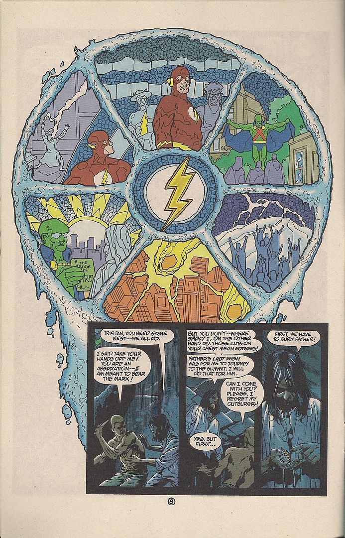
Yet Nihei's true fascination manifests. When a zombie woman shows up, lean and mostly unmutated in a little black dress, her cheekbones are good mostly for detailing how her teeth come out when Zoichi blows open her skinny head. When the girl Zoichi seeks appears, walking in a skirt, it's mainly much the better for tracing the luxurious stretching and splitting of a nude leg torn open by a (talking) motorcycle's tires, and then the recombination of its bloody strips and dancing tendons into a filmy new whole. Better hop into that bear suit, kid - it's a short life for the old flesh. ***

All My Darling Daughters: So, this girl walks into her teacher's office and starts taking off her clothes. She keeps repeating "It's all right" as the flummoxed lecturer urges her to stop, eventually trying to run away when she lifts up her bra. Despite this, he concedes that he likes the girl's breasts, causing her to tear up. She pins him against a bookshelf and demands that he let her go down on him or else she'll yell. He relents -- even though the girl is weird and her hair is oily and sticky -- much to the chagrin of his circle of acquaintances at dinner later on. Yet the girl is among the only ones in his class that seems to listen to him at all; even he considers some of his lectures to be boring. After a subsequent encounter, he offers the girl coffee, which she frantically insists he cannot do, although she tells him he's kind. The teacher idly imagines that he'd accept a more beautiful student's advances anytime. The girl, however, insists that the two of them should not have sex, because it's too good for her; and sex is for the female partner's benefit, while blowjobs are what a man likes best. He smiles when he sees her dutifully copying his words in class. She tells him later that she'd die if he only looked at her face when they're together, and that she used to be embarrassed by her big breasts but accepted them after she learned guys like them; her ex-boyfriends told her that her breasts were her only asset, though she insists they were great guys, because they came to her apartment and ate her food and accepted her presents. She says she likes him better. He admits he's starting to like her, and a friend tells him to return to where it started to go wrong. The next time they're together, he tells her not to go down on him; she cried, but her offers her tickets for them to see a movie. They embrace, and she tells him he's too good for her. In class, he reprimands her for coming in late, and the boy sitting next to her calls her a slowpoke and an ugly bitch. She grins at him as he looks away. "I hope she finds a guy who's a little better than I am." The teacher smiles. Comics?

Well shit, of course it's comics. Not long ago, folks would've called it 'literary' comics, and while that might have raised annoying qualms about imposing prose publishing's literary-genre dichotomy on a different art form -- in that a literary comic could simply be like 'literature' in the sense of being like prose writing itself -- it would nonetheless signal some form of thematic or formalist ambition on the part of various North American comics, albeit at a time when possibly any departure from genre apparatus could be construed as just that.

But comics have grown a lot in the past decade, and the old labels don't stick so well. Case in point: Fumi Yoshinaga, doujinshi-making fan turned pro, the widely-admired creator of the workplace dramedy Antique Bakery and the ongoing alternate history serial Ōoku: The Inner Chambers. This is her newest English release, hailing from 2003 in Japan, a suite of five interconnected stories, one of which I've synopsized above in a way that doesn't leave it too dissimilar to something out of, say, Optic Nerve, Adrian Tomine's quintessential literary comic, which, particularly in its later issues, always struck me as far more cinematographic in its ice-carved observational visuals than anything else. Er, should I mention Raymond Carver?

Prose is not always to be trusted, though, particularly when the prose writer's chief qualification is his blogspot account. What quickly leaps out from Yoshinaga's story is something a plot synopsis cannot capture: how the artist's handling of such potentially risible subject matter is inseparable from her use of the most time-honored aspects of manga iconography. Sweatdrops, booming sound effects, wacky cartoon faces, tiny balloonless dialogue asides - the gang's all here, if not as blatantly so as in youth manga. Still, they are the operations of a mangaka working in a relaxed idiom, a detailed comics language so fully hammered into place by decades of usage in a mass medium that they needn't be questioned. The purpose of Chibi-like cartoon faces are easy to understand (someone is losing their cool), so why not use them in a painful story about a teacher and his student? Because people won't take you seriously? Because you need to look like something else?

Manga may not be the most seriously considered art form in Japan, but it's understood enough that its toolbox doesn't need to be emptied to meet some threshold burden for adult consideration. It's like this: when Jaime Hernandez uses zany cartoon effects dating back to before Dan Decarlo, it's Jaime Hernandez being Jaime Hernandez; when Fumi Yoshinaga does it, it's manga being manga.

Another crucial difference: North American comics don't have a tradition of perfectly GOOD dramas like this to draw from. Currently, they have a small niche capable of selling drama as literature, without the distinctions that mark prose literature, or a limited means of presenting drama as an accessory to genre mechanics.

The beauty of manga is that drama can be simply drama, which, oddly enough, allows for less fussy access to certain literary qualities -- psychological depth, social inquiry, etc. -- though some might claim a more direct comparison to television drama; indeed, Yoshinaga is no stranger to that terrain, in that Antique Bakery was adapted into both live-action and animated television series in Japan, in addition to a feature film in South Korea. This might be a product of comparative serialization, though; certainly most of the television comparisons I hear regarding North American works surround superhero comics, the last big holdout of monthly or weekly chapters around here.

What Yoshinaga's work lacks is interaction with the comics form beyond that of the relaxed idiom. I doubt most non-devotees could even pick her artwork out of a lineup, it's so placidly observant of developed manga values, although a likable blockiness to certain obstinate characters' faces becomes noticeable over the course of the book; certainly she can put together attractive page designs, as evidenced above by the interplay between tones and blocking and those narration-only panels for... special... emphasis.

All of this is directly communicative, however - Yoshinaga is just not a fancy storyteller, rarely attempting even basic dissonance between words and pictures, except for comedic effect. It could be the tide of critical thought is turning, and that as drama becomes more commonplace in North American comics -- hardly guaranteed, given the precarious state of the market -- formalism might yet emerge as the new easy-reading shorthand for 'ambitious' funnies; last year's darling, Asterios Polyp, would obviously fit that bill. I haven't read every manga in the world, but I can't imagine a work like Mazzucchelli's coming out of Japan; maybe my imagination is limited, but it could be that the conditions necessary to conceive of such an obsessive metaphorical outlay just don't exist with manga, where even 'art' comics tend to study movement, like Yuichi Yokoyama's, or play with perspectives or drawing styles, a la Shintaro Kago or the heta-uma artists, or swing a hard fist at societal conditions, as did some of the older gekiga.

You don't need to fulfill any of these criteria to make an effective comic, much in the way you don't need to appear on critics' Top 10 lists to be good. The point I'm getting at is that the transformation of North American comics' makeup will probably cause a shift in how comics are analyzed qualitatively, and it's unassuming books like this that'll raise the biggest questions for readers disinclined to let nationality serve as their co-pilot. Yoshinaga remains upfront, like literature also can. As a writer, she typically has her characters flatly state their minds, confessing to or confiding in one another to move the plot, laughing and crying. She draws superb tears; there's these two pages with a little kid waking up sick, crying and spitting and puking, and there's a world of pain in that, one of the simplest ways comics can charge you up by being what they are.

The stories of All My Darling Daughters aren't very tightly connected -- the characters are all somehow friends or relations of each other, if sometimes tenuously -- although the last one does circle around to compliment the first, and the passage of time is duly conveyed as characters build relationships or get married. All of them concern women struggling with a deterministic world that ensures their relationships are connected to events of the past. Schoolroom slights create lasting tension between a mother and daughter, understandings between friends are informed by teenage vows for the future; probably the most complex aspect of the book is its title, indicating a particular parental concern, a love that Yoshinaga's manga reveals as potentially stifling.

"She said I was too good for her," says the teacher to his friends. That's a recurring sentiment throughout the book, a summary of the neuroses bedeviling Yoshinaga's characters. From this union of aching, across the book as a whole, we can understand the student in that story, even while the artist maintains the male's perspective (the only one of the book) throughout. She is young, and she might find her way out of the trap, although the only characters to really take control of their lives are prompted by one mother's life-threatening disease, thereby signalling a daughter to do the same.

Well, there is another character that undergoes a big change: a young woman who seems to care for everyone, yet never manages a romantic relationship. She's the star of the book's longest and most troublesome story, illustrative of Yoshinaga reaching too far, working with the fairly sophomoric notion of falling in love as potentially cruel discrimination between people as its thematic axis, then ungainly dressing it with allusions to the early 20th century struggles of Japanese leftists and the teachings of Christ, after which a perfectly logical and still faintly silly conclusion is reached.

This character is the counterpoint to Yoshinaga's mother and daughter, a person that can't stand the vagaries of romantic love and thus cuts herself off entirely from mainstream society. It's tempting to read this as revealing of the artist's own position, more adept with smartly observing domestic interactions than grappling with headier stuff; she does seem to want after something different, given this false start's inclusion, and the vastly expanded scope of Ōoku. We may be coming into a time where the new critical biases will demand more, and maybe in a way that Yoshinaga's straight-shot art cannot provide.

Yet maybe the nurturing of calm drama will spark its own nuanced appreciation, and readings will spread outward. Just having a book like this glide across bookstore shelves like it's just manga shows how much the years can change comics, more pliable than Yoshinaga's drawn families and nervous lovers for sure.

My Life is Choked with Comics #20 (Ver. 2.0): Captain Hadacol

This is a song about Louisiana and some of the people in it. Or outside it. Or nearly anywhere in these United States as the 1950s approached, and superheroes declined as charismatic rogues stood tall, proud like they knew we'd miss them once fatedly laid low. It's a nostalgic record.

Let it play. Can I offer you a drink?

This is Hadacol.

***

Twelve Percent True (Being a second and updated version of a post of January 31, 2010, amended to include exciting superhero art and duly expanded/adjusted text and formatting.)

***

Hadacol was a popular 'patent medicine' of the late 1940s that transformed into a full-blown national fad as the century's midpoint arrived. "A Dietary Supplement," as you can see, Hadacol was supposed to be taken four times per day -- once after every meal, then right before bed -- as diluted in water, half a glass for one tablespoon. A typical bottle retailed for $1.25 (over $11.00 today), chock-full of vitamins B1, B2, and B6, with Niacinamide, Iron, Manganese, Calcium, Phosphorous, and sweet sweet honey.

And... diluted acid hydrochloric, which the product's Wikipedia page happily informs us (without citation) was intended to open the body's arteries to facilitate better absorption of the Hadacol health mix, including its 'preservative' - 12% alcohol, roughly as much as in a typical bottle of table wine.

By literally every account I can track down, Hadacol was absolutely disgusting, which probably didn't matter: it was healthy! Sort of! At least, enough so to circumvent the legal/moral/religious concerns of 'dry' communities across the land, while giving even the most saturated household a special license for consumption. Plus, it was fun, the ballyhoo of it all, much grander than that behind the boozy potions of earlier American miracle vendors, dating back to before the Revolutionary War. A new, modern, post-WWII country needed a contemporary elixir, and Hadacol cured just what ailed 'em.

Dr. James Harvey Young provided a detailed overview of the Hadacol phenomenon in his 1966 book The Medical Messiahs: A Social History of Health Quackery in Twentieth-Century America (rev. 1990, free online), so I'll just run down the highlights. Hadacol was the brainchild of one Dudley J. LeBlanc, a Louisiana politician, entrepreneur, and quintessential Colorful Character from Down South prone to boasting that he got the inspiration for his bottled success in 1943 by way of swiping an injectable prototype from out of a doctor's office after the nurse had left the room. It wasn't LeBlanc's first patent medicine endeavor; one earlier project, Happy Day Headache Powders, in fact ran afoul of the Food and Drug Administration. Apparently not one to lay down and accept defeat, LeBlanc compressed the name of his former Happy Day Company into Ha-Da-Co-L, the 'L' being his own last name.

But if this time it was personal, LeBlanc didn't show it - mostly, he liked to say that he hadda call his product something.

I bet that's not the first time you've heard that joke. Hell, it's not even the first time today if you listened to that song like I asked you. But don't go thinking the lore of Hadacol entered into song and jest unassisted - it's said that LeBlanc himself commissioned Everybody Loves That Hadacol, licentious subtext and over-the-top claims and all. I mean, did that guy grow new toes?! Hadacol sounds scary.

Did the song end? Here, try this.

LeBlanc started out hawking Hadacol in French to Louisiana's Cajun population, to which he belonged, but it didn't take many years for the earthy nostrum to build its way up to the level of a genuine south-to-midwest consumer craze, aggravated by aggressive advertising tactics and lavish spending prompted by the possibility of tax write-offs. Mad culmination manifested in 1950, in the form of the Hadacol Caravan, a massive traveling spectacle accessible to the consumer only with the presentation of two Hadacol box tops (one for kids). Plenty more would be available inside, as the caravan wasn't a particularly new idea - it was a medicine show, of a type rapidly withdrawing into antiquity. Leblanc's affair was way bigger and far more monied than avarage, but it was essentially traditional, and I can't imagine some happy Hadacol purchasers didn't grasp the implication as to the, er, palliative qualities of the medicine accordant to such shows.

Ann Anderson's 2000 study Snake Oil, Hustlers and Hambones: The American Medicine Show positions the Hadacol Caravan as effectively the last great example of its folk entertainment kind, though poorer docs continued to wander into the 1960s. The form went out with a bang: among the Caravan's features, albeit not at the same time, were Hank Williams, Roy Acuff, George Burns & Gracie Allen, Jack Dempsey, Jack Benny, Sharkey Bonano's Dixieland Band, Bob Hope, Carmen Miranda, Dorothy Lamour, Rudy Vallée, Cesar Romero, Mickey Rooney, Milton Berle, Jimmy Durante, a chorus line, clowns, acrobats, vaudevillians, beauty queens, prizes, fireworks, and, of course, LeBlanc himself, cruising up through the venue in a white Cadillac. While he was serving in the Louisiana state senate, mind you. By the show's 1951 season, audiences ballooned to number in the tens of thousands.

Interestingly, Anderson's description of the show's over-the-top disposition -- purportedly adorned with unsubtle nods toward the star concoction's primary ingredient and winks at an aphrodisiac quality -- falls right in line with the awfully tongue-in-cheek tenor of the extended jingles we've already heard. Writer Jeremy Alford's account is similar, presenting some of the Caravan's action as approaching a prolonged and elaborate in-joke between Dudley J. LeBlanc and interested personages in Dry America:

A clown dressed in a police uniform stumbles around on stage and makes his way into the audience. A spotlight follows the ensuing folly as every time the clown takes an energetic step, an oversized bottle of Hadacol nearly jumps out of his pocket. He reaches quickly for the tonic and helps himself to a healthy swig. His massive glasses glow in the evening shade with each pull on the bottle. It's obvious that this is one drunken clown, and he's soon joined by another inebriated fellow whose nose lights up when he takes sips. The crowd ' children and adults ' loves it and screams into the night air.

Now, make no mistake, this is hardly the first instance of 20th century advertising adopting a fairly sardonic posture in re: the product at hand. Witness this 1932 marvel, fronted by a pair of New York City brothers that everybody reading this site has heard of:

And that's for Oldsmobile, as opposed to the most noxious libation this side of Jeppson's Malört. Yet people often still think of mid-century advertising as goofily forthright in its glosses and fibs, even while the Fleischers long ago poked at the virile promise of automobile ownership, and LeBlanc, decades later, sometimes giggled openly at the carnival pitchman's shamelessness of his own endeavor; this was a man with the trickster's spirit enough to stand on stage with an inter-party political rival and, at one point, switch his address to French so as to excoriate the man next to him to the delight of fluent attendees, as the target smiled.

Needless to say, he also got into comics publishing.

One comic, as far as I know. A superhero comic.

About a superhero that gets his powers from an authentic, eminently purchasable health product of dubious medicinal value, 24 proof.

That treasure took seventeen hours to find, because Captain Hadacol is smashed. And that's because the secret to his powers is booze. VITAMIN BOOZE.

I don't actually own this comic, nor do I know who wrote or drew it. All scans to follow come courtesy of the Deborah LeBlanc Collection, which informed me that Captain Hadacol -- whom I'd only known of by barest reference in product lore -- is a Superman-Popeye hybrid character, a plain man granted enormous temporary powers through imbibing the sponsor potion (available now, just $1.50). This came as a relief, since Cap looks strikingly like a 'vitamin'-addled normal guy who perhaps only thinks he has powers. Also, his costume looks like stuff he found. Then again, it probably does take a hero to successfully navigate in over-the-knee flat boots; I hope Marvel is taking notice for its upcoming Heroic Age, 'cause those Napoleonic puppies are back in style.

Just look at that wholesome, concerned face, bedecked with the same deadly squint promotions connoisseur Chris Ware sometimes uses for his Super-Man, which puts me in dire fear for Twelve Percent Lad's health. I just made up a superhero name right there; the proper name of that boy on the cover is "Red Reddie," whose family appears to have some firm connection to "John," the top-secret bespectacled identity of Captain Hadacol. "Comic Book No. 2" sees the Reddie family and their blond chum cutting loose down on the ranch:

Now if you're like me, your first thought is "gee, nice colors!" It's not unlike the anonymous, popping fresh style that does a lot to compliment Fletcher Hanks' (earlier) work. But the more you get into this comic, the more you notice its odd stylistic tics, like how four out of its nine story pages utilize the same motif of an expanded center panel, bordered on one side with a smaller column of panels and capped top and bottom with two thinner panel rows. Two additional pages utilize an even wider midsection, giving the comic an eccentric expanding and contracting feel.

Then there's the in-panel art, prone to a curvy sort of caricature, with scenery elements that border on the expressionistic - dig that wiggly drawer balancing the composition! Anyone who knows me is fully aware that I'm the worst person at spotting Golden Age art in the whole of North America's comics readership, so maybe this is some phenomenally well-known talent cashing a Hadacol check anonymously, but it's also possible that a local illustration hand put this thing together in the spirit of just having a go at the form.

Use as directed, kids! Actually, Anderson's book describes a totally different Captain Hadacol -- possibly the contents of the otherwise elusive issue #1 -- in which Our Man entreats a boy to slam eight consecutive bottles of Hadacol for immediate super-strength. "The alcohol in eight bottles of Hadacol equaled a pint of bonded whiskey," Anderson notes. And while that's coincidentally where my powers come from, apparently in this issue the power of Hadacol has expanded sufficiently to charge a man up 'by the label,' in addition to changing his clothes, thereby suggesting a brand of humor doubtlessly better suited to the Hadacol Caravan.

Here's another iteration of Artist X's layout style, with the interrupted big panel now up top. You're not missing any story reading along in this abridged manner, by the way; it's a totally uninspired genre short, propulsive mainly from its heavy breathing page compositions. Quite a thing for shadows too.

I mean, wow - Captain Hadacol's ready to kick some ass up there! I pretty much came out of this story hoping that nobody else discovers the secret of Hadacol, given what it does.

So, in that apparently everyone is a superhero by way of Hadacol's intervention, I can only conclude that the premise is broadly the same as that of The Boys. And sure enough, Captain Hadacol has the same basic superman look as the Homelander -- as well as similar military-corporate interest superheroes from Marshall Law or Power and Glory -- down to that faintly Aryan appearance beloved by talents eager to tease Fascist implications from superhero characters, as it takes only a few modifications to go from flat boots to jackboots.

Captain Hadacol isn't a fascist, of course; indeed, while I may be stretching, there's perhaps an interesting ethnic specificity to his costume, its cape seemingly patterned after the blue and white of the Hadacol box, but its overall blue, white and red-striped color scheme, with a single point of gold in the belt buckle, very loosely approximating the colors on the flag of Acadia, from where the Cajun people came (this is not to be confused with the present, similarly-colored Louisiana-specific Acadianan flag, which was not designed until 1965). Given that the costume itself appears to be slipped over a normal dress shirt and slacks, I wonder if Captain Hadacol 'himself' didn't make any promotional appearances at local events?

This is the back of the comic, listing the real treasures boys and girls can discover with Hadacol's aid; this whole 'comic' 'story' business is plainly secondary. In teeny tiny type at the bottom, it also lists a possible date of publication, January of 1951, right at the roaring height of the craze. We can therefore accept Captain Hadacol as exactly the kind of thing all those crafty satiric superheroes comment on, selling stuff to the public out from the seat of authority -- perverse, corrupt ideas of 'heroism' or 'justice' to Pat Mills or Garth Ennis, rather than decorous booze -- though most of us know that superheroes weren't really so idealistic at birth, certainly not the murderous ones sprung from the pulp tradition (say, Batman).

Still, comics are older than superheroes, just as medicine shows were older than Dudley J. LeBlanc. The most recent (39th) Overstreet guide contains no mention of Captain Hadacol -- given that the issue at hand is #2, there was presumably at least a #1, unless LeBlanc was pulling the contemporaneous comic book stunt of starting a run at a higher number to create the illusion of demand for nonexistent early issues -- although its lovely Promotional Comics section does mention that comics relating to patent medicine date back into the mid-19th century, much like the American medicine show, a fellow promotional entertainment. The two are thereby historically linked.

Yet look at the differences! If the Hadacol Caravan -- at least from the scattered historical record available to me -- seemed awfully wry and rightly sophisticated in its rib-poking promotion, Captain Hadacol the comic occupies a promotional area where LeBlanc wasn't kidding around - the comic book form manifested a simple entertainment for kiddies, if potentially enlivened by oddly emphatic art, and ideally facilitated forthright appeals to Mom and Dad. Behold:

It'd probably be in the Hadacol spirit to make a beer muscles joke here, but instead I'll observe that the promotional comic, as opposed to the promotional live jamboree, operates on these pages as appropriate for a naïve form. As the song goes:

my ex she lives near Bayou Blue

and she could not read or write

she just reads comic funny books

every day and every night

but then she took some Hadacol

and it gave her quite a thrill

'cause now she's teaching high school

she's the best in Abbeville

-from Everybody Loves That Hadacol (Cajun Version), as posted above

Ha, you see? Comics are stupid! Adults who read them are STUPID! They're for little kids, everyone knows this, you can reference it in a song and everyone will get the joke! That's why it's the perfect means for kids to deliver these urgent testimonials to their parents - how could a dumb, childish art form like this lie? It's on-the-nose advertising, and in an inappropriate venue for the arguably more mature posture of the more colorful Hadacol hype. In case you can't see the small text:

--

I must express my honest and sincere thanks to you and the people who discovered the remarkable HADACOL. My little girl, Jean, 7 years old at last birthday, has been weak and underweight since birth. She ate very little at lunch and supper and went to school without eating breakfast. Regardless of how much I coaxed or begged, she just wouldn't eat, was pale and listless. Always complaining, I was afraid to let her out to play because she cried from nervousness. Some of my friends recommended HADACOL. At first, I didn't pay much attention but she grew worse and something had to be done, or, else, she would have to miss school. So she now is on her third bottle of HADACOL. Already my husband and I can tell the world of difference. She eats breakfast and is gaining in weight. She is as spry as a cricket. I cannot praise HADACOL enough. I shall continue to use HADACOL as long as it is sold.

--

My little daughter, Brenda Sue Miller, had been rundown and had a very poor appetite. She took two bottles of HADACOL. She has been eating better, and she feels better. She is very glad she is taking HADACOL. She is ten years old.

--

I have given my little five year old girl HADACOL and it has helped her so much. She would not eat much, but after taking two bottles of HADACOL, she eats everything. So, I will keep on giving her HADACOL and I will try some myself.

--

And, you know, comic books were immature at that time, though superheroes were rapidly hibernating by 1951, in favor of crime and (increasingly) horror comics. And Disney comics and Archie comics, yes, but the nasty stuff caught the attention of society's guardians, terribly concerned for the well-being of susceptible youth.

No worries of this sort from Dudley J. LeBlanc - like Wu-Tang, nearly half a century later, Hadacol is for the children:

--

I have a little son, 7 years old. He was thin and delicate. He would have one cold after another, had no appetite. Early this Fall, I began giving him HADACOL. I have given him three large bottles. Now, he goes to school regularly and eats twice as much as he did before, sleeps much better, and he has gained weight. I'll continue to use HADACOL and recommend it to others. I can't praise HADACOL enough. I think it is wonderful for both young and old.

--

I can't praise HADACOL enough, for what it has done for my little girl Melba Jacobs, who is 10 years old. She started taking HADACOL. She was nervous, and rundown, and, didn't have any appetite, and didn't feel like going to school, and she couldn't rest well at night. Since taking HADACOL she eats well, sleeps well, and feels better in every way. Thanks to HADACOL. Her little playmate is taking HADACOL also, after I told him about it.

--

I can't praise HADACOL enough. My little six year old girl was weak, nervous and rundown. I heard so much about HADACOL and decided to try it. It seemed to help her more than anything. She now eats and seems to enjoy eating. Anyone that has a poor appetite should try HADACOL. I cannot praise HADACOL enough.

--

My daughter, Marilyn Sue, is 5 years old, and for some time lacked energy, had a poor appetite, was generally rundown. Since giving her HADACOL, we have noticed wonderful results. She has a much better appetite, eats everything on the table, and doesn't seem tired like she used to. Incidentally, she likes to take her HADACOL too.

--

My little boy is 10 years old and had always been nervous and he didn't sleep well. He has taken 3 bottles of HADACOL, and now he sleeps much better and feels like going to school. He eats like he'll never get enough. I can never praise HADACOL enough.

--

Man, this is a lot of testimony! How about another song?

Feel free to do the Hadacol Boogie along at home (or an especially liberal workplace), although I think it might be a euphemism for sex. Hey - where do you think kids come from?

--

Sometime ago, our little boy, James Edgar was so weak. We had to give him liver, and all kinds of food that would build blood. He couldn't run and play. Also, his food hurt him. I heard about HADACOL. I decided to try it. Before I gave him many bottles, I could tell a great difference. He has taken fourteen bottles. He is eleven years old, weighs 92 pounds, plays on the school ball team, rides his bike, runs and plays like other boys, and feels grand, sleeps all night, without waking. I can never praise HADACOL enough. I have recommended it to all my friends and got them to take it. They are thrilled over finding such a fine formula.

--

I want everyone to know what HADACOL has done for my little six-year old girl. She was weak and rundown. She was so easy to take a cold. So, we decided to try HADACOL on her, and I can't praise it enough. We have given her about ten bottles and are going to give it to her the rest of this winter. She is going to school. I am enclosing a photograph of my little six year old girl, Ruth Munsey. HADACOL has done so much for her.

--

We have a son, Philip Oren Wood, eight years of age, who became very nervous, and due to this we had to take him out of school. He had no appetite, and could not sleep at night. We were advised to give him HADACOL. He has been taking HADACOL for about two months. He has again entered school, he has a good appetite, and is beginning to sleep as he should. We are thankful for this wonderful discovery.

--

My little boy, 8 years old, was thin, rundown and was so weak he could not run and play without lying down and resting 2 or 3 times during the day. He would not eat like he should. And, then, I heard about HADACOL for children. So, I began giving him HADACOL. Now, after the first bottle, he eats better, sleeps better and is so full of vim. Just feels fine and plays all the time. I will always keep a bottle on hand.

--

But she wouldn't have much time to do it. In late 1951, LeBlanc sold his interest in Hadacol to investors up north. Six weeks later, they discovered that Hadacol was in fact in tremendous debt, and distribution soon collapsed amid FTC complaints and mounting criticism of the product's unique not-all-that-healthy approach to diatary supplementation. LeBlanc was saddled with a hefty tax bill, and never again realized that level of success; a non-alcoholic vitamin drink, Kary-On, proved unpopular. However, despite unsuccessful bids for the U.S. Congress and the governorship of Louisiana, he remained popular enough in his home district that he died in office as a state senator, 77 years old in 1971.

In 1952, the year after the end of the Caravan and the fall of Hadacol, a comic book titled Mad debuted from the increasingly notorious comics publisher EC. Under founding editor Harvey Kurtzman, it would bring a skeptic's eye to comic books, something typically reserved for newspaper or magazine cartoons, more favored species of the comics form, devoting itself to cracking the codes of superheroes and advertisements and gala shows and everything else Hadacol and LeBlanc profited from, in part through comics itself.

And then in 1954 the Comics Code Authority was formed, and comic books couldn't speak ill of judges.

Oh well, you know - the seed was planted.

As for Captain Hadacol himself, indulge me this advertisement of my own:

***

HELP ME. I AM RUNDOWN AND LACKING IN VIM, AND THE ONLY CURE IS INFORMATION. IF YOU KNOW ANYTHING ABOUT CAPTAIN HADACOL -- WHO WROTE OR DREW IT, HOW MANY ISSUES WERE PUBLISHED, WHERE OR HOW THEY WERE DISTRIBUTED OR SOLD -- PLEASE LEAVE A COMMENT OR SEND ME AN EMAIL.

***

Hell, maybe all my half-formed and tenuous ideas as expressed here will change with a little more Hadacol context. Maybe the discovery of future rip-snortin' Cap'n Hadacol adventures will yet boast a texture unique in promotional funnies; its creator didn't seem the type to leave any ballyhoo hanging in the air without the special grin of a born gamer. But as it stands now, Captain Hadacol is more an oddball exhibit of neat visual qualities speaking to a sophistication that comic books, in their stories and their society, could not embody, and so the joke could only be on them.

Let me sum it all up with a story that appears in nearly every Hadacol-related text, starting with Martin Gardner's 1952 omnibus expose Fads and Fallacies in the Name of Science, which I have not read. Accordingly, I'll print the legend.

It so happened that Dudley J. LeBlanc, as Hadacol boomed, was being interviewed by Groucho Marx, whose brother Chico had played/would play the Caravan, which, all things considered, probably provided a nice payday for hard-working performers transitioning away from hot stardom.

At one point, Marx turned to LeBlanc and asked what Hadacol is good for.

"It was good for five and a half million for me last year," LeBlanc replied.

***

- One million thanks to the Deborah LeBlanc Collection for the wonderful scans and information.

Startups and follow-ups, five reviews for 1/13 (sorta).

Orc Stain #1: This is a VERY GOOD Image comic about orcs and stealing and penises and conquest. It didn't come out this week, but I didn't get hold of a copy until Saturday, which is okay by me; this is a perfect comic to find, to turn around in your hands and marvel at how 32-page all-story comics still exist at $2.99, in color, out of the front of Previews, embodying in their small confines a pure worldview, like the underground genre comics of 40 years ago, and their 'alternative' children going all the way forward. These days $2.99 feels like underground pricing too.

Tradition is highly pertinent to the case of creator James Stokoe, still in his mid-20s, I think, and probably best known right now for his two-volume Oni Press series Wonton Soup (2007, 2009), a high-spirited fusion of comedic sci-fi and cooking manga, presented in those 200-page b&w packages that will probably connect Oni to Bryan Lee O'Malley's Scott Pilgrim until the sun has consumed the Earth.

However, Stokoe is best compared with a former studiomate, Brandon Graham, whose own King City is also ongoing from Image and gets a place of honor as this comic's one and only advertisement. In-story, meanwhile, artist Moritat gets a shout-out; he's been the primary artist for Richard Starkings' Elephantmen series at Image, which as of late has served as something of a focusing point for some artists in this Image/Oni-centered group, particularly Marian Churchland, whose graphic novel Beast was also released by Image last year, to some acclaim.

And while these projects aren't all very similar -- King City is digression-prone urban sci-fi relationship drama paced like popular manga (and initially released in 2007 as an OEL manga from Tokyopop) while Beasts is as politely contained a literary comic as one can imagine -- they do reflect an embrace and intuitive parsing of international comics-as-comics styles, apparently disinterested in provincial aesthetic concerns or old-timey genre biases, instead basing creative decisions on the personal impact of diverse older works.

This isn't so different from other periods of comics activity, ranging from the '60s underground through the 'alternative' comics era, but now the solitude of the American, Franco-Belgian and Japanese scenes has faded, stretching the plane of influence to true IMAX proportions, to say nothing of non-comics influences like gaming or animation or graffiti art - indeed, what sets these artists apart from Ben Jones & Frank Santoro of Cold Heat or C.F. of Powr Mastrs is the comparable absence of 'fine' art in the mix, although Graham was also part of the same Meathaus group as artists like Dash Shaw, and anyway was publishing with manga-friendly North American outlets as early as the mid-'90s. I think the best times will arrive when ill-informed future historians concoct the Meathaus vs. Fort Thunder rival schools kung fu narrative.

Orc Stain is cognizant of all of this, but especially drawn toward that earliest American period for comics like this: the underground era. The presence of Vaughn Bodē can be felt as much as the whimsi-mythical creature designs of Hayao Miyazaki (let's say), or the pulsing ultra-detail of Euro-fed seinen manga from decades back; it's maybe also helpful to think of Cobalt 60 as a touchstone, although I don't know if Stokoe ranks it himself, since its mid-'80s Epic Illustrated origins brush against many of these aspects.

The story is airy and fairly simple, as happens in a lot of these current comics: the powerful Orctzar is in search of a "god-organ" that will bring him domination over all the highly fractious and dick-obsessed orc planet, and prophecy provides that a one-eyed soul can hook him up. Fitting the bill is a young thief up north, a dissatisfied master at cracking organic locks, making money by robbing the graves of the great orcs of the past, the only personages allowed names, which are really only numbers.

Summarizing the plot does this comic little good, though; much of it is spent on looming sights and explorations of how those sights function, like how to best crack open a monument to a fallen hero, or create a foreign language potion (by locating a creature that speaks the language, roasting it, bashing its skull open and pouring water through the hole and out its mouth, as you might have guessed). Such visually swollen work is really very fitting for Image, founded on art and artists chasing their desires - work like this both brings that impulse into the present while sitting it in a historical context, although these days all of history seems to exist at once, in the way that Stokoe's interest in near-parodic manly combat virtue by way of bodily function seems both linked to Johnny Ryan's Prison Pit and the old anatomic detail of Richard Corben.

I realize I'm going on a lot about history and interrelated artists here. That's because this is frankly a comic that leans heavily on experiential factors for its value; to study it best is to know how fun and lovely comics can still crackle with new energy, even while evoking old comics books, in a rather old format. It's not random that orcs have ruled their planet for countless years without accomplishing a lot, or that young orcs don't have names anymore, or that the best money is in working smartly on the legacy of the older and richer. All the orc world is open to artists and thieves now; knowing fulfillment is knowing where to hammer. ***

Army of Two #1: Ah, but what of the living legends? Peter Milligan could hardly expect to co-write one of my favorite comics of all time -- that'd be Rogan Gosh -- and expect me not to follow him down every odd road he finds. And man, these days I can hardly keep track of him - our own Douglas Wolk had to clue me in on the very existence of this project, the first output of EA Comics, a joint venture between IDW and Electronic Arts, aimed at dedicated proliferation of video game-licensed series. Have you heard about Orson Scott Card co-writing the Dragon Age comic? First comes Peter Milligan and Army of Two!

Unfortunately, the best I can say of this book is that I think it's supposed to be tongue-in-cheek, and I say that knowing that Milligan himself has described it as more or less a character piece, on which terms it unequivocally fails as a compelling introduction. But really: it's a sequel to the original game, which I haven't played (although I hear it's the kind of thing where your character plays air guitar on his weapon after a particularly awesome accomplishment, so I'm thinking it's not entirely serious itself), following a pair of highly bad dudes that sadly live in a time where you can't just rescue the President from ninja, you've got to bring down your corrupt private military company from within and form a new PMC with the two of you as apparently its sole agents.

This issue begins a ripped-from-the-headlines story about drug gangs in Mexico, following a hapless young lad recruited into a world of violence while our hockey mask-wearing heroes charge into an inter-gang hostage situation, only to discover that the hostages have already been shot. Then they pause and wonder if they should have tried to negotiate, but it turns out that hostages were actually dead a long time ago, so it turns out only harder and nastier lethal action is the answer! There's also a Mexican army major that brings up the culpability of the U.S. drug market in funding such activities, but then the villains shoot him to death and the Army of Two shoot back, remarking "Who needs drugs when you got this kinda rush?" There's also a green recruit that provides pathos via getting shot to death, covering his entire projected character arc in the space of the first issue.

In other words, it's Peter Milligan writing, basically, a Mark Millar comic. He's hampered on two major points: (1) artists Dexter Soy (pencils) & José Marzan, Jr. (inks) work in a proficient, unemphatic style that'll probably pass a technical spot check but adds virtually nothing to the dialogue beyond the illustrative qualities of who's going where or who's talking, even sometimes garbling that as characters lose detail in longshot; and (2) Milligan's "visible writing" -- i.e. his dialogue and the basic scenario -- are subdued to the point where it depends on the art for visceral or funny or dramatic impact, be it a function of "invisible writing" -- script directions to the artist dictating mood, panel layouts, etc., which obviously aren't invisible on the page, they just can't be attributed to the writer without looking at the script itself -- or simple trust in the artists' burden.

The result is a comic that totters uneasily between winking at hoary conventions and simply adopting them in a dryly self-evident manner; as guitar rock simple as its premise might seem, it's actually a bit more overtly demanding on the story-art blend than a more literary, writerly thing. Case study, this. AWFUL place to be.

***

Neonomicon Hornbook: But what happens when we do have the script in front of us? This is a $1.99 preview of Avatar's new Alan Moore/Jacen Burrows project due out later this year; note that it's Moore's first totally original script for the publisher, as opposed to an adaptation of a story or poem, or a project reprinted or continued from another source. The solicitation promised design sketches and an interview with Burrows, but the final product is simply nine pages of completed art from issue #1 paired with Moore's original script for four of those pages, with an unidentified splash page I presume is a cover preview. That's fine by me; I like reading Moore's scripts, and I'm thinking Avatar is very interested in showing off the all-new, all-Moore state of the writing.

The Magus himself has proven less forthcoming about the project, at one point remarking "I don’t know about my story, it might be a bit black, I don’t know, you know." He then went on to heap praise on Burrows, who also drew Avatar's 2003 The Courtyard, a Moore prose adaptation (formatted for comics by Antony Johnston) that serves as the inspiration for the current project. And while not all of the publisher's Moore adaptations have been successful as comics, the Courtyard benefited from a very simple, prose-specific concept: disguised as a police mystery, the story is really an avalanche of H.P. Lovecraft references, culminating in the big idea of Cthulhoid language as a drug, which serves as a metaphor for the addictive, lingering influence of Lovecraft himself, as embodied by the story entire.

Bringing this to comics actually opens it up nicely, in that language (magic) is of such paramount importance to Moore that placing it all in a visualized locale gives the basic plot a grounded feel absent from the source material. Burrows was a good choice for that; as currently on display in Crossed, his specialty is taking smooth, animation-ready characters and contorting them into horrible states in open, chilly spaces.

But how do you read a comic like this - a comic and script? I mean, if you don't like script excerpts you save your two bucks, but since I do I find myself reading them in tandem, interested in correlation. I know the comic is supposed to be the only real part of the story, but 16-page books like this compel me to accept all the information as dual parts of the content (particularly when two bucks are on the line). I realize this doesn't always do the artists many favors, since working full script often requires picking and choosing representations from "the shimmer of murky possibilities" accordant to some prose, in the words of biblical translator Robert Alter, evaluating Robert Crumb's The Book of Genesis Illustrated.

Moore doesn't much benefit from scriptural ambiguity of concision; a 47-line block of text, excerpted above, is followed by "OKAY, I THINK THAT'S PRETTY MUCH IT FOR THIS OPENING IMAGE," after which there are eight more lines before the dialogue begins. Yet Moore's script is remarkably demanding, and slick to boot - he isn't just telling an artist what to draw, he's building parts of a rather self-sufficient story in all that text. Describing the contrast between one character safe in a cozy car and another acting agitated outside in the cold, Moore presents what I suspect is a synecdoche of their dynamic as an opening flourish.

That's lovely, but it's demanding too, benefiting from the evocation of language so that only superior visual nuance could fix it in full as image. This isn't Burrows' strength; his figures aren't so much expressive as liable to be dramatically twisted, while environmental effects (or the disparity between environments) don't tend to register on his cool, clean planes. Yet reading Moore's script doesn't reflect all that badly on him, partially because I think even the most uncharitable reader knows it's rhetorical dirty pool to count the absence-on-page of each and every one of Moore's voluminous stage directions against him, but also because Moore's writing is often so close to 'proper' prose it sometimes begs for its own comics script adaptation; it's like when I read Voice of the Fire and I decided it was better than most of Moore's comics, and then I frowned a little.

Oh, what? How's the comic? Well, I'm afraid it mostly resembles The League of Extraordinary Gentlemen: Black Dossier from this segment, specifically the early bit with Allan & Mina washing up while rolling out an awful lot of stilted exposition; it was like Moore couldn't wait to get the characterization out of the way so he could launch into Ideas, which is the appeal for some readers, granted, but I'm starting to think the all-lecture final issue of Promethea is going to end up as the representative success of the writer's late period, a 'success' based in part on dispensing with characters and plot altogether.

And I loved that issue of Promethea, but Neonomicon does appear to have a plot and characters, and unlike the self-contained Black Dossier we're being asked to only read the setup for now, wherein characters uneasily banter about debilitating personal problems and at one point devote a panel's worth of conversation to summarizing what happened on the prior page. Then there's a final panel reveal that doesn't offer a lot of clarity on its own, but at least restates the Courtyard's worldview-in-a-package outlook in a manner not entirely at the mercy of language. Ironically. OKAY for the sum of it, but if all you want is the comic, it's probably best to wait.

***

Starstruck #5 (of 13): Here's a different take on comics and prose as an ongoing comic book, with the added benefit-burden of being a genuine series rather than a preview item, albeit a series that's up to its fourth incarnation of some of this material. Good news, though: five issues in, and it's becoming clear that IDW's Starstruck is a nearly Chris Ware-caliber feat of creative reconstitution, poking and prodding and expanding and clipping writer Elaine Lee's & artist Michael Wm. Kaluta's stuff into something that seems born for funnybook serialization.

Not that it's transformed into a lightning-quick read, oh lord no - like the aforementioned alternative genre comics of today, Starstruck isn't so much concerned with brisk plotting as enjoying the sensation of being in its detailed world. Unlike those comics, Lee accomplishes this through wildly info-dense, time-skipping story bursts that don't betray any immediately obvious story goal; as the old Epic house ads used to say, "It's not just a comic book. It's an entire universe."

IDW's series exploits this universal state of being by envisioning each issue as not so much a story in the way we expect to see 20-22 pages of comics inside a 32-page book but as a collection of materials: some of it comics, some of it text, and much of it narrated by totally different characters, addressing different points on the series' timeline. Most of the text is placed in between comics segments too, forcing the question of its inclusion as part of the story. You don't have to read it, but it always compliments the dizzy style of the comics segments, which devout fans know will not reach a climax upon issue #13 - the characters will have barely been introduced by that point, again highlighting the grab bag nature of the whole.

It'll read differently as a collected book, sure, but that's the collection's concern. This is comics.

Anyhow, this issue's main comics bit sees hapless Molly Medea -- the future space legend Galatia 9, if you've been reading the text segments, or any of the series' prior incarnations -- advanced to age 21 and her art terrorist phase, despite not being much of an artist or a terrorist. Her struggle with wicked half-sister Verloona Ti lands her in a perfectly absurd prison break situation with a muscular cellmate, foreshadowing future adventures with fellow quasi-protagonist Brucilla the Muscle, who's still a little girl in the issue's backup comics section.

Shot through it all is Lee's fascination with interactions between women in an allusive, often parodic sci-fi universe. Verloona may not deal in, say, genetically engineered sex slaves that die after their virgin use, but she does run a chain of beauty outlets exploiting women's fascination with men's fascination with those things, thus furthering the series' complex interest in notions of sexiness, which can be misinterpreted as sexism or exploitation, because it refuses any simple pro-cleavage/anti-cleavage categorization. Too expansive a universe for that. VERY GOOD.

***

PunisherMax #3: But in the interests of ending this on a more traditional high note, since I am a traditional man, here's a GOOD current ongoing series from Marvel, where Jason Aaron's and Steve Dillon's story and art function in lovely concert, and that's the whole show.

A different Marvel-published writer, Kieron Gillen, also of the Image series Phonogram -- and perhaps more pertinently, the fine gaming news and criticism site Rock, Paper, Shotgun -- recently suggested that writers-on-comics refrain from bifurcating attribution of "innovation" to any specific member of the creative team, in that the writer usually dictates some aspect of the visual presentation (my "invisible writing," as seen above), while the artist inevitably affects the writing with any given choice in page layout, panel-to-panel storytelling, etc. The point is, the terms 'writer' and 'artist' are somewhat vaporous in the realpolitik of comic book creation; Gillen's suggested alternative is to treat the creative team as a "faux-cartoonist," i.e. an even more illusory single person, so as to more effectively address the totality of a work.

I'll go even further than that: we also labor under an illusion in merely accepting the names in the credit boxes, particularly in collaborative Marvel/DC comics, because an editor certainly could have directed some of an issue to put it in line with the wider continuity, or the writer might have fallen ill and asked a friend to put together some stuff, or the artist might be utilizing an uncredited background artist to get the work together in time, or maybe just one panel was inked by a more established artist as a gift or a favor and that panel happened to turn out especially well. But we typically don't address these possibilities because we need a calm, steady space in which to position our analysis, even if it's less 'real.' Mind you, Gillen obviously isn't suggesting that his offered paradigm is somehow more 'real' -- I mean, faux is right in the fucking name -- but rather a more agile mirage, capable of phasing out rhetorically troubling zones.

So I'm fine with that, though I don't think it's a cure-all; there's a lot of forms of writing-on-comics, and some of it rightly ought to hone in on a single member of a creative team. To use one of Gillen's examples, it is no doubt useful to look at a Grant Morrison/Frank Quitely comic as a work by a faux-single entity, yet there's little use in denying that Morrison tends to draw some power from referencing and questioning and building upon his own, real-single body of work, which of course stretches across multiple separate collaborations; indeed, All Star Superman functions as much as a continuation of Morrison's DC meganarrative as a discreet look at the Man of Steel, urging some isolation of themes and plot qualities. Moreover, if you're looking at Detective Comics right now, I obviously consider some study of J.H. Williams' work across his own career instructive on how the book does and does not succeed, although surely you can't credit every bit of the visuals to him (or Dave Stewart).

The question you have to ask is: what kind of criticism do I want? What do I want to talk about? How can I accomplish that without making things up, unless it's a really good joke?

This is all a long way of saying that Jason Aaron (lettered by Cory Petit) and Steve Dillon (colored by Matt Hollingsworth) can very easily be taken as one person, so unified is their drive. Mind you, this is a mid-story bit in a series somewhat famous for flowing more as a segmented book than as chapters, so it doesn't have the same kick as some of the comics covered above, but it is progressing nicely.

The primary theme at work is family, covering the ruined crime families Wilson Fisk is playing off for the sake of his own family, driven by the broken family of his older days, much in the way Frank Castle himself shoots away the ghosts - a nice bit of mirroring panels in issue #2 summed this up, concluding with Fisk stepping into the arms of his son and the Punisher hovering in a doorway in shadows. This issue introduces a super-assassin character from a plot-convenient extreme Mennonite sect that also struggles to preserve his home, a delicate thing indeed in this series.

Garth Ennis' set of themes were similarly bleak, and this new run continues to beg comparison by revisiting the scene of a famous prior set piece. But this new entity-featuring-Steve-Dillon is gradually demonstrating how different it is in the same setting, replacing the Dillon-drawn comedy of early Ennis issues with a more wicked lightness of being, as an arm's length Punisher wipes out every obstacle in the MAX Universe proto-Kingpin's way, and the delight isn't just the reader's but his. As established by Ennis, Aaron continues: the Punisher is gross, so the most fun to be had with his efforts is by the most wicked character around. There's your returning artist's pictures slightly shifted by a new writer's words, like he's a new man, fake or not.

Savage Critics on the Reporter!

It is a Savage Critic Four-fer (is that a word?) as Tom Spurgeon interviews Jog on Death Note, Douglas on Invincible Iron Man, Tucker on Ganges, and Sean on Blankets!

All of them (as well as all of the non-Savage Critic interviews as well!) are definitely must-read pieces!

Spurge initially asked me to do an interview, as well, but then he suddenly decided to do this one-critic-one-book series, and he asked if we could do our general survey of the business of comics later in 2010. I'm certainly looking forward to the chances of doing that sometime in the next month or two, I hope!

-B

My Life is Choked with Comics #19b: Manga

(Being part 2 of 2 in a series; part 1 is here)

***

III. JAPAN, HIDE YOUR WOMEN!

I'll ask it again, this time with feeling - what the hell is manga? Or more specifically, what the hell is manga today, in comparison to Western professional print comics?

(from Hanshin, as presented in The Comics Journal #269; art by Moto Hagio)

There's matters of presentation and distribution, of course. I've mentioned that before. Manga is digest-sized paperback books, usually serialized far away from Western eyes in terms of venue -- anthology magazines, usually -- and often time, in that even the most popular current series have to wait several months for translations to finish or licensing terms to play out. This contrasts with the typically larger, bookshelf-ready originals of the West's dominant Franco-Belgian and American traditions, or U.S. pamphlets swiftly collected into fatter tomes.

Moreover, narrowing our focus to North America, manga is also the stuff that takes up the most space in big box bookstores, as opposed to the books that line most shelves in the Direct Market. Manga usually reads right-to-left, as it's been for as long as it's taken up the aforementioned space in your Borders and Barnes & Noble, while North American comics should ideally go left-to-right, barring some formal experiment and/or deadline catastrophe; the split doesn't get any smoother than that. Hell, if superhero comics are an especially large subset of popular action comics, then popular action manga can even be seen as a bulwark of 'cartoony' artwork against the preference for 'realism' in so many Marvel/DC series, though obviously these designations aren't absolute.

What is of paramount importance, however, is the word popular. If there's anything I hope I've established by now, it's that manga isn't monolithic, that many styles and approaches exist, that manga is big - enough so that an anthology like Manga could effectively excerpt a nation's comics output in the early '80s so as to arrive at something similar to what was preeminent in North America around the same time, possibly as a stratagem for presenting an unfamiliar, foreign kind of comic as not very different from Western funnies at all, except with samurai and stuff. 'Cause it's Japan!

Today, everybody knows something deeper about manga, if only that manga is a deeper something. It's big and present; it might not show on every Best of Decade list from every visible North American media outlet, but you can bet your ass a disclaimer will be provided upon request begging off coverage for lack of familiarity, because manga will not simply be ignored. You see manga everywhere in a way you don't with other professional print comics, like Fort Thunder-inspired bookshelf collections or superhero pamphlets for kids.

Ha - I bet you can already see how I'm comparing segments of the North American comics scene to a whole nation's output, covering decades of time. In my defense, I'll say that some types of manga remain far more prolifically translated than others -- long form pop comics for boys and girls, generally, followed by a little bit of stuff aimed at older men and a smattering of projects for mature women, with individual publishers specializing in 'classic' or 'art' or 'dirty dirty smut' manga -- though surely the picture presented ten to thirty steps away from your local Seattle's Best caffeine counter hews closer to what's actually most visible in Japan than what was seen in Manga-the-anthology, very far away indeed from the shōnen style evidenced in those 2,850,000 copies of One Piece Vol. 56 on new release day, or the attitude that would prompt an Eiichiro Oda to declare a triple-digit intent for a comic weighing in at 200 pages per compiled pop.

(from They Were Eleven; art by Moto Hagio)

That leads us to something else, something only partially intended by anyone in charge, I think. Here in 2009, in North America, manga functions as a full-blown alternative mainstream of comics; not the 'real mainstream' Oni Press or AiT/Planet Lar pondered earlier this decade -- i.e. something akin to entertainments or artworks popular outside of the comics sphere -- but a 'pure comics' mainstream positioned apart from the English-language way of things, with its own set of values and tropes and genres; a setup where foreignness can be a virtue.

With a few years of that kind of development behind it, manga has become the Other. Having made its incursion on North American territory (European too, though I'll stick to what I know in person), the rhetoric surrounding manga in North American comics-focused circles is now often defined by the void manga has filled in the domestic comics scene.

Manga is comics for women.

Comics for teenagers.

Comics for homosexuals.

Comics for everyone North American comics could have reached but didn't, not in a hugely broad money-making way at least, because obviously there are some North American comics aimed at all of those groups, and women and teenagers and gays that enjoy reading North American comics, but Japanese comics brought lots of them close to the comics form and into the bookstore or onto the websites and sold them many, many things they wanted.

This isn't a zero sum game. Naturally, you can read as many comics as you damn well want; plenty of people in North America read Japanese comics and American comics and whatever UK comics that float in and poor old European comics, which have their own storied history and culture but, high-profile exceptions aside, couldn't be less popular domestically right now if they were printed on the H1N1/09 virus and had to be read with a microscope, which is still an improvement from a decade ago.

But in the commentary, the debate, the Big Picture, the mind's eye of the uncertain observer, the comic book fan who hasn't read a lot of manga, standing in the middle of a male-dominated pop comics culture - manga seems so deep, so complicated, like a foreign language somehow in English, demanding of study, aimed at a different demographic, no part-timers aloud, Your Life Required, signed in blood on the dotted line or don't even open your fucking mouth, fanboy, because you'll just get it all wrong, ducking to avoid manga swung like a club against the shortcomings and weaknesses of North American comics, despite its own troubles, its own failings, its complexities, its accidents and strokes of luck.

The overlap of Japanese and North American comics can get lost. I have no doubt that most of you reading this right now can immediately cite someone, Naoki Urasawa let's say, as a mangaka whose work isn't a million miles away from a good spread of Western comics in aesthetic approach. That's fine, very true. Japan has a bigger comics industry than ours, and some of it, as Manga-the-anthology struggled mightily to show, isn't so different in style from ours.

Yet in manga's multitudes stir popular comics that are very separate indeed, and Manga hid it all away for the early '80s, including the revolution of female artists from just a few years before, the women that set the stage for manga's reign today and inevitably swept off most early outliers, the accidental pioneers we're surveying now.

This is the closest Manga came to a segment drawn by a woman: Schizophrenia, by Yôji Fukuyama. That's because Fukuyama was good friends with shōjo manga pioneer Moto Hagio in high school.

Seriously, that's as close as we're gonna get.

On the other hand, the entry does offer a glimpse yet another breed of mangaka still obscure in English translation: the dedicated short form artist. Fukuyama has had numerous collections of short comics published in Japan, with three larger, dreamy projects translated to French and published by Casterman, the longest of them taking up two volumes. Tellingly, the only example of Fukuyama's art I can find in an English edition besides this one is his guest drawings in the French-born artist Frédéric Boilet's 2001 autobiographical romance Yukiko's Spinach (translated in 2003 by Fanfare/Ponent Mon):

Fukuyama drew the lil' angel. The lovely Japanese woman is, inevitably, Boilet's.

Schizophrenia, meanwhile, is a sort of philosophical sci-fi/comedy thing about a man who builds a time machine to whisk him away to the better world of the past. Unfortunately, his invention only takes him ten minutes into the past, just as he's walking into the room. The two hims then try to activate the machine again, which leaves them only seconds away from where they were before, with their bodies now (then?) fused with the bodies of two more versions of themselves. This continues until the man is a shambling, hideous mass of Him, arms and legs everywhere, at which point they all agree to stay inside and watch television.

It's a cute (and gross) fable, and oddly precognitive - the doubling motif also appears in one of Fukuyama's recent forays into a different art form, Doorbell, a short anime film he directed in 2007 for the Studio 4°C theatrical anthology project Genius Party. And like all fables, there's a helpful moral: a person can try to change their environment and thereby themself as much as they want, but it's futile. You'll always remain basically the same, if amended by fragmentation to a weird and grotesque degree.

Couldn't that be true of an art form as well? For Manga, where "[n]othing would give us greater pleasure" than to enhance the Western understanding of Japan itself, as per Executive Managing Director Ookawara on the back cover? Maybe as per the unknown desires of Editor X, whom I'll identify soon enough? I mean, we've seen plenty of art so far, but definitely nothing like this:

(from The Rose of Versailles, as excerpted in Manga! Manga! The World of Japanese Comics; art by Riyoko Ikeda)

Huge, dewy eyes. Sparkles. Petals. A collage-like page construction. Big ol' close-up of a ribbon at the bottom. That's '70s shōjo manga, comics that grabbed the form by its collar and wrung it loose. It was the work of women, the Year 24 Group, named for the year many of them were born (Shōwa 24 or 1949, giving rise to an alternate North American title, the Magnificent 49ers), a wave of female artists entering the girls' comics scene and forcing its evolution from a staid, often Tezuka-derived style to a dynamic, panel-bursting thing more in line with what 'manga' looks like today on casual glance, ready and willing to accomodate experimental effects and new subject matter. And shit blowing up:

(from They Were Eleven; art by Moto Hagio)

That's from a quintessential shōjo story of the era, Moto Hagio's They Were Eleven, published in 1975 and subsequently adapted to television, stage and screen. I'd say it's the most exciting looking image I've posted so far, and possibly the most confusing. It also looks nothing like any mid-'70s North American comic I can think of, mainstream or underground. It's totally uninhibited - not in the manner of S. Clay Wilson's seething panoramas or Jack Kirby's gesticulating figures, but in how the panel-to-panel storytelling runs screaming down the page, loud and fast so that the unseen activity in between panels registers as just as hyperactive as what's actually drawn. The character art signals its era, yes, but the narrative design is startlingly modern.

(from Toward the Terra; art by Keiko Takemiya)

None of this is to downplay the efforts of male shōnen artists of the time or the alternative comics talents working in magazines like Garo or really anyone else -- the '70s are often considered a Golden Age for manga all around -- but female artists like Hagio and Riyoko Ikeda and Keiko Takemiya were working toward what amounted to a popular avant-garde, big-selling comics that pressed firmly against what 'comics' were capable of, drafting a new iconography for new layouts that married pulsing fast reading to pages that stood as self-contained expressions of their characters' psychological states while getting the story told.

And that's to say nothing of subject matter, including the mid-'70s development of shōnen-ai, "boys' love," aestheticized same-sex desire which begat the more explicit yaoi of the self-published dōjinshi scene.

(from Disappearance Diary; art by Hideo Azuma)

As you can see, the heavy female presence in fandom toward the end of the decade was not without opposition. Girls and their fanfic and their slashfic; sometimes I get the feeling that some North American funnybook readers see 'manga' (or anything that looks like it) as the Twilight of world comics due mainly to its visible female readership, or maybe just its feminine aspect, emphasized by the relative absence of women reading a wide swathe of North American comics. Which means more money for woman-targeted manga, which means more poppy shōjo on the shelves; it should be noted that josei manga, aimed at mature women, has had a harder time getting a foothold in North America.

Anyway, it's no surprise then that Manga-the-anthology put its fingers in its ears and shut its eyes to the very presence of female comics artists upon its early '80s release, to say nothing of the influential visual experiments they conducted - the prior decade had not been a Golden Age for North American comics, with the underground scene witnessing a distribution meltdown and neophyte mainstream artists expressing belief that they'd be the final generation of comic book artists. The Direct Market was still young by the time 1980 rolled around, and while woman-targeted, woman-drawn and/or woman-appealing comics existed, they were niche in the niche that comics already were, and good business perhaps suggested that they and their formal tricks were best kept obscured from a foreign anthology's window view unto Japanese culture.

Instead, we got this:

God! An old fashioned space-faring yarn with a gorgeous woman looming over a rogue adventurer and his manly facial hair while he ponders his latest tight spot! I love this vintage pulp story type of comic, and I bet artist Yukinobu Hoshino (credited as Yukinori Hoshino) loves it a hundred times more. In the tradition of fantasy-variants-on-old-stories from comics and magazines past, The Mask of the Red Dwarf Star transposes a Poe classic to the sea of stars, as con man Roscoe finds himself captive on a luxury vessel dedicated to carting rich old folks in cryogenic slumber all over the universe, thawing them out for only the rarest and most novel sights, like an imminent supernova

Hoshino draws in a stately, handsome manner; if Manga was aiming to be an irregular Heavy Metal for Japanese comics this is the entry that sells the notion completely, packed with bleeding rich color art reminiscent of Howard Chaykin's work on Cody Starbuck around the same time, but with an evident 'realist' manga approach to the character designs. There's wit along with the gloss - the story's colors are derived from the seven rooms identified in The Masque of the Red Death, with the red dwarf hanging in the void as illustrated above standing in for the red light bathing the black and final room, the chamber of death presented as icy, lifeless space.

The artist was part of a male manga generation that debuted in the mid-'70s and adopted a Western, often European approach to page design and in-panel detailing; the best known of these artists in North America is probably Akira creator Katsuhiro Otomo, and while I don't know of any direct influence of his on Hoshino's work, his time of the latter's arrival on the scene plugs him in with that faction, although Jason Thompson, in his Manga: The Complete Guide, argues that Hoshino is more in line with an older artist, infamous Crying Freeman/Sanctuary super-realist Ryoichi Ikegami, a Garo alum that blazed a Neal Adams-influenced trail through the post-gekiga/seinen Manga for Men arena for most of the 1970s, with a few memorable layovers in boys' comics like the official '70-71 Spider-Man manga.

Hoshino's visual disposition made him ideal for Manga-the-anthology, and attractive to an early manga-in-English industry that valued artists like Otomo and Ikegami for their Western approach. VIZ published Hoshino's 1984-86 hard sci-fi story suite 2001 Nights as pamphlets in 1990 and 1991, and then as three collected volumes in 1996, while presenting an abridged edition of his 1987 story collection Saber Tiger in 1991 as part of its short-lived Spectrum line of oversized softcover books of heavy-detail art, along with Natsuo Sekikawa's & Jiro Taniguchi's Hotel Harbour View (which is awesome) and Yu Kinutani's Shion: Blade of the Minstrel, (which is not awesome in the slightest, but makes for a great trivia answer).

Later, Dark Horse published Hoshino's 1993-94 manga adaptation of James P. Hogan's The Two Faces of Tomorrow as a 13-issue miniseries in 1997 and 1998, then didn't collect it until almost a decade later in 2006. By that time, Hoshino's type had almost vanished from North American manga publishing, like they were wiped out by a supernova blast as filtered through a ruby crystal into a laser beam aimed at a spacecraft, in the hoary pulp SF tradition.

Hoshino remains active in manga today; he just won an Excellence Prize at the Japan Media Arts Festival last year for his episodic 'manly professor of folklore solves mysteries, maintains mustache' series Munakata Kyōju Ikōroku (Case Records of Professor Munakata), ongoing in some form since 1995, anticipating the release of a twelfth collected volume next month, and currently enjoying its own exhibition at the British Museum until January 3, 2010.

We may yet see more of him in English, though his type of comic doesn't make the kind of money from the target audiences that 'manga' as a live concept embodies these days. You look at his art and it's pretty and skilled, but it embodies the spirit of a dashing space cowboy zipping out of danger with a freshly-rescued hottie at his side, still bound and gagged, regarded with a friendly enough leer.

Aw, don't sweat it babe. He'll cut you loose when he knows you're ready.

IV. WE'RE ALL JUST ANIMALS

And speak of the devil: Katsuhiro Otomo!

Yep, the man himself is among the Manga artists, his entry probably composed while he was working on Domu: A Child's Dream, the esper action epic that honed his skills for the Akira project. Otomo was actually a prolific creator of short, often experimental comics prior to that, though this large body of work is nearly unknown in North America. I can only think of the 1992 Epic one-shot Memories, which presented a short story later adapted to theatrical anime form in a 1995 anthology of the same title (though a 1995 Random House Australia release also titled Memories boasts over 200 pages of Otomo shorts in English for those willing to hunt and pay).

The Watermelon Messiah makes for a tricky-cute seven pages, similar in outlook to Otomo's opening to the anime anthology picture Robot Carnival from 1987, in which the film's title -- literally a clattering, smoking, gigantic ROBOT CARNIVAL -- goes parading through a hapless village and wrecks the place with entertainment or just the promise of such. It's a first world story, anxious about progress at a time where Japan in particular seemed primed to take on the world.

Otomo's story in Manga is more about unity, but just as downbeat: in a series of long vertical panels, a gigantic watermelon zooms through space toward a ruined, ragged civilization of scavengers among fallen skyscrapers. The space melon strikes the ground and splits apart, and a final splash depicts tiny people crawling all over it like ants.

Stripped of our technology, our progress (and our comics industries, no doubt), we're tiny and similar in our helplessness, every color and creed as pathetic as the next under the eye of an uncaring god, to flaunt a Western idea. Japanese comics - taste the sensation!

Here's another trick, a story titled Midsummer Night's Dream, conceived and drawn by Keizo Miyanishi and written in English by Lee Marrs, the project's lone female participant and the only Westerner granted a story credit above the expected English adaptation work. The plot is simple: Hikaru Genji, ice-cold negotiator with a most literary name, stops to admire a Yugao flower while on a journey and finds himself duly confronted with the splitting image of his beloved dead mother, accompanied by a beautiful Lady. Genji hits it off well with the Lady, but their night of passion ends with her disappearance: ah, the women were just spirits in disguise, playing a trick so as to unlock Genji's sensual warmth for his own good! Captions assure us he later hooks up with a neighbor's daughter. THE END.

The allusions to Shakespeare and Lady Murasaki are obvious. Mono no aware is absent, replaced by an 'in praise of love' outlook that seems to apply the English drama's faerie-tamper'd romance as a salve to the crueler fates witnessed in The Tale of Genji, where "Yugao" was a perfectly human woman who died from her own encounter with a spirit, sent by another lover of Genji, the Shining Prince.

You can catch some approximation of that Heian beauty in Miyanishi's character art, which seems mildly evocative of Yamato-e narrative painting, a tradition dating back to Murasaki's era. Thus, the primacy of the Japanese half of this mash-up rests in the visual aspect, undercut by Marrs' Western dramatic citations in her story. It doesn't add up to a lot as a comic -- 'Genji as a short story with a happy ending' sounds a bit like a joke about an American version of the tale -- but its give-and-take between literary traditions mirrors some of the struggle between English and Japanese-based comics traditions going on inside the Manga project.

And isn't it striking that we've got another departure from the North American comic style here - once again, as it was with Hiroshi Hirata's work, given an apparent pass by the exotic, easily-identifiable look of the work?

The trick is, Miyanishi's classicism isn't mainstream in manga at all. He's actually an alternative cartoonist, far more underground than anyone else in the book, slated to appear again in English soon as part of Top Shelf's Ax: A Collection of Alternative Manga. But even around the time of Manga, he more prone to images like this, from a 1979 book cover:

He wasn't a prolific alternative cartoonist, however (although Midsummer Night's Dream did later show up in a 1990 collection of his short stories); he seems frankly better known online as mastermind behind the music act Onna, accompanied by images like:

But if you look close at his Manga disguise, you can see untoward detail about the eyes and lips. A Renée French fuzz. A lust beckoning undirected release from tradition. This can go several ways.

There's an issue that crops up sometimes in discussions of manga: whether 'manga' is really 'comics.' Some think not! As you can tell from my free usage of 'manga' and 'Japanese comics' and 'funnybooks' and the like, I'm naturally disposed to thinking otherwise. They're all words and pictures, right? Like how people are all the same, breathing the same air, bleeding the same blood. All ants, all specks, when you pull back enough. Fragile creatures; who has the time for conflict?

Why drive wedges between us? I was raised Catholic, so that's the kind of nerd I am. You can't go in with a lot of preconceptions though, if you want it to work. You can't think of 'comics' as 32-page floppy books in color. Or anything beholden to genre. You must accept that writers don't have to be in charge, that the whole idea of a "comic book writer" might be an anomaly, a sub-specialty in an art-driven storytelling. It doesn't have to be that way, it never has to be; values will compete, opinions may vary, but comics never have to be limited. Anyone of any age can read comics; any subject matter can be approached. You don't even need storytelling, because comics hide a 'fine' art aspect, a gallery art relationship in spite of or energized by its history of mass production, not that comics even need to be mass produced.

Does manga stand for all that? No, god no, but to stand that far from particulars is at heart to prepare yourself to know comics from any angle, to delve with the eye for permutation, energies old, slow or new in a whole cosmos.

God help me, the further I go the less I'm comfortable with that. Sometimes I think maybe manga isn't comics. Moreover, it shouldn't be.

What is comics? What's your history with comics? Should comics exist in the world? If so, as works of art, they have some cultural force, muted or smothered as it may be. Inevitably, this force will be specific to the culture, even if the signal is so weak it only covers the culture of comics publishing.

When the book titled Manga entered the culture of North American comics publishing, it was not in a form representative of the words & pictures called manga. Instead, intentionally or not, it matched the culture of North American comics in the early '80s as best it could: a magazine-sized, Heavy Metal-looking publication full of richly detailed art, sometimes of an authentic but stereotypically "Japanese" flavor. No formal advancement was present beyond what was known to North America. No demographic were pursued beyond the cultural norm. Manga was comics then, because it accepted the terms of the culture.

To call manga 'comics' today, don't we impliedly accept those terms again? Maybe we want to, but let's say we don't - is it wise for a North American comics reader to accept manga as 'comics,' when the terminology suggests the former can only become part of the latter, melding an insurgent popular mainstream into a smaller, older one in a way that flatters received wisdom? I'm talking semiotics here. Manga as manga has a strength that manga as just comics doesn't; in rejecting the aesthetic terms of comics, in suggesting 'comics' become more like 'manga,' don't we preserve and emphasize the progressive aspects of the Japanese form for better, deeper comparison, now that manga has gained the capitalist muscle around here to take a few swings?

Doesn't conflict make things stronger?

The burden there, I think, is not to excerpt so much. I've been going on and on about popular comics and popular manga, but what of the virtue of unpopular things?

In the macro sense, you can view comics as among the least popular iterations of North American pop culture, which arguably puts it in a unique position to offer cultural resistance. Certainly U.S. comics don't export like U.S. film or U.S. television, or fast food or soft drinks; indeed, a symptom of comics' stature is that manga has managed to build its presence as much as it has. Can you imagine Japanese pop music holding an equivalent position in the United States of America? Part of the thrill I get from comics is that it seems so pliable right now, so rich with potential. So under-studied, so unburdened with financial expectation yet so fucking young!

It'd be a mistake to overstate manga's influence in Japanese culture -- there's plenty of trouble in the air with declining circulation and competing forms of entertainment, stretchy pirates notwithstanding -- but it's plain that manga enjoys an enhanced status as a mass entertainment medium. And, as happens with mass media, money has gone in and formulae have gotten tight; the big circulation youth comics have become very editorially guided, their ingredients laid out in order as law, at least when not subject to the whims of reader response surveys maximizing consumer satisfaction.

It's said that there's little in the way of an 'art' comics scene in Japan, though the sheer size of the industry and the breadth of its history assures that Western readers won't be left hungry too soon, if the publishers remain willing and viable. Even then, manga artists seem distinctly less taken with the specifics of the comics form, instead focusing on tone or sensation or shock or drawing; use of the form as a mechanism. The closest I've seen a mangaka get to Asterios Polyp is Shintaro Kago, and his formalist mindfuck comics are both an awesomely extended sick joke and only part of his oeurve anyway.

There always seems to be less fretting about manga in manga, and I wonder if that isn't due to the comparatively smooth evolution it's had across the 20th century; PTA struggles and a lack of highbrow respect, sure, but nothing like the Comics Code Authority or the industry crash of the mid-'90s. Could it be that manga as an industry isn't as hungry for validation as comics, that artists may be hungry but must be content with remaining sort of small, while comics is small enough that the idea of 'literary' comics has materialized prominently in our midst? Is manga the better pop comics? It it best as only pop comics? Can I really say a single worthwhile goddamned thing about a popular culture inaccessible to most of us and in a language I can't even read, half-visible in translation financed by the gaps it fills in my pop culture's shortcomings and soured, biased in that way?

Gah! Catholic angst at its best! Give me something to pluck from the comics cosmos! Some worl manga insight! Just tell me something about my life, funnies! Harrow my soul! Prepare me for death!

It's a march, the perception that is manga in North America. Manga-the-anthology wasn't adept enough to reproduce and it probably didn't influence much of anything, but the conditions it existed in remained present as manga slowly grew. The big three manga publisher Shogakukan shelled out the money to form Viz Media in 1986, teaming with Eclipse Comics the next year to release manga pamphlets: Sanpei Shirato's ninja comic The Legend of Kamui; Kazuya Kudo's & Ryoichi Ikegami's mutant power-like esper serial Mai the Psychic Girl; and Kaoru Shintani's jet fighter action series Area 88, which was actually very much cartooned.

Within, without. The same year Viz was established Canadian-born writer and cartoonist Toren Smith -- who had helped coordinate the Eclipse deal and worked on some of the publisher's early English adaptations -- formed Studio Proteus, a freestanding entity that would acquire licenses from Japan with the approval of a North American comics publisher (usually Dark Horse, as it would pan out) and provide flipped (left-to-right), translated comics for distribution. It'd be totally wrong to say that Studio Proteus only worked on bloody sci-fi and action comics, but I don't think it's off the mark to say that those Katsuhiro Otomo and Masamune Shirow and Hiroaki Samura releases are well-remembered by readers of my age.

All the while, there was anime, which should not be underestimated as a force in drawing eyes toward manga. It's funny that Japan's animation industry is so male-dominated and increasingly focused on milking every last drop of money out of its harder-than-hardcore otaku base, because anime in the U.S. became an open thing as VHS tapes gave way to Sailor Moon airing on television in the mid-'90s, slowly building more of an audience of girls and women that later bought the Sailor Moon manga from Mixx, which later became Tokyopop, which personified the unflipped, digest paperback manga that made history when the bookstores picked it up.

Every bit of that -- manga for girls, direct-to-bookshelves, right-to-left -- had been tried earlier. But as the 21st century crept forward, manga assumed its new identity, and the old experiments and comic book-friendly standbys didn't always find a place. They were as much manga as anything else, but what manga is had to change.

(prior seven images from Phoenix: Karma; art by Osamu Tezuka)

Let me tell you now about the editor of Manga: Masaichi Mukaide, the first mangaka published in English in the Direct Market era.

V. I WAS BORN, BUT...

You'll remember that Mike Friedrich served as Manga's consulting editor. Friedrich's pamphlet-format anthology series Star*Reach, launched in 1974, was a noteworthy 'bridge' comic between the underground stylings of that just-passing era and the genre-hungry territory of a mainstream still hobbled by content restrictions. They called 'em "Ground Level Comics" back then, playing on under-aboveground terminology and presenting themselves as stop #1 in the new comics future.

In his publisher's note at the top of Star*Reach #7, released in 1977, Friedrich highlighted the international flavor of the issue, including a contribution by two talents from Japan: writer Satoshi Hirota and artist "Mukaide," only one word. This was one year prior to the initial English-language release of portions of Keiji Nakazawa's Hiroshima bombing-themed serial Barefoot Gen, leaving only made-in-the-USA oddities like 1931's The Four Immigrants Manga known to me before it. I will admit, however, that the story Hirota & Mukaide created -- The Bushi, six pages -- may not have been published prior to its Star*Reach appearance.

As you can see, Mukaide drew the piece in a very American-looking style, giving me the impression that he might have been a dōjinshi artist or small press guy aiming to break in with U.S. comic books. I can find no record of any Japanese-only comics he drew, nor can I find the slightest mention of writer Hirota working in comics or manga anywhere again. Friedrich is credited with "additional dialogue," hinting that he might have eased the script into English, if that was the language it was initially written in - no translation credit is given.

Hopefully some answers will turn up in a letters column somewhere since Mukaide became a minor fixture in Friedrich's comics at the end of the '70s, illustrating stories for the aforementioned Lee Marrs and Steven Grant in issues #15 and #18 of Star*Reach, and showing up in half the six-issue run of sister series Imagine (#3, #4 and #6), working again with Marrs in issue #4 but writing his own work otherwise.

I haven't gotten hold of any of these other comics, just Star*Reach #7. Mukaide's art isn't the kind you stop to notice; you look at his story of a samurai fighting a demon only to pass the test to become a demon himself (ha ha ha ha haaaa!) and you imagine a 1977 comics reader blinking a few times and going "huh, Japan," having maybe seen some televised anime before or communicated with fellow enthusiasts preparing to ramp up first generation fansub operations. You'd have had to physically go to Japan to encounter any other manga at that point.

By the time Mukaide edited Manga his draftsmanship had gotten noticeably better, very design-oriented with stylish use of blank or toned space. His story was titled The Promise, concerning another samurai's encounter with a spirit. Poor Kwairyu is a survivor of a lost war, only looking for a place to rest his war-weary bones for the night, but his companion winds up frozen solid when they enter the home of a pure white woman. She takes pity on Our Man, but warns him that he's as good as dead if he ever tells a soul what he's seen.

This is an old tale, an encounter with a Yuki-onna, a spirit first brought to English in Lafcadio Hearn's 1904 folkloric tome Kwaidan: Stories and Studies of Strange Things, which saw its version of the story adapted to the screen by director Masaki Kobayashi in his 1964 anthology film Kwaidan. I first encountered it as the basis for the Lover's Vow segment in Tales From the Darkside: The Movie, which may not have the same cineaste cachet, but also added gargoyles, so it totally balances out.

It was a poetic choice for Mukaide, suggesting an early meeting of East and West through Hearn's study, charging his editorial duty with metaphor. We can get fancy with this. Kwairyu begins to thrive after his chance meeting with the white woman, as does Mukaide, his writing partner Hirota frozen after their own early encounter with Western comics. Manga was the biggest, most complicated campaign he ran, full of striking forces in effective dress. The end was already drawing near.

Did I forget to define mono no aware earlier? It's a literary concept that came up in study of the Tale of Genji, then grew to become a vital trait of Japanese art in general, like a deep dream image suddenly given words to describe it and thereby made memorable while awake. Put simply, it's the idea that nothing is so lovely as when it is fleeting - an appreciation of the ephemeral qualities of living. A tiny pang, an ache at seasons passing, of romance quieting, of sweet youthful rituals put away, sakura suspended in mid-air, and, most profoundly, the scent of yellowing paper wafting up from an open longbox.

Kwairyu meets a wonderful woman. They marry. She swoons and her breasts are shown for the reader. Mighty Kwairyu comes upon the ruins of that snowy home from years ago. His wife lays nude on a black swipe across the top of a page. Foolish Kwairyu tells her of the spirit, which is of course her. It begins to snow indoors. Time is changing.

I don't know when Manga was published. I don't know where it was sold. I don't know how well it sold. I don't know what happened to Executive Managing Director Tadashi Ookawara. I don't know if I'll ever see half these artists in English again. But they were here. I know what Manga was.

And Masaichi Mukaide, to the best of my knowledge, was never seen in English again.

***

(This post is dedicated to the memory of my beloved personal copy of Manga, which cracked its spine and ceded its glue as I scanned the above images, scattering its pages, boldly giving its life for the proud cause of illustrating internet blog posts here at savagecritic dot com. Our time together was so short, but oh how we burned, you at my bosom, vintage manga comic book. Pie Jesu Domine, dona eis requiem. Amen.)

(198X-2009)

From Today, Four Publishers

Batman and Robin #6: Oh yes, I'm feeling like an old-fashioned omnibus review post tonight.

It's entirely possible the above image might just say it all, but I still feel obliged to point out that the image of Batman & Robin to the right is supposed to be what the people in the inset panel to the left are watching on their monitor.

I haven't been quite as upset with penciller Philip Tan's work this storyline as some folks -- his shortcomings are roughly similar to those of Tony Daniel, who didn't attract half as much disapprobation with his Grant Morrison collaborations, despite something like R.I.P. needing a steadier visual approach far worse than this thing -- but there's no denying his awkwardness with visual humor, which also causes some trouble with this issue's much-hyped villain Flamingo. He's a joke character, basically, a flamboyantly-dressed super-glam superkiller ("I was expecting scary, not gay," muses Damian) who nonetheless communicates entirely in grunts and RRRs and cackles - the exclamation point at the end of writer Morrison's three-issue statement on cool and dark characters attempting to muscle out our reformed, uneasy Dynamic Duo.

Tan (with inker Jonathan Glapion) doesn't get much out of this sizzle/steak disconnect - that's more cover artist Frank Quitely's bread 'n butter (given one image, he immediately takes the opportunity to quote Purple Rain). Moreover, portions of the issue seem especially hurried, with some panels approaching Igor Kordey's "famous" issues of New X-Men in tortured posture. Pages seem to fade in and out of a richer, sooty look (and the character art seems to shift a little in style), suggesting that Alex Sinclair may have colored some parts directly from the pencils; the finished work ends up looking vaguely like a Hong Kong action comic with assorted panels painted for effect, but sloppier.

The troubles don't end there, however. One of the better ideas behind Batman and Robin as a series is that it takes the 'everything is canon' approach of Morrison's previous Batman run and applies it to a new Batman & Robin so as to strike out a fresh tone - a kind of fun-bloody romp through oddball villains and skewed team dynamics. The irony, naturally, is that Batman himself needed to be removed from the story in order for "Batman" to get on with forward-looking stories, as opposed to confronting his past all the time.

But Morrison tends to work best with grand summaries of superhero themes, which his doomy Bruce-as-Batman were inclined toward. Now that we're into the new Batman and the new Robin, we get... er, a story about whether Batman is dark enough and how really cruel superhero characters are kinda nasty, which is not only an old superhero concern -- even one of this issue's Batman-specific jokes on the 1-900 Kill Robin fiasco mostly reminded me of Rick Veitch's take in Brat Pack 19 years ago -- but something Morrison has done several times in the past; the struggle between creative forces of wise evolution and corroding grit was central to both Seven Soldiers and Final Crisis, just to name two big ones, and it's almost always been done with more depth and panache than present here. This series, however, keeps trying to be a sleek, fun superhero read, yet it remains so fixated on old themes it seems less light than shallow, as if Morrison was building up a Bat-apocalypse toward a new morning, then didn't quite know where to go once the sun was up.

The fact that the struggle between Dick Grayson and Jason Todd to follow Bruce Wayne fits neatly into this old scheme doesn't make the execution any more interesting; Batman's been around long enough that I'm well aware of how the shape of Bruce Wayne leaves a void that can't be filled. I mostly find myself thinking to Morrison's comments in interviews, about how Gotham City should have the most amazing arts scene in the world and stuff, and how nice it'd been to see those stories. This stuff - it's like build build build to Batman's death, then a new status quo that gets right on to build build build to Batman's return, since that's the implicit focus of a story like this. I know: big-ticket superhero comics in 2009. Maybe there's just nothing else to do. AWFUL.

***

PunisherMAX #1: In which Marvel finally kicks off its proper longform follow-up run to Garth Ennis' fine tenure on the Mature Readers Punisher book. And make no mistake - this may be a relaunch, and yes, it's sporting the silliest alternate spelling of a familiar brand since they started calling the devourer of worlds "Gah Lak Tus" in the Ultimate line, but this absolutely is a sequel to the Ennis run, which is paid all due specific homage via dialogue. So where does writer Jason Aaron take it? It's kind of hard to say; this is more of a prologue issue than anything, full of characters setting things up in between a few obligatory scenes of punishment. Pretty low key, as if it's just the next issue after Ennis left, and thus begging for a direct comparison between the writers' starting points.

Still, it's interesting to see how Aaron tries to set himself apart, despite the able-as-ever presence of artist Steve Dillon, a man not unfamiliar to Ennis' readers. There's no Frank Castle narration, for one thing, which tosses the narrative focus right over to the criminals; Ennis spent a lot of time with the supporting cast too, but he usually planted us inside Frank's head to an extent that everything we'd see almost seemed filtered. Aaron plays a bit with our distance from Frank, depicting him coldly as a torturer, and declining to even show most of this issue's big firefight.

On the other hand, I caught a few worthwhile similarities to Ennis' own debut MAX story, In the Beginning. There a bit more gore than usual, as if the series is again stretching out to enjoy the relative freedom of the Mature Readers designation. There's also an interest in exploring Marvel U characters: Microchip in Ennis' story, the Kingpin in Aaron's. It's mostly a hook to attract readers from the wider pool of Marvel interest, I suspect, and striking in being cast out again for the relaunch, particularly in that the MAX line hasn't actually used that technique all that much in its development. Aaron's take on the Kingpin is a good one so far, acknowledging the absurdity of the Master of All Crime type sitting in a tower by having it exist mostly as an idea for Frank Castle (always the MAX series' most unrealistic man) to pursue over the mundanity of a real, cunning Wilson Fisk in the realistic-save-for-the-Punisher MAX world. Makes sense that it starts out as chit-chat, then! GOOD.

***

Starstruck #3 (of 13): I've written about this series before, at least concerning its prior incarnations as an off-Broadway play, a Heavy Metal serial, a Marvel Graphic Novel, an Epic Comics series and an expanded, b&w Dark Horse series. This is IDW's new release, with Michael Wm. Kaluta's art somewhat reconfigured from the Dark Horse expansion, freshly recolored/colored-for-the-first-time by Lee Moyer. Various Charles Vess-inked back-up strips are included too, some of them previously unseen and some of them straight out of The Rocketeer Adventure Magazine. You'll note that the publisher is also slated to present a recolored edition of The Rocketeer itself pretty soon (colors by Laura Martin), albeit as a collected edition rather than a new pamphlet series.

In some ways, this expanded-and-expanded again Starstruck seems slightly perverse in pamphlet form. Its 14-t0-18-page bites of the 'main' story ensures that the detail-heavy plot moves at a stately pace; this issue is marked by the birth of one of the series' main characters, while another is still a little kid in the back-up material. Even if you didn't already know that Starstruck is an unfinished series -- and that this particular incarnation should approximate the run of the Dark Horse issues, which itself only made just past the start of the Epic issues, roughly 1/3 of the way into the intended megastory -- you'd probably still get the feeling that a lot more space will be demanded for the already pretty damn large cast to play out its space drama.

Yet Starstruck-the-pamphlet still seems oddly right, entirely because it's so nicely conceived (the editor is Scott Dunbier). It's no secret that the series has picked up a reputation for being 'difficult,' and almost everything in these $3.99 comic books seems primed to keep you oriented without holding your hand. Writer Elaine Lee provides new (in-character) introductions focused on the history of the series' universe, and encyclopedia entries keyed to each issue clarify exactly enough of the finer points before launching into additional digressions and odd jokes. Best of all, the story segments make great use of natural break points in Lee's fragmented narrative so you can linger on all those packed-in details. It works well enough that pages now getting their fourth English-language version give up new information, carefully shading Lee's vision of diverse femininity along the fringes of a future with more such peripheral room. VERY GOOD.

***

Hellboy: The Wild Hunt #8 (of 8): Quick quiz, what's Hellboy's main superpower? He's the best listener in the whole damn world!

Aw, that's just a little joke from a compulsive Mignolaverse patron; I buy Hellboy comics like Tucker buys Batman. And I think the going estimate is that Our Man has spent a solid 65-70% of his 44 issues so far listening to folk tales and personal histories and ill omens and such, usually before kicking something's ass. I've always felt that formula grew out of the strong appeal creator Mike Mignola's art had for so many readers - his characters have always looked so fine peeking out from opaque shadows that long stretches of mood-setting seemed workable, and then monsters! and fighting! - he could do that too.

Mignola has since stopped drawing the series (mostly), though his stories have begun pouring out through many Hellboy universe projects, a unique shared-universe situation for the front of Previews in that every book demands a fairly high level of visual quality; granted, having Dave Stewart color almost the whole line and keeping A-level talents like Guy Davis and Richard Corben in the pool is bound to make an impression, but even the smallest of Mignola's series -- and he has a writer's credit on almost everything, with Scott Allie as constant editor -- seem bound by a mandate for technical aptitude that keeps the qualitative average remarkably high. Some of these comics can get bland and formulaic, sure, but shockingly few of them are ever really awful, which stands in sharp contrast to most other genre comics labels around.

The main Hellboy series remains a little bit apart, though, in that it is still primarily a visual spectacle. Oh, there's a plot, characters - shit, I can't even keep track of all the characters anymore, but the funny part is I also never feel like I need to. The Hellboy backstory has gotten almost insanely complicated, but it inevitably winds up offering only more scenic routes to vivid sights and massive fights, not to mention near-comedic levels of portent, which I suppose will climax with something, eventually. As it is it's nearly a meta-commentary on the superhero propensity for perpetual anticipation of Earth-shaking events and bigger, badder threats, always transformed into the largely visual experience that Marvel and DC comics usually can't provide.

So here we've got the end of the new 'present day' Hellboy story, which has even more unique demands for an artist. Corben does a lot of work on Hellboy proper, say, but his past-tense stories allow for him to mostly do his own thing with Hellboy himself kept on-model. Duncan Fegredo, however, Mignola's most direct heir, is doing a genuinely eerie job of capturing Mignola's own cadence, the way he slices our perspective away to skulls on a shelf or a soaring bird; he does the heavy shadows too, but in his own way, and anyhow that was never all Mignola was about - his was a total vision on the page, always scanning the place for evocative images, sequence barely hanging on.

And despite all I've just said, Mignola's also about a bit more than just pretty pictures. This storyline is titled The Wild Hunt, which seems odd at first since the Hunt (for undead giants) ends in issue #2 and the story winds up building to yet more revelations about Hellboy's lineage... on his mom's side! But Mignola pulls a trick - the big unavoidable fight scene with the giants is cut to bits and then scattered through the rest of the story as flashbacks, all the better to hit on what has to rank as the most substantial bit of the title character's development since the 1990s: his realization that he really, truly, deeply enjoys having massive, violent fights, and that violence perhaps inexorably draws out the dark potential of his destiny as a son of Hell.

This is clever, and really kind of ballsy for a series so totally steeped in action as release; casting every ass kicked as one step closer to the throne of pandemonium has a way of signaling finality like nothing else for this series. Mignola then goes on to elaborate by cutting back constantly to the series' ex-elf shrunken giant warthog antagonist Gruagach, a hapless villain first introduced in 1996, doomed to start shit so much bigger than himself, his true origin told in a characteristic-to-the-series folk tale manner smoothed down to two and a half pages and hammer-blunt with fairy story cruelty, then his history with Hellboy summarized as a life-ruining encounter that clearly didn't mean so much to the guy talking with his fists; Hellboy's tough-guy line "Where's that baby?" is repeated so that it takes on a malevolent tone, which is surely the point.

It's true that this literary content probably didn't need eight issues of comics to go through, but the visual content feel like it did. Trees bursting into flame, spirit bodies constantly switching from fleshy to skeletal form, still-amazing page-to-page, panel-to-panel and in-panel contrasts in color - this is Hellboy's identity, and one that seems all the more assertive now that the basic, necessary parts of the plot are as liable for toying as the complicated decoration that is the title character's family saga and list of friends and foes. Who cares which magic sword he's drawn - how's he gonna use it now? Keep listening with your eyes. GOOD.

A Review of Batwoman in Detective Comics Focusing Mostly on the Art

Detective Comics #858

Here we have the fifth issue of the "Batwoman in..." iteration of this title, and the first chapter in a three-part Origin of Batwoman story. Writer Greg Rucka is on for the duration, as far as I know, but be aware that artist J.H. Williams III will be absent for a while following issue #860; Jock steps in as guest artist for issues #861 through #863, while #864 should see Cully Hamner, artist of the series' backup feature starring the Question, take that character up front while an unspecified artist (maybe Jock, maybe Williams) does a Batwoman backup. After that, issues #865-#869 should round out Williams' involvement with the series, god and schedule willing.

I don't know if Batwoman will stick around much after that, but I think Williams' departure might mark the 'end' of the run anyway for a lot of readers. Most eyes are on him right now as bringer of the book's identity, which isn't so common with superhero comics these days; even artists working in hypothetical collaboration with colorist Dave Stewart and letterer Todd Klein -- both surely on top tiers up front in Previews -- tend to register as secondary to writers. But Williams isn't a common superhero artist, and he seems to get less common with every new project.

I mean, go all the way back to Innovation's Hero Alliance Quarterly #2 in 1991 and sure, you'll find a novice artist, inked by one Ray Kryssing, parsing a pretty traditional superhero short concluding in a pretty traditional superhero fight, commonly awkward as first-time pencillers are.

From our comfy seats 18 years later, sorting through our official J.H. Williams III longboxes, maybe we might say up front that plain superhero action doesn't fit him well. That's totally flawed reasoning -- how many first-time superhero artists look good at all? -- though for some reason, maybe Chuck Dixon's scripting or the presence of toner Barb Kaalberg, or just the content, Williams seems more apparently suited to drawing NOW Comics' The Twilight Zone #4 in 1992, a few months later.

Ha ha, the first use of multiple art styles on one page! You wouldn't guess at the time what that kids' drawing anticipates. You could guess that Williams' shadowed, nervous characters would be suited to more explicit thrills, and you'd be right. Go forward, and you'll see him become a grounded horror artist, with an Eternity-published, Full Moon-approved Demonic Toys miniseries in 1992, drawn with Larry Welch and inked in part by Dave Lanphear.

And if that's a little slick for you, 1993 brought an abortice project at Faust homebase Rebel Studios: creator/writer Michael Christopher House's Empires of Night, only one issue published (along with a short story in Raw Media Mags #4), with Williams providing pencils and inks himself.

By 1995, Williams had broken in to DC, following Michael Avon Oeming as regular penciller on the American publisher's ill-fated domestic edition of Judge Dredd. He also did some scattered Milestone Media work, most prominently a miniseries starring an ultraviolent supporting character - Deathwish. It was an odd project, gun-toting costumed vigilante content subsumed into writer Adam Blaustein's bloody, bombastic tale of art and murder and transsexuality; such issues didn't start with Batwoman, you know. Williams began to transform, even beyond the obvious effect of teaming with inker Jimmy Palmiotti -- a semi-regular Williams cohort in the mid-'90s -- and painter J. Brown; his layouts began to take obscure yet oddly fitting forms.

Horror remained in his blood. It's easy to forget, but he seemed to be the Horror Guy. When he drew a story in the Annual-but-we're-not-calling-it-that Wolverine '95, the X-Men went to hell. Thought they didn't it that either.

Of the three inkers assigned to that story, one was Mick Gray. He and Williams were soon a devoted visual team. By 1996, they were taking on a fill-in issue of Batman (#526), a fine, dark superhero for dark, developing artists.

You can see how sturdy the figure work has gotten. You can sense how Williams & Gray would soon transition out of terror-type works into a broader space of moody superheroics. Williams' layouts would eventually become more decorative. But one final element needed to be firmly established, and I place its full arrival at the release of The Flash Annual #9, later in '96.

It's not unlike that kid's scribble six pictures up and four years prior - an item in a story, depicted as having different visual properties than the story itself. But here the emphasis is on total contrast: light with dark, simple figures with heavy ones. Williams was less than five years into his professional career, and there was the first real sign of a chameleon's trait. From there you can fill in the next 13 years, Chase and Promethea, Gray's departure and Williams' decision to only ink himself, Seven Soldiers and Desolation Jones. I haven't been close to comprehensive here, but the highlights add up, taking us to where Williams is now: the superhero artist as high goddamn formalist.

(From Detective Comics #854; Batwoman pt. 1)

You see, somewhere along the line, a ways after the turn of the millenium, Williams' interest in design and his aptitude for adopting wildly varied visual styles evolved into a detailed usage of elements of the comics form, where his storytelling began resisting the value of simple, efficient guidance of the reader from one panel to another as an ultimate goal. His page layouts and panel innards began to draw specific attention to themselves, in that they took on specially and intuitively coded meanings, or violating the steadiness of tone typically demanded by 'realist' superhero art.

Williams's figures remain heavily realist, granted, but you can't quite say that of his art - look at the huge floodlight behind Batwoman in the top-most panel above. Look at how her skin is so white that her body is nearly a light source. Look at how the Bat-symbol that is the bottom-most panel doubles at Batman's POV, upsetting her by literally poking down at her head. Any one of these techniques could slip in and be welcomed in most realist-styled superhero comics, but all of them together upset reality itself. And Williams is just getting started.

(from Detective Comics #857; Batwoman pt. 4)

This is a fight scene. One where the center figures don't actually move - a typical trap for realist superhero artists is leaving their detailed (perhaps photo-referenced) characters posed instead of moving in fights. Williams steps around this by stepping around the figures, trapping the action inside red bolts of PAIN. But there's more; remember the brightness of Batwoman, the backing floodlight and white skin. By this point of the story, Williams' visuals have established that Kate Kane is playing a role, that becoming Batwoman changes her.

We know, because Williams simply changes his art, so that bright, simply laid out domestic scenes of Kate out of costume contrast wildly with the sprawling layouts and burnished colors of her superhero life, prone to glowing red as markers of thrilling, visceral violence, a real horror idea first steadily used in Desolation Jones. Moreover, Williams shows one style bleeding into another at times, so that stepping into the superhero zone melts away one world, and that aspects of that superhero 'world' -- its special, unique art style -- can silently comment on the character's state of mind merely by appearing.

In this way, Williams' art tells a story in tandem with but also independent of Rucka's words. It's free to run ahead of the plot, giving away secrets or even undercutting the dialogue for a deeper total effect. To say that Williams' art is merely good-looking or well-designed is to deny how truly unique it is, not so much inhabiting narrative space as invading it, pushing the words around, probably, I expect, with Rucka's assent - it's easy to attribute the words of dialogue to Rucka, and the individual visual elements to Williams, but surely the approach to individual scenes comes partially from both of them, the writer discussing the art and the artist directing the writing. It's easy to credit the whole visual display to Williams (and Stewart, and Klein), but reality likely isn't so simple.

(from Detective Comics #854; Batwoman pt. 1)

This is the tidy, domestic style, albeit with Kate's & her dad's psychological trauma lurking behind them. The splotchy watercolor effect becomes very important to the visuals; here in the first issue it's 'defined' as anxiety and inner hurt. Now go back up one image: it's soaked into the background of the fight. Back up another: it's all over, mostly in the center panels, most obviously around Kate as she notices Batman is looking at her, and then around Batman, though half-transitioned into a proper background of overcast Gotham skies. It's all over, and it all stems from that image in the center of the page just above, and this issue is where we find out what it all means.

Which isn't to say the issue's composed in that style. Oh no, that'd be too simple. I'm gonna start spoiling the plot now, by the way.

(from Detective Comics #858; Batwoman pt. 5, which is the present comic I'm reviewing now, not that I'd blame you for losing track, I mean how many pictures is this? 12?)

Here's lil' Kate and her twin sister Beth, twenty or so years ago. Crisp coloring -- and really, Dave Stewart is doing top-notch work on this series every issue -- not totally unlike the domestic scenes set in Kate's present. But there's something about this character art. Something familiar... like another Batman book... from twenty or so years ago...

(from Batman: Year One)

Oh shit, it's David Mazzucchelli! My god, Williams must have found him at a rare con appearance or talk and touched his exposed skin and took his power! I wonder if he'll ever get to kiss Gambit? Hang on, Batman's Marvel, right? No, I checked. That answer's no. Maybe I need a more detailed refresher here.

(from Detective Comics #855; Batwoman pt. 2... the story isn't called "Batwoman," btw, I'm just trying to put the whole run in sequence)

The bright young thing above is, apparently, Kate's sister Beth, as the Religion 'o Crime villain person "Alice." Or, that's what she told her in issue #857. I believe her, since the comic's visual storytelling, in retrospect, has been hinting at this for a while. This is a double-page spread detail, in which Kate's "Alfred" -- her military dad -- comes to her rescue. Note the red-border pain box on the far left, marking a point of foot-to-gun impact. Now see how the same pain box appears on the far right, apparently to highlight Alice's vision for no reason. This is a hint, a double meaning; she's pained to look at this man, because this is where she realizes it's her father.

(from Detective Comics #857; Batwoman pt. 4)

Here we are at the top of last issue, after Alice has kidnapped hers and Kate's father. Right on the first page (and on the cover, actually), Williams' layout reveals that the two are twins. We don't know until this issue that Kate has an actual twin sister, so the visuals are free to spoil while only seeming to trigger more basic concerns for duality - Alice is a painted Joker to Batwoman's Batman, both with white skin in the classic two-sides-of-one-coin conception. While Kate prefers pants and suits and 'masculine' clothes, Beth is almost a parody of frilly femininity. The dualism motif continues throughout the issue, until a segue at the end.

(Id.)

All tone is ripped from the image as Batwoman processes Alice's revelation of their true relationship. Next issue, this issue:

A reversal, as the b&w soccer ball comes toward lil' Kate, in her own memories.

It looks like Beth has taken after her mom, given her Alice persona's hair. Kate has short red hair when grown, like her dad. The body language of those kids is great; Williams is no simple impersonator, even leaving aside his own statements that Alex Toth went into this look along with Mazzucchelli. His craft is on high enough a level that he can take on a total visual persona, and work it smoothly into the series' overall visual display.

For example, as I mentioned above, the 'flashback' domestic scenes share various properties with the 'present' such scenes: clean, bright colors, placid panel layouts, etc. Now here's another part of this issue's flashback.

The visual difference between this and the image above it is obvious; the storytelling difference is that Kate isn't actually remembering this part, it's her impression of what her father was doing when she was a child, a memory of a memory. So, we get this excellent patriotic background and a bright-colored, heavy detailed visual display (just look at all the work in those shadows! that grass!), somewhere between the cleanness of Kate's adult life and the drama of her superhero life, well-organized panels simply tilted to the side. It's a continuum Williams has established, built up over close to 100 pages now, broad enough to accommodate semi-specific homage while maintaining a keen logic whereby every aspect of the page -- line, panel, color -- has a metaphoric charge that can be read and felt, and extrapolated from.

Or, to give a recent example, it's essentially what David Mazzucchelli does in Asterios Polyp. Like Williams, Mazzucchelli began in comics as an odd duck stylist staking a claim on the genre landscape. He matured, attained some mastery, and then became interested in elements of form as wittily literalized narrative items. For Mazzucchelli, though, the lattermost only happened after he departed from genre comics. I can imagine Williams vanishing one day too, only to return years later with a fat book of comics all his own. For now, however, Williams' own formalism is tethered to 'realist' interests, which include realistic figure drawing and reactions to (or subversions of) realism itself. It's telling that his Mazzucchelli style is kept the most distant from the story's living present, full of weighty, muscled people.

(from Daredevil: Born Aga... wait... no, from Asterios Polyp)

Mazzucchelli himself, meanwhile, has tapped into stripped-down cartooning -- and he's doing all the letters and colors and writing himself -- so his hand is more free. An entire world of allusion looks ready for access, anything, anything capable of being visualized. Still, this approach is not reserved for literary comics, and its study needn't be restricted to non-genre works. Even as writer-driven a type of funnybook as today's superhero comic can address the form, and wring psychological depth and emotional power from the stuff of the page. That this most venerable DC title hews close enough to expected realist superhero visuals cannot prevent it from wielding the make-up of those visuals in a self-conscious, clever manner.

Which then raises the inevitable question: to what end? We're not talking abstract comics here. There is a minority opinion as to Mazzucchelli's comic, a dissent, holding that it's little more than busy prettifying of a banal, shallow story, the most ado ever about Doc Hollywood or Pixar's Cars, a dazzling display of craft that leaves hapless critics swooning from such sheer fucking bravura, cataloging every fresh swoop of the line or canny citation while failing to evaluate whether it adds up to anything soulful, or truly demanding or insightful, or really just damn anything beyond the egotism of aptitude just recited.

The key, I think, is in the reader's own willingness to draw pleasure from formal traits, to soak in the metaphoric power these books deal in, as related to their plots, to see the shades of character revealed not through psychological inquiry or even mere statement, but through the self-evident interrelation of elements of comics, icons against icons on a more basic level, defined and electrified and set loose among the icons-as-people that populate our picture stories. I've never found Chris Ware to be chilly either, cloudy as that makes the issue, I guess.

(I suppose you're wondering about the backup story, huh? The Question? Its own first storyline ended this issue, and nobody has mentioned it all that much. Unfortunately, there just isn't much to say - as with every chapter beyond the first, this one sees Montoya evade a fix she's gotten into and investigate a location, this one bearing a plot climax and an opportunity for hero to vanish before the happy supporting characters can thank her. It's total superhero detective boilerplate, and while Rucka & Hamner don't do anything particularly wrong, there's nothing to distinguish it from hundreds of similar stories sitting around in just the past 800+ issues of Detective to say nothing of superhero history itself.)

Of course, none of that's to say Asterios Polyp and Detective Comics succeed in equal measures. Mazzucchelli's book leans very heavily on visual traits, taking its story into its heart like a power core, which gets its place and figures and letters and everything contorting to marvellous effect. Detective Comics actually promotes a more even balance between writing and art. But that's the problem.

I like the image just above. That's in the middle of this issue, a detail from the second of two double-page spreads that cuts Kate's flashback in half. It neatly allegorizes the growing break between Kate's private life and her Batwoman performance - Williams even sets up the bright 'domestic' scenes in square television screens that mock the staid, squares 'n rectangles layouts of those portions of the series. Kate is growing apart from that now, the vivid detail of her Batwoman body now making her seem especially hurt and tired, performing her detective work in a detective comic.

Yet there's no escaping that this remains a deeply typical superhero detective story, one with the tremendous benefit of such visual inspiration running along side it, but when you really look hard, it often only comments on Kate Kane's psychology, or anticipates some typical everything-in-its-place origin story twists, or plays with a Batman/Joker duality Alan Moore's had sitting in the freezer since the twilight of the Reagan administration.

Rucka is a skilled writer, but so far here he's neither deep nor subtle; the cut off point for the first half of this issue's flashbacks is no less than the doomed Kane twins and promising they'll always be together, accompanied by a dramatic fade to white (which could be Williams, mind you). As the obligatory tragedy that will set Kate on the winding path to superherodom draws near, irony is squeezed out as the girls misbehave, only for their demands to lead their poor mother right into danger, and pathos. Never mind the general three-act arc of the story, introducing a villain with a secret connection to the hero (pts. 1-4), leading into the revelation of the painful secret origin (pts. 5-7) and probably, I'd guess, culminating in some clash that sets up a status quo while not entirely foreclosing on future developments in the same vein (pts. 8-12, not counting the Jock and Hamner stuff).

Because the writing and the art run close, one can't pass the other by much, and to me there's always some dissatisfaction. I'd still call it GOOD, though folks more tolerant than me of some blunt, familiar genre mechanics will rank it higher, I'm sure. And this grade tries me, because seeing J.H. Williams III & co. at work in this way assures I'll look to them in the future, which I can't say of everyone. Mazzucchelli too, obviously.

(just guess, huh?)

The two becoming one, the basic frameworks, the archetypes among archetypes becoming something greater and more shaded or sturdier through communication, feeding on each other's energy, enjoying one another's heat. Bits of form becoming fuller, getting -- eek! -- more realistic as characrers. You can go far with this.

And as for Kate Kane.

I don't know if you can even see it on the screen. It's better on paper. It's the last panel in the comic. She's just seen some bad stuff. Her white skin is no longer pure. In her arms, the watercolor splotching is present, very slightly. She's down the path of transformation just a tiny bit, that which will transform and delight her, but it's born from pain. The motif gains in meaning. No words are spoken. Her eyes tell a story, but there's more to a panel than that. Some artists know.

The Political Fursona

Grandville

***

[FEDERAL DISCLOSURE NOTICE: It is with great pride and not inconsiderable pleasure that I hereby certify to having procured the consumer product applicable to the consumer product functionality report ("review") presented hereafter through a genuine and recognized commercial exchange of the common merchant-consumer practice, facilitated by monies obtained via the efforts of mine own labor, or, to seek the recourse of metaphor, that dolorous transubstantiation of sweat and blood into the liquidity which itself ferries the oxygen of the body capitalism. The reader is hereby assured that my subsequent analysis of said consumer product's satisfactory or unsatisfactory operation is free of that influence or partiality, however potential, as might be assumed from incidental exposure to the siren's call, again metaphorical, of similarly conceived consumer products provided sans economic consideration ("review copies"), an effect counteracted in affixing the present seal of due consideration duly conveyed. By way of further disclosure, the reader is cautioned that the below analysis was, regrettably, not composed in isolation of, non-exclusively: marketing efforts related to the consumer product; offhanded opinions and hearsay testimonials by persons rhetorically and/or physically conjoined to the consumer product or its development; unrelated affairs and/or communicable diseases and/or weather conditions and/or nightmares prevalent to my daily life; alcohol; and, in light of the specific makeup of the consumer product, the pernicious and relentless lobbying efforts of the European Congress of Liberated Anthropomorphics and Independent Rascals ("ECLAIR"). By way of further disclosure, the reader is advised that the following text was composed in large part by my unpaid assistants, Dennis and Maribelle, as has been a significant majority ("all") of my writing of the prior financial quarter. By way of further disclosure, I am not engaged in sexual relations with Dennis and/or Maribelle, whom, in good faith satisfaction of understood curiosity, are both nominally above the age of majority, by virtue of my firm belief in a respectful and healthful work environment, however unpaid, although, incidentally, I do suspect Dennis and Maribelle are engaged in sexual relations with each other, as evidenced by their bold, shimmering teenage eyes, unashamed, virile, fertile, which I am wont to gaze into, albeit covertly, following those hard days of labor which happily result in uncompromised analyses of consumer products, one example of which is imminent. Should the reader remain unconvinced of the impartial and dispassionate fibre of this analysis, she or he is gladly referred to a print-format evaluative body, august and trustworthy so as to be exempt from necessary oversight, such as Wizard Magazine.]

***

Grandville is a comic about funny animals that have adventures and shoot things.

Well, all right, it's not just that.

This is actually a pretty tough book to write about, in that much of its appeal is tucked away in not only how the story itself plays out, but how its packaging and marketing and author's comments have been underplaying exactly what the bloody thing is. And I mean bloody - I was pretty startled by how violent a comic this was, particularly given how everything I'd heard about it emphasized the adventuresome funny animal aspect of the work. Although I suppose that's one aspect of the book connecting it to prior works by that ever-restless living legend of British comics, Bryan Talbot: few seemed to know what the hell 2007's Alice in Sunderland even was before reactions started trickling in, and 2008's Metronome didn't even carry Talbot's name upon its initial release. Expect the unexpected, eh?

So let me say this up front, before I start giving the game away: Grandville, in spite of its odd disposition, is probably the most straightforward action-adventure book Talbot has ever produced, although it's still best taken by those who felt what Blacksad really needed was steampunk and 9/11. See what I mean?

Now, the cover art above doesn't lie or anything, no. This is indeed a "scientific-romance thriller" starring Detective-Inspector LeBrock of Scotland Yard, a hulking b&w badger with the brains of Sherlock Holmes and the drive of Jack Bauer, knocking the provincial coppers dead in the Socialist Republic of Britain, until a strange "suicide" case sends him and his nattily-dressed rodent adjunct Ratzi off to Grandville, aka Paris, the biggest city in a world 200 years past the Napoleonic War, in which the French Empire conquered all of Europe. It's only been 23 years since Britain was liberated from French rule -- a giant bridge still connects it to its former ruling power -- and two years after the terrible September day when British anarchists flew a dirigible into Grandville's Robida Tower, although LeBrock doesn't think all the pieces add up.

But on Talbot's list of influences (helpfully provided on-page), below caricaturist J.J. Grandville and illustrator Albert Robida, Frenchmen both, their impact already evident on (respectively) the characters and setting of the work, is filmmaker Quentin Tarantino. As the story plays out, it becomes clear that he's not just there due to the Mexican standoff panel or the big ear cutting bit -- although all of that's in here too, post-9/11 allegorical funny animal steampunk style -- but also for the artist's love of reference. Talbot himself headed the book's design, in homage to the European children's books of years ago, and there's a distinct mid-20th century Franco-Belgian adventure comic decoration to the innards, extended (unnamed) Spirou cameo included.

Several art and illustration history nods crop up as well, but it seems mainly from the children's works that Talbot draws his fanciful take on comics sci-fi, citing later robot concepts and furry characters -- Omaha the Cat Dancer!! -- to establish a continuum that might lead to his violent, conspiratorial characters. Not that they're perfectly serious about their position; in the good Tarantino style, Talbot works in vivified archetypes played straight in the way that can only quite be done in an absurd universe that supports them. As a result, DI LeBrock is never is never short of opportunities to haughtily inform others of his superior mind, nor does it seem at all odd when a stimulating evening of reading a book on Vidocq while pumping iron with huge dumbbells carried at all times in his travelling case is interrupted by a summons to a comely lady badger's boudoir, at which point Talbot threatens to sail the book down the waterfall of full-blown furry action, only to switch away to an exterior and leave the reader with the exhilaration of, in the language of Herzog, being shot at unsuccessfully.

And, you know: violence, shadows, secrets. It gets droll, leaving it up to the reader to take what they want from a stone-faced dramatic moment in which Tintin's own Snowy relates through an opium haze the sad tale of the day his life was ruined by witnessing a murder.

Yet, to what end is all this done? Kids' characters put in a booming, bleeding political caper? LeBrock torturing his funny animal fellows, at one point cracking a (ha ha) froggy's ribs until he expires, following up with the line "Damn. He's croaked"? The allegory is obvious: Grandville may be geographically French, but it's really American, playing up the wonder and size of a U.S. population center while toying with oft-voiced American perceptions of Britain as 'socialist' with a dangerous connotation. That's the most timely piece of satire, really: the rest of it is a simple enough embracing of Truther nonsense for genre comic plot fodder -- and I'm okay with that; it's certainly been the best stuff to come out of Garth Ennis on The Boys -- with a big ol' dollop of Bush administration revenge impulse.

I'm not conducting a close reading here, by the way. Part of the climax has Our Man struggling with Donald Rumsfeld as a muscular rhinoceros onboard a robot-piloted flying machine.

This doesn't automatically lend itself to a tremendous amount of depth, frankly, and the somewhat stale, vengeful nature of Talbot's plot leaves it teetering on the edge of embarrassing-silly instead of fun-silly. The artist isn't as adept with his genre/tonal mixes as Tarantino, often leaning on the simple dissonance between his animal characters and their activities for kick, which admittedly has its effect, given the wide, often placid badger eyes of DI LeBrock, humans drawn in a serviceable ligne claire approach while the critters remain very much Talbot's, his coloring (mostly with flats by Jordan Smith) reminiscent of 1999's Heart of Empire look with Angus McKie, if shinier and more overtly digital.

Moreover, while some readers might accuse Talbot of trafficking in tired old children's characters-gone-grim 'n gritty shocks for the purposes of a bemused, not-terribly-shaded conspiracy thriller cum revenge fantasy on America's expired Presidential administration, there's a virtue, I think, to the build of the damn thing. I mean that both in terms of concept and culmination. Concept in that this is, at its center, by its design, a type of children's fantasy, which perhaps encourages a sort of simplistic approach as catharsis, now for an adult robbed of much sense of overt justice in the world, as Talbot seems to feel. Culmination in that Talbot's execution piles killing atop killing, violence upon violence, until -- shades of Inglourious Basterds, which I doubt the artist had time to see -- until patches of the fantasy start to go rotton on even LeBrock, haunted eyes gazing on a real terrorist's fire.

That too is nothing fresh -- a genre piece chasing its tail -- yet Talbot's basic skill with comics storytelling affords eveything a real joy of tale-telling: the pace is quick, the settings are often witty, and I can't deny the novelty of a miniature Iron Giant repurposed as a heroic suicide bomber. It's a master's fancy, this, and Talbot is already at work on a second volume, which will hopefully join Detective-Inspector LeBrock's search for the Prime Minister's longform birth certificate. I'm GOOD with that.

My Life is Choked with Comics #19a: Manga

(Being part 1 of 2 in a series; part 2 is here)

***

What is manga?

(from Even a Monkey Can Draw Manga; art by Koji Aihara & Kentaro Takekuma)

Japanese comics, right? Maybe a collection of recognizable icons - big eyes, speed lines, etc. Flowers in the background, cartoony art. Except when it's not.

How about format? It's dozens of little books on the shelves of Borders. Naruto. Nana. Death Note. Pluto. A Drifting Life. A different world, an alternate reality - a foreign industry where comics are more popular and more prolific, escapism of an extra-narrative type. More comics for women, more comics for kids, more comics, beholden to their own traditions and biases, maybe intimidating, maybe interesting. Maybe a precognition, if you're feeling irrational: a new funnybook behavior, an example for America or insert-your-nation-here to follow. Or at least a steady-promised stream of comics of a type becoming cozy. Manga has fit right in for a while now, looking broadly at books.

But that's the present and the future. What about the past? What about manga the way it used to be taken in North America, the answer to the very same question if asked a quarter of a century ago. What is manga?

Well, there's one easy response:

Yeah, that's it! Says so right up top! Manga, objectively, is a robot woman vamping in the sunrise while casually failing to grit her teeth. A red cocktail dress is hiked up over her hips so as to model the stainless steel panties that are apparently welded to her loins. An arrow has been discreetly cast onto her left leg, so as to assist the confused or inexperienced viewer. Her upper body is an official selection of the Venice Film Festival, and her thin visor evokes an even hotter iteration of Robocop. She was there first, though. She's why law enforcement needed a future. Vice law, for a sexy future. There's an arrow.

As is sometimes his way, the artist -- famed illustrator Hajime Sorayama -- appears to be joking around. A pin-up model's body is matched with a distinctly inhuman face, almost bemused with how the viewer must be eyeing her. This isn't his flesh-and-steel Gynoid work, it's all gloss and chill; pin-ups can be son unrealistic, and this one makes it obvious. There's no lock on that chastity belt - that's why she's showing it off, as a joke. The punchline is: "you cannot access the robo-booty, hu-man."

Er, manga!

This is on the back cover. Manga, you see, is a book: a perfect bound, magazine-sized softcover. Its one-word title is the first part of its explanation for itself, and the above image is literally all the rest; no cover price is provided. It's 88 pages, in b&w and color. Ten artists are showcased, with absolutely no further explanation provided. Just their names. There isn't even a date of publication; in the Jason Thompson-edited Manga: The Complete Guide, veteran editor Carl Gustav Horn narrows the possibilities to anywhere from late 1980 to 1982, though I've seen sources online placing it as late as '84. Horn also provides the ISBN for easier searching -- 4-946427-01-5 -- and cites one of his sources as Mike Friedrich, editor & publisher of the famed "ground level" comics anthology Star*Reach, one of the noteworthy bridge works between the old underground funnies and the 'mainstream' of the mid-to-late-'70s.

Friedrich also served as Manga's consulting editor, even though it was a Japanese-published book, from "Metro Scope Co., Ltd." of Tokyo. There was a Japanese editor, of whom more will be said later. It was still intended for American readers (despite a Japanese release that charmingly played peek-a-boo with the cover art), however, and I suspect Friedrich's participation might have been due to his yet earlier role in bringing Japanese comics to North American readers, which I'll get into later. Comics writers such as Larry Hama and Steven Grant were brought on board as "adapters" to work the scripts into fit English. Connections in the rapidly-growing Direct Market were presumably sought, although I don't have the slightest idea who carried the damned thing. "Damned" is a most appropriate word.

And, crucially, though it has nothing to do with the book directly, though it seems to fly in the very face of that back cover statement of Executive Managing Director Tadashi Ookawara (of whom I can locate no record whatsoever of subsequent involvement in manga in North America) that this hand-selected "reflection of Japanese society" was purposed "to give the non-Japanese reading public a visual taste of Japan and the creative talents that exist here" and maybe even "boost the cultural understand [sic] in the west about Japan" - in spite of all that, cover artist Sorayama provided a rather famous image for that very important 'bridge' comic, Heavy Metal, in late 1980.

The timing couldn't have been more perfect. The implications will soon become clear. Manga isn't what it used to be, but that old, obscure place, that 1980-84 says a lot about Japan and America, and Japan's view of America, and which particular aspects of Japan should best be reflected in America's direction through these crazy mirror things called comics.

So let me modify our first question. ***

What Was Manga?

***

I. THEY SAY HE GOT JEDI FROM JIDAIGEKI

The very first story in Manga-the-anthology is by probably the most experienced and acclaimed of the artists roped in with the project: Hiroshi Hirata.

Sure: there's worse ways to start an anthology. I think this is how Kramers Ergot 1 kicked off. Ben Jones, how you've changed.

And it makes perfect sense to get those swords swingin' and helmets clashing as fast as bloody (and bloodily) possible in a book of this type, because Japanese period pieces have proven so frequently successful in the West, and also as unusually fertile ground for cultural influence. The Magnificent Seven from Seven Samurai; bits of Star Wars from The Hidden Fortress. From Le Samouraï to Ghost Dog: The Way of the Samurai. Comics would be no different; around the arrival of Manga, one of the most popular artists in the field was already flaunting his Japanese influence in an extremely prominent manner.

(from Ronin; drawings by Frank Miller, color by Lynn Varley)

In 1983, Frank Miller began serialization of his miniseries Ronin at DC; the influence of the aforementioned films of Akira Kurosawa and the samurai comics art of Goseki Kojima was noted, though Kojima's and writer Kazuo Koike's seminal Lone Wolf and Cub wouldn't see release in North America until 1987, in pamphlet form despite its 28-volume length. Miller provided cover art, an introduction and miscellaneous seals of approval as if to cement the work's value for the skeptics. That was a big year, '87 - the same month that served up First Comics' release of the Koike/Kojima manga saw the publishing debut of the mighty VIZ, then in association with Eclipse Comics, armed with their own damn swordfight manga, The Legend of Kamui, from genre godhead Sanpei Shirato.

It's easier now to appreciate the place of these artists in the greater history of manga. Both Kojima and Shirato were noteworthy practitioners of gekiga, the "dramatic pictures" cooked up by artists who wanted the postwar "whimsical pictures" of Osamu Tezuka to grow up with them. Shirato in particular proved to be a major figure, his popular Marxism-informed ninja sagas providing a valuable popular hook (and even the title) for the famous 'alternative' manga anthology Garo. Kojima likewise became known for intense period work, the 'jidaigeki' of cinema, novels and theater perhaps becoming jidaigekiga, which might not be a real word, I admit. But back then, artists made it up as they went along, like Lone Wolf writer Koike, who advocated creating complex characters as paramount to comics writing, enough so that stories could often just happen.

(from Samurai Executioner; art by Goseki Kojima)

It's ironic, then, that Hirata arrived in North America first. On first glance his work might seem more appealing than Kojima's, with muscular, detailed figures ripping across mighty panels hosed with testosterone and whisked with manly tears. Even the MAD Magazine-style "we're not a comic oh no sir, those are for babies" robot typeset lettering can't detract much from the rippling power of Hirata's compositions, professionally engineered to drive a reader wild with appreciation for these impossible deeds of awesome he-man samurai gods.

That Ralph Steadman-ish lettering above is there to approximate a specific flourish of Hirata's: rendering the most crucial of his characters' titanic exclamations and/or blood oaths in rich, classical calligraphy. When Dark Horse set about translating Hirata's Satsuma Gishiden (1977-82) in 2006, it opted for the unique option of subtitling those whopping images, so vital to Hirata's style. So firm in the historical period. Same thing.

(from Satsuma Gishiden; art by Hiroshi Hirata) Yet that five-book series remains the only other 'pure' Hirata work released in English -- he also provided the art for a 1987 (that year again!) East-West project Samurai, Son of Death (Eclipse Graphic Novel No. 14), written by Sharman DiVono and lettered by Stan Sakai -- and it sold poorly enough that Dark Horse pulled the plug after vol. 3.

Part of that failure, I expect, is due to Hirata's writing. Very little of Shirato's work has been made available in English-speaking environs environs either -- VIZ has two out-of-print volumes of The Legend of Kamui floating around, although the old Eclipse pamphlets go a bit further along than those collections -- but what's available belies an instinct for tucking the political/philosophical content into a sugar cube of rip-snortin' ninja action. And Kojima, for his many North American-released work, always had Koike, who's never encountered a crackpot digression or sensational plot twist or perverse character wrinkle he wouldn't embrace.

Hirata, in comparison, and admittedly going by what's available, is a truly ponderous writer, offsetting the over-the-top fury of his combat scenes with long historical explanations and almost compulsively detailed depictions of political intrigue. Following their introductions his characters rarely waver from their place on his most-to-least scale of masculine honor, positions set by electric words and blood drawn for ritual or warfare, the lifeforce of Old Times.

His contribution to Manga is self-contained and quintessential (as far as that goes, given how little of his work is available), focusing on two friends ordered to duel to the death at the pleasure of a warlord; the act will both reveal the greater fighter and seal his devotion to unquestioning obedience. Yet one of the men hesitates, and the other slices off his arm, after which the warlord allows both of them to serve as his personal guard.

But alas, years later an arrow plunges into the warlord's eye. In shame, the one-armed man jabs his own eye out, yet the warlord is unmoved, ordering the man's still-whole friend to kill him. It is only then that the unmolested man reveals that, in sorrow for never hesitating in that terrible duel, he urged the warlord to allow his maimed compatriot to serve. Incensed, the proud one-armed, one-eyed fighter declares that friendship is alien to the warrior's creed, and that they must duel again, beyond hesitation or pity! In a sickly whirlwind of skin and steel, the samurai collide in a for-the-books bonanza of dismemberment that oh, dear readers, leaves them literally torn to pieces, each man killed by the other's hand!!

And if you're thinking, "hmm, those wives don't look all that upset over the carnage up in panel #1, notwithstanding the caption to their immediate right," know that such things are really the point of Hirata's manga. The violence of those times was terrible, and modern society has its perks, yes, but boy - all that bleeding man honor was goddamned amazing, you've gotta give it up. The fans, revered author and code of honor devotee Yukio Mishima among them - they knew. And it traveled. Except when it didn't.

II. ARCHIE GOODWIN IS A SUGAR MERCHANT OF LICORICE LIES

It likely wasn't just Hirata's intent immersion in Sengoku overload that did in his American prospects, however, ironic as it might be to witness a body of art spoiled in its crossover potential as a historical work for being too steeped in history. No, there's also the simpler fact that 'manga' in 2006 was very different from the exotic and pliable concept of the early '80s. Kojima & Koike continued to sell, having been established for years, but the wildcard macho art of Hirata didn't look a damn thing like One Piece or Fruits Basket, and it didn't have a scrap of the art comics cache necessary to survive outside the 21st century manga bubble. For the older, harsher works, the Satsuma Gishidens drawn in the late '70s, there is little hope.

Ah, but with Manga, anything was possible! A "reflection of Japanese society," remember! Why, I don't see any language promising coverage for all of society, do you? It could be anything anyone wanted, a whole visual culture shifted just a step or two to one side, for the purposes of landing the work on foreign soil. Samurai would work then; everyone knows about them, and Hirata has a good, strong visual style. Appealing. Realist, and thereby less likely to seem weird or confusing to the untapped readership.

There were a few alternative perspectives around, mind you. The Winter 1980 issue of Epic Illustrated -- issue #4, the last quarterly edition -- featured an illustrated profile of the great Shotaro Ishinomori, written by Gene Pelc and the magazine's editorial director, Archie Goodwin. Ishimori was a great figure in boys' manga history, creating the famed Cyborg 009 series in 1963 and designing the beloved tokusatsu television hero Kamen Rider in 1971. His art beamed with all the popular style of the time.

(from Epic Illustrated #4; art by Shotaro Ishinomori)

Which is to say, you can draw a rather short, straight line from Ishinomori to Osamu Tezuka; the former even assisted on the latter's Astro Boy. Such work is closer to the source of postwar manga, the status quo that gekiga developed to answer.

And it wasn't just fun frolics for boys that were drawn in the manner - Keiji Nakazawa's semi-autobiographical Barefoot Gen, a saga of a young survivor of the Hiroshima bombing, can be startling in how firmly it's planted in the male youth tradition of shōnen manga, loud and bright and cartooned. A few volumes were nonetheless published in the early '80s, clearly in regard for its weighty subject matter, and an excerpt appeared in Frederik L. Schodt's landmark 1983 study Manga! Manga! The World of Japanese Comics.

(from Barefoot Gen, as excerpted in Manga! Manga! The Art of Japanese comics; art by Keiji Nakazawa)

Schodt made note of Manga-the-anthology in his book as "carefully edited," which might carry a double meaning depending on how you take 'editing.' In his 1996 follow-up, Dreamland Japan: Writings on Modern Manga, he makes reference to the early '80s manga-in-English mini-proliferation of, among short stories, English-learning aids and anime tie-ins, "vanity press" books "by Japanese artists hungry for international attention." One is reminded of Lead Publishing's ill-fated 1986-87 attempt to break Takao Saito's Golgo 13 into the North American market by sheer force of will and glossy production values, but Schodt might as well be referring to Manga.

But for a vanity tome, they did have some keen presentational ideas. Remember that Heavy Metal cover above? Same guy that did the cover for Manga? The years just about match up so that the connection might not be a coincidence. Indeed, Carl Horn mentions in the Thompson book that Manga gives off an impression not unlike that of Heavy Metal; I agree, and would actually go farther to speculate that the book -- while not a magazine, just sized like one -- might have been planned as the first of a series of Japanese answers to Heavy Metal's solidly French line-up. Or at least they saw success in action and opted to look like it.

Hell, they even threw in an illustrator's profile section, spotlighting one Noriyoshi Olai, a painter of book and magazine covers who'd just completed some poster artwork for The Empire Strikes Back. In the proper Heavy Metal tradition, special emphasis is lavished on his brooding images of horror/sci-fi stuff or lavish depictions of women wearing little-to-nothing above their waists. It's universal: French, Japanese, American - we all like stuff like this:

Oh don't deny it.

It'd be a mistake, incidentally, to pretend that no French-Japanese exchange had happened around the time of Manga. The artist Moebius hadn't just taken off in North America; his inspirational reach in Japan would eventually inspire the visual approach of Hayao Miyazaki's fantasy manga Nausicaä of the Valley of the Wind when it started up in 1982. That's probably a bit late for Manga, but the scent was in the air earlier.

A French influence can be picked up in this, a no-panels three-page story by Yousuki Tamori, who had recently (in 1979) begun work on his most popular creation, the fantastical PoPoLoCrois, later to be adapted to various anime series and role-playing video games (the first of which to see release in North America was the 2005 edition for the PSP). The very title of that work reflects Tamori's international flair, with "popolo" being Italian for "people" and "crois" being French for "crossing." People crossing, cross-culturally. Very neat, but I know of no other manga by the artist to see translation for English reading.

Likewise, it'd also be wrong to invoke Tezuka without acknowledging the obvious impact of vintage American animation on his own artistic development, the Disney features and Fleischer Brothers. And for the occasional shit Miyazaki has slung at Tezuka for damning Japanese anime to the limited animation cellar of sweatshop television schedules, a peek at Tezuka's short animation work -- recently collected on R1 dvd by Kino -- reveals several works that don't look a damn thing like anime at all.

There's a small batch of animation-informed strips in Manga, wordless pieces by Masayuki Wako, about whom I know nothing, under the banner title of Cat in Animation. They're cute little jokes about the comics form, icons taken literally and stuff; sometimes they're not all that clear in delivery. But they do sort of touch on this formative Western influence that seeded 'modern' manga, reliant on Tezuka's application of cinematographic principles to the comics page, not to mention his adoption of the Disney big eyes. Wako, for his effort, was not to my knowledge seen in American comics again.

Picking up a pattern? Several? It's true that many of the artists showcased in Manga would not become well-known later on. In fact, all of them -- even one particular former white-hot superstar whom I'll be addressing soon enough -- are either unknown or diminished in today's North American manga-in-English scene. That could well be related to another pattern: Manga-the-anthology's cherry-picking of certain artists influenced by certain phenomena (or just working in a salable genre) that made them seem Western.

"Although solidly adapted into English, what strikes the contemporary reader is how little the pieces of Manga resemble popular notions of manga itself," remarks Horn, but it's not just that - it's how much the pieces of Manga seem tuned to look like comics a newsstand Metalhead or a patron of the still-sparkling Direct Market might regularly encounter, only more polished, just a little bit different. Friendly. Unless it's something really obviously Japanese in the exotic sense, like samurai. Cutting each other to pieces over HONOR! The length of the magnificent manga series doesn't strike me as a factor; this was mostly new, commissioned short work, and a great amount of Japanese editorial control over the collection's look and feel can be presumed.

Again, if you're looking to present an appealing comic to a foreign market, it seems to make economic sense to erase the Tezuka aspect, the weird underground stuff and frankly most of the popular youth looks from the cultural landscape, as you're presenting it. Moreover, the early '80s also saw a genuine wave of Western influence in manga art, spearheaded by Katsuhiro Otomo and likeminded semi-realists. It wasn't the whole story, but it could form a whole story, with only 88 pages to fill.

Just look at this. It's from a 12-page contribution by Noboru Miyama, who died very recently, in 2007. His story, The Great Ten, is filled with images just like this: detailed machines and steely environments, with humans reduced mainly to faces beholding the wonder of setting. That's good, since Miyama's human figure work isn't so strong; this was among his earliest published stories, unless it actually is his first published solo work, since most sources cite 1981 as the year of his pro debut. Prior to that he'd worked as an assistant to Satoshi Ikezawa, creator of a mid-to-late '70s racing manga titled Circuit no Ohkami.

This story too is a racing manga, boiled down to its essence. Carlin is the greatest jockey ever to race in the deadly 3-D Derby, a cube maze that kills. His shocking series of wins delights the betting public, until they tire of how his excellence prevents big payouts and thrilling death lunges for 1st. He's too good, and thus hated; and while the kindly fellow in the pace car tries to warn him that he's playing with fire, Carlin can't help but go for a big 10th win, unaware in his ambition that the game is now fixed against him.

Lots of well-drawn tech, some fine action. And a message about pushing yourself as hard as you can go - not an unfamiliar sentiment for the youth manga that Manga didn't show. But there were other things, revolutionary things the book didn't show, that would broker no great similarity to this boyish activity, that nobody could have believed would have flown with Manga's laser-honed American target audience. Something was hidden.

***

(Forward to part 2)

Three Bloody Ones: This week in superhero decadence.

Dark Reign: Zodiac #2 (of 3):

Superhero decadence! I love it! You love it! Do you love it? Do you love me? I love you! Even though I disappear for weeks at a time doesn't mean you aren't always in my heart! I've gotta follow my bliss, babe! Gimme a kiss. Right up to the monitor. Your boss isn't watching. Or your spouse, housemate. Whatever! Where was I? Right: superhero decadence. Some say all the shared-universe cape comics are decadent, in that they're made self-absorbed, genre-absorbed from the rigors of the shared universe, the frequent crossovers. Others identify it as superhero comics with a lot of bloody violence, and often some gross sex but never with much nudity, because that's dirty. Or maybe it's more of a designation of an era than a type of genre work - these are the days of decadence, like a society primed to collapse from its idle care and disparity. It's not 'decadence' in the proper literary sense, but then superhero comics have rarely been considered proper literature.

(mosaic provided in-comic, true believer!)

Maybe we just need a GOOD comic to poke through as a handy aid. And you can hardly get more acutely self-referential than a three-issue Dark Reign series dedicated to reviving a supervillain team that Wikipedia tells me has undergone four prior incarnations since 1970, the most recent hailing from 2007. Writer Joe Casey does the honors, and, on first blush, it doesn't seem like a very deep concept results. A callow young man calls himself Zodiac, dresses in a suit and puts a bag over his head, and goes around recruiting D-list or relatives-of-supervillain allies, basically for the purposes of killing the shit out of loads of people and beating up the Human Torch.

But that's not all that's happening. Casey isn't just indulging his affection for wayward super-concepts -- Whirlwind! The Circus of Crime! -- but providing a platform on which marginal bad guys can be defined philosphically. Really! The 'plot' of this book is thin so as to become secondary; what's more important is the purpose of Zodiac's mission, to establish forgotten supervillains as agents of the irrational in face of the muted villainy and conspiratorial motives of the Norman Osborn as Director of National Security concept. Indeed, the series isn't so much part of a larger story as a pocket of resistance in which seemingly inapplicable characters take on necessarily reactionary roles.

And if Zodiac's take on life seems reminiscent of a certain grinning agent of chaos as depicted in a certain recent not-from-Marvel blockbuster superhero movie, it's nonetheless interesting as directly applicable to the 'real world problems, kinda' stance of so many Marvel events. Why so serious?

Mayhem ensues, crucially as drawn by Nathan Fox in a style that may seem heavily reminiscent of Paul Pope's -- and the presence of frequent Pope colorist José Villarrubia helps that right along -- but works just as well to marry wrinkled, stylized human figures to some old-fashioned Marvel kick. I can't say the storytelling is always as clean as it could be, but the feeling is always visceral, and that's necessary to keep Casey's story from seeming academic. The words might tell us about why Zodiac is faking a new arrival of Galactus -- for the hell of it, to cause trouble, to force the institutional villains to lose their shit coping with something as irrational as a purple guy from space that eats planets -- but the pictures carry the enjoyment, the sick thrills of being horrible.

They blow up a hospital at one point. It's mostly superheroes that survive. "Well, that's all part of the dance, isn't it?" replies Zodiac. He knows superheroes aren't going to die (or stay dead if they do). He knows the contours of the world. But in his headquarters, decorated with the mounted heads of all prior Zodiac members -- that's decadence! -- he still plans a means of taking on the status quo, which itself is a challenge against the favored ways of writing supervillain characters in the crowded universe. Old ideas, new contexts. Call it an essay story, as much as Warren Ellis' & Marek Oleksicki's Frankenstein's Womb from Avatar this week, a walking tour of modernity's precognition.

This, on the other hand, is an imagining of super-stories. Aren't they all?

The Boys #33:

Yet superhero decadence needn't be restricted to shared-universe stuff. Now, you might be thinking this particular series is a satire, I know, but really it's as on-the-ground as your typical genre piece. That's where it functions best.

The Boys, you see, takes place in a world where all superhero metaphors are made literal. So, when a patriotic superhero appears, ostensibly to remind us of the appeal of martial-themed characters, he's literally presented as having fought in a war on behalf of the United States. Except, he hasn't, since superheroes are typically full of shit in this Garth Ennis-written place. And indeed, superheroes didn't really fight in WWII, the obvious point of reference -- they're not real, after all -- so the bloody punishment handed down to the character gets that extra whiff of righteousness.

And taken on its face, this is very shallow commentary, ignoring, say, the appeal of superhero characters to servicemen in WWII, possibly the all-time high of superhero popularity, to say nothing of the subversion of the patriotic trope in god knows how many prior, less mouthy superhero comics from decades back. All the shading, then, is added by the comment's positioning in the comic's 'world,' where the whole idea of heroism has been essentially co-opted by corporate-political interests, in the form of corporate superheroes. From that angle, we can see that the contemporary idea of the throwback patriot superhero is presented as inherently propagandist, divorced from a genuine wartime conflict and thereby toxic in its nostaliga for killing. It also helps to know that the primary two fighters of the superhero-slappin' cast of the Boys have different opinions on 'supes,' which form an internal conflict on Ennis' part in regards to the subject matter.

Oh, and it's way funnier if you're reading this stuff right now, in the pamphlets, with all of these unfortunately placed Project Superpowers house ads chock-full of glowing Alex Ross images of the greatest generation of superhumans. Yikes!

Anyway, it's also worth mentioning that this commentary is only part of the issue, which mainly builds up to next issue's finale of the current 'superheroes fight back' storyline, while nudging the various subplots forward a bit. Those vary a lot in quality: the bits with lead supe the Homelander growing tired of corporate constraints are pretty good, particularly if you're reading the series in conjunction with its current spin-off miniseries, Herogasm - the effect is basically having the series go bi-weekly, with the stories jumping back and forth in time; it's clearly been planned to work out this way, since events in one title seem to correspond with what's going on in the other without giving away too much information. Meanwhile, the continuing exploitation of good girl superheroine Starlight leans weakly on routines about skimpy costumes and superhero storytelling attitudes toward rape (conclusion: they're gross).

More immediately, you'll notice the fill-in artists now have fill-ins of their own, with Herogasm's John McCrea & Keith Burns flown in to replace Carlos Ezquerra, himself filling in for cover-credited co-creator Darick Robertson. Ironically, this makes the series seem all the more like a real superhero comic of today, planting it in the nitty-gritty of ongoing genre work. I actually like the McCrea/Burns work this issue; Ezquerra (who just did fine work with Ennis in The Tankies) didn't seem to mesh well with the series' disposition, while these artists are with it enough to draw anti-hero Butcher exactly like Frank Castle in certain panels (see above), preserving a little of the old all-Ennis concordance. OKAY, as it tends to be.

Absolution #1 (of 6):

On the other hand, some comics just don't warrant a lot of attention. Writer Christos Gage, while previously experienced in film and television scripting -- I've only seen director Larry Clark's 2002 made-for-cable Teenage Caveman, which I remember liking -- first came to the attention of a lot of comics readers through his 2007 revival of an old Wildstorm property, Stormwatch: P.H.D. This is an original work, published by Avatar, but it still feels like a revival, specifically that of a Marvel MAX-type work from 2003 or thereabouts. I'm talking straight-shot hard 'R' superhero stuff, directly crossed with some other genre that might withstand spandex trappings.

Here that other genre gets especially specific: the cop drama wherein some particular cop has crossed the line and started doling out justice outside the system. Superheroes are usually outside the system, granted, so Gage posits a world where superheroes are essentially a special police division, possessed of fantasy powers yet restricted by many of the same basic rules of conduct and procedure; it's almost a one-for-one swap of 'cops' for 'superheroes' in the plot, with gory throwdowns in place of shootouts. All the while, our John Dusk is haunted by visions of the many atrocities he's seen men commit, a bit like Rorschach's cracking up as stretched to scenario-length.

It's all played out exactly as you'd expect so far -- Dusk even has a non-super detective girlfriend who just might be catching on to his killings -- with almost no distinguishing characteristics. In fact, almost nothing even happens in this issue that wasn't already established in the 11-page issue #0 from a while back, save for the introduction of a few nondescript superhero teammates and the suggestion that Dusk's oozing, quick-hardening blue mist abilities might be starting to lash out as much from his subconscious desires as anything else.

The art is by Roberto Viacava, whose character designs fall somewhere in between Paul Duffield and Jacen Burrows in the Avatar cartoon continuum; colorist Andres Mossa gives some of it a decent sun-faded candy coat, but he can't help the stiffness of a lot of the action or the cast's general inexpression when not confronted with imminent violence. As a whole it fits in that it's as bland as everything else, down to Our Man stumbling into a blood-spattered rape chamber in which the monster in charge was nonetheless thoughtful enough to drape a blanket over the breasts of the victim in the immediate foreground. Now there's superhero decadence like we all can recognize. AWFUL.

Old English #3

Conquering Armies

This is a softcover book from 1978, perfect bound and b&w and 64 pages for your post-bicentennial $4.95.

It's big, as in "big as Paul Pope's old oversized books, like Buzz Buzz Comics Magazine or THB Circus," or almost as big as that new Seth book, George Sprott (1894-1975), or that recent hardcover he designed, The Collected Doug Wright. You know, the one with the infernally gleaming red cover? Hold that thing up to an adequate light source and you can transform an ordinary bathroom into a scene from Flashdance. Of course, that's how my bathroom is already, but, like Seth, I'm an old-timey kinda guy.

To wit: 1978, big ol' softcover comic, big like the European albums, big in a way that seemed right for A Heavy Metal Book, just as they were new and hot, and the likes of Moebius' Is Man Good? and Lob & Pichard's Ulysses rolled off the presses. The world indeed seemed ripe for conquest, but this lost tome proved cautionary in more than its mere eventual obscurity. Battlefields may seem huge, barks the metaphor, but conquerors are thus necessarily small.

Conquering Armies is a suite of five short comics first seen in the pages of Métal Hurlant, and quickly brought to English via early issues of Heavy Metal. Obviously a lot of people believed in these stories, which weren't lacking in pedigree: the writer was Jean-Pierre Dionnet, Hurlant's co-founder and editor-in-chief, working with an artist he'd known for nearly his entire comics writing career, Jean-Claude Gal.

Granted, Dionnet's comics writing career had only just started in '71, with Gal following a year later, both teamed in the pages of the venerable Pilote, the growing pains of which would give way to Howling Metal just a few years later. Fast times, sure, but those virginal pages of 1975 looked like they had something to prove.

This is just a detail, mind you, as is every individual image in this post. You should see it in person. The stuff looks big in magazine form, but once you've witnessed those collected dimensions -- which I presume match a '77 French album of the same material -- you'll never settle for less. Gal wants to assault you with scope, much in the way he intimates violence toward those tiny soldiers, toy-like against their rocky scene so that magnified panels are necessary to track a man down the stairs, only then humanized.

And that's no basic establishing vista you're seeing; the grandeur of Gal's scenes is the very heart of this work, these linked stories, all of which seek to smother the ambitions of armies in the magnitude of greater existence. The first tale even stretches to literalize this notion, with a mighty vanguard rushing into a massive city that exacts a terrible psychological toll on the men, particularly as folks begin vanishing or falling over.

Heavy realism, that, at least in terms of character art. But Gal still emphasizes the scale of the room with his wide panels, pivoting to stretch the gulf between the characters and then zooming in to associate space with death. There's a tremendous amount of detail in these panels, but it never becomes overwhelming until Gal wants it to, as a means of aggravating the story's dread. When there comes a time when no detail at all would be better, the opportunity is taken.

All of this comes from a man three years into his professional comics career, although he'd been a drawing instructor for years prior. Yet remarkably little of the work suffers from the 'frozen' feeling illustrators sometimes bring to comics, or the sedate atmosphere of some older French adventure comics in a realist style, and I think much of that is due to the almost despairing sense of diminution Gal foists on his mighty warriors.

It's very different from the world-building majesty of Philippe Druillet and his mad architectures and psychedelic combats - Gal is drawing 'real' people, and his real, big places are going to kill them, or at least foreshadow their doom via the looming presence of matters greater than martial accomplishment.

Very little of Dionnet's comics writing has been translated to English, but what I've seen places him firmly in the political area of Hurlant's approach to fantasy. There are no wild visions in here (or the Enki Bilal-drawn Exterminator 17) devoid of evident purpose, all of it rueful in facing the human condition.

All of the military adventures in this book are doomed, always by something out of the control of the powerful, be it chance or disease or magic. Or metaphor. There is no explanation as to why the city in the first tale destroys the occupying force; the men of violence merely vanish as we see them growing humanized, chatting with locals or abandoning their posts, worn down by time and seemingly absorbed by the enormity of Gal's scenery. It's not sorcery, really, but the symbolism of the huge city as the endeavor of occupation, or colonization, beating the materialism of combat by just sitting around it.

Subsequent stories proceed in much the same way: violent, material desire is thwarted by elements beyond the control of the sentry, always with a special emphasis on titanic locales. Simplistic, yes, but diabolical - there isn't one action scene or bit of daring in this book that isn't coated with irony or in active anticipation of the hero's downfall. Just look at this:

Vintage newspaper serial stuff, from probably the book's weakest tale. The encounter with the tiger leaves one brother maimed and the other scarred; the latter sets off on a journey to find an old mystery man who knows healing magic, his lair fittingly large and horrible, and filled with beasts to fight.

Our Man kicks his quota of ass, but alas - the magician's spell causes his brother's fingers to grow uncontrollably, and anyway he'd been captured by the magician while the hero was busy, and now his fingers will be cut off again and again for all his life, ha ha ha ha haaaa!

Still, even a story as silly as that benefits from Dionnet's distaste for genre heroism, and especially Gal's devotion to selling the both the occasion of the action and the constant visual metaphor of ambition dwarfed. Even one of Dionnet's more lackadaisical plots, concerning an ambitious commander ruined by a random local boy carrying the plague, becomes somewhat straightened by Gal's recurring motif of homes and tents as vessels for surrounding, burning death.

Again, though, this stuff's probably best taken at its most visceral.

Two soldiers away from battle, one attempting to sell the other into slavery for financial gain. Whoops - the seller winds up on the same ship as his erstwhile item, and combat breaks out again. Here it's chance that fucks pride up, the coincidences that happen in expansive spaces. Still, Dionnet has a soft spot for the enslaved, and just as a fresh army rushed in to re-take the haunted city from Story 1, a new master is again overthrown by ex-soldiers, ex-merchant & good, only equals at the bottom.

The conquest of Heavy Metal would reach its end too, and comics of this size would soon get less viable for direct English localization. You might be able to find a copy online for not too much money, though - they did seem to print a lot of these things, in the flush of early victory.

Dionnet kept working with Gal into the '80s, with the dark fantasy albums The Vengeance of Arn (1981) and The Triumph of Arn (1988); he left his editorship with Hurlant in 1985, two years before it suspended publication. Gal later began work on a color album with writer Alejandro Jodorowsky, La passion de Diosamante, which saw publication in 1992. From what I've seen, color takes away from Gal's power; the rawness of black and white underscore the power of his buildings and mountains, while color mutes it all into decoration.

He wouldn't get the chance to refine it. Gal died in 1994, at the age of 52. The second volume of Jodorowsky's series wouldn't appear until 2002, drawn by artist Igor Kordey, in the very thick of New X-Men and the whole Jemas thing at Marvel. Speaking of the folly of men's struggle.

I don't know of any other Jean-Claude Gal books in English. There might be a story or two lurking somewhere in that Heavy Metal back catalog. I wonder how else his heavy realism became the weight of powers beyond accomplishment, sneering at mortal effort? Or did it? Comics triumph gave us this much, buried to dig up; our little resistance against obscurity's campaign. It was all in here, from the man who saw how it worked, and delivered his urgent transmission:

Shit does happen.

Old English #2

Ashen Victor

Here's a question that comes up every so often: we hear plenty about North American cartoonists inspired by the energy and style of manga, but are there any mangaka crazy about cartoonists from the West?

To my knowledge, the answer is "not a ton." It seems there's some pretty specific, dominant ideas in Japan about how comics are supposed to 'work,' with a strong emphasis placed on visual mechanics. Put simply, Western comics just don't look right, and to the extent there's much of a Western comics presence in Japan at all, it tends to dwell on highly individual stylists as self-contained aesthetic forces. Yet some manga artists draw fabulous inspiration from that area.

This book is one result of that inspiration. I may have obtained it at tremendous monetary cost, but it's no big deal - I do it all for you.

And Yukito Kishiro? Looks like he did it for Frank Miller; I have no evidence, but it could be he devoured every volume of Sin City and still wasn't satisfied.

So he made his own.

Ah, never mind my melodrama. VIZ may not exactly have shied away from Miller comparisons when it published Ashen Victor -- first in 1997 as a four-issue pamphlet miniseries, then in 1999 as a collected book -- but the work itself is thoroughly Kishiro's. Indeed, it's actually a short prequel work to his expansive Battle Angel Alita (aka: Gunnm) saga, a massive sci-fi series that initially ran for nine volumes, 1990-95, and then saw its artist discard the original ending in 2001 and revive the series as a still-ongoing concern (Battle Angel Alita: Last Order) current up to vol. 13 in Japan and vol. 11 via VIZ's English translation.

Ashen Victor appeared between the two major Alita series in Japan, in late 1995; it was definitely not a sprawling opus, in that it consisted of only one volume and focused on the noir-like goings on in the violent armored racing sport of Motorball. It's also conspicuously the only piece of VIZ's Kishiro catalog not currently in print. Maybe some licensing trouble got in the way. Maybe the story seemed too odd for the bookstore-friendly Alita reprint push. Hell, maybe the damned thing looks too American for the market these days. That'd be a laugh.

But truthfully, Kishiro doesn't venture too far out into foreign waters. He certainly ramps up the high-contrast in good Sin City style, and deliberately avoids typical character stylization for a Japanese comic of this sort, yet there remains a suppleness to his backgrounds, a traditional scenery that Miller would strive to dissolve into a thousand scratches surrounding inky gobs. In other words, Alita fans might still admire their familiar world as recognizable, despite the curious perspective imposed on them. It's possibly as much a franchise concern as stylistic one; two reasons for not going too far over the top.

Why, Kishiro even has a spiky-haired hero we all can root for. God, he looks a little familiar, though...

That's right, sports fans: not only is this a Japanese Sin City homage set in the world of ultraviolent cybernetic racing, but one that features a lead gore-spattered cyborg racer modeled after Dream of the Endless. That is brilliant.

Or, at least that's what it looks like; I mean, he does draw in the eyes in a bunch of panels, and hair like that isn't exactly unknown as a boilerplate manga design trope, and I certainly don't have an interview or anything in which Kishiro states "oh, Morpheus, right; great guy, lovely eyes," but the resemblance is simply uncanny.

And it makes perfect sense too, well beyond the Sin City's an American comic, Dream's an American comics character, why not level. I can hardly think of a more perfect example of a writer-driven book than The Sandman; it had some consistent art toward the end of its run, sure, but it largely built its reputation in spite of its irregular visual quality. In the midst of the Image Revolution, it was a beacon of the scribe's victory over fulsome splash page aplomb, and, to my circle of 13-year olds, evidence of trust in the writer over the artist as the true mark of the connoisseur. It was the American way!

Call it projecting (because you could be right), but that's why the Dreamy protagonist of Ashen Victor seems so awesome to me - it's dealing with Sandman on a strictly visual level, ripping out that excellent character design and working the pale flesh and black hair and sunken eyes into the especially black & white contours of Kishiro's pseudo-Sin City, a clever application of visual elements that's indicative of the manga emphasis on the art as the storytelling base. That doomed complexion, that spur of danger... Dream can be noir as fuck!

The plot of Ashen Victor, meanwhile, is a gurgling broth of Miller-approved tactics and general noir notions, like 'fixing the races' and 'fighter bound to throw the match.' Snev (our Dream King) used to be a Motorball prodigy, able to glide between opponents on the track with ease to deliver the ball to the goal. But 17 matches into his pro career and he's best known as the Crash King, the "storm of self-destruction," famous for wiping out in violent, dismembering style in literally every match, to the point where his not inconsiderable fanbase adores him strictly for the spectacular show his body provides while ripping itself to shreds.

It's ok: Snev kinda likes it too, that weird pleasure of his artificial body falling to pieces; it's the fatalism of these stories literalized into an in-action motive. His teammates hate how he cheapens the sport with such circus hi-jinx, even though the best of them, Dolagunov (the semi-Marv design, here a villain) is doped to shit on designer sensory boost Accel, which a pharmaceutical corporation is trying to promote via racing victory. Granted, Snev used to believe in victory too, until the urge to self-destruct rose in his very first pro match, when some guy ran onto the track, and Snev was too far into winning velocity to move away, and:

I think that was a deleted scene from A Game of You.

Anyway, Snev is also good friends with Beretta, one of the city's various angelic-yet tough prostitutes (oh yes), who winds up getting him into a heap of trouble when she swipes a Very Important Briefcase off of Snev's team manager, resulting in her murder and a violent race to discover the dirty secrets behind tomorrow's sports entertainment. And a scene in which a dude who looks like a boyish manga version of Dream of the Endless punches a cyborg until his brain squirts out the back of his head. Comics!

It's a fast-paced thing, probably not as tightly plotted as it could be, but consistently diverting. The real fun, though, is seeing Kishiro cook up increasingly showy visual tricks, balancing the obvious Miller influence with alternate approaches. You'll note, for instance, that all of the book's female characters are drawn in a more classically big-eyed style; this becomes a means of asserting their otherworldly beauty in the city without pity; talk about on a pedestal.

Other moments see the artist break his pages apart, glorying in the arrangement of panels for purely emotional effect.

And occasionally the art simply erupts into slashes of pain, obliterating fixed representation entirely in favor of the sensation of Snev's total immersion in the ecstasy of racing.

It all comes down to a final showdown on the track, naturally, where Our Hero must either live up to his self-made expectations or ruin everything that makes him a viable talent by succeeding for once; more complex than the average Sin City yarn, probably, but appropriate for a book in which an artist fresh off a big, successful series wanders around some striking, hopefully personally satisfying territory at some risk of alienating readers. He's made it his own.

You can probably see it for yourself, even if VIZ isn't keeping it in print. Online used bookstores tend to reward searches for lost manga nuggets like this one, and the rewards won't stop with finding a $1.30 library copy. This is eager, restless stuff, international yet so much of its birthplace. The kind of manga publishers used to hope for, an East-West 'bridge' to ease readers in. Those aren't common anymore; in time, you can't win for losing.

Old English #1

Perramus: Escape From the Past #1-2 (of 4)

Q: God, what the hell am I going to do with all these old foreign comics I bought in that April research binge? That was addressed to you, God.

A: This is a new series of short posts about old English translations of foreign language comics, probably still obtainable through back-issue and/or used book resources. There will be lots of pictures, as per God's advice.

And we might as well start with a veritable legend of sinking into oblivion, Fantagraphics' late '80s/early '90s magazine-sized pamphlet translations of Euro-by-way-of-South-Americomics. The publisher's five-issue, 1987-90 take on Carlos Sampayo's & José Muñoz's Sinner is probably the most prominent of the bunch, but there was a later, odder release in the same format: Perramus: Escape From the Past, a four-issue, 1991-92 release of work by writer Juan Sasturain and artist Alberto Breccia.

It was a curious release, not least of all for being a formidable bait-and-switch; all cover-sourced close-up skull imagery and "the horror is real" and POLITICAL HORROR CLASSIC notwithstanding, Perramus actually isn't a horror comic by most standards. There's horrific sequences, in which the art gleefully trades in terror comic visual tropes, but this is mainly in the service of genre-comprehensive allegorical adventure serial, prone to marshaling all manner of cultural stimuli in the service of confronting recent, awful political history.

Perramus was first published in 1984, serialized in the Italian anthology series Orient Express. Its first collected edition appeared in Europe in 1985, and subsequent editions continued along until 1991. It's a four-volume series, although most European editions compile vols. 1-2 in a single album, resulting in three books. Fantagraphics' four-issue English-language release, despite kicking off the year the work was completed, does not correspond to the four volumes of the original work; rather, every two or so issues collects one volume, which means the series halted around the end of vol. 2 (or, the first of the common European albums). I'm equivocating since I only have the first two issues, which definitely cover the first original volume, since they end on an Epilogue at a natural stopping point.

But maybe it's fitting that such a work stretches across so many odd, international forms; perhaps it could only really be at home in Argentina. Breccia (who died in 1993) was a giant of Argentine comics, who specialized in fantastical horror comics of a more traditional sort. Indeed, English edition editor Robert Boyd suggests in a much-needed back-of-issue #1 biographical essay that Breccia gradually moved deeper (if never completely) into a literary horror emphasis -- Poe, Lovecraft adaptations -- as a means of evading the hazards of Argentina's increasingly brutal political situation in the 1970s. His frequent writer, Héctor Germán Oesterheld, "disappeared" in 1976 as the duo prepared a comics biography of Che Guevara; is there any more appropriate response than horror?

Argentina's military junta relinquished power in 1983, and Perramus began almost immediately thereafter from a script by Sasturain, a novelist and poet. The story begins with an unnamed man fleeing the dead-of-night approach by a (literally) skull-faced death squad, dooming his revolutionary compatriots left behind, still asleep. In a daze, the man wanders into a teeming nightclub where he's offered his choice of three prostitutes: Rosa, for luck; Maria, for pleasure; or Margarita, for forgetting.

The man opts for Margarita, and surely does awake a while later without the slightest idea of who he is, or what he's done. Dressed in a patchwork uniform left from johns of many nations, he derives his identity from what's closest to his heart.

What follows is a freewheeling series of events, chopped up into 2000 AD-sized chapters, seeing Perramus and a growing band of companions through various satirical encounters. Conscripted by the death squads to body-dumping detail aboard a ship, Our Man and one Washington Sosa -- possibly an allusion to a sidekick character from one of Breccia's earliest adventure comics -- escape to an island where a local dictator justifies his existence with an annual trotting out of society's Enemy (a downed foreign airman), who's recently begun a campaign of civil disobedience by refusing to escape.

Then there's a run-in with an equally dictatorial film company that only makes trailers, although their enforcers are fortunately well-trained enough to fall down and play dead when you pretend to shoot at them. Less playful are Perramus' old cohorts at the Volunteer Vanguard for Victory -- not the ones he got killed, mind you -- who don't recognize him personally but do understand the revolutionary potential he carries. History seems to be repeating, along with visions of Margarita, who appears to be somehow present in every escapade in the form of a different woman; and she's not the only one he'll be seeing again.

Recurrence is an important theme in this work, along with development. Surely the visuals seem to be redolent with Breccia's own evolution; any given panel seems hell-bent on packing in as many mixed-media flourishes as possible without sabotaging readability, although the sheer richness of these images can nonetheless seem overwhelming. Lavishly caricatured figures share space with environments ranging from suggestive swirls and dashes of ink to photographic collage. Supine corpses are covered with a gauze of light against deep shadow -- respect for the dead -- while death squad skulls hide additional skulls in their hats, symbolizing the authoritative facet of their personal killings. Often the human figures will recede into silhouettes, left small and alone against the mayhem of clashing textures that is Breccia's South America, a world of sufficient unreality arranged to register as nature, and sometimes be beautiful.

Yet persona and politics is fundamentally a construct, as the titular runaway learns late in issue #2 as part of a titanic team-up with Argentine literary lion and in-story secret agent Jorge Luis Borges, ready to encode messages in the poetry of 15th century Spanish satirist Francisco de Quevedo (and still alive at the time of the material's early publication). Sasturain & Breccia make mention of Borges' 1942 story Funes the Memorious as a sort of mirror to their own story; Funes also met Borges, but his talent was to remember everything, to the point where his command of detail undercut his capacity for abstract thought. In contrast, Perramus meets Borges unable to recall a thing about his past life, which renders him sheer abstraction, fortuitously wandering a continent of abstracted political and societal ideas, fastidiously rendered by Breccia in multimedia splendor.

Does it go deeper? Down to the literary Funes' Uruguayan heritage, same as Breccia's?

Ah, but even Borges himself is part of the plan, recontextualized like a good frequent literary character into an avatar for sheer artistic skepticism. In this world, the real Borges' politics needn't matter so much as his art's capacity for inspiration. This mixes well with Breccia's self-reference, his horror images positioned in society now explicitly in the form of repression, rather than as a response to such. There's plenty more where that came from - I sincerely doubt you can grasp the totality of this work without a serious command of Argentinian politics and culture, which I don't have. Still, as the might of Breccia's art is obvious, so is the broadest contours of his and Sasturain's story, looping Perramus back to the mystic nightclub for the volume's end, where the prostitute again offers what's expected: his desire. Will he have learned for next time? Will his country?

There's a little bit of an answer in these two Fantagraphics issues I have, and obviously more in the other two, although the other half remains obscure. I can't imagine a comic of this sort did gangbuster business in the US in '91, to the point where I'm mildly surprised that the issues we've got exist. Maybe the future holds something more for Breccia, but until then it's another story from another longbox, undeniably out there.

Désastre Hurlant (T18): À Suivre

(being the final installment of an 18-part series of posts concerning each and every book released as part of the DC/Humanoids publishing alliance, 2004-05; index of posts here and here) JM: Hello all! This is Jog, speaking in the exotic dialect of italics.

TS: I'm Tucker, I roll with No Formatting. This is where Jog and I will talk about the Chaland anthologies, the school of the clean line, diacritical markings, and how it's fun to google By The Numbers and find out the only other person who talked about online happens to be Evan Dorkin.

JM: All right, I'm getting the hang of it. Talking to other people, I mean.

TS: Portions of this were written while I was waiting to download a pornographic version of Silence of the Lambs. If I seem unduly excited about Yves Chaland, that's why.

I. Associated Humanoids

TS: My first question is "Why do all these books, Jog?" You were the one who came up with the idea, although there was a sort of weird coincidence in that Matthew Brady (not the Matthew Brady Jodorowsky yelled at, the Warren Peace one) and I were having a little debate about whether or not it mattered if comics companies make good business decisions, and DC/Humanoids was stuck in my head as proof positive of what can happen to good material when it's horribly mismanaged. But yeah: all of them? What's up with that?

JM: Two reasons spring to mind right away:

1. I love starting big projects and only finishing after extravagant delays. It's a fetish, a physical thing, and for that I thank you.

2. It's a strange window, this Humanoids thing. You know? Like, the publisher's status these days; it's mainstream, mostly. It's a mainline publisher, putting out populist books, and we don't see all that many of those in North America. Not from France; manga, sure, but that's tapped into a desire for popular entertainment of a different stripe than what was readily available before. French-language comics haven't done that, but there's obviously interest in the 'art' comics world, so I think there's a hovering notion of French-reading Europe as a haven for arts-first comics, but some of that's just what we can see through the framing of language, of publishing activity.

I mean, obviously you can argue the French-reading environment is more amenable to certain genuses of sophistication, sure, but then you've got the Heavy Metal problem. That was the first germ of this idea for me. Christ, germs and problems - I'm a psychological ruin, Tucker. What's it like watching a man come apart via Google Docs, by which I mean face-to-face communication that's totally real?

(From The Metabarons: Alpha/Omega) But yeah, Heavy Metal. It's around every month, on your friendly local chain bookstore newsstand, right next to Classic Rock Presents: Prog or The Best American Penthouse Letters 2008, and you look inside and *holy shit* it's French comics! Album-length French comics, most months, sometimes twice in a month if it's a special, and a lot of them aren't art comics, you know? But there present all the time, and obviously they're coming from somewhere; it's a somewhere we don't see, but it's not inconsiderable.

And Les Humanoïdes is special in that regard; that's the place Heavy Metal came from -- in that Métal Hurlant was the inspiration -- which also served as a focal point for the French mainstream. Moebius, Druillet - those guys were actually interested in pushing boundaries in more than just the "extra blood; naked" sense. There was more violence and nudity, yeah, but there were metaphorical, philosophical, improvisational aspects too; I really really don't want to oversell their influence, but they were part of something, which was on the a cutting edge of the form for a while, visually, literarily, etc. There were ideals and longings.

Time passes, then - the publisher survives, changes hands, the scene changes, everything changes. Humanoïdes is part of the mainstream. Heavy Metal is part of the mainstream (they were always owned by different people, the National Lampoon people at first, but bear with me), a North American mainstream that it played a part in too, since it arrived right in the bridge period between underground comics and 'alternative'-comics-as-a-force, in the young Direct Market. Come 1999, and Humanoids is founded as a North American concern. The environment is totally fucking different, nobody is fucking involved in comics in 1999 that doesn't want to be there because it's a complete mess, it's hard to get a foothold; it's totally new, but new in a way that Humanoids' French counterpart had a tiny hand in. And the French stuff is different too; like, The Metabarons isn't The Airtight Garage, you know?

So there we have history looking to repeat itself, but it's really two brands of mainstream that don't match. It's pamphlets vs. albums, and a hundred other things. Humanoids goes through all these ideas to fit in (when less than a quarter of a century prior they just waltzed in and picked partners) - releasing pamphlets, breaking storylines up, carrying some albums over wholesale, multi-album trade paperbacks, new 'modern' coloring, hiding all the dangerous bits of the body that take me to Bad Time, reviving a magazine in comic book form and calling in people from around the world... they tried everything!

Suddenly, 2004: oh my god, it's DC! And Mainstream A tries to partner up with Mainstream B, and suddenly the window breaks open, and we can see a huge glob of what Humanoids became. Or, it was possible to see, at least, since there wasn't a ton of press and they put out a shitload of stuff, more than anyone could probably keep up with, so the bigness of it ironically wound up hurting its visibility. Some people were talking -- Warren Ellis and Matt Fraction (I'd link but artbomb seems to be dangerous these days, per Google) were on top of the Metabarons, the Bilal stuff -- but despite the internet being around there wasn't a lot of comprehensive coverage, not like you'd find for every DCU title. I'm counting myself in with that, by the way - I was blogging, writing about comics, and I covered exactly one of those books (François & Luc Schuiten's The Hollow Grounds).

(From The Hollow Grounds)

By 2005 it was gone; the deal was sunk. Humanoids vanished until this year, teamed up with DDP. That's five years, and I was looking around, you and me were talking, we'd wanted to work together on something. I think our second best option was doing the first 20 issues of The Savage Dragon, using Olav Beemer's letters to Erik Larsen as holy writ, an involuntary third critic reporting from 1993, for our reaction - time-travel criticism!

Then you started mentioning Yves Chaland; I'd looked at some of his stuff, Humanoids had released some, then DC/Humanoids reprinted it and put out more, and I'd written him off totally as a nostalgist bore, and you got me to actually read further than the first one and a half stories, and whoops - he's kind of a genius! And the type of genius with one foot in the early days of Franco-Belgian comics, and the other in the early Humanoïdes days; it was perfect, and it really provoked me, and I wanted to see what else was hiding away in the DC/Humanoids catalog.

There was something going on about criticism too. I don't think it's unfair to say a lot of online comics criticism is devoted to pamphlet-format serials/ongoing series, which isn't illogical, since the steady output of stuff facilitates discussion and commentary, new topics, new questions. But I think that also marks the conversation as perpetually current, which spills over to talk about standalone books and things. And the internet doesn't have to do that, in my opinion, because it doesn't have to answer to investors or subscribers or sponsors, and there's no risk of someone picking you up off the stand and going "holy hell, these Penthouse letters are all from 2004, I'm not turned on by John Ashcroft anymore, sheesh," which I think is maybe the expectation of a print publication, unless it's specifically dubbed a forum for reflection or whatnot. Or, you know, maybe there's a 'old times' slot, but even then you've got space to worry about; if you're running a zine, there's spatial concerns, getting it out to people.

On the internet, there's none of that. Ideally, people can easily access a huge amount of content, which there's space for. Yet I couldn't find a lot of work related to even something sorta-mainstream like DC/Humanoids (maybe more hybrid-mainstream, which arguably defeats the whole 'mainstream' idea) and I thought: hey! Times have changed! These books are pretty cheap, used, so they're untethered from the financial constrainst of new releases (which is another topic entirely), and there ought to be something going on with the whole sick crew. There's stuff here. Interesting stuff.

And since you'd gotten my mind on the topic, I realized it was the perfect idea for our collaboration. I know you have a history with these books too.

TS: I would hate to read blogs if it was all just up-to-the-minute "this just happened" kind of coverage. The internet provides this forum where there's a mentality that everything needs to be talked about by everybody, and I just can't be bothered. Sure, it might give me the opportunity to write about The Bad Girls Club, which I really enjoy doing, but the idea that everybody needs a Flash: Rebirth review within a week of it coming out--really? Why? You can taste it when somebody is online and feeling like they "have" to have an opinion because all the big sites/bloggers are expressing one. Like that Marvel Divas cover thing, or whether or not the single issue sales for DMZ are accurate: I don't have an opinion, and just because there's a forum to put one out there doesn't mean I need to take part. I don't walk down the street and jump into every fucking conversation I see strangers having, and I don't talk about the movies I like with the people in my office who won't shut up about Hotel For Dogs. There's got to be a reason to talk about something, or else it's just not going to be interesting to read about.

(From The Nikopol Trilogy)

Doing something like this--a silly, labor intensive slog through a bunch of great-to-awful comics, all of which aren't quick throwaways--there's got to be a real desire to do it. Otherwise you're not going to finish it, and if you do, it's going to be unreadable. When you brought it up, my first thought was "That's going to be difficult", not just because the style, story and quality had quite a range even in the portion I'd already read, but also because there's this mystique (that I subscribed too, although I'm not so sure I believe it anymore) that European comics were just categorically "deeper" than the stuff I normally write about. I think that stems a bit from the way they get treated in America, that they're first and foremost foreign material, material that comes from a different type of publisher and artist relationship than the one I've spent years immersed in.

At the same time, I don't think I came to this with the sort of background you have--I don't know that I've ever really paid much attention to Heavy Metal, my initial experience with Moebius probably was that scene in Crimson Tide, and I'd always thought of Jodorowsky as a filmmaker, first and foremost. But as when we got into it, I realized that was sort of an interesting point: most of the people coming at this work, or at least a good portion of them, would have explored the Humanoids line the same way when DC started releasing the books. They probably knew more than I did, most people do, but it wasn't like these reprints were showing up because of reader demand. Also, I knew in advance you were going to handle The Incal, and I found that book particularly intimidating to talk about.

My history with these books, which I touched on a little bit when I reviewed Bilal, was pretty simple: I saw The Horde and Hollow Grounds, and I liked the idea that I was finally going to get to see some non-Tintin/Asterix European stuff. I wasn't a blogger person then, so I had more free time to jack off to weird shit. I just signed up for the series on a whim, and I stuck with that for a good six months at least, maybe longer. I'd go into the comics shop, they'd have a Humanoids trade pulled for me, I'd take it home and read it or not. Some of these--the conclusion of Son of the Gun for one--I had never made the time for, and the only ones I'd ever even played at writing about was a sarcastic "go fuck yourself" with The Technopriests. At the time, and even more so now, I was struck by how out of touch it was to label all of these under one tent. Even with the scattered selection DC made, there was such a wide ranging variety of books, books like The White Lama that were really smart boy's adventure pulp stories (with tits, gore and Buddhism), books like The Hunting Party or The Nikopol Trilogy that stretched my own perception of what kind of comics I liked (I never expected to read a political dialog comic that I'd enjoy as much as Hunting), and of course, the doldrums of terrible that I put Sanctum and Transgenesis in. Comics--Europeans can put sand in my panties as easily as Americans!

What are your favorites of the Humanoids stuff you read? I'm firmly in the camp of hating-on-some-new-coloring for the Incal, although I do quite like it in the original version.

JM: Jeez, that takes me back to the avant-garde-gone-mainstream idea. Like you mentioned about Jodorowsky, you probably think of his movies first, and the prevailing opinion on that seems to be 'weird.' That's not set in stone, of course, but anyway - then you look at The Incal, his big splash, his big first long Moebius thing, and wow, it's pretty subdued. It's got a point of view, themes, right - it's not a three-act structure sort of comic. But it's way more of a straight-up adventure than anything Moebius was doing on his own at the time! It's one of the biggest projects the artist had done under the 'Moebius' name, but it's also pretty... normal. In comparison.

And I think there's something to that, the guiding of Moebius back into a more traditional style. It's funny, when you get the real AA+ level guys with Jodorowsky, the Girauds and the François Boucqs, he cools them down. They collect themselves into serving the story. While with, say, Georges Bess or Juan Giménez, he pushes them past where they'd been. He's like a star. Not a star writer (that too, though), but something that inspires orbit - quite a personality! All the odder that he writes these comics by meeting with the artists and basically relating the story to them rather than providing a script. Matthew Craig mentioned that he's got a little Stan Lee in him, and I agree.

TS: One of the things I didn't really grab about Jodorowsky's work until after doing this back and forth was how good the guy is at working with his artists. I'm so used to the serialized American comic, where the actual cohesion of give-and-take is completely random, that it was really striking to see him work with these guys in such different fashion. It's still fun to point out the rampant incest in the Jodorowsky books, regardless of what the plot is about, but I love how the dialog and pacing doesn't apply across the board. The bad guys in White Lama don't sound or act like the bad guys in Son of the Gun, and the Incal reads like neither. It's not that Jodorowsky doesn't take the reins, I almost wonder how much MORE involved he really is--it's that there's a true relationship between the story and the creative team. My top shelf out of the one's we read would be the Metabarons for pure raw entertainment, the Woman Trap portion of Nikopol for the "holy shit, this is big deal art" value, and the Chaland anthologies. Throw Hunting Party in there too, no matter how bad our US coloring might be, and you've got my favorites.

JM: I really fucking liked the Chaland stuff. Which we'll get to in a minute. I thought the Metabarons was the most perfect expression of Jodorowsky's worldview I've encountered, and enthralling for that. And the NogegoN portion of The Hollow Grounds, for being sad and strange and show-offy in all the best ways, love and humanity down before the eyes of god, but even god can't see everywhere. Rats live on no evil stars.

(From Different Ugliness, Different Madness)

TS: I think my least favorites are probably obvious--I thought Olympus was just terrible, whereas I found that Transgenesis thing to be as near to unreadable as anything could be possible. That's to be expected though-I can't imagine anybody looking at the entirety of the Humanoids/DC line and loving everything in it--but those two just stood out in their complete lack of purpose or passion.

JM: We had different Transgeneses, and I didn't read yours - oddly, your review didn't prompt a burning desire for purchase! No, mine was just dull and obvious. El Niño all but put me to sleep too. But really, I didn't think any of these books were straight-up horrible. I didn't read all the books you did, so maybe I'd dislike those as much as you, but there's a real lack of total incompetence here, although I suppose Humanoids maybe knew not to let the really bad stuff get out. On the flip side, I should also say that I totally appreciate the efforts of 'literary' comics publishers in getting the presumed cream of the crop out there, and yeah, I don't think the DC/Humanoids line had its own David B.'s Epileptic, like a serious best-of-decade contender in terms of North American releases. Although I know some might slip the Nikopol Trilogy in there, actually.

But hey, let's not get too conclusive; we've got two guys left to read.

TS: I feel confident in my belief that Olympus was the worst piece of shit in the bunch. Prove me wrong, ligne claire!

II. Yves Chaland is Dead

TS: Ah, the clean line, the "ligne claire"...how I recall the nights resting at my father's knee, "Tucker," he said to me, "Never forget the ligne claire, pioneered by Hergé in his many Tintin adventures."

JM: 'Ligne' and 'claire' were my third and fourth words as a child. 'Mama' placed tenth.

TS: So what were the first two? Miller and Mazzucchelli?

JM: Anyhow, Yves Chaland got a meaty two books dedicated to him in the DC/Humanoids adventure, the Chaland Anthology vols. 1 and 2. Book 1 covered three albums, 1981's The Will of Godfrey of Bouillon, 1984's The Elephant Graveyard and 1986's The Comet of Carthage. Book 2 sported two albums, 1988's Holiday in Budapest and 1990's F.52, the latter of which was published the year Chaland died in a vehicular accident. He was 33 years old.

TS: Why did you think Chaland was a "nostalgist bore"? I'll admit that I was mostly into him for the comedic value at first, although I was pretty sold on the look immediately. Correct me if I'm wrong: it was the comet story, right?

JM: The comet story (the third one) was what turned me around. It was the very first story, The Will of Godfrey of Bouillion, that put me off, in that I put the book away after reading it and didn't go back until you advised me to do so.

TS: Huh. I liked them both at first blush, but I'm a sucker for funny shit sometimes, and my relationship with the clean line was so limited at the time--they both worked for me pretty quickly. I don't know when else I'll get the chance to bring it up, so here's my favorite gags from The Will of Godfrey of Bouillion:

1: Freddy's Constant Scowling. Chaland always makes the guy go straight from normal to seething rage filled hate. He rarely follows through by vomiting acidic blood, but he always looks like he's on the verge.

2. The dream sequence reminded me of when Moonlighting would do dream sequences, where all the actors would show up as various 20's era gangsters and what not. Best joke would be "Stop groaning Freddy! It's annoying!" coming from Sweep the bowman to Freddy's "I'm not groaning! Who are you, anyway?"

3. Drunk Freddy arguing with a statue about the weather. Kills me. Kills me stone dead.

JM: Ah, I probably should have been more open-minded. Background, maybe? With me, the answer's always yes.

You see (you, reading this, not Tucker), the Chaland Anthology books were unique among DC/Humanoids projects in that they specifically set out to collect various and sundry short works by a single artist - one of the Bilal books, Memories, did that also, but that was only one book among various themed collections. Like I mentioned above, Humanoids put out a big oversized hardcover of the first volume in 2003, and then the DC deal had it reprinted as a standard-sized softcover, with a second volume following. Those two books were the only ones released before the DC deal fell through, and they happened to collect all of Chaland's work with this character called Freddy Lombard, who was named for the old Belgian publisher Le Lombard, which published Tintin and The Smurfs and a lot of classic series; it was a statement of intent. There were two other Chaland Anthology books in France, and our most valued commentator Pedro Bouca -- and seriously, we've got to thank Pedro right now for giving us great feedback on every portion of this series -- tells us they contained some very strong material, really sharply satiric work criticizing the racist, paternalistic aspects of early Franco-Belgian comics by adopting their visual style and cranking up the ugly themes 1000x.

Which is something latent to Chaland's style, I've since come to realize. He'd been a cartoonist since 1978, with a lot of earlier fanzine work behind him, and he'd done some 'realistic' work, but he became famous as one of the guys who brought the ligne claire back into the public eye. Joost Swarte was also on that; he actually coined the term "ligne claire." But Chaland's take wasn't just emulation; it was called the "Atomic" style, a meaningful appropriation of an aesthetic charged with a specific social quality of its time, an idealism and sense of boyish adventure, which Chaland contrasted with particular, difficult subject matter to bring out some criticism or special evocation. Like, using the look of Tintin to poke at what went down when he visited the Congo.

TS: Oh, I love what I've seen of Joost Swarte. Is that cool? Does that make me lame? I don't care. Please continue.

JM: One day that big Swarte collection really will be released by Fantagraphics, and oh the birds will sing.

There's a lot of sheer visual pleasure to the stuff. Chaland became really popular, for illustrations as well as comics, if I recall correctly. But I wasn't so sure of that back when I read the first Freddy Lombard story in the first Chaland Anthology, which didn't contain any context or historical info or anything. It's just adventure guy Freddy Lombard and his crew -- bald, irritated Sweep and headstrong Dina -- getting mixed up in a search for treasure in the mountains, and then there's a really fucking long dream sequence set in a Peyo-like Dark Ages slapstick palace, and then the story kind of runs around.

TS: Goddamnit Joe, the guy gets drunk and argues with a statue about the weather. Let's not throw the baby out with the bath water. The water tastes of baby. That shit ain't freely available.

JM: The trick is, we're not told right away it was an experiment. It was like 'automatic drawing' for Chaland, a whole album he finished in 30 days, just blowing through a page a day until the story looked done, which naturally accounts for the extra-long dream. His head was full of old-timey comics! It just came out! But I didn't know that until the historical stuff included in the back of the Chaland Anthologies vol. 2; it just seemed misshapen as a story, really old-fashioned, almost winking slapstick. I didn't see any point, given the man's reputation, which I did know about, at least!

Here's something: do you think not having immediate context really hurts this stuff?

TS: I definitely came back to the story with a different mindset after reading about the "automatic drawing" stuff, but I wouldn't say it changed my initial enjoyment of the comics themselves. The backmatter, where Chaland describes the "automatic" proces made me respect the stories more from an experimentation aspect, if you know what I mean. I definitely responded to the artist behind the comics differently after I read that stuff though. Chaland... man, I really wish there was more of his stuff out there. Here he was, from his own notes: "I believe in treating the reader badly..." I wish that kind of honesty was more widely available. All the constant "let's talk to our fans" "I'm so glad you liked it" "I wish i could win an Eisner, aw shucks." Fucking Chaland had gigantic testes, full of man milk. They totally should have put that quote on the cover.

JM: DDP, are you reading? There's two of these things left! No pun intended.

TS: That kind of frank, open behavior--I don't know, maybe it's just me, but every time I ever read cartoonists mentioning the "lack of respect" comics get from high art types, I just wish they'd shut the fuck up. Chaland knew he was an artist, he didn't need somebody to argue it for him, or write a book about why it was true. He was an artist, he made art, and fuck you if you thought comics were for kids. It hurts that there's not more of him to read. Died too young, too soon.

JM: Right. I'd have probably had a different reaction myself if I'd actually read deeper into the first anthology. The second album in there, the Elephant Graveyard - that's a diptych of stories, one of which sees Freddy & co. (and one of the things I like is that they're total mooches, just hanging around wherever until adventure beckons) ship off to Africa at the behest of a wacky collector who really wants a rare photographic plate for his horde. Conflict against natives results, and we're assured that Our Heroes have brought utter chaos to a region that's been peaceful for a quarter of a century. The second story is much darker, concerning murders among white African explorers at home in Paris, with a connection to poaching and violence on the continent years back. You've mentioned having some problems with the material on first blush?

TS: Yes, his depiction of black people in the Elephant Graveyard story threw me off. It did then, and I had always skipped that stuff on the re-read until the team-up. So yes, Pedro Bouca, our comment resident expert on Humanoids: I will freely admit that I was one of those overly-sensitive American readers offended by the garish stereotype, because I didn't do any research. After finishing this re-read, talking a little bit with you, reading the back-matter and, for the first time, looking into the guys work, I found out that it was purposely done that way as satire.

JM: Uh huh; the two stories in the album sort of compliment one another, although they're both pretty critical; the first one casts all of this violence as a goofy, repugnant game between these dumb arch-collectors of nonsense, while the second refuses to even leave Paris while all these muscular French he-man explorers are murdered, despite that jaunty title: The Elephant Graveyard! Plus, Chaland wants the book to feel like an old Lombard production, so there's sincere laffs and shit, which probably jars even worse.

TS: The thing that I think hurts this a bit is that I came at this first volume--which doesn't have any backmatter, and the blurb description on the back doesn't indicate any of Chaland's intentions--as a non-blogging, non-wikipedia reading, non-googling type. I just bought this at a comic store and read it, and if I'd never joined the dark forces of "write shit on the Internet" club, I don't know when that feeling would have changed. One of the things I see as a consistent complaint online is that attitude that people shouldn't dislike something, or be offended by something, without getting the context. In some cases, I can agree with that--David Brothers put up a couple of panels from a Garth Ennis Hellblazer story once, the "Don't call me whitey, nigger" panels--and some people pointed to that as racist despite not knowing anything about the comic that surrounded that panel. There, I'm on the side of the publisher, the writer: read the comic first, don't make this into some Aryan maternity test. But in the case of Elephant Graveyard, I think that it's a strange choice to have a 134 page trade collection without any acknowledgement or mention that the reason the natives are big-lipped Booga Booga types is because Chaland was being ironic on purpose.

You mentioned the possibility that putting this alongside the first story was the "tell" that Elephant Graveyard wasn't supposed to be standard racist depiction done for racist reasons. And while yes, I'm more inclined to agree with you now, that isn't something that I think is explicit enough to be clear to the majority of the American audiences. If we were dealing with something like Tintin in the Congo or Robert Crumb's "Nigger Hearts," a comic that is easily surrounded by an existent discussion of the imagery, if we're talking about the Mamie character in the Walt & Skeezix reprints, were Chris Ware says "Look, we know how bad this looks, and we agree, it's kind of fucked up," that's one thing.

But these Yves Chaland reprints from DC/Humanoids? This isn't something that has a lot of peers for American readers, they barely got this stuff into bookstores, which means you're stuck with one potential audience: the direct market reader. I don't think it was the right choice to put this out there and just optimistically expect everybody would get it. A change in the back cover text--just the addition of the word "satire," maybe the type of disclaimer that Chris Ware puts in the front of those Walt & Skeezix books... shit, I don't like this anymore than anybody else does. It's veering pretty close to hand-holding, I know. But these aren't huge selling comics where they can just cockily write off the portion of the audience that would see those Booga Booga types and get upset. When you're dealing with these things, which I think Brian Hibbs once said got pre-orders of less than 5000, every potential buyer matters.

I don't know, I feel bad about making a big deal out of this, I didn't intend to. I love these two collections of Chaland's stuff, I really do. I don't have any evidence, anecdotal or otherwise, that American readers were upset by the drawings. I just want more of this stuff available, and I really hope the reason that there isn't is just because American readers suck at buying good comics, and not that some American readers were offended by what they saw here. Because this is one of the times when I think there wasn't enough context freely available for them to make an argument otherwise.

JM: Sure, I totally understand.

And then, after that - oh man, the comet one. The Comet of Carthage. That's the big leap, right there; it's where I should have kept reading until, because I know it would have knocked me on my ass.

TS: The Comet of Carthage--and I'll admit, I'm counting a bit on you to explicate this--it's just about a perfect comic. I have a lot of affection for all of the stories contained here, despite my P.C. concerns as well as finding the first story in the second collection, Holiday In Budapest, to be a bit long-winded. But I've got zero complaints with Comet Of Carthage, and when it comes to being disappointed at the loss of a guy who wasn't even 33 when he died, it's the fantasy of more stories like Comet that motivates that feeling.

JM: How to describe it? I'm sure some of the shift in style comes from Chaland picking up a co-writer, Yann Lepennetier, who'd go on to work on every freddy Lombard story (so, three in total), but... it's like being slapped in the face. It's like Gilbert Hernandez stumbling on a lost Eddie Campbell Deadface script circa Doing the Islands With Bacchus -- I should mention right now that The Last of the Summer Wine, from the 1988 Harrier Bacchus series issue #2 is one of my favorite comic stories of all time -- and editing it in the smash-cut style of Love and Rockets at its most fevered. And, you know - Tintin references! Freddy Lombard 'n pals wandering around this unstuck-in-time place, a comet bearing down, scenes just barely connecting, mythological allusions everywhere, a mad professor in a submarine, a strange women in sunglasses - probably Nouvelle Vague too, actually. I loved this. LOVED it. The last page destroyed me.

It's funny, because none of it's 'realistic,' like even in the sense of evoking a '50s comic or anything. There's huge, huge word balloons and just... it somehow works? It's like an organic evolution of these comics into something that interacted with developments in French popular culture without shifting in pure surface aesthetic, like a crazy superfan's dream... does that make sense?

TS: Oh, I think I see where you're going with this. The timing of the whole thing, the way it delivers all the necessary tropes--the greasy scary guy with his mustache, the coming crisis of environmental destruction, the sultry seductress of mystery, the May-December romance--how it's all mashed up into one concise story? I'm terrible with France, my knowledge begins and ends with Godard and Ionesco. I think I have maybe two albums of popular French music, and both of them are terrible.

Those pages where "A princess" falls into the sea for Freddy to find her--I was knocked out by every little thing about it. The crash of the suitcase, the initial desperate grab for the picture of her and her sister, the why Chaland changed the direction of the rain to show how much worse the storm was getting, her scream of "NO" when the rocks started to fall...jesus, I'm not even looking at the comic, it's just nailed to my brain.

And yes, of course--the final pages of the comet coming down, even though we know it's not going to hit the Earth or something, the way it just punctuates this massive collapse, a tidal wave, an octopus...and then the sun comes up, and all that's left is wreckage.

JM: Then we get to Holiday in Budapest (the start of the DC/Humanoids vol. 2), and, naturally, it's different once again. I think more than anything else in the series it fulfills maybe the 'expectations' for a project like this, in that it's a logical, 'mature' version of a 1950s Franco-Belgian comic, which Chaland mentions as his intent in the back - it's like a comic of the period, but tackling unrest in that part of the world, with the goofy heroes agreeing to take some kid back home to the city to be a man and fight the Russians, and antics totally goddamned ensue. It's not quite on-the-level, I don't think, in that I haven't read a ton of comics from that period (like most English-only Americans; my French is seriously as good as that of mold in an apartment in Paris), and there's some 'spicy' stuff I suppose, but I don't see a lot of irony to it. It's 'mature Tintin,' basically.

TS: Not to be too sarcastic, but I'd say you're right, and that's probably why I preferred F.52, no matter that it had a little mentally handicapped girl that everybody calls retarded. My favorite thing about Holiday In Budapest was watching Sweep get laid--the cutesy whining socialist and his misadventures wore me out. I just kept hoping somebody would stick a grenade in that kid's mouth. What an irritating little twat.

JM: Oh, the sex scene is totally the best part. I really dug how it's mostly this increasingly improbably series of slapstick antics that Sweep gets into, but you know, the essence of slapstick is physicality, and she just keeps watching his body going through these absurd routines and getting more and more excited - it's great.

TS: Definitely! If you read Holiday In Budapest and just skip anything with or about the kid, you end up reading this really great comic about Sweep and his asshole pal, Freddy Lombard.

JM: So what about F.52? It's a 'chaos on a plane' children in peril special, terror at however many thousands of feet, little girl running from crazy people in an enclosed space, with a tear-off-the-roof ending (not literally). I liked it when Freddy murders a woman and starts screaming NO! I DIDN'T MEAN TO DO THAT! or something, 'cause that's not supposed to happen! Much!

TS: F.52 doesn't have the same emotional punch to it that Comet did, but it's still pretty fucked up and insane. The violence in it is so brilliant--when the female part of the crazy couple beats the shit out of Dina, and the next time you see her there's just all kinds of gore hanging off her face--so amazing, and so out of nowhere. Or when the cabin crew brings the mentally handicapped girl back to the Jodie Foster stand-in (what was that movie called? Flightplan? Not Without My Daughter?) and she starts saying "This isn't my daughter" and then she fucking SHOVES the kid about 10 feet into a bunch of people? That's some pull-no-punches cruel comedy, it's like the Eastbound & Down of the ligne claire.

In some ways, I think F.52 wraps up Yves Chaland's Freddy work even better than Comet of Carthage. Now, I don't mean I like F.52 more, but I think this might be more of what he was going for with these Lombard adventures--clear antecedents in the "throw my characters in crazy circumstances to showcase what they do best" kind of plotting, the over-the-top, borderline juvenile humor, the somewhat obtuse addition of characters with weird motives and proclivities, and an overall tempo that just forces you to pump through the comic at whatever speed he dictates. On the other hand, Comet is a story that seems more direct and mature, a story that almost seems a little beyond the type of involvement Freddy and his pals provide. They seem--and this isn't so much a complaint or criticism--outclassed by the story surrounding them. In F.52, they couldn't be more at home: this is what they should be doing. Getting the holy fuck kicked out of them and accidently murdering people, all while wearing funny outfits.

JM: You've gotta wonder where he was going to take it from there. With this one he's adding graphic violence -- it's far and away the bloodiest of the Lombard stories -- to a sort of typical adventure setup. He mentions in the back that he liked the look of the aircraft. Very 'atomic,' which I'm sure sparked a lot of interest, although there was also a Tintin story set around a plane - Flight 714. They don't get on it until the end, though.

You're right; it's a good ending. The iconography of the final bit is powerful, and not just because of the circumstances surrounding Chaland's death that year (sadly, you can't escape that): nice vintage automobile, speeding into the air and falling gracefully into the sun. There goes the old style. There goes Yves Chaland.

III. Stanislas (Or the Decline and Fall of the '70s Avant-Garde)

TS: I'm really curious to what you have to say about Stanislas & Rullier's By The Numbers, since I don't think that's one you and I have talked about at all the way we did about Chaland, Bilal, Jodorowsky. Without knowing in advance, i'll take a plunge and say that I liked this one as well, although I think it goes into different territory completely than Chaland does, despite it sharing a similar "look". For one, it's more direct in its ambition to be a comic about French people in Vietnam--I think there's even something in the end notes where the writer talks about how he wished there were more comics out there about the subject, but I didn't get a specific reason beyond that. He just wanted there to be comics set in that time period.

JM: It is a very straightforward historical adventure piece, isn't it?

For all you who may not know -- which is to say, possibly everyone besides Evan Dorkin -- By the Numbers is a series of books released between 1990 and 2004 by writer Laurent Rullier and artist 'Stanislas' (Barthélemy). There's actually only four of them, the first two of which were collected into the DC/Humanoids edition, although the supplements suggest there's probably been a number of revisions made to the material across various printings. As it is, the DC/Humanoids edition ends on a logical stopping point, although it's obvious the story isn't entirely over.

The books focus on this guy, Victor Levallois, who narrates the various stories from 1968, where he's a middle-aged balding guy with a lot of experience behind him. Most of the books are actually flashbacks that follow his life's path, from being a mild-mannered accountant in the late '40s to finding himself mixed up in money-making schemes in Saigon, and eventually falling in with a mixed crew of revolutionary opium smokers, not entirely ex-Nazis, action-starved volunteer French soldiers and a whole lot of grifters and rich kids who enjoy the notion of sex with 14-year old prostitutes. There's an apparently popular scheme going on at the time, exploiting legally-controlled exchange rates of currency, allowing for francs and dollars and piastre to get passed around for big French profits. Most of the dollars wind up going to anti-French forces in the area, but not a lot of folks seem to care - they're totally amoral in that regard, and Victor (an accountant!) comes to profit as well as the years go by. And he falls in 'love' with a young woman, of course, who's got a thing for gambling, and then the tides of history come in to wash it all away, etc. etc.

I was pretty startled by the depictions of morality in the book - I think that sets it apart as more 'novelistic' (oh god, there's a trap I've stepped into) than comics or movies or whatnot often art, in that there's a lot of nuance going on. Like, 14-year old prostitutes... that's fucking awful, there's all these terrible conclusions to draw from that, yet otherwise sympathetic characters are depicted as taking part of this type of vacation from morality. It's a real playground of paternal profit, as depicted, and the book really does an effective job of showing Victor's sort of conflicted delight in that world... he enjoys making money, Stanislas always draws him smoking that smart cigarette - what an ass!

TS: Yes, there's a definite paternalistic quality to this whole thing--while Victor doesn't behave atrociously or anything, and I'd imagine he's probably depicted a bit nicer than your standard "emigre with superiority complex," the entire relationship between him and his Vietnamese lover comes across as being a sort of "I look after you and your gambling problems, you dumb native chick, you'll love me whether you want to or not" kind of attitude. I'd bet there's some accuracy to that, romanticized as it might be.

JM: What did you make of Stanislas? His art? I think he added an extra layer of depth, in that he drafts all these rather unadorned 'just living' scenes without a lot of judgment as to the moral situation. There's the great bit early on with Victor carrying a little kid through a yard and into a house; it's not detailed art, but it's so lived-in, really evocative stuff without resorting to 'show your work' type of historical detail overload. It's really nice.

TS: It's interesting how the entire "feel" of the story's time and place were defined (to me at least) by those party sequences. Just a bunch of lazy French-types hanging around and drinking too much in some really precious attempts at beatnik lifestyle. It worked well when things start to get nasty, when they run out of money and the Vietnamese gangster types start turning against them. The portions on the ship, the shoot out at the dump--that stuff is all well and good, but I didn't get a sense that was specific to Vietnam or France. It was just a shoot out at a dump. But when you see those cocky pricks and their hammocks, with their stilted arguments about politics and their gross behavior towards the locals--that locked it into something out of The Quiet American.

Stanislas doesn't seem to have the same blowing-up-the-spot kind of art that some of these cats do, although I think there's some moments of real excitement in By The Numbers. When I think about the collection--of which DC/Humanoids only released one, although the title "Volume 1" makes it seem like more was coming--the stuff that stood out the most for me was that war page in the second story, where most of the violence is shown through all red panels with the word "Bom" while black shadows shoot guns. Except for the "oops! sorry." dialog, there's just that one line at the end, "It lasted all night". That was a pretty tasty page.

JM: He also manages to put together the occasional 'awesome' bit - the part at the end of chapter 1 with the fellow who's been sitting around (possibly all night!) with a gun trained on a guy's head - I liked the meshing of the story and art there, in that there's a sort of unassuming (and thus awful; frightening) 'no big deal' quality to guys getting shot.

TS: Oh, yeah, that part also had my favorite piece of dialog in the whole comic. Right before he shoots that guy, Mr. All Nighter says "I used to know an oberleutenant who got his throat slit by a 13-year-old girl!" That's the way he distracts him? It's such a random interjection. And then he shoots him from a seated position with a machine gun. Like you said, it's totally unassuming and awful--the guy just blows the dude to pieces from point blank range in the middle of the day. While sitting down. No negotiation, no "is there another way", he just kills him and leaves, so he can go to bed.

JM: Here's something - I tend to associate Stanislas' art more with, say, Dupuy and Berbérian and that kind of latter-day cartooning look, even though I suspect that the period setting of the series associates it with the clear line. What do you make of that?

TS: Oh, I'd definitely agree with the Dupuy/Berbérian connection. By The Numbers may be clear line, but it's a contemporary clear line. It's also almost universally a thinly lined comic, everything in here looks like it's not far removed from the type of layouts you see whenever a company publishes a cartoonists style. There's none of the type of brushed in depth you see in Chaland, where thick lines are added to Freddy's face to define his mood. By The Numbers is a really tightly boxed comic too, sort of the way Moebius laid out the Blueberry stuff I just read. Some of these pages have 20 panels, the only reason it doesn't smother the story is because they're all so clean to look at.

JM: Yeah. There's probably a bit less to talk about with a story like this in that it just sort of darts forward - I did think it kind of starts to lose impact once the shit really hits the fan by the end and Victor goes bananas trying to find his lover -- and period-psychological accuracy or not, I'll cop to never, ever being much of a fan of the old-school 'headstrong woman who dooms her man through his intense love and winds up a whore dying in agony, one presumes for her sins' character type; I do think the work buys into those genre (historical fiction genre) elements a bit -- where he's falling in and out of occasion in various locations, dodging death. I think the observational qualities got a bit lost there, even though there's still some skillful character bits. It's a very neatly composed work. Sure do wish we'd get the second half.

TS: The thing that I found interesting about his pursuit of the girl was that, whether it was intended or not, I never got the sense he loved her. Victor treated that girl like property, and his pursuit of her read like another version of Victor pursuing something that doesn't belong to him, but that he's laid claim too, the same way France treated Vietnam: we give a shit because we've decided we know better. Victor spends a good portion of the first volume chasing some money that doesn't belong to him so he can pretty much steal it himself, and then he spends the second half chasing a woman who he doesn't love so much as he believes she belongs to him. France in Indochina--they screwed around for a while and then America turned it into a blood-soaked debate on communism. Either way, it was white people just saying "We know better" to a bunch of natives. Victor, for all his qualities, isn't much different.

JM: There's more than one type of historical quality present too. The first of these books came out in 1990 - exactly the same year Stanislas co-founded the famous French alternative publisher L'Association with Jean-Christophe Menu, David B., Killoffer, Lewis Trondheim and Todd McFarlane. No, wait... Mattt Konture. And Mokeït, who stopped releasing work almost right after he started, thus forever branding him the Whilce Portacio of French comics. For me.

TS: Somebody should review every Wetworks related comic at some point. That would make for prime time reading.

JM: And it's funny, because L'Association wound up raising the banner of the avant-garde that Les Humanoïdes used to wave. That's totally a rough statement, granted - if anyone wants to learn more, I 100% recommend Bart Beaty's very fine book Unpopular Culture: Transforming the European Comic Book in the 1990s, which should fill you in on a lot of the stuff going on. But there's... I think Jodorowsky ruined my brain, because I'm thinking in such odd ways, but there's an odd symbolism to Humanoids releasing this work from the year L'Association opened, out into the midst of this broken effort to re-introduce the publisher's material to a North American audience, doomed to failure while it's the children of L'Association itself that finds such purchase, as far as the cultural perception of 'Eurocomics' goes. It's like their world, even though they're not 'mainstream' at all - the cultural capital is great, though. Maybe the exchange rate it better, like back in Indochina in the '40s.

IV. Howling Disaster

JM: Tucker, why do you think DC/Humanoids failed?

TS: Here's the thing: it isn't that the Humanoids Publishing empire is somehow better as a whole than any other publishing company.

JM: Gosh no; this is some alternate dimension shit, a 'real mainstream' apart from our reality.

TS: They put out crap, so does everybody else, and the lens for that crap is going to get focused even tighter by the basic stumbling block that the DC/Humanoids deal wasn't designed with any real aesthetic methodology behind it. DC picked the books they thought they could sell, they shoved them out on a ridiculous publishing schedule that was, regardless of who came up with it, indefensibly stupid, and they didn't back them up with any real marketing or ambition beyond turning to the internet for some token press releases--which the internet is already drowning in. They picked books that were demonstrably successful in other markets, including some that Humanoids had already brought to American market, they picked ones that were new and vaguely relatable to bookstore friendly graphic novels, but they did it in a haphazard, stupid fashion. What was Different Ugliness, Different Madness supposed to compete with in a comic book store? The Drawn & Quarterly and Fantagraphics books that those stores didn't carry or have an audience for? What was the point of re-releasing the Metabarons, the Nikopol Trilogy, White Lama, Sanctum and the Technopriests when the Humanoids versions of those titles had been released just a few years earlier and failed to crack the market? What was the point of a unified production design, one that matched the also-botched 2000 AD reprints, if the books were going to lack a unified content as well?

JM: Ha, the unified book design was almost all DC did in that regard; it took the million formats of the old Humanoids's Direct Market efforts and ordered them into a standard line. God rid of the blankets over the nudity too. And yeah, they had the Rebellion deal going on at the same time (somebody take this excessive reviewing baton and run!) - interesting on the similar format. Like all the foreign stuff goes in the same place, except for manga. Ah, but I'm sure they only wanted to make them easier to sort, or sell.

TS: Oh, I'd agree that it was a good bookstore choice, but it's also not something that can make magic happen. I like that MOME and the new Love and Rockets, House, Jessica Farm are all the same size, and I like that all my Humanoids are the same size, but come the fuck on: you can't just do that and some email bombing and call it a day. Grow the fuck up.

JM: I agree, I agree.

TS: It's one thing to publish a bunch of Humanoids reprints that focus on science fiction, which was the rough majority of DC's choices, and it's another to split the difference and throw in a black & white 30's 'feelings' comic, a short throwaway script Geoff Johns came up with in the weeks prior to when his DC-exclusive contract took effect, and a couple of compilation albums of satirical ligne claire work that looks like Tintin by way of chain smoking sarcasm. That's not a publishing imprint. That's vomiting books out, and it's no surprise at all that it couldn't crack a direct market--the store where I picked up many of these books on the release dates had no idea what or how many to order, they were completely dependent on the sort of people who read the monstrous Previews catalog, and while it's a debate I'm not wholly invested in, I do think the idea that the consumer should read through fucking Previews to find comics is completely fucking ridiculous.

DC/Humanoids, like DC and Marvel always seem to do, expected stores and consumers to trust them, to just order and order and order away, to just suck it up and build a new shelf for a bunch of comics a bare minimum of customers realistically knew existed. The intent was obvious enough--if DC could get the Tintin audience with Chaland, Rulliers & Stanisals, they'd have a foot in the door in a way that the adventures of Supergirl couldn't crack, if they could get the Palookaville and Alex Toth sketchbook audience with Different Madness, if their stand-alone science fiction sagas and epic Jodorwosky tales could do this, so on, so forth...the mentality was solid, that makes sense. The Humanoids books offered something that Vertigo and DC Universe titles didn't, still don't, and probably never will. (Unless something changes, I can't see Vertigo publishing stuff like Different Ugliness while Marvel MAX puts out the Metabarons, Soliel reprints notwithstanding.)

I think these things had a chance, and while I don't know if Devil's Due is the right home for them--I never know how much one should rely on that crazy Lying In The Gutters guy, but he's nailed that company for non-payment a few times--it's just ridiculous to me that something like Bilal, or Jodorowsky, comics that have huge exposure and name recognition amongst a swath of non-American readers besides Pedro Bouca. Tintin sells here: so could Chaland. Bad science fiction comics sell here: so could good science fiction comics. Huge epic kill-fest comics sell here: so could Metabarons.

I work in advertising, and I hate it when idiots just say that the solution is "marketing," so I won't just say that. But NOBODY EVEN TRIED with the DC run. They just chucked them out non-stop! It's not like there's a business decision that I can pick apart here, because DC didn't even come up with a business decision, beyond the actual format, which is honestly the only thing I think they got right. I can understand the criticisms against it from a purely comics-as-art standpoint, nobody wants to be forced into a specific size. But the Humanoids/DC line wasn't showing up with a huge amount of fanfare, and making some kind of "however the artists wants it" decision probably wouldn't have been the right call. (Bill Watterston didn't demand control over his Sunday pages in the first year of Calvin and Hobbes, he did that when he had the clout to pull it off.) Unified production design isn't the most attractive thing in the world, but if these books had made it to bookstores in a more expansive way, it would have made them more attractive.

But really, I'm just spitballing random opinionated specifics. If there was a business plan in place for DC/Humanoids, it was a completely mysterious "hope for osmosis and cold fusion" one. I can criticize what I think it was and brainstorm rough drafts of what I think it should have been, but the simple truth is that they didn't try anything at all beyond the physical printing of material. So here's the simple answer, which I should have put before all these paragraphs: They didn't do anything. They should have tried something.

JM: That's very well put. When I look at these things, I'm really taken with the futility of struggling against history. Because the last time Humanoïdes found themselves introduced to the North American comics audience, there also didn't seem to be much of a plan besides trusting the National Lampoon people with making a nice magazine -- and if you look at some of Jean-Pierre Dionnet's comments, some of them felt their trust was misplaced, in an aesthetic sense -- which, if you really look at those early issues, turned out to be some ferociously newcomer-unfriendly shit! There'd be whole issues composed of nothing but middle chapters of serials and pin-ups, there was no fucking context or artists' statements or recaps or anything, just 'look at all this cool shit, it's great!' and there really was a positive reaction. Yeah! That is great!

It was a different time. Print magazines were still a solid concern; National Lampoon was very popular. American comics and comics readers were really hospitable to that kind of work. The maturation of the form seemed to match up at that moment, in the US and France, which is funny, since France & Belgium used to lag behind a bit in the '50s compared to the US and Japan - I bet if we ever see a lot of examples of the gekiga Yoshihiro Tatsumi works on in A Drifting Life, it wouldn't be a thousand miles off from the baby steps taken by Charles Biro's crime comics. But Japan made a choice to keep going forward, and the US found itself acting differently, from political, social pressure - many factors. Heavy Metal was witness to a new instant of international union, dramatic as that sounds. Odd things came in; they always do at those times.

There'll be more times like that, although who knows what it'll involve. Certainly that wasn't the case with Humanoids, with or without DC. They contorted, cut, capered and cried for access, and they got it - too much. What barking madness, eh?

TS: The best thing that can be said about DC's failure, the way I see it, is that I don't think anybody with any sense would see what they did and use that as evidence that there's no audience for what guys like Bilal, Yves Chaland or Alejandro Jodorowsky have to offer. These things may have sold miserably--by all accounts, that seems to be true--but it seems just as obvious that was more because anything would fail when presented with this little intent and design. One of the things you touched on in your own review of Bilal's The Beast Trilogy was that he was an artist who regularly sees another "push" to get him over here. You go on Amazon right now, or eBay, you find people offering and selling copies of his work for insane prices--these guys aren't going anywhere.

And the thing is, as much as I want the artists I like to succeed while still alive enough to enjoy it, some of these guys won't feel it until they, like Tatsumi, hit 70, and some of them won't hit it until after they're dead. They didn't all make books that have those kind of legs, but some of them did, and I want to believe that the good will out, and that someday down the line you won't have to bust your ass and break into your savings just to find out how great The Woman Trap is.

JM: These artists, though - maybe their fame right now is all they want. The North American comics industry can pretend that where it goes follows the world, but honestly? I don't think many people do that anymore. I think most of us that know these names know of the respect that a lot of them already have; what's ours but icing? Gravy? Brown icing? Another revenue stream? Another 10,000 copies sold, atop Bilal's 400,000? Jodorowsky didn't sound like he needed sound like he needed attention from our neck of the woods on Newsarama.

But yeah, what about the discovery? For North American readers, English-only? It's hard to even talk about some of these books, given that some of them have already become so rare and costly; speaking of lessons learned on this trip!

It's not over. Humanoids is still around. Cracks are still visible in the taped-over window. Comics are better and worse than they were half a decade ago. And something's gonna happen again. We don't need another five years to tell you that.

My Life is Choked with Comics #18 - King Smurf

The Politics of Smurfing

This is the story of the day the Smurfs became terrorists.

***

In 1965, the comics album King Smurf (Le Schtroumpfissime) was released to French-reading audiences. It was drawn by 'Peyo' (Pierre Culliford), the artist and animator who had created the Smurfs (Les Schtroumpfs) in 1958 as impish supporting characters for his Johan et Pirlouit medieval adventure series. It was written with Yvan Delporte, editor-in-chief of Le Journal de Spirou, the Belgian comics magazine in which the story had been serialized.

In 1978, the Belgian publisher Dupuis licensed an English translation of the album to Random House -- sans its original back-up story (Schtroumphonie en Ut) -- for simultaneous release in Canada and the United States. As evidenced by the back cover of the U.S. edition, an entire line of English-language Smurfs books had been released (or at least planned) by that time, although the franchise's prolifigate merchandise had only just begun to materialize stateside, its longstanding smash success in Europe not quite yet gone supernova.

In 1981, the animation studio Hanna-Barbera Productions introduced its wildly popular television adaptation of the Smurfs, which ultimately ran for 256 half-hour episodes, until 1990. It was a cultural force. Most of you reading this can still whistle that damned theme song. Yes you can. R1 dvd box sets began appearing in early 2008, although I suspect many viewers were not aware that the little blue characters were approaching their 50th anniversary, or that it all used to be a comic, or that the comic used to be political, sometimes, owing to its time and place.

King Smurf was adapted into an episode of the animated series in its first season. The edges were smoothed down considerably. But then, the Smurf Village is a secret place, and I expect the comic book Smurfs would rather keep a few things to themselves.

***

Our tale begins on a beautiful night in Smurf Village. Papa Smurf, who is totally not a Communist, is up late cooking up some alchemical thing for a no-doubt beneficial purpose.

But wait! Papa is fresh out of the suggestively-named herb "Euphorbium," which is crucial to the success of his project! We're never told what exactly Euphorbium does, or how it ran out, but my current theory connects it to the community service obligations that required Papa's appearance in Cartoon All-Stars to the Rescue. Anyway, it's obvious this little ritual to Glycon won't work without it.

I do think the whole explosive materials in the lab deal is what's known as 'the pistol in act one,' just a heads up.

As such, Papa takes off the next morning to fetch some herb on "the other smurf of the mountains," where I presume the police helicopters cannot navigate. He asks his Smurfs to "be very smurf" while he's gone, at which point a Smurf smurfs in to suggest a round of smurf, but then Brainy Smurf smurfs in like a smurfwit and starts demanding everyone work on restoring a bridge and shit (smurf). The gang isn't terribly enthused about addressing Smurf Village's longstanding infrastructure problems.

Oh right, "go to smurf," yeah! Did you think me and your elementary school classmates were the only ones to play the 'replace ass with smurf' game? No, I kind of expect that possibility occurred to Peyo approximately three seconds after he and fellow cartoonist André Franquin came up with the Smurf (Schtroumpf) language over dinner, and may indeed have made up the majority of the Schtroumpf-related interactions for the remainder of the week.

You do know the Smurf language, right? And how the different Smurfs have different characteristics, even though they look pretty much the same? Brainy Smurf is slightly more complicated, in that he's both a brain and a total dipshit who's usually wrong about things. He's actually a really good, funny character in this particular comic, a very specific-seeming caricature of (pseudo)intellectual elites as social conformists, trusting in the status quo to reward them for their blustering support while remaining totally clueless to anything outside of their frame of reference.

Naturally, Brainy expects to be hailed leader of the Smurfs, more or less because he figures it's his turn, just for being as brainy as him. This (again) doesn't go over well with the other Smurfs, who eventually opt for their first-ever display of "universal smurffrage." A few kinks in the plan quickly emerge.

The philosophical profundity in the bottom left corner comes from Grouchy Smurf, who boasts one of the more iconographically questionable origins in comics history, having been a sunny Smurf who was bitten by a bug that turned his skin black and made him violent and sour; more and more Smurfs were bitten and made black, until Papa managed to expunge the blackness from Smurf society, although Grouchy was still grouchy afterwards. This all went down in 1963's The Black Smurfs (Les Schtroumpfs Noirs), not available in English.

Getting back to the story, a lone anonymous Smurf soon arrives at a startling revelation: if he promises people stuff, they'll vote for him! So, when Brainy Smurf finishes boring some other Smurf to tears via assertions of his Papa-approved greatness, Our Smurf zips in and promises to pass a law outlawing bores - success!

Soon Lazy Smurf is promised a Right-Not-to-Work Bill, Harmony Smurf is promised a position as first trumpet in the Big Smurf Band and Vanity Smurf is complimented on his immense physical beauty. Smurf Prime even makes sure to urge Dopey Smurf to vote for Brainy, trusting that he'll somehow screw it up. Speaking of Brainy, the niceties of the political process seem to have escaped him.

Before long, Smurf (and yes, it's always just VOTE FOR SMURF, since it could be anyone in his position, you see) is having parades in his honor, and delivering hot campaign speeches before inviting the lads out for drinks while Brainy babbles on and on about his status as virtual incumbent to an audience of Grouchy, who hates drinking.

Election day arrives. It's a real nest of vipers, chock-full of thrown-out ballots and rampant fraud; thank heavens there's no appeals in Smurf Village, or we'd still be awaiting the results.

In the end, Smurf-Just-Smurf emerges winner of the farce, with Brainy receiving votes from only himself and Dopey Smurf, who is so phenomenally stupid that he managed to screw up fulfillment of Smurf's intent for him to screw up, paradoxically arriving at the correct result for possibly the first time ever. The total voting population of Smurf Village, by the way, is exactly 100, counting the absentee Papa. I only ask that you dedicate your next trivia night victory to me.

***

If you really want to understand the Smurfs-in-comics, though, just take a look at their feet. Fat, oval lumps, real dinner rolls.

Oh, I'm sure there's some longstanding precident for that look, and it's obviously been used in many places subsequent. But I always associate it with Belgian comics of that period, specifically the tight-knit "Marcinelle school" of Belgian cartooning, named for the town surrounding Dupuis, aesthetically headquartered in the Spirou anthology and bound by blood (and marketing) to always oppose Le Journal de Tintin, home of Hergé and the style that would become known as the ligne claire, the "clear line," after some Dutch guy cooked up a sufficiently catchy name in the '70s.

The Marcinelle school was different, focusing broadly on vigorously cartooned forms and the illusion of movement. Granted, there were several individual departures, including, ironically, the "school's" founder, Joseph "Jijé" Gillain, who eventually developed a distinct oscellation between a clear line-inspired cartoon approach and a polished 'realistic' style, a dichotomy later replicated by his noteworthy pupil, the Frenchman Jean "Moebius" Giraud. But the core identity of the style was nonetheless firm, perfected in the works of André Franquin, the great cartoonist who headed Spirou's flagship series, Spirou et Fantasio, in its mighty golden age.

However, almost nobody in the U.S. has heard of Spirou et/ou Fantasio, whereas everyone over the age of 15 has heard of the Smurfs, and so they are the sealed-in-amber conclusion of the Marcinelle school for many American eyes. And while Peyo was no Franquin, there's something about the uniform chubby roundness of the lil' blue devils that suggests a summary at work, a distillation of accrued cartooning tropes into factory-ready icons, every one perfect, and perfectly ready to adopt specific, isolated attributes: Brainy, Lazy, Grouchy, etc. After all, if you're not going to tend toward realism, as the Tintin school did, you might as well plunge into sheer iconography, the sure symbol of Smurf society.

But that's no secret; it's as plain as your eyes, regardless of your personal awareness as to Papa's seat in Belgian comics history.

No, the mystery is provided by Delporte, who lived until 2007 and wrote a ferocious amount of comics, not to mention his share of scripts for the Smurfs cartoon show. As stated above, though, the Saturday morning iteration tended to be sedate, in spite of the slapstick, while Delporte's Smurf scripts for comics took on an often satirical edge. They were children's comics, sure, but keenly aware of their place in a society owned and operated by adults.

Take, for example, 1973's Smurf Vs. Smurf; I haven't read it (since it's never been translated to English), but Wikipedia's summary suggests that it's a fairly pointed lampoon of the strife between the Dutch-speaking northern region of Belgium (Flanders) and the French-speaking South (Wallonia), as translated to an ongoing Smurf Village argument between the verb-dominant Smurfs (ex: I wanna smurf you like an animal) and their noun-dominant brothers (I wanna fuck you like a smurf). All-out war in the streets soon erupts, leaving Papa to restore peace via the conclusion of the hit comic book and motion picture Watchmen.
I'm serious; the story ends in almost exactly the same general manner as the Alan Moore/Dave Gibbons classic, with Papa fabricating a threat by villain and gourmand Gargamel so as to pretty much scare the warring Smurfs into a state of peace. I sure hope Wikipedia isn't pulling my leg, since there's even apparently an ambiguous ending suggesting that the harmony may be short-lived! No word on whether Grouchy Smurf narrates from a journal kept of the story's events, or if any right-wing publications discover it in the end.

***

But oh, dear readers, trouble soon arrives in the fair Smurf municipality. The freshly-elected Smurfy Smurf hustles into his room to change into a little something he'd obviously been working on for a while: a brand-new footy pants 'n cap combo, forged from pure gold. Or, colored in that manner, unsuccessfully.

Undeterred, Our Man declares that all shall henceforth refer to him as King Smurf, resulting in highly respectful peals of laughter. No matter: when Harmony Smurf pops into the His Majesty's office to collect on his Big Smurf Band promise, King Smurf gives him a really fancy title (First Chief Head Spokesman), outfits him with a drum, and sends him out to announce that all Smurfs will respect and obey, or face terrible consequences.

This prompts Hefty Smurf (who is strong) to bust into the King's room to kick his ass. But King Smurf knows what desires lurk in a powerful Smurf's heart.
In mere minutes, Hefty has lined up an honor guard of fellow Smurfs, armed with deadly blades. Brainy can't believe he wasn't picked. Tiring of his shabby digs, King Smurf decides to put the rest of the village to work building him a rightly awesome palace. Sensing another authority figure whom he can leap behind, Brainy takes up his tools while the guards round up the rest of the Smurfs. The reign of terror has begun.

Yes, forced labor is the new rule of the day! Smurfs now live as slaves, worked to the bone under threat of death! The rule of law is useless too, and inequality reigns supreme; poor Jokey Smurf gets hauled before His Eminence for pulling off one of his knee-slapping 'exploding gift' tricks on a guard, and comes face to hideously singed face with the new double standard.

Sending a man to jail for innocently detonating a bomb in someone's face in the name of fun is step #5 or #6 down the road to totalitarianism, as I've personally mentioned to several magisterial district judges, so you can imagine the uproar in the Smurf community following Jokey's arrest and detention. But a march on the palace only leads the Smurfs to be held back at speartip, and the crowd is soon dispersed. Is there no hope left in this town?

Under the cover of night, a shadow falls across a mushroom house. A cloaked figure evades the evening patrol. He knocks on a door, whispers a password, and enters. Then descends. There's friends waiting, under the earth.

La résistance! De weerstand! A regular White(-Hatted) Brigade! Smurfs should not fear their government - the government should fear its Smurfs!!

No time at all is wasted. The Secret Smurf Society drugs a guard, busts into the prison and runs like hell to the woods beyond the village. Brainy Smurf, no doubt anticipating a change in the winds, happens to be with them, and also manages to be the only one caught. For the remainder of the comic, he'll occasionally get a one-panel cut to his prison cell, in which he'll ponder when his friends will be around to break him out and hail him as a hero. Nobody will ever come.

That's probably the most powerful lesson a young person can take from the Smurfs: don't be an asshole.

***

The politics of King Smurf in particular -- or at least its deep-seated distrust of political mechanisms -- likewise had some probable correlation with the adult life of Belgium surrounding its creation.

After all, both Peyo and Delporte were born in 1928, positioning their individual comings-of-age directly against the German occupation of Belgium during World War II, in which many citizens were shipped away for use as forced labor in the Nazi machine. It's extraordinarily easy to see those rebel Smurfs' covert activities as reminiscent of the many factions of the Belgian resistance, often squirreled away in the woods, spiriting away downed pilots and evading capture to subvert another day.

However, this reading seems insufficient, since neither Belgians nor Smurfs elected Adolph Hitler, who was not specifically a king. No, Belgian had a king of its own, Leopold III, a controversial man in those days of struggle. It had been less than three weeks since the German invasion of May, 1940, when the King of the Belgians announced the nation's surrender, without the approval of the legislature. Compounding the difficulty, Leopold III chose to remain in Belgium under the occupation, while the civil government eventually repositioned itself in London, outside the village of mushrooms, although unsuccessful overtures were made to construct full occupational governance in Belgium.

This resulted in a duly anarchic state of affairs, with the Belgian monarch and legislature-in-exile declining to entirely recognize one another's authority, neither body cooperating with the Nazis and their military government, and various aspects of the resistance -- necessarily separated by language, remember -- sometimes operating to their own ends.

Interestingly, though, from this chaos grew the might of the Marcinelle school, the home of the Smurfs. Imported comics became inaccessible, leaving gaps to be filled; Jijé drew a considerable amount of Spirou's content in those days, including a few off-label episodes of the American comics the magazine was running at the time, like Superman. By the time the war ended, Jijé had the authority to appoint younger artists like Franquin to fill slots, thus seeding the future of Spirou in the trodden dirt of war. Peyo followed several years later, having met Franquin & company as a teenage animator during the occupation.

Still, formative an artistic age as it was, it couldn't have been the best time for instilling pride in civic coordination in a pair of young men, to say nothing of respect for His Majesty, who was deported by the German military government in 1944, and, following the end of the war, settled in Switzerland while the returned Belgian government set about determining whether he was a literal traitor (A: no). His eventual return to the domain in 1950 was marked with violence and civil disoedience, particularly in the Wallonia region, and he abdicated the throne in 1951.

Yet while it's probably not a stretch to position Peyo's & Delporte's vision of governance-as-free-for-all as purely a product of the domestic upheaval which, in its way, brought them to the place they were, there were separate breakdowns going on as the comic itself was drawn, farther away, but still close.

***

King Smurf is on edge after the jailbreak, and his enforcers are attentive to even the slightest departure from the usual. Still, Smurfs sometimes manage to slip away from the village, trusting that their faith won't get them killed by their exiled brothers out in the trees.

Serious shit those Smurfs are into. Covert activities have been sowing the seeds of discord in the village too:

Yes, they're threatening to kill him. Or, I dunno, maybe "Smurf to King Smurf" means "Voter Recall to King Smurf"; I don't even know how you read those things. Is it subtle shifts in the handwriting? A perfect in the 'S' the difference between libel and reverence? Oh the debates I have with my anime hug pillows!

Regardless, King Smurf clearly gets the message, and opts to put a crack forestry investigatory together the only way he knows how: by appealing to everyone's basest instincts.

I really do truly love that this comic is aimed squarely at kids. There's no respect for anything at all in here. Not military service, not heads of state, not the fundamentals of democracy... it's great! It's awesome, noisy slapstick paired up with bizarre fits of witty sophistication, all in a crispy pretzel cone of rampant anti-authoritarianism. How could the cartoon get so fucking saccharine? Smurfs have teeth! Shit out in the woods? It bites you.

So, King Smurf leads his decorated fellows out into the forest to smoke out the rebels. What results can best be described as a rib-tickling military quagmire (aren't they all?), with people falling into holes, getting soaked with water and opening strange gifts in the middle of nowhere to unhappy conclusions.

The campaign is a disaster. King Smurf and his men turn tail and retreat as the rebels laugh and jeer. Defections are evident. Still defiant, King Smurf declares that all Smurfs shall now join the military or face jail. A wall is erected around the Smurf Village. Nobody gets in or out.

A message from the other side is delivered.

Abdicate, Your Highness, or draw your sword. The King of the Smurfs opts for the latter.

It's time to get down to some serious killing.

***

Belgium's colonialist disposition was in for a shift as World War II ended. For our purposes, some symbolism can be dragged from the work of Hergé, whose Tintin in the Congo contained several unconcerned references to the colony's status as such in its 1931 initial printing, which were removed by the artist in an extensive 1946 revision.

Outside of comics, pressure for Congolise self-government was building as the '50s moved forward; riots erupted in 1959 upon Belgian prohibition of a meeting by the increasingly formidable ethnic association ABAKO, resulting in some allowance for Congolise participation in governance, and the subsequent formation of dozens of political parties.

Events passed with tremendous speed. Plans to transition the colony into independence compressed, and free elections were held in May of 1960. The Mouvement National Congolais-Lumumba performed well, and the formal handover of power occurred on June 30, 1960. However, not a week later, a mutiny broke out against remaining foreign military officers, leading to the entrance of the Belgian army and, by August, the secession of two areas -- the mining-rich province of Katanga, still close to Belgian industry, and the region of South Kasai -- and the intervention of the United Nations. This situation (and I'm wildly simplifying here) also led to prime minister Patrice Lumumba requesting aid from the Soviet Union to press into Kasai, after which strife exploded in the parliment and army chief of staff Joseph Mobutu, with support from the American CIA, ultimately took power in a military coup.

The struggle continued through the 1960s. In 1964, the year King Smurf began serialization, violent rebellions broke out, which again saw involvement by Belgium and the U.S. In 1965, the year the comic was published in a collected edition, Mobutu (who had previously suspended the parliment) launched a second coup and prohibited all political organizations save for his. This was the backdrop for the story's creation and release, in addition to the bloody division of Ruanda-Urundi into Rwanda & Burundi. The motif of elections leading to conflict seems perhaps informed by such current events.

Naturally, the comic's satire isn't directly on point. I speculate. And frankly, a noxious reading is possible from that perspective, a clucking of the tongue at those silly Smurfs thinking they can run things without the undemocratic wisdom of Papa around - my god, can names get any more paternalistic than "Papa"?

Yet maybe I'm wrong to look to the Smurf's feet for their secrets. Maybe the answer to everything is on top of their heads.

Those wilted cone things aren't their skulls, you know; they're Phrygian caps, and I'm not talking gallbladders. I mean headgear of antiquity, used in ancient Greek art as a symbol of foreignness, and in Roman culture as an accoutriment of freedom, worn by freedmen. Sometimes there was a martian connotation; if you should even encounter a Smurf running at you quoting Horace in Latin at the top of his lungs, the meaning will be clear. The caps were later adopted by the American and French Revolutions for their long-built association with liberty. The red cap was preferred, but putting Papa and his Smurfs together gives you something cumulative: the colors of both lands, red, white and blue.

And if indeed the Smurfs, as icons, as drawings, as mentioned above, are a distillation of accrued cartooning tropes, perfectly molded identities upon which endless human characteristics can be imprinted, the widest exposure of the Marcinelle school, grown from the dirt of World War II and wearing liberty caps and fighting in the midst of a democratic collapse in a time of post-colonialist democratic collapse, then - isn't their uniformity especially and awfully human? Isn't there a metaphor at work in these blue gnomes born it seems with freedom atop their brows?

Doesn't everyone want to be actualized? To be in control of themselves? And don't we still fall into groups, communities of desire or necessity, to our benefit and peril?

That's the real conflict of Smurf village, illustrated in King Smurf. To long to stand for yourself, but for individuality to be your downfall, and to become a collective, all again for freedom; resistance, rebellion, subjugation. Liberty atop the brow, all Smurf underneath, just lose Brainy's glasses and shave Papa's beard.

Er, and there's Smurfette, I guess, but she's not in this comic, and that's another story.

***

Thus:

What more needs to be said?

Do note, though, that while the Smurfs hold clubs and rocks and spears and things, and sometimes bite one another's asses, most of the actual warfare goes on via the not-very-deadly tomato, which Peyo nonetheless uses for maximum graphic detail, red on white. It's an impressive balancing act, maintaining an appropriateness for children while getting the point across without a lot of obfusication. I mean:

As the battle rages, some hot-blooded patriot gets the bright idea to raid Papa's lab, which we've long ago established contains a lot of explosive materials, no doubt stockpiled for the revolution Papa won't be heading, in that he is not a Communist. The bomb is lit, and chucked into the palace, and in a glorious flash of victory the walls of the oppressor come falling, mostly around Brainy Smurf, who was still locked inside. Ah, he's a big guy, he can take it.

Before long, the war's conclusion is certain. The final press is made. No quarter given. We're gonna see what color a Smurf bleeds. This had to happen. This is how you water a society.

And then, Papa walks in, before anyone's head seriously loses track of its shoulders. He's unhappy to an extent that even a green sack full of Euphorbium cannot counteract, not that he'd ever try that stuff.

I like the pike driven through the red-stained home on the left; they should have ended more episodes of the Get Along Gang with images like that.

Yep, with Papa back in town, order is soon restored. King Smurf volunteers to clean up the village all by himself, but soon every Smurf is jumping in to help. Everyone is happy, and democracy is rightfully relegated to the scrap heap of bad ideas. I mean, nobody comes out and says that, no, but it's not left unclear that Smurf Village probably won't be seeing another election day for a quite a while; what's the need, with Papa back? I mean it: the comic concludes with the heroes rejecting democracy and it's a happy ending.

All right, ok, but what are the Smurfs? Politically? Like, isn't this a weaselly ending, the whole book talking all sorts of shit about the perils of authority and then spinning around and having the Smurfs just agree with whatever Chairman Papa says?

Jesus, 'Papa' does have that paternalist bite.

Which makes sense, because, on the surface, not as icons, not symbols or allegories, without thinking about it too hard - the Smurfs are children, in the way their audience is children. And surely children need to listen to their parents when it's time to go to bed.

But that's the only authority this comic nods toward as valid. The parent, calling an end to playtime, and scolding the kiddies for acting like "human beings," which we might as well call adults, specifically the adults a child witnesses beyond their parents' adoration. Don't grow up to be like them. Don't make their mistakes.

Someday they'll be old enough to know their parents hold some responsibility. Until then, you know what they can do with the shit stupid robes of those awful motherfuckers?

Sadly, this wouldn't be the final conflict to bedevil the good Smurf Village.

***

In 2005, a certain commercial for UNICEF aired on European television.

Produced with the agreement of the family of Peyo, who died in 1992, the short piece depicted happy, dancing Smurfs and their delightful music annihilated by aerial bombing, their shouts of terror giving way the the squeals of Baby Smurf, a future bomb-thrower, an anticipatory gunman aimed, in potential, toward the next village, the next nation, sitting in the center of a heap of blue corpses, their faces blackened in that Marcinelle manner.

Witnessing this terrible scene, it is not difficult to imagine the tiny Smurfling growing to find a mask and wear it, and hide among the trees. This time it won't be tomatoes, and there's no Papa left to stop it.

The ad campaign was initiated to raise money for the rehabilitation of child soldiers in Burundi and the Democratic Republic of the Congo, the former colonies of Belgium.

And history's great burden is that it never does end.

***

Nothing ever seems to end.