Startups and follow-ups, five reviews for 1/13 (sorta).
/![]() Orc Stain #1: This is a VERY GOOD Image comic about orcs and stealing and penises and conquest. It didn't come out this week, but I didn't get hold of a copy until Saturday, which is okay by me; this is a perfect comic to find, to turn around in your hands and marvel at how 32-page all-story comics still exist at $2.99, in color, out of the front of Previews, embodying in their small confines a pure worldview, like the underground genre comics of 40 years ago, and their 'alternative' children going all the way forward. These days $2.99 feels like underground pricing too.
Orc Stain #1: This is a VERY GOOD Image comic about orcs and stealing and penises and conquest. It didn't come out this week, but I didn't get hold of a copy until Saturday, which is okay by me; this is a perfect comic to find, to turn around in your hands and marvel at how 32-page all-story comics still exist at $2.99, in color, out of the front of Previews, embodying in their small confines a pure worldview, like the underground genre comics of 40 years ago, and their 'alternative' children going all the way forward. These days $2.99 feels like underground pricing too.
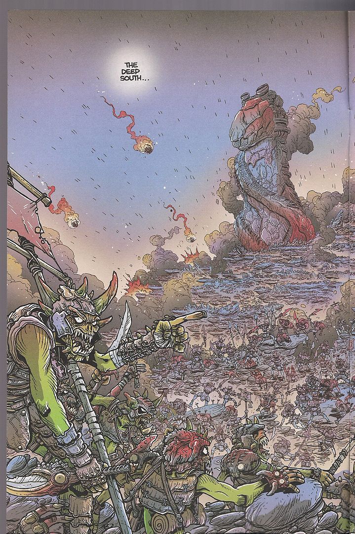
Tradition is highly pertinent to the case of creator James Stokoe, still in his mid-20s, I think, and probably best known right now for his two-volume Oni Press series Wonton Soup (2007, 2009), a high-spirited fusion of comedic sci-fi and cooking manga, presented in those 200-page b&w packages that will probably connect Oni to Bryan Lee O'Malley's Scott Pilgrim until the sun has consumed the Earth.
However, Stokoe is best compared with a former studiomate, Brandon Graham, whose own King City is also ongoing from Image and gets a place of honor as this comic's one and only advertisement. In-story, meanwhile, artist Moritat gets a shout-out; he's been the primary artist for Richard Starkings' Elephantmen series at Image, which as of late has served as something of a focusing point for some artists in this Image/Oni-centered group, particularly Marian Churchland, whose graphic novel Beast was also released by Image last year, to some acclaim.
And while these projects aren't all very similar -- King City is digression-prone urban sci-fi relationship drama paced like popular manga (and initially released in 2007 as an OEL manga from Tokyopop) while Beasts is as politely contained a literary comic as one can imagine -- they do reflect an embrace and intuitive parsing of international comics-as-comics styles, apparently disinterested in provincial aesthetic concerns or old-timey genre biases, instead basing creative decisions on the personal impact of diverse older works.
This isn't so different from other periods of comics activity, ranging from the '60s underground through the 'alternative' comics era, but now the solitude of the American, Franco-Belgian and Japanese scenes has faded, stretching the plane of influence to true IMAX proportions, to say nothing of non-comics influences like gaming or animation or graffiti art - indeed, what sets these artists apart from Ben Jones & Frank Santoro of Cold Heat or C.F. of Powr Mastrs is the comparable absence of 'fine' art in the mix, although Graham was also part of the same Meathaus group as artists like Dash Shaw, and anyway was publishing with manga-friendly North American outlets as early as the mid-'90s. I think the best times will arrive when ill-informed future historians concoct the Meathaus vs. Fort Thunder rival schools kung fu narrative.
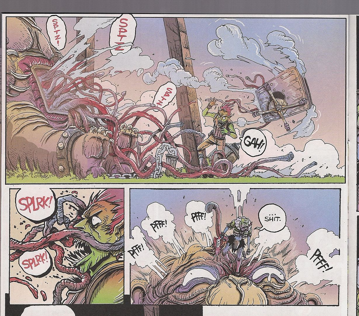
Orc Stain is cognizant of all of this, but especially drawn toward that earliest American period for comics like this: the underground era. The presence of Vaughn Bodē can be felt as much as the whimsi-mythical creature designs of Hayao Miyazaki (let's say), or the pulsing ultra-detail of Euro-fed seinen manga from decades back; it's maybe also helpful to think of Cobalt 60 as a touchstone, although I don't know if Stokoe ranks it himself, since its mid-'80s Epic Illustrated origins brush against many of these aspects.
The story is airy and fairly simple, as happens in a lot of these current comics: the powerful Orctzar is in search of a "god-organ" that will bring him domination over all the highly fractious and dick-obsessed orc planet, and prophecy provides that a one-eyed soul can hook him up. Fitting the bill is a young thief up north, a dissatisfied master at cracking organic locks, making money by robbing the graves of the great orcs of the past, the only personages allowed names, which are really only numbers.
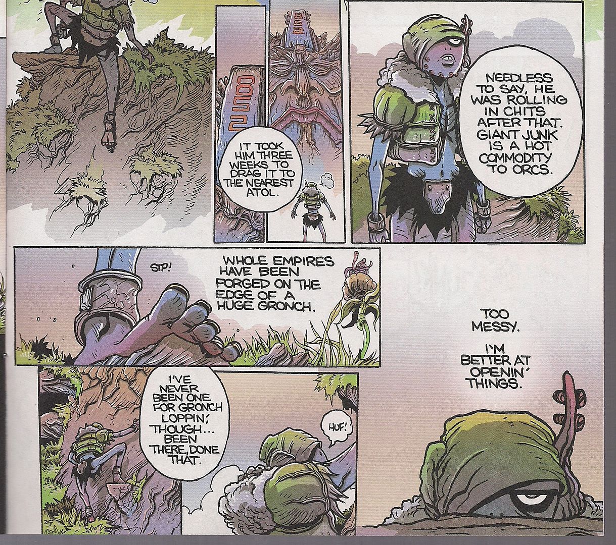
Summarizing the plot does this comic little good, though; much of it is spent on looming sights and explorations of how those sights function, like how to best crack open a monument to a fallen hero, or create a foreign language potion (by locating a creature that speaks the language, roasting it, bashing its skull open and pouring water through the hole and out its mouth, as you might have guessed). Such visually swollen work is really very fitting for Image, founded on art and artists chasing their desires - work like this both brings that impulse into the present while sitting it in a historical context, although these days all of history seems to exist at once, in the way that Stokoe's interest in near-parodic manly combat virtue by way of bodily function seems both linked to Johnny Ryan's Prison Pit and the old anatomic detail of Richard Corben.
I realize I'm going on a lot about history and interrelated artists here. That's because this is frankly a comic that leans heavily on experiential factors for its value; to study it best is to know how fun and lovely comics can still crackle with new energy, even while evoking old comics books, in a rather old format. It's not random that orcs have ruled their planet for countless years without accomplishing a lot, or that young orcs don't have names anymore, or that the best money is in working smartly on the legacy of the older and richer. All the orc world is open to artists and thieves now; knowing fulfillment is knowing where to hammer. ***
Army of Two #1: Ah, but what of the living legends? Peter Milligan could hardly expect to co-write one of my favorite comics of all time -- that'd be Rogan Gosh -- and expect me not to follow him down every odd road he finds. And man, these days I can hardly keep track of him - our own Douglas Wolk had to clue me in on the very existence of this project, the first output of EA Comics, a joint venture between IDW and Electronic Arts, aimed at dedicated proliferation of video game-licensed series. Have you heard about Orson Scott Card co-writing the Dragon Age comic? First comes Peter Milligan and Army of Two!
Unfortunately, the best I can say of this book is that I think it's supposed to be tongue-in-cheek, and I say that knowing that Milligan himself has described it as more or less a character piece, on which terms it unequivocally fails as a compelling introduction. But really: it's a sequel to the original game, which I haven't played (although I hear it's the kind of thing where your character plays air guitar on his weapon after a particularly awesome accomplishment, so I'm thinking it's not entirely serious itself), following a pair of highly bad dudes that sadly live in a time where you can't just rescue the President from ninja, you've got to bring down your corrupt private military company from within and form a new PMC with the two of you as apparently its sole agents.
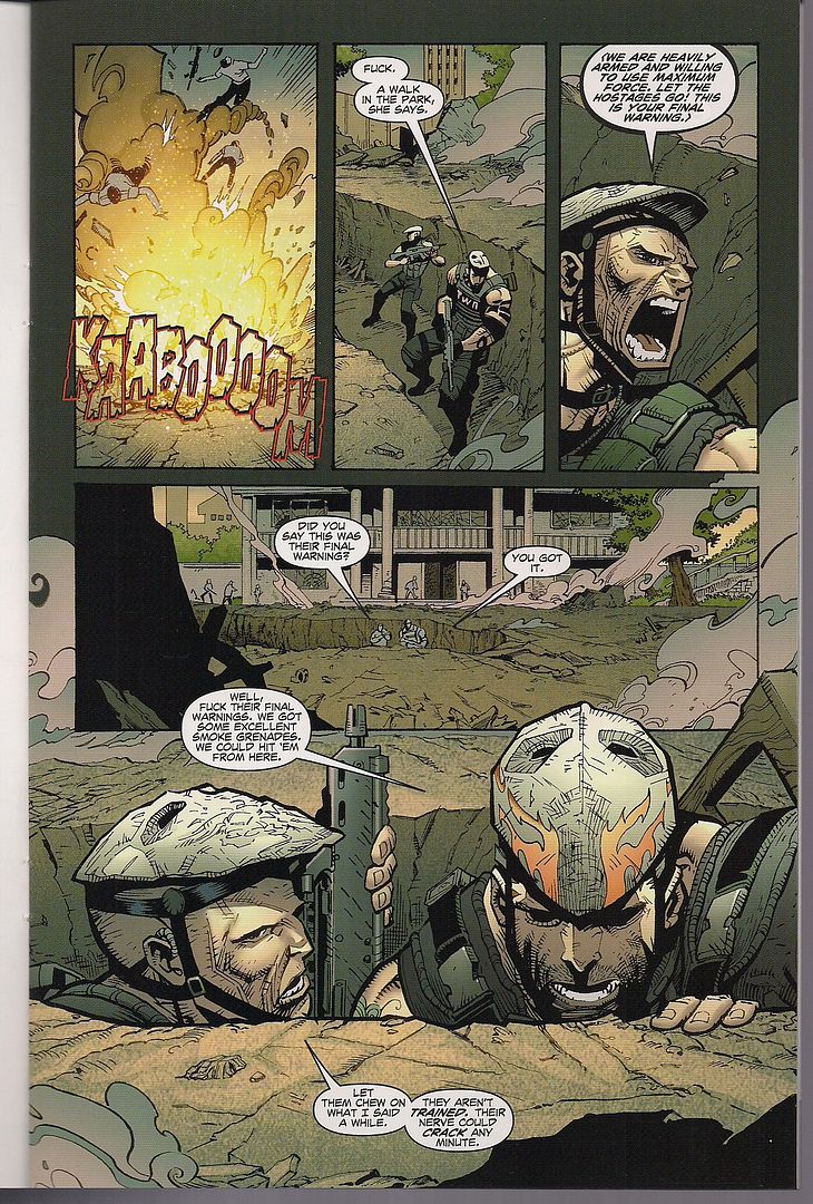
This issue begins a ripped-from-the-headlines story about drug gangs in Mexico, following a hapless young lad recruited into a world of violence while our hockey mask-wearing heroes charge into an inter-gang hostage situation, only to discover that the hostages have already been shot. Then they pause and wonder if they should have tried to negotiate, but it turns out that hostages were actually dead a long time ago, so it turns out only harder and nastier lethal action is the answer! There's also a Mexican army major that brings up the culpability of the U.S. drug market in funding such activities, but then the villains shoot him to death and the Army of Two shoot back, remarking "Who needs drugs when you got this kinda rush?" There's also a green recruit that provides pathos via getting shot to death, covering his entire projected character arc in the space of the first issue.
In other words, it's Peter Milligan writing, basically, a Mark Millar comic. He's hampered on two major points: (1) artists Dexter Soy (pencils) & José Marzan, Jr. (inks) work in a proficient, unemphatic style that'll probably pass a technical spot check but adds virtually nothing to the dialogue beyond the illustrative qualities of who's going where or who's talking, even sometimes garbling that as characters lose detail in longshot; and (2) Milligan's "visible writing" -- i.e. his dialogue and the basic scenario -- are subdued to the point where it depends on the art for visceral or funny or dramatic impact, be it a function of "invisible writing" -- script directions to the artist dictating mood, panel layouts, etc., which obviously aren't invisible on the page, they just can't be attributed to the writer without looking at the script itself -- or simple trust in the artists' burden.
The result is a comic that totters uneasily between winking at hoary conventions and simply adopting them in a dryly self-evident manner; as guitar rock simple as its premise might seem, it's actually a bit more overtly demanding on the story-art blend than a more literary, writerly thing. Case study, this. AWFUL place to be.
***
Neonomicon Hornbook: But what happens when we do have the script in front of us? This is a $1.99 preview of Avatar's new Alan Moore/Jacen Burrows project due out later this year; note that it's Moore's first totally original script for the publisher, as opposed to an adaptation of a story or poem, or a project reprinted or continued from another source. The solicitation promised design sketches and an interview with Burrows, but the final product is simply nine pages of completed art from issue #1 paired with Moore's original script for four of those pages, with an unidentified splash page I presume is a cover preview. That's fine by me; I like reading Moore's scripts, and I'm thinking Avatar is very interested in showing off the all-new, all-Moore state of the writing.
The Magus himself has proven less forthcoming about the project, at one point remarking "I don’t know about my story, it might be a bit black, I don’t know, you know." He then went on to heap praise on Burrows, who also drew Avatar's 2003 The Courtyard, a Moore prose adaptation (formatted for comics by Antony Johnston) that serves as the inspiration for the current project. And while not all of the publisher's Moore adaptations have been successful as comics, the Courtyard benefited from a very simple, prose-specific concept: disguised as a police mystery, the story is really an avalanche of H.P. Lovecraft references, culminating in the big idea of Cthulhoid language as a drug, which serves as a metaphor for the addictive, lingering influence of Lovecraft himself, as embodied by the story entire.
Bringing this to comics actually opens it up nicely, in that language (magic) is of such paramount importance to Moore that placing it all in a visualized locale gives the basic plot a grounded feel absent from the source material. Burrows was a good choice for that; as currently on display in Crossed, his specialty is taking smooth, animation-ready characters and contorting them into horrible states in open, chilly spaces.
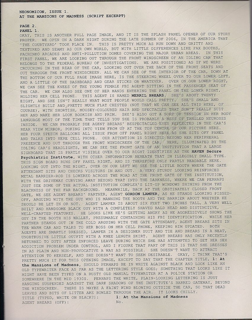
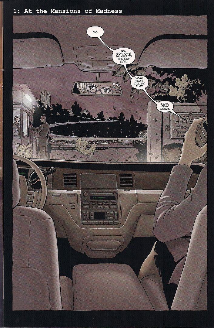
But how do you read a comic like this - a comic and script? I mean, if you don't like script excerpts you save your two bucks, but since I do I find myself reading them in tandem, interested in correlation. I know the comic is supposed to be the only real part of the story, but 16-page books like this compel me to accept all the information as dual parts of the content (particularly when two bucks are on the line). I realize this doesn't always do the artists many favors, since working full script often requires picking and choosing representations from "the shimmer of murky possibilities" accordant to some prose, in the words of biblical translator Robert Alter, evaluating Robert Crumb's The Book of Genesis Illustrated.
Moore doesn't much benefit from scriptural ambiguity of concision; a 47-line block of text, excerpted above, is followed by "OKAY, I THINK THAT'S PRETTY MUCH IT FOR THIS OPENING IMAGE," after which there are eight more lines before the dialogue begins. Yet Moore's script is remarkably demanding, and slick to boot - he isn't just telling an artist what to draw, he's building parts of a rather self-sufficient story in all that text. Describing the contrast between one character safe in a cozy car and another acting agitated outside in the cold, Moore presents what I suspect is a synecdoche of their dynamic as an opening flourish.
That's lovely, but it's demanding too, benefiting from the evocation of language so that only superior visual nuance could fix it in full as image. This isn't Burrows' strength; his figures aren't so much expressive as liable to be dramatically twisted, while environmental effects (or the disparity between environments) don't tend to register on his cool, clean planes. Yet reading Moore's script doesn't reflect all that badly on him, partially because I think even the most uncharitable reader knows it's rhetorical dirty pool to count the absence-on-page of each and every one of Moore's voluminous stage directions against him, but also because Moore's writing is often so close to 'proper' prose it sometimes begs for its own comics script adaptation; it's like when I read Voice of the Fire and I decided it was better than most of Moore's comics, and then I frowned a little.
Oh, what? How's the comic? Well, I'm afraid it mostly resembles The League of Extraordinary Gentlemen: Black Dossier from this segment, specifically the early bit with Allan & Mina washing up while rolling out an awful lot of stilted exposition; it was like Moore couldn't wait to get the characterization out of the way so he could launch into Ideas, which is the appeal for some readers, granted, but I'm starting to think the all-lecture final issue of Promethea is going to end up as the representative success of the writer's late period, a 'success' based in part on dispensing with characters and plot altogether.
And I loved that issue of Promethea, but Neonomicon does appear to have a plot and characters, and unlike the self-contained Black Dossier we're being asked to only read the setup for now, wherein characters uneasily banter about debilitating personal problems and at one point devote a panel's worth of conversation to summarizing what happened on the prior page. Then there's a final panel reveal that doesn't offer a lot of clarity on its own, but at least restates the Courtyard's worldview-in-a-package outlook in a manner not entirely at the mercy of language. Ironically. OKAY for the sum of it, but if all you want is the comic, it's probably best to wait.
***
Starstruck #5 (of 13): Here's a different take on comics and prose as an ongoing comic book, with the added benefit-burden of being a genuine series rather than a preview item, albeit a series that's up to its fourth incarnation of some of this material. Good news, though: five issues in, and it's becoming clear that IDW's Starstruck is a nearly Chris Ware-caliber feat of creative reconstitution, poking and prodding and expanding and clipping writer Elaine Lee's & artist Michael Wm. Kaluta's stuff into something that seems born for funnybook serialization.
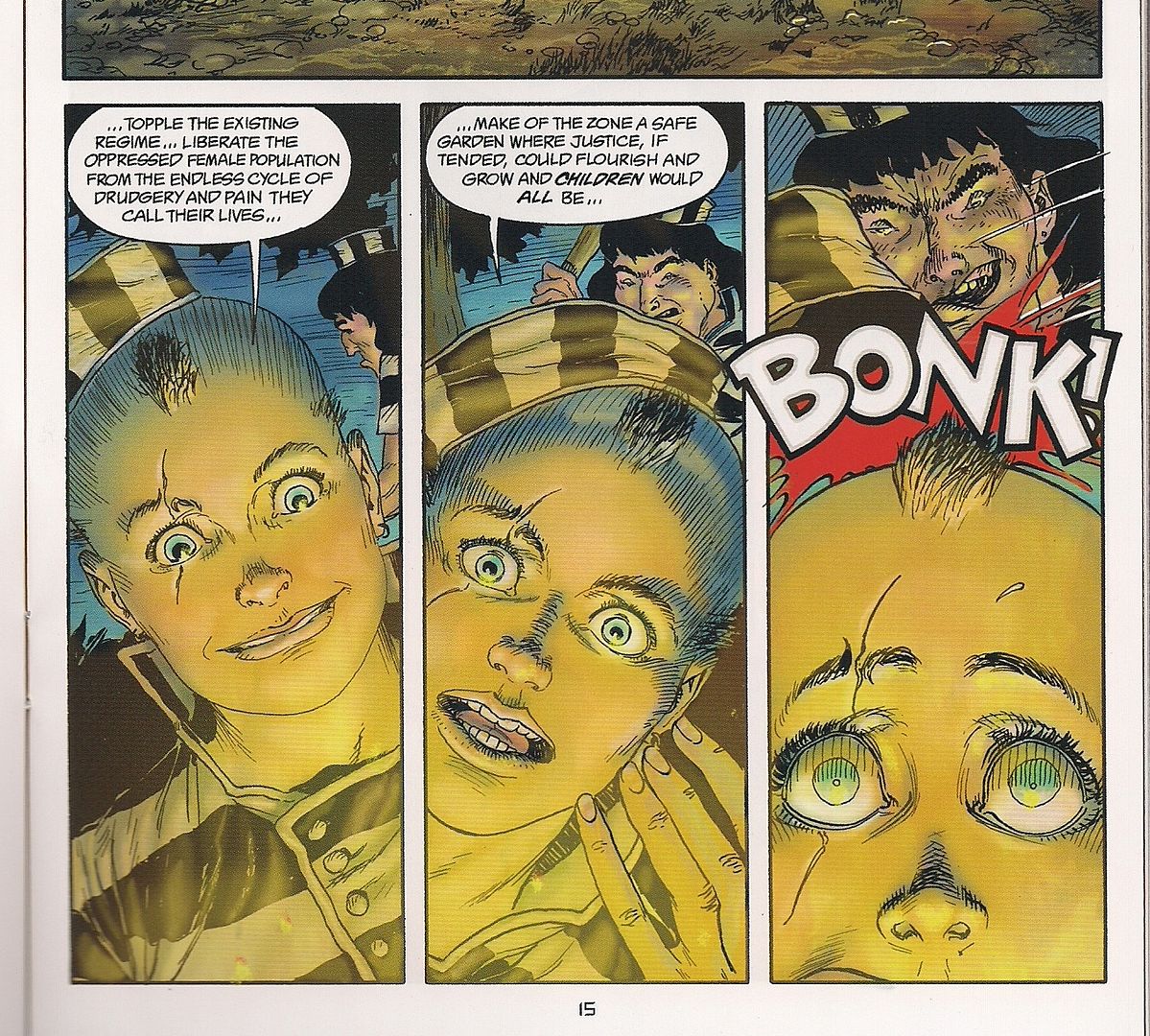
Not that it's transformed into a lightning-quick read, oh lord no - like the aforementioned alternative genre comics of today, Starstruck isn't so much concerned with brisk plotting as enjoying the sensation of being in its detailed world. Unlike those comics, Lee accomplishes this through wildly info-dense, time-skipping story bursts that don't betray any immediately obvious story goal; as the old Epic house ads used to say, "It's not just a comic book. It's an entire universe."
IDW's series exploits this universal state of being by envisioning each issue as not so much a story in the way we expect to see 20-22 pages of comics inside a 32-page book but as a collection of materials: some of it comics, some of it text, and much of it narrated by totally different characters, addressing different points on the series' timeline. Most of the text is placed in between comics segments too, forcing the question of its inclusion as part of the story. You don't have to read it, but it always compliments the dizzy style of the comics segments, which devout fans know will not reach a climax upon issue #13 - the characters will have barely been introduced by that point, again highlighting the grab bag nature of the whole.
It'll read differently as a collected book, sure, but that's the collection's concern. This is comics.
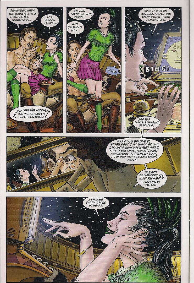
Anyhow, this issue's main comics bit sees hapless Molly Medea -- the future space legend Galatia 9, if you've been reading the text segments, or any of the series' prior incarnations -- advanced to age 21 and her art terrorist phase, despite not being much of an artist or a terrorist. Her struggle with wicked half-sister Verloona Ti lands her in a perfectly absurd prison break situation with a muscular cellmate, foreshadowing future adventures with fellow quasi-protagonist Brucilla the Muscle, who's still a little girl in the issue's backup comics section.
Shot through it all is Lee's fascination with interactions between women in an allusive, often parodic sci-fi universe. Verloona may not deal in, say, genetically engineered sex slaves that die after their virgin use, but she does run a chain of beauty outlets exploiting women's fascination with men's fascination with those things, thus furthering the series' complex interest in notions of sexiness, which can be misinterpreted as sexism or exploitation, because it refuses any simple pro-cleavage/anti-cleavage categorization. Too expansive a universe for that. VERY GOOD.
***
PunisherMax #3: But in the interests of ending this on a more traditional high note, since I am a traditional man, here's a GOOD current ongoing series from Marvel, where Jason Aaron's and Steve Dillon's story and art function in lovely concert, and that's the whole show.
A different Marvel-published writer, Kieron Gillen, also of the Image series Phonogram -- and perhaps more pertinently, the fine gaming news and criticism site Rock, Paper, Shotgun -- recently suggested that writers-on-comics refrain from bifurcating attribution of "innovation" to any specific member of the creative team, in that the writer usually dictates some aspect of the visual presentation (my "invisible writing," as seen above), while the artist inevitably affects the writing with any given choice in page layout, panel-to-panel storytelling, etc. The point is, the terms 'writer' and 'artist' are somewhat vaporous in the realpolitik of comic book creation; Gillen's suggested alternative is to treat the creative team as a "faux-cartoonist," i.e. an even more illusory single person, so as to more effectively address the totality of a work.
I'll go even further than that: we also labor under an illusion in merely accepting the names in the credit boxes, particularly in collaborative Marvel/DC comics, because an editor certainly could have directed some of an issue to put it in line with the wider continuity, or the writer might have fallen ill and asked a friend to put together some stuff, or the artist might be utilizing an uncredited background artist to get the work together in time, or maybe just one panel was inked by a more established artist as a gift or a favor and that panel happened to turn out especially well. But we typically don't address these possibilities because we need a calm, steady space in which to position our analysis, even if it's less 'real.' Mind you, Gillen obviously isn't suggesting that his offered paradigm is somehow more 'real' -- I mean, faux is right in the fucking name -- but rather a more agile mirage, capable of phasing out rhetorically troubling zones.
So I'm fine with that, though I don't think it's a cure-all; there's a lot of forms of writing-on-comics, and some of it rightly ought to hone in on a single member of a creative team. To use one of Gillen's examples, it is no doubt useful to look at a Grant Morrison/Frank Quitely comic as a work by a faux-single entity, yet there's little use in denying that Morrison tends to draw some power from referencing and questioning and building upon his own, real-single body of work, which of course stretches across multiple separate collaborations; indeed, All Star Superman functions as much as a continuation of Morrison's DC meganarrative as a discreet look at the Man of Steel, urging some isolation of themes and plot qualities. Moreover, if you're looking at Detective Comics right now, I obviously consider some study of J.H. Williams' work across his own career instructive on how the book does and does not succeed, although surely you can't credit every bit of the visuals to him (or Dave Stewart).
The question you have to ask is: what kind of criticism do I want? What do I want to talk about? How can I accomplish that without making things up, unless it's a really good joke?
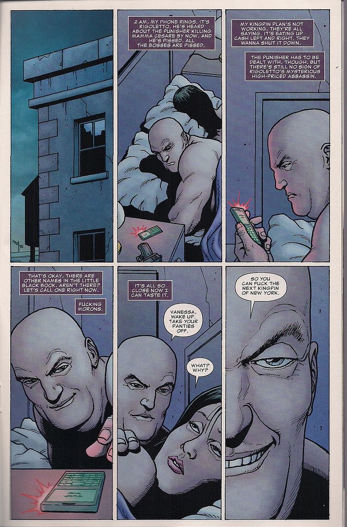
This is all a long way of saying that Jason Aaron (lettered by Cory Petit) and Steve Dillon (colored by Matt Hollingsworth) can very easily be taken as one person, so unified is their drive. Mind you, this is a mid-story bit in a series somewhat famous for flowing more as a segmented book than as chapters, so it doesn't have the same kick as some of the comics covered above, but it is progressing nicely.
The primary theme at work is family, covering the ruined crime families Wilson Fisk is playing off for the sake of his own family, driven by the broken family of his older days, much in the way Frank Castle himself shoots away the ghosts - a nice bit of mirroring panels in issue #2 summed this up, concluding with Fisk stepping into the arms of his son and the Punisher hovering in a doorway in shadows. This issue introduces a super-assassin character from a plot-convenient extreme Mennonite sect that also struggles to preserve his home, a delicate thing indeed in this series.
Garth Ennis' set of themes were similarly bleak, and this new run continues to beg comparison by revisiting the scene of a famous prior set piece. But this new entity-featuring-Steve-Dillon is gradually demonstrating how different it is in the same setting, replacing the Dillon-drawn comedy of early Ennis issues with a more wicked lightness of being, as an arm's length Punisher wipes out every obstacle in the MAX Universe proto-Kingpin's way, and the delight isn't just the reader's but his. As established by Ennis, Aaron continues: the Punisher is gross, so the most fun to be had with his efforts is by the most wicked character around. There's your returning artist's pictures slightly shifted by a new writer's words, like he's a new man, fake or not.
