

My Life is Choked with Comics #19a: Manga
/![]() (Being part 1 of 2 in a series; part 2 is here)
(Being part 1 of 2 in a series; part 2 is here)
***
What is manga?
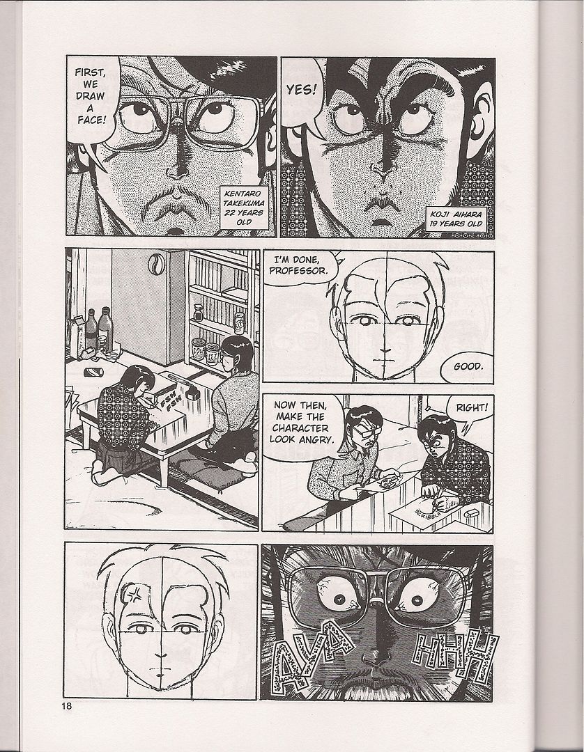 (from Even a Monkey Can Draw Manga; art by Koji Aihara & Kentaro Takekuma)
Japanese comics, right? Maybe a collection of recognizable icons - big eyes, speed lines, etc. Flowers in the background, cartoony art. Except when it's not.
How about format? It's dozens of little books on the shelves of Borders. Naruto. Nana. Death Note. Pluto. A Drifting Life. A different world, an alternate reality - a foreign industry where comics are more popular and more prolific, escapism of an extra-narrative type. More comics for women, more comics for kids, more comics, beholden to their own traditions and biases, maybe intimidating, maybe interesting. Maybe a precognition, if you're feeling irrational: a new funnybook behavior, an example for America or insert-your-nation-here to follow. Or at least a steady-promised stream of comics of a type becoming cozy. Manga has fit right in for a while now, looking broadly at books.
But that's the present and the future. What about the past? What about manga the way it used to be taken in North America, the answer to the very same question if asked a quarter of a century ago. What is manga?
Well, there's one easy response:
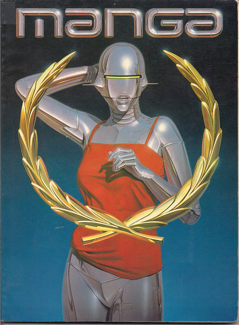
Yeah, that's it! Says so right up top! Manga, objectively, is a robot woman vamping in the sunrise while casually failing to grit her teeth. A red cocktail dress is hiked up over her hips so as to model the stainless steel panties that are apparently welded to her loins. An arrow has been discreetly cast onto her left leg, so as to assist the confused or inexperienced viewer. Her upper body is an official selection of the Venice Film Festival, and her thin visor evokes an even hotter iteration of Robocop. She was there first, though. She's why law enforcement needed a future. Vice law, for a sexy future. There's an arrow.
As is sometimes his way, the artist -- famed illustrator Hajime Sorayama -- appears to be joking around. A pin-up model's body is matched with a distinctly inhuman face, almost bemused with how the viewer must be eyeing her. This isn't his flesh-and-steel Gynoid work, it's all gloss and chill; pin-ups can be son unrealistic, and this one makes it obvious. There's no lock on that chastity belt - that's why she's showing it off, as a joke. The punchline is: "you cannot access the robo-booty, hu-man."
Er, manga!
This is on the back cover. Manga, you see, is a book: a perfect bound, magazine-sized softcover. Its one-word title is the first part of its explanation for itself, and the above image is literally all the rest; no cover price is provided. It's 88 pages, in b&w and color. Ten artists are showcased, with absolutely no further explanation provided. Just their names. There isn't even a date of publication; in the Jason Thompson-edited Manga: The Complete Guide, veteran editor Carl Gustav Horn narrows the possibilities to anywhere from late 1980 to 1982, though I've seen sources online placing it as late as '84. Horn also provides the ISBN for easier searching -- 4-946427-01-5 -- and cites one of his sources as Mike Friedrich, editor & publisher of the famed "ground level" comics anthology Star*Reach, one of the noteworthy bridge works between the old underground funnies and the 'mainstream' of the mid-to-late-'70s.
Friedrich also served as Manga's consulting editor, even though it was a Japanese-published book, from "Metro Scope Co., Ltd." of Tokyo. There was a Japanese editor, of whom more will be said later. It was still intended for American readers (despite a Japanese release that charmingly played peek-a-boo with the cover art), however, and I suspect Friedrich's participation might have been due to his yet earlier role in bringing Japanese comics to North American readers, which I'll get into later. Comics writers such as Larry Hama and Steven Grant were brought on board as "adapters" to work the scripts into fit English. Connections in the rapidly-growing Direct Market were presumably sought, although I don't have the slightest idea who carried the damned thing. "Damned" is a most appropriate word.
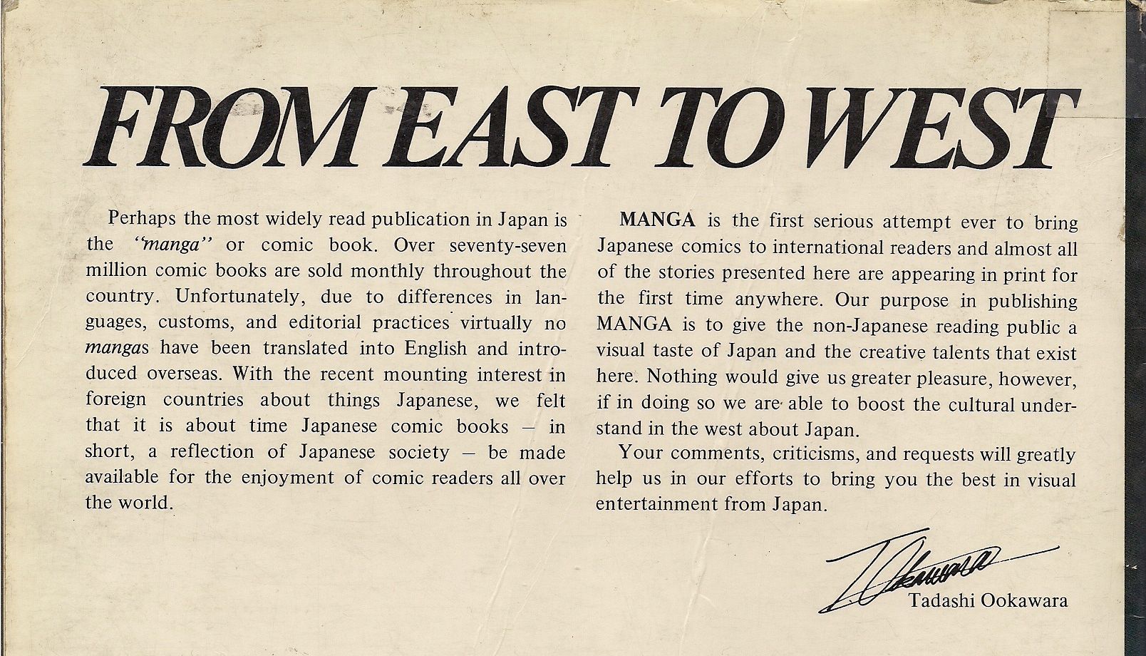
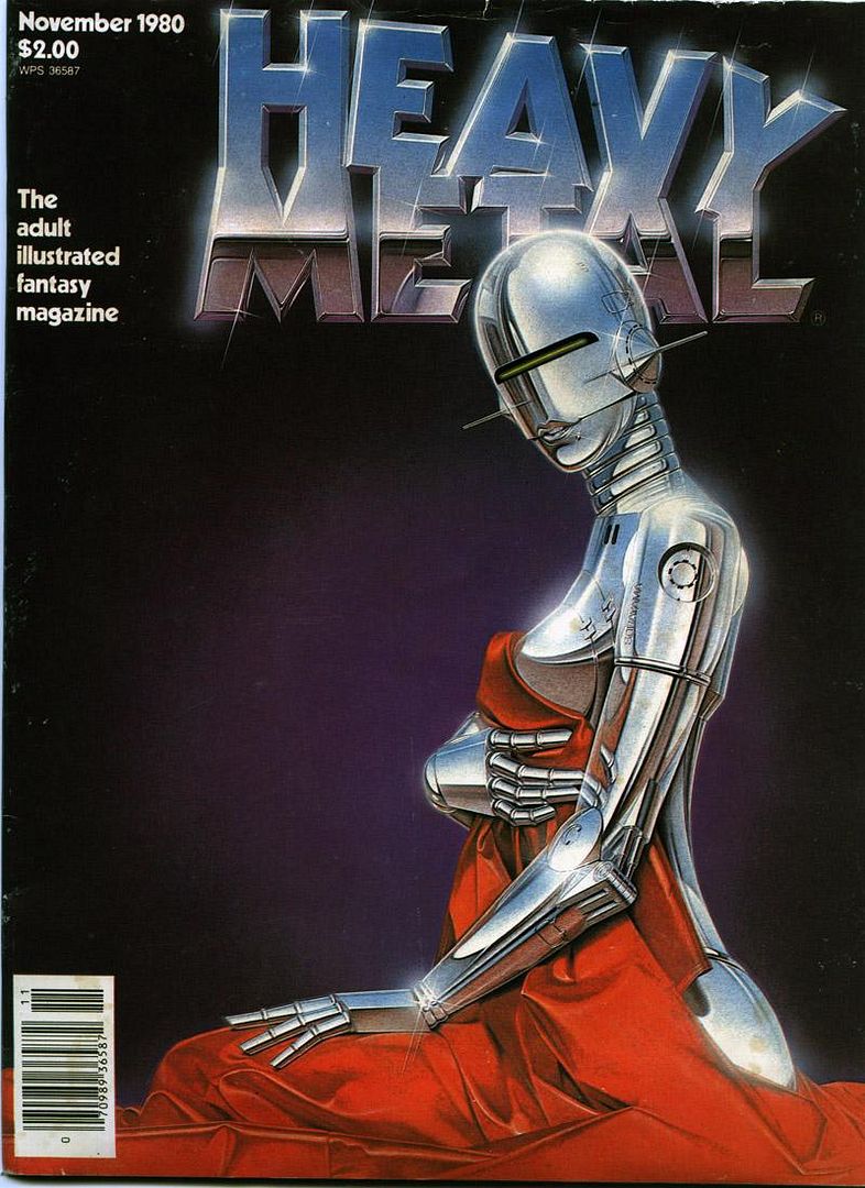
And, crucially, though it has nothing to do with the book directly, though it seems to fly in the very face of that back cover statement of Executive Managing Director Tadashi Ookawara (of whom I can locate no record whatsoever of subsequent involvement in manga in North America) that this hand-selected "reflection of Japanese society" was purposed "to give the non-Japanese reading public a visual taste of Japan and the creative talents that exist here" and maybe even "boost the cultural understand [sic] in the west about Japan" - in spite of all that, cover artist Sorayama provided a rather famous image for that very important 'bridge' comic, Heavy Metal, in late 1980.
The timing couldn't have been more perfect. The implications will soon become clear. Manga isn't what it used to be, but that old, obscure place, that 1980-84 says a lot about Japan and America, and Japan's view of America, and which particular aspects of Japan should best be reflected in America's direction through these crazy mirror things called comics.
So let me modify our first question. ***
What Was Manga?
***
I. THEY SAY HE GOT JEDI FROM JIDAIGEKI
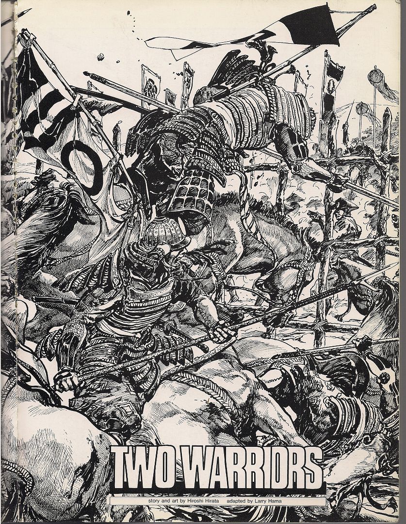
The very first story in Manga-the-anthology is by probably the most experienced and acclaimed of the artists roped in with the project: Hiroshi Hirata.
Sure: there's worse ways to start an anthology. I think this is how Kramers Ergot 1 kicked off. Ben Jones, how you've changed.
And it makes perfect sense to get those swords swingin' and helmets clashing as fast as bloody (and bloodily) possible in a book of this type, because Japanese period pieces have proven so frequently successful in the West, and also as unusually fertile ground for cultural influence. The Magnificent Seven from Seven Samurai; bits of Star Wars from The Hidden Fortress. From Le Samouraï to Ghost Dog: The Way of the Samurai. Comics would be no different; around the arrival of Manga, one of the most popular artists in the field was already flaunting his Japanese influence in an extremely prominent manner.
 (from Ronin; drawings by Frank Miller, color by Lynn Varley)
In 1983, Frank Miller began serialization of his miniseries Ronin at DC; the influence of the aforementioned films of Akira Kurosawa and the samurai comics art of Goseki Kojima was noted, though Kojima's and writer Kazuo Koike's seminal Lone Wolf and Cub wouldn't see release in North America until 1987, in pamphlet form despite its 28-volume length. Miller provided cover art, an introduction and miscellaneous seals of approval as if to cement the work's value for the skeptics. That was a big year, '87 - the same month that served up First Comics' release of the Koike/Kojima manga saw the publishing debut of the mighty VIZ, then in association with Eclipse Comics, armed with their own damn swordfight manga, The Legend of Kamui, from genre godhead Sanpei Shirato.
It's easier now to appreciate the place of these artists in the greater history of manga. Both Kojima and Shirato were noteworthy practitioners of gekiga, the "dramatic pictures" cooked up by artists who wanted the postwar "whimsical pictures" of Osamu Tezuka to grow up with them. Shirato in particular proved to be a major figure, his popular Marxism-informed ninja sagas providing a valuable popular hook (and even the title) for the famous 'alternative' manga anthology Garo. Kojima likewise became known for intense period work, the 'jidaigeki' of cinema, novels and theater perhaps becoming jidaigekiga, which might not be a real word, I admit. But back then, artists made it up as they went along, like Lone Wolf writer Koike, who advocated creating complex characters as paramount to comics writing, enough so that stories could often just happen.
 (from Samurai Executioner; art by Goseki Kojima)
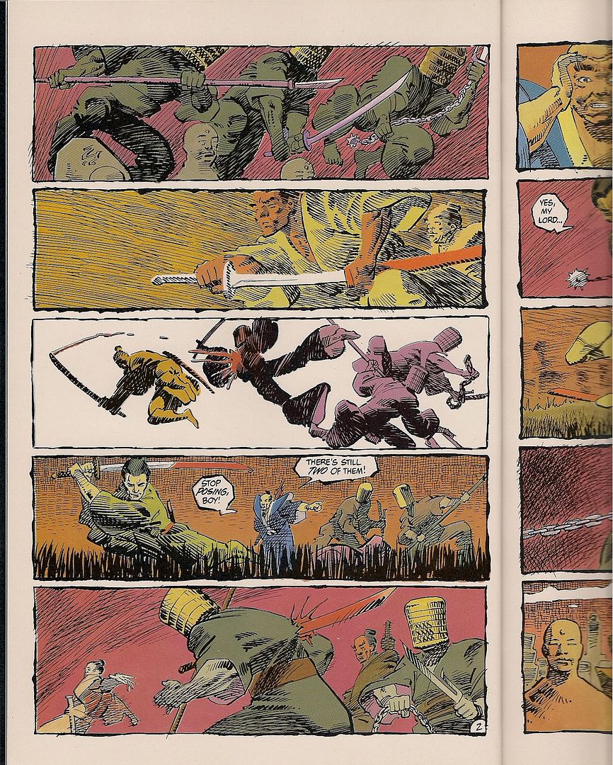
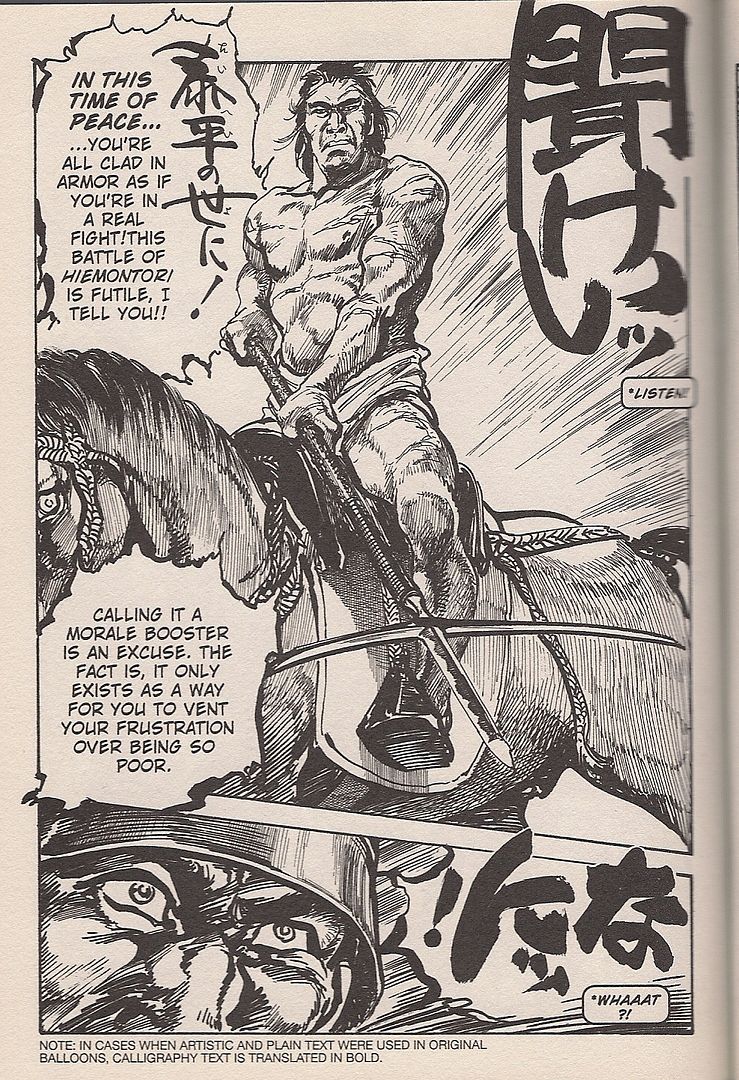
It's ironic, then, that Hirata arrived in North America first. On first glance his work might seem more appealing than Kojima's, with muscular, detailed figures ripping across mighty panels hosed with testosterone and whisked with manly tears. Even the MAD Magazine-style "we're not a comic oh no sir, those are for babies" robot typeset lettering can't detract much from the rippling power of Hirata's compositions, professionally engineered to drive a reader wild with appreciation for these impossible deeds of awesome he-man samurai gods.
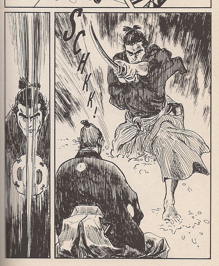
That Ralph Steadman-ish lettering above is there to approximate a specific flourish of Hirata's: rendering the most crucial of his characters' titanic exclamations and/or blood oaths in rich, classical calligraphy. When Dark Horse set about translating Hirata's Satsuma Gishiden (1977-82) in 2006, it opted for the unique option of subtitling those whopping images, so vital to Hirata's style. So firm in the historical period. Same thing.
 (from Satsuma Gishiden; art by Hiroshi Hirata)
Yet that five-book series remains the only other 'pure' Hirata work released in English -- he also provided the art for a 1987 (that year again!) East-West project Samurai, Son of Death (Eclipse Graphic Novel No. 14), written by Sharman DiVono and lettered by Stan Sakai -- and it sold poorly enough that Dark Horse pulled the plug after vol. 3.
(from Satsuma Gishiden; art by Hiroshi Hirata)
Yet that five-book series remains the only other 'pure' Hirata work released in English -- he also provided the art for a 1987 (that year again!) East-West project Samurai, Son of Death (Eclipse Graphic Novel No. 14), written by Sharman DiVono and lettered by Stan Sakai -- and it sold poorly enough that Dark Horse pulled the plug after vol. 3.
Part of that failure, I expect, is due to Hirata's writing. Very little of Shirato's work has been made available in English-speaking environs environs either -- VIZ has two out-of-print volumes of The Legend of Kamui floating around, although the old Eclipse pamphlets go a bit further along than those collections -- but what's available belies an instinct for tucking the political/philosophical content into a sugar cube of rip-snortin' ninja action. And Kojima, for his many North American-released work, always had Koike, who's never encountered a crackpot digression or sensational plot twist or perverse character wrinkle he wouldn't embrace.
Hirata, in comparison, and admittedly going by what's available, is a truly ponderous writer, offsetting the over-the-top fury of his combat scenes with long historical explanations and almost compulsively detailed depictions of political intrigue. Following their introductions his characters rarely waver from their place on his most-to-least scale of masculine honor, positions set by electric words and blood drawn for ritual or warfare, the lifeforce of Old Times.
His contribution to Manga is self-contained and quintessential (as far as that goes, given how little of his work is available), focusing on two friends ordered to duel to the death at the pleasure of a warlord; the act will both reveal the greater fighter and seal his devotion to unquestioning obedience. Yet one of the men hesitates, and the other slices off his arm, after which the warlord allows both of them to serve as his personal guard.
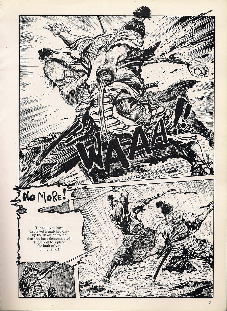
But alas, years later an arrow plunges into the warlord's eye. In shame, the one-armed man jabs his own eye out, yet the warlord is unmoved, ordering the man's still-whole friend to kill him. It is only then that the unmolested man reveals that, in sorrow for never hesitating in that terrible duel, he urged the warlord to allow his maimed compatriot to serve. Incensed, the proud one-armed, one-eyed fighter declares that friendship is alien to the warrior's creed, and that they must duel again, beyond hesitation or pity! In a sickly whirlwind of skin and steel, the samurai collide in a for-the-books bonanza of dismemberment that oh, dear readers, leaves them literally torn to pieces, each man killed by the other's hand!!
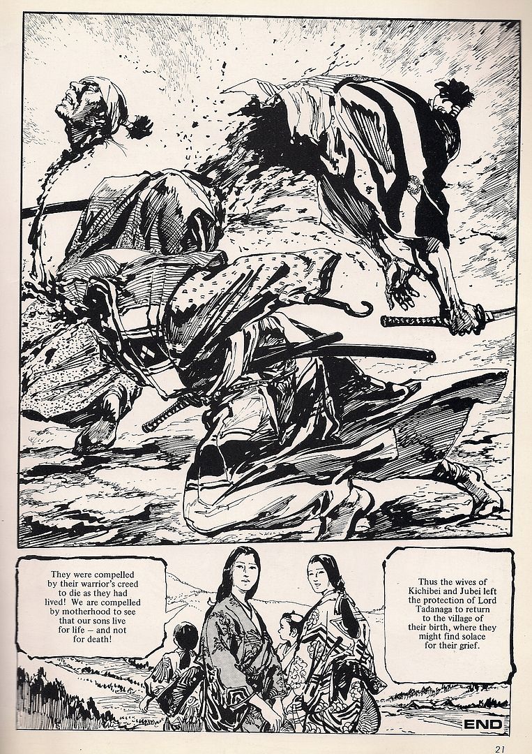
And if you're thinking, "hmm, those wives don't look all that upset over the carnage up in panel #1, notwithstanding the caption to their immediate right," know that such things are really the point of Hirata's manga. The violence of those times was terrible, and modern society has its perks, yes, but boy - all that bleeding man honor was goddamned amazing, you've gotta give it up. The fans, revered author and code of honor devotee Yukio Mishima among them - they knew. And it traveled. Except when it didn't.
II. ARCHIE GOODWIN IS A SUGAR MERCHANT OF LICORICE LIES
It likely wasn't just Hirata's intent immersion in Sengoku overload that did in his American prospects, however, ironic as it might be to witness a body of art spoiled in its crossover potential as a historical work for being too steeped in history. No, there's also the simpler fact that 'manga' in 2006 was very different from the exotic and pliable concept of the early '80s. Kojima & Koike continued to sell, having been established for years, but the wildcard macho art of Hirata didn't look a damn thing like One Piece or Fruits Basket, and it didn't have a scrap of the art comics cache necessary to survive outside the 21st century manga bubble. For the older, harsher works, the Satsuma Gishidens drawn in the late '70s, there is little hope.
Ah, but with Manga, anything was possible! A "reflection of Japanese society," remember! Why, I don't see any language promising coverage for all of society, do you? It could be anything anyone wanted, a whole visual culture shifted just a step or two to one side, for the purposes of landing the work on foreign soil. Samurai would work then; everyone knows about them, and Hirata has a good, strong visual style. Appealing. Realist, and thereby less likely to seem weird or confusing to the untapped readership.
There were a few alternative perspectives around, mind you. The Winter 1980 issue of Epic Illustrated -- issue #4, the last quarterly edition -- featured an illustrated profile of the great Shotaro Ishinomori, written by Gene Pelc and the magazine's editorial director, Archie Goodwin. Ishimori was a great figure in boys' manga history, creating the famed Cyborg 009 series in 1963 and designing the beloved tokusatsu television hero Kamen Rider in 1971. His art beamed with all the popular style of the time.
 (from Epic Illustrated #4; art by Shotaro Ishinomori)
Which is to say, you can draw a rather short, straight line from Ishinomori to Osamu Tezuka; the former even assisted on the latter's Astro Boy. Such work is closer to the source of postwar manga, the status quo that gekiga developed to answer.
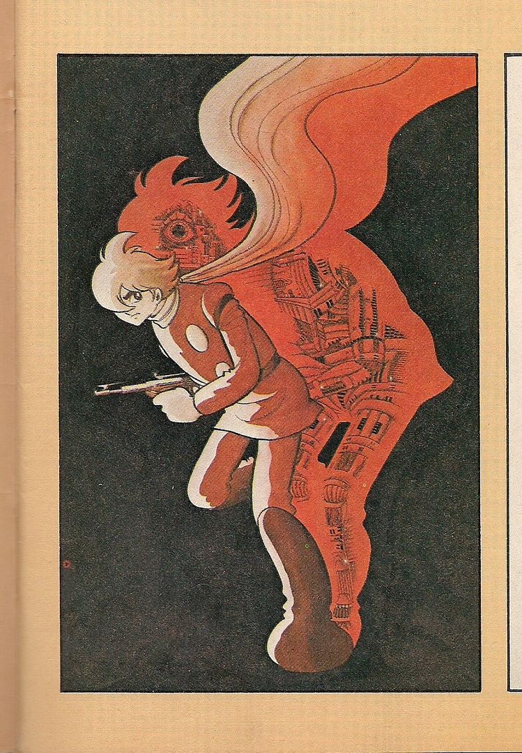
And it wasn't just fun frolics for boys that were drawn in the manner - Keiji Nakazawa's semi-autobiographical Barefoot Gen, a saga of a young survivor of the Hiroshima bombing, can be startling in how firmly it's planted in the male youth tradition of shōnen manga, loud and bright and cartooned. A few volumes were nonetheless published in the early '80s, clearly in regard for its weighty subject matter, and an excerpt appeared in Frederik L. Schodt's landmark 1983 study Manga! Manga! The World of Japanese Comics.
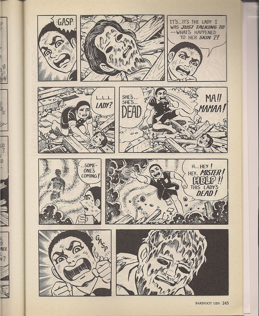 (from Barefoot Gen, as excerpted in Manga! Manga! The Art of Japanese comics; art by Keiji Nakazawa)
Schodt made note of Manga-the-anthology in his book as "carefully edited," which might carry a double meaning depending on how you take 'editing.' In his 1996 follow-up, Dreamland Japan: Writings on Modern Manga, he makes reference to the early '80s manga-in-English mini-proliferation of, among short stories, English-learning aids and anime tie-ins, "vanity press" books "by Japanese artists hungry for international attention." One is reminded of Lead Publishing's ill-fated 1986-87 attempt to break Takao Saito's Golgo 13 into the North American market by sheer force of will and glossy production values, but Schodt might as well be referring to Manga.
But for a vanity tome, they did have some keen presentational ideas. Remember that Heavy Metal cover above? Same guy that did the cover for Manga? The years just about match up so that the connection might not be a coincidence. Indeed, Carl Horn mentions in the Thompson book that Manga gives off an impression not unlike that of Heavy Metal; I agree, and would actually go farther to speculate that the book -- while not a magazine, just sized like one -- might have been planned as the first of a series of Japanese answers to Heavy Metal's solidly French line-up. Or at least they saw success in action and opted to look like it.
Hell, they even threw in an illustrator's profile section, spotlighting one Noriyoshi Olai, a painter of book and magazine covers who'd just completed some poster artwork for The Empire Strikes Back. In the proper Heavy Metal tradition, special emphasis is lavished on his brooding images of horror/sci-fi stuff or lavish depictions of women wearing little-to-nothing above their waists. It's universal: French, Japanese, American - we all like stuff like this:
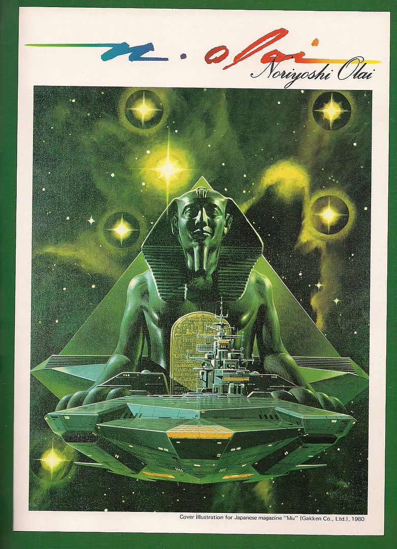
Oh don't deny it.
It'd be a mistake, incidentally, to pretend that no French-Japanese exchange had happened around the time of Manga. The artist Moebius hadn't just taken off in North America; his inspirational reach in Japan would eventually inspire the visual approach of Hayao Miyazaki's fantasy manga Nausicaä of the Valley of the Wind when it started up in 1982. That's probably a bit late for Manga, but the scent was in the air earlier.
A French influence can be picked up in this, a no-panels three-page story by Yousuki Tamori, who had recently (in 1979) begun work on his most popular creation, the fantastical PoPoLoCrois, later to be adapted to various anime series and role-playing video games (the first of which to see release in North America was the 2005 edition for the PSP). The very title of that work reflects Tamori's international flair, with "popolo" being Italian for "people" and "crois" being French for "crossing." People crossing, cross-culturally. Very neat, but I know of no other manga by the artist to see translation for English reading.
Likewise, it'd also be wrong to invoke Tezuka without acknowledging the obvious impact of vintage American animation on his own artistic development, the Disney features and Fleischer Brothers. And for the occasional shit Miyazaki has slung at Tezuka for damning Japanese anime to the limited animation cellar of sweatshop television schedules, a peek at Tezuka's short animation work -- recently collected on R1 dvd by Kino -- reveals several works that don't look a damn thing like anime at all.
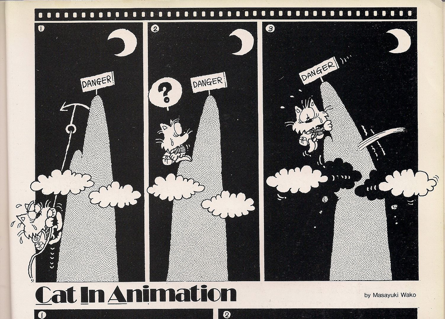
There's a small batch of animation-informed strips in Manga, wordless pieces by Masayuki Wako, about whom I know nothing, under the banner title of Cat in Animation. They're cute little jokes about the comics form, icons taken literally and stuff; sometimes they're not all that clear in delivery. But they do sort of touch on this formative Western influence that seeded 'modern' manga, reliant on Tezuka's application of cinematographic principles to the comics page, not to mention his adoption of the Disney big eyes. Wako, for his effort, was not to my knowledge seen in American comics again.
Picking up a pattern? Several? It's true that many of the artists showcased in Manga would not become well-known later on. In fact, all of them -- even one particular former white-hot superstar whom I'll be addressing soon enough -- are either unknown or diminished in today's North American manga-in-English scene. That could well be related to another pattern: Manga-the-anthology's cherry-picking of certain artists influenced by certain phenomena (or just working in a salable genre) that made them seem Western.
"Although solidly adapted into English, what strikes the contemporary reader is how little the pieces of Manga resemble popular notions of manga itself," remarks Horn, but it's not just that - it's how much the pieces of Manga seem tuned to look like comics a newsstand Metalhead or a patron of the still-sparkling Direct Market might regularly encounter, only more polished, just a little bit different. Friendly. Unless it's something really obviously Japanese in the exotic sense, like samurai. Cutting each other to pieces over HONOR! The length of the magnificent manga series doesn't strike me as a factor; this was mostly new, commissioned short work, and a great amount of Japanese editorial control over the collection's look and feel can be presumed.
Again, if you're looking to present an appealing comic to a foreign market, it seems to make economic sense to erase the Tezuka aspect, the weird underground stuff and frankly most of the popular youth looks from the cultural landscape, as you're presenting it. Moreover, the early '80s also saw a genuine wave of Western influence in manga art, spearheaded by Katsuhiro Otomo and likeminded semi-realists. It wasn't the whole story, but it could form a whole story, with only 88 pages to fill.
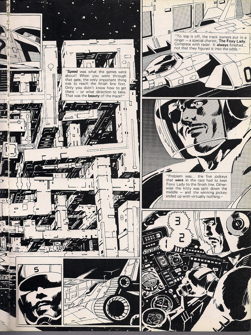
Just look at this. It's from a 12-page contribution by Noboru Miyama, who died very recently, in 2007. His story, The Great Ten, is filled with images just like this: detailed machines and steely environments, with humans reduced mainly to faces beholding the wonder of setting. That's good, since Miyama's human figure work isn't so strong; this was among his earliest published stories, unless it actually is his first published solo work, since most sources cite 1981 as the year of his pro debut. Prior to that he'd worked as an assistant to Satoshi Ikezawa, creator of a mid-to-late '70s racing manga titled Circuit no Ohkami.
This story too is a racing manga, boiled down to its essence. Carlin is the greatest jockey ever to race in the deadly 3-D Derby, a cube maze that kills. His shocking series of wins delights the betting public, until they tire of how his excellence prevents big payouts and thrilling death lunges for 1st. He's too good, and thus hated; and while the kindly fellow in the pace car tries to warn him that he's playing with fire, Carlin can't help but go for a big 10th win, unaware in his ambition that the game is now fixed against him.
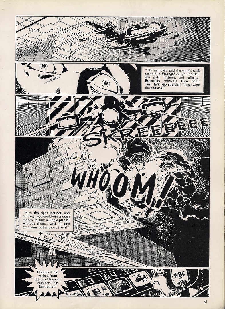
Lots of well-drawn tech, some fine action. And a message about pushing yourself as hard as you can go - not an unfamiliar sentiment for the youth manga that Manga didn't show. But there were other things, revolutionary things the book didn't show, that would broker no great similarity to this boyish activity, that nobody could have believed would have flown with Manga's laser-honed American target audience. Something was hidden.
***


