"..When You're Digging For Artifacts...Don't Bury Your Reputation!" COMICS! Sometimes I Guess You Can't Trust An Orangutan!

In which I continue to drag you along on my cheerless trudge through all the 1970s Marvel UK issues of Planet of the Apes Weekly a man at work lent me that time. Doesn’t it just make everything in your life seem radiant with an inner light by comparison? Suit yourself.  photo PotAExcitmentB_zps7e195ca8.jpg
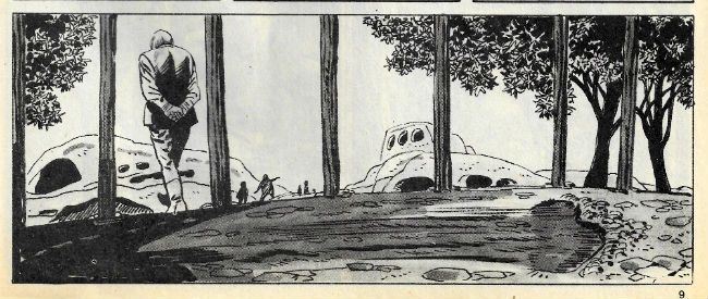
Planet of the Apes by George Tuska, Mike Esposito & Doug Moench

Anyway, this... PLANET OF THE APES WEEKLY #3 (Week Ending November 9th 1974) Edited by Matt Softley Planet of The Apes Chapter Three: In The Compound! Art by George Tuska & Mike Esposito Written by Doug Moench Based on the 20th Century Fox Motion Picture Planet of The Apes (1968) Based on the novel by Pierre Boulle Gullivar Jones, Warrior of Mars: River of the Dead! Art by Gil Kane & Bill Everett Written by Roy Thomas Lettered by John Costa Freely adapted from the novel Lt. Gullivar Jones  by Edwin L. Arnold Ka-Zar: Frenzy on the Fortieth Floor! Art by Jack Kirby & Stan Grainger Written by Roy Thomas Lettered by Sam Rosen Ka-Zar created by Jack Kirby & Stan Lee Marvel UK, £0.08 (1974)  photo PotA003CB_zps75537661.jpg
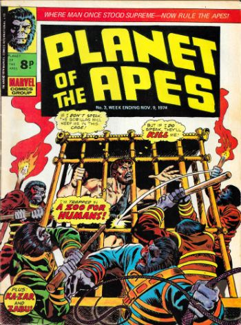
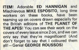
A quick note about the covers: Since Planet of the Apes Weekly appeared more frequently than its monthly US parent mag it required more covers. In this issue there's a note about who did what. So fair play to Marvel in this instance. And so let the record show:

 photo CovCreditsB_zpsa22feafe.jpg

Planet of The Apes Chapter Three: In The Compound! Art by George Tuska & Mike Esposito Written by Doug Moench Based on the 20th Century Fox Motion Picture Planet of The Apes (1968) Based on the novel by Pierre Boulle

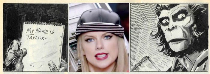
Being the third chunk of Doug Moench & George Tuska’s faithful replication of the 20th Century Fox motion picture presentation Planet of the Apes. Just to recap for those joining us late (yeah, right) or anyone who enjoyed their twenties a tad too much – it’s a very respectful adaptation which, in a sense, is nice. But then again it’s a bit too respectful. You’d think Planet of The Apes stormed the beaches of Normandy, invented the iPad or died for our sins. Heck (not Don; just the expletive), I like Planet of the Apes but, c’mon. Mind you, as we’ve also covered (and it will be on the Mid-Terms) there were probably reasons for that (you couldn’t watch the movie in the comfort of your own home, never mind on a tiny phone screen propped up on your dashboard while you drove, like some dangerous jackass.) But, forty years on I get a bit restless reading even these small chunks and my mind wanders and I find myself wasting time and energy making very poor jokes like this:

 photo PotATaylorB_zpsdc1a16b9.jpg

Planet of the Apes by George Tuska, Mike Esposito & Doug Moench

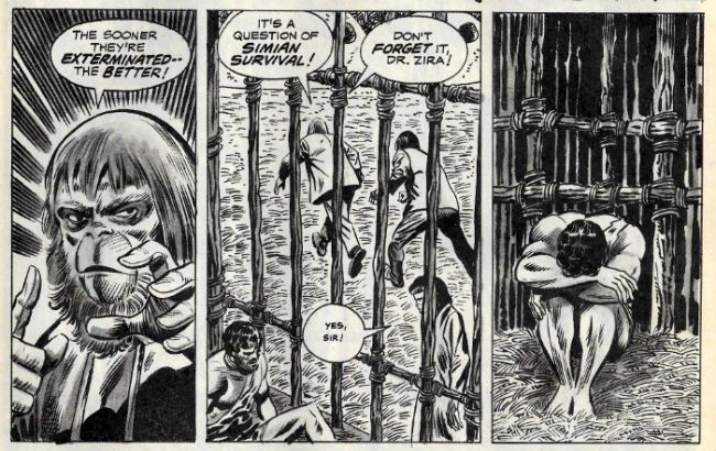
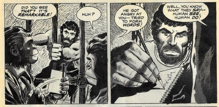
I think Zira’s Little Rascals’ face seals that particular deal. But, no, it’s weak comedic tea indeed and I’m not proud of having done that, but it’s pretty clearly Doug Moench and George Tuska’s fault. So, um, Moench is mostly just aping the script and it’s up to Tuska to impress. And he does, really, in bits. In one smashing panel Tuska catches the body language of Doctor Zaius ("Doctor Zaius! Doctor Zaius!") just so. That’s no mean feat as the apes in the old movies walk in a kind of ambling shuffle which encompasses a kind of see-saw effect in the shoulders. Obviously Tuska is denied movement but the figure he draws is clearly frozen at a point in that process.

 photo PotAApeWalkB_zps63c9e78e.jpg

Planet of the Apes by George Tuska, Mike Esposito & Doug Moench

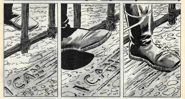
Also, and crucially, Moench senses when to shut up and Tuska knows how to sell the pivotal moment when Dr Zaius’ stitched slippers sweeps Taylors words away. It’s not exactly a visual gift that scene, but it works on the page and it’s important that it works. As an entertainment Planet of the Apes keeps its momentum up by serving up a succession of uppercuts to expectations and this one is one of my favourites; when Dr Zaius reveals himself as a big furry shit.

 photo PotAFootB_zpsd65a8b97.jpg

Planet of the Apes by George Tuska, Mike Esposito & Doug Moench

But it also, also, it puts a little bit of spin on the events. It’s a bit of a shocker isn’t it, really? So Zaius knows? What exactly does he know? How does he know it? Eh? And why doesn’t he have those funny big cheeks like the orangutan in that modern Apes movie? Not the new new one with Commissioner Gordon, no, the old new one. The old new one where Jess Franco, the world’s stupidest genius, ignores every single health and safety protocol (put there for your own safety, people) to save his Dad, who can’t remember how to play the piano anymore (not everyone else; just his Dad because his Dad’s special; fuck everyone else whose Dad can’t remember how to play the piano, or the tuba or whatever. And if your Dad wasn’t musically inclined in the first place, well, he’s just wasted everybody’s time and should lie down in a ditch and scrape the earth over his (rightly) weeping face.)  but instead ruins National Parks for ever. Or something. I don’t know, I had to stop watching when the ape went to stay at Brian (the stocky actor not the baby-faced physicist) Cox’s and it was all David Pelzer Time but, y'know, for motion capture fake animals. I can’t watch animals being sad anymore. Not even pretend ones. I don’t know what happened. I just can’t do that anymore. This is what age does to you; you can't even take pleasure in the suffering of fake animals. Enjoy your youth. But, yeah, the bit on the bridge was good (I came sashaying back in for that bit) and old floppy cheeks was in that bit. So, yeah, Dr Zaius  - did he evolve out of his floppy cheeks? Maybe there’s more than one kind of orangutan? There was “Right turn, Clyde!” Y'know, Clint and that. American Orangutan. Like An Orangutan Lining Up Its Shot. Oscars, yeah. America, I feel you. Sweet. So , yeah, January - not the month to ask a lot of me, I'm guessing.

 photo PotAFightB_zpsc08d474d.jpg

Planet of the Apes by George Tuska, Mike Esposito & Doug Moench

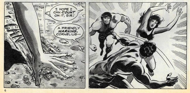
It’s kind of freaky that Tuska handles such a quiet (but momentous) moment so well because when action erupts Tuska’s super-heroic Marvel House Style reflexes kick in to ill effect. Muscles become swollen like boulders and a generic air descends on the combat. Super-hero comics (back then anyway) dealt in action rather than violence. (Yes, I’m archaic enough to think there’s a difference between a bit o’ colourful wrasslin’ and some guy in a domino mask dismembering some other dude and feeding him, piece by piece, into his own arse. Call me old fashioned. Call me Pappy!) But PotA isn’t about super heroes; it’s about animals and man and how the two are (SPOILER!) quite similar if you think about it (I hate that presumptuous phrase so much). Yeah, so, action is how humanity domesticates its violence and Tuska undercuts this point by portraying action when he should, I think, be upping the ante to violence. He does good monkey faces though. Sorry, ape faces. See fig. 1 above; that there’s as close to a jowl wobblin’ Elvis Double-Take (see Gigolo Rigmarole! or Clamgasm! for more face shakin’ Presley action!) as comics can come, I believe. In fact the expressions on Tuska’s apes are much better than those on his people. Yeah, Tuska’s Taylor (some might spy) is well served at the emotional extremes but in-between he looks like someone’s switched him off. Don’t get me wrong, with all this talk of lack of effect and lifelessness George Tuska’s art is still a far more amenable sight than , say, that of Greg Land. Tuska’s Nature may well be beige in tooth and claw but at least it isn’t shit. OKAY!


Gullivar Jones, Warrior of Mars: River of the Dead! Art by Gil Kane & Bill Everett Written by Roy Thomas Lettered by John Costa Freely adapted from the novel Lt. Gullivar Jones by Edwin L. Arnold

In this second episode of the adaptation of the original (cough) inspiration for John Carter our old mucker Gullivar Jones gets a bad case of worms. More pertinently the writing bloats with all the bad habits of Bronze Age writing. Which is a massive shame because it makes me look bad. After all, last time out, I made great play about how Roy Thomas’ writing was as verbose and purple as a Peter Ustinov made of plums. And yet, and yet, I maintained mulishly,  that approach suited the material perfectly. Obviously, I’m not saying I was wrong (what a terrible thing to say; wash your mouth out) I’m just saying I can’t say that this time out. What I was saying a lot while reading it was sub-vocal and largely consisted of instructions for Roy Thomas to get out of Gil Kane’s way. Quite forceful instructions, if you know what I mean.

 photo GullSplatB_zps80f6529c.jpg

Gullivar Jones, Warrior of Mars by Gil Kane, Sam Grainger & Roy Thomas

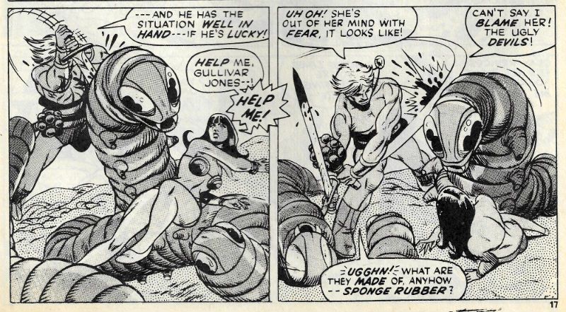
Because, be still my beatin’ heart, Gil’s away again. He’s off at a proper canter all right with Gullivar hacking at big worms, then slicing up ape headed spiders (or spider bodied apes) before being crucified and fed to a giant Gil(a) monster. It’s all cavorting and chopping, nasal flare and sweeping hair. It’s Gil Kane with his ridiculously anatomical  antics on great form. The mere brow muscles of Gil Kane’s Gullivar Jones could crack walnuts. The stuff here’s a hair closer to violence than action with the odd gout of blood (ichor?) splashing up from a wounded worm. I remember that being a bit of a shock when I was little; the rarity of such signifiers of the effects of violence lending them weight and, yes, horror. But startling spurts aside, throughout the strip Gil Kane’s spectacular gymnastics have their energy stifled by the physical presence of Thomas’ clotted prose. Because that’s the thing about comics, the writing is there; like a fedora, it’s part of the image.

 photo GullDiveB_zpsa76b1b32.jpg

Gullivar Jones, Warrior of Mars by Gil Kane, Sam Grainger & Roy Thomas

Now, I like writing. A good turn of phrase or a mot which is bon turns me on; I like words. But this is Comics so when they bog down the art I’m all rearing back like a horse at a cliff face and Unh-UH! Words that do that better be some special words indeed. Unfortunately the words here aren’t terribly special. I’ve not read the original Arnold novel so maybe Thomas is just adhering  to the source, and the source isn’t very good. Or it’s just not working this time out; it can happen to the best of us. In 1970’s Roy Thomas’ defence there are still, in 2015, plenty of writers who can’t find that golden balance twixt art’n’words. And there’s always the art, which is Gil Kane. Word. GOOD!

Ka-Zar: Frenzy on the Fortieth Floor! Art by Jack Kirby & Stan Grainger Written by Roy Thomas Lettered by Sam Rosen Ka-Zar created by Jack Kirby & Stan Lee

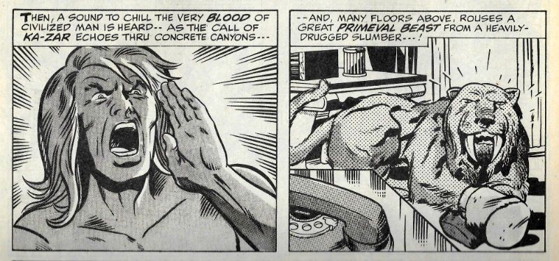
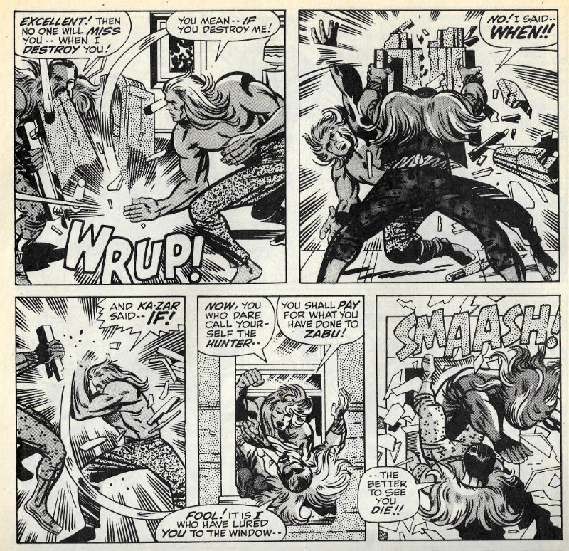
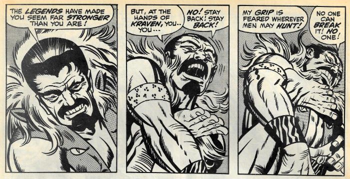
Ka-Zar tracks Kraven The Hunter to his swanky NYC hotel lair and battle commences  for the freedom of Zabu. I know what you’re thinking (ugh!) but, no, Ka-Zar doesn’t just barge in like some savage. Instead, like a latter day loin cloth clad Sun Tzu Ka-Zar stands in the lobby of the hotel and bellows…and then barges in like some savage. Kirby’s prime concern here is A!C!T!I!O!N! and he’s set his slobberknocker in the environs of the urban “jungle” to see how that shakes out visually. And visually it works a treat with swinging from balconies instead of branches and commuters hurriedly dispersing like startled rodents. Like an old timey wrasslin' match in the first episode Ka-Zar and Kraven wrassled on Ka-Zar’s home turf and Ka-Zar lost (because Kraven cheated, natch. Boo!) Here we get the rematch where, despite Kraven’s habitual cheating (boo!) and the unfamiliar environs, Ka-Zar is victorious.

 photo KZReTouchB_zps3c67d96b.jpg

Ka-Zar by Jack Kirby, Sam Grainger, Roy Thomas & Sam Rosen

All Rascally Roy's Stan-tastic dialogue can do is cling on and hope to  convince via its relentless presence that it’s an integral part of the whole thing. Which it isn’t, so you get some dandy Faux-Stan Lee moments of Stan Lee’s patented (not really, legal eagles) “I knew you were going to do that, so I let you, so I can do THIS!” Manoeuvre. Which is a smarter move on his (Stan or Roy's) part than he’s generally given credit for. Such impromptu one-upmanship is, after all, a staple of the schoolyard play of the 1970s target audience.  Children, I’m talking about children there. Remember, children? They used to read comics. Or maybe they still do. Someone bought those 250 giga-billion copies of the first issue of that comic based on the children’s entertainment Star Wars. Children, obviously. Oh, or Retailers.

 photo KZPlaygroundB_zps1da1ab09.jpg

Ka-Zar by Jack Kirby, Sam Grainger, Roy Thomas & Sam Rosen

This Ka-Zar strip here is a mess, but it’s fun, it’s daft too; it’s basically men in tights, but these are the kind of tights stretched out of shape by the girth of such 70s giants of the ring as Big Daddy, Kendo Nagasaki and Giant Haystacks rather than those that snugly cosset the somewhat more svelte Superman. Next time they want to make a Wallace Beery "B" they should nix that Barton Fink fella and go for that “Jack Kirby feeling”. It is preposterous stuff  that retains the attention thanks to its rowdy visual energy. Mind you, these visuals are strangely marred by touch-ups. It’s not even subtly done so I know it’s a fact that there’s definitely the hand of a Severin (Marie?)  in the mix here, which makes you wonder what strange set of circumstances must have arisen to occasion Jack Kirby’s art being footled with. I’m not saying Jack Kirby’s mind was on other things but I will say that this strip originally appeared in Astonishing Tales #2 circa 1970, which is when Kirby disappeared from Marvel and took a chance on DC. I’m just sayin’ is all! OKAY!

 photo PotAMarcusB_zps255bdcde.jpg

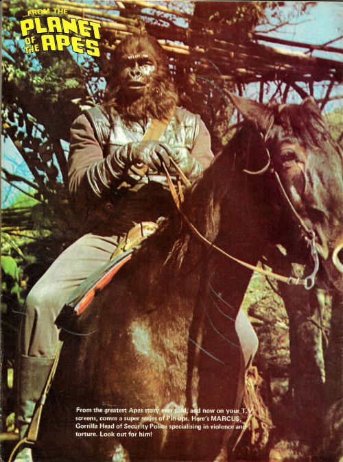
This issue of PotA-W is rounded out by a pulse-pounding pin-up. So, I leave you, gentle reader, with this thought: some under-tens didn't put aspirational pictures of sportsmen and women on their wood-chipped walls, but plumped instead for “MARCUS, Gorilla Head of Security Police specialising in violence and torture. Look out for him!” Look for that kid, I say!

NEXT TIME: Hopefully the snow will have melted enough to let the Royal Mail drop off my first comics parcel of the new Year. Then I can stop entertaining myself at your expense and get stuck into some modern – COMICS!!!

"Man HAS No Understanding, Dr. Zira! He Can Be Taught A Few Simple TRICKS Nothing More!" COMICS! Sometimes I'm Just Glad I Don't Have Ka-Zar's Vet Bills!

In which I continue to fly in the face of popular opinion, medical advice, and common sense to continue my languorous amble through Marvel UK’s Planet of the Apes Weekly.  photo SeeDoB_zps620cfde7.jpg Planet of the Apes by Tuska, Esposito & Moench

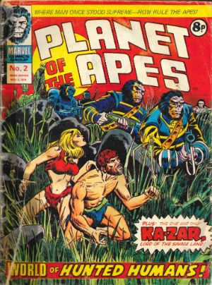
Anyway, this… PLANET OF THE APES WEEKLY #2 (Week Ending November 2nd 1974) Edited by Matt Softley Planet of The Apes Chapter Two: World of Captive Humans Art by George Tuska & Mike Esposito Written by Doug Moench Based on the 20th Century Fox Motion Picture Planet of The Apes (1968) Based on the novel by Pierre Boulle Gullivar Jones: Warrior of Mars Art by Gil Kane & Bill Everett Written by Roy Thomas Lettered by John Costa Freely adapted from the novel Lt. Gullivar Jones  by Edwin L. Arnold Ka-Zar: The Power of Ka-Zar! Art by Jack Kirby & Stan Grainger Written by Stan Lee Lettered by Sam Rosen Ka-Zar created by Jack Kirby & Stan Lee Marvel UK, £0.08 (1974)

 photo PotA002CB_zps3a2b4757.jpg

Planet of The Apes Chapter Two: World of Captive Humans Art by George Tuska & Mike Esposito Written by Doug Moench Based on the 20th Century Fox Motion Picture Planet of The Apes (1968) Based on the novel by Pierre Boulle

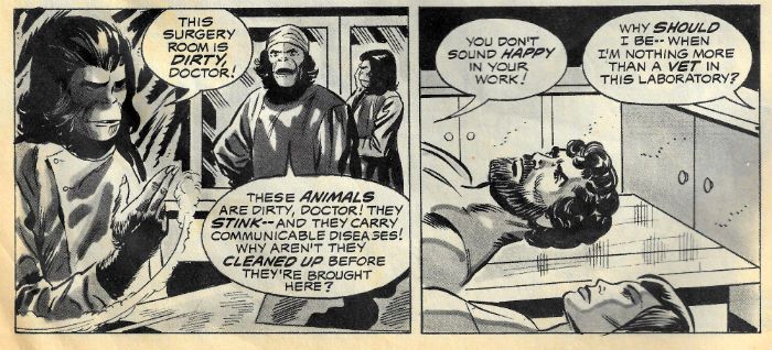
In which Doug Moench and George Tuska continue to place scenes from the 20th Century Fox motion picture Planet of the Apes in front of you with all the vigour and drama of a tired vice cop at the end of his shift showing you mugshots while preoccupied with remembering where he stashed that fifth of Old Grandad. (No one's judging you; we’ve all been there.) Once again then, it’s Yeoman’s work all the way, with such little spark on the part of the art that at times Tuska’s people are so drained of emotion and animation they resemble big, stiff dolls. Still, George Tuska does wrench himself out of his torpor for a couple of panels where Taylor reacts badly to talk of brain surgery and experimentation but that’s the last page. To be fair, George Tuska had his moments. But few of them are on these pages. I know I said that’d be in the last one; I’m just keeping you on your toes. While faithful replication remains the paramount concern of the adaptation overall, there's still quite a bit of chicken fat about this thing.

 photo BigDollsB_zps736e8643.jpg Planet of the Apes by Tuska, Esposito & Moench

Everything feels dragged out as though the problem isn’t the allotted space but the filling of it. I guess this is why Moench expands on the movie dialogue to ensure every point is made at such ambiguity trepanning length that the movie seems subtle in comparison. (And it’s very much not a subtle movie; it isn’t supposed to be.) Turn that CAPS LOCK off, Moench fans, because I might seem to be giving Moench a hard time but, luckily, he does most of the Marvel Apes material and I’ll be saying far nicer things further down the line. Sure, this is just a weird isolated chunk of a story transformed into an episode by the weekly nature of UK comics production but there’s still a good bit or two. Certainly the bits where the chimpanzees are arguing about tenure, office supplies and quota systems was funnier after several decades sitting at a desk praying for my pension to kick in than it was at age four. While there are bits to like here, they were already in the movie. There’s nothing yet about the adaptation as a comic to cause anyone to start bouncing up and down, teeth bared, while slapping the top of their head. So far even the action scenes have been consistently spuffed down the comic’s leg. This issue's section is mostly talk, and it's all so enervating you pine for the inactive action of last issue. Tuska’s art is just too tentative here to engage for long when limited to talking heads. Heck, they are talking ape heads and still my mind wandered off and…well, I hope it gets back soon, I kind of need it. Meat‘n’taters this strip remains then. OKAY!

Gullivar Jones: Warrior of Mars Art by Gil Kane & Bill Everett Written by Roy Thomas Lettered by John Costa Freely adapted from the novel Lt. Gullivar Jones  by Edwin L. Arnold

The personal highlight of issue 2 is Gullivar Jones, Warrior of Mars by Gentleman Gil Kane and Rascally Roy Thomas. Now y’all know by now I’m a bit of a one for a GilRoy© Joint, but what y’all don’t know is this particular GilRoy© Joint is the exact and precise one to blame. But before we get to that we have the bit where I prove I can look stuff up on the Internet - this strip originally appeared in issues 16 to 21 of Creatures on The Loose in a series of 10 page instalments with the rest of the comic bulked out by reprints. The perfect size for its slot in PotA-W. This is the one about a Confederate yanked off to Mars where he meets a steel bikini clad princess and kills the stuffing out of a load of bad dudes. It is not to be confused with John Carter of Mars which is the one about a Confederate yanked off to Mars where he meets a naked princess and kills the stuffing out of a load of bad dudes. The two are not to be confused largely because Edwin Lester Arnold’s Gullivar Jones: His Vacation was published in 1905 and Burrough’s (Edgar Rice not William) first John Carter book arrived in 1912. I think, I was kind of losing the will to live reading about all that so feel free to correct me if I'm wrong. Anyway, I'm sure they are totally different because the last thing we want is lawyers developing time travel so they can go back and get dead people suing each other as well. Because they will. They will. Hasslein knew. The similarities between the two properties are certainly, um, arresting but then I don’t know how faithful GilRoy©’s adaptation is; there’s always the possibility they blended the two.

 photo WhiteTopB_zpsaa022b3a.jpg Gullivar Jones by Kane, Everett, Thomas & Costa

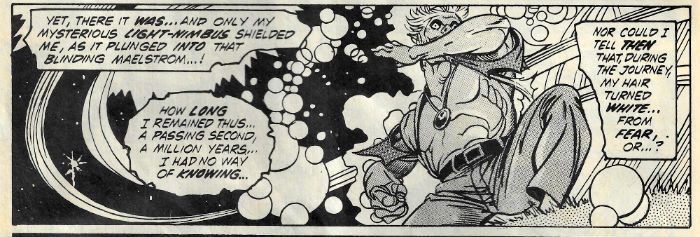
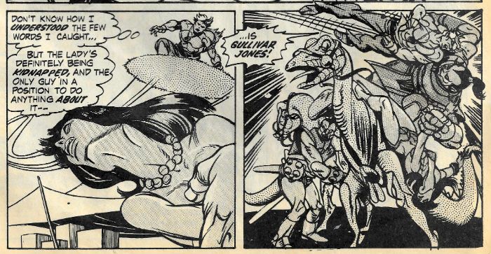
It can’t be all that faithful to the source because here Gullivar is a ‘Nam Vet (no, not an Indo-Chinese animal doctor; the other kind.) and instead of a magic carpet he is Mars borne on a sort of cloud composed of Gil Kane’s ™ and © cosmic amoebas. Gullivar also has a sweep of ice creamy hair atop his chiselled head not unlike Gentleman Gil’s artic topping. Gully’s hair turns white during his transportation from Earth to Mars; when Gil Kane’s hair turned white is anyone’s guess. (Probably thirty seconds after he started working in comics. Only kidding! It’s just one big fun club-house of magic!) Keen Kane Watcher’s will note quite a lot of Gil Kane’s heroes spurn Just For Men. I don’t know if GilRoy© threw that bit in nor if they gave Gullivar enhanced muscle powers like ERB’s Jon Carter because…I haven’t done my due diligence. Anyway, Gullivar lands on Mars and without checking much out immediately wades in and starts killing things while immediately pairing up with the swellest gal round, Heru by name. It’s a ridiculously propulsive chunk of bounding, swashbuckling, romance, leaping, jumping, violence, buckswashling, torn shirts, and heterosexual male wish fulfilment. It is fantastic stuff if you are partial to GilRoy© Joints, barbaric tomfoolery or, um, John Carter (Shhh!)

 photo PositionB_zpsf50d9993.jpg Gullivar Jones by Kane, Everett, Thomas & Costa

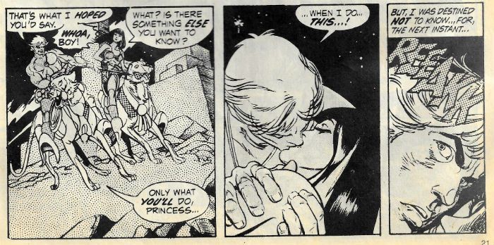
Gil Kane’s on top form here despite the muting effect of the B& W art’s none too precise reproduction. I think some of it’s been redrawn to make it pop out of the monochrome slurry the colour has become, and I’d suggest there looks to be some redrawing around the cups area of Heru's bikini as well if that didn’t make me seem like a creepy weirdo. ( I am a creepy weirdo, of course, but apparently lot of adult life is spent hiding what really you are so no one burns you in public.) Mostly though, I’d say Gil Kane was into this one, which I certainly was. So much so that I know this strip here is where Gil and I struck up an immediate bond; one whereby I would forever after be willing to pay him for his services. Hmm, that sounded a lot less seedy in my head. Because I remember (and I do remember this) reading this exact strip in this issue and feeling Kane’s hit me like Larkin's “enormous yes". Seriously, somewhere in pages 4 and 5 I was lost; Gil and I were in bonded by the chains of art/commerce for life after that. So, you know, if I can just address every comics publisher everywhere, I find the lack of Gil Kane reprints pretty ridiculous. Sort it out, please. Pronto, if you would.

 photo WhenDoThisB_zpsb9f994ed.jpg Gullivar Jones by Kane, Everett, Thomas & Costa

We’ll take about Gil Kane more later no doubt, no doubt. But what about Roy? Roy Thomas plays a big part in making this strip work as well as it does, and I think it works pretty well. I like Roy Thomas; Roy’s okay by me. He likes order to excess and can probably find his apple peeler in the dark but he can write. He can write pulp, anyway. There are plenty of words on these pages; perhaps too many for today’s prose averse readers, but I like ‘em and I think they’re needed. It’s written in a really butch pulp style - this prose stops off in a bar after a hard day riveting to catch the game and sink some brews; this prose buys its shoes by mail because no way is another man touching its feet; this prose wonders why Walter Hill never won an Oscar; this prose totally tucks hard packs of cigarettes under its rolled up sleeve; this prose is macho stuff all told. Which is great, it keys you in, it cues you up - this is beefy pulp action soaked in bourbon, and apologies and poetry aren’t happening tonight, baby! And that’s intentional, “With a cording of throat muscles” is no one’s first choice of wording. We all know what he means but how he says it means something too. Writing there; it’s not just putting one word after another. Gullivar isn't like Roy, Gullivar doesn’t work with words, he works with his hands and his hands are killing hands. Thomas' lurid insight into the mind of the protagonist makes it a much richer and more immersive experience. It's still pulp nonsense but you're paying attention. Here the clumsy carnality of Thomas’ prose couples with the sensual elegance of Kane’s practically throbbing visuals to make a heated experience indeed. Captions aren’t always necessary but also captions aren’t always redundant; captions are a tool - one of many. You choose the right tool for the job. And Gullivar Jones is a right tool. Or something. Someone should reprint this stuff, it's VERY GOOD!

Ka-Zar: The Power of Ka-Zar! Art by Jack Kirby & Stan Grainger Written by Stan Lee Lettered by Sam Rosen Ka-Zar created by Jack Kirby & Stan Lee

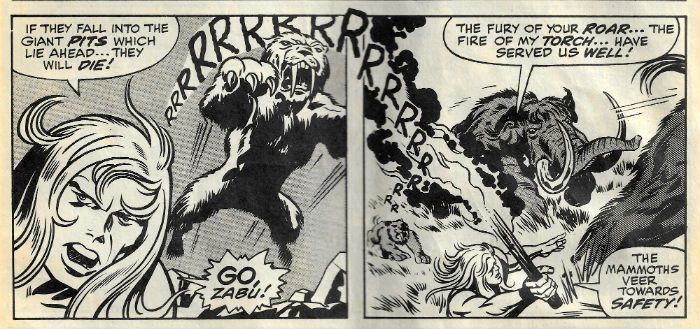
This starts off with one of those great full page panels which make no sense whatsoever if you think about it for a second - Kraven is thrusting a newspaper at the reader and bellowing about something that’s really getting his balls in an uproar. But, and trust me on this, we aren’t actually there so I don’t know what that all’s about. It’s like we aren’t meant to take it literally or something! Turns out Kraven is on his own in his Kirby-esque study built of, as so many Kirby studies are, antique Lego. Kraven’s plan is to talk out loud about everything he knows concerning Ka-Zar into a “recording device” and when he’s done that, having kick started his little grey cells into unconscious ratiocination, I guess, he will know where Ka-Zar and Zabu are. As plans go this seems pretty flimsy, but it works so, hey, what do I know. Surprisingly, despite being dressed like an Earth-2 Liberace Kraven doesn't want to adopt Lord Peter Whimsy (aka Ka-Zar); Zabu is his real target because, well, Kraven has issues - check out his name! He’s gonna find that sabre-toothed tiger and give it a good wrasslin’!

 photo GoZabuGoB_zpsb4338e0e.jpg Ka-Zar by Kirby, Grainger, Lee & Rosen Preventing you from registering how none of what you read so far makes a lick of sense the story suddenly hurls images of Ka-Zar and Zabu saving some dinosaurs from their own stupidity at you. At this stage (quite early; "Ka-Zar first showed up in the now legendary X-Men#10 (1965). Joltin'John.") in his career Ka-Zar is still talking like he’s got something lodged in his brain. Ka-Zar is basically a blonde Tarzan who lives in the pocket of prehistoric throwbackery known as The Savage Land, and is accompanied by a sabre-toothed tiger rather than a cheeky chimp. I don’t know about you, but by the time I finished that sentence we seemed to be a long way from Tarzan, and yet the jungly musk of Edgar Rice Burroughs’ creation still permeates everything about Ka-Zar. Go figure. Kraven’s a wrasslin’ man with wrasslin’ on his mind so there’s a whole lot o’ wrassling in this one with some characteristically dynamic Kirby panels. I am always particularly taken by the one where bodies explode away from a figure at the epicentre of a panel and the one where someone cranes their neck to look back out of the panel with a big old “Oh Shit!” expression on their strangely blocky face. Both of which are here but my favourite was a trio of tusslin’ panels which brought to mind a famous Harvey Kurtzman sequence:

 photo FightB_zpsca7eb603.jpg

Ka-Zar by Kirby, Grainger, Lee & Rosen

 photo ImjinB_zps489ffd91.jpg

Cover Detail from "Corpse On The Imjin" And Other Stories by Harvey Kurtzman (Fantagraphics, 2012)

Just a fun collision of images in my head with no deeper meaning or import, I’m sure. But I think we can all agree that Kirby’s use of the foot there is pretty funny. There’s no way this strip wasn’t driven by Kirby’s art and the proof is in the patter Lee provides. Patter which is almost puce in the face as it struggles to both keep up and pretend something sensible is happening. Nothing sensible is happening here but who gives a cheesy toupee when there’s a whole lotta Kirby goin’ on ! GOOD!

BONUS: Rejected visual pitch for Just Imagine...Stan Lee Creating V For Vendetta!

 photo JImagineB_zps574206e3.jpg

NEXT TIME: George Tuska starts livening up! Jack Kirby clearly has other things on his mind! And Gil Kane's work forces me to don flame retardent pants! All this and a whole lot less in Part 3 of Planet of the COMICS!!!
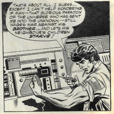
“You Who Are Reading Me Now Are A Different Breed - I Hope A Better One.” COMICS! Sometimes You Stop And Find Forty Years Have Slipped Down The Back of The Sofa!

Yes! This is a thing which is happening! It’s the second patience sapping instalment of the world’s slowest and most digressive crawl through Marvel UK’s Planet of the Apes Weekly (1974 - 1977). O ye of little faith! Run, you fools!  photo PotAStartB_zps37829286.jpg Planet of the Apes by George Tuska, Mike Esposito & Doug Moench

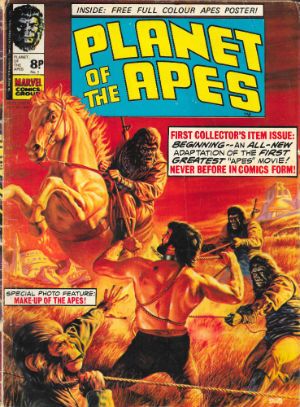
Anyway, this… PLANET OF THE APES WEEKLY #1 (Week Ending October 26th 1974) Planet of The Apes Part 1 Art by George Tuska & Mike Esposito Written by Doug Moench Based on the 20th Century Fox Motion Picture Planet of The Apes (1968) Based on the novel by Pierre Boulle Marvel UK, £0.08 (1974)

 photo PotAW001B_zpse9b78783.jpg

Blame it on The Roy. For Rascally Roy Thomas was the one. The one who personally bagged Marvel the rights to produce original material based on the 20th Century Fox motion picture presentation Planet of The Apes. That movie was released in 1968 so why a push for a comic in 1974? Why, Roy? Why? Good question; Roy’s glad you asked. Because Television. You know how important Television is to comic creators today? Well, Television was that central to everyblummingbody back in 1974. Albeit less for monetary reasons, and more for distractions-from-the-hideous-reality-of-the-1970s reasons. There was comparatively very little Television programming at this point in time (the 1970s, keep up!) which tended to lend it all an importance out of all proportion to its quality. It was still early days so there was only a limited array of TV programmes – ones where a pair of caucasian, heterosexual males (one blond, one brunette) had adventures in a variety of settings, ones where a mishap prone heterosexual couple inhabited a house filled with invisible laughing maniacs, ones where someone, usually a caucasian heterosexual male (blond or brunette), was pursued from town to town for eternally unresolved reasons, ones with news on them and then documentaries about corned beef manufacture in Argentina. When the Planet of the Apes TV (PotA-TV) series was broadcast in 1974 it was a daring evolutionary step forward for Televisual entertainment - it was about a pair of caucasian, heterosexual males (one blond, one brunette) having adventures on the Planet of the Apes WHILE ALSO being pursued from town to town for eternally unresolved reasons. As artistically modest as it may appear to audiences raised on The Wire and Mr. Bean it remains a fact that PotA-TV was a smash-hit with the simple, clueless, happy-go-lucky folk of 1970s Britain.

 photo PotAWalkB_zps479c6a9f.jpg

Planet of the Apes by George Tuska, Mike Esposito & Doug Moench

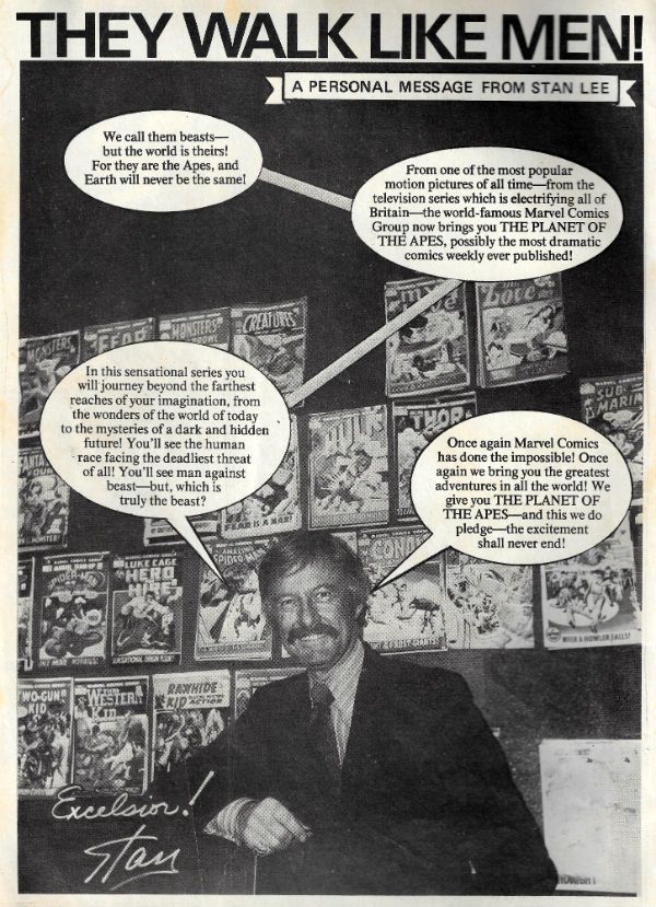
Luckily for all their lovely share-holders Marvel UK were Johnny-on-the–Spot with Planet of the Apes Weekly (PotA-W) which basically acted like a papery pocket money attractor. So successful was the comic that it ended in 1977 not, as is traditional, for want of sales, but rather because APJAC international Productions raised their licensing fees and Marvel balked. Marvel UK was a bit different from Marvel proper in that it was formed in 1972 (said Wikipedia, yesterday) to publish comics in the UK but with editorial direction via Noo Yawk. While it’s true that Neil Tennant, long before becoming a pop colossus, did work for Marvel UK in an editorial capacity, he denies anything to do with PotA-W. This is a shame because I’d have liked to have mentioned Neil Tennant, being a big fan of The Pet Shop Boys as I am. As it is any mention of Neil Tennant would just unnecessarily cloud the issue. And I think we all know I just cannot be doing with unnecessary digressions. In 1976 Marvel UK would produce its first original material in the form of Captain Britain Weekly, which I liked (Herb Trimpe, oh yeah!) Since PotA-W was produced prior to 1976 all its content (bar the letters page) was produced in the Land of The Free and the Home of The Brave. America, I’m talking about America there. And the face of American comics in 1974 was a Smilin’ one. So, opening the painted cover, the first thing you saw in 1974 was Smilin’ Stan Lee. Caught there for posterity in a comic book store somewhere, in a picture bearing mute but unarguable testament to the sublimity of craft imbuing his hairpiece, Stan Lee welcomes us to this, the first issue of PotA-W. Thanks, Stan! Don’t mind if I do.

 photo PotAStanB_zpsa426f7d6.jpg

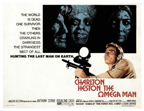
The comic strip bits of the first issue of PotA-W consist entirely of the first part of Marvel’s “6 part adaptation” of the movie (PotA-M). Before the children’s entertainment Star Wars (1977) happened science fiction in movies was, mostly, telling us that the future was going to be even worse if we didn’t get our act together. PotA-M is very much in that grand, finger wagging tradition and it stars Charlton Heston, who I will always adore for a number of reasons. I shall now bore you with them. Obviously, and most pertinently, he would eventually star in three of my favourite Pull Your Socks Up, Humanity! movies – Soylent Green (1973), The Omega Man (1971) and Planet of the Apes (1968). Those were all movies I saw slightly later in life because they were on later in the evening, but I was still primed for Charlton Heston. For, when younger, I had spent many a happy Sunday afternoon drinking Cresta in front of the Television watching The Hest’s parched delivery save such historical and long movies as El Cid (1961), The Warlord (1965) and Khartoum (1966) from my childish disinterest. Best of all the many Sunday Afternoon Hest Fests was The Naked Jungle (1954) which was about Charlton Heston and Eleanor Parker learning to love among the marabunta ants. Unstoppable killer ants aside, the scene where the widowed Eleanor Parker character tells Hest that the best piano is one that's been played remains kind of awesome to me even now. Then, later, I found out about Charlton Heston insisting Orson Welles be allowed to direct Touch of Evil (1958), Charlton Heston marching for Civil Rights and, naturally, Wayne’s World 2 (1993). Probably other things in there as well. Yes, for a very long time there was no question about Charlton Heston. But then I made the mistake of watching some Michael Moore thing which had Charlton Heston brandishing a firearm and yelling about his cold dead hands. Unbeknownst to me, apparently in the 1980s (that heinous decade), Charlton Heston threw liberalism over for conservatism. If he’d just called I might have been able to talk him out of it, but he was a proud man and, perhaps unconsciously sensing his error, never sought my advice. Yes, there were sure some mixed feelings in my head that day. But those feelings, that head and that day itself were in 2002; which, in line with Haslein’s theory, hadn’t happened in 1974 when PotA-W started.

 photo omegamanB_zps79fe7680.jpg

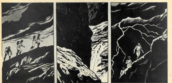
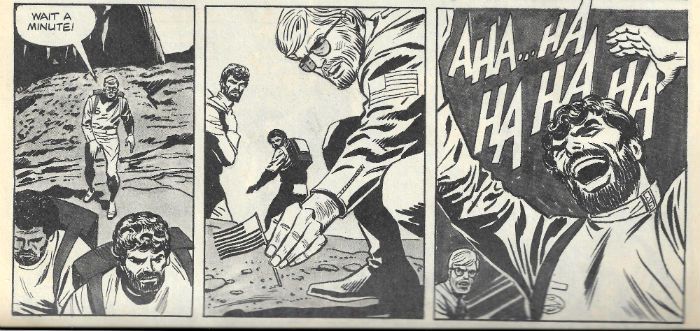
Mind you, reading George Tuska and Doug Moench’s comic book adaptation of PotA-M you’d be hard pressed to guess Heston was the star. In the old days, with their old ways, licenced comics had to get some kind of likeness agreement from the people in the movie concerned; otherwise there’d be some legal unpleasantness. Apparently Marvel didn’t bother with that, because Tuska was, so it’s still claimed in smoky back rooms and seedy dance halls, explicitly told not to make anyone “look like Charlton Heston”. A bit of a drawback really when adapting a movie starring Charlton Heston. And so Tuska’s art compliantly contains no one who could even charitably be said to “look like Charlton Heston”. I’ve had food that looked more like Charlton Heston. If anything Tuska overplays his underplaying as all the human faces resemble cereal boxes bearing variations on the same generic visage. This pretty much sums up Tuska’s performance here – he does as he’s asked, but little more. There’s a lot of chops involved in just doing that well, I’m not unaware of that, but Time lacks mercy and while in 1974 this was probably pretty good stuff, by 2015 I (and this is just me, never mind someone actively involved with comic art) have seen Sienkiewicz & Macchio’s Dune, Bissette & Veitch’s 1941 and Simonson & Goodwin’s Alien: The Illustrated Story. Tuska’s stuff here is never not going to look rough in that company. Audrey Hepburn would struggle in that company, and George Tuska is no Audrey Hepburn. Gamine or no, what George Tuska is though, is competent.

 photo PotAlaughB_zps3c2fa1b5.jpg

Planet of the Apes by George Tuska, Mike Esposito & Doug Moench

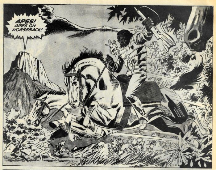
He’s certainly as competent as Franklin J. Schaffner’s unspectacular direction of the source movie. But Schaffner had advantages denied to Tuska. Schaffner had Jerry Goldmith’s appropriate pandemonium of parping brass and screeching strings to load even the stillest moments with foreboding, and he had a cast comprising Roddy McDowell, Kim Hunter and Charlton Heston. Poor old George Tuska has none of these things; Hell, he’s even denied anyone who even “looks like Charlton Heston”. He does a decent job; even though I kind of tense at the meagreness of his line and the inertia soaking everything so that even the rough and tumble in the reeds which ends the issue struggles to excite. But it’s doubtful if excitement was even on their agenda. What Tuska and Moench have done here isn’t so much an adaptation as a documentation of PotA-M. Moench & Tuska are obviously attempting to replicate the movie as rigorously as possible on the printed page. Of all the comic options this is the most literal and least interesting approach. But, again, I wrote that in 2015 and this comic was made circa 1974 when the idea that the mass of the UK population might own and view movies in their own home was the stuff of unhinged fantasy. (The exception was a minority of film buffs and onanistically inclined gentlemen for whom select movies were available for home projection; but it was hardly a widespread practice. The projection of movies in private domiciles that is; onanism is ever at hand.) The ephemerality of the movie viewing experience at the time meant that a comic such as this would act as a substitute to a repeat viewing. Once a movie’s theatrical run ended usually the next time you’d see it would be five years later on Television. So there are certainly reasons for Tuska and Moench’s, to modern eyes at least, tiresomely literal script. Yet, what was once a boon has become a burden thanks to that unstoppable bastard, Time.

 photo PotAHorseB_zpsdf160c16.jpg

Planet of the Apes by George Tuska, Mike Esposito & Doug Moench

Basically, in 2015, I’d rather watch the movie but in 1974 I didn’t have that option, and neither did anyone else. Because I do like the movie, don’t get me wrong. While I may have found Pierre Boulle’s original 1964 novel torpidly unengaging someone liked it enough to get Rod “Twilight Zone” Serling (and Michael Wilson) to punch it up with sensationalised action and on-the-nose allegory to the point where someone as uncouth as I is still quite happy to watch it. Sure, there’s more than the one odd thing about PotA-M, not least Taylor himself. When we first meet Taylor, and Taylor is the first person we meet, he is not only hubristically huffing a cigar in a high pressure oxygen environment but also helpfully setting up the themes and basic gist of the movie about to unfold. He does this via a Hestonically delivered misanthropic soliloquy. Taylor’s basic distaste with the Human Race persists throughout the movie until it is knocked off its perch by his distaste for the simian usurpers. He’s just not a people person, Colonel Taylor, and I don’t think putting him in charge of a space mission speaks highly of NASA’s (or is it ANSA's?) screening processes. And that NASA mission’s a bit odd as well. It looks like someone’s had the bright idea of throwing three men and a woman into space with the intention of setting up a new franchise of Humanity. “She was to be the new Eve”, yeah? Now, when it comes to biology my interest is purely amateurish and recreational, but it strikes me that three men and a lady is a breeding fast-track to kids with more thumbs than fingers. I could be wrong; I’m no science-tist. Or maybe two of the blokes were a couple or something. As it happens the, biologically speaking, weird science doesn’t matter much because quicker than you’d Adam and Eve it Stewart (the female crew member) is both old and dead which, even in the swinging ‘60s, is enough to dampen the crew’s ardour. Gerontophilia, perhaps. Necrophilia maybe. But both together’s a bit rich, or am I just being old-fashioned? Then there’s a long mostly quiet bit full of rocks, wandering about and Taylor winding up his crew before we get to the big shock reveal, which is that they are on a (SPOILER!) planet of apes! Boy, it’s a good job it isn’t called Planet of the Apes or something, he said sarcastically. Mind you, at least they left The Big Twist (they’re all dead!) until the end back then, nowadays even that one’s spoilt by the box cover. All of which spoilery matters a lot less than you’d think because back in 1968 they made movies that were so well made that they could survive as satisfactory viewing experiences even with all the surprises sucked out. Alas I can’t say the same for the comic adaptation which is just OKAY!

 photo PotAEndB_zps747ba829.jpg Planet of the Apes by George Tuska, Mike Esposito & Doug Moench


NEXT TIME: The back-ups are coming! The back-ups are coming! Gil Kane! Jack Kirby! Can poor printing mute talents so large? Sabre-toothed tigers and horse riding lobster men! It’s even better than an offer to groom you for nits - it’s Part 3 of Planet of the COMICS!!!
"Or Is There ANOTHER Way?" COMICS! Sometimes The Carny Winds Up In The Fridge!

Sorry about that interruption in the weekly magic of me but I'm back now! What's that? Photobucket Art by Bernie Wrightson with words by Bruce Jones.

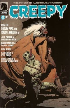
Man, you people are brutal. Talking about a horror comic after the break... CREEPY #8 Art by Colleen Coover, Kelley Jones, Rick Geary, Kyle Baker and Bernie Wrightson Written by Jeff Parker, Doug Moench, Rick Geary, Dan Braun and Bruce Jones Lettered by Colleen Coover, Nate Piekos of Blambot® and Rick Geary Frontispiece by Darick Robertson Cover by Richard Corben Dark Horse, $4.99 (2012)

Photobucket Art by Richard Corben.

Because I like telling you what you already know I'll start by saying this is the revival of CREEPY, a horror anthology that was originally published from 1964 to 1983 by Warren publishing. Dark Horse are currently reprinting those original issues in the form of expensive hardbacks and at least one story in each of the current incarnation’s issues acts as an advert for such. In this issue that story is Jenifer. Ah, Jenifer. But before we get to Jenifer first we must disinter the new contents provided by the creepy crew named and shamed above.

NINETEEN Drawn by Colleen Coover and written by Jeff  Parker

Photobucket

Art by Colleen Coover with words by Jeff Parker.

Jeff Parker and Colleen Coover are both smart and talented artists. Parker having a deceptively simple style and Coover being less than shy about sexuality in her work on X-MEN: FIRST CLASS, sorry, her work for Eros. It’s hardly a twist ending then that the story they produce is a short, smart shocker which updates a psychosexual myth while also neatly exploiting the links between sex and guilt. It isn't remotely scary but it is cerebrally unsettling and rewards reflection. Given the themes and the nature of the mythical concept in question Nineteen is in roughly the same plot of the graveyard as Jenifer but the approach is less lurid and, thus, less striking. Ah, Jenifer. You’ll soon see how striking Jenifer is.

THE LURKING FATE THAT CAME TO LOVECRAFT PART 1 Drawn by Kelley Jones and written by Doug Moench

Photobucket

Art by Kelley Jones with words by Doug Moench.

Here Moench cunningly casts the spade faced master of prolix perversity and possibly racist undertones as his main character and thus, witting or un, provides himself with an opportunity for prose of the most Tyrian hues. An opportunity he doesn't so much seize as throttle until its eyes bug out and its bowels void. Which, as I say, is pretty fitting. Anyway, the man notable for lacking in the craft of love, so I hear, himself is finding his mind falling apart at an appalling rate as reality seems to be confusing itself with his own fictions. If you enjoyed Carpenter’s In The Mouth Of Madness as much as I did (Did you? Really? Really.) you’ll enjoy the premise here. Moench’s long time collaborator Kelley Jones is just the right fit for this stuff as well, with his contortions of physique, viewpoint and architecture. Since we don’t have “gibbous” as a rating I’ll call this one GOOD! If I were to say that Jones’ art contains a lot of Wrightson then that wouldn't be a criticism, not considering the work Wrightson does on Jenifer. Ah, Jenifer. But we have yet to meet Jenifer.

THE MAUSOLEUM Drawn and written by Rick Geary

Photobucket

Art and words by Rick Geary.

By way of a continuing series of original graphic novels (A Treasury of Victorian Murder..., A Treasury of XXth century Murder…) Mr. Rick Geary has documented some of the lesser and greater known incidences of horror human beings have visited upon each other. Murders, I’m on about murders. Along the way he has developed a style which is seemingly non judgemental but through the implacable accumulation of facts becomes unmistakable in its moral disgust. Also, no one works straight lines harder than Rick Geary. Seriously, he’s murder on them. Sigh. Anyway all of the remarkable craft he applies to historical atrocity is here applied to a bitterly sweet tale of life and death and love and loss. It’s Rick Geary so it’s GOOD! Wait, can you hear her tread upon the step, her shadow through the glass; she's almost here. Jenifer approaches.


LOATHSOME LORE Art by Kyle Baker and written by Dan Braun

Kyle Baker draws over some photographs to good effect here, showing that drawing over photographs isn't intrinsically evil after all. As to the contents, if Dan Braun seriously expects me to believe Siouxsie And The Banshees ever horrified anyone except people allergic to large quantities of cosmetics on a confined face, he’s going to have to personally introduce me to them. This was CRAP! And now a rap-rap-rappin' at the door and we throw it wide to reveal...


JENIFER Drawn by Bernie Wrightson and written by Bruce Jones

Photobucket

Art by Bernie Wrightson with words by Bruce Jones.

Jenifer is written by Bruce Jo…wait, come back! I know, I know, Bruce Jones did the unforgivable; Bruce Jones wrote some bad super hero comics. Actually judging by the output of today’s superstars Bruce Jones’ real mistake was to write some bad super hero comics without first inveigling himself into the brain matter of fandom like some wayward tape worm. Before that though, before Bruce Jones (<choke!>, <gasp!>) wrote some bad super hero comics, Bruce Jones wrote some really, really good horror comics. Of which Jenifer is but one.

Photobucket Art by Bernie Wrightson with words by Bruce Jones.

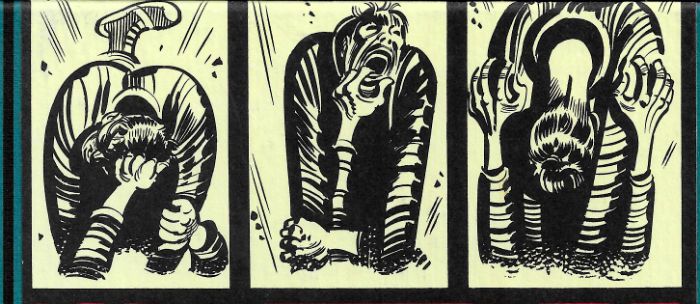
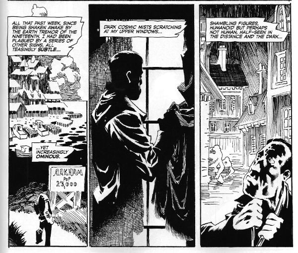
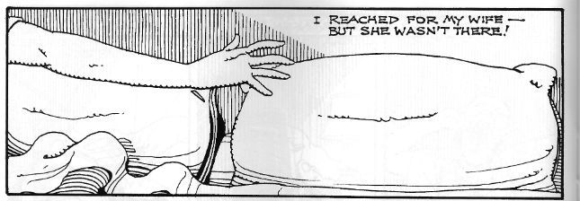
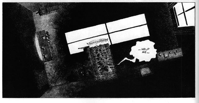
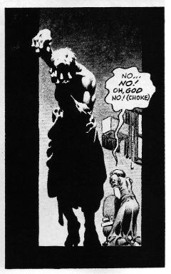
The big thing about Jenifer is that it is horrible. Bruce Jones doesn't shy away here he just goes for it. Bruce Jones goes there. Bruce Jones goes to that place where you start to doubt the sanity, or at least the decency and good taste of the author. And if decency and good taste have much to do with horror they don’t have to anything to do with this kind of horror. This horror is both visceral and cerebral. Oh, there’s gore galore here alright, but it’s the thoughts that count. Sometimes horror needs context and without that context you won’t understand why the next image is the one that sticks, why this simple panel is the one that tunnels in and nests:

Photobucket

Art by Bernie Wrightson with words by Bruce Jones.

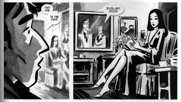
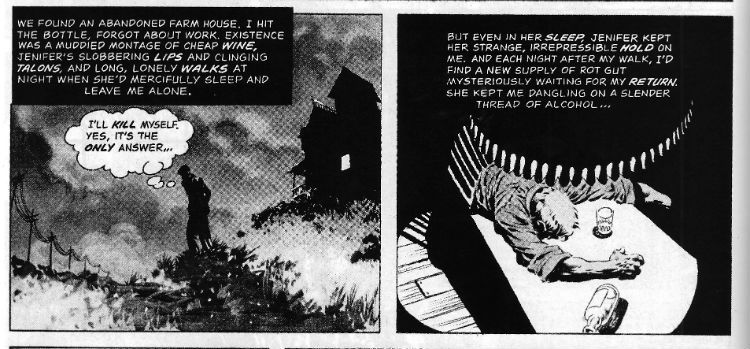
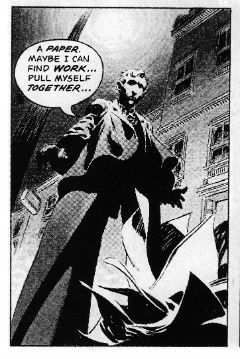
Of course Jones isn't working alone here, he’s got an accomplice, better yet he’s got Bernie Wrightson. Wrightson’s art is essential to Jenifer’s success. All the things you think of when you think of Wrightson's overwrought art are here. So much so that it should be overwhelming. The figures are gnarled, tortured, hunched, looming doomed things inhabiting rooms lit like noir’s paying the bills and existing in a world of forced perspective and perplexing forces. It’s too rich, too much and it is overwhelming, it’s supposed to be overwhelming. Jones’ nervily helpless narration and Wrightson’s muddily grey washed series of tableaux (separated by the almost subliminal white flare of the gutters, the flare of a flash as he records photos of Hell and presses them into your eyes) punch a series of moments which roil with a lunatic heat right into your brain. Where they will probably remain until your body cools and sets with rigour. Oh yes, Jenifer is a very bad girl but Jenifer is VERY GOOD!

Overall this issue of CREEPY was VERY GOOD! This isn't always the case, previous issues have been somewhat, ahem, variable in quality. This one's worth picking up for Jenifer alone but the quality of the other stories should ensure you get your blood money's worth. Oh, and it's by no means a slight on the modern contents than Jenifer ranks highest, that's because when it comes to horror Jenifer is pretty rank stuff indeed. Heh. Heh. Heh. Enjoy, kiddies.

Until next week then, don't have nightmares; read about them in COMICS!!!