"Oh, Come ON." Comics! Sometimes They Are Set in 1959!
/Yeah, sorry about this. What can I say? I will take your patience and shatter it like the dry bones of your childhood dreams!
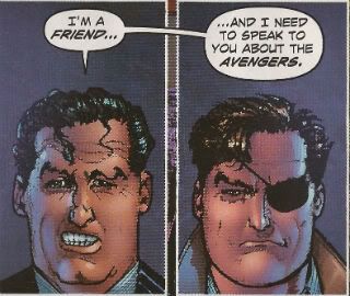
Next Time: A Howard Victor Chaykin free zone. Promise! My Other Half said, "There's no pony like a one-trick pony." That certainly set my mind at ease. Ah, well...
AVENGERS 1959 #1 By Howard Victor Chaykin (w/a), Jesus Arbutov (c) and Jared K. Fletcher (l) (Marvel Comics, $2.99)
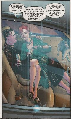
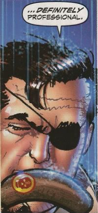
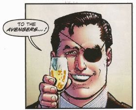
Spinning off and out of that NEW AVENGERS arc where in the present the Avengers took 6 issues to ring an ambulance while in the past Howard Victor Chaykin earned that month’s alimony payments comes this 5 issue series! Nick Fury and his rag tag ensemble of D-Listers (Bloodstone, Kraven, Namora, Sabre Tooth, Silver Sable and Dominic Fortune) celebrate the successful end of their mission with a swanky meal before disbanding. Immediately a new threat targets our heroic band, well, those members Howard Victor Chaykin is interested in writing about (Silver Sable and Bloodstone are dispatched from the narrative as soon as possible) and The Blonde Phantom is introduced in order to fulfil Howard Victor Chaykin’s stringent lingerie quota.
Consequently the issue has a rock solid structure consisting of an introduction of the team and then a succession of scenes in which each member evades an attempt upon their life by the mysterious new foe. A mysterious new foe that could well be an embryonic Hydra. It’s efficiently delivered tongue-in-cheek stuff that entertains and retains momentum despite the fundamentally episodic composition. Howard Victor Chaykin isn't breaking any new ground here but what he is doing is bringing his considerable talents to bear with the aim of providing a nice slice of pulp pie. And in that he succeeds.
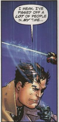
"Ooooh! Meta!"
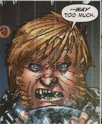
AVENGERS 1959 #1 is probably a pretty good point to examine The State of The Chaykin in the year of 2011. The current mode of Chaykin criticism is to bemoan the downward trajectory of his work while also bleating about how he draws “fat faces”. This latter criticism first appeared with his work illustrating Marc Guggenheim’s 2006 BLADE series. This prompted me to make the hilarious joke that Guggenheim had told Chaykin that Blade was “phat”. Since I am a repellent human being no one else was in the room and the joke fell to the floor and expired for want of appreciation. But I have held it in reserve for 5 years knowing that its time would come. Like a quality butcher I waste not; I use everything but the scream. So Howard Victor Chaykin? Degenerate degenerating or innovator innovating? Let’s warm up the thermometer, get AVENGERS 1959 #1 to drop its strides and see what Doctor John can diagnose.
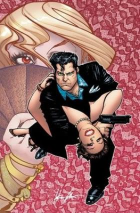
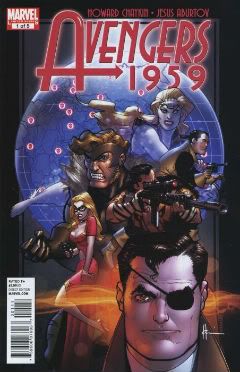
The cover to AVENGERS 1959 #1 is great. Real swell stuff but that’s no big shocker. If there’s one thing Howard Victor Chaykin excels at its, allegedly, lady baiting if there are two then we’d have to admit to page design; cover design in particular. Now as rabid and immune to sense a fan as I am I have never had the financial wherewithal merely to buy a comic because it had a Howard Victor Chaykin cover. Actually on one occasion I did. The 2009 Vertigo series BANG TANGO. Look at this:
Howard Victor Chaykin’s covers were some hip shit, pals o’mine. Alas, the series itself was like wading through hip deep shit. (No offense to all the talented individuals involved.) So I learned my lesson. And the lesson I learned was that Howard Victor Chaykin does covers like a cover artist should. Google image AMERICAN FLAGG! And tell me that those covers aren't like comic cover Heaven. Working in the field of advertising and paperback cover design sure didn't do him no harm. Just ask the Louisiana State University. So yeah, Howard Victor Chaykin knows how to do covers and with AVENGERS 1959 #1 he belts out another winner:
There’s nothing amiss with the storytelling on these pages either. The Howard Victor Chaykin Method is here in full effect. I guess you could call it a formula but then we’d have to argue out the negative connotations before I’d smile at you again. Life’s too short to sweat the small stuff so let’s call it The Howard Victor Chaykin Method and say it can be summarised thusly: long panels for scene setting and context, vertical panels for action within said scene and inset panels for reaction shots and moments of notable action. It varies a bit but that’s pretty much what we have here and it works just fine. It’s not experimental or visionary just solid and effective borne of decades of being experimental and visionary. It’s unobtrusive but it works and that’s pretty much what AVENGERS 1959 #1 demands.
And the stuff in the panels, well, I guess we’ll call that draughtsmanship and that’s pretty…variable. This is kind of where the shakiness starts to set in. Now, as you all remember from previous soliloquies Howard Victor Chaykin doesn't give his draughtsmanship much props. Together with his frequent claim that it’s the design aspects that make his brow feverish rather than the finishing I think we can start to see where the problem may lie. Now, Howard Victor Chaykin’s work is, I understand, the result of his own mighty self and assistant(s). This is super peachy in terms of fulfilling his page quotas as the primary benefit is one of speed. In fact it’s a peachy arrangement all round depending on, well, the assistants. If long before the finished article Howard Victor Chaykin’s sloped off down the bingo to charm a blue rinse then a lot of weight rests on the poor assistant. I don’t know who Howard Victor Chaykin’s assistants currently are but they aren't of the calibre of, say, Don Cameron or Rick Burchett. They aren't terrible and in fact the book does seem to get better as it goes on. There’s a lot less wonkiness by the final page and more precision. Things are looking good on the old assistants front!
"Howard Victor Chaykin: yesterday."
Maybe it isn't the assistants after all maybe it’s the technical methodology involved. When I potter about The Internet sometimes I look at original Howard Victor Chaykin art (and pictures of those wrinkly dogs) and I can say that as recently as the 2009 DOMINIC FORTUNE series the original art looks a whole heap better than the printed version. Come to that his art as whole seemed a far tighter and attractive affair right up until the bulk of his output started flooding out of Marvel. His work on CITY OF TOMORROW, CHALLENGERS OF THE UNKNOWN and, yes, even the much vilified HAWKGIRL had a level of precision and sureness that seems lacking in much of his Marvel stuff.
Judging from my on-line scourings Howard Victor Chaykin has also taken to drawing figures in isolation and then placing them on backgrounds via 21st Century technology. He’s not alone in this but to me, being old, it brings to mind those Letrasets from by gone days. You’d get a background sheet and a sheet of characters and objects. The latter would be applied to the former by firm application of pencil rubbing. I liked the KOJAK one best. Who knew the future of comic book art would take its direction from things given away in ‘7os packets of cereal! It’s a perfectly fine method but the results do tend to suggest that maybe all these artists should watch that scene where Father Ted explains to Father Dougal the difference between “far away” and “small”. Maybe it’s the increased output, maybe it’s the assistants or maybe, maybe it’s the colouring.
Now I tend not to notice the colouring on comics too much but, by Tatjana Wood’s eyes!, I notice the colouring in recent Howard Victor Chaykin’s comics. Regrettably this is largely not because of its excellence. There were times when reading RAWHIDE KID: SENSATIONAL SEVEN when I didn't even know what I was looking at. It was like being a character at the end of a H.P. Lovecraft story. My mind could simply not process that which it perceived. Now it’s a Howard Victor Chaykin Fact that he’s colour blind but that’s no reason to take advantage! There seems to have been a real effort in the Marvel stuff, particularly on the part of Edgar Delgado, to colour Howard Victor Chaykin’s work in the manner of animation cels. That’s okay, that’s an approach but it’s an approach that only works, I think, when the art is built to accommodate that. I don’t think Howard Victor Chaykin’s art is built that way. Thankfully for my ocular orbs Jesus Arbutov, the colourist here, seems to agree and I’d have to say the colouring in AVENGERS 1959 #1 is, yeah, its okay. It’s obviously done with computers and science so it has that weird unnatural vibrancy that makes each page look like it’s been lacquered like lacquers’ going out of fashion. Crucially though it doesn't make me re-enact Rod Steiger’s stand out scene of restrained (cough!) horror in THE AMITYVILLE HORROR (1979). Small mercies, eh.
"Testify!"
Of course Howard Victor Chaykin wrote as well as drew AVENGERS 1959 #1 and it's pretty much boiler plate Howard Victor Chaykin writing. The patter has fizz and spark, the exposition is delivered economically and painlessly and the whole thing has a patina of self deprecating humour that makes it a jolly appealing read. When the comics scene was blessed by the return of Howard Victor Chaykin following his adventures in the financially lucrative field of Television it turned out he'd added writing tool to his arsenal; the omniscient narrator. I like this innovation in his work as it lends extra value to each enterprise and also because I like words. Ideally I like to "hear" the narration in my head as the voice of a 61 year old mensch whose tonsils have been gargling musk. The kind of guy who declares loudly "I'm a sexagenarian, but, hey, who was in doubt? Am I right ladies!" before firing his finger like a pistol at every female in the room. I also like this narrative technique because it displays a confidence in language and provides evidence of research that is sorely lacking in other writer's work. It also allows for neat touches like the realisation that the opening narration isn't about the characters we see on the page but rather about the situation that is developing independently of them as they sit toasting and bantering; a situation that will soon enfold each of them and so propel the plot. Words are useful tools for writers, even in a primarily visual medium, and it's laudable that Howard Victor Chaykin remains not only aware of this fact but fully able to press it to his advantage.
"That's the word!"
So, wait what was the question again? Degenerate degenerating or innovator innovating? On the whole, taking everything into account, with all the facts in hand, after due consideration I'd have to say; degenerate innovating! (Legal note: Howard Victor Chaykin is not a degenerate. It's a joke.) It's not as smooth as previous Howard Victor Chaykin stuff, no. But the bumps seem to tend from attempts to embrace new methods and technologies and the fact that these experiments rest upon a solid foundation of tried and true achievements means that AVENGERS 1959 #1 is an example of a comics master embracing modern technology with variable results. On the whole the results are VERY GOOD!
"Well, Avengers 1959, yes. Now, that other AVENGERS stuff..."
