"...Workers Killing Each Other In The Name Of Some Plutocrat's Lies." COMICS! Sometimes They Come Back!
/My Internet is back up! Got no time for smalltalk. Who knows how long this window of technical opportunity will stay open? So, hello, my name's John and I wrote too many words about two comics and I hope you have fun. A boy can hope, right? So, let the merrymaking commence!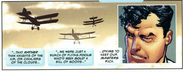
Anyway, this...
Here are two comics predicated on the fact that in the future things will be worse. It’s a pretty reasonable assumption since in the future there will still be people. And we all know what they are like, right? Jackasses. Except for you, you dreamy fool. And except for that one person who can make a difference, obviously. Thank God up in the big blue sky for that person! Is it you? It could be you (it won’t be you)! Both of these books also concern themselves with this special person. Anyway, I though the books’ premises had enough in common and their implementation had enough differences to justify another bunch of sense repelling words from yours truly, John The Ripper. And so without any further ado let’s get our papery candidates drunk and see who boils John’s eggs properly!
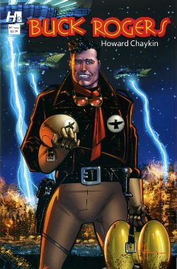 BUCK ROGERS #1
Art and Story by Howard Victor Chaykin
Colours by Jesus Arbuto
Letters by (Ken Bruzenak?)
$3.99, Hermes Press (2013)
Buck Rogers created by Philip Francis Nowlan
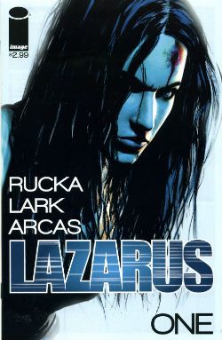 LAZARUS #1
Written by Greg Rucka
Art and Letters by Michael Lark
Colour by Santi Arcas
Cover art and colour by Michael Lark
$2.99, Image Comics (2013)
Lazarus created by Greg Rucka & Michael Lark
Hell, I’m feeling saucy so let’s give this shameful shit a basic veneer of professionalism and crack out some titles:
Judging Without Reading or First Impressions and the Unreliability Thereof
One of these books, LAZARUS, is a creator owned comic from a creator owned friendly publisher. The accepted wisdom would be that by rights this should be the one fizzing with invention, reckless with innovation and altogether so comicstastic that it would be the nearest you could get to a good time without emitting liquids while pulling a stupid face. The other one, BUCK ROGERS, is work for hire intended to raise the profile of a 9000 year old Intellectual Property in a clear attempt to shift some of the meat’n’taters reprints of newspaper strips (or continuities if you are a TCJ reader) the publisher is primarily noted for. Some folk get all florid faced, spittle flecked and bug eyed when an old property is dusted off because new things should be created, always! Insipidly, I reckon it depends on whether the actual comic is any good though. So here comes Buck Rogers (yet) again! But in 20 years will anyone be bringing LAZARUS back from the dead? DO YOU SEE WHAT I DID THERE! NO…DO YOU SEE WHAT THEY DID!!!
LAZARUS is new and the new is good! BUCK ROGERS is old and the old is bad!
BUCK ROGERS: 0 LAZARUS: 1
Titles Or The Naming Of The Animals (and some puerile humour)
LAZARUS is called LAZARUS which is an immediately recognisable Biblical reference to anyone brought up in the Judaeo-Christian tradition, or anyone familiar with said tradition. Or just familiar with pop culture. This is actually quite a lot of people, particularly in America which is the book’s primary marketplace. The first scene involves the heroine coming back from the dead just like…my penis on a Saturday night! Oh, okay just like…LAZARUS! Although titling the book MY PENIS ON A SATURDAY NIGHT would certainly get tongues wagging. I used to be quite good on The Bible but that was a long time ago, so other than the fact that every word on its pages is super-true I’m a bit hazy. However, I don’t think Lazarus rose from the dead and proceeded to heal the world with violence. Unlike…my penis on a Saturday night! I know, don’t milk it. Like…my penis on a Saturday night! I can do this all night, you know. Like…my penis on a Saturday night! Anyway, as titles go it is pretty bad. Pretty Television. It is dismaying in its obviousness and empty in its promises of depth. Just like…all together now!
The Hermes Press comic BUCK ROGERS is called that because it is about a man called Buck Rogers. Truth in advertising there. It is written and drawn by the divinity made flesh Howard Victor Chaykin. (Bias ahoy!) Since his last book was filthier and funnier than my penis on a Saturday night (This? This is what pride feels like.) I half expected a Flesh Gordon approach but since he hasn’t called it FUCK RODGERS it looks like he’s keeping his pants on and his hands to himself this time. I feel compelled to note the lack of …IN THE 25TH CENTURY. This means that Hermes Press aren’t wishing to trade on nostalgia for the cheerfully shit TV Series which I enjoyed when a child; the one with Gil Gerard and Twiki. Anyway, Hermes Press (or HVC) have gone back to the source for this one; buck to basics! (You liked that.)
Title wise then BUCK ROGERS wins despite the fact it is a dully literal title because it is at least honest while LAZARUS goes for a veneer of sophistication about as convincing as a politician’s choice of favourite authors.
BUCK ROGERS: 1 LAZARUS: 0
INTERVAL: It’s Ladies Night! A Brief Digression Guaranteed To Backfire Right In My Face Like Nobody’s Business, So Thank God I’m Drunk.
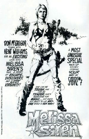 Ladies! Why won’t you read comics, ladies! It’s okay, ladies! Because we here at The Comics have the answer! The answer to the question which is always phrased to imply that ladies will read comics but only if they are for ladies! Comics by Lentheric! This question about why ladies don’t read comics is Trojan horseshit. Ladies do read comics they just have better things to do than go on the Internet and get upset about Marvel or DC. That doesn’t mean ladies don’t read comics it means ladies have priorities. Anyway, so much concern about ladies and comics lately, so much, so very much. But as John Vernon said, don’t piss down my back and tell me it’s raining, Senator; all this concern about ladies and comics is really about how can they get ladies to like formularised pap and give them their money just like they did with the daft men folk? Nobody gives a shit about ladies reading comics except the people who make comics, and they don’t give a shit about ladies reading comics but they sure give a shit about those ladies’ money. Spending power as spur to equality! Well done, comics! Capitalism hasn’t been around long you’ll soon catch up! There’s clearly a popular conception that ladies will only read comics with ladies in them. But only comic book ladies who are violent because violence is strength! Also, violence means the men will read them too. And ladies, your time is nigh! Coming soon from Image is a new series about a lady spy. She’s a Spy! But she’s a Lady! She’s soft! But she’s strong! She’s…Silky! From Image! Also, a retelling of Homer’s Odyssey but in the future and…with a lady! When she went on an odyssey it was an…Ody-SHE! From Image! The home of comics for women written by men who can’t master a safety razor! I can see their logic here about ladies only reading about ladies and it is sound. Personally I only read comics about embittered old men who can only build themselves up by dragging other, better people down. And POPEYE; I like those Sagendorf Popeye comics. As boring as it is I fear that the answer to the question of Ladies and Comics is: just make good comics. Maybe ladies will read those. Maybe they already are.
Lead Character or Lead(en) Character
Of course, ladies and comics? I don’t write comics (which, really, I am all eaten up inside about) and I’m not a lady (but I have brushed up against a few in crowds, purely for research) so I know bupkis. I don’t even know what bupkis is. Is it when you burp while kissing? Greg Rucka isn’t a lady but he writes comics for a living and so he knows what to do. What Greg Rucka usually does is give us a troubled woman in a sweaty vest kicking nasty men in the face in a series of mundane locations. When tasked with reimagining Steve Ditko’s ideologically charged and visually iconic character The Question Greg Rucka gave us a troubled woman in a sweaty vest kicking nasty men in a pay-n-stay car park…but wearing a hat! In a bold move Rucka here gives us a troubled woman in a sweaty vest kicking nasty men in the face in a series of mundane locations…but in the future! Form an orderly queue, ladies! She is a strong female character in the thuddingly literal sense that she is physically strong. She is also called Forever Whatsit like a bathroom suite in a catalogue. This leads to some inadvertently cringey dialogue when people say things like “We were attacked, Forever.” and “I was in the toilet, Forever.” Any such amusement occurring is probably inadvertent because humour isn’t high on the agenda for LAZARUS. Naturally Forever Amber is pretty. Despite being a killing machine she remains unmarred by scars, her nose is unbroken and her teeth unsoiled by tea or coffee stains. Although she is a killing machine she feels sad about all this killing; it is important that she feels sad about killing all these plebs because otherwise she would be a mass murdering monster with nice hair. Forever Amber is vulnerable though. Forever Amber’s vulnerability (despite her being a killing machine) is stressed by her being surrounded by people who are using her, lying to her and just downright being a bunch of two faced meanies. Forever Amber also comes across as not a little feckless and more than a bit stupid. I mean these people around her are practically twirling their moustaches and tying her to railroad tracks. She’s no Keatinge and Campbell's GLORY, is what I’m saying there. For all its surface sophistication LAZARUS is oddly unsophisticated in many very basic ways. Subtlety’s not even in this race, it’s Cliché all the way! So much so that I was hoping the ultimate signifier of Monied Evil would appear; the sweater draped over the shoulders with the sleeves fastened over the chest. Not yet but give it time, though.
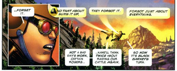
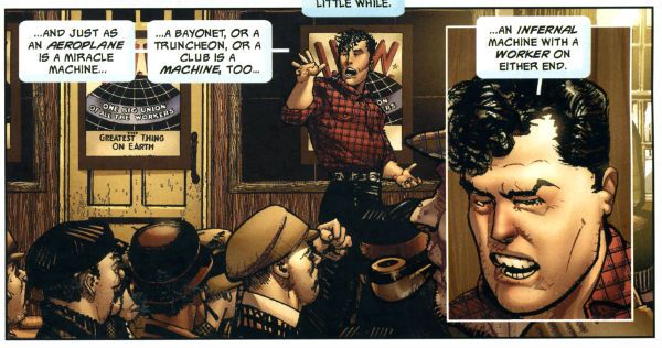
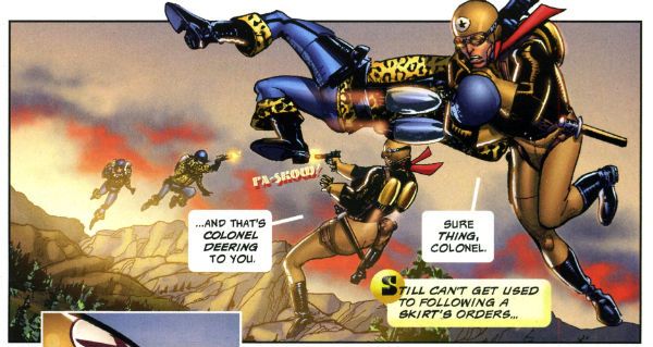
Over in Buck Rogers we find Howard Victor Chaykin’s Wilma Deering outranks Buck Rogers and is busy getting on with her job and sassing him back. Like Forever Amber Wilma kills people but everybody in BUCK ROGERS is killing people. But it's in that sort of pulpy weightless way. Okay, Colonel Deering doesn’t exactly look like a bag of spanners but other than that she’s treated as a capable individual in her own right. It’s hard to find fault in that, really. Mind you, Howard Victor Chaykin’s female characters have always skewed towards the independent, intelligent and individual. If they weren’t also so keen on lingerie more people might have noticed. It’s okay though, he’s only been doing this for forty years. The real star of BUCK ROGERS is, naturally, Buck Rogers whose voluminous and lively quiff sets my mind at rest on at least one score; in the future there will be pomade. Buck Rogers is portrayed as an adult human being who has had a number of experiences before the book opens and is written as being capable of rational thought and informed decision making. He is also purposefully written as a bit irritating. He can however quote Eugene Debs in support of his acceptance of his sexually equal future.
I have now become tired of summarising.
BUCK ROGERS: 1
LAZARUS: 0
Setting The Scene Or Budgetary Restrictions Of The Mind’s Eye
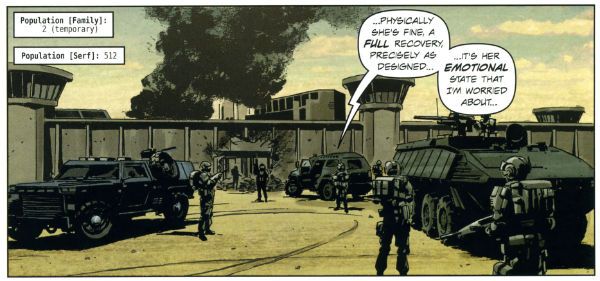
The worlds visualised in these books are quite different. The world of LAZARUS is oddly dull. There’s a tepid quality to the storytelling by Rucka & Lark, a sense that nothing should be too exciting, too challenging. A sense of imposed limitations. I don’t know what they are and they might not even exist outside my mad head, but reading LAZARUS the storytelling felt constricted. There’s a sense that everything on these pages wouldn’t be beyond the reach of a mid-level Television budget. Coincidence, I’m sure. I don’t find Lark’s art to be exactly to my palate, he’s far too parsimonious with ink for my tastes. He can draw well though and he draws everything he’s asked and while nothing really stood out as amazing, nothing stood out as awful. A measured and professional performance from Lark, I guess.
Meanwhile, Greg Rucka’s done his research and Greg Rucka lets us know he’s done his research. The tepid world of LAZARUS is based on fact, okay, it’s based on prediction based on fact. Facts like the statistics Rucka quotes to prove that the gap between the rich and the poor is growing wider despite the fact that no one believes the opposite is ever the case. Except rich people. And in the book there is science, but the science is based on real things that might happen based on real things happening now. Or at least things Warren Ellis told him might happen when Greg Rucka e-mailed him. Apparently Warren Ellis can see the future! Can he see the future where he finished that NewUniversal series? Future cloudy, ask later! Maybe warren Ellis just has a subscription to New Scientist. There’s even some maths to prove the elite control the majority. A great deal of work has been put in to make the world of LAZARUS convincing. It’s admirable really the work Greg Rucka and Michael Lark have put in conceptually and visually delineating the world of LAZARUS. Sadly, they appear to have built a living breathing world and populated it with papier-mâché people. When I was young and shone with fear of the world I used to build dioramas using TAMIYA kits. Mine were a bit shit but other people could work wonders making the hardware and the scenery as realistic as could be. But the figures would always be stiff and there would never be any life in their faces. That's what LAZARUS reminded me of. People in LAZARUS say things like, "She's asking questions.", "AGAIN?" and "We can't have her getting IDEAS." It's very Television dialogue. But wait, run those numbers about the Elite and the oppressed past me again. Hmmmm, I think I see a way out!
And so does Buck Rogers! And it’s the same way out because for all its differences the world of Buck Rogers has the same central problem as the world of LAZARUS: an elite few are mucking the many about. Buck Rogers has figured out that if all the oppressed band together instead of fighting amongst each other, maybe…just maybe! Oh, sorry, no, it's okay, settle down, my American friends, that’s not Socialism, it’s just common sense. Common sense which, and I’m going out on a limb here, it will take Forever Amber many issues (seasons maybe (uch!)) to reach but HVC’s not interested in the long haul (the DVD box set) so Buck’s already figured this out by the time he arrives in the 25th Century. In fact there’s a truly super page of storytelling where, reading down the page via a series of repeated set ups with different specifics to suggest the passage of time, we see Buck’s ideology evolve. Great page of comics. It is also preceded by another great page of comics where HVC’s modern technique of cut’n’paste and vivid texturing gels so well I had to genuflect and concede that when HVC’s modern approach works it really fucking works. Of course not every page works that well but they all work at least well enough for the story’s requirements. Well…okay, he does really chuff up the origin bit. I had no idea what happened there. It’s like some text or some pages were missing or something. Seriously, that whole how Buck got to the future bit was seriously muffed. Otherwise I liked the storytelling and art just fine. Even the fact that a scene seemed to take place in an apartment from BLACK KISS 2 but with different textures was okay; it just made it seem even more like a cheapy pulp serial where you’d recognise bits of scenery from other stuff. A fun side effect that.
BUCK ROGERS: 1 LAZARUS: 0
Colours or Colors(sic)
LAZARUS' world is coloured in a way that further study might prompt me to use the word subtle, but as it is I just read the thing and afterwards I thought: brown. Actually I didn’t think about the colouring much at all. That may be the point. Colouring can be purposefully unobtrusive after all. The palette did appear to be one chosen to suggest seriousness, and also to be easily replicable on a mid-level TV budget. Coincidence, I’m sure.
Jesus Arbuto vividly and vibrantly colours BUCK ROGERS’ world and over it all hang great slabs of sky in unnaturally cheerful hues. These bring to mind nothing less than the vivid and arrestingly swirling skies of Mike Hodges’ majestic Flash Gordon (1980). Here even the colourist is in on the pulp sensibility action and the colourist goes Big and Bold and it is lovely and it is apt.
BUCK ROGERS: 1 LAZARUS: 0
Lettering or The Strange Case of The Invisible Bruise
I didn’t like the lettering in LAZARUS. The text is oddly placed in the balloons in just such a fashion that before I’d read the contents I mentally went NnnnH! Then I’d read the contents and I’d go NnnnH! verbally. Basically, the lettering seems to have been tasked with being as unobtrusive as possible. This is the default setting for genre comics and so no great demerit. But. But it does indicate a disinterest in exploiting the visual possibilities of comics as a medium. Which would make it easier for people to visualise it in another medium. A mid-level budget TV series perhaps. Just a guess.
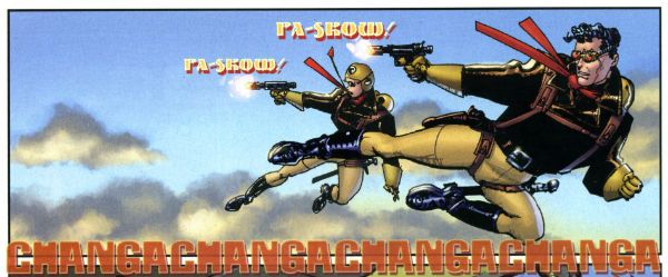
BUCK ROGERS has fun lettering bouncing about all over the shop. The ray guns make silly noises in an overwrought retro font, an explosion FX is shaped and there’s just a real sense that the letterer, like the colourist, is contributing to the whole lurid pulp aesthetic. There’s also a strong suspicion the letterer is Ken “The Bruise” Bruzenak. It’s only a suspicion as I couldn’t find any letterer credit so I don’t know. I hope that this was an oversight that will be corrected by Hermes Press in future. It’s okay bringing back old IPs but we don’t want to bring back the bad habits of not crediting creators with them.
BUCK ROGERS: 1 LAZARUS: 0
Back Matter Or Ingratiation Really Grates
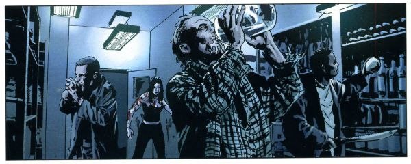
The back matter of LAZARUS is a slick mix of interesting yammering about process and clammy glad handing. Some will find this fascinating and feel privileged to receive such a peek into the world of the creators. For those people I am happy. But I am a bitter man, slow to trust and quick to flinch from unsought intimacy. Basically, I’m British. Look they’ve got a hard row to hoe here because by this point I’ve read the comic and I’m not sure I believe the unchallenging lukewarm TV friendly content of the comic is really such a passion project for the creators. That sounds shitty but it’s actually a compliment to the creators. Shitty compliments; that's me all over. As usual with creator owned comics’ back matter it’s a bit like someone hugging you while clumsily going through your pockets. The worst bit is when Greg Rucka recounts a conversation he had with a financier friend of his. The financier friend tells Greg Rucka that because he was on The Inside he can tell Greg Rucka that during the recent financial crisis we were seconds away from it All Going To Hell. Greg Rucka stresses that this person is intelligent and so implies that this fear mongering talk should be taken as a clear indication that the world of LAZARUS is just another bunch of inadequately regulated arrogant greedy c*nts away. Greg Rucka tends to forget that people talk nonsense, even intelligent people, particularly when talking to writers. Anyway, we can tell things were sixty seconds from shit city because this totally blameless financier dude was on the cusp of buying shotguns and actually stocking up on pork and beans. Christ, reduced to pork and beans! Pork and beans yet, like an animal! My heart went out to him here, it burst from my chest and travelled across the Atlantic to shatter his window whereupon he shot it with a shotgun (“for hunting purposes, Officer”) because he thought it was after his precious pork and beans. What I took away from this bit was comfort knowing that when it all goes down the financiers will be armed. Armed financiers. Great. Maybe LAZARUS would have been a better comic if Greg Rucka had talked to more of the people more directly affected by the crisis. You know, the people who would have been on the other end of his financier pal’s shotguns. He could even have bought them dinner. After all, pork and beans are cheap.
Actually, most annoyingly, the backmatter in LAZARUS comes across mostly as an attempt to kneecap any criticism. Rucka pre-empts queries why he chose a lady lead with, er, because it had to be so. He shows his data to reinforce the possibility of the future he presents and provides his liberal bona fides with Occupy memories and stresses he and Lark have waited ten years to tell this story, and only this story and only in this way could it be told and...such and so forth. All this pre-emptive defensiveness does is convince me of a lack of confidence in the material. Read the comic and ignore the back matter and what do you have? A not very good comic. Factor in the back matter and only an animal wouldn't feel bad about pointing that out. The backmatter almost worked, I admit; I almost spiked this because I felt bad. And also because it is too long, the jokes are weak and posting stuff always makes my nerves sing like cats with stepped on tails. Sure, the intentions are good and the creators are talented but this comic just sits there, failing to engage. I don't like writing negative reviews. I put the humour (if humour it is) in to soften blow but maybe it just sharpens the knife, I don't know. I really don't sit here touching myself at my perceived superiority as I bring my foot down again and again on the newly hatched chick of independent creativity. But it is what it is and LAZARUS isn't very good, to my mind, and no amount of back matter can change that.
Howard Victor Chaykin requires no caveats. Howard Victor Chaykin remains brazen. His back matter blather consists of him outlining his basic approach to the series; he read some old continuities thought about it a bit and kept what worked and updated the rest. Then there’s a quick bit of comics criticism in which he maligns the reprint books advertised a page or so later but makes me hungry for some Russell Keaton Buck Rogers Sundays. Then there’s all the variant covers and a promo poster reproduced in colour and black and white which is just spoiling little old me really. Now I can scan the B&W ones in and play at being Jesus Arbuto (Arbutov? Make your mind up, son.) for a day! Basically beneath all HVC’s usual loveable grumpalumpagus schtick there’s the usual humble air of “I did what I did and I did it as best I could. I hope you like it. Now pound leather, foetus. Did I mention I live by the beach?” It’s quite short words wise and there’s a couple of typos giving it a hurried air as though HVC had somewhere else to be. Maybe he had a dinner appointment? Christ, maybe HVC stayed in and ate pork and beans that evening even though there was no State of Emergency. Pork and beans, like an animal! Or worse, a poor person! I hope he ate with his Colt Python near at hand. For as Jesus said, the poor will always be with us. And apparently they will always be after our pork and beans. Arm yourself, Jesus!
BUCK ROGERS: 1 LAZARUS: Pork and Beans!
The Verdict or Who’s Better, Who’s Better, Who’s Best?
BUCK ROGERS is messy and vivid and altogether lively. It is fast, funny intelligent and far from flawless but it has a genuine sense of pulpy fun shining out of it on every page and so it is GOOD!
LAZARUS is cold and calculating; it affects to address real human concerns but instead it's like someone returned from the dead but with something crucial missing. Something intangible, something like a soul perhaps. That's why LAZARUS is EH!
The Intellectual Properties may be old or they may be new but as long as there are good ones, in the future there will be - COMICS!!!


