 Wednesday Comics is here, and with it comes nostalgia! No, not for the time before we were born when the Sunday Funnies were enormous canvasses for the geniuses of the day to work their magic. Wednesday Comics instead transports us back to those heady years of 2006-7, when DC was putting out a weekly comic that inspired neither hair-pulling dismay nor polite boredom. Yes, the 52 nostalgia train is boarding!
I have always been a sucker for oddly sized comics: even in the midst of trying to pare down my physical collection of comics, I am collecting more huge 1970s Treasury Editions and 1980s Blue Ribbon Digests. This predilection is likely the primary motive for my continued devotion to the McSweeney's publishing empire. So of course I'm all over Wednesday Comics. But should you be?
I'll venture to say yes. Judging from the first issue, not every team is going to knock this concept out of the park. Writing a single weekly page is very different than writing a full issue of a comic, something the contributors to the New York Times Magazine's "Funny Pages" also discovered. Likewise, artists seem to struggle with putting too much or too little onto the larger canvas (as in last year's Kramer's Ergot).
And even the strips which seem to handle these challenges proficiently, like Dave Gibbons and Ryan Sook's Kamandi, did not thrill me on their first go-round. Regardless, it's a swell package and the sort of thing that will age better on your shelf than the fourteenth DARK REIGN tie-in mini-series you might be considering.
Anyway, in honor of Wednesday Comics's VERY GOOD stylistic return to fondly remembered days of yore, my reviews are all tweetable. If you want to know who is doing what, check DC's page, I couldn't fit creative teams into 140 characters.
BATMAN: Twelve Parts, Twelve 'BONG's, Fifteen stories, Fifteen Panels. CLUE CRAZY? Azzarello doesn't seem the mystery type, though.
KAMANDI: Never cared for Prince Valiant illo + text style but it's appropriate here. Sook's art almost too elegant for a Kirby character.
SUPERMAN: Very pretty, goofy Toy Story alien face unexpected. Everyone knows Superman is an alien! Not sure this will hook USA Today crowd.
DEADMAN: I like that they took the time to introduce Deadman, not sure if I like the hardboiled vibe they're going for. RED LANTERN, NO!
GREEN LANTERN: A solemn plea: let no other colors of rings come into play! I like the New Frontier/Space Race setting. Doesn't set up much.
METAMORPHO: Hey Gaiman, you already killed off Element Girl! Awkward cliffhanger feels more like page transition. Wait, Floating Heads? SOLD
TEEN TITANS: Really? This is the venue in which you choose to revamp Trident? You're revamping Trident? Only strip to feel 'in continuity'.
ADAM STRANGE: Adam, don't point out how all aliens look kinda like Terran animals. It's impolite. Not sure I'm feeling the color scheme.
SUPERGIRL: I hope they resist the urge to bring in Comet the Super Horse and all the freaky baggage he represents. Cute setup, cute art.
METAL MEN: Gorgeous art earns this goofy ass story a pass until the team witnesses the second coming of Christ. Cast barely introduced.
WONDER WOMAN: Nice concept, nice art style, terrible typeface and way too much crammed onto the page.
SGT. ROCK AND EASY CO.: Feels like it could've been a standard comic page, but I guess I should trust Joe.
FLASH: Loving the split strip format, the IRIS WEST logo, the halftone dots in the coloring, everything. My early favorite.
CATWOMAN + DEMON: When did Catwoman have time to google J. Blood between spilling tea and heading to dinner? Does she have an iPhone?
HAWKMAN: I had no idea Hawkman could talk to birds. Can he talk to birds? Who cares, IT'S TERRORIST MACIN' TIME AT 30,000 FEET!
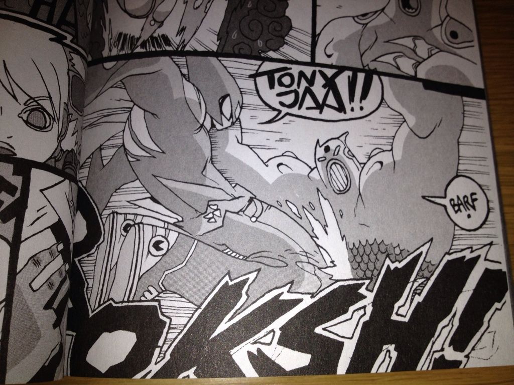 [Image above from the awesome Sharknife: Double Z by Corey Lewis, which we did not discuss in this episode, but believe me it was rad.]