Hell: Marvel didn't need to tell me, on 3/19
/![]() War is Hell: First Flight of the Phantom Eagle #1 (of 5):
War is Hell: First Flight of the Phantom Eagle #1 (of 5):

I thought there was something odd about this book the whole time I was reading it. But it wasn't until I checked the credits box and saw Todd Klein's name that I realized what was going on: There's no sound effects in this thing.
And the reason that feels odd to me is because prolific Howard Chaykin is doing the drawing, which naturally made me wonder how Klein might handle those famous webs and strings and walls of letters that Ken Bruzenak used to do with Chaykin back in the day, the ones various parties have provided since then.
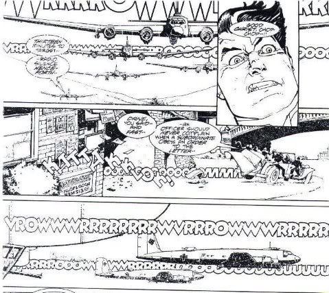
Well, no luck.
There's plenty of possible reasons. This is a realistic, ostensibly hellish war comic from Marvel's MAX line, after all, and cutting out the sound effects has long been a handy comic book shortcut to sophistication. V for Vendetta is the most obvious example of this approach, although there were several works before it that took the same route, including Chaykin's own 1978 original graphic novel Empire, written by Samuel R. Delany and most eager to distance itself from the sequential arts pack.
Actually, Empire is also the earliest comic I can think of that devoted whole pages to horizontal 'wide' panels, so as to amplify the action, a technique that didn't become popular until decades later and is now impossible to escape. Ironically, Chaykin didn't seem all that comfortable with the style; it always struck me as a bit inert, like all of those solid images were kin to the novel and album covers Chaykin was illustrating around that time.
Which does bring me to another possible, maybe even simpler reason for the state of War: Chaykin is changing, for whatever reason. But it's not a sudden thing, when you look at it.
I mean, the Howard Chaykin of today is different from the Howard Chaykin of, say, Blackhawk (just to keep it in the air). Chaykin '88 could be counted on for a lot of specific visual acts; expanding our view from those letters -- which could always be counted on to act as fitting, oft-geometric design elements as per the page as a whole -- there was a certain compression to his pages, a tight-wound cohesion that had a way of holding the eye on the page and dragging it in the appropriate direction.

It didn't hurt that Chaykin was (and is) a wordy writer, which had a more obvious way of slowing things down, but the density of his overall visual scheme gave the reader pause in more ways than one. And sometimes he'd poke at elements of the form for specific effect, or just exploit his command of the form. I don't have pictures, but surely everyone who read Blackhawk remembers the bit with the empty word balloons, or the finale that ratcheted up the tension by dividing things into tiny panels, skipping from face to face to object to face etc., only to release the tension in a splash image?
Don't look for that in here.

But Chaykin began to decompress way before now. I'd say 1993's Midnight Men was the first of his post-American Flagg! works as a writer/artist to seem appreciably 'lighter' in style, although the 1990 graphic novel Wolverine/Nick Fury: The Scorpio Connection (written by Archie Goodwin) is also notable, maybe in suggesting a deliberately stripped-down approaching to working with another person's script, something he hadn't done much since the '80s began.
If anything, the big surprise is that there was little shift in style between 1996's Batman: Dark Allegiances and 2003's Mighty Love, despite Chaykin's lack of comics output in the interim. Following that, his visual works became increasingly airy, and fascinated with symmetrical or repeating page designs, and floating sound effects - lots of those. I think there is a difference still between Chaykin's recent work as a writer/artist and his art-only projects, in that the former exhibit (naturally!) a tighter command of the page. I'm not that interested in Chaykin's writer-only work; his 'writing,' to me, has always been primarily visual, his words read at least partially as their own especially intuitive visual elements.
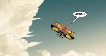
Meanwhile, his increasing art-only works have become delighted with computer textures, hugging his increasingly haggard, grimacing character art; I suspect he works closely with his colorists. The sound effects have been gradually disappearing, as if all the panel-exploding might of one interest is fading against an in-panel fixation on clothing detail and tactile buildup. Moving inward.
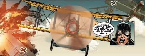
Or hell, maybe the editors or someone shouted WAR COMICS ARE SERIOUS BUSINESS and he left the BLAMs out. I don't know.
Anyhow, this is an OKAY start for a WWI-set aviation thing. Garth Ennis is the writer (in case you were wondering), and, like a good math student, he's intent on showing his work. There's a lot of talking in his account of a worn-down RFC base and the booming Yankee hotshot that fakes his way in and accidentally doesn’t get massacred in the sky (yet) - period terminology and slang flows freely across several broad character types, like the American that tries awfully hard to act and sound British, or the drunkard Captain that stumbles right into a propeller and gets chopped to bits. I guess that's gallows humor?
Ennis does manage a fairly compelling take on the start-and-stop chaos of early air warfare, which covers a bit for the lack of character, as does Chaykin's extra-disheveled character art; the protagonist in particular is no more than a grinning, strutting symbol of American romantic adventurism all but begging to get crushed by reality. This is a mostly serious war comic written by Garth Ennis, so bank on the dark, killing heart of good, bleeding men to make an appearance later on. And expect more pale, silent air from Chaykin, continuing his own flight.


