Abhay: Inquisition - Rumble #1
/Here is the 3rd attempt at answering a series of questions about a comic, this attempt concerning the recent Image debut of Rumble. Part 1 was about The Valiant #1, and Part 2 was about Bitch Planet #1.
10 Questions about RUMBLE #1 by John Arcudi, James Harren, Dave Stewart, Chris and Eliopoulos.
A basic description of this comic, so that everyone's on the same page.
Rumble is a comic by a creative team that had gotten some notice years back, at least in action comics circles, for their work together on Mike Mignola's BPRD series. Their BPRD issues had noticably visceral fight scenes, which had garnered a very enthusiastic reaction upon their publication (at least online). This is the Image debut of their new series.
It is about ... some guy ... with a sword, I guess... or something...?
That's as good a description as I can do.
Co-author John Arcudi, talking to Multiversity:
"Rumble is a concept I’ve been working with for years. It’s gone through a few different iterations, but it wasn’t until James and I talked about it that it felt like it would really work as this larger, more complex storyline that had “legs.” Part of that, of course, was having lots of time to think about it, getting older, getting better, but having the right artist — well, you can’t do it without that."
QUESTION 1.
Is this comic about anything besides its plot?
Noooooooooooooooo.
It's barely even about it's plot.
QUESTION 2.
Did the creative team make any interesting choices in the visual presentation of the story?
Even though the authors had built a reputation for fight scenes, there's only about two-to-three pages of fighting featured in this comic. The visual focus of this issue lies instead more in the world-building, in setting up the book's City setting.
"Three-legged Dog" is my favorite cut on the new Tim Allen album. He's really got us Men pegged.
The streets are littered. Characters stand at pay phones next to rats and trash. Everything is run-down. Three-legged dogs run wild, urinating on a parking meter. Televisions buzz late-show monster movies in the distant background. One of the best panels in the book features a hulking, shirtless figure with a "Does this tattoo make me look tough" tattoo across his chest, sleeping with a bag of "Bunyans" potato chips at his side; behind him, a stuffed moose head; nuncucks, hanging on his wall. The more impressionistic backgrounds are often hazy, abstract, not just conveying a city but a specific city, a polluted one, a dirty one, neon-drenched and filthy.
The authors at least seems intent on constantly finding ways to invest his world with a sort of humorous detail or life, though unfortunately an instinct that they abandoned when it came time to the create the actual story. The book's sense of visual humor is exceeding common for comics, a "look at how grody all this is!" type humor, but without it, this comic would have been completely grueling.
I like that bucket over on the left, but that booth does not look so comfortable.
Another smaller technique perhaps worth noting is how the artists sometimes use negative space. An early panel uses negative space to establish the industrial texture of a bar ceiling. Another early panel uses negative space to suggest sparks coming off a sword being drug along a road.
Really glad there are word balloons of unintelligible gibberish needlessly covering up that pesky comic art. Capital choice. A+. (I'm referring here to every word balloon in this comic).
The authors are also fond of adding a sort of minuscule amount of textural detail digitally, though to what effect is unclear. As an example, the smoke rising from the streets in third panel of page 3 has a texture on it that you really have to press your face against the page to grok the detail of. There’s something similar going on with the detailing of brick walls throughout the comic, a sort of ink splatter effect, but rendered ultra-finely.
QUESTION 3.
How is the comic structured?
The first issue has no discernible structure whatsoever.
The first page is a page of someone walking towards a mountain. The word balloon "humph" is spoken by an indiscernible figure who is never identified in this comic. All of the panels are "widescreen" because of course they are. No other scene in this comic takes place on a mountain.
Where this is happening or what this means is never identified in this comic.
This is followed by a page of a Paul Bunyan statue lying broken on the ground in a decrepit amusement park (symbolism!). This page has narration in caption boxes, spoken from an unidentified source. This is unlike every single other page of this comic, none of which feature narration. No other scene in this comic takes place at this amusement park.
Where this is happening or what this means is never identified in this comic.
This is followed by a three page sequence set at a bar, that establishes that the main character of this comic is a weakboy that girls don't like.
The two characters from that bar sequence are then embroigled in a four-page action sequence, upon being attacked out-of-nowhere by a "mysterious" figure.
Why the four-page action sequence is happening is never explained in this comic.
There are then two pages about an old woman and a cat. Something sure seems funky about that cat. (Confusing storytelling here involving a window).
Where this is happening or what this means is never identified in this comic.
There are then three pages of the weakboy character and two police characters reflecting on the action scene we'd seen previously.
The plot does not advance significantly and almost no new information is presented to the reader.
There are then two pages about something or another happening to two random hicks in a swamp, one of those generic "oh no, bad things are happening to men while they fish" scenes that you see in movies, provided you primarily watch terrible, badly-written movies.
Where this is happening or what this means is never identified in this comic.
A six page scene of the weakboy main character being threatened by two monsters then follows. (It begins with a generic scene of the main character calling someone from a payphone, but leaving an answering machine message since the person they're calling is sleeping through the message. This technology was outdated sometime around when Seinfeld stopped being broadcast, so I guess the comic is a period piece...?)
Want to guess what the last page is?
If you guessed that the last page is a splash page cliffhanger of a superhero character muttering some bland sentence, and that this is somehow meant to entice readers to come back for more next month... Well, don't get that impressed with yourself. That's how all bad comics end their first issues now. It's really not that impressive you'd be able to guess that. You learned how to rip off lukewarm Mark Millar comics the same as everybody else.
8 "scenes": 1-1-3-4-2-3-2-6.
First issues are monsters. There are so many challenges. How do you sell readers on what your comic's about? Have you given readers a way of selling their friends on the comic, some easy hook that won't just hook readers for one issue but that they can tell their friends and hook them, too? Have you set up both an immediate story but also enough material for a long-running series? With Rumble #1, we see a creative team deciding to ignore addressing any of the challenges of a first issue, and instead do nothing more than try to establish a "mood".
Perhaps this team's audience is used to consuming their work on a trade-paperback basis, and that negates the importance of any single issue. But as a single issue experience... Well, it's only ever going to be a single issue experience for me, as this comic wasted my time, completely, and I won't allow that to happen again.
QUESTION 4.
Is there anything noteworthy about the cover, logo, lettering, or design?
The copy I purchased has a James Harren cover, but according to the inside cover, there is a variant cover available from Jamie McKelvie. Which... really? Jamie McKelvie draws fine, some of his comics look entirely decent to me, no offense to the guy, but this seems like a very, very odd comic for a reader to crave having a Jamie McKelvie cover.
"It's a fight comic about a giant monster-man with a massive sword, and some swamp hicks."
"I know just the man for that job... Jamie McKelvie."
...? That's an interesting choice.
There's a bit where Chris Eliopoulos takes a character yelling for help, and rather than put the word in a word balloon, he sets out HELP in block letters, and has a word balloons coil out from the H block. If I've seen that move done before, it's nothing I've ever stopped and made specific note of.
Eight pages of house ads for Image comics. Comic ads, I don't really get how anyone expects those to work. It's always a splash image and some dopey tagline, like a bad movie poster. But who goes to see movies based on a poster? Reyn: "Myth, Sorcery and an Unlikely Pair on a Quest to Discover their Destinies." Oh good I love unlikely pairs e.g. my balls. Graveyard Shift: "Crime-solving sucks." I'm sure this is unfair to say, I'm sure it's a fun comic, but I don't know if I'd recommend putting the word "sucks" on the ad for your comic...? That's something I should be putting on the ads for your comic, using MS Paint, not you. The Dying and the Dead: "This January, Image Comics proudly presents the last story of the Greatest Generation." Oh good they're proud about this one, they just didn't pull this one out of a toilet like those other comics. I don't know. Why don't these ads ever say what the comic is about...? I can't really guess how much bang anybody really got out of these eight pages. But I just don't understand advertising or selling things, either.
QUESTION 5.
Is anything about this comic interesting politically, socially, or from some other frame of reference?
Well, it's another comic about a weakboy who learns that his world blah blah blah.
I really hate weakboys in comics.
What percentage of comics do you figure are about weakboys? 105? 108? I'd put the percentage at somewhere between 105 and 119% of comics are about weakboys.
Movies? Last year, there were movies about a single dad under a mountain of debt whose struggles to raise his rambunctious daughter are complicated by finding Optimus Prime, a monkey king who wants peace but has to fend off his more hawkish monkey-advisors, a single dad forced to give up raising his kids in order to fly to other planets and listen to Anne Hathaway babble about love incoherently, a widowed Keanu Reeves shooting people in the fucking face, two guys disappointed by adulthood who pretend to be cops, etc., etc., etc. Even without thinking of serious dramas, there was a range of character types, character motivations.
Comics, though? I know I'm exaggerating, but some days it just really feels like a nonstop parade of weakboys. "I don't understand why girls don't like me even though my only personality trait is complaining that girls don't like me. Oh look now I have superpowers / a big sword / a friend who's an alien robot / blah blah blah. Now I'm totally on the road to Getting Crazy Laid. AMERICA!" I just wrote ALL OF THE COMICS-- weeee!
I'm just so fucking exhausted of that character-type. Shonen manga, adolescent American comics, it's all just weakboy after weakboy. It just seems unhealthy, for people to consume that kind of mythology over and over.
There's less male self-pity on fucking Reddit.
QUESTION 6.
Riddle Me This: A man goes into a restaurant and orders the albatross. He takes a single bite, pulls out a gun, and shoots himself. Why does he do this?
He's Pagliacci, the famous clown. This is part of his act. After he shoots himself, the other people in the restaurant laugh for days. Except the waiter, who has to clean up Pagliacci's brains. Days later, Pagliacci's doctor would fire his nurse-- it was her job to find out the names of new patients, take down their health information, look at a copy of their driver's license, get a blood pressure reading. She had really fallen down on the job. The doctor didn't know that she had once eaten her husband on a deserted island, though, having mistaken him for a delicious albatross. Of course, after she returned home, she ordered another albatross at the restaurant, and realized her mistake. She became severely depressed. Everyone told her to go see Pagliacci. She did, but that night, Pagliacci phoned it in. So, who's laughing now, clown? Answer: The restaurant owner. He's laughing all the way to the bank. You can't buy advertising like this riddle.
QUESTION 7.
What was the best bit of dialogue in the comic?
Weakboy: "See, now if my life was a movie, THAT's what would happen?"
Some guy?: "If your life were a movie it would be over in an hour and a half."
QUESTION 8.
What is the most interesting page in the comic and how does it work?
Rumble, Issue One, Page 8.
I bought this comic for fight scenes, so might as well talk about one of those, even though as referenced above, there are only about two-maybe-three pages of fights in this comic. So if you're just into it for the fights, this is spoiling 33% of the comic for you. Whoops.
Fur is murder.
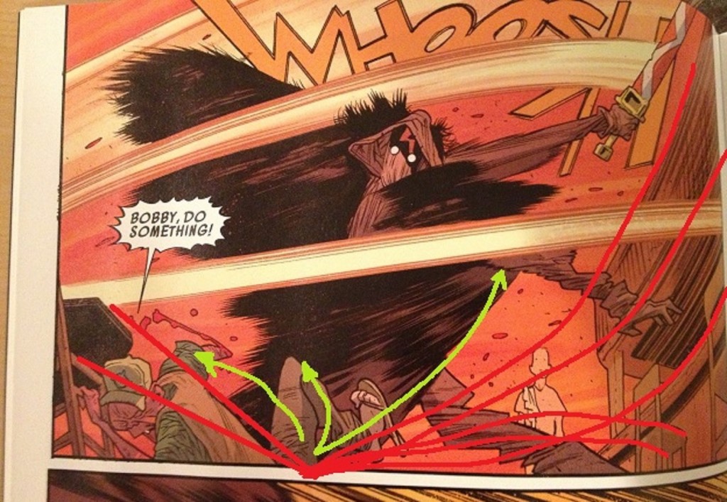
Panel 1, Harren goes with a full-bleed panel, at least to the top of the page. He doesn't do full-bleed that often. Except for that last page cliffhanger, he usually uses it for establishing shots where he's trying to imply height. Harren mostly sticks to pages with proper white gutters otherwise. This is the only place in the comic where he really uses a bleed as punctuation. I think it helps to imply the height of the Action Scarecrow character (we never learn his name) as compared to the other characters on the page, as a way of conveying how much he towers over the others.
The most noteworthy thing here is the character design. While Harren's fond of speed-lines, he doesn't rely on those. The main character's design is a figure nestled in a set of furs, such that in action scenes, the furs flouncing around create a sort of secondary set of linework conveying motion. Well, not just motion. It conveys the enormous bulk of Action Scarecrow, while still drawing that character as a mass of speed. Action Scarecrow has both heft and velocity. It makes for an intimidating presence in a fight scene.
Wearing flip-flops to a bar, tho? Kind of asking for it, that guy.
Note also how Action Scarecrow's legs and arms create a helpful frame for the more abstract shape of Weakboy in the distance. I like the lack of detail on Weakboy: he's surprised by this action scene erupting, so he's not all there mentally; he's an abstract detail in his own life. Been there!
The gesture of the sword superimposing over the WHOOSH sound effect is also a nice touch, I suppose. The sound effect suggests the sound of the sword, while the sword cleaving the sound effect implies the sharpness of the sword, sharp enough to cut sound.
One detail easy to miss: look how Harren draws the character being attacked, Trucker Hat, his sandal. Trucker Hat's sandal is twisting a way no sandal should. The distortion of the figures in motion extends down to the smallest of details.
I once got stuck on a ride at Epcot for a while. It felt a lot like looking at this fucking panel over and over. I still remember hearing the animatronic robots repeat themselves to us: "Mommy! Mommy! Look-- Timmy's flying!" I must've heard that 20 times. I never thought I would hate a robot dog, but Epcot had so much to teach me that day.
It is a drastic understatement to say that I'm not great with understanding perspective, but Trucker Hat seems to be falling away from what I think is kind of the vanishing point, which maybe contributes to the overall feeling of speed to this panel...? (There's some curving going on, making it trickier, but). In action scenes, my impression is that a good action page is usually using vanishing points to boost the action, to imply speed. But that kind of talk is a little beyond me since perspective-talk always makes my nose bleed.
-
Perspective for Dummies by a Perspective Dummy: perspective's a way of fooling the eye so that the viewer thinks they're seeing a 3-d scene, a drawing with depth rather than just a flat 2-d drawing like in some kind of Egyptian heiroglyphic. Or some kind of nonsense like that. It involves lines converging at vanishing points, which are on horizon lines or ... stuff like that, basically. There can be more than one vanishing point (though I remember reading that some comic artists are really into trying to stick to one vanishing point; fetishize that). I couldn't even begin to tell you the Why of any of it-- it's just some stupid shit that some Renaissance guys figured out, inbetween feces-baths and dying of the plague. If you look at the old How to Draw Comics the Marvel Way book, most of the examples they use to convey the importance perspective are drawings of cities. Or this one weird downshot of a bunch of couches...? John Buscema really strongly felt like drawing comics the Marvel way involved couches. Or if you look at old Andy Loomis books, there are all these messy diagrams about how to draw two characters on a set of different level stairs, so that the heights of the characters are consistent. Understanding some perspective apparently can help with comic storytelling, too, but I don't really know what you'd read if you're interesting in hearing more about that; most comic art books just focus on the city and/or couch drawings. Perspective is just this gross headache, but it's stuff people who draw know about, so if you want to draw yourself, what else can you do but, you know, get out a ruler and draw some couches? Couch it up! My favorite John Buscema couches were the couches in Madripoor. Those couches had eyepatches.
Trucker Hat is being framed for the eye by the blacks on the page, the black ink-mass of Action Scarecrow to his right and the inks of the table above him to his upper-left. (Plus, he's got the excited word balloon from the midst of the sword swing pointing at him, which probably doesn't hurt to draw the reader's attention to him).
I like this panel because action is transpiring in the foreground (Trucker Hat yelling), midground (Action Scarecrow swingin' away), and background (Weakboy, gawping). I always think that's a pretty neat thing for a comic to shoot for.
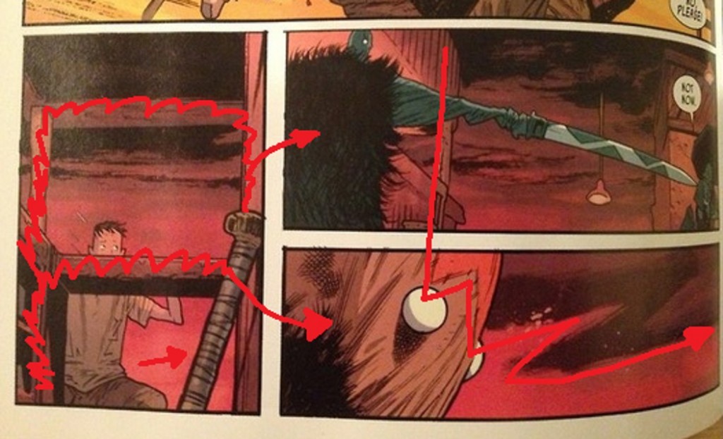
And of course, for eyeflow purposes, the bar area and sword puts in sharp diagonal lines drawing us to where the Action Scarecrow rests in the next panel.
I really think if I pushed myself, my next caption for that first panel would've been the best one. I wish I were looking at that first panel again. I miss it.
Well, "rests" is not the best word. Again, note how Harren's character design pluses the speed lines. And again, talking out of my ass, it would appear we have Trucker Hat falling away from where I would guesstimate the vanishining point sits, and framed by the black of the table to his right, and his crotch to his left.
For eyeflow purposes, the table and chair both point to the third panel.
The main character robbed Rick Ross's closet on the way to this scene. EVERY DAY HE'S HUSTLING EVERY EVERY DAY HE'S HUSTLING HE WANTED TO GO ON VACATION WITH HIS KIDS TO LEGOLAND BUT HE COULDN'T CANCEL HIS PRE-EXISTING COMMITMENTS TO HUSTLING.
Weakboy is now framed by the bar, while the hilt of a baseball bat in the foreground points the way to panel four. Though with panel configurations like this, I always feel like panels four and five are kind of happening simultaneously (though panel four does lead the eye down using the background drawings of the bar, while panel five pushes to the next page using that smudged lightning bolt Z that Stewart paints into the background).
Panels four through six emphasize something Dave Stewart did in panels one and two, namely the more excited the action panels, the brighter the background colors. The action heated up the world around the action; the intensity of the action didn't just take place within an environment, but are reflected by that environment. When things calm down, they go back to red. (Or maybe I have that backwards from a color temperature perspective...? Put "color temperature" down as another thing I don't really have any kind of grasp on. It works, however you want to phrase it; plus, more functionally, let's the red of the bleeding Trucker Hat's severed arm stand out more).
Small thing, but worth noting: I like that Harren hand-draws his panel borders (if that's what's happening here). The way the nubs of lines protrude out. I find leaving that kind of discordant detail very comforting, even if I know these pages have been worked over digitally thereafter, even if it's just an affectation.
QUESTION 9.
Did you experience any noteworthy emotion reading the comic?
I started texting halfway through the comic. That is not a joke.
I experienced no emotion other than an utter disregard for the hard work this creative team had done preparing this comic.
Nothing about this comic engaged in me in any respect.
It is a shambles.
QUESTION 10.
What do we hope that younger cartoonists learn to do and not to do from this comic?
To do / Not To Do:
Well. This would be a very easy one to dance on top of, in that it's a comic that I thought was pretty terrible, a nice drawing here or there aside. It's the kind of terrible it'd be fun to rip up because this comic is bad in a way that suggests a kind of laziness in thinking. Comic creators soft enough to waste pages on the Mystery of Why a Fucking Cat has Glowing Eyes at an Undetermined Location for Unknown Reasons, in their very first issue, rather than create a single character worth listening to, or a story of any substance? Creators who'd make that kind of choice, a guy like me, with my kind of dysfunctions, would have plenty of cause to think them soft and flabby, and to think the kind of self-satisfied and smug culture that allowed that kind of flabbiness needs to be decapitated. Ripping apart that kind of work is a matter of no small satisfaction. It would be fun and it'd feel good, at least if you're my kind of sinister.
But I find myself a little philosophical tonight, here at the end of this (too long!) set of questions, that... I find myself thinking about something instead of mean-guy talk, which is...
If you're the kind of person who needs to put stuff out into the world, it's very likely that the reaction you get from that experience, that it's never going to be good enough. People might like what you put out, but unless you have a very particular kind of talent and your talent luckily gets expressed in particularly lucrative and sex-generating endeavors (guitarist for a band that actually makes money, A-list actor, etc.), it's not likely that the reaction to what you put out will be "enough", however it is you may define "enough".
People liking what you do is not going to heal you. All that broken stuff that makes your work interesting, that shit's not getting fixed cause someone clicked the like icon on your creative output. Heck, if you're a certain kind of person, you're not even going to believe the nice bits people say; you're going to go looking for the bad bits, the really nasty bits. You'll trust those more because they sound closer to what you hear inside your own head everyday.
This is a comic made by seasoned professionals with a track record of praise behind them. And for me at least, it's a mess, a fucking pointless mess of a first issue. They just did not create anything even remotely interesting to experience, just white noise. A complete waste of my time. But when they were making it, when they were making it, there must have been a moment where none of that matters: "Oh we've really got something here. A scarecrow! That's big! With a sword! We are fucking geniuses with rock hard boners!"
So, I think the "thing to learn" from this kind of failure is this: learn to appreciate the moments where you feel excited about what you're doing, that early rush where the potential of what you're about to do is buzzing all around, where you can't wait to get started. There's no telling what happens after that. You try your best and sometimes you just miss. Or you try your best and you get stuck with a co-creator who's not bringing the fire, or a collaboration that's not firing on all cylinders, or a million other things. Or even if you hit, even if you hit, even then, it still probably will not be enough. So, at least, try to stop and appreciate that one moment.
How does that Kurt Vonnegut quote go?
"I urge you to please notice when you are happy, and exclaim or murmur or think at some point, 'If this isn't nice, I don't know what is."
NEXT WEEK: THE NAMES #1 from DC-Vertigo.
