21st Century Innovations in Magazine Racket-Busting: Jog is there and here for 2/13
/![]() Fantastic Comics #24 (The Next Issue Project #1):
Fantastic Comics #24 (The Next Issue Project #1):

This is the debut of a new, Golden Age-proportioned anthology series from Image. There's no credited editor, but it appears to be spearheaded by Publisher Erik Larsen and PR & Marketing Coordinator Joe Keatinge. It's 64 color pages for $5.99; note the fake markup sticker.
And while the proper, legal title of this issue is Fantastic Comics #24, allowing it to dub itself "the latest comic book Image has ever published," seeing as how issue #23 hit the stands in 1941, you'll probably know it better under its banner title of The Next Issue Project. Simply put, each issue of the project will provide a 'next issue' for some long-dead Golden Age series, with a shifting crew of writers and artists providing new stories for the now-public domain characters that used to be found in each title.
It's a fun idea, and a flexible one; none of the contributors are bound to using any specific style, or setting their work in any particular era, although the book's design does its best to evoke an old-timey feel, with authentic period ads, faux paper yellowing and digital printing 'errors,' plus the same page header numbering style seen in Paul Karasik's recent Fletcher Hanks collection I Shall Destroy All the Civilized Planets. Indeed, Larsen has noted that Keatinge's interest in Hanks' work formed part of the impetus behind getting the project started; ironically, Hanks' own Fantastic creation, Stardust the Super Wizard, all but unknown to most of the comics world just a few years ago, is now undoubtedly the Batman of this book, thanks to the great success of Karasik's collection.
Unfortunately, the Stardust story in here, from my perspective as a fellow Fletcher Hanks reader, is no good.
Written by Keatinge himself with art by Mike & Laura Allred, it's essentially a 'Comics Have Abandoned Their Charming Past, and the Present is Therefore Fucked' kind of parable, albeit toned down into more of a 'Comics Have Abandoned Their Wild Past, and the Present is Therefore Dull.' It's no surprise that the tale is more about what Stardust 'represents' than anything; it's pretty obvious to me that the appeal of Hanks' comics come from his singular approach rather than his concepts, and I suspect it'd be futile to simply run with the character, or attempt to replicate the artist's unique style.
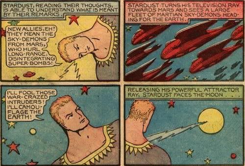
But certainly there's plenty of room to explore the underpinnings of Hanks' works. Actually, the Karasik collection does a bit of this on its own, allowing Hanks' repetitive, blunt force accounts of violent acts met with kaleidoscopic retributive cruelty to stand without comment, so as to attain the force of ritual, then revealing the human pain behind all the ugly/beautiful fun. Karasik's arrangement forces the reader into the position of the eager collector, discovering these strange, early abridgements of the superhero concept for the first time, without the fuss of searching around or paying big bucks. Then, it splashes cold water in the reader's face by revealing just enough background to force a reconsideration of what's just been enjoyed.
That's the book's depth as a text; it takes what's unique about those comics -- crazy reactions, forceful declarations, gnarled forms, bullet-impact action -- and suggests why they came to be. This new story, in contrast, jettisons everything unique about Hanks' work in favor of broad, dull statements about the vitality of old things and the wild 'n crazy ways of the goofy old awesome past; it's not sneering or ironic, but it's hardly interesting or particular.
Keatinge writes in a mixed period-modern style, augmenting dialogue often paraphrased or quoted from the Hanks originals (in one case, a punctuation error is dutifully replicated) with a narrating woman's more traditional, caption-based musings. She knew and loved the gentle (but firm!) Stardust back in the day, but he abandoned the Earth when there was no more crime worth his time. Not a bad concept.
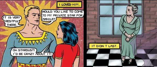
Yet Keatinge plays things out with the most obvious approach one can imagine. Time passes, and humans build anonymous, robotic superheroes to watch over things. They all get fat and lazy and old. Note above that Laura Allred differentiates between past (rulez) and present (droolz) with her coloring approach, while Mike Allred folds Hanks' brawny character art into sleeker, statuesque designs. Fitting, since Stardust -- the one who could not be tamed, readers! -- is coming back to show us all how the superheroing is done, and just maybe freeing the fun ways of yore and bringing (dot) color back to our gloomy world and literally making old people young again, which I guess is the logical conclusion of such super-charged nostalgia. I suspect it's meant to act as a type of manifesto for the project as a whole.
The problem with this SparkNotes Kingdom Come isn't that it fails to take the 'dark' route with Stardust -- after all, part of the beauty of the public domain is that you can subvert aspects of the established work to create new statements -- but that it makes absolutely no use of the original's specifics beyond a generic appreciation of wacky old comics fun. In fact, for all its citation, it doesn't even do an effective job of conveying the wacky old comics fun aspect of Fletcher Hanks, so wistful is the narration and subdued the pace. It seems like a waste of a good appropriation; this could have been any Golden Age character.
Obviously, I'm coming to this as a prior Stardust reader. Your reaction may vary depending on what you take from Hanks' work; needless to say, if your reading of Hanks' work tends toward, say, 'embodies the superhero concept as fascist impulse,' oh boy is this story gonna get sticky for you. And even if you're 100% onboard with the story's point of view, or if you've never heard of Stardust before, I suspect this'll prove a most predictable harangue about how neat the past can be - there's just nothing all that compelling on display.

This does raise an issue for the rest of the book's stories, since most of them deal with characters that are probably lacking even Stardust's limited familiarity; the immediate danger is that tribute will be paid to a lot of forgettable stories via new stories that are quickly forgotten, and most of these new works are, for sure, fast and very slight.
For me, the pieces rose and fell on the energy each artist or team brought to the table. Larsen's own 13-page Samson boasts the artist's typically fine command of fighting-mad dynamics, married to a wonderfully detailed take on Golden Age coloring, even as the goofy 'kid sidekick taken by social services' story dissolves on contact. Jim Rugg and Brian Maruca (of Street Angel) provide six pages of amusing macho antics with Captain Kidd. Tom Scioli (artist of Gødland) has six pages too, taken from a Space Smith serial already in progress; a bit labored with its humor, but sometimes striking. There's a funny, boyish wimmen-hater thread running through several of the stories; girls are trouble and sex is gross (well, not for Captain Kidd)!
But be warned, that's as good as it gets, save for two exceptions.
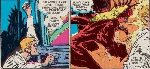
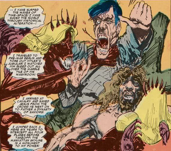
First, there's the six-page Flip Falcon in the Fourth Dimension, written by Joe Casey (writer of Gødland, the new Youngblood, and various other books), with line art by Bill Sienkiewicz and colors by Larsen. It's by far the most extreme of the book's period suggestions, and the only one that registers as something viscerally affecting on its own merits.
Every element comes together, although Sienkiewicz's contribution is what you'll notice first. It's like a fevered, scribbly variant of his New Mutants style, both perfectly clear and wildly idiosyncratic, yet fitting for the time; it appears to inspire Larsen to garish, seeping heights. Casey's script is both a full-scale revamp and a cheesy gag, packing down vortex angels and doomed romance and religion and evolution and moral conflict, all into its tiny allotted space. It's a loud comic, and it makes an impression. Hell, it sells an impression - you'll want to find some old comics just like it, even as you know it's only like itself.
Then, secondly, way at the end of the book, last but in no way least, is Ashley Wood's (you guessed it) six-page piece, executed in his contemporary signature style. Call it a postscript. Or a horselaugh. It's my favorite thing in the book.
What initially seems like a deliberately obtuse update of Sub Saunders -- consisting mostly of black, sound effects-laden panels, murky bodily close-ups and word balloons presented in untranslated German -- ultimately reveals itself to be a giggling little fable of its own, with Saunders fighting off the oblivion of owned obsolescence with a little help from an all-new character that might perhaps bring to mind the hero of a prior Wood-illustrated comic (that Joe Casey wrote) (for some corporation, years ago), but is truly an entirely different thing, yes yes.
An in-joke, to be sure, but just the sort of puckish, brainy thing the book needed to help make things seem merely EH, although the risk of disintegration remains.
