“You're Catching On, Buster!" COMICS! Sometimes I Don’t Want To Ruffle Any Feathers But I Do Have To Say That Nazis Seem Like Really Quite The Most Awful People!

I read a 1960s DC war comic. It was pretty neat. Don’t worry, it’s inevitable that we’ll hit some real shockers soon, but not this week.
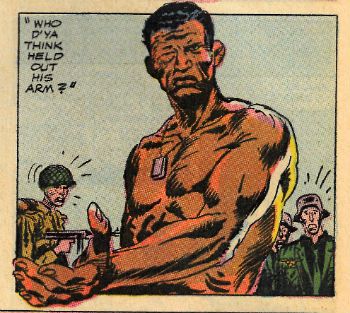
 photo OAaWArmB_zpsjhc4mxux.jpg
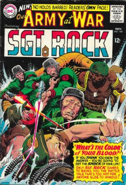
OUR ARMY AT WAR by Joe Kubert & Robert Kanigher

Anyway, this…
OUR ARMY AT WAR #160
What Is The Color Of Your Blood?
Art by Joe Kubert
Written by Robert Kanigher
Sgt Rock created by Joe Kubert & Robert Kanigher
DC Comics, $0.12 (1965)

 photo OAaWCovB_zps8ce8bxyi.jpg

This yellowing and elderly comic clutched in my yellowing and elderly hands is remarkable for a number of reasons. The most amusing of those reasons is Robert Kanigher’s lovably hyperbolic reaction to a letter criticising his work on WONDER WOMAN: “What is one more scar to a walking battlefield?” This being OUR ARMY AT WAR and not WONDER WOMAN the precise criticism is irrelevant so Kanigher doesn’t print it. Kanigher’s steely indifference in the face of such criticism is, however, important so he does share that with us. “What is one more scar to a walking battlefield?” Fantastic stuff. Due to its relevance Kanigher is however able to share with us the rest of the letter which, fortuitously, is praise, this time for the Enemy Ace strip. Yes, as you’ve probably gathered from previous entries in the appallingly persistent “Old Man! Old Comics!” things I do, one of the very special pleasures of reading an old comic is the dip into the psyche of the Comics Scene Past it allows via the letters page. Usually, because I err towards old war comics, this is an exciting peek into the minds of readers who were inclined to address their excitable letters to fictional characters (“Hi, Sgt Rock! Remember when you shot that Jerry in the face? How did his brains taste?”) and correct mistakes regarding weaponry (“…the Koch-Wobbler sub-machine gun was in fact useless in prolonged firefights due to its tendency to overheat and loudly question why everyone couldn’t just get along.” ) The thrilling fusion of imagination and pedantry on display is an entertainment in itself, and an important indicator of how seriously the audience took this stuff. Well, some of the audience. Admittedly most of the audience neglected to write in and probably forgot these books as soon as they finished them, but, still, someone out there was listening. In recognition of this DC’s war comics would occasionally try to say something worth listening to. OUR ARMY AT WAR #160 is one such issue.

 photo OAaWHype1B_zpsr3vd1wep.jpg
OUR ARMY AT WAR by Joe Kubert & Robert Kanigher

OUR ARMY AT WAR#160 is a Message Issue and, no, the message isn’t that you can’t hurt Robert Kanigher’s feelings with your WONDER WOMAN criticisms but rather that everyone should knock that racist shit off. From my privileged view point (white, male, one cat, no hair) it’s easy to think such a message is like telling everyone not to wash their hair in lava ,or not to keep tigers under the bed, and yet rumour has it that racism persists. Sure there’s a black President in The Americas but there was also all that pretty racist stuff about him being a Hawaiian muslim or something. (Those damn Hawaiians! Always causing a fuss! I don’t want to sound anti-Hawaiian here but…etc.) Things are by no means sorted on the racial equality front in 2015 and terrible, terrible things still happen to remind us of that. But things are… better (said the complacent middle aged white man) in 2015 so the clumsy but heartfelt sentiments on show here might seem a tad toothless. But not all times are these times. And this comic didn’t come out in 2015; it came out in 1965. That may well have been ten years after Rosa Parks changed everything by not going to the back of a bus but those ten years of Civil rights progress had been filled with tear gas, violence and death. In 1965 there may well have been the Voting Rights Act but there were also the Watts Riots (Aug 11-17, 1965) and the assassination of Malcolm X (21 Feb 1965). Offering up a plea for racial equality in a comical periodical might not exactly have been literary gunpowder, but in 1965 it was still far from empty gum flapping.

 photo OAaWSayitB_zpsr9s5ql2i.jpg

OUR ARMY AT WAR by Joe Kubert & Robert Kanigher

Throughout I’m treating this comic as a Kubert & Kanigher collaboration because comics are (ideally) a collaborative art form and Kubert & Kanigher worked closely together on the Rock comics. The storytelling with its in media res opening, repetitive reinforcement of key points, flash-backs, direct to the point of bluntness dialogue, use of quotes to highlight simple metaphors and the general ability to impart something quite rickety with the illusion of solidity is Kanigher at the top of his “get it done” game. Kubert’s art has an extra level of commitment here, with that lively looseness of line bolstered by the blunt impact of his blacks to smooth the eye through.

 photo OAaWHype2B_zpsstpqipzi.jpg

OUR ARMY AT WAR by Joe Kubert & Robert Kanigher

As I’ve said in the past I think Joe Kubert was quite keen on his comics being edifying so I can quite see the whole message thing originating from him, Kanigher giving the thing shape, and then the two batting it back and forth until time ran out and they just had to go with what they’d got. The result is not exactly buffed to a high gloss, but for all the slips into silliness and end runs past realism “What is The Color of Your Blood?” works well as a four colour punchy polemic.
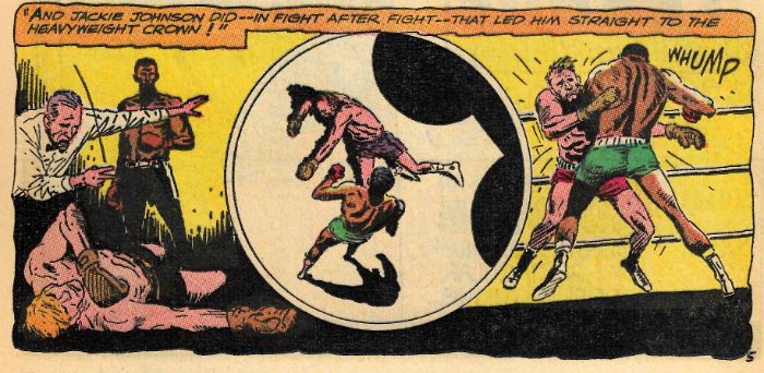
 photo OAaWcareerB_zpslukquzjr.jpg
OUR ARMY AT WAR by Joe Kubert & Robert Kanigher

As is traditional Sgt Rock headlines OUR ARMY AT WAR but for much of this blockbuster battle yarn Jackie Johnson takes centre stage. Because you aren’t old and daft you probably don’t read a lot of DC war comics so it’s maybe worth pointing out that Jackie Johnson is the black member of Easy Co. From my intensive researches (i.e. reading Codename: Gravedigger in MEN OF WAR) I can tell you that this is unrealistic as blacks and whites were segregated during WW2, with black soldiers relegated to menial and unpleasant tasks while the white soldiers did the fighting. However, due to further research (i.e. reading SGT ROCK comics) I can assure you that Sgt Rock stories are not supposed to be documentaries so, yes, there’s a black soldier in Easy Co. In 1965 America was still firmly impaled on the Punji sticks of the Vietnam War and soldiers (back before they were allowed porn vids) were notorious for reading comics. Sometimes people wonder how DC’s war comics lasted as long as they did and, simplistically, I think it’s because even though they were (mostly) about WW2 they allowed America to acknowledge and deal with the wars that came after. Anyway, racial segregation in the US Army had ended in 1948 so by 1965 black soldiers could die with white soldiers, which just goes to show equality isn’t all pony rides and ice cream. It also shows why Easy Co. anachronistically included a black soldier - it was an attempt to reflect the diversity of the armed forces audience of the time.
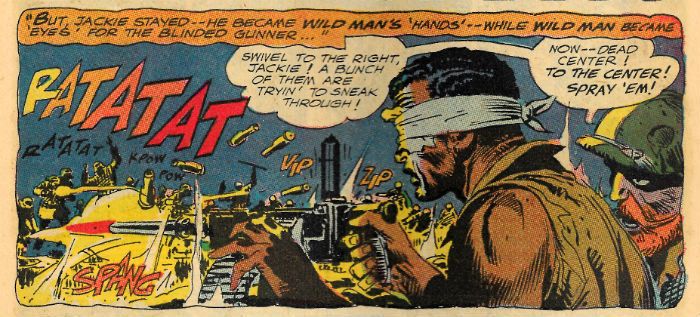
 photo OAaWOkayB_zps6cnn0kdf.jpg
OUR ARMY AT WAR by Joe Kubert & Robert Kanigher

The exact individuals whom Jackie Johnson is supposed to be an amalgamation of varies according to who you ask, as this story revolves around boxing I’m going to stick with Jackie Johnson being a combination of Jack Johnson & Joe Louis, who were both boxers. They also both play directly into the ideas and themes Kubert & Kanigher are utilising. Man, that’s a chalk and elbow patches sentence right there. Before we get to that dusty stuff I have to tell you about the dust up it’s attached to. In essence then, Rock, Wild Man (he of the eerily prescient hipster beard) and Jackie Johnson are captured by Nazis, amongst whose number a familiar face is found. Fate (as if working against a really tight deadline with little room for such niceties as plausibility) has conspired to bring Jackie face to face with, one Uhlan who is not only a German boxer, but the very same German boxer to whom Jackie had memorably lost the heavyweight boxing championship prior to WW2 (!) Memorably for Jackie that is, not you because it didn’t really happen so how would you remember it? Turns out Jackie remembers it enough for everyone as we see in a series of flashbacks in which Jackie saves Easy Co. via a succession of typically Kanigher-esque acts awesomely entertaining in their unfeasibility, but then looks all sad and Sgt Rock stands near him and does one of his little monologues which explain Jackie’s sadness in a manly way. Basically, Jackie has really taken his Stateside loss at the hands of a Nazi, and the later use of his defeat as Propaganda, really badly. He needs to toughen up a bit; what if someone did something really awful like criticise his work on WONDER WOMAN?
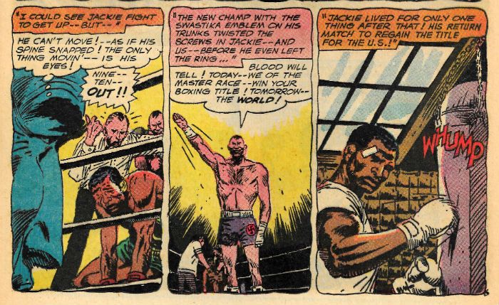
 photo OAaWRematchB_zps1xlm3exg.jpg
OUR ARMY AT WAR by Joe Kubert & Robert Kanigher

Having won once the Nazi reckons twice can’t hurt and so elects to do so in an impromptu rematch. The idea here is to have a bit of fun during a rare spot of down time to demonstrate to his cackling pals the racial superiority of the white race. (Why, I do the same myself when running long macros at work!) Of course it’s implicit that once Jackie even starts to look as though he’s winning the Nazis will kill Rock, Wildman & Jackie because, well, Nazis are big jerks. So, at this point of suspense I naturally change the subject and start going on about Jack Johnson: Jack Johnson (1878-1946) was the first African-American world heavyweight boxing champion. His landmark 1908 win followed several years of doggedly pursuing the chance to fight for the title, and then fourteen rounds of hitting the Canadian Tommy Burns in the face. What’s important here isn’t his title but the fact that his victory was seen as a bit of an affront to believers in the self-same superiority of the white race which the Nazi in this story is so keen to prove. Unfortunately for Jack Johnson that was quite a lot of people in his own country at that point in history. Mind you, in their defence none of them were Nazis. This led to a string of white opponents being thrown at Johnson and the creation of the horrible term “Great White Hope”, because the hope was that the white man would put this uppity, um, fellow in his place. The white man repeatedly failed to do so until April 5 1915 when Johnson lost his title to Jess Willard. It’s this “Great White Hope” thing which is informing Kubert & Kanigher’s work here. The reference to the whole ugly deal of a white guy knocking a black guy down and thus proving the superiority of an entire race in one victorious act of thuggish brutality is inescapable. In Jack Johnson’s day apparently it all seemed pretty reasonable, but by 1965, thankfully, it’s a view presented as the childishly delusional nonsense it clearly is.
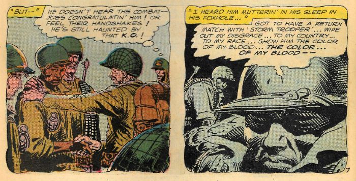
 photo OAaWRegretB_zpsfttecv26.jpg
OUR ARMY AT WAR by Joe Kubert & Robert Kanigher

Joe Louis (1914-1981) has an even more direct connection to the narrative at hand. Joe Louis was also black and also a boxer, but following wise advice had played it safe and played it quiet in direct contrast to Jack Johnson whose flamboyance had really upset certain folk (white folks, I’m talking about whites folks there). Canny management had built Joe Louis up as a respectable and honourable sporting figure in the public eye. People were okay supporting Joe Louis. Which was good because Joe Louis would take on a symbolic aspect he probably could have done without. Jackie Johnson’s first loss to Uhlan echoes Joe Louis’ 1936 defeat at the gloves of Max Schmeling (1905-2005), a white German boxer. The state of things in Germany were frankly distressing at that time and so this victory was seized upon as proof positive of the Aryan superiority preached by the kind of people who think putting skulls on uniforms is an adult fashion decision. In 1938 a rematch occurred, and things with the Nazis were getting so bad so quickly the world was having trouble ignoring it. War was coming. The rematch was no longer only about black vs white, but also about Fascism vs Democracy. And so two men hitting each other for money took on a ridiculously potent symbolism. Records show that on the night of June 22, 1938 the myth of Aryan supremacy got in the ring with an athletic black man and lasted two minutes and four seconds. No, Joe Louis did not fall that night.   Despite his failure Schmeling, surprisingly, wasn’t stuck in an oven or shot but served his country as a paratrooper in WW2. The boxer Jackie faces is also a paratrooper. So, no, see, all these connections aren’t simply in my head. Now, I would like to tell you that following the fight Nazi Germany admitted it was wrong, apologised to everyone, rethought its philosophy and became a socialist utopia where men and women of all colours joyfully worked together to achieve the goal of peaceful space colonisation, but I would be lying. In fact Nazi Germany carried on merrily turning the world to fiery dung as though nothing had happened. Because apparently settling the whole racial superiority in the ring thing only counts if the white guy wins.
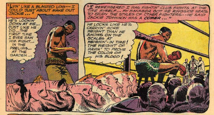
 photo OAaWweightB_zpsxbybryck.jpg
OUR ARMY AT WAR by Joe Kubert & Robert Kanigher

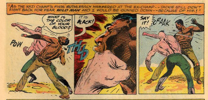
Where there’s boxing there’s blood, and that together with its colour is crucial in the racial power play on these pages. The Nazis were big on blood and not just the spilling of that of others, but the (supposed) purity of their own. While he’s being smacked about Jackie is constantly taunted as to the colour of his blood by the Nazi. Now, the Nazi obviously doesn’t believe Jackie’s blood is black, that would be ridiculous, it’s just the whole bending another to your will thing beloved of bullies everywhere. Because he believes the others’ lives are at stake Jackie won’t fight back, but equally he won’t give the Nazi the satisfaction of saying what he wants to hear. Luckily (cough) Rock and Wild Man break free and are beaten to the ground which allows the narrative to fudge the next bit nicely. Rock tells Jackie to take the guy’s face off and maybe Jackie hears him or maybe Jackie doesn’t, either way Jackie starts swinging and Jackie starts winning.
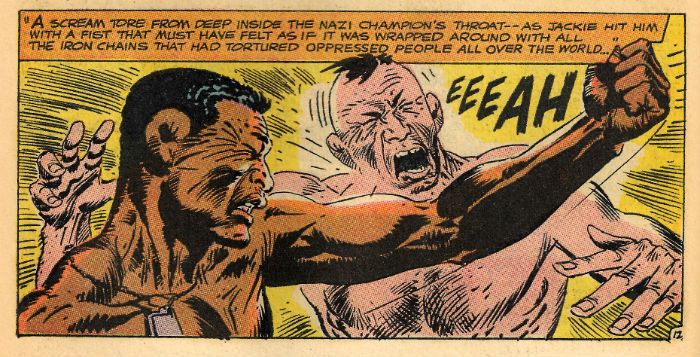
 photo OAaWChainsB_zpsbhblag0d.jpg
OUR ARMY AT WAR by Joe Kubert & Robert Kanigher

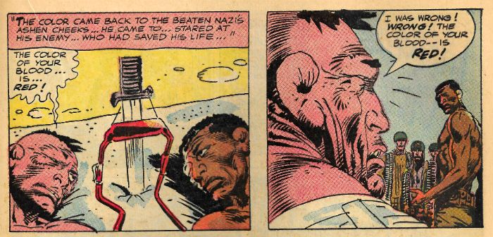
Seeing Uhlan guy in trouble the Nazis immediately fire on both of them to erase the mistake they have made, which is less than sporting of them. Wild Man and Rock now take out the Nazis without any trouble because (cough) Easy Company jump out of a bush and because it’s time for the big finish. Jackie and NAME are wounded but a transfusion could just save the Nazi’s life..! Sorry, no prize today for guessing what happens next.

 photo OAaWSenseB_zpsa8xjbaql.jpg

Look, as inelegantly arrived at as it may be there is still a power in the final scenes where Jackie’s blood saves the Nazi’s life and the dude immediately recants his vicious idiocy. Yeah, turns out that there are actually two messages in this book - one is to knock that racist shit off, and the other is that people can change. As bumpy a narrative ride as it may be OUR ARMY AT WAR#160 turns out to be both right thinking and remarkably generous of spirit, and you know that can’t ever be less than VERY GOOD!
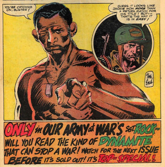
 photo OAaWEndB_zpskcgydwey.jpg
OUR ARMY AT WAR by Joe Kubert & Robert Kanigher

What's the only kind of dynamite that can stop a war? COMICS!!!! They are "Top-Special"!

"Pop...EVERYTHIN' I Want Costs MONEY!" COMICS! Sometimes I Slap Leather!

Sorry, that garage clearing was a beast. Still, look what I found:  photo TomSunB_zpsq5hew5i6.jpg

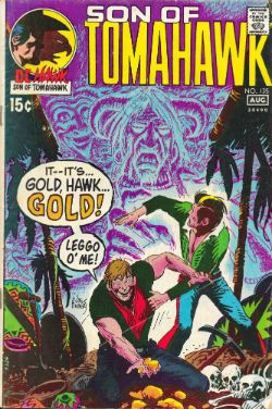
Hawk, Son of Tomahawk by Thorne & Kanigher Anyway, this... TOMAHAWK# 135 Art by Frank Thorne, John Severin Written by Robert Kanigher, Jerry DeFuccio DC Comics, $0.15 (1971) Tomahawk created by Fred Ray & Ed Frances Herron Hawk, Son of Tomahawk created by Mr & Mrs Tomahawk

 photo TomCovB_zpsec1brpnc.jpg

Here's a DC Western book I'd never heard of and didn't realise I owned. It's got a Joe Kubert cover that looks like an “Egg-timer Special” but still has time for a sweet charcoal effect background, and slips its lack of detail past by walloping you with a fistful of impact. Yeah, Joe Kubert could do you a cover like no other. Joe Kubert was also the Editor here, which explains the presence of Robert Kanigher on typewriter hammerin'. Back then Editors had a favoured stable (Western wordplay, cheers.) of talent whose most valued attributes were timeliness and dependability rather than flash, pizzaz or having performing hair. Kanigher was a sturdy workhouse who Kubert was always happy to employ because he knew that he could ask Kanigher for a 12 page oater by lunchtime tomorrow and Kanigher would deliver - like it was his job or something. Basically, books edited by Joe Kubert tend to have a lot of Robert Kanigher in them because Robert Kanigher got it done. And I tend to have a lot of Joe Kubert edited books because I like the weird genres they put him in charge of (War, Westerns, Apemen and Tor (always Tor)). Just in case you were thinking I was engaged on some stealth rehabilitation of Robert Kanigher or something.

 photo TomSkullB_zpsp6nwjojs.jpg

Hawk, Son of Tomahawk by Thorne & Kanigher

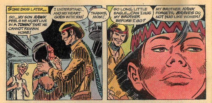
The book is called SON OF TOMAHAWK but the indicia reveals it is actually TOMAHAWK, this discrepancy is due to the recent replacement of Tomahawk in the main strip by his son Hawk, Son of Tomahawk. The repercussions of this are documented in the letters page where the level of bewilderment, guarded optimism and plain dislike show comic fans' embrace of change is timeless in its consistency. Unfortunately, I lack any kind of context for this comic so I had to look up Tomahawk and it turns out his adventures were originally set during in the Revolutionary War where he fought on the wrong side (I'm British, natch). In this book he wanders about in his vest puffing on a corncob pipe while his son has all the fun. His son, Hawk, Son of Tomahawk, is a design classic in the same way as a Plymouth Fury. A Plymouth Fury that some crackjob's driven into a wall. Because Frank “Every Rose Has Its” Thorne's art here is characteristically light on detail it's hard to pin down Hawk, son of Tomahawk's look too specifically, as Thorne's work becomes more nebulous the harder you look at it. Basically though Hawk, son of Tomahawk, with his skunk streaked DA, tasselled jacket with tribal decals, and drainpipe jeans would make even Vegas Elvis do a double take. But then this is a new kind of Western hero.

 photo TomFamilyB_zpsaxlfgib3.jpg

Hawk, Son of Tomahawk by Thorne & Kanigher

Or at least I think it is; this is the only issue I own so it might just be an outlier in what is otherwise a run as salty and plain ornery as SCALPHUNTER or JONAH HEX. Here though it looks like every effort is being made to avoid offence, even to the extent of having a pacifist hero. Hawk, Son of Tomahawk's mum is a Native American and he has a toddler brother decked out in tribal duds. Which is nice, but they are pretty generic and later when some other Native Americans show up they are all stoic and dignified. Which is fine, very respectful and that but it's hardly the stuff of high drama. Luckily, there's always the White Man. I don't know why the White Man gets such a raw deal (reads a history book; cries. Okay, **** the White Man.) The story starts by some bad white guys harassing a peddlar who gives Hawk, Son of Tomahawk a catalogue as a reward. Now, remember the Old West was like a giant open air lunatic asylum where the only recreational activities were murder, rutting, trains and drinking until blindness set in. So a catalogue in the Old West would have been like the Internet but with less naked people involved in wallpaper paste accidents and less pictures of cats hating us. Seriously, Hawk is enraptured and decides immediately to set out to gain enough riches to buy some scented candles, Sea-Bison or a life-size cardboard glow-in-the-dark Abe Lincoln. Whatever; I don't know what they had in those things; vittals and gingham or something. Anyway, he bumps into his big pal who is just setting out with a treasure map. That's quite a coincidence to you, but if you had 12 pages you'd tend to think of it as expedient. There's a nice bit where they find the Ghost Mountain inside another mountain, but the gold turns out to be in a Native American burial ground. (Joke about America being one big Native American burial ground removed on grounds of taste.)

 photo TomGoldB_zpsleefkrib.jpg

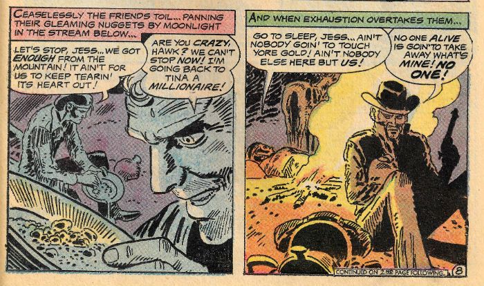
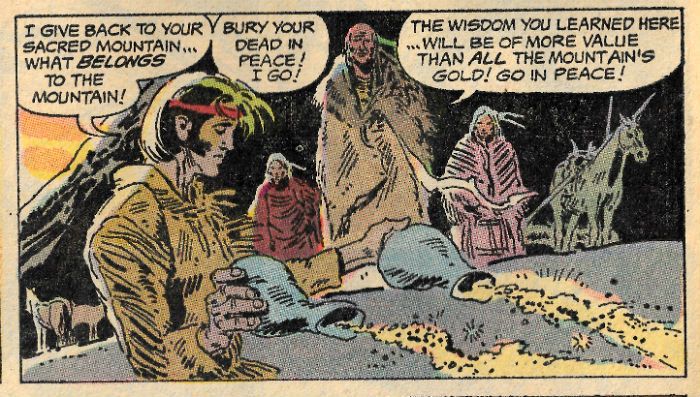
Hawk, Son of Tomahawk by Thorne & Kanigher Up until exhaustion and gold fever set in Hawk, son of Hawk's pal is pretty okay but then he gets all racist and violent like a Farcry game on legs. That's not because he's white though, let's be clear here; gold turns the guy's head, at which point he becomes a big murderous racist. This is good because if someone had more time they could “read” this story about the corrupting effect of the capitalist system and how its emphasis on reward sets people against one another. Or something. Mind you, I don't know if Kanigher accidentally stumbles on this, I've just had a brain fart, or it's actually built-in. It's not every comic that has the brass balls to declare that even The White Man isn't the villain, it's the system of exploitation in which he exists which is the true villain! Socialist Pacifist Western Comics for The Win! Anyway, the whole trapped underground with a violent racist thing is pretty unfortunate for Hawk, Son of Tomahawk, what with his Mum being a Native American. Even worse, he's in a 1970s comic where it seems they are actively trying to get away from the usual Western thing of plugging varmints and owlhoots at the drop of a stetson. Luckily, he's in a 1970s comic where it's still entirely okay for the greed addled white dude to get speared by a toppling corpse because this makes it both no one's fault and karmically just.

 photo TomDustB_zpsdny4pahy.jpg

Hawk, Son of Tomahawk by Thorne & Kanigher

Basically, and admirably, Kanigher attempts to deliver a message via a tale without villains, heroes or excessive violence. Since all those things are the reasons comics are entertaining its no surprise their lack makes the result a little dull. But I do have to admire how Kanigher leaps out of his own trap built of good intentions. I was entertained after all, just in a different way than usual. It's efficiently and pleasantly drawn by Frank Thorne, whose art has a fluid grace not entirely unlike that of Joe Kubert. Thorne would later become famous for drawing Red Sonja and spend many happy years producing his own comics featuring ladies in a state of undress, and judging Red Sonja-a-like contests while dressed as a wizard. In many ways, I think we can all agree, Frank Thorne won.

 photo SAMspreadB_zpsxmaaflee.jpg

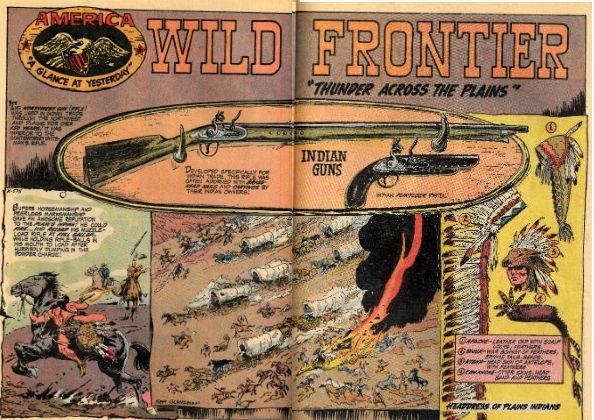
AMERICA: "A Glance at Yesterday" by Sam Glanzman

After the lead feature Sam Glanzman gets roped in to do one of his typically informative double page spreads. I’m used to seeing these pop up in war comics so it’s interesting to note he was versatile enough to do The Old West too. Here kids get to thrill to a picture of a wagon train being burned, which is surrounded by informative illustrations of weapons the native Americans would have used to slaughter the same kids' ancestors and some of the headdresses they might have sported to do so. It's nice, dusty looking stuff and it's even nicer to be reminded that space fillers could be quality gear.

 photo SevPanelB_zpshroigmvg.jpg

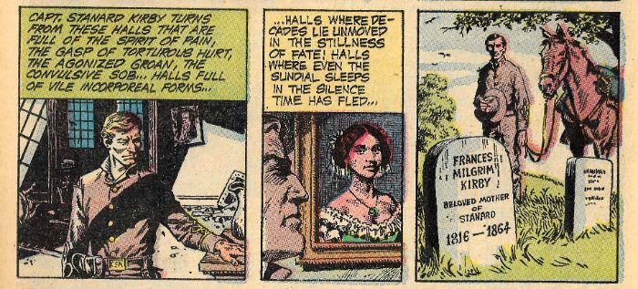
"SPOILERS" by Severin & DeFuccio The final 8 pages are a (probably reprinted) story called “Spoilers” by Jerry DeFuccio and illustrated by John Severin. This is a really dense tale with an attention to detail in the text which suggests it is an attempt to adapt a true story into comics. Maybe not though, because during a quick spin around the Internet I found no mention of “Kirby's Raiders” circa 1865. I did, however, find some really interesting pictures of naked people who had been involved in wallpaper paste accidents, and also of cats hating us. It's a nice yarn about a Confederate who goes back home to one of those mansions apparently everybody in the South seems to have lived in (well, everybody white). You know the ones with the big pillars and a big pile of fixings for them thar mint juleps out back. Unfortunately those Northern bastards have been at it and left it not unlike when a burglar breaks in and dumps one out on your bed (apparently it’s from the adrenalin; it makes you loose). As revenge Kirby forms his Rangers and they go around stealing gold from that darned gubbermint. Kirby takes a break, disperse his gang, hides the cash and takes up on a farm where he helps out with his honest toil until a bunch of locusts turn up. Basically, Kirby sees he has become a spoiler like the darn Yankees and the locusts. It ends with a hilariously underplayed final panel where he muses on the lesson he has learned and we are informed that the money he hid earlier had also fallen victim to the locusts. It’s left unsaid, but if I know my westerns then that guy’s life was short and punctuated by violent inquiries as to the location of the loot from his former colleagues. John Severin draws the holy Hell out of it all in his characteristic style - sharp as a craft knife and loaded with detail. Two decent strips and an informative space filler makes TOMAHAWK #135 a comic which is GOOD!

In 1971 for fifteen slim cents you could get Joe Kubert, Frank Thorne, Sam Glanzman and John Severin. Now that's – COMICS!!!

"WHO'S Stubborn?" COMICS! Sometimes Only The Sea Sees!

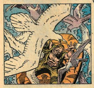
No, no, no! Oh, Sgt Rock, the optimum method of seagull attracting is to be a small child stood in St Ives holding a rapidly collapsing ’99, as my still somewhat traumatised son will attest. Naturally I realise it isn’t the fault of the seagull but rather that of the idiots who persist in feeding them in flagrant contravention of the many signs prohibiting this precise behaviour. (I am particularly proud of how middle-aged that sentence sounds; it’s the written equivalent of rolling up my jacket sleeves and nodding fiercely along to a shitty Phil Collins “number”. At a wedding.)  photo RockClutchB_zpstfqarpbk.jpg SGT ROCK by Heath & Kanigher

Anyway, this... OUR ARMY AT WAR #258 Art by Russ Heath, Sam Glanzman Written by Robert Kanigher, Sam Glanzman DC Comics, $0.20 (1973) Sgt Rock created by Joe Kubert, Robert Kanigher & Bob Haney

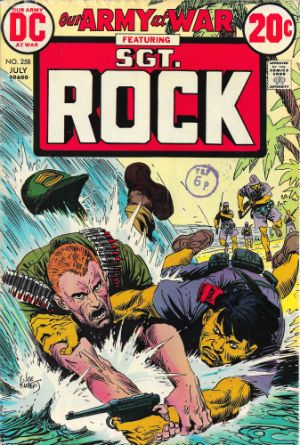
 photo RockCovB_zpss87afchp.jpg

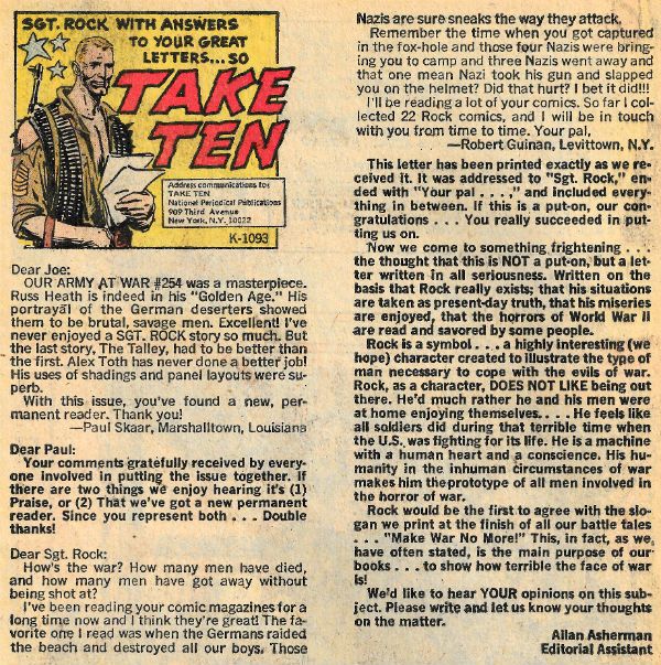
This comic came out in 1973 and is set during a war which ended in 1945. As I peck these words out it’s 2015 and while you’ve probably heard of that war (The Second World War) you’ve probably never heard of this comic. There’s no real reason for you to have done so. I only found it because I’ve had to start clearing out the garage because someone had the crazy notion that we should put a car in there. Sheer madness, I trust you’ll agree. Obviously then, I’ve been sorting through my comics, and I read this one and thought I’d write about it precisely because it is a good example of the kind of comic that’s rarely mentioned; a 1970s DC war comic. 1970s DC war comics get the high hat because they aren’t as good as 1950s EC war comics and also, everybody probably (and rightly) feels a bit hinky about war as entertainment. This sensitivity to tastelessness can be seen right there in this issue's letter column:

 photo RockAlanB_zpsr4hjumqk.jpg

Allan Asherman there, making sure everyone's on the same pag viz a viz reality and war. Besides Sgt Rock the book is also bulked out by other strips, most notably one of Sam Glanzman's unaffected and clear eyed depictions of serving aboard the USS Stevens. It's a particularly bleak tale drawn in Glanzman's Kuberty and roughly blunt signature style. Basically, Sam Glanzman is pretty great, you know?

 photo RockUSSB_zpsfqu4jq7g.jpg USS STEVENS by Sam Glanzman

Anyway, this isn’t the old Comics Were Better Back Then! or the rarer Hey, Look a Lost Masterpiece! it’s just a look at one of hundreds of thousands of comics produced in the past before it slips into the obscurity it was intended for. Well, slips back into my garage, because this one’s a keeper.

 photo RockWhooooMB_zpscajiuv9m.jpg

SGT ROCK by Heath & Kanigher

Keeping it as basic as basic training then, the cover is by Joe Kubert but that’s not all of Joe Kubert’s contribution. If you squint at the print below the opening splash page it’s possible to see that the Editor was also Joe Kubert. Joe Kubert (1926-2012) was a titanic comics talent whose staggeringly voluminous output consisted largely (but not solely) of war comics. And Tor comics. In his later years he would attempt to connect more directly with the world by addressing the Bosnian conflict (Fax From Sarajevo ( 1990)) and by dealing with a chunk of personal issues in a series of OGNs addressing the Holocaust (Yossel, April 19, 1943 (2003)), parental expectations (Jew Gangster (2005)) and the reality of war (Dong Xoai, Vietnam, 1965 (2010)). All of them were visually striking if slightly over earnest comics which, disarmingly, sought to impart the importance of decency, respect and empathy. An admirable aim he pursued right up to the end of his life, and which saturates his final comics series (Joe Kubert Presents (2013)) And, yes, even his Tor comics. Here though, with OAaW#258, the mighty Joe Kubert’s visual contribution is a typically arresting cover featuring Sgt Rock wrestling a very yellow fellow indeed. Sgt Rock’s foe is a Japanese soldier and his icteric aspect may be down to a touch of malaria and an attendant pinch of jaundice, but let’s face it it’s probably down to the heavy handed colouring of the day. But wait, weren’t Sgt Rock and Easy Company active in the European Theatre which was kind of light on Japanese soldiers and, it should be noted, a really poor choice for a night out as theatres go? Every so often Robert Kanigher would find a reason to shift Sgt. Rock to the Pacific. This was largely for reasons of variety, I expect. While Bob Haney actually wrote the prototype Rock’s first appearance in OAaW#81 (1959), Kanigher created him (Rock, not Haney) in an editorial capacity and he and Joe Kubert further refined the character into his iconic state. Kanigher wrote the vast majority of Rock’s antics so it was probably primarily for the sake of his own sanity that he changed things up intermittently.

 photo RockSplashB_zpsgjork67i.jpg SGT ROCK by Heath & Kanigher

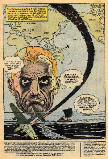
Of course the audience of the time (children, soldiers, degenerates, reprobates) couldn’t be counted on to have seen the previous issue so a quick catch up was always appreciated. The first page of this issue is one such catch-up. Today you might get a page of poorly proof read text, the tone of which can vary from the functional to the humorous. Here we get a Russ Heath splash page, which may very well just be an exercise in visual exposition, but it’s one done with such design flair and general artistic excellence I’d certainly hang that bad boy on my wall. Check it out. Check it out again. Still rocking, right? All the information a reader needs is represented visually right there. Rock’s haunted face has pride of place in a position suggesting the elements surrounding him are thoughts/memories, and the smoke trail of the falling plane carries the eye down while it gluts itself on the surrounding detail. You’d have to be trying very hard indeed not to interpret the visuals here correctly. Admittedly, yes, all the information a reader needs is repeated in the text box. But while this image-text repetition results in a certain level of redundancy intrinsic to the form at this time (i.e. 1973, not 2015) this occurs less frequently than you might expect in the following pages, but it does occur. I hold that this repetitiveness is entirely intentional and a natural result of the bifurcation of the workload, rather than bad writing per se. Say an editor asks a writer to write a script and assigns it to an artist, where’s the guarantee that they’ll get back a seamless piece of entertainment? It’s over there having tea with Lord Lucan is where that is. So, you make sure the writer writes it all down and you make sure the artist draws it all too; belt and braces, basically. Comics was different back then; it was better. No, of course it wasn’t. The rewards back then were pitiful. I’ve read this comic a couple of times and I can’t actually find the names “Robert Kanigher” or “Russ Heath” credited as writer or artist respectively. These dudes expected nothing. These dudes weren’t going on chat shows anytime soon, or getting their snout in the TV cash-trough, or snorting uncut Hollywood; they were making a comic and doing it as well as they could. Which in Russ Heath’s instance was phenomenally, in case I don’t make that clear later. Heath’s the star of this strip but Kanigher’s no slouch.

 photo RockWhaB_zpsoyivej0o.jpg

SGT ROCK by Heath & Kanigher Robert Kanigher (1915-2002) was, reportedly, not well loved by his peers but as far as posterity is concerned that carries as much weight as a politician’s promise. You pick up this book and you'll just find Robert Kanigher’s a decent writer. This sucker just chugs along. It’s 14 pages long but it feels like three times that, and in a good way. In another way he’s a very bad writer because the strip is just a succession of events that aren’t actually thematically connected or any of that fancy stuff; but it entertains. Since that was his job - he’s a good writer here. For the bulk of the issue Rock is alone and adrift yet Kanigher singularly fails to let us into Rock’s head except via his terse and basic narration of events.

 photo RockWaveB_zpsrsms2eai.jpg

SGT ROCK by Heath & Kanigher

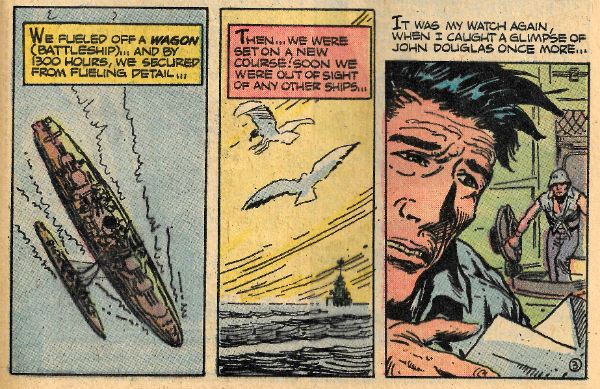
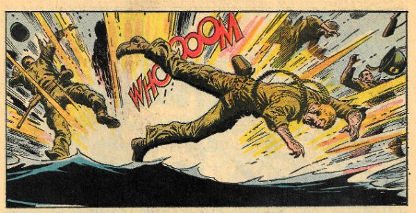
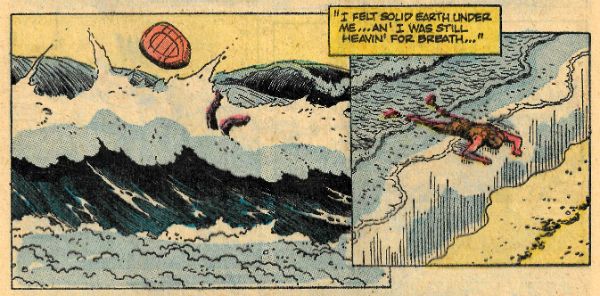
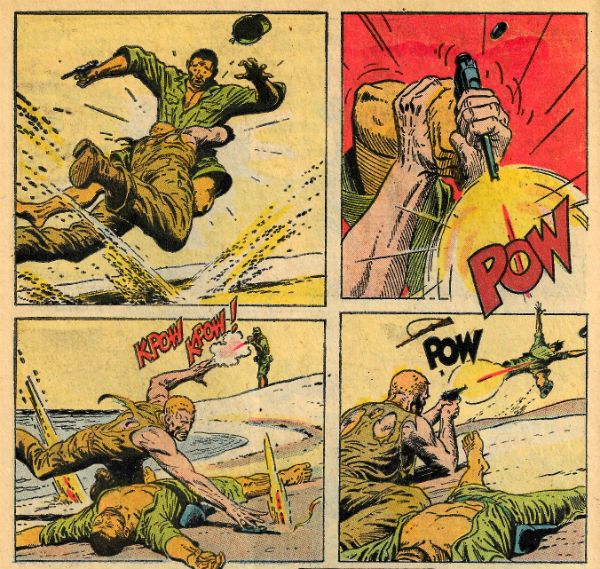
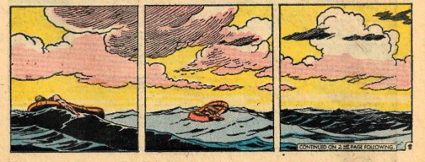
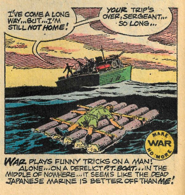
Most writers wouldn’t exercise such restraint. There are no revelations about Rock’s past; it’s all about his present. This is good because Rock is a pretty basic character. Whatever you throw at him, he doesn’t fall. He endures. He’s a rock. That’s it. (It works, don’t knock it.) Having flashbacks to Rock’s first sweetheart, harvesting waving fields of corn, labouring in the steel mill and being dandled on Pappy’s knee etc. would dilute him. Sure, such after the fact encumbrances would appear in other Rock comics and be so poorly policed that at one point if you totted them up he’d got three Dads, like some shitty sit-com or something. In this comic there’s none of that; just a man existing moment to moment. Because that's how you survive a situation this horrific. Well, in this comic anyway. However, Kanigher’s nerve buckles when it comes to having faith that this stoic castaway stuff will keep the audience attentive. So we have a flashback with Easy Co. storming a pill box so that the kids get their customary action scene, complete with Kanigher’s signature move – the "TNT-whatsit" phrase ("Looks like that flyin' swastika is goin' to put us in the ice-box --with a TNT ICE-BERG!"). In his defence Kanigher does use the scene to establish the particular quality of Rock the issue will pivot around; his stubbornness. And, let's face it, editorial may have required certain “Sgt Rock” elements to appear in every issue; I think that’s pretty likely. A more organic outburst of action occurs when Rock lands on one of those tiny islands the Pacific hosts which are as numerous as my grudges, and he encounters some Japanese soldiers. A sequence of violence is then depicted by Russ Heath who, with ink, brush and genius, manages to communicate all the desperate tension and explosive movement of such an encounter. Being the shy type I’ve never been attacked by Japanese soldiers on a beach but for a few seconds Russ Heath sure made me feel like I had. Just Rock and the Japanese officer are left and, sensibly enough, they decide to pool their resources until they get back to the war.

 photo RockKpowB_zpsjz9v4tnp.jpg

SGT ROCK by Heath & Kanigher

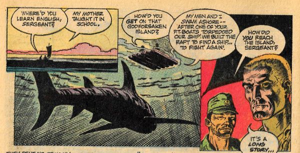
I know, I know, you’re ahead of me here and are already thinking of John Boorman’s 1968 movie HELL IN THE PACIFIC. This movie starred Lee Marvin and Tosihro Mifune as WW2 enemies stranded on a Pacific island who first fight then unite, before the War inevitably returns and with it, duty. And this bit in the comic is, indeed, like that fine movie, but it isn’t 103 minutes long it’s 14 pages long. Kanigher & Heath don’t have the room to do more than nod in the movie’s direction but it’s a firm nod. So, I guess there’s a bit of pop culture referencing going on there; some homaging, yeah? You didn’t realise they did that before Community did you! This basic premise was also, uh, homaged somewhat more extensively in an episode of Battlestar Galactica, but that hadn’t happened in 1973 and I doubt Robert Kanigher had seen it unless he was prone to prophetic visons of crap culture. Depends how hard he was hitting the sauce, I guess. I know I’ve seen a few sights that way (badgers on mopeds!) One of the interesting things about the movie is that Marvin and Mifune never stray from their native languages so the audience shares their frustrations and breakthroughs, this is a great idea but probably not one the public warmed to as the movie was a huge financial loss. Kanigher & Heath don’t have time for all that smart malarkey so it turns out the Japanese officer can speak English.

 photo RockStoryB_zpsns4s4ybs.jpg

SGT ROCK by Heath & Kanigher

In a pithy masterclass on exposition, Kanigher establishes how that is ("My mother taught it in school." BANG! Job done.) Kanigher cannily uses the officer to have Rock fill us in on the story so far, which is one time too many really. As though sensing this Russ Heath wades in and draws the balls off of what is basically several panels of two men sitting and talking. The standout here is the bit where Russ Heath takes us under the surface of the sea to show a shark shadowing the raft and its oblivious passengers. A certain kind of easily excited blogger might start telling you that this shark represents the war which exists independently of the two men’s attention and could explode into their lives without warning. Me, I think Russ heath is keeping both himself and his readers awake and just really drawing that shark the way sharks should be drawn - really well. Look at that panel. Damn, the song Russ Heath’s art sang in 1973 is so strong in this comic I can hear it all the way in th efuture year of 2015.

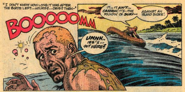
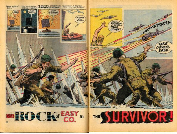
As I’ve said the strip is only 14 pages long (did you catch that?) and yet Rock’s journey takes days, weeks even. Kanigher acquits himself well, but it’s Russ Heath’s art which leaves you feeling you’ve shared Rock’s journey and appreciating its span while he generously spares you the actual tedium of it. Heath’s opening splash is a majestic thing but the double pager that follows it up is equally strong. Having established Rock is adrift on the previous page Heath uses the top panels on the next page to punch home how long Rock’s been floating and the cost it’s had on him. Alternating (and enlarging) Day-Night-Day panels punctuated by repetitious babble take the eye across to the seagulls which become in Rock’s sun-fried mind, and before our eyes, planes swooping down from the top right with their bullet trails diagonally strafing the combat happy joes of Easy Co., who push across to the right against the bullets and take us to the page turn. That’s some pretty sweet visual storytelling right there.

 photo RockDoub1B_zpsimr0ivpc.jpg

SGT ROCK by Heath & Kanigher

In a later sequence similar to the one at the top of page two Heath manages to make it send a different message; this time the panels again indicate an indeterminate but large amount of time has passed but Rock seems barely to have moved. The maddeningly slow pace of drifting depicted there, because unless some weather is happening the sea isn’t really rushing anywhere.

 photo RockTimeB_zpsegp4tdmf.jpg

SGT ROCK by Heath & Kanigher

Again and again, on every page it’s Heath’s eye for detail which convinces. Heath pays everything the same level of interest and doesn’t play favourites. As a result his people are convincing in posture and expression within a world that seems concrete. He actually draws the sea for a start, then there’s the stances in the tussle on the raft, the body blown back by bullets, the predatory grace of a shark, everything, all the way down to the scabs on Rock’s head.

Just another comic; just another day at work for Russ Heath & Robert Kanigher. Our Army at War #258 is just VERY GOOD!

 photo RockRaftB_zps5fmodc8e.jpg SGT ROCK by Heath & Kanigher

In the end all rocks must crumble but some things endure. Yeah, I'm talking about COMICS!!!

"They Gave Their Lives...Just For THAT?" Comics! Sometimes They "Dare To Be Different"!
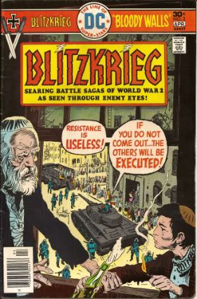
Old war comics written about by old man - pictures at Eleven! Photobucket Here's a thing: In MAN OF ROCK by Bill Schelly, a book which is all about Joe Kubert and the things he has spent his time doing, there is no mention of BLITZKRIEG. (Other than that Bill Schelly's book is, however, VERY GOOD!)
It's okay, Bill Schelly, I think I've mentioned BLITZKRIEG enough for everyone!

And now our Feature Presentation:

Photobucket

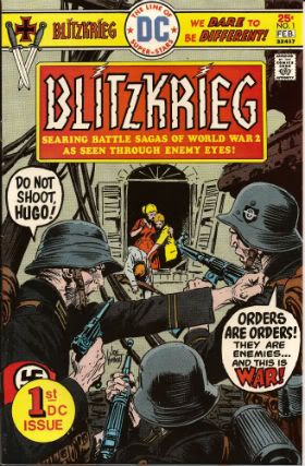
It was 1976 and it was time to see WW2 “through the eyes of the enemy”. This was hardly unprecedented. Joe Kubert (b. 1929)and Robert Kanigher (1915 – 2002)had previously worked up and on Enemy Ace in Star Spangled War Stories. Said series was an innovative look at WW1 (1914-18) through the character of a German air ace modelled upon The Red Baron (Manfred Von Richthofen not Snoopy). These stories are collected in their entirety in SHOWCASE PRESENTS: ENEMY ACE which is a plump lump of B/W brilliance (VERY GOOD!). Giving in to the temptation to gorge on the contents, however, results in an unavoidable recognition of the repetition in their structure. If read in the short bursts as it was initially published it becomes clear that this repetition was entirely intentional. Read any individual Enemy Ace story and you get a complete story with all the information required to understand the context and point of what was on the pages.

Photobucket

Modern readers may also finds some of the contents a bit broad at best and belief defying at worst. That’s understandable but tends to underestimate the fact that these are primarily stories and their intention is principally to entertain and then, typically, to make a point. To get the most out of them it’s probably best to view them as a form or parable rather than an attempt to accurately reflect reality. You probably remember The Parable Of The Killer Skies from Sunday School. The contents of Showcase: Enemy Ace will always be of interest thanks to the astonishing performance of all the artists involved; Joe Kubert, Neal Adams, Frank Thorne, Howard Victor Chaykin and John Severin. There were indeed giants in those days but it’s worth stressing that of these lofty talents Joe Kubert’s scalp was the most sky scraping. I’m a like me some Joe Kubert, I do. But the fact that these stories are still readable is evidence of the rock solid craft brought to the task by Robert Kanigher.

A lot of people liked Enemy Ace but not enough people, sales on the book kept falling and, as Editor, Kubert was forced to drop the series and replace it with The Unknown Soldier. (Don’t worry if I’m going to talk about The Unknown Soldier it will be a time other than this one.) The point here is that the success of Enemy Ace is due to the fact that the techniques involved were as taut as Cher’s face. So Enemy Ace wasn't a total success but it was very popular which is more than can be said for The War To End All Wars (which is a case of false advertising if ever I saw one). Of course after the world got its breath back it decided to produce the more popular sequel WW2. And it was in this setting that Kubert and Kanigher attempted to replicate the success of their “through the eyes of the enemy” approach.

Photobucket

But because you are paying attention you are now thinking why do that? If Enemy Ace couldn't pull in the punters why launch a whole new series with a similar premise? The DC Explosion is why. It’s aptly named because it was about as controlled and disciplined as an explosion. The fact it was almost immediately followed by the DC Implosion should tell you just how successful cramming as much stuff onto the spinner racks turned out to be.Given the urgent need for fresh recruits to be rushed to the Retailing Front many comics were sacrificed on the spinner racks. BLITZKRIEG was amongst the cannon fodder.

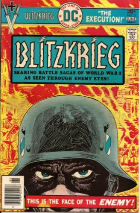
BLITZKRIEG #1 - 5 By Ric Estrada, Sam Glanzman and Lee Elias(a), Joe Kubert & Robert Kanigher(w) (DC Comics, $0.30 ea, 1976)

Sadly the big thing about BLITZKRIEG is how half-baked it seems. There's an interesting premise ("Yeah, but how was WW2 for The Bad Guys?") but it just doesn't get any traction. The stories themselves are solid enough to start with but as the series progresses they start to become more hazy, lacking a point around which Kanigher can cohere his scripts.  It's a good framework though; following three German soldiers through the war and having them reflect the mindset of "The Enemy" (who unsurprisingly will be surprisingly like "Us"). The first problem is that Kanigher has too many protagonists. Sgt. Rock and Enemy Ace have a strong central figure around which events can orbit and whose experiences provide the Reader with an "in". BLITZKRIEG has Franz, Ludwig and Hugo. Franz is blond and handsome representing The Intellectual, Ludwig is a meathead always thinking of ladies and Hugo is a speccy bald weasel always thinking about food. It's fairly clear that they are three separate aspects of Man and their very separation is that which blinds them to the fact that if all three were united in one individual more perspective would be available, possibly even enough to grant them the wit to realise that what they are involved in is both inhuman and insane.

Photobucket

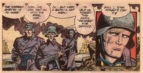
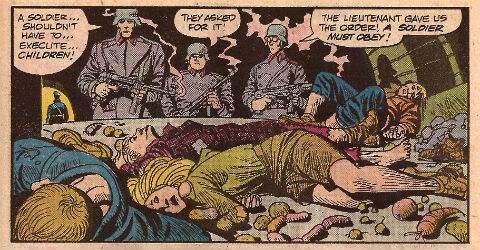
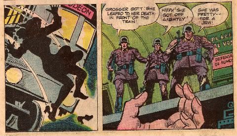
And, to be fair, BLITZKRIEG doesn't stint on the depiction of the horrors perpetrated by these ordinary guys. Throughout the course of this series the "heroes" kill women and children, both armed and unarmed, massacre P.O.W.s and are active in the horror of the pacification of The Warsaw Ghetto. It's unpleasant stuff and there lies BLITZKRIEG's second main difficulty. By focusing on this barbaric string of events it's hard to root for our Three Stooges. The series focuses so hard on these atrocities that there is barely even room for our three chums to pop up and offer their character revealing insights ("I like bread!", "I like ladies!", "I like Butterflies"! Jesus, these guys make Brick Tamland look nuanced.) The Reader never gets to know them because they are hardly present in the narrative and when they are they are always saying the same things. They never change and they never learn no matter how bad things get, no matter how stained their hands.

Photobucket

But then maybe that's the point. Maybe that's how these things happen. Franz, Ludwig and Hugo appear totally at the mercy of events, pulled under by the current of History only to resurface briefly to state to themselves (and to us) the only things that keep them functioning; their appetites and their belief that this is necessary, or at least unavoidable. They are trapped in a narrative not of their making and they cling to sanity only by reducing themselves to their most basic, unthinking needs. That would be good, I think. But I only think that, I don't know that. And I think I only think that because that is how I am naturally inclined to think. I don't believe there is much on the actual pages to convince me that the authors (writers and artists; comics is a gestalt thing remember) are moving me by design to these thoughts. But then inspiring thought in a reader isn't such a bad thing. Even if the particular colour of that thinking is an unintended by product. Because, maybe, WW2 is the kind of thing that happens when people stop thinking and let other people do that for them, particularly when those people doing the thinking are the kind of people who should be heavily medicated and monitored for their own safety.

Photobucket

BLITZKRIEG has other problems too. The premise is a deceptively complex one and the truncated nature of the episodes (roughly 11 pages) doesn't allow enough room for the authors to really start working. What a comic like BLITZKRIEG needs to succeed, amongst other things, is room to breathe. In the '70s comics authors were rarely allowed this luxury. Sure, modern comics do get this break but if comics from 2000 to 2011 have shown us anything it's that if you give comics creators room to breathe often that's all they do; breathe. Then there's the nature of the conflict BLITZKRIEG depicts. Enemy Ace not only has a single protagonist but also benefits from being set in a conflict where "Good" and "Bad" are entirely more nebulous labels, and the meaning of these is further diffused by the concepts of honour, duty and tradition. These concepts had pretty much worn out their welcome by the time WW2 rolled around, sure, they lingered and were important but by no means to the same extent and the longer the war rolled on the more denuded of meaning these concepts became. In a War in which people are putting other people in ovens, reduced to cannibalism, arming their children and dropping nukes on civilian targets honour, duty and tradition aren't really going to be able to cut it. Hell, even "Good" is going to have its work cut out for it. Presenting WW2 "through enemy eyes" would require rather more serious thought than BLITZKRIEG can muster.

Given the moral morass of its setting, its uncharismatic leads, fuzzy storytelling and general lack of polish BLITZKRIEG fails to achieve its lofty ambitions but...but...even at its worst BLITZKRIEG is wholly innocent of the most objectionable charge that could be raised at such an endeavour. At no point are the actions of the Germans glamorised or presented as attractive. That would be the worst thing and BLITZKRIEG doesn't do that thing.

Photobucket

Authenticity is usually a concern with war books. Personally I’m rubbish at authenticity as long as Hitler isn't a space-stoat and the Yanks aren't riding gorillas into battle I’m generally okay. Luckily though back when smoking was good for you readers used to send letters in to comics and in issue #4 we have a letter which addresses the accuracy of BLITZKRIEG #1 thus saving me the bother:

"...mistakes are prevalent in this issue. Uniform insignias and ranks were inaccurate.The main characters were portrayed as privates. However, their weapons sub-machine guns were not issued to privates, who were armed withWW1 bolt action rifles throughout the entire war...German panzer represented was not built until 1941. The Molotov Cocktail was not named until 1941...In the Polish campaign Rommel was a Colonel attached to Hitler's bodyguard..." (text edited from Cadet Captain Rudy S. Nelson's letter from BLITZKRIEG#4)

So, not so accurate then but accurate enough if accuracy isn’t too much of a concern. And I don’t want it come across like special pleading but back when steak was a breakfast cereal research was proper work. You had to leave the house and visit these buildings called "libraries" which had "books" in them with "pages" and, yeah, I know it sounds like a madman's dream or something. Luckily, the ever reliable Sam Glanzman leaps into the trench of doubt and picks up the authenticity potato masher and chucks it back in your face with some pics'n'facts spreads about tanks and planes (The Panther Tank, Dornier DO-335A and the F-40 Corsair) before supplying a "3-D table-top diorama" where kids could paste the pictures to cereal boxes and through the judicious use of scissors and imagination recreate their own hellish scene of human suffering to treasure forever ("U.S.S. Buckley Rams The U-66"). Or at least 'til the cat got hold of it.

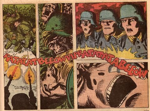
The intentions of all involved are, I’d say, honourable and good but we all know where the road paved with those leads. Except Ernest Hemingway who said that the road to Hell was paved with stuffed donkeys, but that guy liked his pop a bit too much. Obviously this comic isn't Hell on paper but the good intentions of all involved don’t stop it being more interesting than successful. Way more interesting than successful in fact but since I like interesting things I’d ultimately call BLITZKRIEG GOOD!, although as entertainment it’s probably EH! Having said that though there is the odd panel like this one below which brings BLITZKRIEG back up to GOOD!

Photobucket

And like moral certainty - I'm GONE!

Have a nice weekend, everybody!

"RA-409966!" Comics! Sometimes They Have Russ Heath Art!

Couldn't find a turkey, but I got a canary.  Careful of the bones! Photobucket

Hey, let's give thanks for an old DC war comic with the emphasis on Russ Heath.

Prompted by reading that OUR FIGHTING FORCES issue t'other week I was thinking about Russ Heath,  no, not because I have a kink for elderly comics artists. He’s old so I thought maybe I should do something about him. Y’know before he pops off and we all find out that he’s spent the last decade living in a badgers set and eating his own nose hair and we all feel bad before being distracted by the new AVENGERS movie. The first thing I think of when I think of Russ Heath is that time he squatted in the Playboy Mansion before he was asked to leave, probably with his pockets stuffed with canapés and ladies’ pants. The second thing I think of is this:

Photobucket

"Truth In Advertising!"

I know the child I was spent a ridiculous amount of time fantasising about those products, luckily though being a foreigner I never got the chance to purchase them and find out how much of a chasm existed between Heath’s marvelously evocative illustrations and the cheap plastic bas-relief reality. Alas, the murdered dreams of a generation of greedy children must be laid at the feet of Russ Heath. I guess no man gets to decide how History will remember him but I think it is important to at least mitigate the sins of Russ Heath by recalling the excellence of his work, particularly his work in this ‘70s DC war comic that I just happened to have read this week.

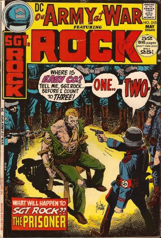
OUR ARMY AT WAR Featuring SGT. ROCK #245 By Russ Heath, Mort Drucker(?), Joe Kubert, Sam Glanzman(a) and Robert Kanigher, Sam Glanzman(w) and some other people who aren't credited because back then that's how comics rolled. (DC Comics, $0.25, 1972)

Sgt. Rock in The Prisoner by Heath & Kubert The nights in North Africa are cold but things heat up when Sgt. Rock is held behind enemy lines! It's a tale that could have been called "Rock, Paper, Scissors - NAZI!!" or "Now I Know Why The Uncaged Bird Doesn't Sing!" but wasn't!

Photobucket

This one’s called “The Prisoner” but rather than involving Sgt. Rock waking up in a natty blazer and being chased by balloons on a Welsh beach it involves Sgt. Rock being captured and interrogated by a nasty Nazi. Kanigher only has a few pages to play with so it’s to his credit that so much is packed in here. Following Rock’s nighttime abduction and the apparent death of the Combat Happy Joes of Easy Co. when they pursue him (it’s okay they are fit as fiddles when he rejoins them at the end, they just are because this is a Robert Kanigher War comic and he ain't got room for the niceties!) we get to the meat of the matter. Rock in a chair while a Nazi tries to break him.

Photobucket

"Fret not. The deaths of Easy Co. would be retconned faster than even a Marvel Event could manage."

What I wanted to do here was look at Russ Heath's work and try to at least ameliorate his rep as being strong on hardware but weak on the other stuff. So here we have Rock out of his element and Heath out of his element as the bulk of this tale involves one man interrogating another. Given the restricted arena for it to work it’s going to be all about catching moments; catching the right moments and not fluffing the catch. How’s Russ Heath’s catching?

Kanigher sets up a couple of ambitious bits of business here. There’s clearly supposed to be some kind of contrast between the methods of the effete interrogator and his more hands on second in command. Here’s two panels that set that right up without any dilly dallying:

Photobucket

"When it came to circus acts Sgt. Rock was always more of a clown man."

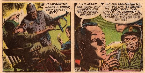
In the first panel Heath powerfully illustrates the large amount of violence that is contained in such a small act as pushing someone forcefully into a chair. The amount of movement in the Nazi’s body is minimal in comparison to the effect on rock and his seat. It’s cause and effect and here the cause is slight but the effect is great. Rock's inadvertent flailing perfectly captures a his instinctive need for a solid footing. Even the chair manages to suggest the shock of an inanimate object briefly become animate. Maybe?

The second panel not only contrasts the two approaches of the Nazis but also provides a vivid symbolic enaction of the approach of Kapitan Smooth. After all, if nothing else, I think we can all agree that a canary eating bird seed of the tongue of a Nazi is vivid. Going from brute force to sedate sadism is a pretty neat trick and I think we're going to have to say Heath gets that one bang on.

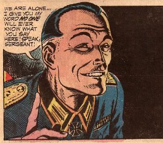
Temporarily divorced from his usual hardware Heath transfers his energies and has some fun with the Nazi, not only giving him a cigarette holder but also a creepily lax wrist action. C'mon the guy looks sculpted from smarm. Sure it’s shorthand and reliant on clichés but this character only lives for a handful of panels so it’s important to get it across quickly. In this guy’s case, contrary to what your Mum told you, it’s important to make the wrong impression. Have to keep that balance though, let the visual clichés serve the narrative and not overwhelm it.

Photobucket

"Trust me, I'm a NAZI!"

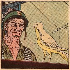
Oh, the canary's nice too, well done Russ Heath. The poor thing has been broken to the extent that it won’t even occur to it to fly off even though it has every opportunity. This is the sly power of persuasion but can a man as bluff and artless as The Rock resist? ( Spoiler: Yes.) He does this by just blaring his serial number in response to every question. This is the recommended technique and the repetition works well. The scene isn't as tense as it could be due to its enforced brevity. In a modern comic they could argue about their favourite Charlie Chaplin films or the best Hero sandwich they ever ate with lots of nine-panel grids with each panel containing the same image of a person face-on except in the last panel where the mouth has moved slightly and there’s a balloon saying “I know!” Regrettably Kanigher and Heath don’t have access to such sophistication. Actually they just don't have a lot of pages and their primary goal is to entertain in the space they have. They do actually have craft in spades. Which might be the point I'm struggling to make? I don't know, I got distracted.

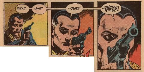
Sorry, where was I? Rock's belligerent obstinacy is tiresome to our Nazi friend and so he has little recourse but to point his Luger in Rock’s face. Rock persists with his recalcitrant repetition so the Nazi straight up shoots him in the face. The series ends and no more Sgt. Rock comics were ever published.  No, I have fooled you with the magic of my words; it was a blank! What a trickster! What with unsettling canary feeding tricks and poor taste in physical humour it’s no surprise that following the War very few fleeing Nazis chose to hide under the guise of children’s entertainers. But he’s overplayed his Hunnish hand as Rock now knows he isn't bluffing. Next time is for keeps – how will the Rock escape!

Photobucket

I love the effect not having the tail on the first balloon has. It creates a disconnect between the text and image that nicely suggests the disorientating sensory impact of stress. Rock’s vision is lagging behind his hearing as his mind works overtime to process everything. As the moment of truth arrives Rock's hearing and vision synch up and the zoom replicates the focusing of his attention. That's some nice craft there.

In a weak attempt at suspense I may have forgotten to mention that Rock’s hands aren't tied. So he just slaps that sucker back as it fires and our teutonic torturer gives himself a lead lobotomy! The contrast between force and finagling doesn't really go anywhere but Kanigher does get to demonstrate that neither can break The Rock.

Photobucket

"Despite dying before they were formed Rock was a big Manhattan Transfer fan (Each time I hear RATTA-TATTA-RATTA, chanson d'amour!)"

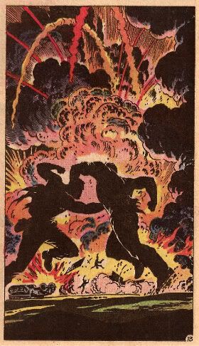
Having left the tent (Kanigher's been a good boy until now but can't resist here: "CATCH THIS, BUSTER!”) and blown the whole base up by driving through it in a Kubelwagen while firing a mounted Spandau one-handedly (Because he’s THE ROCK!) Sgt. Rock faces off mano a mano with the thuggish one with the unpleasant method of seating guests. I mention the brand names of the hardware just to show that Heath gets to do his signature hardware thang even in such a restricted arena. You can clearly tell the items have been referenced even if I have got the names wrong, after all I've less familiarity with WW2 German hardware than The Pope so errors may occur. Heath gets one panel for this confrontation. And I think we can safely say he uses this panel wisely:

Photobucket

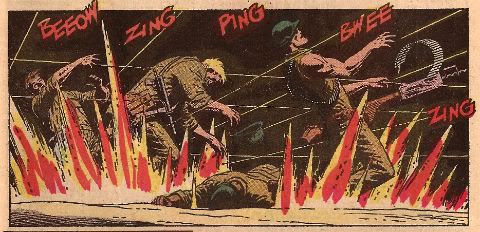
Man. That panel is so sturm und drang it’s actually turned the page yellow with the heat from the boiling background fires! Or maybe that’s because I don’t keep my comics nice. Anyway, I think we can agree that that single panel puts most capes’n’tights bust ‘em ups to shame. It’s the kind of thing that’s given at least a double page splash these days. Maybe with some deathless dialogue along the lines of “Hnn!” or “Ack!” Well, Russ Heath spits on such page wasting ostentation! Heck, he doesn't even need dialogue. Actions speak louder than words after all and that panel is full of A!C!T!I!O!N! You could stick that panel on the cover with “And Worlds Will…DIE!” as the strap line and it would still barely communicate the oomph and bang it blasts into your eye-holes. Russ Heath got one panel and he gave you one panel. One great panel. And I’m sure he doesn't really spit because it's dirty.

Photobucket

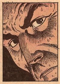
"The Many Emotions Of  Sgt. Rock #1: Sweaty"

I have of course cherry picked moments to illustrate the versatility of Russ Heath. There are some dead panels on these pages and his faces are often less than emotive. Kanigher's script also reaches for more than it can deliver but both of them were working with limited pages and purely to the end of entertaining bored G.I.s, kids and people waiting for video to be invented. Oh, and Kanigher gets a good joke in at the last. Rock gets back to Easy Co. and it turns out he couldn't answer the Nazi’s question because he didn't know the answer! I don't know but I think that's pretty suave and makes Kanigher's script GOOD! but Russ Heath, largely out of his element remember brings it up to VERY GOOD!

And me? Like The Thousand Year Reich – I’m GONE!

"Watch Yer Noggin!" Comics! Sometimes They Are About Losers!

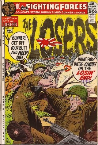
I read an old ‘70s DC war comic and I liked what I saw. Because what I saw was drawn by Joe Kubert, Alex Toth, Sam Glanzman and John Severin. I am good to my eyes. It cost 25 cents. Well, in 1971 it did. Photobucket

OUR FIGHTING FORCES # 134 By John Severin, Alex Toth, Joe Kubert & Sam Glanzman (a) with Robert Kanigher (w), lettering (probably) by the artists and colours by U.N. Known. The colourist no one knows but is known to everyone! Ho! DC Comics, Nov-Dec 1971, 25 cents (7½ pence)

Photobucket

"Joe Kubert edited this so if he wants Japanese soldiers on the cover when there are none inside, By God, there will be Japanese soldiers on the cover!"

It’s probably untrue to say that OUR FIGHTING FORCES (OFF) isn't anyone’s favourite comic but you could probably fit all the people who’d choose OFF before all other comics into the snug of a small pub. Personally I chanced upon this issue due to a weakness I have for smelly, yellowing non-tights’n’fights ‘70s mainstream genre comics. Sure, some men have a weakness for dangerous women or the thrill of the hunt but that’s their loss. I wasn't expecting much is what I’m saying. But what I got was Toth, Kubert, Glanzman and Severin. And I also learned some exciting facts about dogs.

Photobucket

"An awesome pause and then  - mad shit busts loose - it's SEVERIN!"

Robert Kanigher writes all the tales between these two tatty covers and if any one man personified DC’s war comics it is Joe Kubert. But after Joe Kubert it is definitely Robert Kanigher. Now while on a purely human level it seems Kanigher was certainly “difficult” on a professional level he was certainly, well, professional. Unlikely to be critically lauded anytime soon Kanigher could not only fill pages but, even better, he could fill lots of pages and better still he could do it without surcease. Robert Kanigher was a writer when a comic writer’s job was to write and no one can deny the fact he did that. When Joe Kubert replaced Kanigher as DC’s war books editor Kubert kept Kanigher on as writer. Whatever ill feeling there was Kubert did what it took to deal with it in order to keep the man he felt was best suited to the job. That’s a pretty solid tribute to the man’s talents. Either man. Anyway, Kanigher could churn this stuff out and like anyone who ends up as a churner the results were mostly mediocre with the odd brush with greatness and far more belly-flops into incoherence. Given the rate at which he pumped this stuff out it’s also easy to spot his style so although the last story here (“Number One”) is not credited to a writer I’m pretty sure it’s Robert Kanigher.

Photobucket

"Wait 'til he sees her teeth. (British people's teeth - comedy GOLD!)"

If it isn't Robert Kanigher my gast will be flabbered because the story is very, very Robert Kanigher. It’s a variation on his old standby of someone repeating a phrase embodying something they want to do while the events of the story conspire to prevent them and usually leading up to an ironic ending. Where “ironic” usually means “coincidental” rather than “ironic". It also has another signature Kanigher move – the lone soldier who pretty much unfeasibly kills his way to the end while the threats ascend in scale and danger; here our plucky dogface bests a plane, a gunboat, a U-boat and finally a pill box with three ’88 guns. That’s not bad for one grunt. I’d guess this one isn't writer-credited because it’s a reprint (the page filling banner across the top clues you in) but Joe Kubert has stuck his name on the art. This is lucky because it looks a bit like he was in a rush and so it resembles the work of someone who has just left The Kubert School rather than someone who will soon open the Kubert School. It’s OKAY!

Photobucket

"There's practically nothing there but everything essential is there - it's TOTH!"

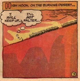
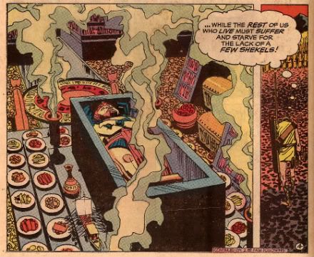
Preceding Number One there is “Soldier’s Grave” by Robert Kanigher and Alex Toth. Yeah. Alex Toth. Not much to say really as it’s Alex Toth so the page designs and layouts are wonderful, the brevity with which he visually communicates the necessary information is borne of skill rather than sloth and, look, it’s Alex Toth. Kanigher’s tale tells of an aged Egyptian who joins the Pharaoh's armies so that the pay he will receive on fighting will take care of his family. Now, I’m a Dad and a Partner while also having, shall we say, a certain Autumnal mental aspect so that kind of stuff gets in me and hurts. The poor sucker can’t make it into the fight (so his family won’t get any moolah) but luckily he lucks into holding up the Persians while his forces retreat. This costs him his life but the Eygptian leader promises to see his family right by giving them the valuable dagger that slew their paterfamilias. Again, I think Kanigher is reaching for irony here but ends up kind of edging more into the area where the dagger is a symbol for a kind of old timey Death In Service payment. It’s not a terribly convincing ending but there is an effective playing up of the disgusting waste of the Pharaoh and the parlous state in which his subjects live. It’s kind of clever really. With the exception of one panel the story shows just desert, pyramids, rocks and soldiers; it’s barren and harsh and then there’s the single panel showing the Pharaoh's tomb filled with food and loot. It would of course be cleverer without the big word balloon spelling it out for us but back then over-egging the pudding was par for the course. So, Kanigher’s script is okay but Toth’s art lifts it up to VERY GOOD!

Photobucket

"It's okay all that'll end up in a British museum - because we are stealers!"

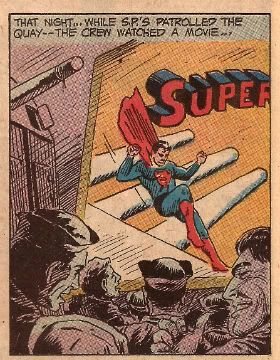
Sam Glanzman’s U.S.S. Stevens’ tale “In Tsingtao” takes us almost to the front of the book and, like all it’s author’s work, it has a lot of heart that makes up for most of the rough edges. Glanzman actually served aboard the U.S.S. Stevens during 1941 – 45 and I believe (although you may correct me) that these stories certainly draw upon his experiences if not actually document said experiences. It’s knowing this that lends a certain generosity to my reception of the strip. While I might otherwise be unimpressed by what appears a muddled attempt to contrast the comic book mythology of Superman’s invulnerability with the very real vulnerability of four sailors slain on shore leave; knowing it is probably based on a real event means that I can be more impressed by it as an attempt to embody the sadness and waste of such an event and that reading more into the panel where the sailors watch a Superman serial than the fact that sailors used to watch Superman serials is entirely my fault. Which is a long and tedious way of saying In Tsingtao is short and affecting and GOOD!

Photobucket

"Man, I bet the guys who created Superman died rich!"

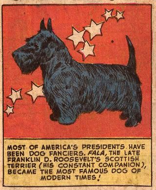
Luckily any reader will have been prepared for Glanzman’s depressing tale by the feel-good fun facts of “Canine Corner”! This is two pages of dog facts and pictures which are linked to the military theme of the book by the fact that some dogs were used by the Army as they could “giving warning of enemy infiltration at night”. i.e. they barked.

Photobucket

"For Mr. Graeme 'The Dog Botherer' McMillan"

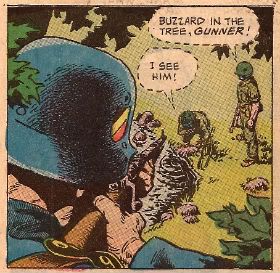
Which brings us to the tale at the front of the book - “The Real Losers!” I have worked my way backwards because like the immortal Vanessa Williams song I like to leave the best ‘til last. This isn't the best story because of Robert Kanigher’s script but because of John Severin’s art. The script is basically an excuse to build to a scene where Gunner (the young blonde Loser) rediscovers his will to fight the good fight. Like all Kanigher’s war scripts the plot has little to do with reality but for it to work it has to at least appear to be grounded in reality. Given Kanigher’s shortcomings as a writer this is a task the art has to shoulder. John Severin’s performance on these pages is more than suited to the task. I like to group Severin amongst my personal roster of Quiet Giants of Comic Art. He rarely appears on anyone’s best of list but he certainly deserves to. It’s probable that working with the inestimable Harvey Kurtzman on EC’s war stories cemented in Severin a certainty that research and authenticity were essential to successful verisimilitude. See this panel from pg.8:

Photobucket

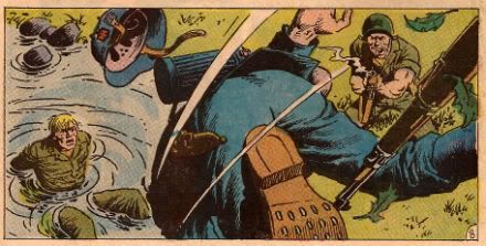
Now I've read a lot of war comics so I've probably seen more bullet riddled German soldiers fall out of trees than is strictly healthy but what strikes me about that panel is the level of detail. The insignia on the helmet is clearly visible, attention has been paid to the studs on the soles of the boots and, best of all, Severin has drawn the lining in the helmet. Now I’m not a WW2 obsessive so I can’t vouch for the veracity of these elements but the wealth of them convinces me of the reality of the image and makes me shake my head in admiration at the effort that could have been so easily avoided but wasn't. Later (pg.13) Severin draws a bunch of howling Wehrmacht bursting from a landing craft. According to a WW2 obsessive and pedant (how often the two are paired!) I once worked with it seems holding a Schmeisser by the ammo clip wouldn't work due to its instability when firing. So, I’m not unaware that Severin gets things wrong but the things he gets wrong are the things everyone gets wrong and the things he gets right are things most artists wouldn't even bother about.

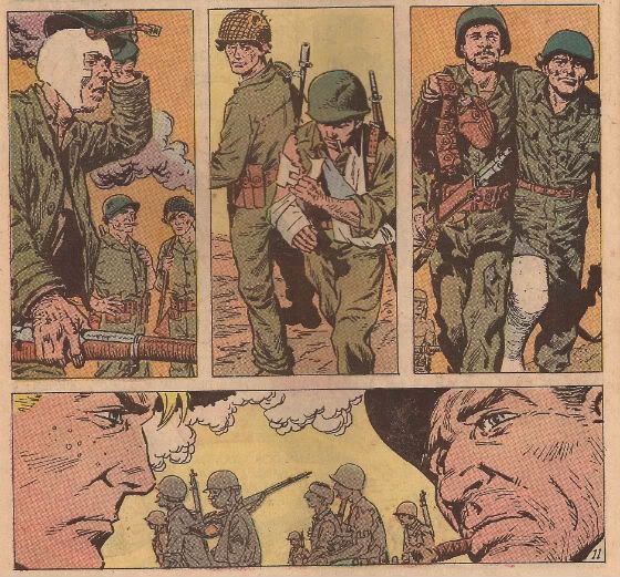
But Severin isn't just about the detail, which in isolation would make his work err towards the clinical, but also about body language and expressions and it’s these that give his work heart. By pg.11 Gunner and Sarge are on a beach with a bunch of walking wounded when they are made aware of an impending German attack. At this point Gunner still won’t pick up his gun to fight but at the OIC’s command of “Walking wounded!—Grab your weapons and form a line at the water’s edge!” Kanigher steps back and lets Severin’s lines speak with dignity and sureness:

Photobucket Of course Kanigher has to spoil it on the next page with some customarily hilarious over-egging (“Who needs FEET to SQUEEZE a TRIGGER!”) but look at that last horizontal panel. Look at Sarge’s face; his expression. That’s a complex piece of “acting” right there. It’s class and John Severin is a class act all the way. It’s a sad thing that such excellent work has to be stumbled upon in back issue bins by accident. But it’s a good thing I did because I got to tell you about it. Assuming you’re still here. John Severin’s excellent work lifts The Real Losers! up to VERY GOOD!

So there’s an old DC war comic I wasn't expecting anything from but got a Hell of a blast out of. And me? Like The Pharoahs I'm history!

Have a nice weekend all a youse stumblebums!