You wouldn't like Smitty when he's...grossly disappointed (Reviews 6/26 comics)
/Follow me into the largely NEGATIVE zone after the jump...
So Nice I posted it twice. Take that, free version of F0toshap!
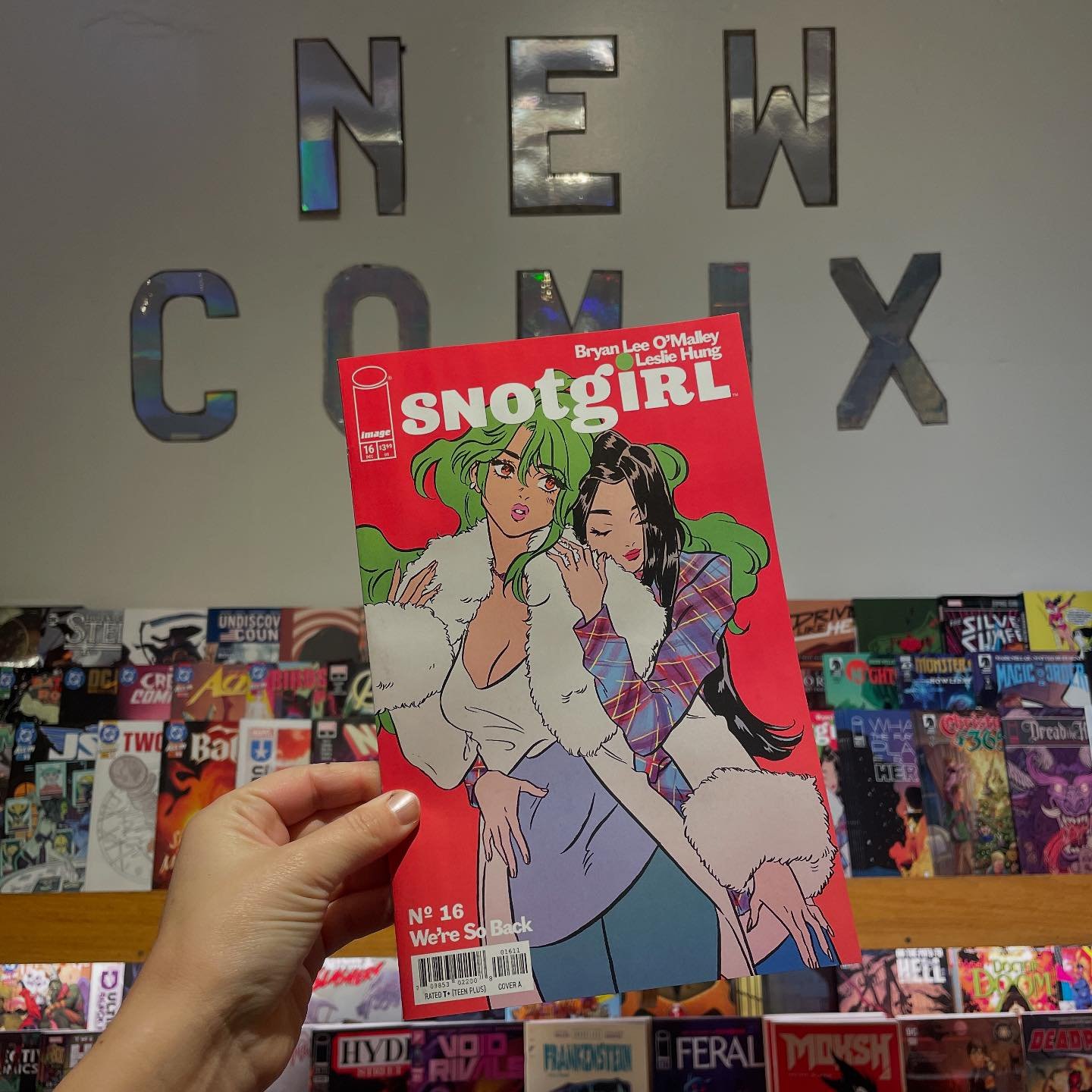
JUPITER'S LEGACY #2
$2.99 IMAGE COMICS
MILLAR / QUITELY
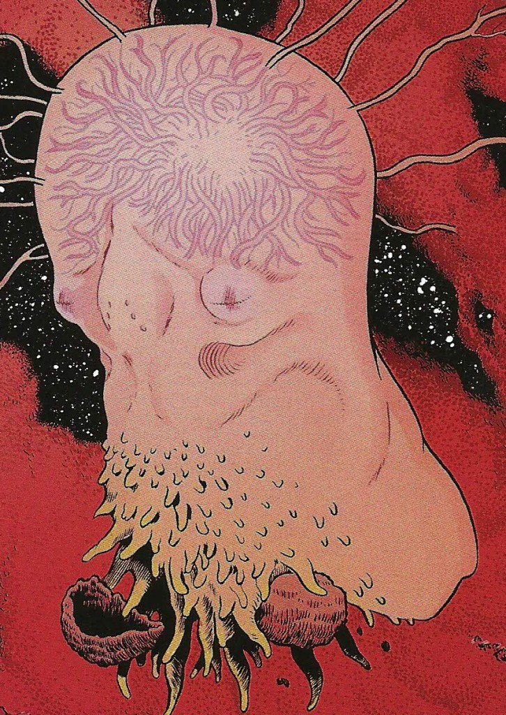
Well, the above image really says it all for me. Millar continues to prove himself the world's most accomplished checkers player when it comes to comic scripting. The sole positive here is that he's playing this game with a really sweet set of pieces courtesy of Quitely. If you don't know where this is going after the end of issue #2 by all means, keep plowing away. The subtle master that is Millar is sure to keep you "guessing." This would probably get my standard - "Professionals doing professional work, art is nice, $2.99 price point, blah blah" but when you put on the back of your crap comic that it's the "GREATEST SUPERHERO EPIC OF THIS GENERATION" you are inviting a more critical eye. It pains me...literally PAINS me to give anything drawn by Quitely this much scorn but...AWFUL.
PROPHET #36
$3.99 IMAGE COMICS
GRAHAM / ROY / MILONOGIANNIS / BERGIN III
Still a complete serving of FULL GUT VISUALS but I can't help but notice we're starting to drift into a referencing wasteland. Characters and imagery from 90's Liefeld comics is coming to dominate the course charting for this series and I think it's a little lesser for it. When we were adrift in the "post everything" world Prophet initially set out for us I was much more at ease with the feel of the series. Now Graham is racing us towards a conflict that has everything to do with the past and nothing to do with the future. I could really see this current arc being wrapped up with nice bit of anti-climax and then moving on to more open fields of conquest. This world is just sooooo rich and cultivated. I hate to see it dominated by the flat 2d reproductions in the "IMAGE CRYSTALLINE BALL" Still as with almost all issues in this run I'm opening it up again and again. Flip. Flip. Flip. GOOD.
BATMAN SUPERMAN #1
$3.99 DC ENTERTAINMENT
PAK / LEE / OLIVER
First, Batman Superman? Not cool. Anyhow, check it out everybody. Jae Lee got a case of JH Williams and he got it BAD.
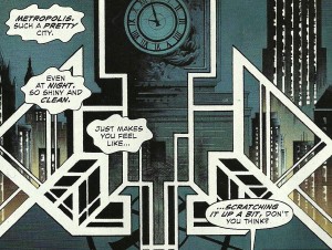
The storytelling in this is rough. Rough, rough. Colin Smith once pointed out to me that he enjoyed Jae Lee's figures but was bothered by his lack of backgrounds. Boy, I wish I could get some of that "lack of background." Here they are so over the top they wind up being the foreground if you know what I mean. Sure, there's a scene early where Clark confronts an in disguise Bruce on a park bench and we more than get the gist that Gotham is an eery place. What we also get is the idea that Gotham's parks administrators are diseased maniacs. There's setting the emotional context of the scene via place details and then there's fever dream. As the show goes on we're treated to so many tight panels I was reasonably sure I was watching the new version of Les Miserables. TONSILS!
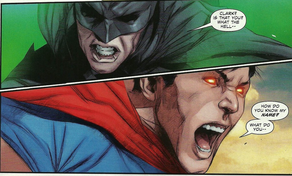
There are way too many of this form of composition used to be effective. What is supposed to be a kinetic and over the top brawl between an out of control / disoriented Superman and (future? alternate?) Batman is depicted as "FACES IN DISTRESS." Also, figures in action are frequently cut off by panel borders to a laughable degree. Call me old school but that is annoying and looks crappy as hell.
Another YMMV choice is the big, splashy computer graphic sound FX move. It just seems like a wrong / terrible choice tonally speaking for this style of line work. It took me out of almost every scene it appeared in but what do I know? I'm no comics pro.
Finally, for the coup de grace, Clark calls Pa Kent "Dad" on the last page. BLASPHEMY! C'mon Greg Pak! Don't do me like that!
Do better at your job, comics. Jae Lee you did some amazing work with Morrison on Fantastic Four and you draw my second favorite version of the Inhumans but let's get it going here, ok? (Yes, I know the second half of the book is not drawn by Lee.) ((Yes, that's its own damning statement.)) (((Three? No, not three.))) (((())))
I'll stick for a couple more but this was pretty damn close to another AWFUL and a disappointing EH at best for a much heralded opener.
LAZARUS #1
$2.99 IMAGE COMICS
RUCKA / LARK / ARCAS
So, it's DALLAS with souped up engineered killing machines and higher stakes. I haven't figured out who plays Larry Hagman yet but we're getting there.
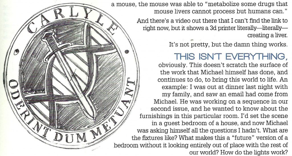
The world has proceeded to fall to shit, as it tends to do, and warring families of incredible wealth are all that remains of genteel society. Each family has one - and apparently only one - NEO-esque hyper killing machine to do it's most glamorous dirty work. The one we meet here, Forever Carlyle (Oy...) is the avatar for House Carlyle. Eh, I'll take the Lannisters. Anyway, the back matter does an excellent job of explaining what got Rucka's gears turning on making this story and - if I'm honest - was as good or better than the comic that preceded it.
I mean, light switches you guys. LIGHT SWITCHES! AWESOME!
Still, it means that they care and that...that is important. In a world scary enough to contain Jupiter's Legacy that is VERY important.
GOOD
